All Latest 582 A/B Tests
Become a member to unlock the abiltiy to see the highest impact a/b tests. Being able to see the actual test results and sort by impact allows growth and experimentation teams to take action on the biggest gains first
MOST RECENT TESTS
Test #261 on
Valkexclusief.nl
by
 Online Dialogue
Sep 20, 2019
Desktop
Checkout
Online Dialogue Tested Pattern #111: Field Explanations In Test #261 On Valkexclusief.nl
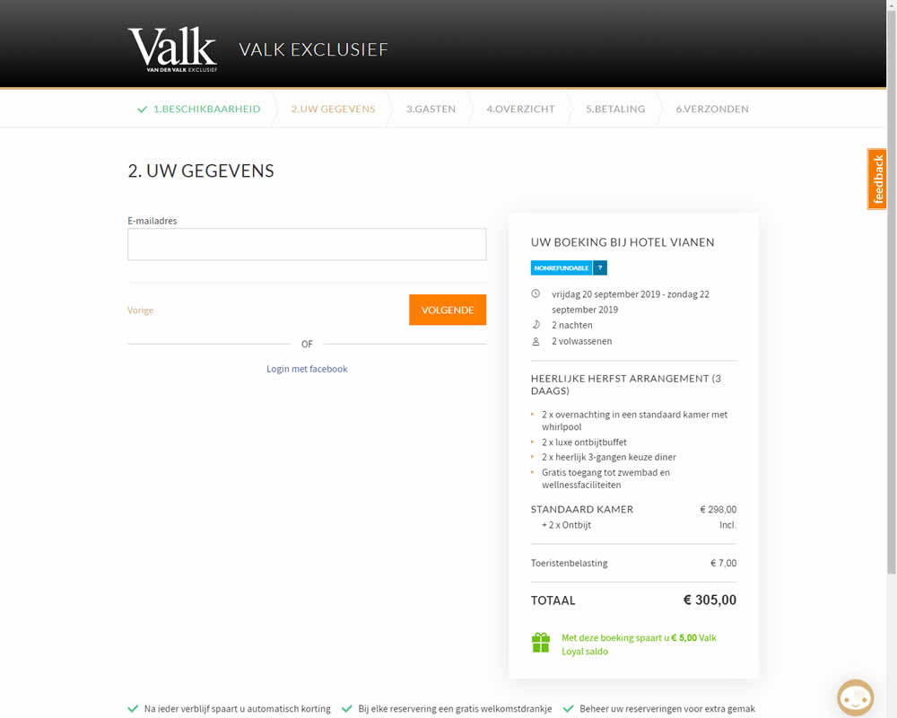
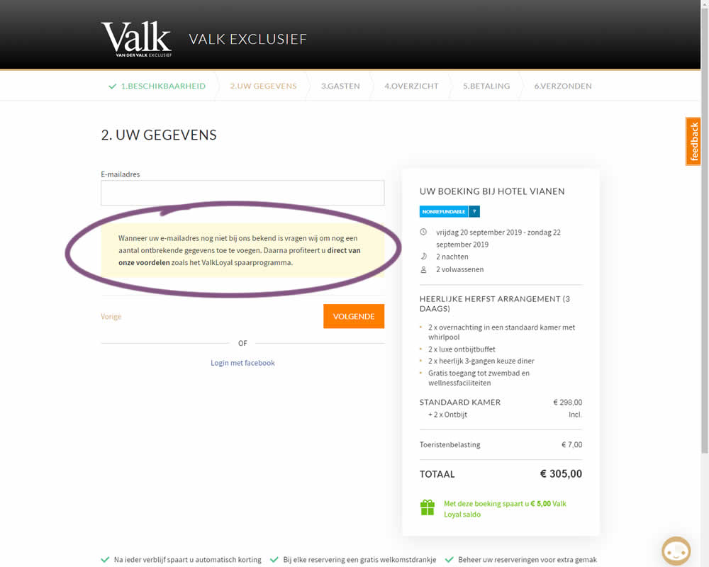
In this experiment on Valk Exclusief's web site, a reason was provided for why the e-mail address is being collected. Google translation of the added text is as follows: "If your e-mail address is not yet known to us, we will ask you to add some missing information. Then you immediately benefit from our benefits such as the ValkLoyal savings program."
Test #260 on
Valkexclusief.nl
by
 Online Dialogue
Sep 16, 2019
Desktop
Home & Landing
Online Dialogue Tested Pattern #45: Benefit Bar In Test #260 On Valkexclusief.nl
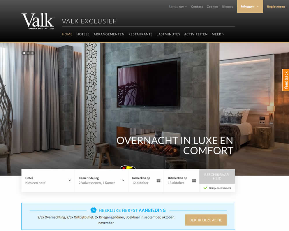
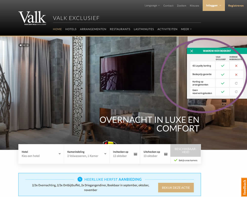
In this experiment on Valk Exclusief's web site, a transparent overview of the benefits for booking hotels was shown. The copy translates to: "Why should you book here? - 5€ Loyalty Discount - Best Price Guarantee - Discount On Packages - No Reservation Costs. Valk is a 150 year hotel chain in the Netherlands.
Test #258 on
Thomasnet.com
by
 Julian Gaviria
Sep 12, 2019
Desktop
Mobile
Signup
Julian Gaviria Tested Pattern #110: Optional Field Labels In Test #258 On Thomasnet.com

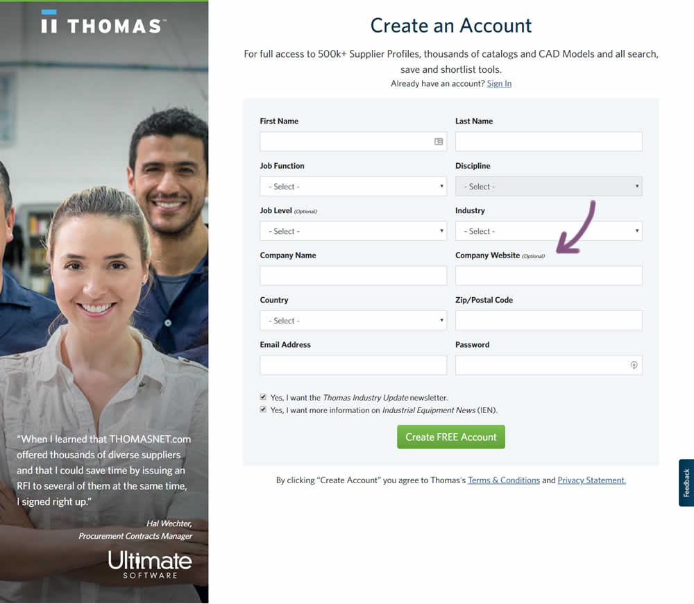
In this variation an optional field label was added.
Test #259 on
Thomasnet.com
by
 Julian Gaviria
Sep 12, 2019
Desktop
Mobile
Signup
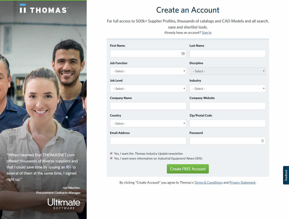
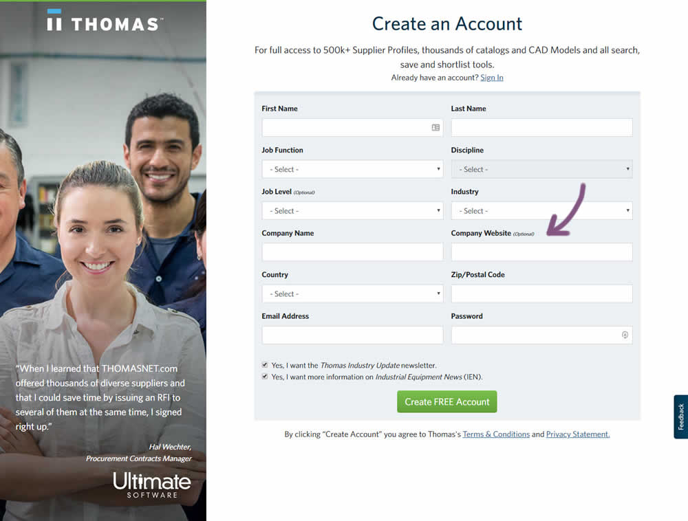
Julian Gaviria Tested Pattern #110: Optional Field Labels In Test #259 On Thomasnet.com
Test #257 on
Thomasnet.com
by
 Julian Gaviria
Sep 09, 2019
Desktop
Mobile
Signup
Julian Gaviria Tested Pattern #109: Required Field Labels In Test #257 On Thomasnet.com


In this followup experiment, field labels without and with a marked asterisk were tested.
Test #256 on
by
 Alex James
Aug 23, 2019
Desktop
Mobile
Signup
Alex James Tested Pattern #109: Required Field Labels In Test #256
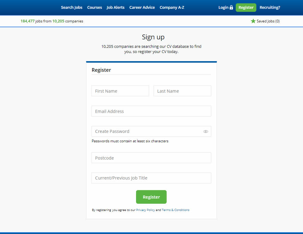
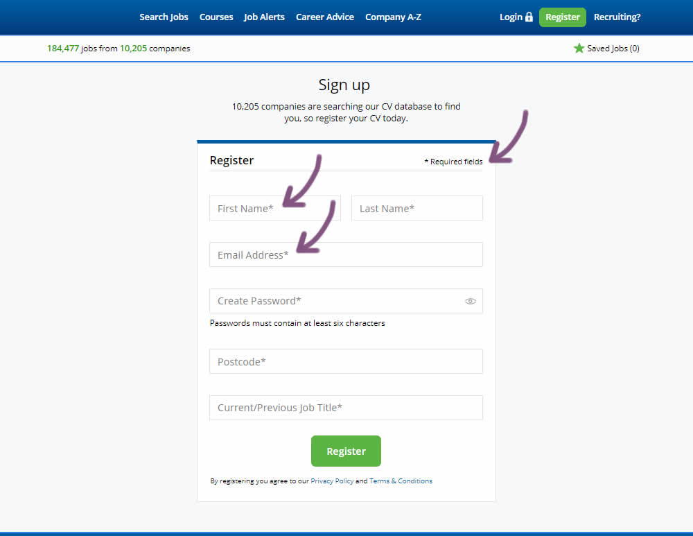
The original had no fields marked as required. The variant had all fields marked as required with an asterisk (and a reference note).
Test #255 on
Thomasnet.com
by
 Julian Gaviria
Aug 22, 2019
Desktop
Mobile
Signup
Julian Gaviria Tested Pattern #109: Required Field Labels In Test #255 On Thomasnet.com
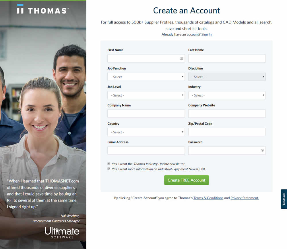

In this experiment, field labels without and with a marked asterisk were tested.
Test #254 on
Volders.de
by
 Alexander Krieger
Aug 16, 2019
Desktop
Mobile
Signup
Alexander Krieger Tested Pattern #17: Least Or Most Expensive First In Test #254 On Volders.de
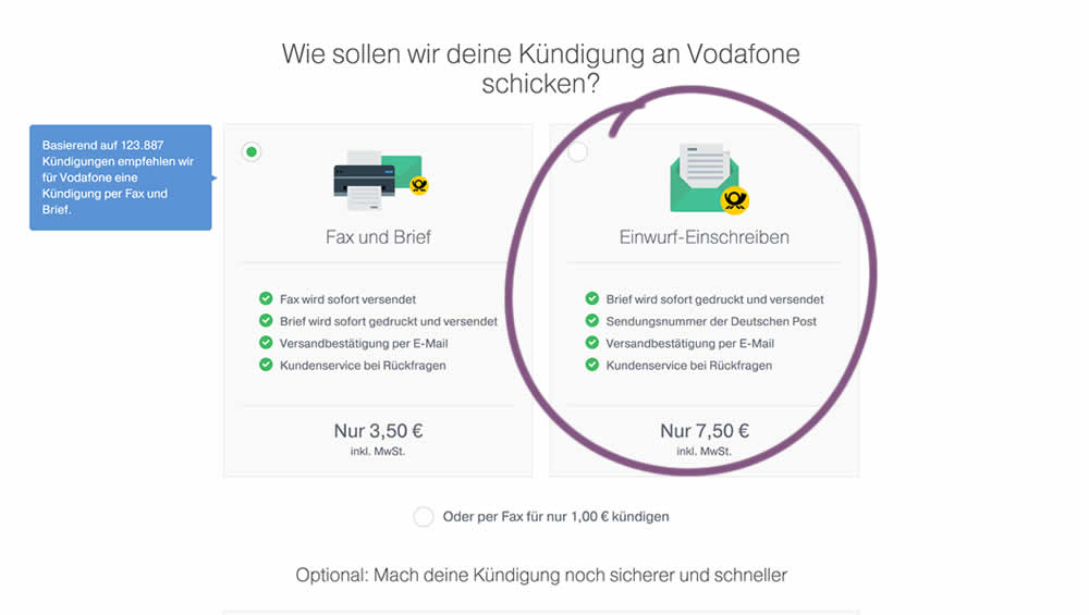
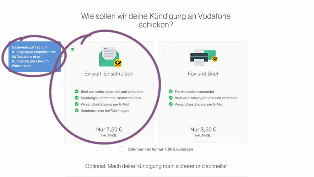
In this experiment, 4 things were adjusted in the variation: the highest pricing plan was shifted to the left, it was set as the default one, the recommendation was also adjusted to point to the highest plan, and one benefit from the lowest plan was removed (customer support).
Test #40 on
Adoramapix.com
by
 Herman Klein
Aug 13, 2019
Desktop
Product
Herman Klein Tested Pattern #85: Benefit Button In Test #40 On Adoramapix.com
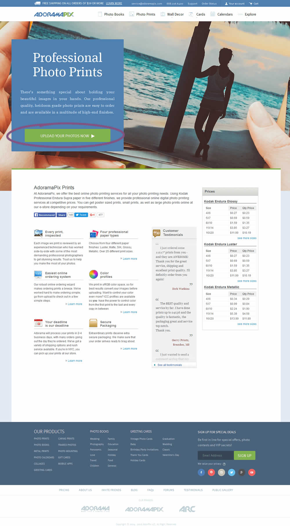
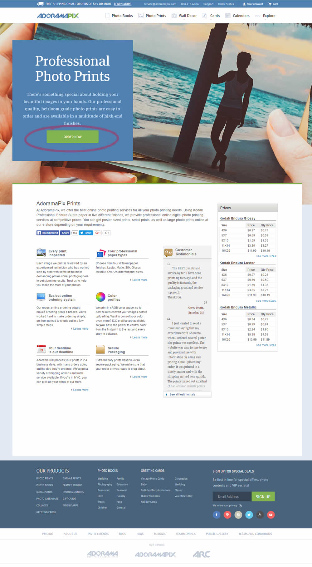
In this experiment only the button label changed. The control had a more immediate (next step-oriented) button label of "Upload Your Photos Now". The variation tried a more benefit-oriented button of "Order Now" (hinting at paying and obtaining the product).
Test #253 on
Volders.de
by
 Alexander Krieger
Aug 08, 2019
Desktop
Mobile
Signup
Alexander Krieger Tested Pattern #17: Least Or Most Expensive First In Test #253 On Volders.de
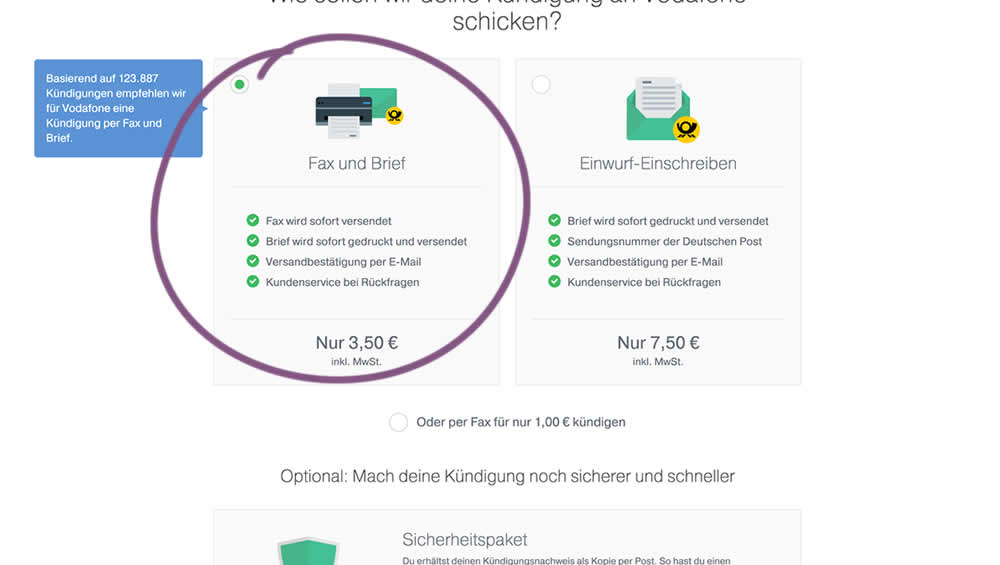
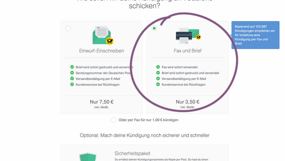
In this experiment, two pricing plans were inverted to show the most expensive plan first (in the variation).
Test #252 on
Thomasnet.com
by
 Julian Gaviria
Jul 30, 2019
Desktop
Mobile
Content
Julian Gaviria Tested Pattern #107: Contrast Links & Buttons In Test #252 On Thomasnet.com
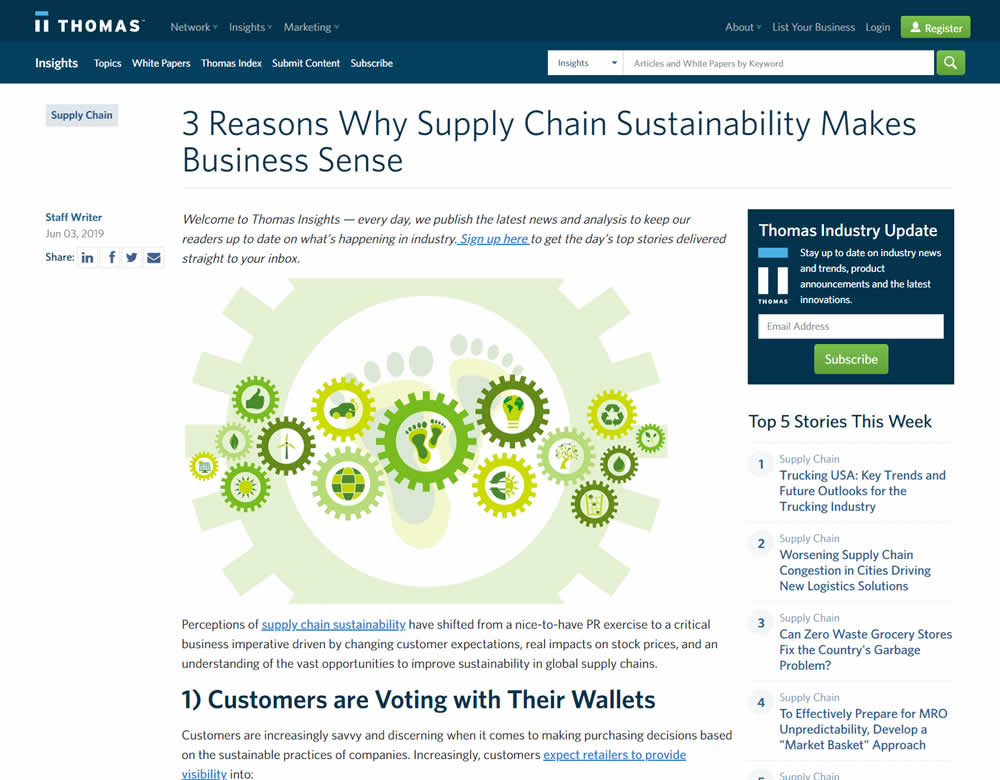
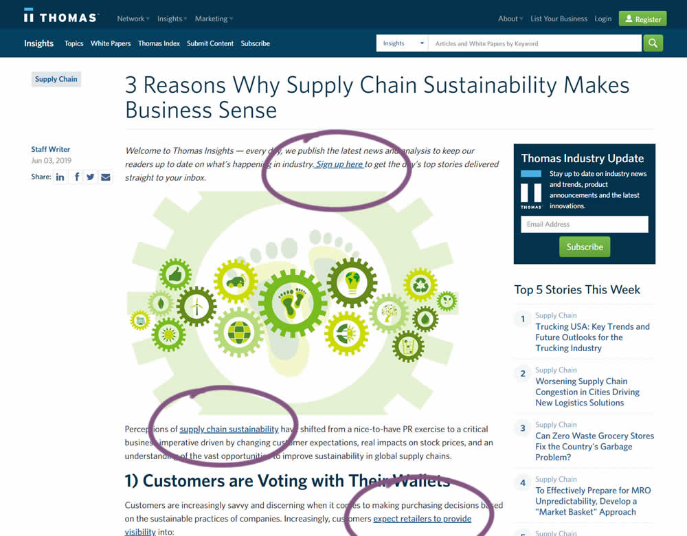
In this experiment a light blue bold link was tested against a darker blue bold link.
Test #250 on
Volders.de
by
 Alexander Krieger
Jul 25, 2019
Desktop
Mobile
Signup
Alexander Krieger Tested Pattern #106: Back Buttons In Test #250 On Volders.de
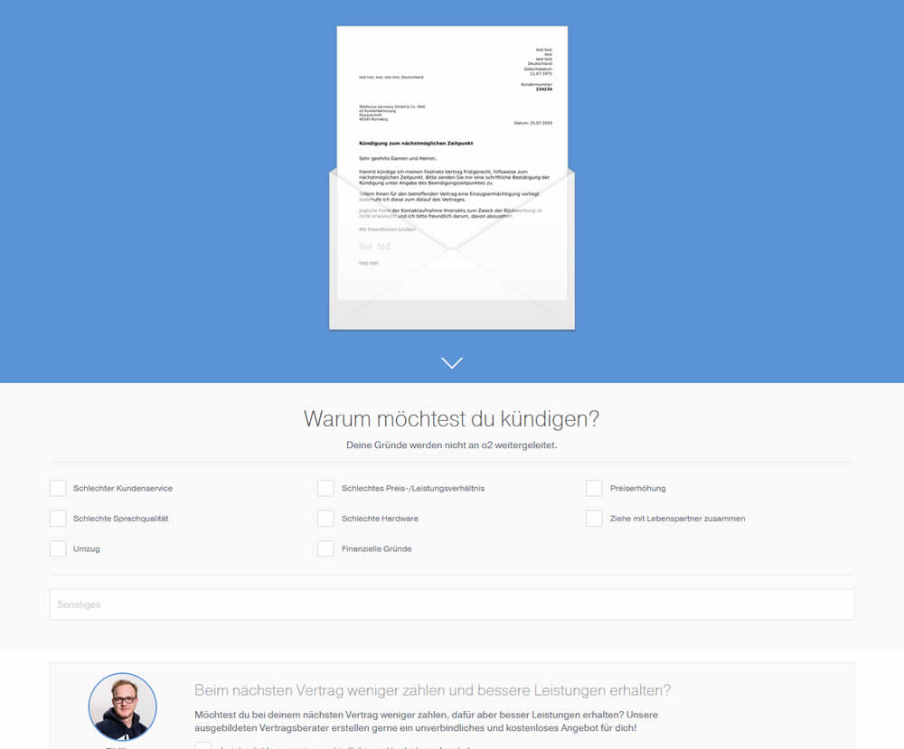
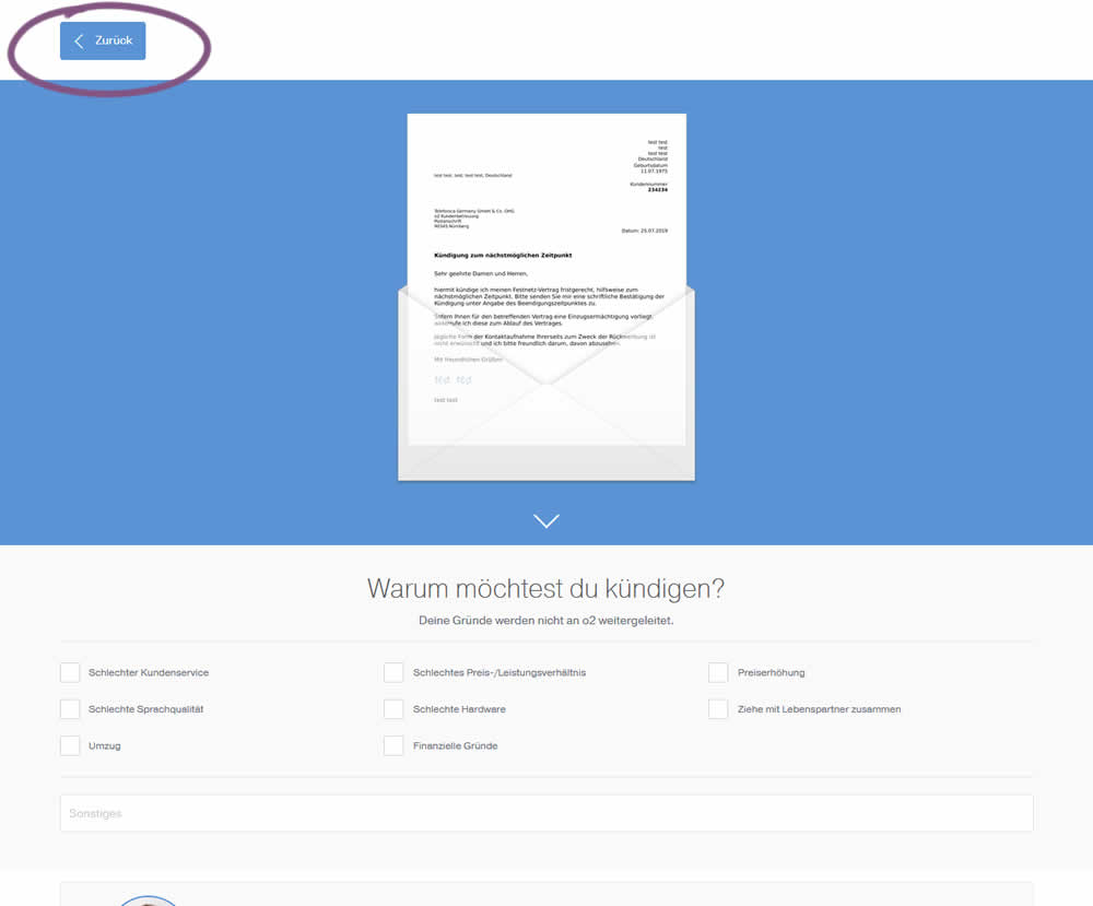
In this experiment, a version without a back button was tested against a one where it was positioned in the upper left corner. This test occured on a second step of a contract cancellation service.
Test #251 on
Goodui.org
by
 Jakub Linowski
Jul 25, 2019
Desktop
Mobile
Content
Jakub Linowski Tested Pattern #57: Maybe Later In Test #251 On Goodui.org
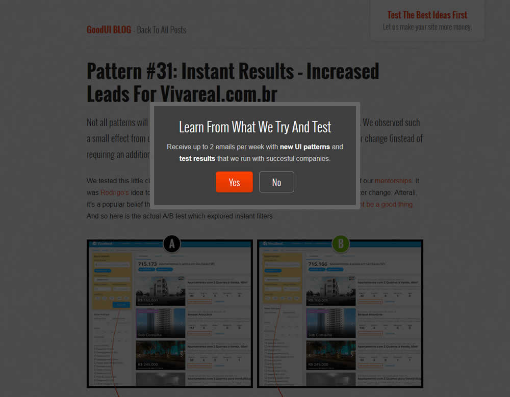
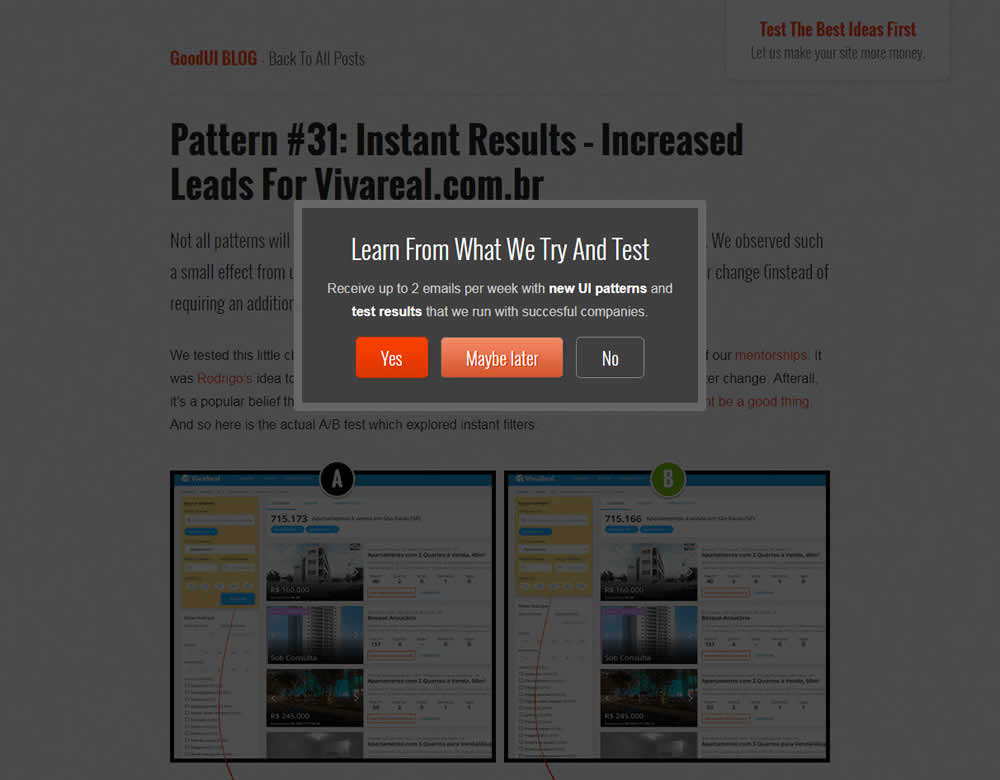
In this experiment, we tested a standard modal (with 2 choices) against a "Maybe Later" one (with 3 choices). One of the choices in the variant allowed users to postpone their decision with a "maybe" which would enable a floating bar at the bottom of the screen. Clicking on any of the "Yes" options would send people to the bottom of the screen with an email signup form. Increasing signup was our primary measure. Both modals also appeared instantly after a page load.
Test #249 on
Autoscout24.com
by
 Optimizely
Jul 17, 2019
Desktop
Product
Optimizely Tested Pattern #20: Canned Response In Test #249 On Autoscout24.com
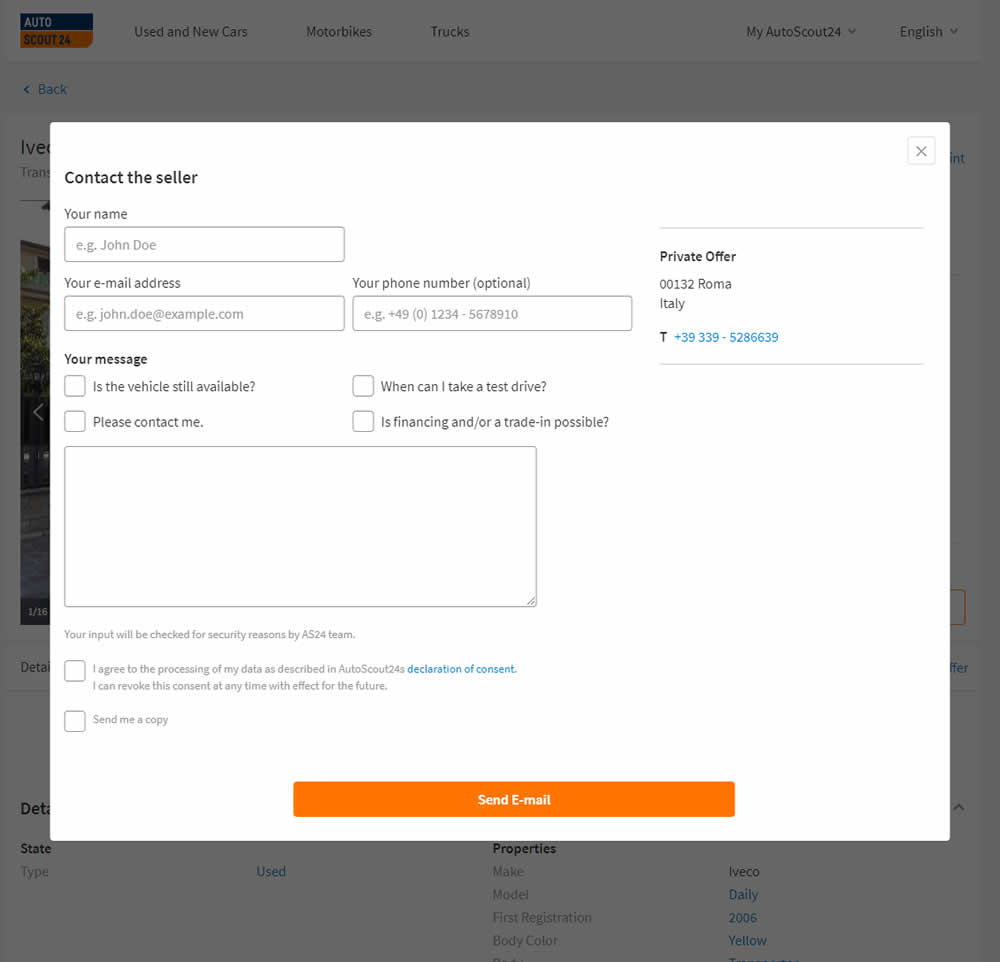
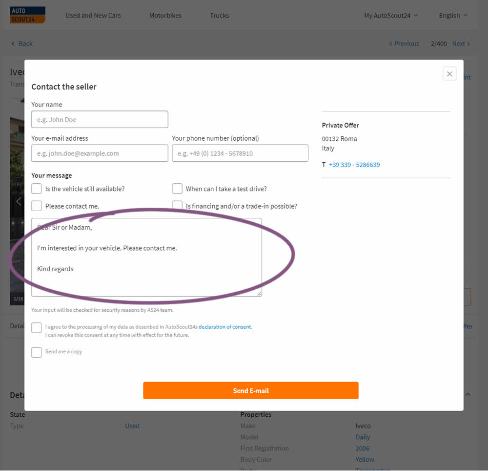
AutoScout24 is Europe’s largest online marketplace for new and used cars. As published by Optimizely, they tested a form pre-filled with text that read: ‘Hello. I am interested in your vehicle. Please contact me. Kind regards.’
Test #248 on
Volders.de
by
 Alexander Krieger
Jul 16, 2019
Desktop
Signup
Alexander Krieger Tested Pattern #20: Canned Response In Test #248 On Volders.de

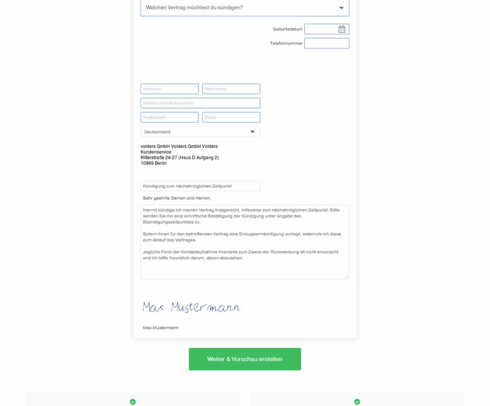
In this experiment, an editable contract cancellation letter was tested against a non-editable one. The editable letter first appeared in a text state, which required a click on a link in order for it to be transformed into an editable textarea field.
Test #39 on
Over-blog.com
by
 Tael Pinault
Jul 02, 2019
Desktop
Signup
Tael Pinault Tested Pattern #83: Progressive Fields In Test #39 On Over-blog.com
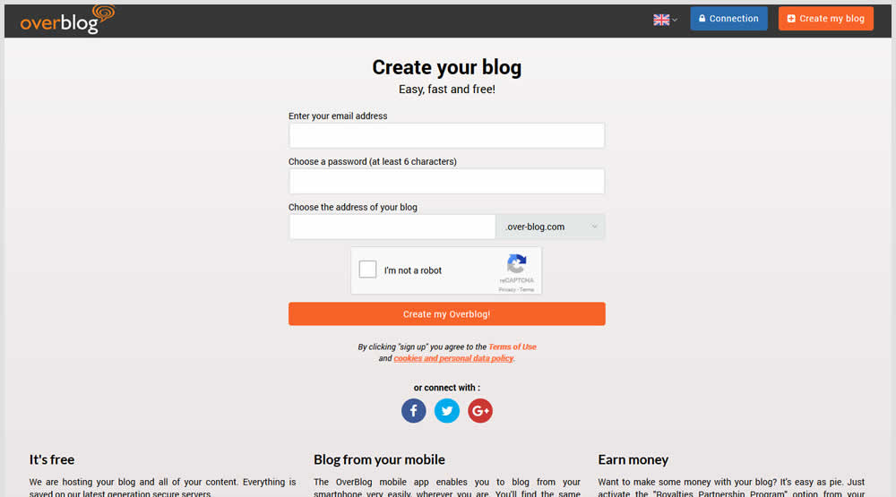
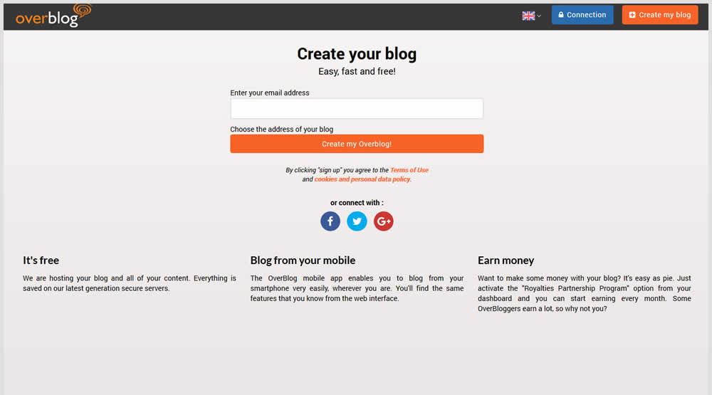
This test explored a progressive disclosure interaction in variation B. When a user started typing text into the first field, two more fields expanded into view.
Test #247 on
Thomasnet.com
by
 Julian Gaviria
Jun 13, 2019
Desktop
Mobile
Content
Julian Gaviria Tested Pattern #41: Sticky Call To Action In Test #247 On Thomasnet.com
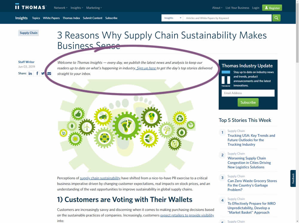
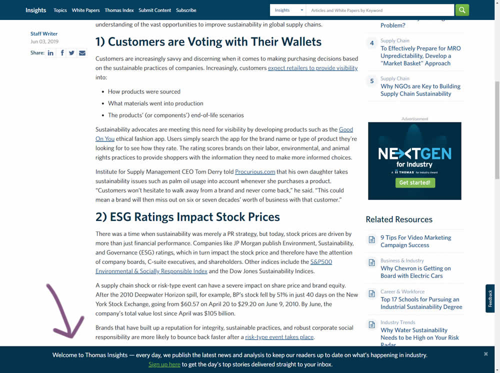
In this experiment, the same message (with a link) for signing up to a newsletter was shown in two distinct ways. The control (A) showed the signup message as inline one that preceded the content of the article at the very top. The variant showed the same signup message as a scroll-delayed sticky interaction at the bottom of the screen. The background color of the B variant was also inverted to match the style of the footer.
Test #246 on
Thomasnet.com
by
 Julian Gaviria
Jun 12, 2019
Desktop
Mobile
Home & Landing
Julian Gaviria Tested Pattern #88: Action Button In Test #246 On Thomasnet.com
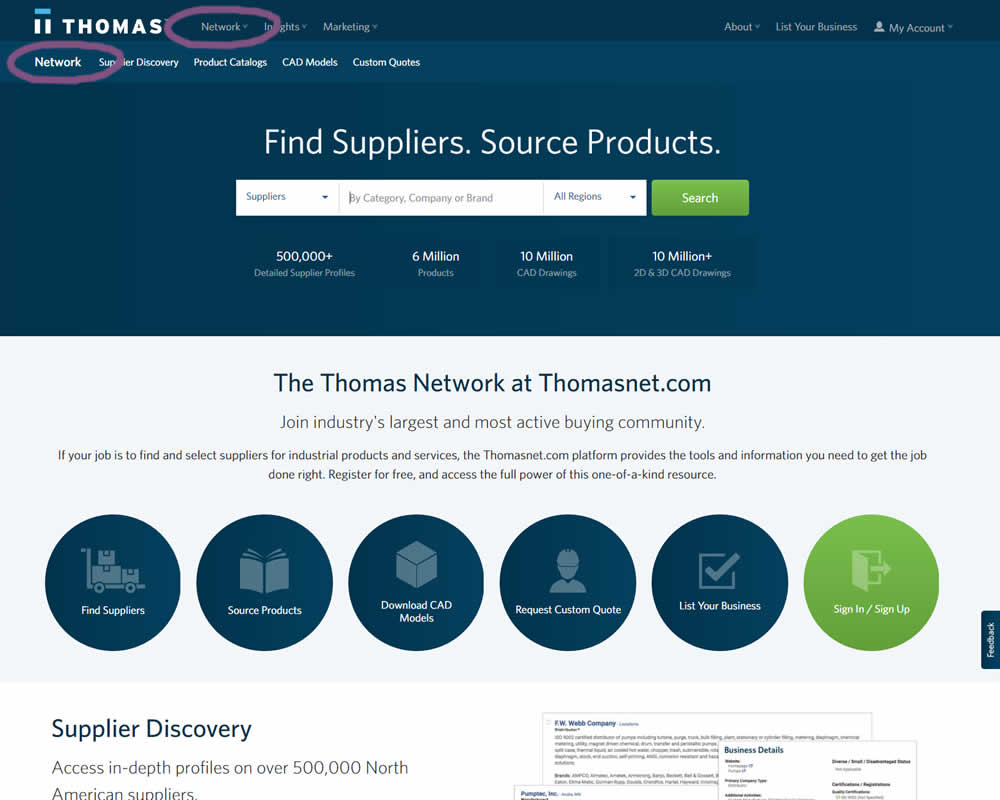
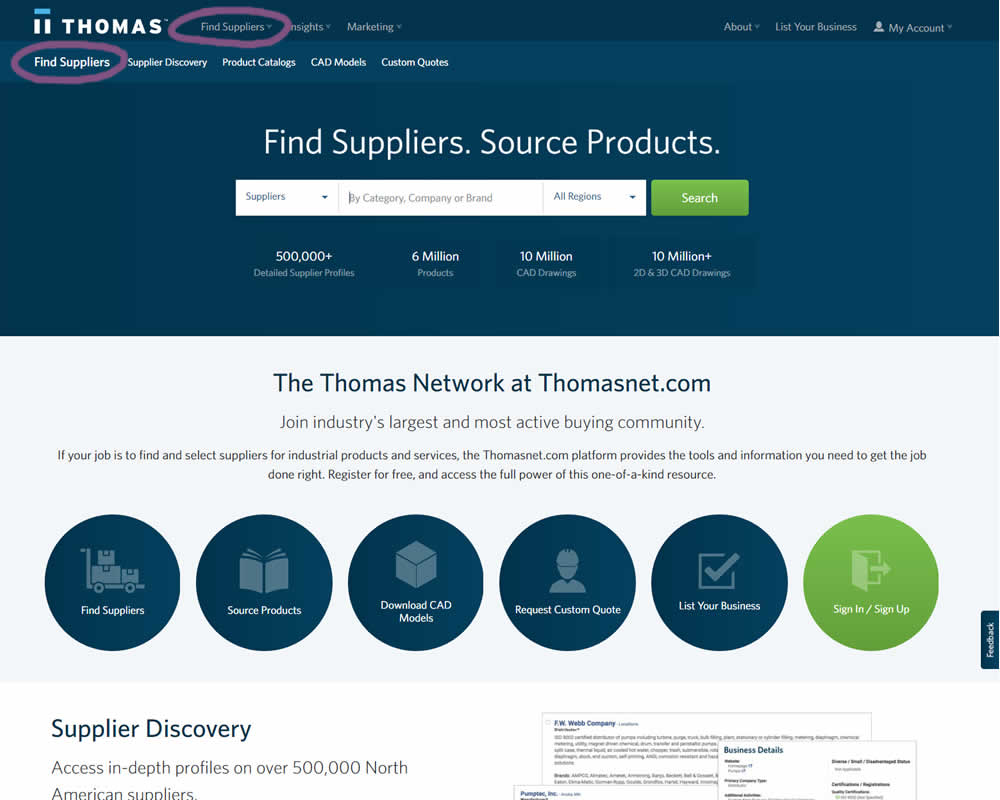
In this experiment, the navigation label was changed from "Network" to "Find Suppliers". The idea was to make use of an action label with a clearer benefit.
Test #245 on
Kenhub.com
by
 Niels Hapke
Jun 11, 2019
Desktop
Signup
Niels Hapke Tested Pattern #19: Benefit Testimonials In Test #245 On Kenhub.com
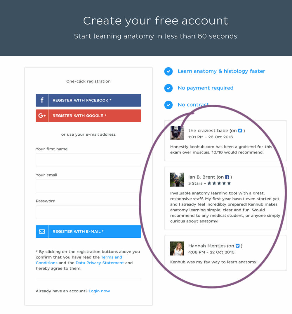
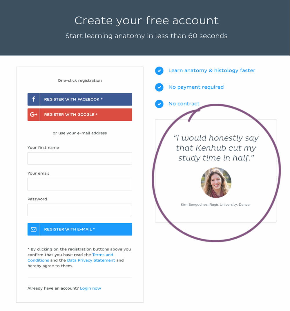
In this experiment a more elaborate and authentic testimonial was used instead of three more generic ones from social media sites.
Test #244 on
Mt.com
by
 Vito Mediavilla
Jun 06, 2019
Desktop
Product
Vito Mediavilla Tested Pattern #49: Above The Fold Call To Action In Test #244 On Mt.com

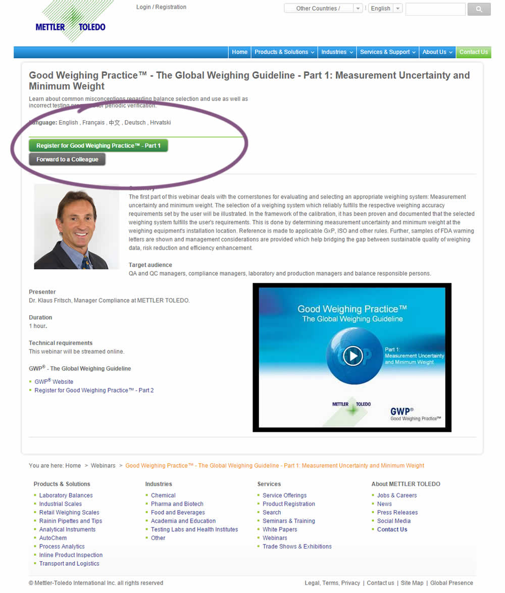
A product landing page with an image was tested against one without - raising the call to action above the fold.