All Latest 550 A/B Tests
Become a member to unlock the abiltiy to see the highest impact a/b tests. Being able to see the actual test results and sort by impact allows growth and experimentation teams to take action on the biggest gains first
MOST RECENT TESTS
Test #578 on
by
 Jakub Linowski
Feb 20, 2025
Mobile
Product
Jakub Linowski Tested Pattern #48: Video Testimonials In Test #578
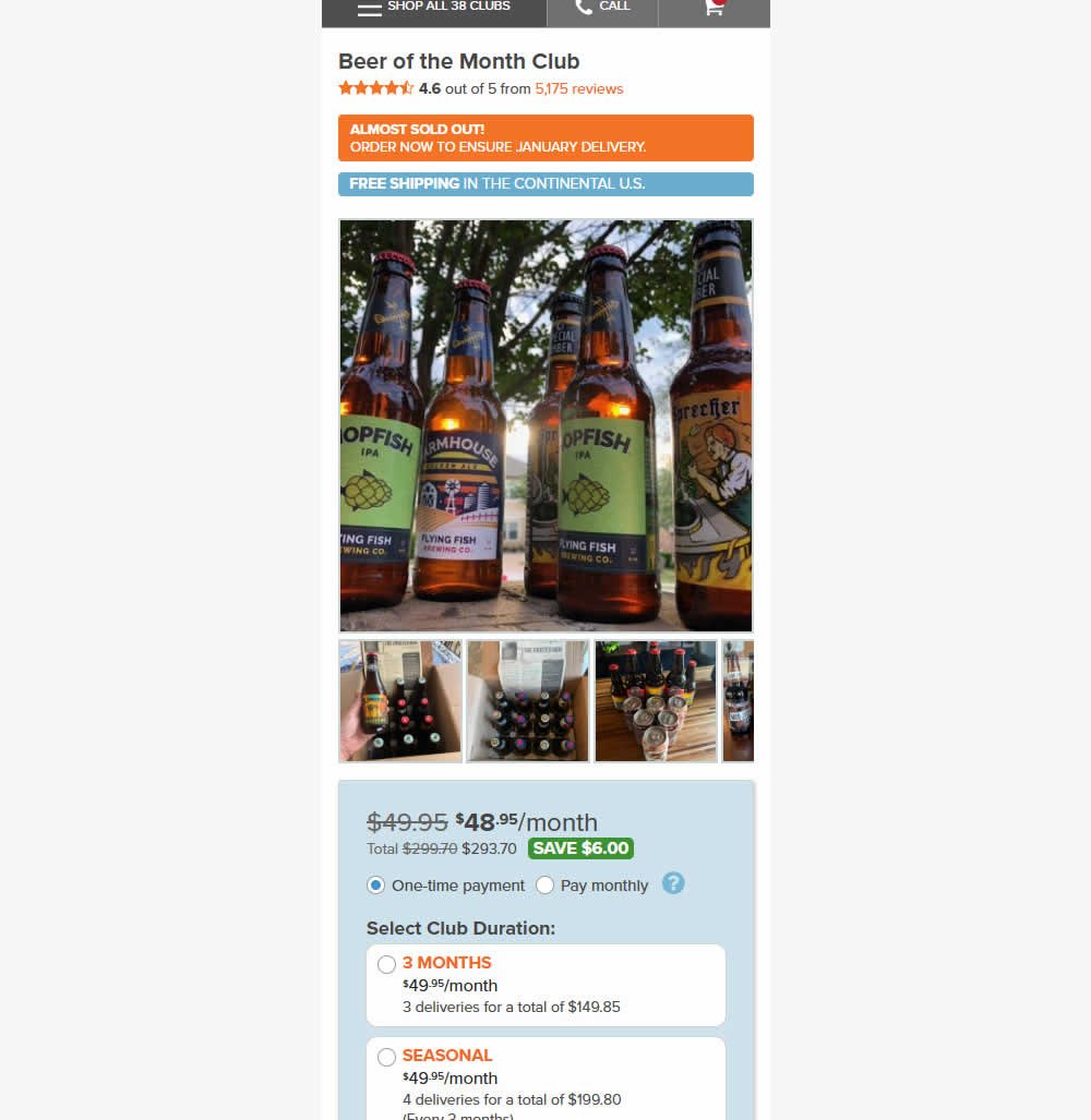
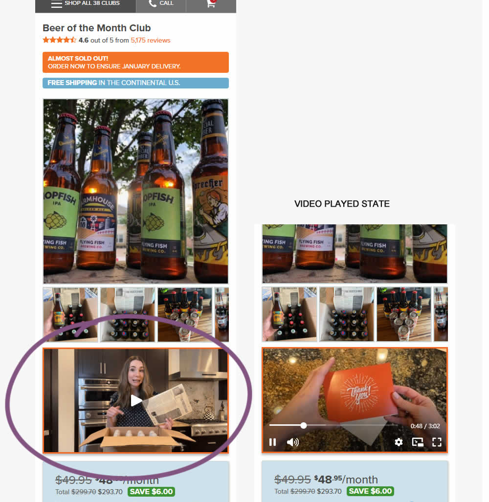
In this experiment, a video unboxing and product overview video was added on product pages. After pressing play, the video started playing with the controls only appearing for a short time before fading away.
Notice the confounding from pushing the buy box further down.
Impact on adds to cart and sales was measured.
Test #577 on
by
 Jakub Linowski
Feb 19, 2025
Desktop
Product
Jakub Linowski Tested Pattern #48: Video Testimonials In Test #577
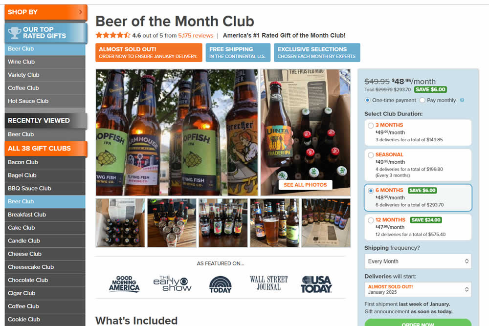
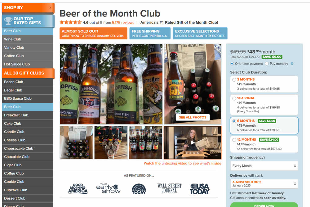
In this experiment, a video unboxing and product overview video was added on product pages. After pressing play, the video expanded to a full column width (taking over the middle column while replacing the 5 small square photo tiles and growing in height.) The video in its play state also contained a prominent (X) icon that allowed users to stop and revert to the original state.
Impact on adds to cart and sales was measured.
Test #574 on
Myer.com.au
by
 Jay Kim
Jan 30, 2025
Mobile
Product
Jay Kim Tested Pattern #41: Sticky Call To Action In Test #574 On Myer.com.au
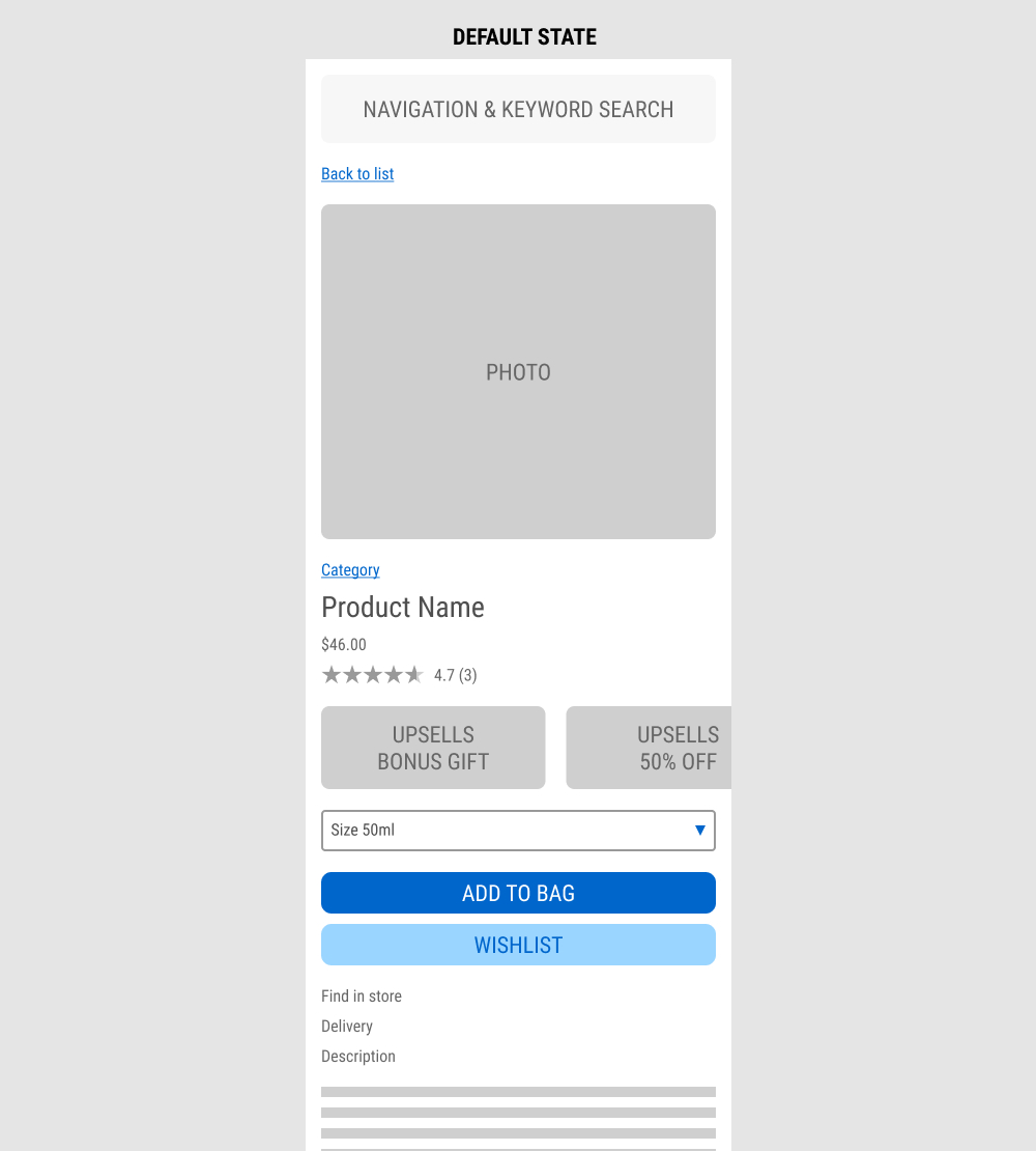
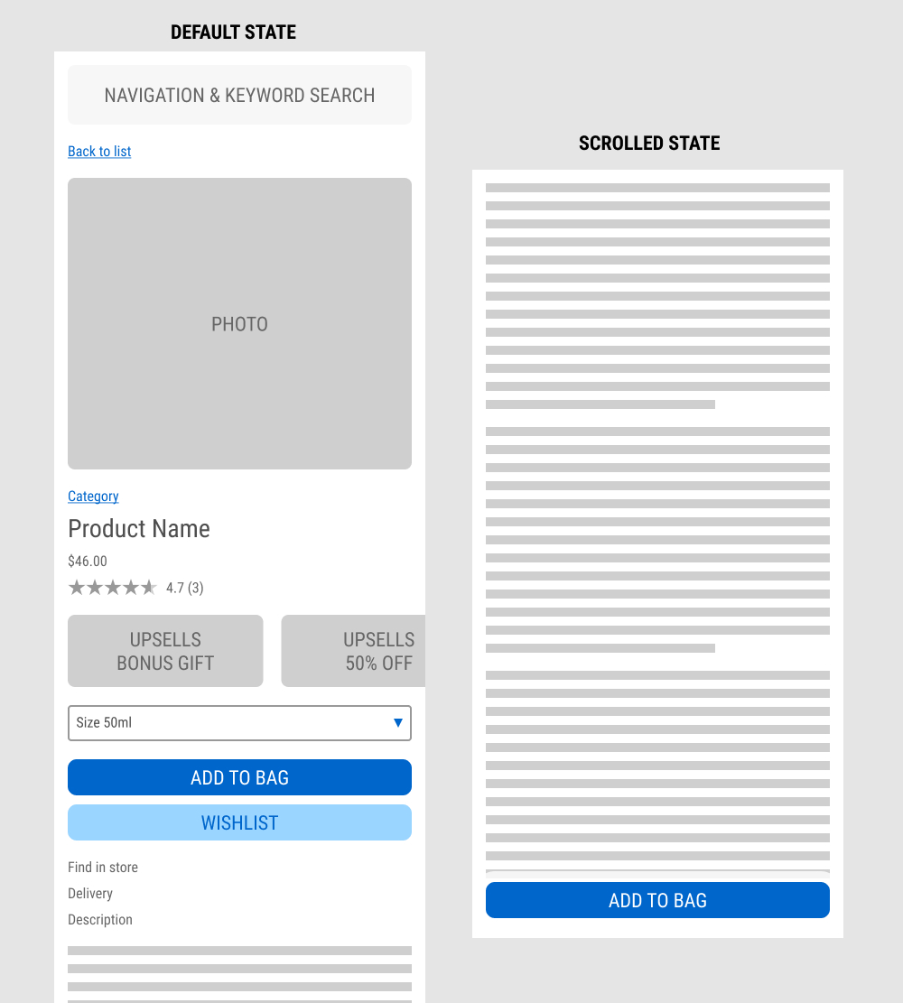
In this experiment published by Jay Kim, a sticky add to cart button was added on mobile product detail pages. It appeared after the scroll depth past the original add to cart button. Impact to adds to cart and completed sales was measured.
Test #572 on
by
 Deborah O'Malley
Jan 27, 2025
Mobile
Product
Deborah O'Malley Tested Pattern #41: Sticky Call To Action In Test #572


In this experiment from GuessTheTest.com, the control variation only showed the primary add-to-cart button further down on the page. The variation however turned the button into a floating one once users scrolled on the page. Impact on button clicks was measured.
Test #571 on
by
 Jakub Linowski
Jan 03, 2025
Desktop
Mobile
Product
Jakub Linowski Tested Pattern #30: Authentic Photos In Test #571
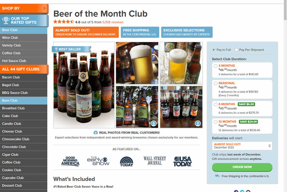
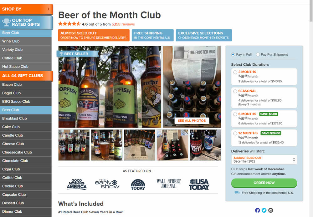
In this experiment, additional customer product photos were shown at the top of the product page. A "Show More Photos" button was also added which launched a modal with additional and larger images. Impact on sales was measured.
Test #569 on
Snocks.com
by
 Melina Hess
Dec 29, 2024
Mobile
Product
Melina Hess Tested Pattern #124: Confirmed Selection In Test #569 On Snocks.com
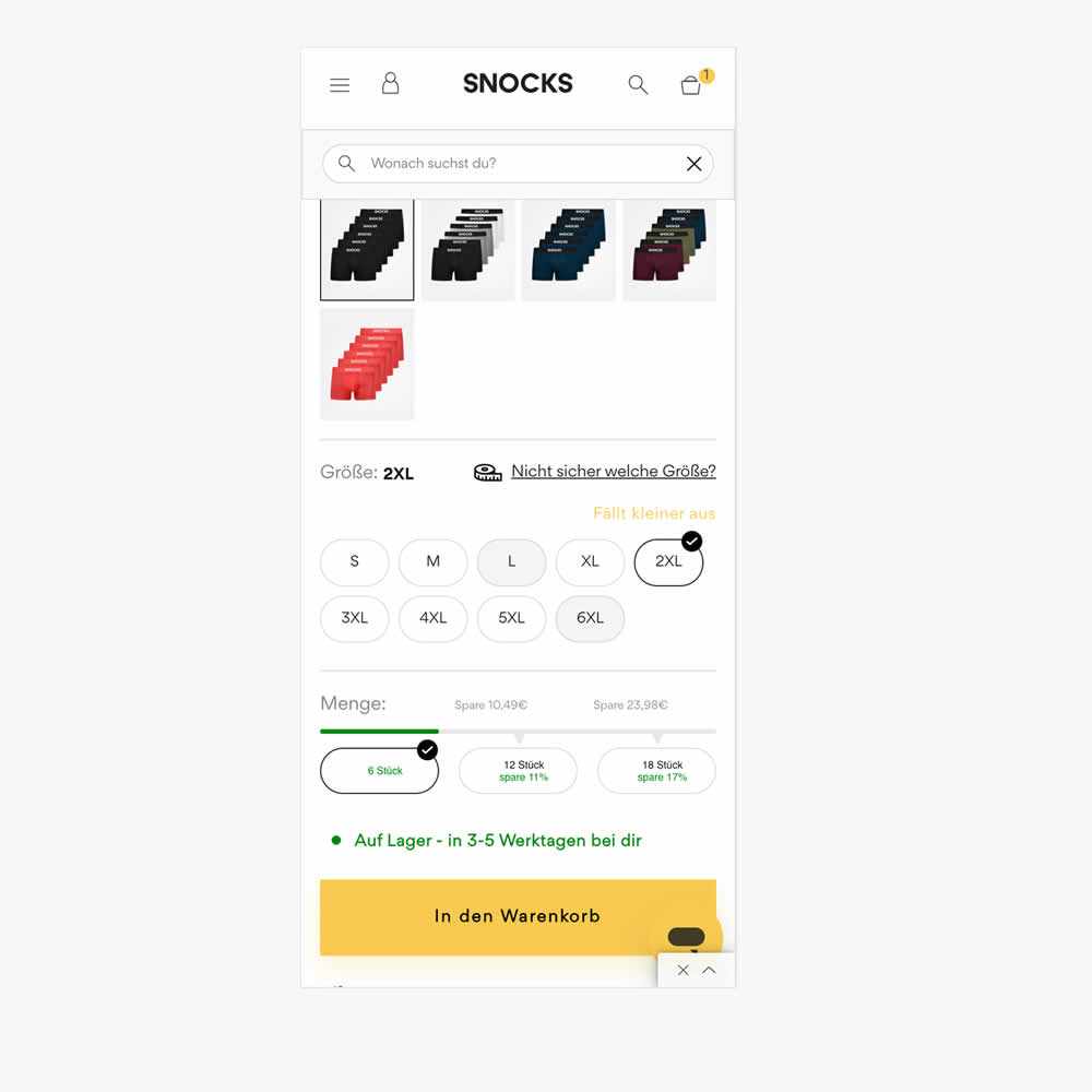
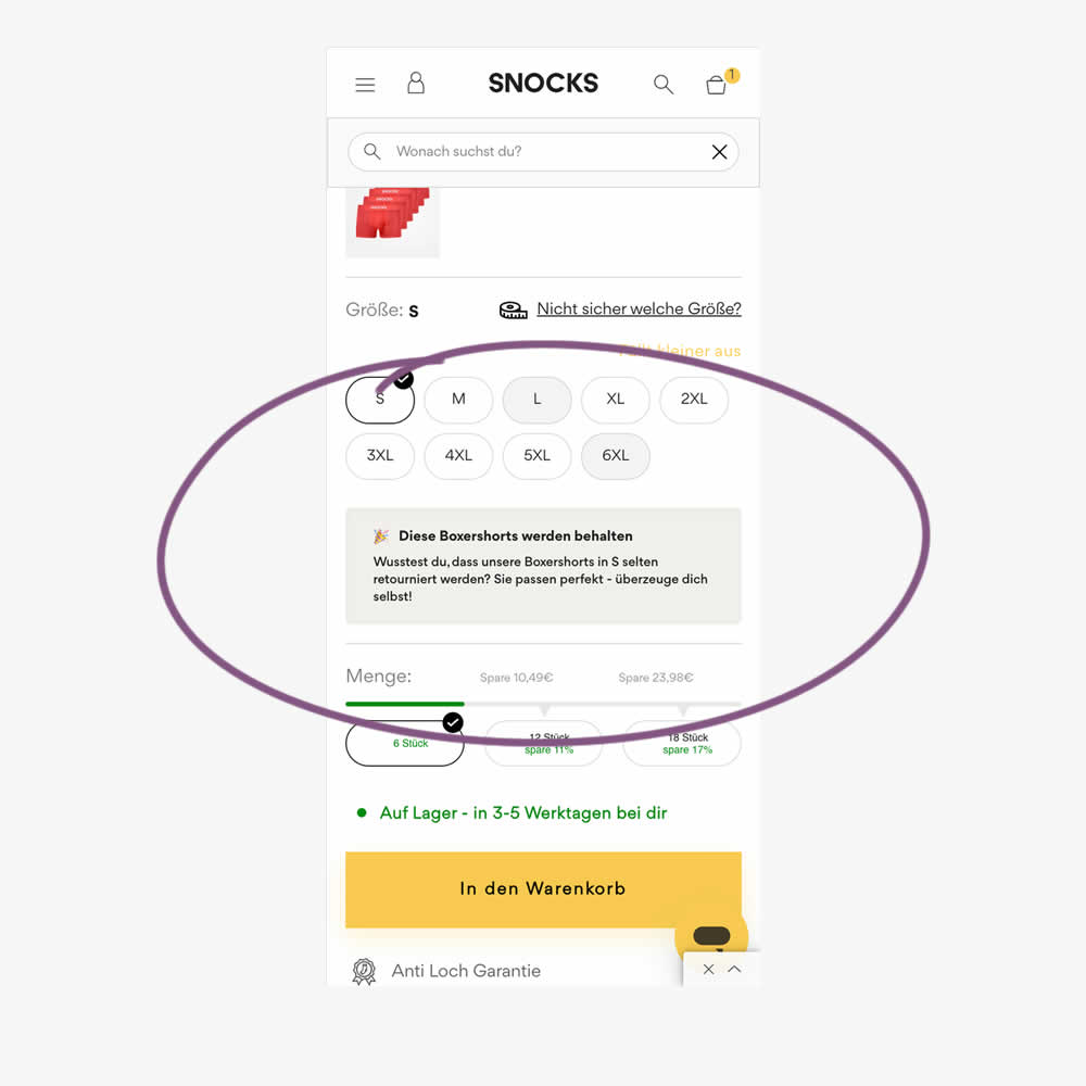
In this experiment, reaffirming copy was added for particular size options in the variation. Here is the translation from German:
"These boxer shorts will be kept. Did you know that our boxer shorts in S are rarely returned? They fit perfectly - see for yourself!"
Impact on sales was measured.
Test #566 on
Banter.com
by
 Craig Kistler
Dec 11, 2024
Desktop
Product
Craig Kistler Tested Pattern #66: Complementary Upsell In Test #566 On Banter.com
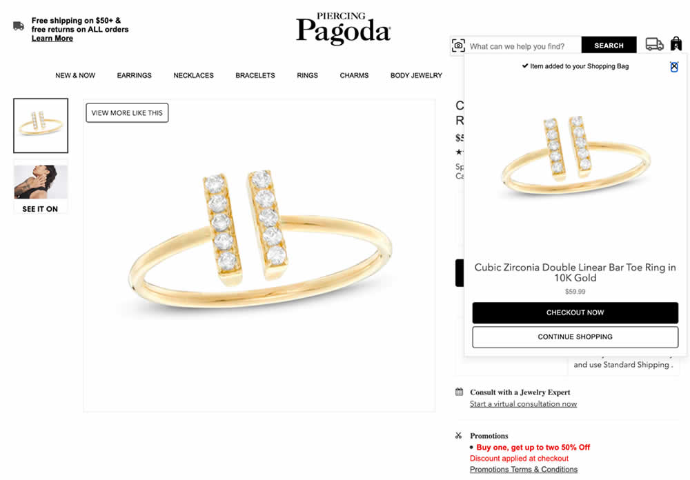
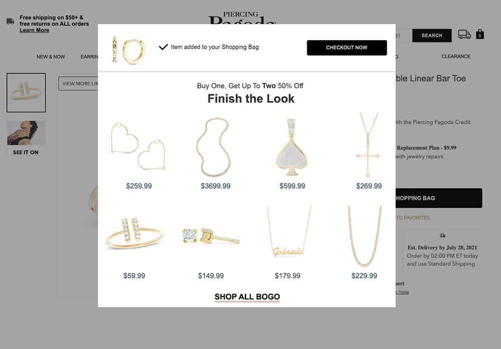
In this experiment, a modal based message was shown to encourage extra products being added as complementary upsells. In the control, the promotion text appeared at the bottom as red text ("Buy one, get up to two 50% Off"). Whereas in the variation, specific products were shown on the modal (post add-to-cart). Impact on adds-to-cart, sales and average revenue was measured.
Test #557 on
Obsbygg.no
by
 Joachim Furuseth
Oct 17, 2024
Desktop
Product
Joachim Furuseth Tested Pattern #41: Sticky Call To Action In Test #557 On Obsbygg.no
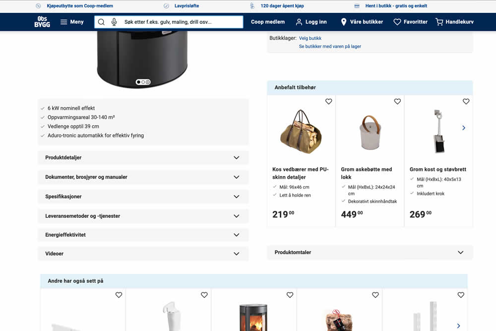
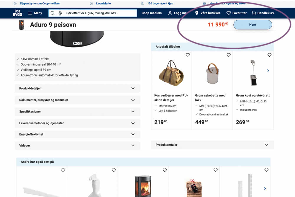
A sticky floating navigation bar was tested on product pages. The floating navigation contained: the product name, price and an add to cart button (add to cart). Impact on sales was measured. (Desktop Only)
Test #558 on
Obsbygg.no
by
 Joachim Furuseth
Oct 17, 2024
Mobile
Product
Joachim Furuseth Tested Pattern #41: Sticky Call To Action In Test #558 On Obsbygg.no
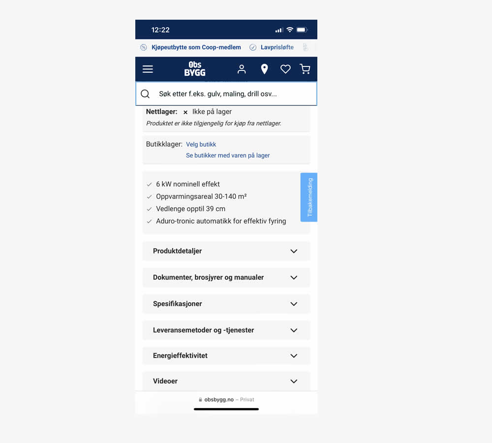
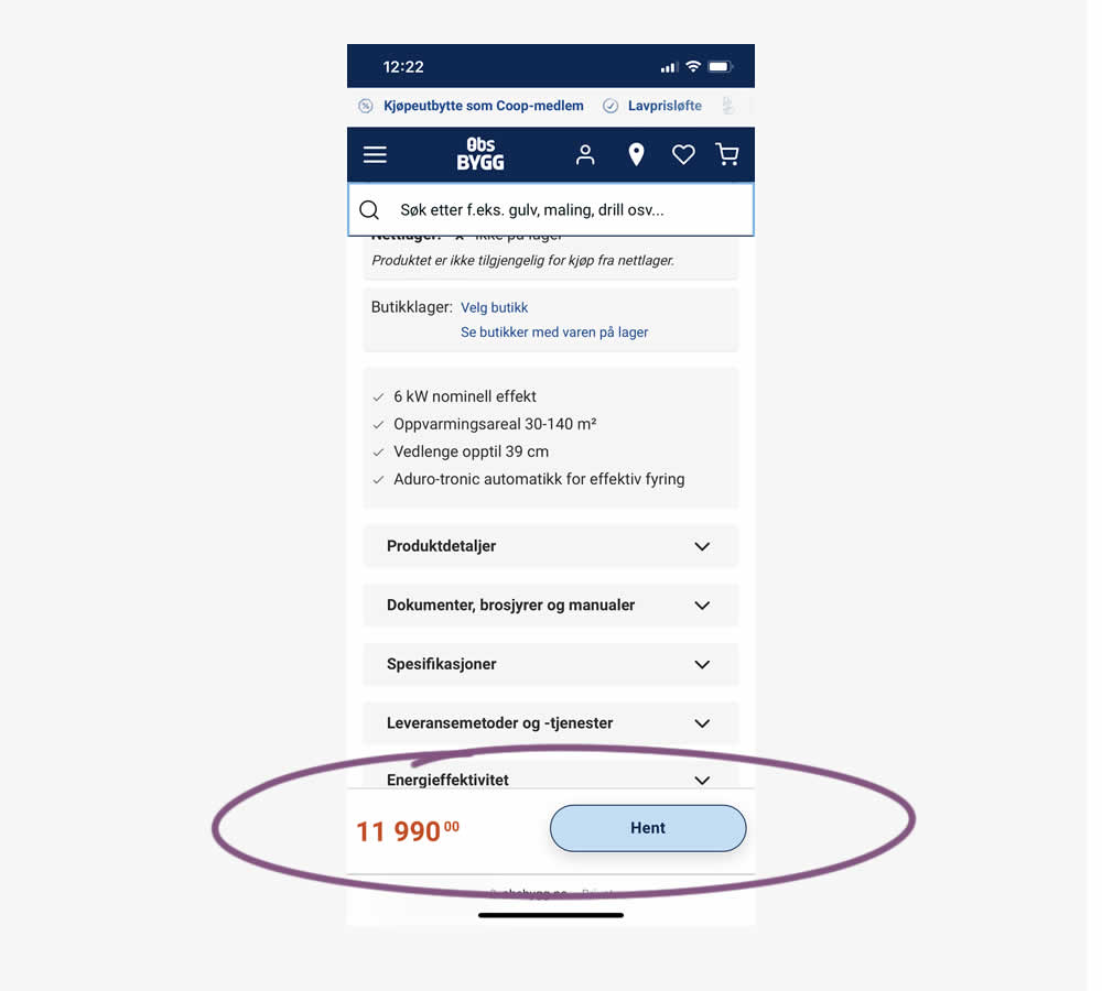
A sticky floating navigation bar was tested on product pages. The floating navigation contained: the product name, price and an add to cart button (add to cart). Impact on sales was measured. (Mobile Only)
Test #556 on
Snocks.com
by
 Melina Hess
Oct 08, 2024
Mobile
Product
Melina Hess Tested Pattern #65: Add More For Free Shipping In Test #556 On Snocks.com
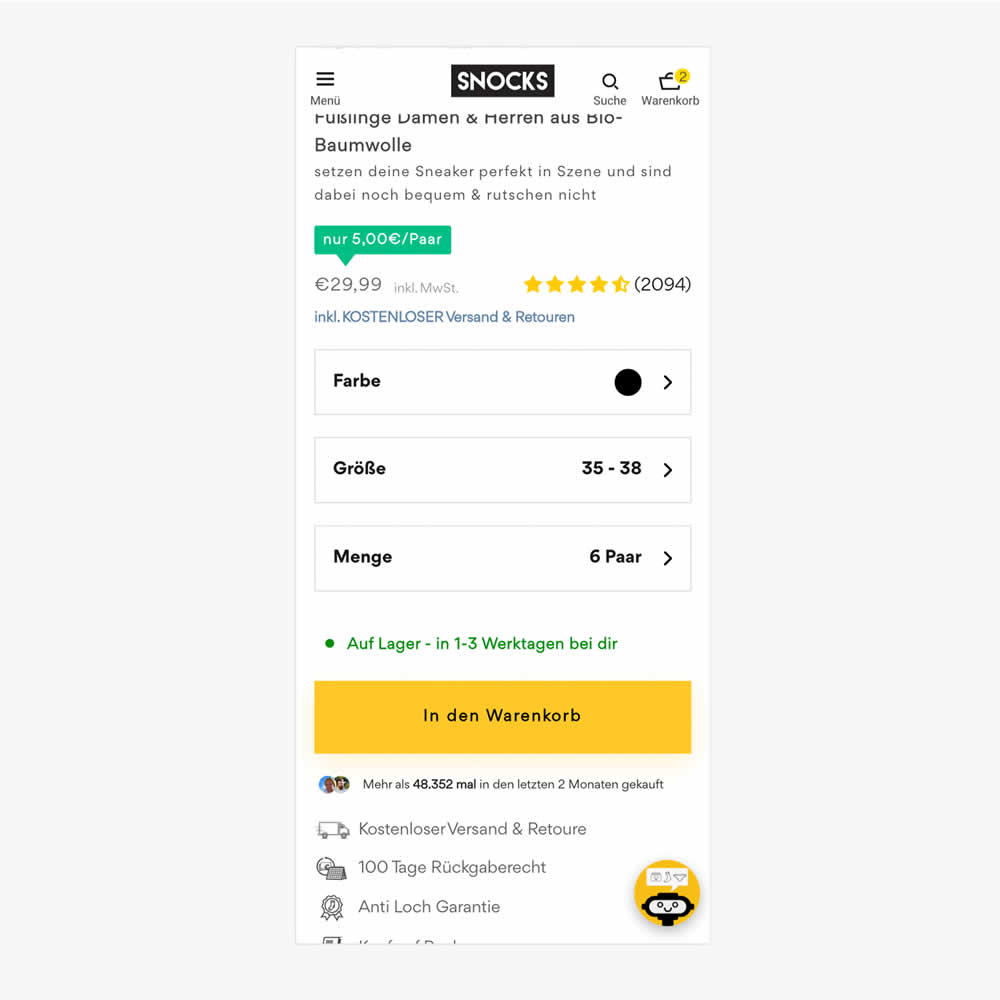
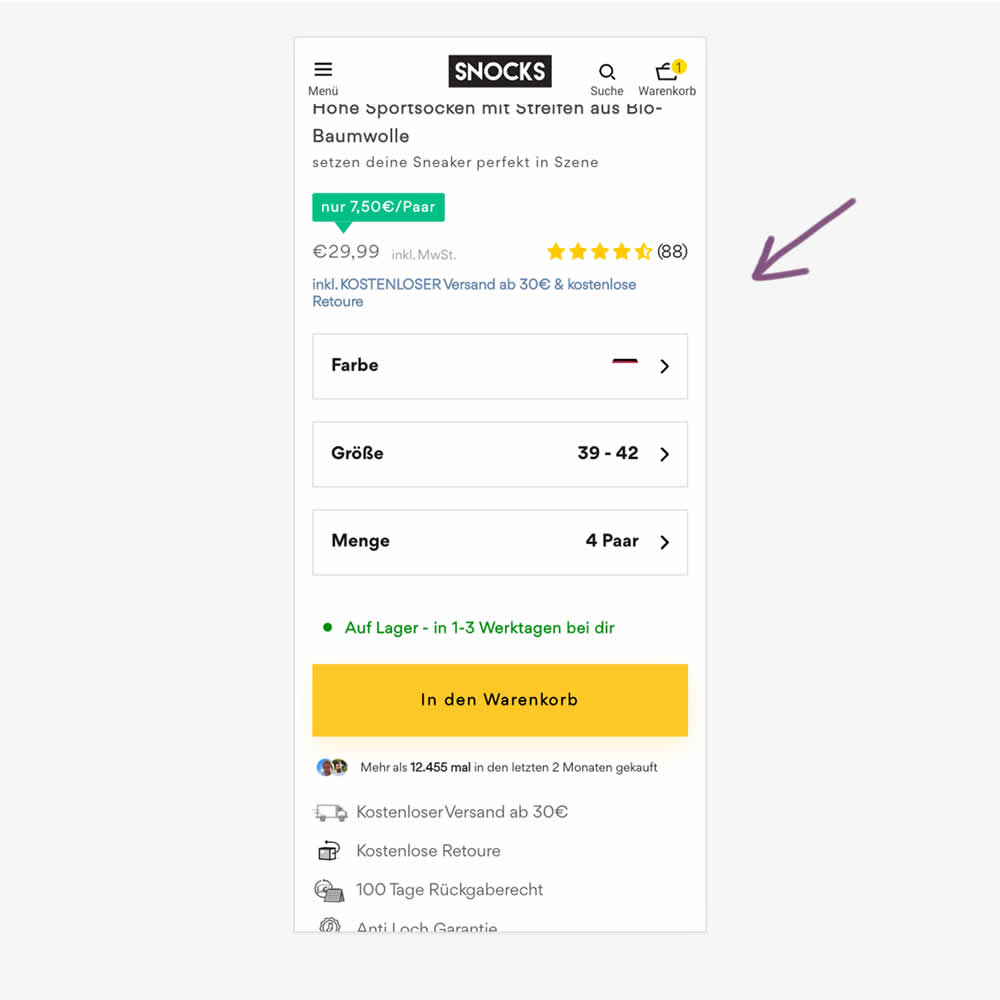
In this experiment, free shipping was a/b tested against free shipping with a 30€ purchase or higher. Hence, in the variation, customers needed to reach a cart amount total in order to be eligible for the free shipping.
Test #554 on
Obs.no
by
 Joachim Furuseth
Sep 30, 2024
Desktop
Product
Joachim Furuseth Tested Pattern #41: Sticky Call To Action In Test #554 On Obs.no
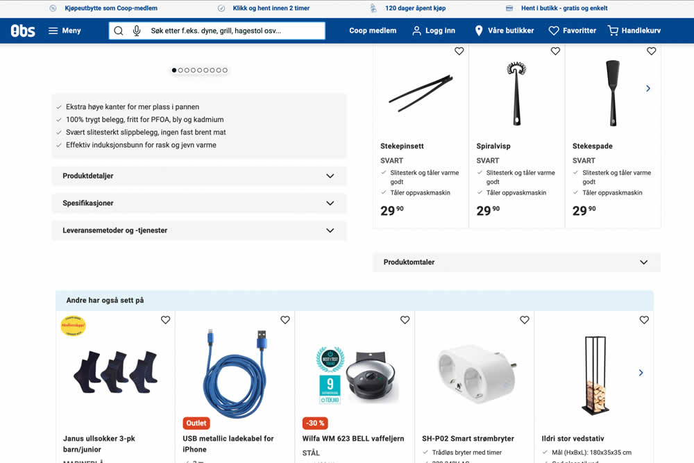
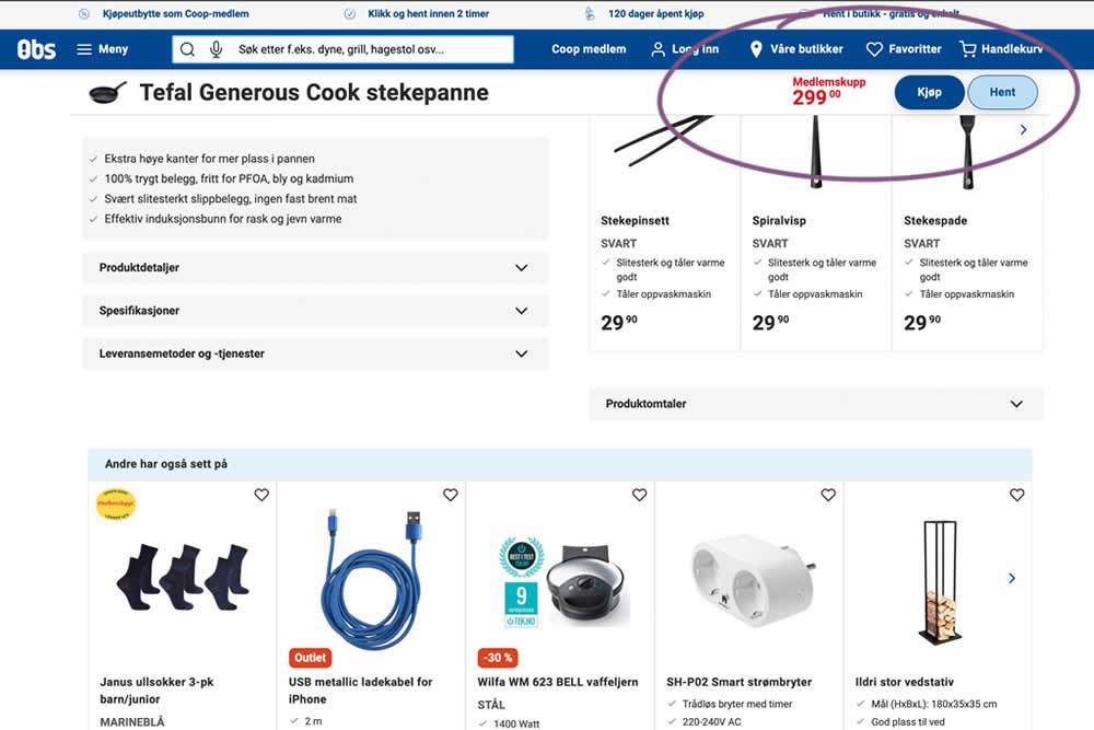
A sticky floating navigation bar was tested on product pages. The floating navigation contained: the product name, price and two add to cart buttons (add to cart; pickup in store). Impact on sales was measured. (Desktop Only)
Test #555 on
Obs.no
by
 Joachim Furuseth
Sep 30, 2024
Mobile
Product
Joachim Furuseth Tested Pattern #41: Sticky Call To Action In Test #555 On Obs.no
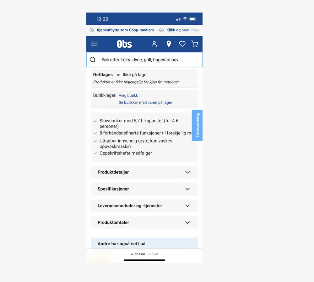
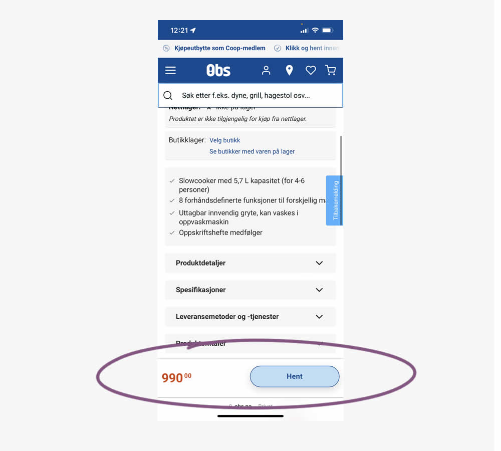
A sticky floating navigation bar was tested on product pages. The floating navigation contained: the product name, price and two add to cart buttons (add to cart; pickup in store). Impact on sales was measured. (Mobile only)
Test #552 on
Tourradar.com
by
 Clemens Grave
Sep 19, 2024
Product
Clemens Grave Tested Pattern #15: Bulleted Reassurances In Test #552 On Tourradar.com

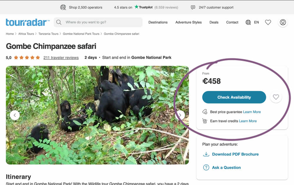
In this experiment, existing reassurance copy was changed. The control contained copy that focused on splitting payments and paying over time. The variation challenged this and showed a best price guarantee and the ability to earn credits.
Test #551 on
Tourradar.com
by
 Clemens Grave
Sep 04, 2024
Desktop
Product
Clemens Grave Tested Pattern #139: Page Level Navigation In Test #551 On Tourradar.com
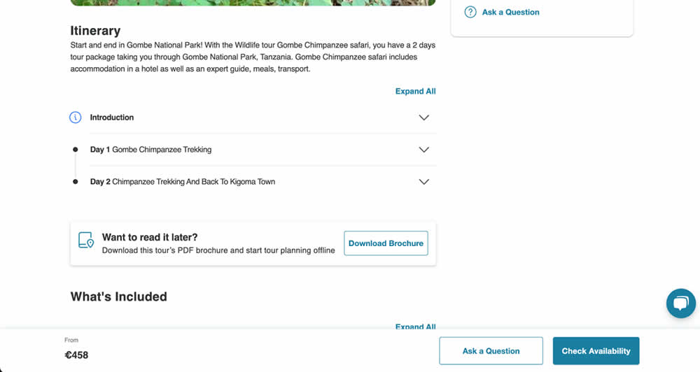
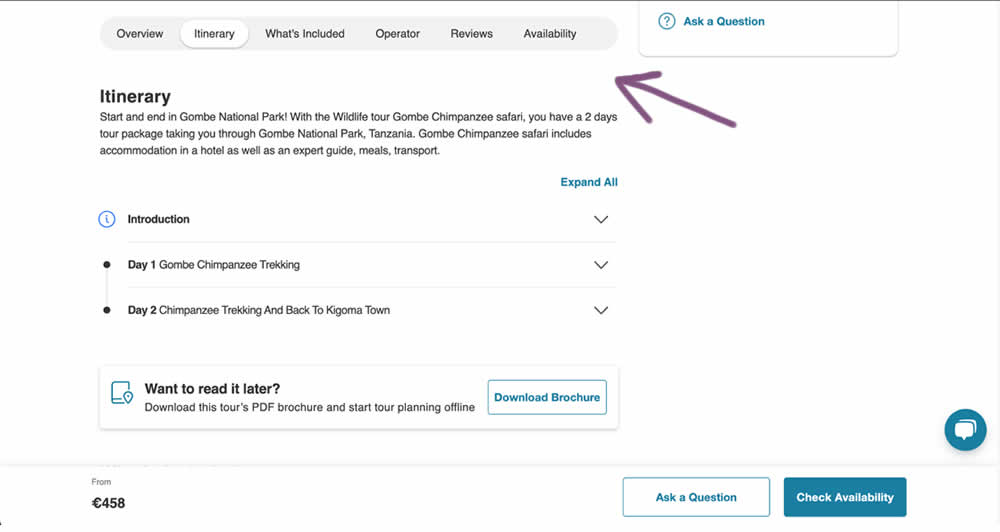
In this experiment, a floating page level navigation was added near the top of the product pages (under the main image). The navigation links included: Overview, Itinerary, What's Included, Operator, Reviews and Availability. Impact on next step progression was measured.
Test #548 on
Livefresh.de
by
 Melina Hess
Aug 13, 2024
Desktop
Mobile
Product
Melina Hess Tested Pattern #17: Least Or Most Expensive First In Test #548 On Livefresh.de
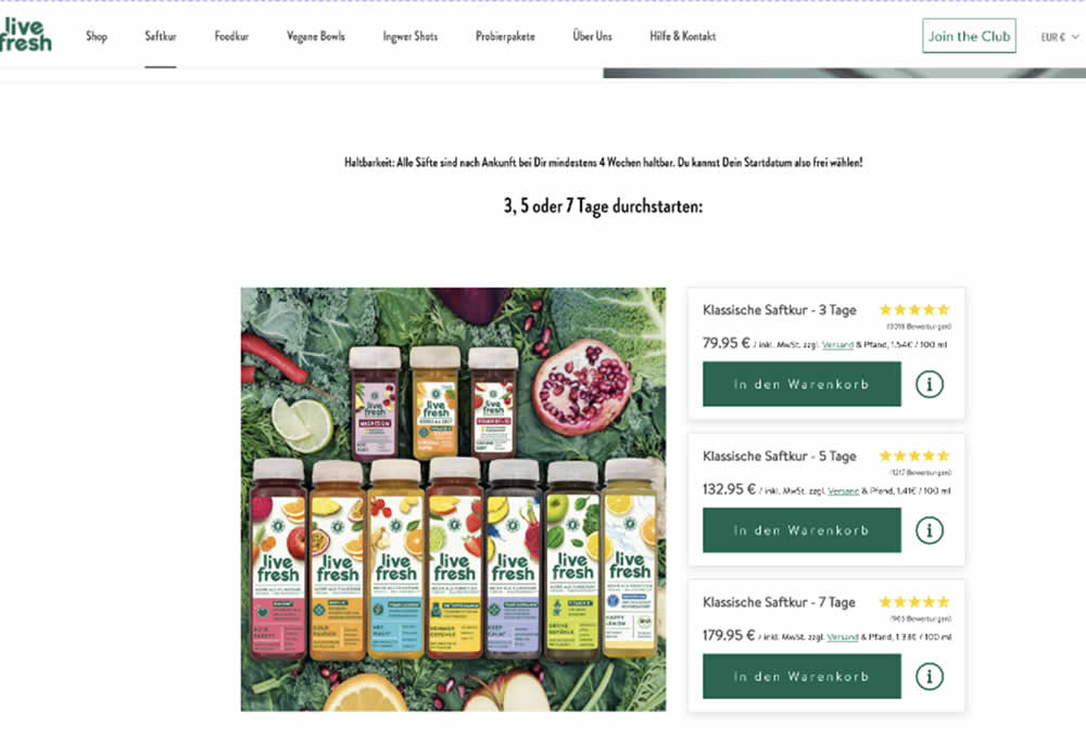
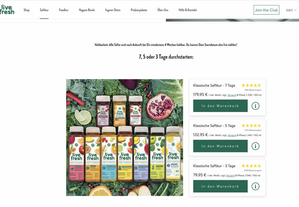
In this product landing page experiment, the plan sort order was rearranged. In the control it was sorted from least expensive to most expensive. In the variation, the plans were shown as most expensive first. Impact on sales and revenue was measured.
Test #545 on
Banter.com
by
 Craig Kistler
Jul 29, 2024
Desktop
Product
Craig Kistler Tested Pattern #66: Complementary Upsell In Test #545 On Banter.com
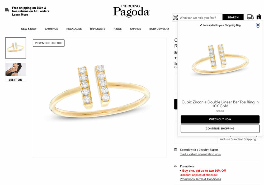
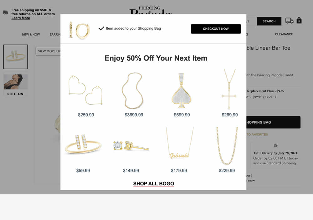
In this experiment, a modal based message was shown to encourage extra products being added as complementary upsells. In the control, the promotion text appeared at the bottom as red text ("Buy one, get up to two 50% Off"). Whereas in the variation, specific products were shown on the modal (post add-to-cart). Impact on adds-to-cart, sales and average revenue was measured.
Test #544 on
686.com
by
 Adan Archila
Jul 25, 2024
Desktop
Product
Adan Archila Tested Pattern #104: Carousel Vs Static Grid Images In Test #544 On 686.com
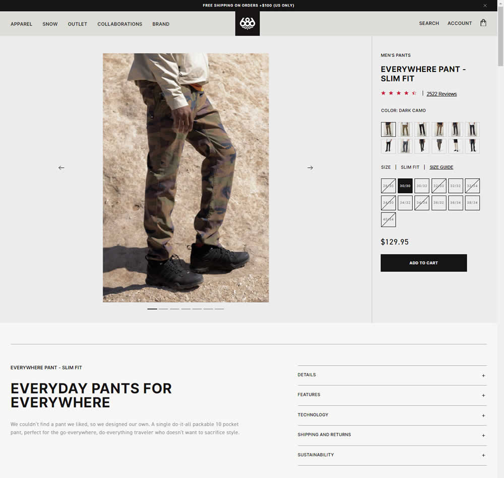
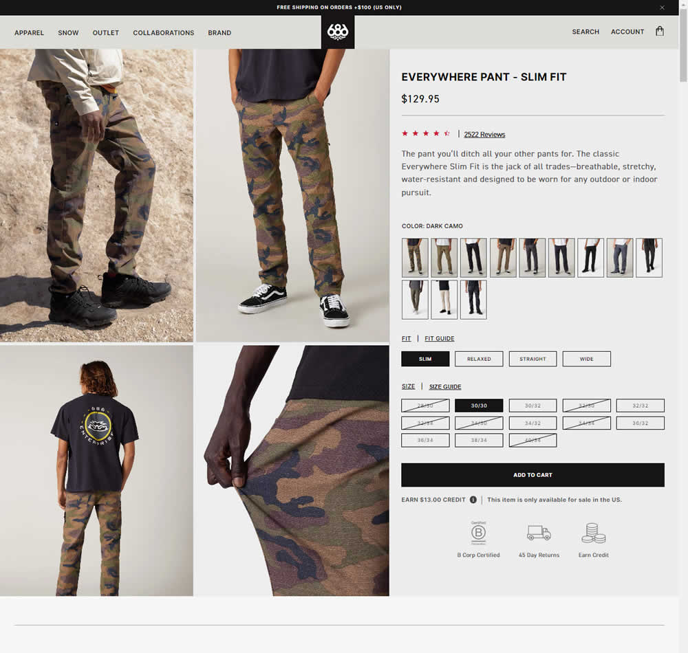
In this experiment, a single image carousel gallery was replaced with a grid gallery. In addition the variation also used: taller swatches; a wider size box, added fit (slim, relaxed, straight, wide) options; and used a wider Add to Cart CTA (full width of the column). Impact on sales was measured.
Test #543 on
by
 Jakub Linowski
Jul 22, 2024
Desktop
Mobile
Product
Jakub Linowski Tested Pattern #7: Social Counts In Test #543
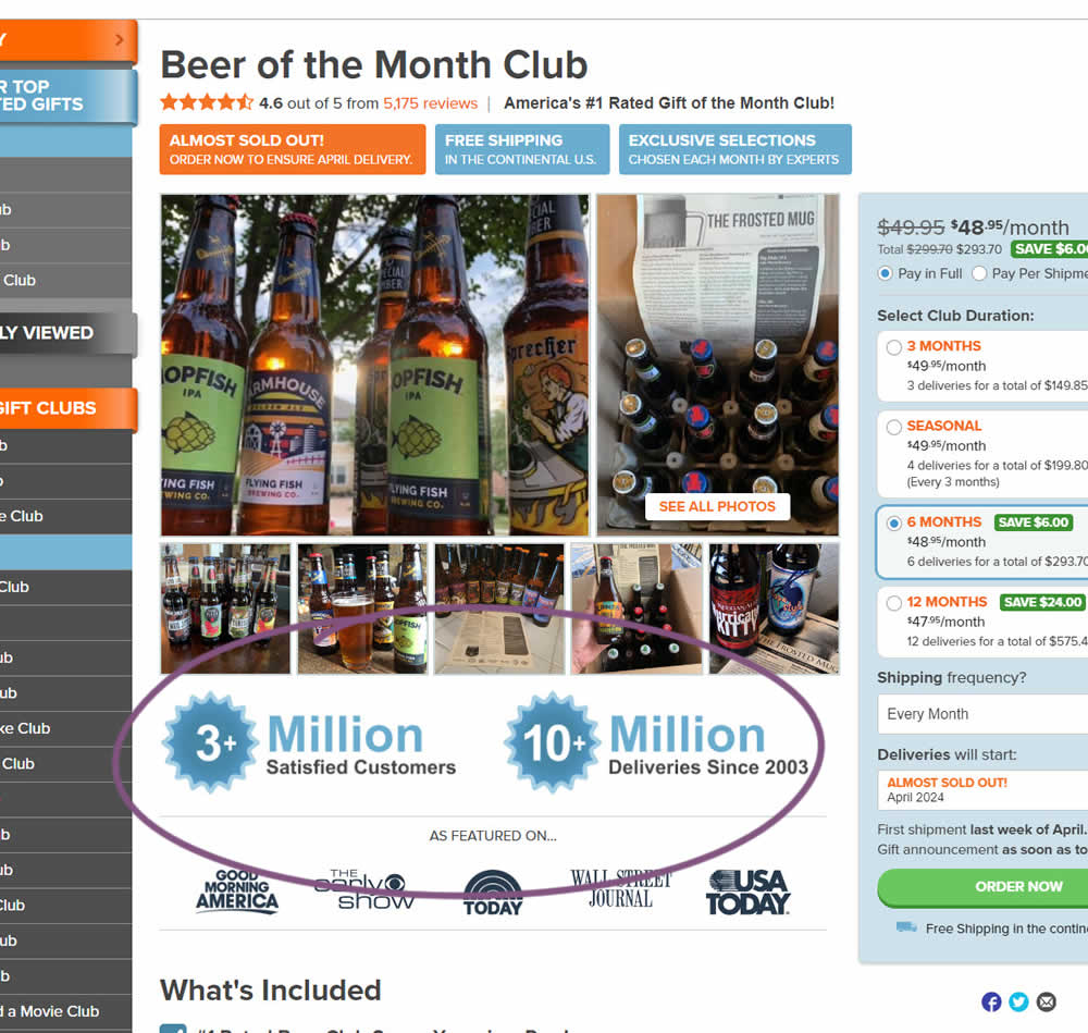
In this experiment, social proof copy was added just below product photos. The copy emphasied that "3 million satisfied customers" and "10 million deliveries since 2003". Impact on sales was measured.
Test #537 on
Online.metro-cc.ru
by
 Andrey Andreev
Jun 19, 2024
Desktop
Mobile
Product
Andrey Andreev Tested Pattern #135: Product Categories In Test #537 On Online.metro-cc.ru
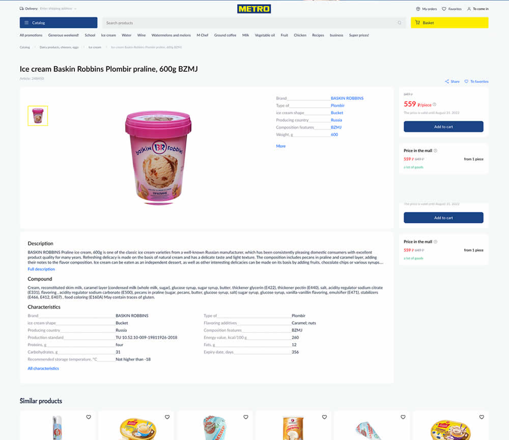
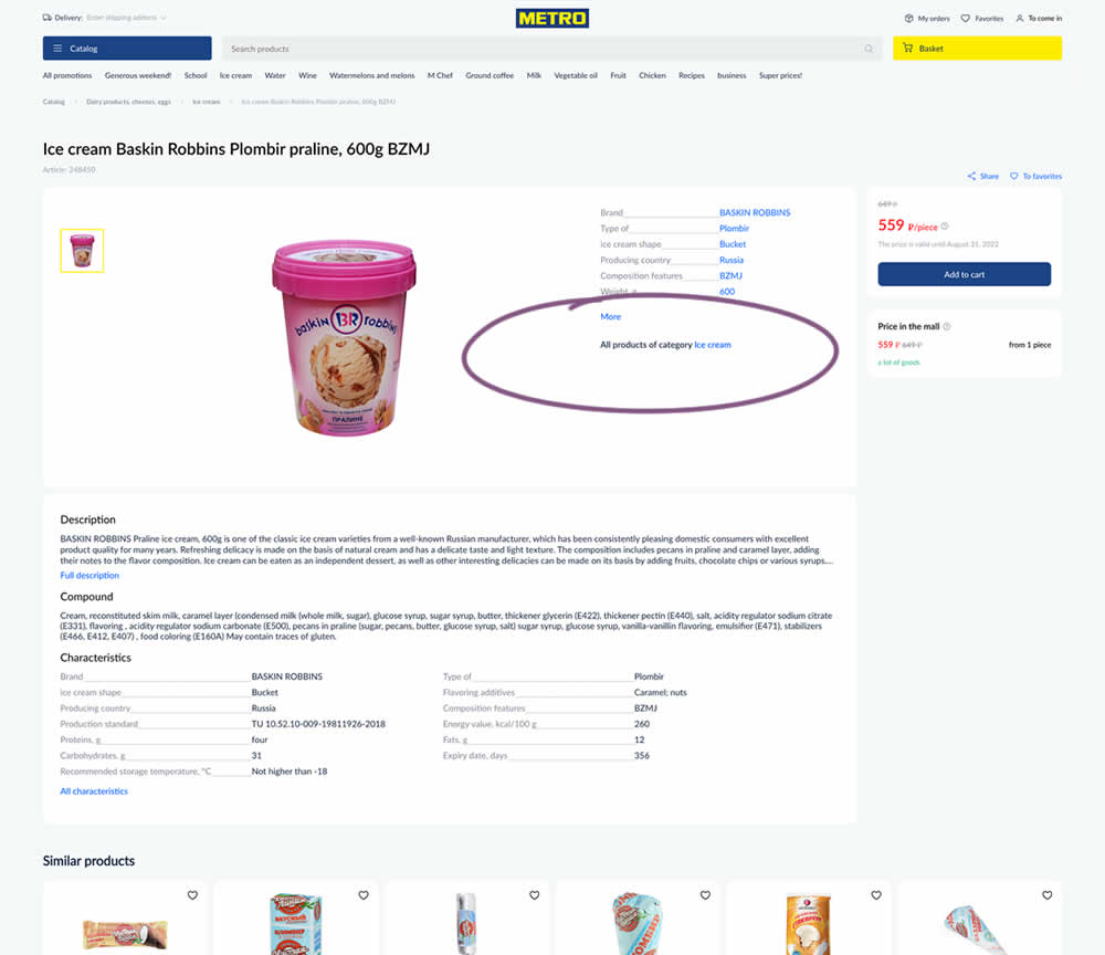
In this experiment, a simple product category link was added on product detail pages. These links linked to listing pages with more of a similar product type. Impact on sales was measured.
Test #527 on
by
 Jakub Linowski
Apr 23, 2024
Desktop
Mobile
Product
Jakub Linowski Tested Pattern #132: One Time Payment Copy In Test #527
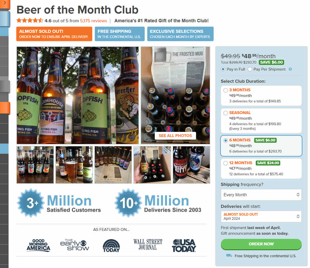
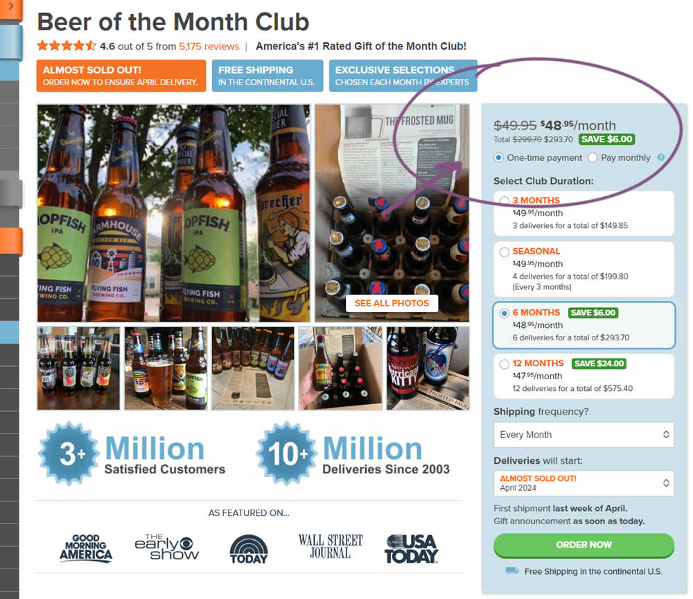
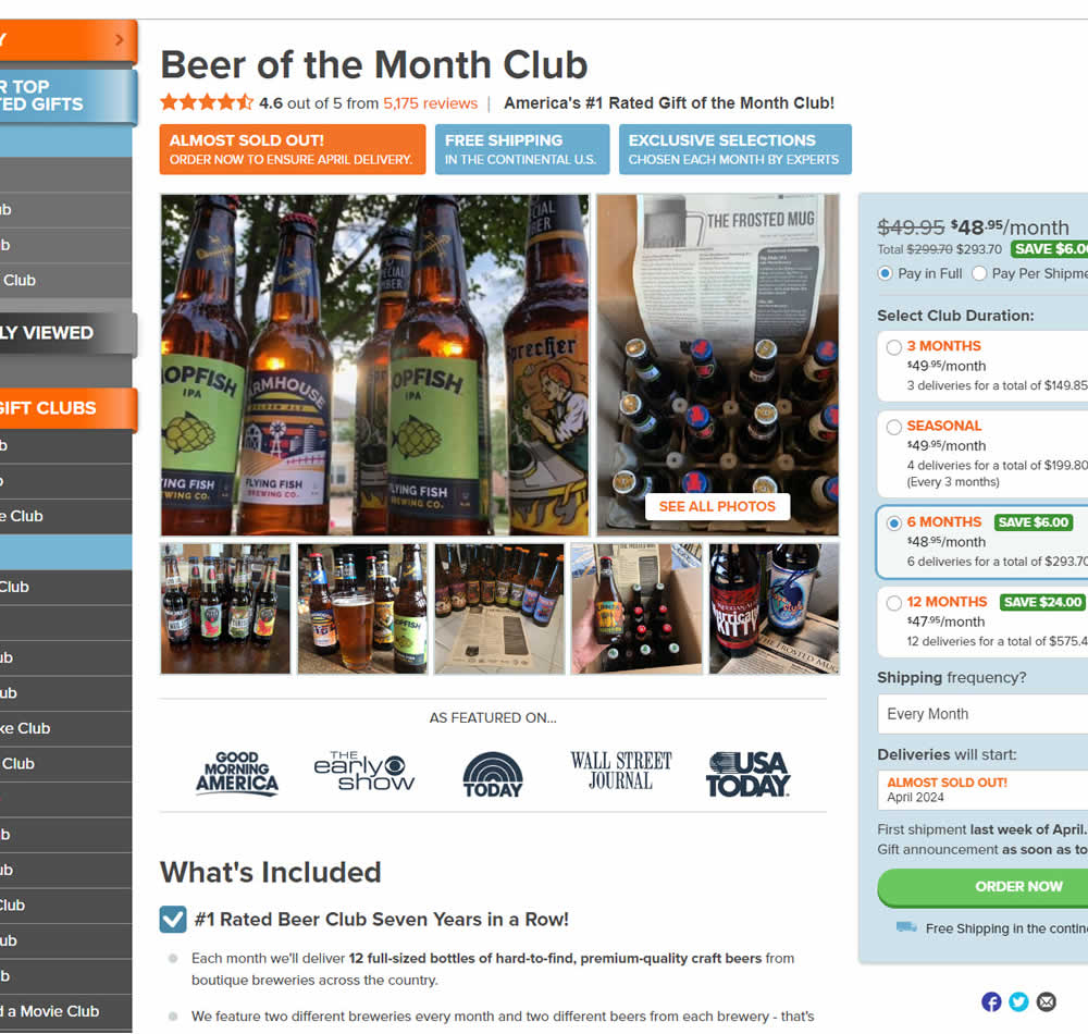
In this experiment, copy related to payment duration types (paid in full or ongoing) was changed. In the the control, one of the option used the "Pay in Full" copy, whereas the variation changed this to "One-time payment". Impact on sales was measured.