All Latest 571 A/B Tests
Become a member to unlock the abiltiy to see the highest impact a/b tests. Being able to see the actual test results and sort by impact allows growth and experimentation teams to take action on the biggest gains first
MOST RECENT TESTS
Test #324 on
by
 Jakub Linowski
Oct 30, 2020
Desktop
Mobile
Product
Jakub Linowski Tested Pattern #17: Least Or Most Expensive First In Test #324
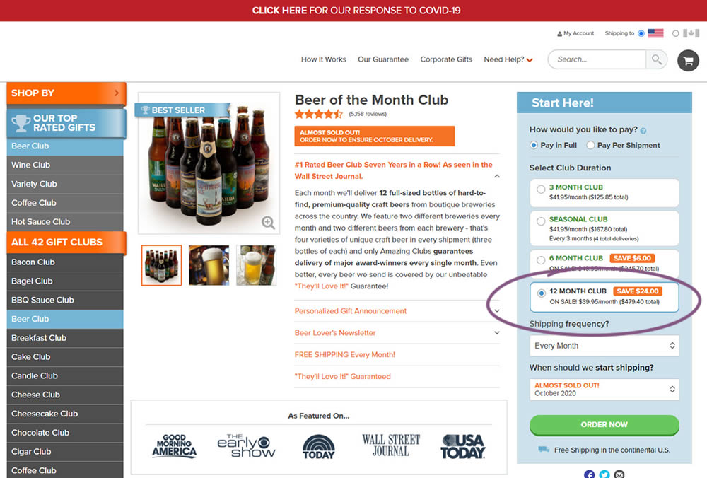
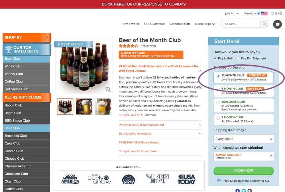
This experiment tested the order of purchase plans. The control version sorted the purchase options by the least expensive while the variation sorted them by the most expensive first. Impact on sales and revenue was measured.
Test #322 on
Thomasnet.com
by
 Kyle Phillips
Oct 27, 2020
Desktop
Mobile
Product
Kyle Phillips Tested Pattern #82: Onboarding Callouts In Test #322 On Thomasnet.com
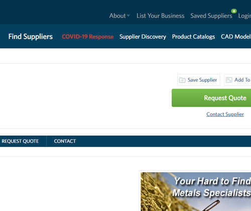
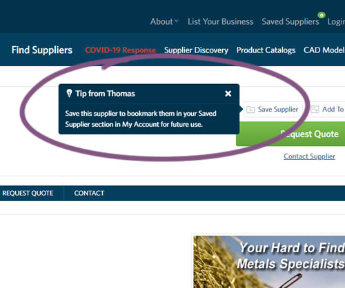
This experiment variation prompted users to save (bookmark) a company profile on a company detail page. Clicking on the save feature while logged out, would prompt a registration modal. Hence the save feature acted as an extra reason to signup. The number of people engaging or interacting with the feature was measured, as well as registrations.
Test #99 on
Vivareal.com.br
by
 Rodrigo Maués
Sep 23, 2020
Desktop
Mobile
Product
Rodrigo Maués Tested Pattern #24: Visible Availability In Test #99 On Vivareal.com.br
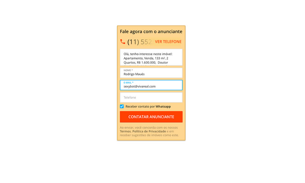
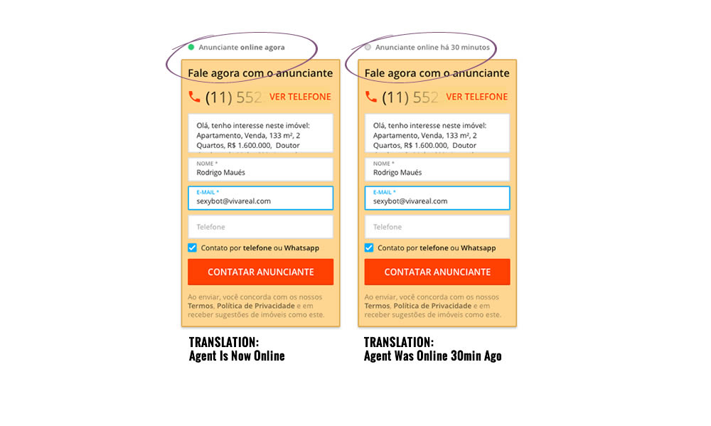
In this experiment, a lead form on a listing page showed whether an agent was recently online or not. The diplayed had two statuses: either indicating that someone is online now, or the most recent time they were online in minutes.
Test #314 on
Zapimoveis.com.br
by
 Vinicius Barros Peixoto
Aug 21, 2020
Desktop
Mobile
Product
Vinicius Barros Peixoto Tested Pattern #43: Long Titles In Test #314 On Zapimoveis.com.br
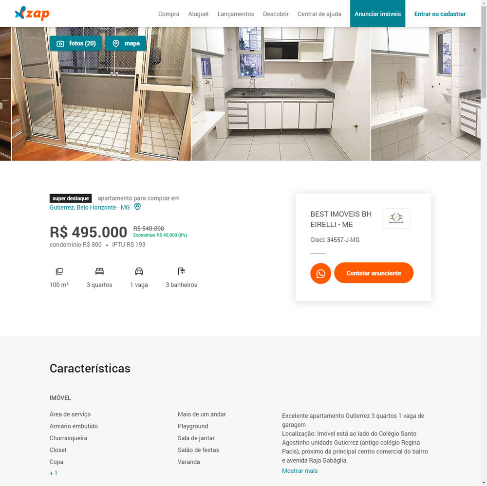
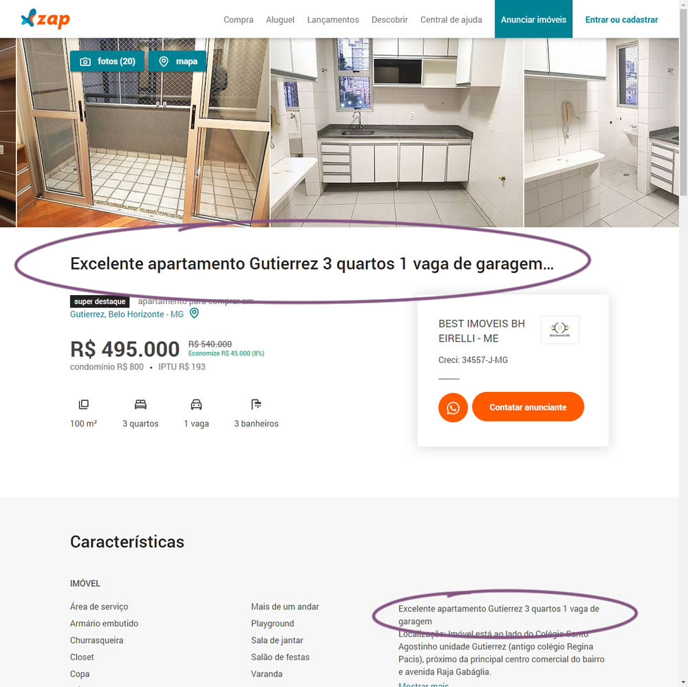
In this experiment, a dynamic page title was generated and added at the top of the screen. The first few words from a property description were used to dynamically generate these titles. The effect on leads was measured.
Test #312 on
by
 Jakub Linowski
Aug 14, 2020
Desktop
Mobile
Product
Jakub Linowski Tested Pattern #83: Progressive Fields In Test #312
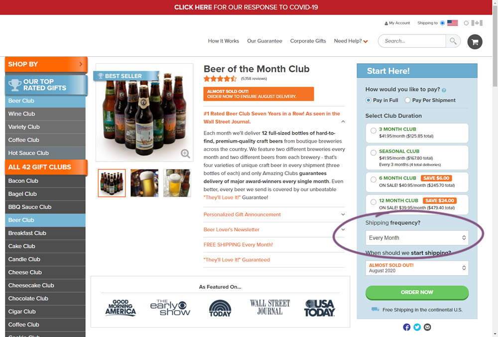
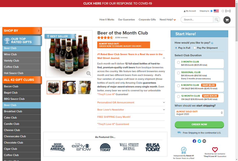
In this experiment, we tested a visible "Shipping Frequency" (A) option against a progressively displayed one (B) that would only appear after someone first chose a duration option. Thus in variation B, the buy box component would initially appear with fewer fields and smaller. The experiment measured initial progression and actual sales.
Note on the data: the experiment was run a little shorter than usual, as one of the variations triggered a stop rule to protect losses (so the effect might be somewhat inflated from a lower power).
Test #304 on
Backstage.com
by
 Stanley Zuo
Jun 29, 2020
Mobile
Product
Stanley Zuo Tested Pattern #97: Bigger Form Fields In Test #304 On Backstage.com
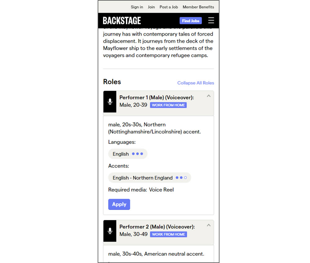
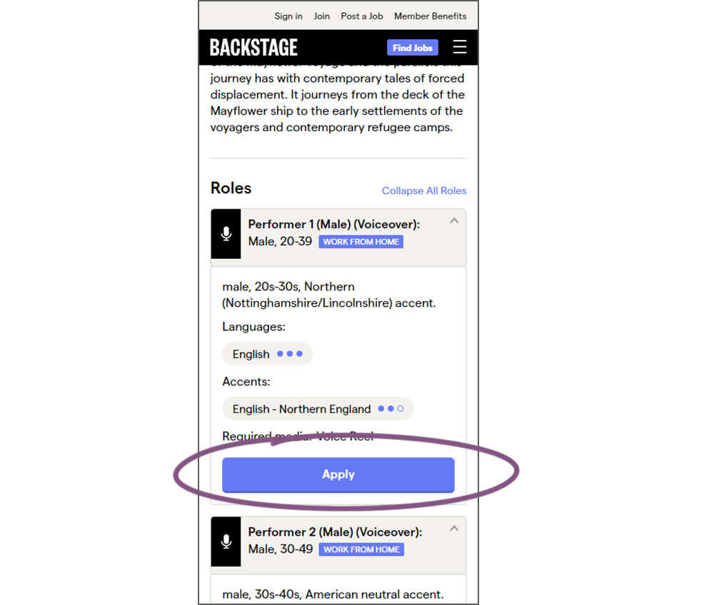
In this experiment, larger "Apply" buttons were shown on a casting detail page. The application funnel would take users through a series of steps leading to a paid membership subscription. The experiment measured initial progression and account signups (email signups).
Test #301 on
Zapimoveis.com.br
by
 Vinicius Barros Peixoto
May 31, 2020
Desktop
Mobile
Product
Vinicius Barros Peixoto Tested Pattern #21: What It's Worth In Test #301 On Zapimoveis.com.br


In this experiment, the B variation property prices were framed using higher and crossed out price points from 12 months ago - achieving a relative discount. A tooltip was also shown which explained the higher price point on hover. The example in the screenshot translates to "2% less compared to 12 months ago". This high-power experiment measured the number of leads that were generated on property (product) screens.
Test #293 on
Backstage.com
by
 Stanley Zuo
Apr 14, 2020
Desktop
Mobile
Product
Stanley Zuo Tested Pattern #114: Less Or More Visible Prices In Test #293 On Backstage.com
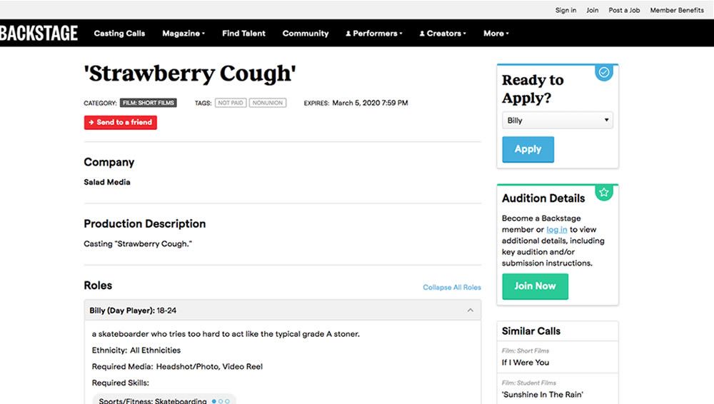
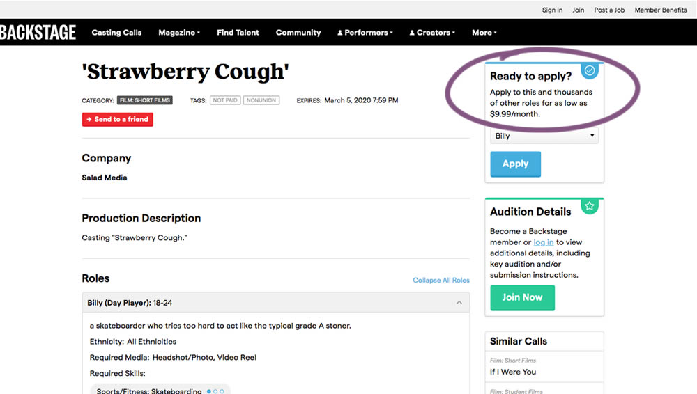
In this experiment on a casting call site, pricing information was shown beside the application button. This change shows the effect of setting a price expectation and being more clear that the application process is not free.
Test #285 on
Ibood.com
by
 Lukas Jorissen
Feb 27, 2020
Desktop
Product
Lukas Jorissen Tested Pattern #7: Social Counts In Test #285 On Ibood.com
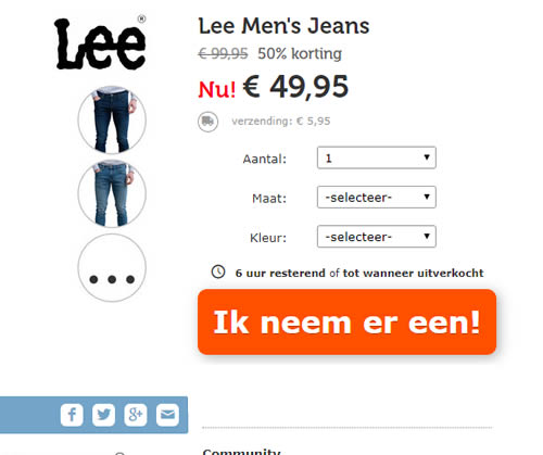
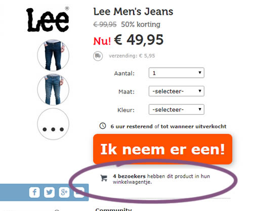
In this experiment, realtime social proof information has been added below an add-to-cart button. The variation shows how many users that have viewed, or placed a product into their basket. Translated to "4 visitors have this product in their shopping cart."
Test #266 on
by
 Someone
Oct 25, 2019
Desktop
Mobile
Product
Someone Tested Pattern #4: Testimonials In Test #266
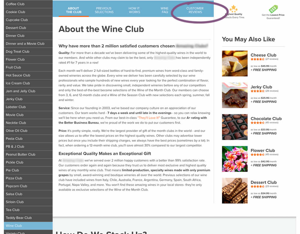
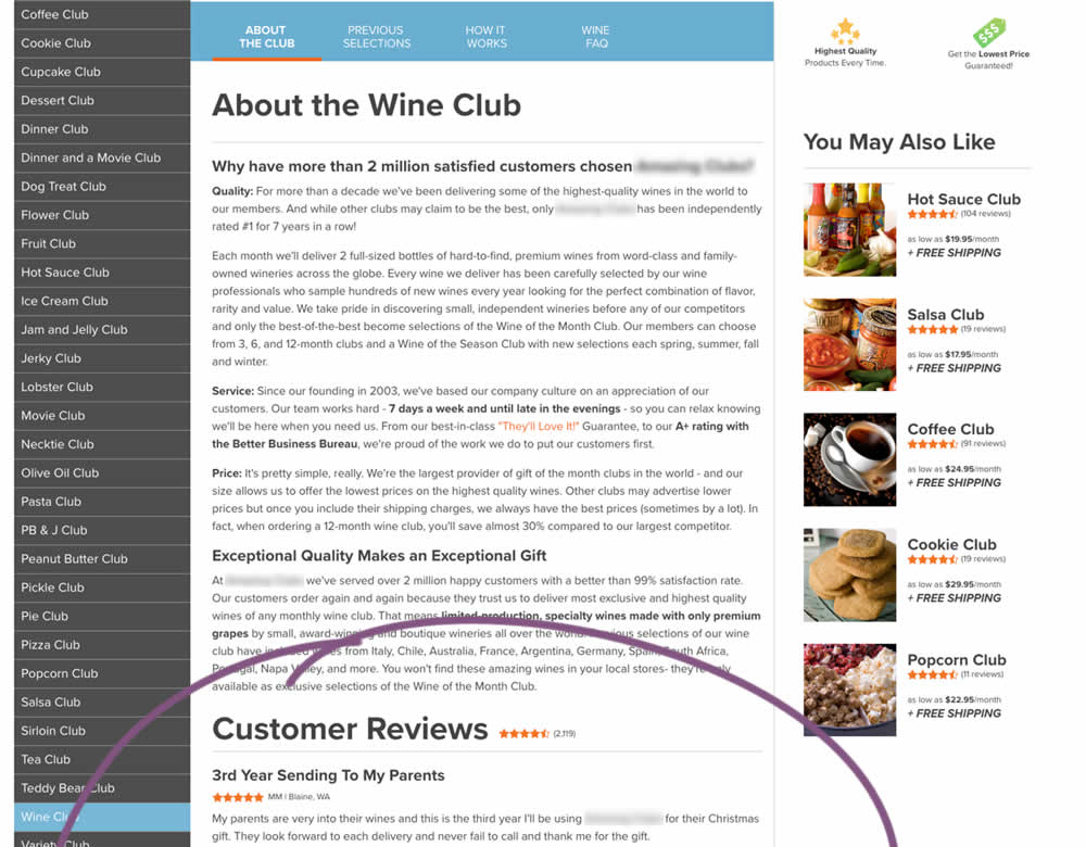
In this experiment, a product page showed customer reviews at the bottom of the page (B) instead of hiding them under a tab (A).
Test #40 on
Adoramapix.com
by
 Herman Klein
Aug 13, 2019
Desktop
Product
Herman Klein Tested Pattern #85: Benefit Button In Test #40 On Adoramapix.com
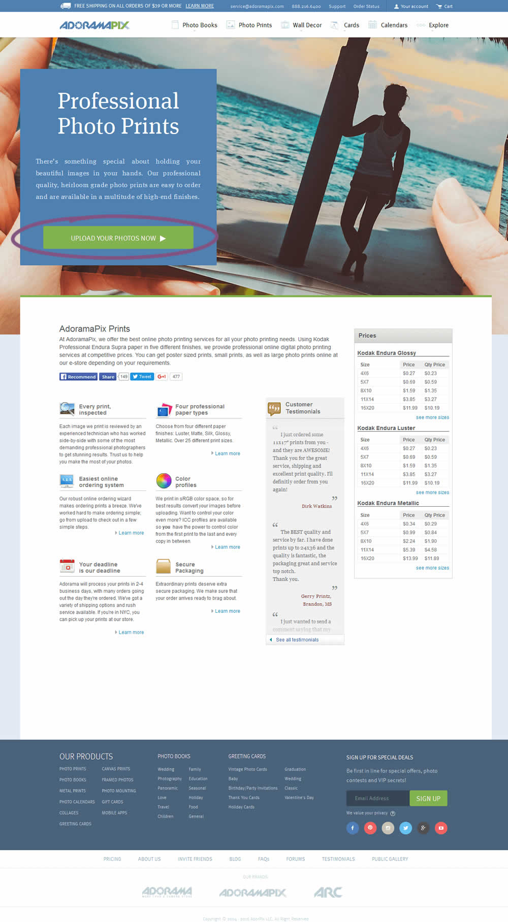
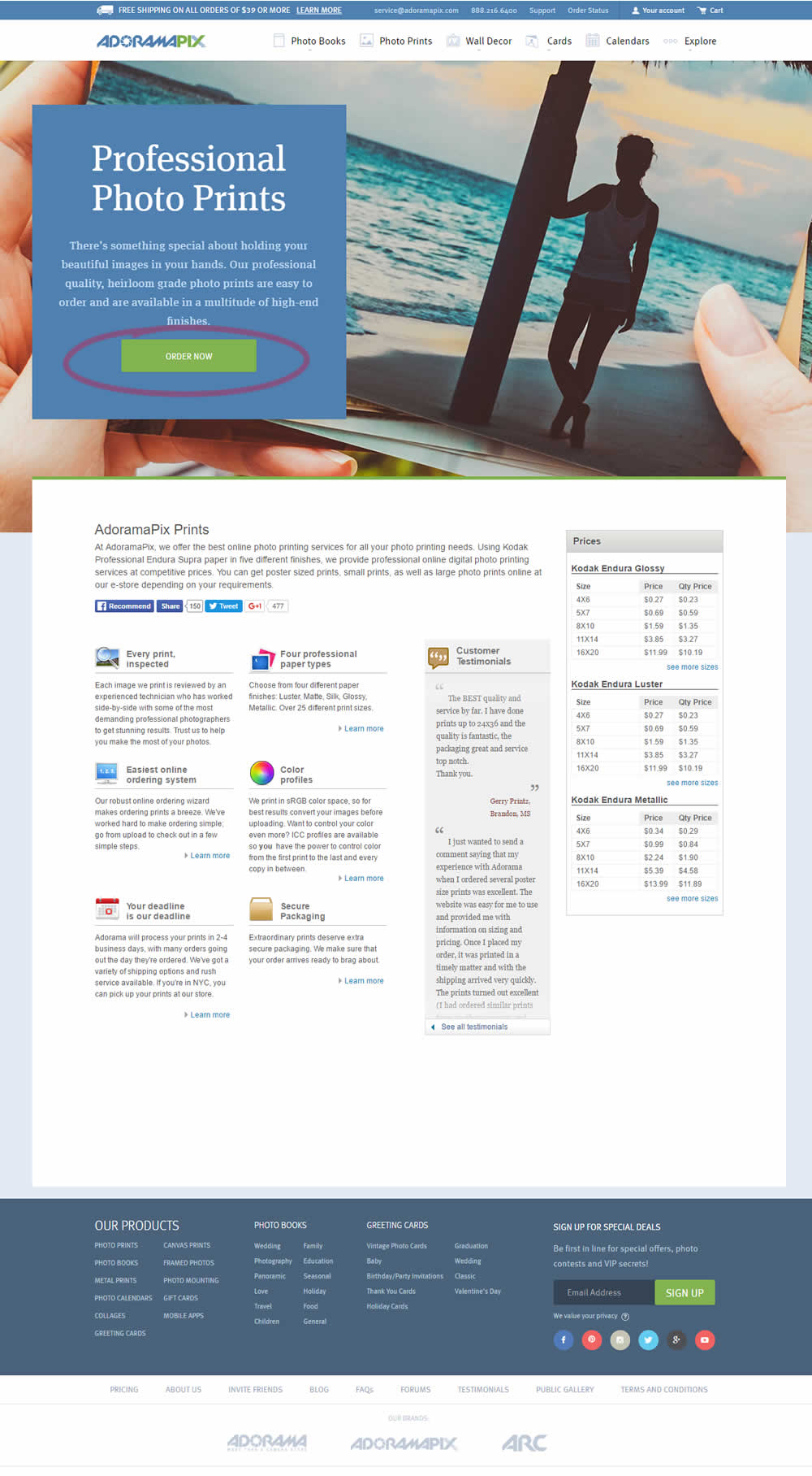
In this experiment only the button label changed. The control had a more immediate (next step-oriented) button label of "Upload Your Photos Now". The variation tried a more benefit-oriented button of "Order Now" (hinting at paying and obtaining the product).
Test #249 on
Autoscout24.com
by
 Optimizely
Jul 17, 2019
Desktop
Product
Optimizely Tested Pattern #20: Canned Response In Test #249 On Autoscout24.com
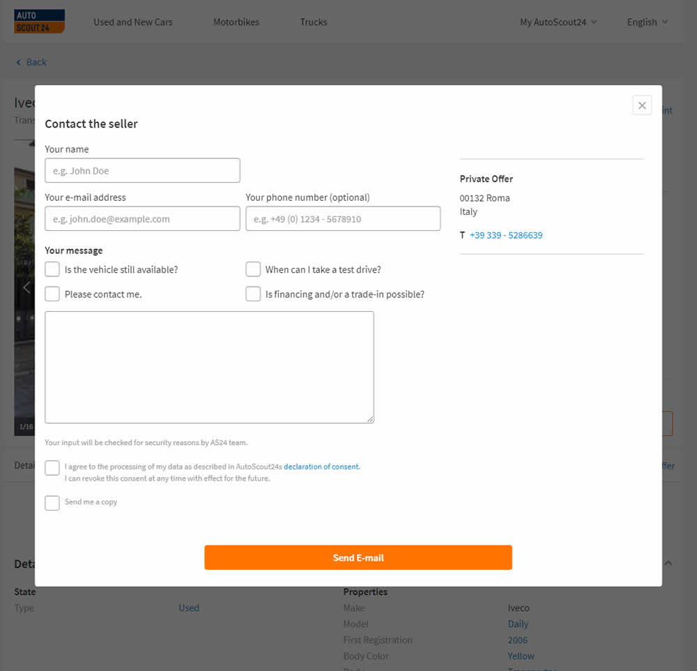
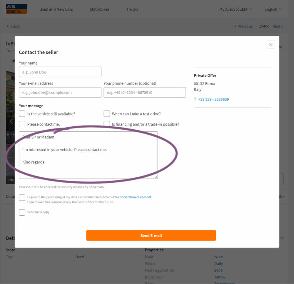
AutoScout24 is Europe’s largest online marketplace for new and used cars. As published by Optimizely, they tested a form pre-filled with text that read: ‘Hello. I am interested in your vehicle. Please contact me. Kind regards.’
Test #244 on
Mt.com
by
 Vito Mediavilla
Jun 06, 2019
Desktop
Product
Vito Mediavilla Tested Pattern #49: Above The Fold Call To Action In Test #244 On Mt.com

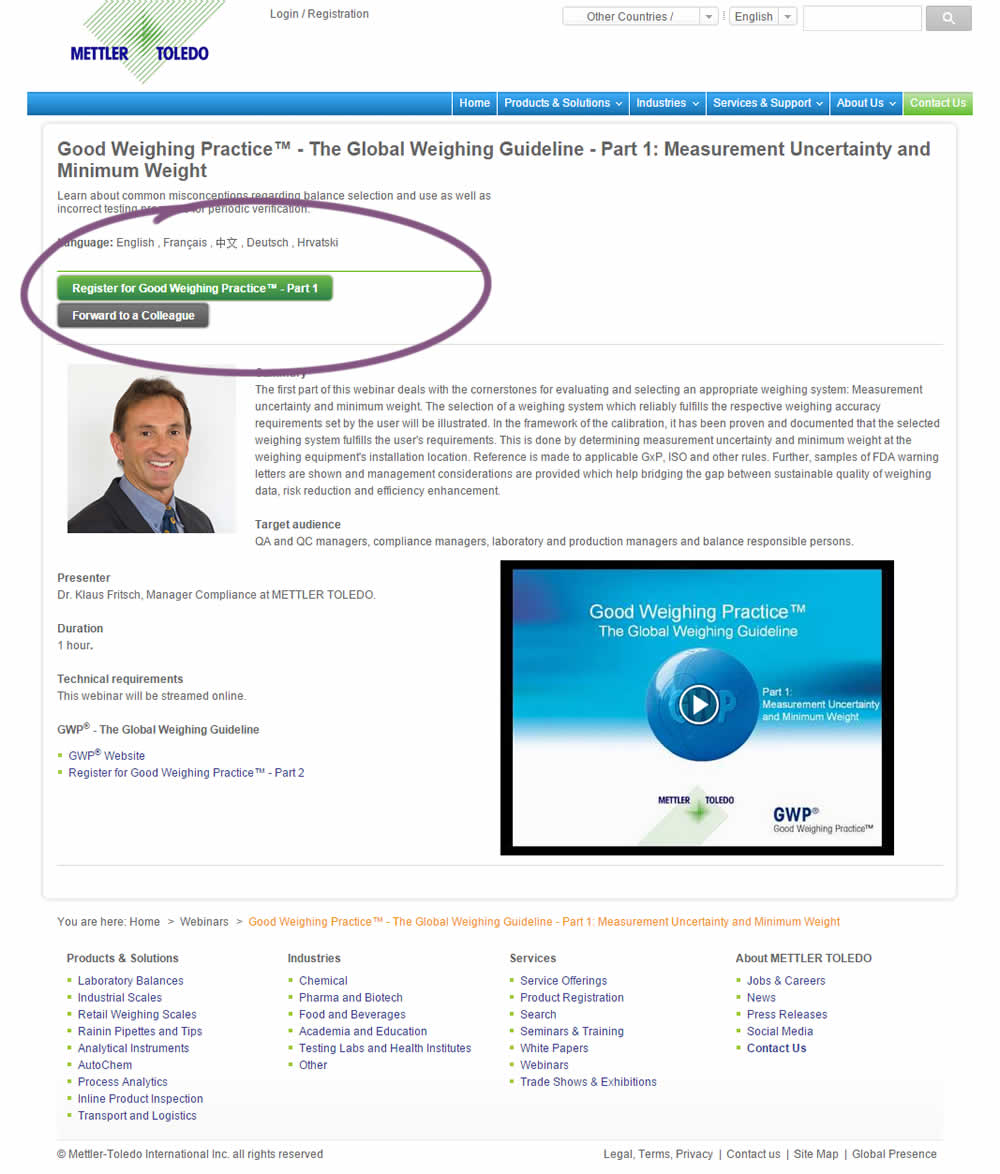
A product landing page with an image was tested against one without - raising the call to action above the fold.
Test #226 on
Microsoft.com
by
 Ronny Kohavi
Feb 18, 2019
Desktop
Product
Ronny Kohavi Tested Pattern #96: Single Focus Photos In Test #226 On Microsoft.com
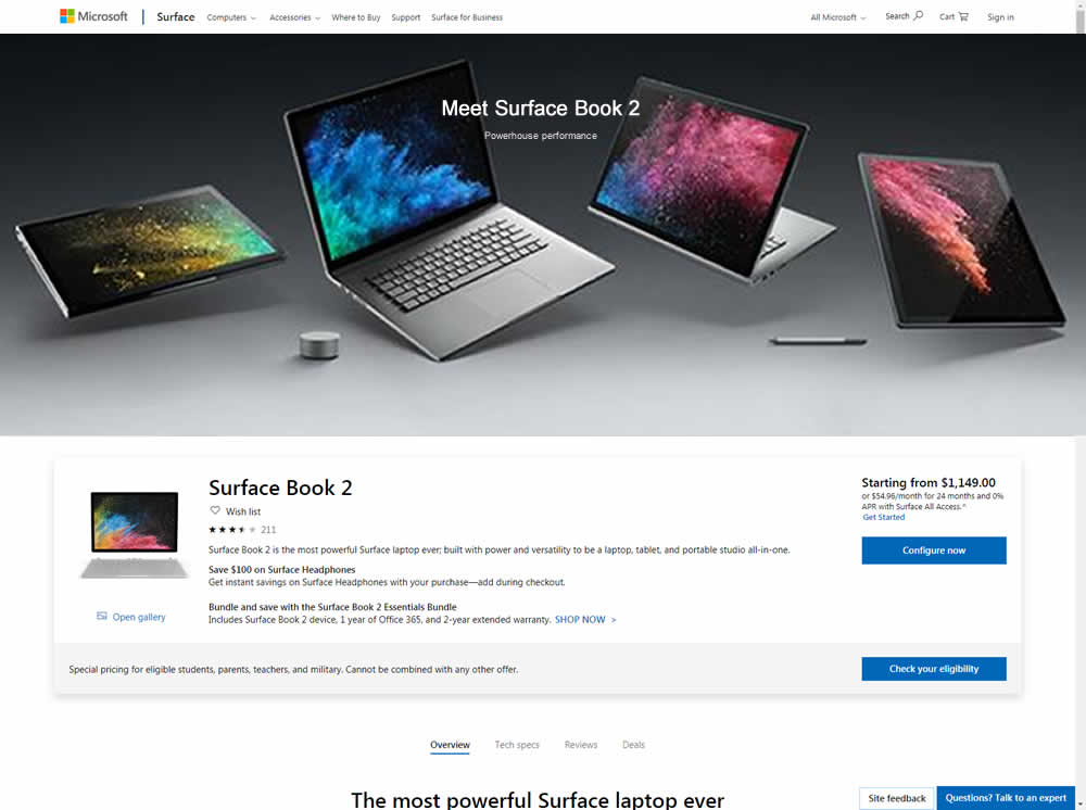
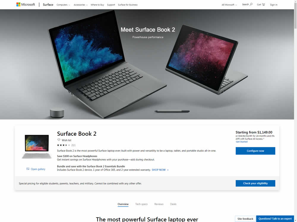
Microsoft Store ran an experiment on the Surface Book 2 product page. The treatment showed a hero image with fewer, yet larger product photos
Test #225 on
by
 Devesh Khanal
Feb 17, 2019
Desktop
Product
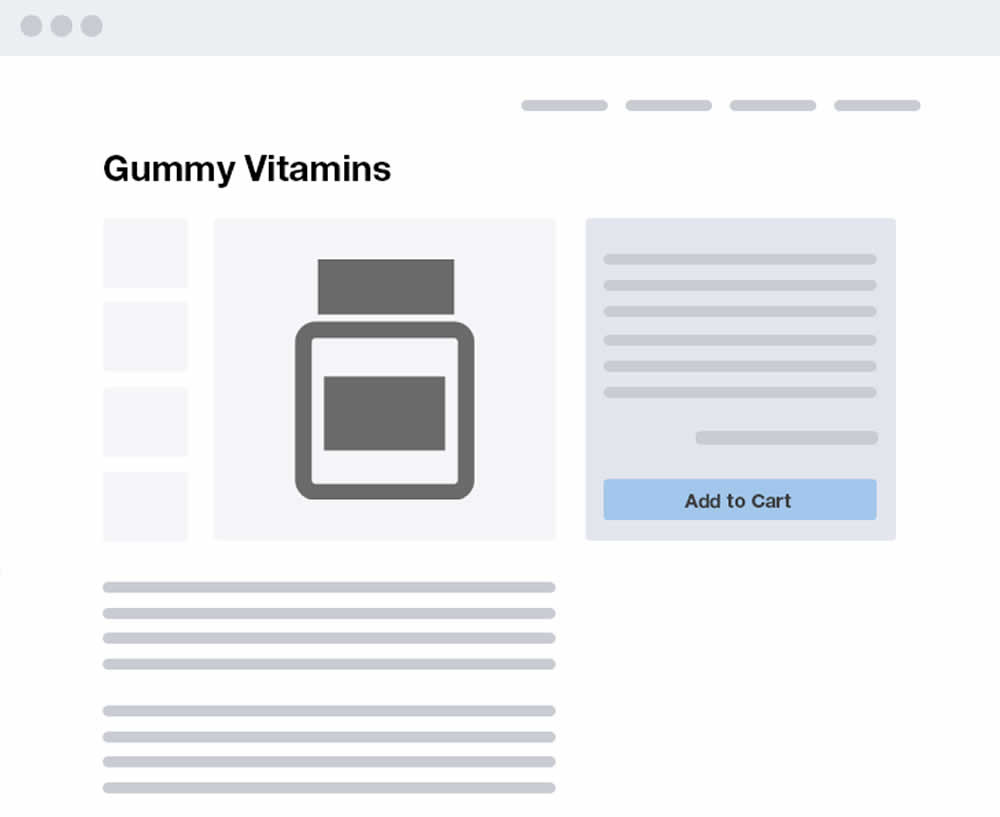
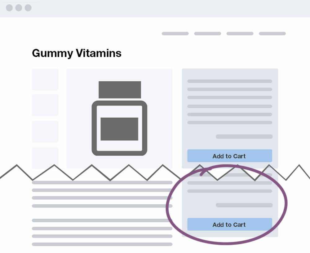
Devesh Khanal Tested Pattern #41: Sticky Call To Action In Test #225
Test #221 on
Microsoft.com
by
 Ronny Kohavi
Jan 27, 2019
Desktop
Product
Ronny Kohavi Tested Pattern #49: Above The Fold Call To Action In Test #221 On Microsoft.com
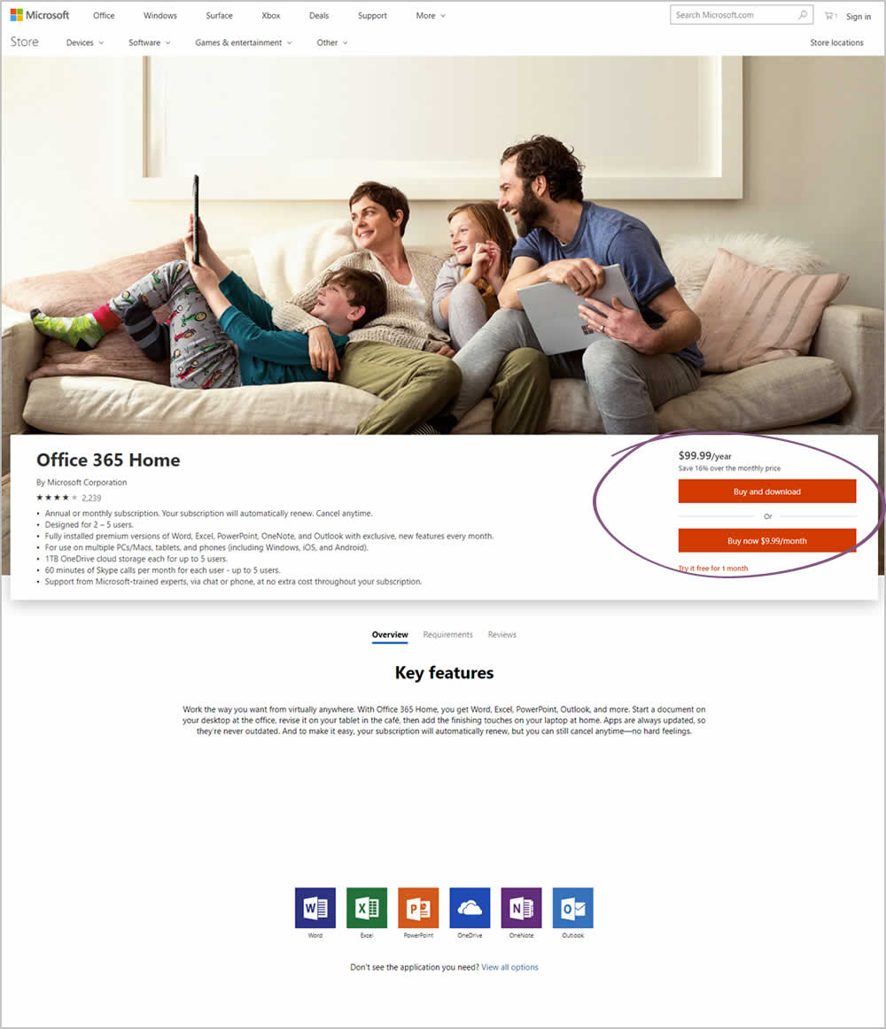
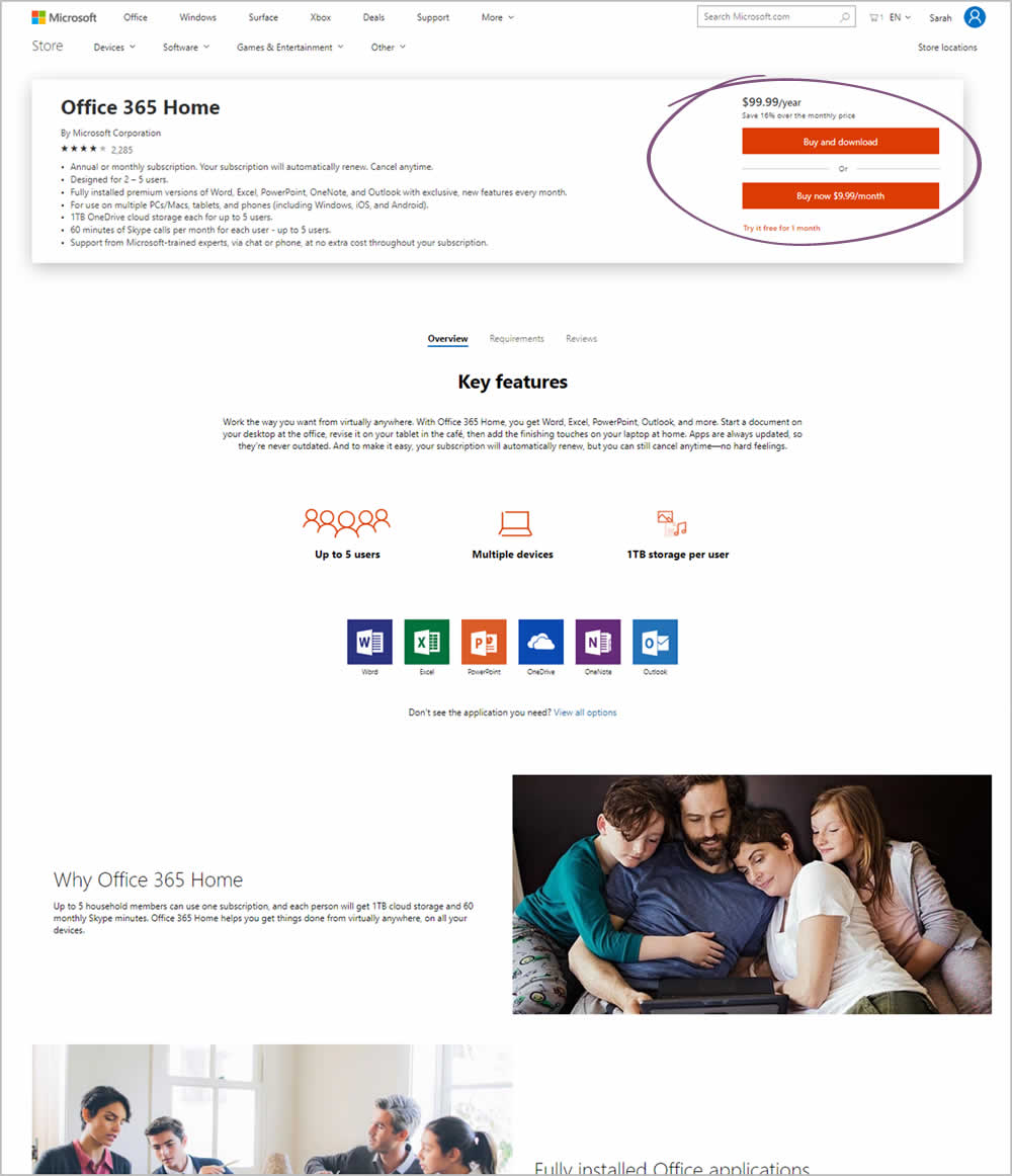
Microsoft Store ran an experiment on the Office 365 Home product page. The treatment raised the purchase calls to action higher by removing the hero image.
Test #212 on
Mt.com
by
 Vito Mediavilla
Dec 04, 2018
Desktop
Mobile
Product
Vito Mediavilla Tested Pattern #60: Repeated Bottom Call To Action In Test #212 On Mt.com
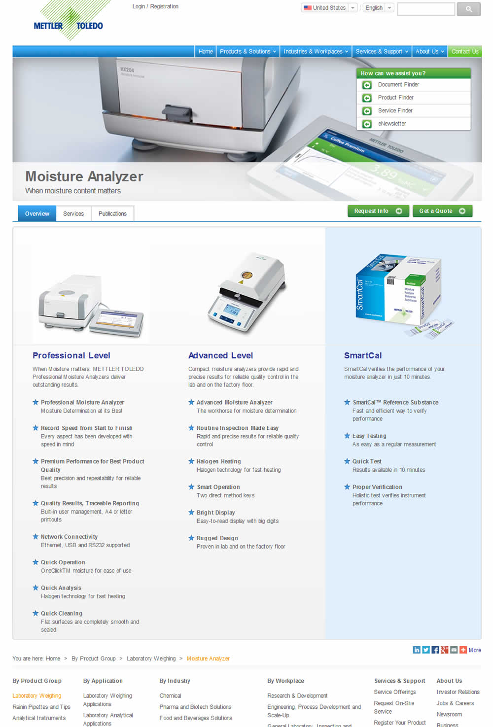
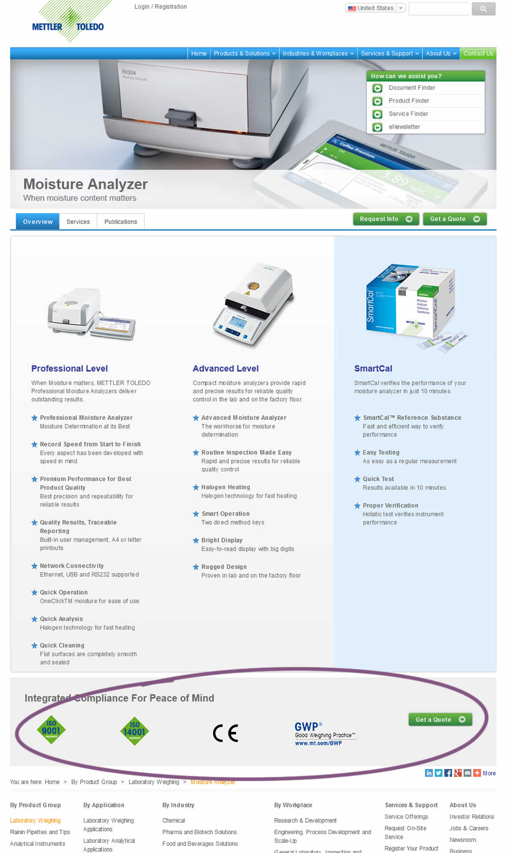
In this experiment, a call to action was repeated at the bottom of the product page. Additional certification icons were also added for additional reassurance.
Test #207 on
Suzuki.be
by
 Karl Gilis
Nov 01, 2018
Desktop
Product
Karl Gilis Tested Pattern #88: Action Button In Test #207 On Suzuki.be
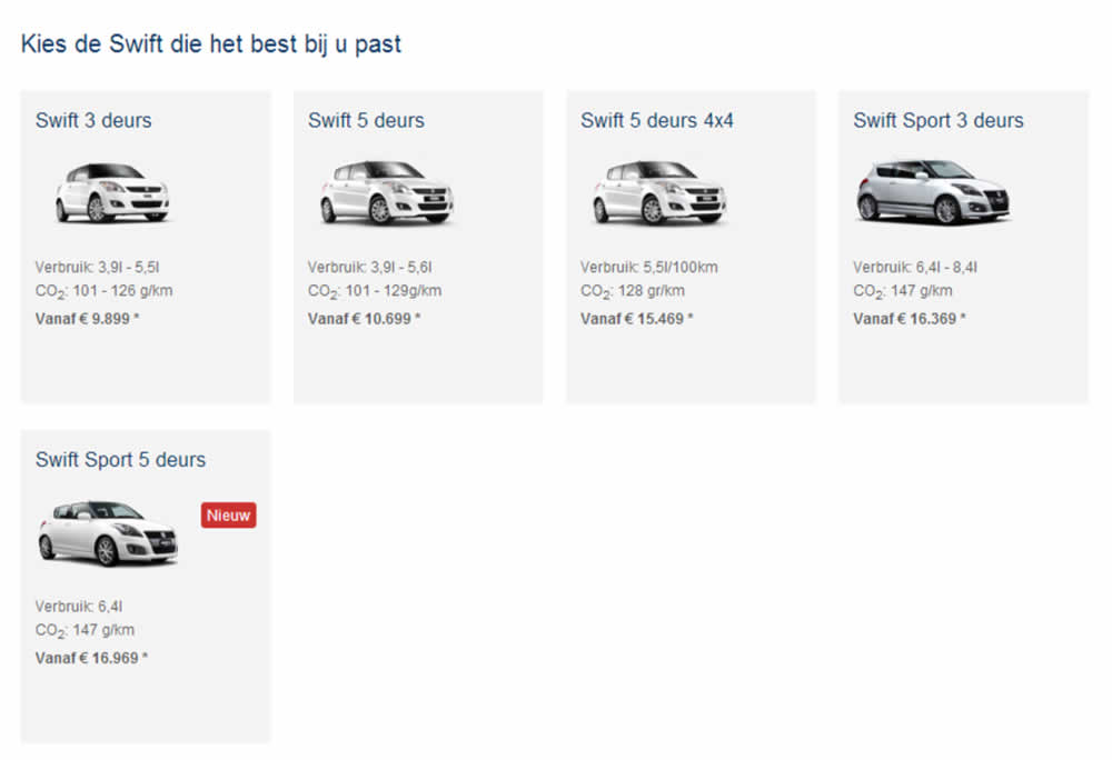
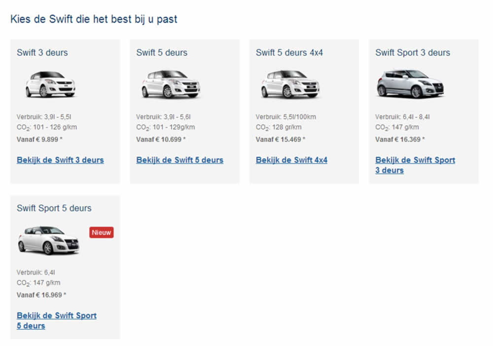
This test ran on the Suzuki Swift landing page. In the B variation, extra links with the following copy ‘Discover the <name of car model>’ were added for each sub product. (in Dutch: ‘Bekijk de…’).
Test #197 on
Reverb.com
by
 Nicholas Evans
Sep 04, 2018
Desktop
Product
Nicholas Evans Tested Pattern #4: Testimonials In Test #197 On Reverb.com
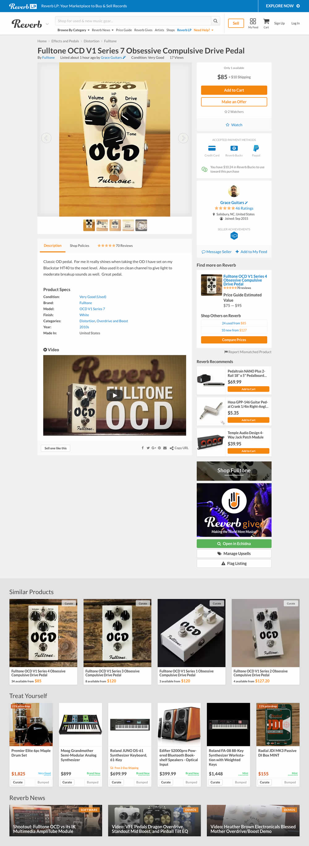

In the variation, customer reviews were exposed from a less visible tab view.
Test #192 on
Refactoring.guru
by
 Alexander Shvets
Aug 07, 2018
Desktop
Mobile
Product
Alexander Shvets Tested Pattern #4: Testimonials In Test #192 On Refactoring.guru


In this experiment, a number of customer reviews were added at the middle of a product page.