All Latest 556 A/B Tests
Become a member to unlock the abiltiy to see the highest impact a/b tests. Being able to see the actual test results and sort by impact allows growth and experimentation teams to take action on the biggest gains first
MOST RECENT TESTS
Test #570 on
Livefresh.de
by
 Melina Hess
Dec 30, 2024
Desktop
Mobile
Home & Landing
Melina Hess Tested Pattern #79: Product Highlights In Test #570 On Livefresh.de
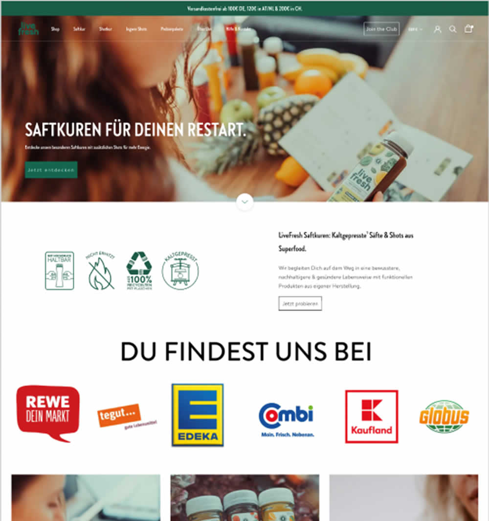
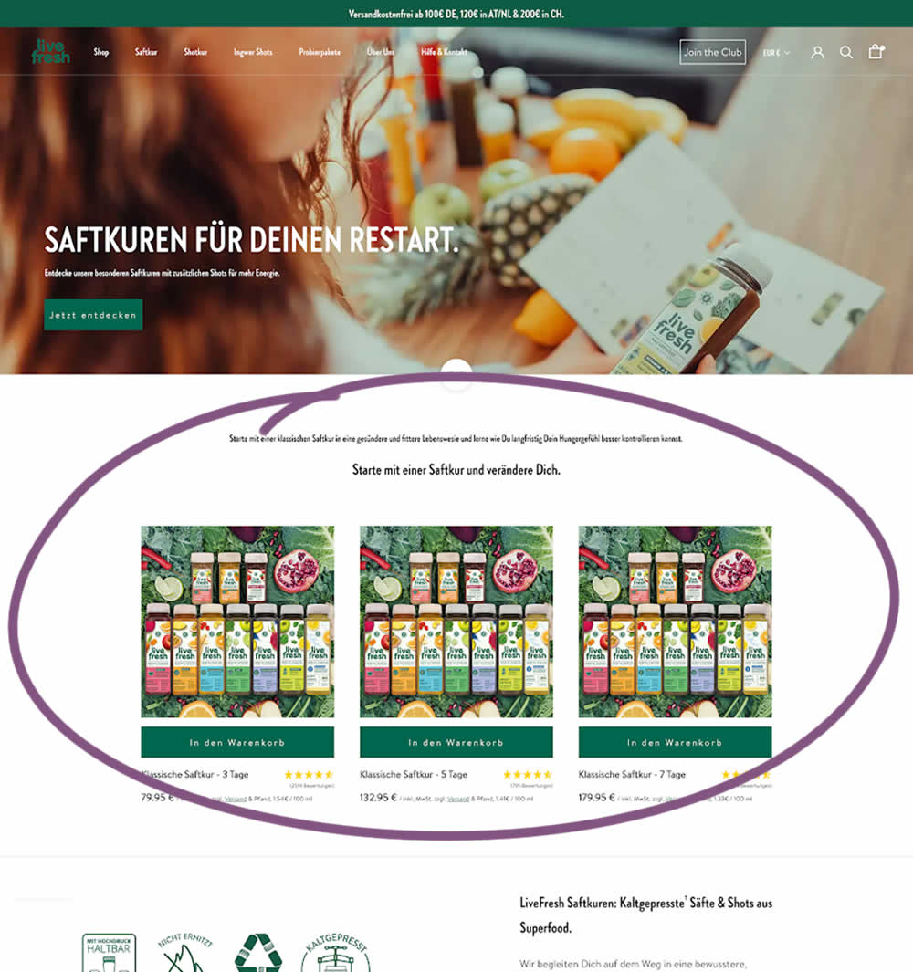
In this experiment, three popular juice products were shown higher on the variation (instead of lower in the control). Impact on sales was measured.
Test #567 on
Online.metro-cc.ru
by
 Andrey Andreev
Dec 18, 2024
Mobile
Desktop
Home & Landing
Andrey Andreev Tested Pattern #135: Product Categories In Test #567 On Online.metro-cc.ru
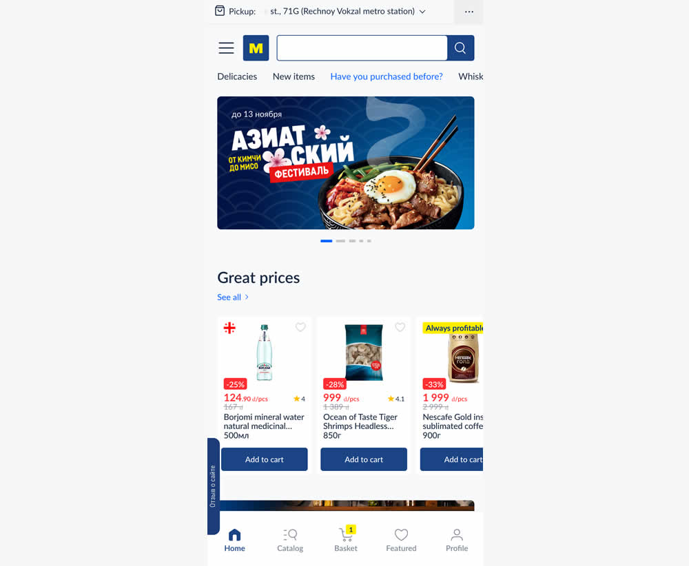
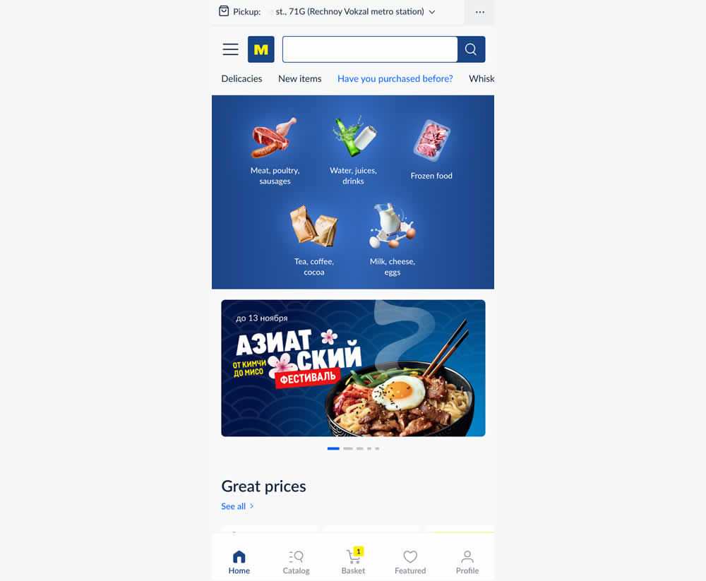
In this experiment, the variation added popular categories with links at the top of the homepage. This was done for all sets of user segments: new and returning. Impact on transactions was measured.
Test #565 on
Umbraco.com
by
 Lars Skjold Iversen
Nov 30, 2024
Desktop
Home & Landing
Lars Skjold Iversen Tested Pattern #129: Right Or Left Aligned Forms In Test #565 On Umbraco.com
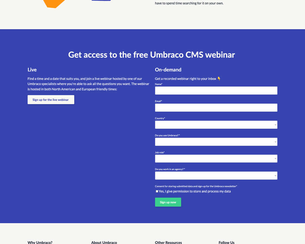
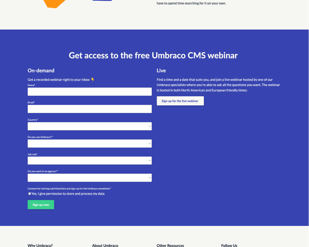
In this experiment, the right vs left position of a form (at the bottom of a landing page) was a/b tested. Impact on progression and form completion was measured.
Test #564 on
Hellostake.com
by
 Louis Alston
Nov 26, 2024
Desktop
Mobile
Home & Landing
Louis Alston Tested Pattern #114: Less Or More Visible Prices In Test #564 On Hellostake.com
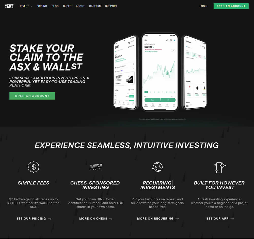
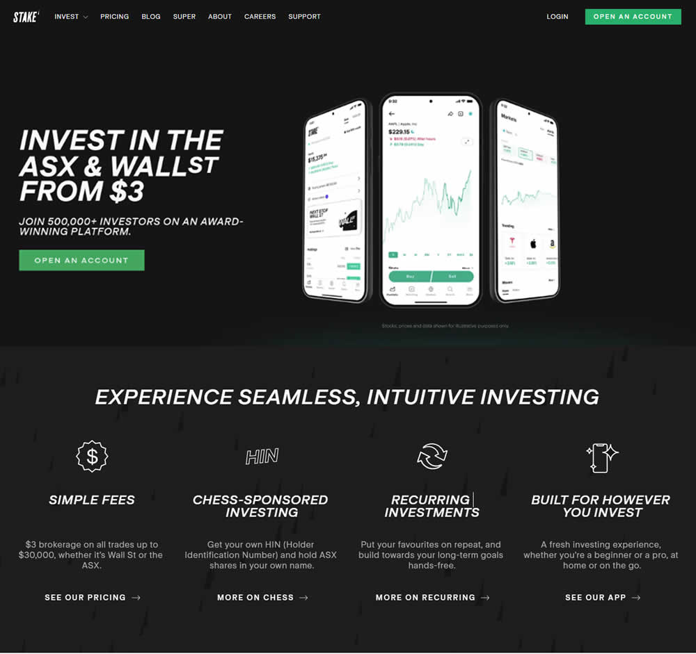
In this a/b test, the headline was changed to reflect pricing information (informing that trades are starting at $3). Impact on progression and signups was measured.
Test #563 on
Expertinstitute.com
by
 Ardit Veliu
Nov 19, 2024
Desktop
Home & Landing
Ardit Veliu Tested Pattern #108: Frequently Asked Questions In Test #563 On Expertinstitute.com
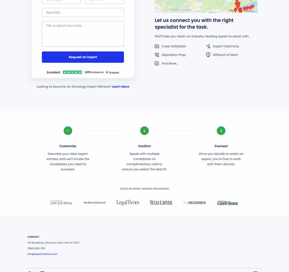
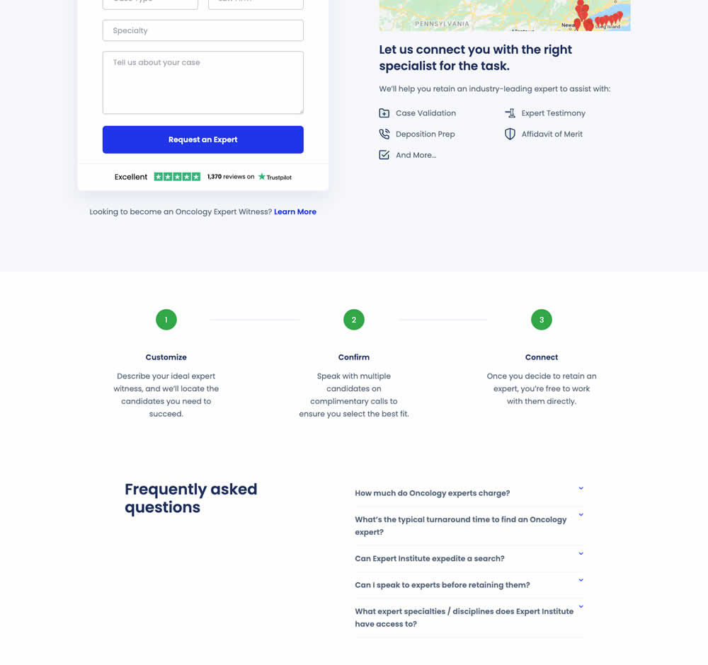
In this RETEST experiment, a Frequently Asked Questions section was added near the bottom of a short lead gen form. This test ran on one of Expert Institute's landing pages for their expert witness seeking services. Impact on leads was measured. It was also triggered by users who scrolled at least 100px downwards towards the FAQ section.
Test #542 on
Expertinstitute.com
by
 Ardit Veliu
Jul 17, 2024
Desktop
Home & Landing
Ardit Veliu Tested Pattern #108: Frequently Asked Questions In Test #542 On Expertinstitute.com
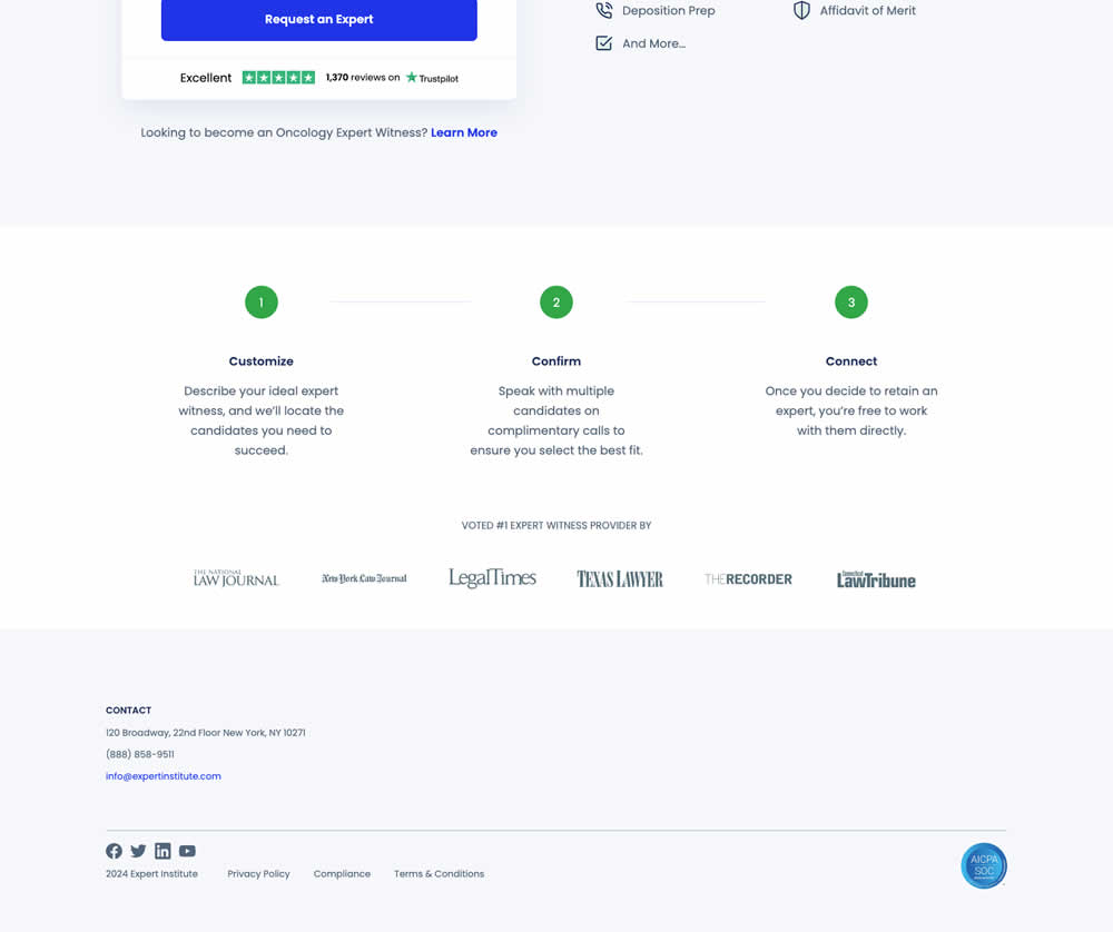
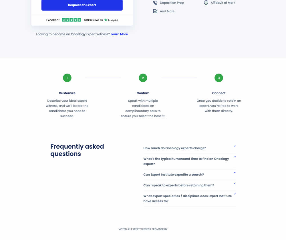
In this experiment, a Frequently Asked Questions section was added near the bottom of a short lead gen form. This test ran on one of Expert Institute's landing pages for their expert witness seeking services. Impact on leads was measured.
Test #521 on
Finn.com
by
 Maksim Meged
Mar 14, 2024
Mobile
Home & Landing
Maksim Meged Tested Pattern #26: Cart Reminder And Recently Viewed In Test #521 On Finn.com
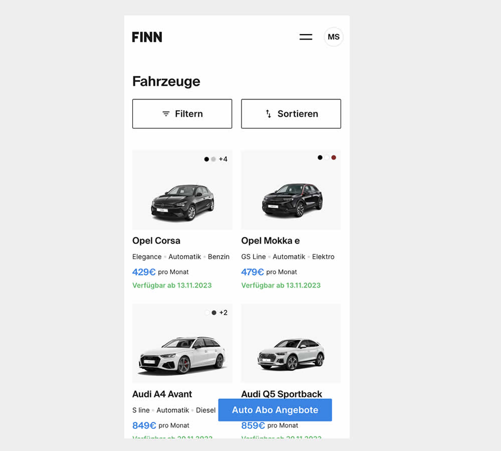
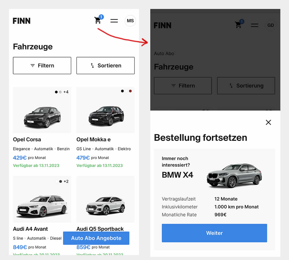
This experiment was triggered by a small segment of users who completed the first step of checkout funnel (submitted email, name, phone number), but dropped from checkout and returned to cars catalogue 7 or more minutes later.
In the control, users didn't see any cart icon nor function to resume their checkout flow.
In the variation however, users saw a filled shopping cart icon with resume functionality. Clicking on the icon would guide and redirect users to their latest abandoned stage of their checkout flow.
Test #515 on
by
 Jakub Linowski
Jan 31, 2024
Desktop
Mobile
Home & Landing
Jakub Linowski Tested Pattern #69: Autodiscounting In Test #515
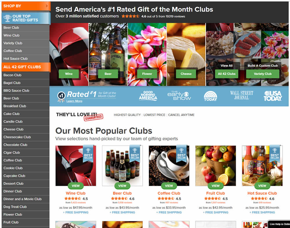
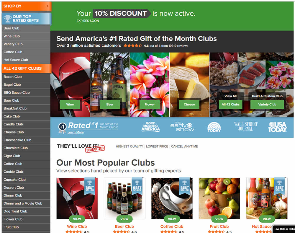
In this experiment, people who saw an offer (in an email or popup) would see a more visible site wide reinforcement of their earned discount being active. In the control, the discount was only shown during checkout. In the variation, it was shown throughout the web site on the homepage and product detail pages.
Test #511 on
Online.metro-cc.ru
by
 Andrey Andreev
Jan 09, 2024
Desktop
Home & Landing
Andrey Andreev Tested Pattern #79: Product Highlights In Test #511 On Online.metro-cc.ru
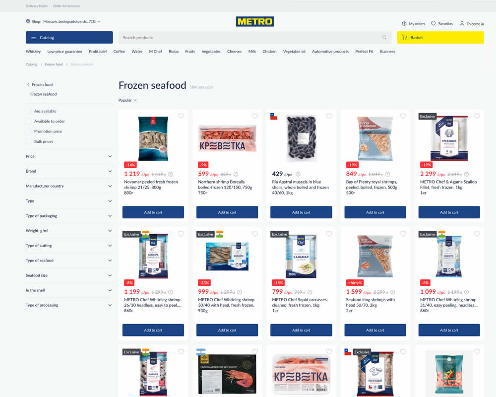
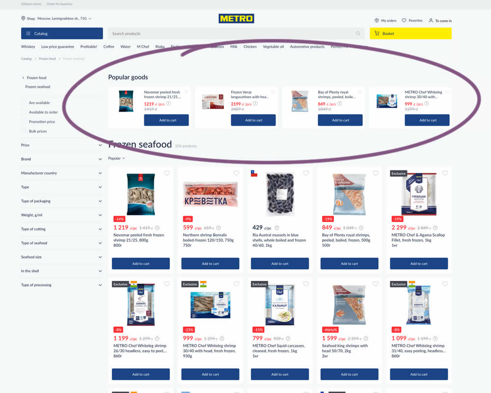
In this experiment, popular products were shown at the top of the homepage. Impact to sale was measured.
Test #510 on
Formelskin.de
by
 Alexander Krieger
Dec 21, 2023
Mobile
Home & Landing
Alexander Krieger Tested Pattern #26: Cart Reminder And Recently Viewed In Test #510 On Formelskin.de
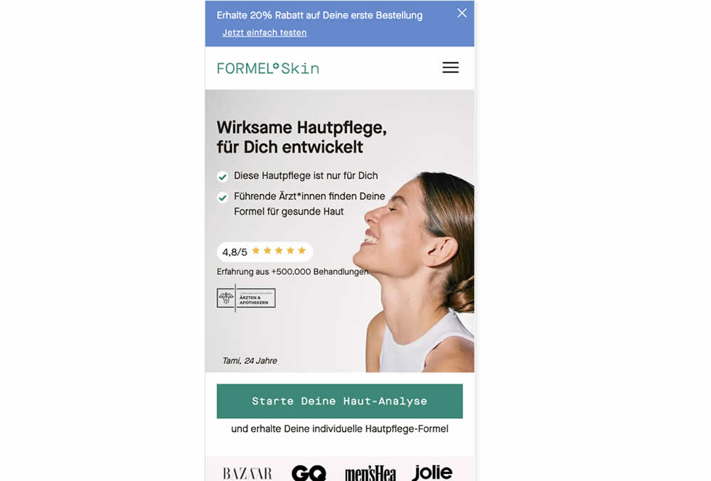
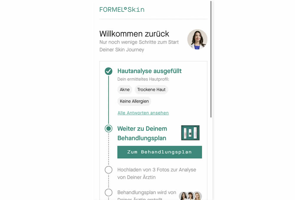
In this experiment, users that did not complete a purchase and came back to the homepage were shown two different experiences. In the control, users would see the homepage (essentially having to restart the purchase flow). Whereas, in the variation, users would be shown a "Welcome Back" summary view with the completed steps shown as completed and a quick resume button to the next incomplete step. Impact on completed sales was measured.
Test #503 on
by
 Jakub Linowski
Nov 05, 2023
Desktop
Mobile
Home & Landing
Jakub Linowski Tested Pattern #36: Fewer Or More Results In Test #503
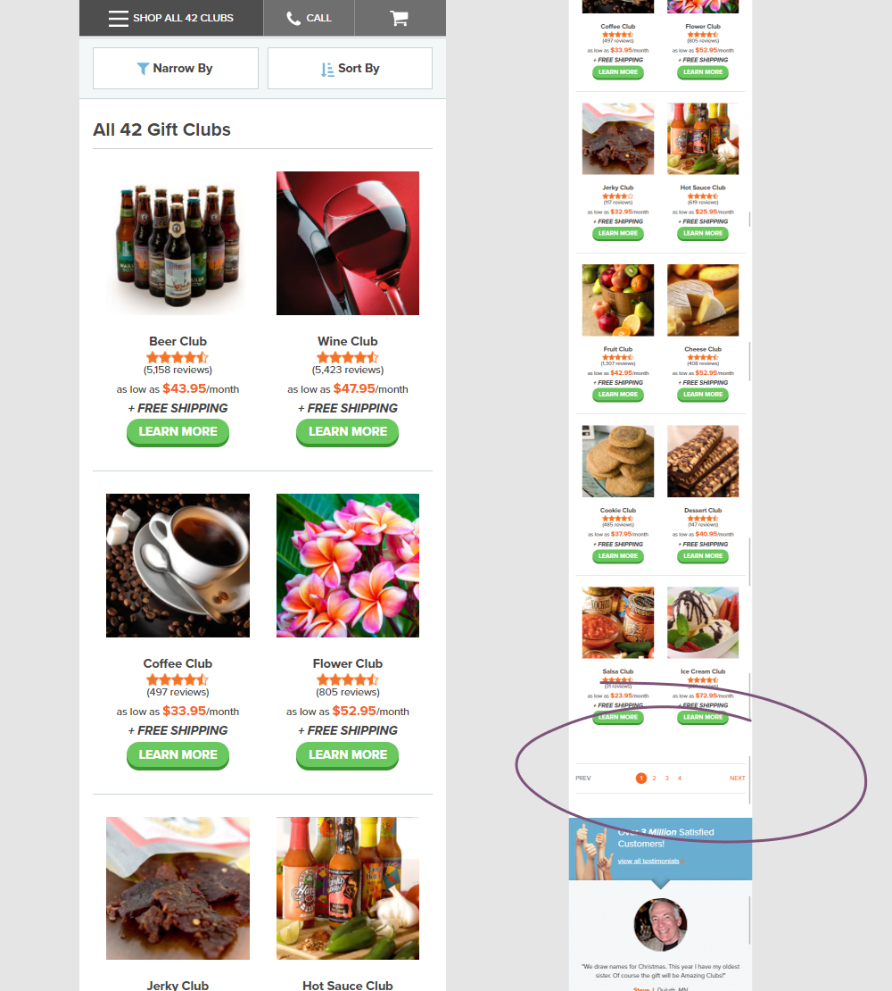
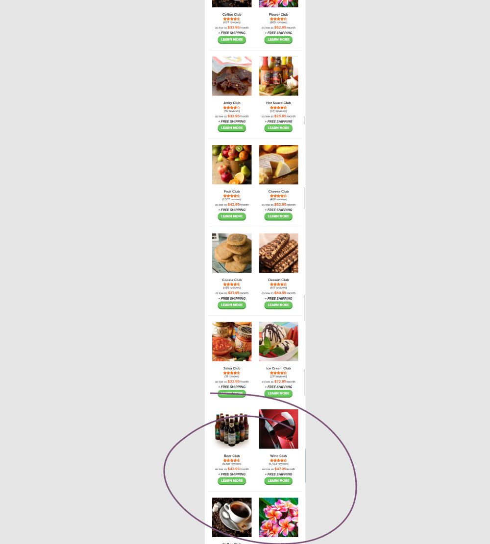
In this experiment, instead of showing 12 products per screen (with pagination), the variation showed all 42 products on a single screen. Impact on adds to cart and completed orders was measured.
Test #494 on
Online.Metro-cc.ru
by
 Andrey Andreev
Sep 20, 2023
Desktop
Mobile
Home & Landing
Andrey Andreev Tested Pattern #26: Cart Reminder And Recently Viewed In Test #494 On Online.Metro-cc.ru
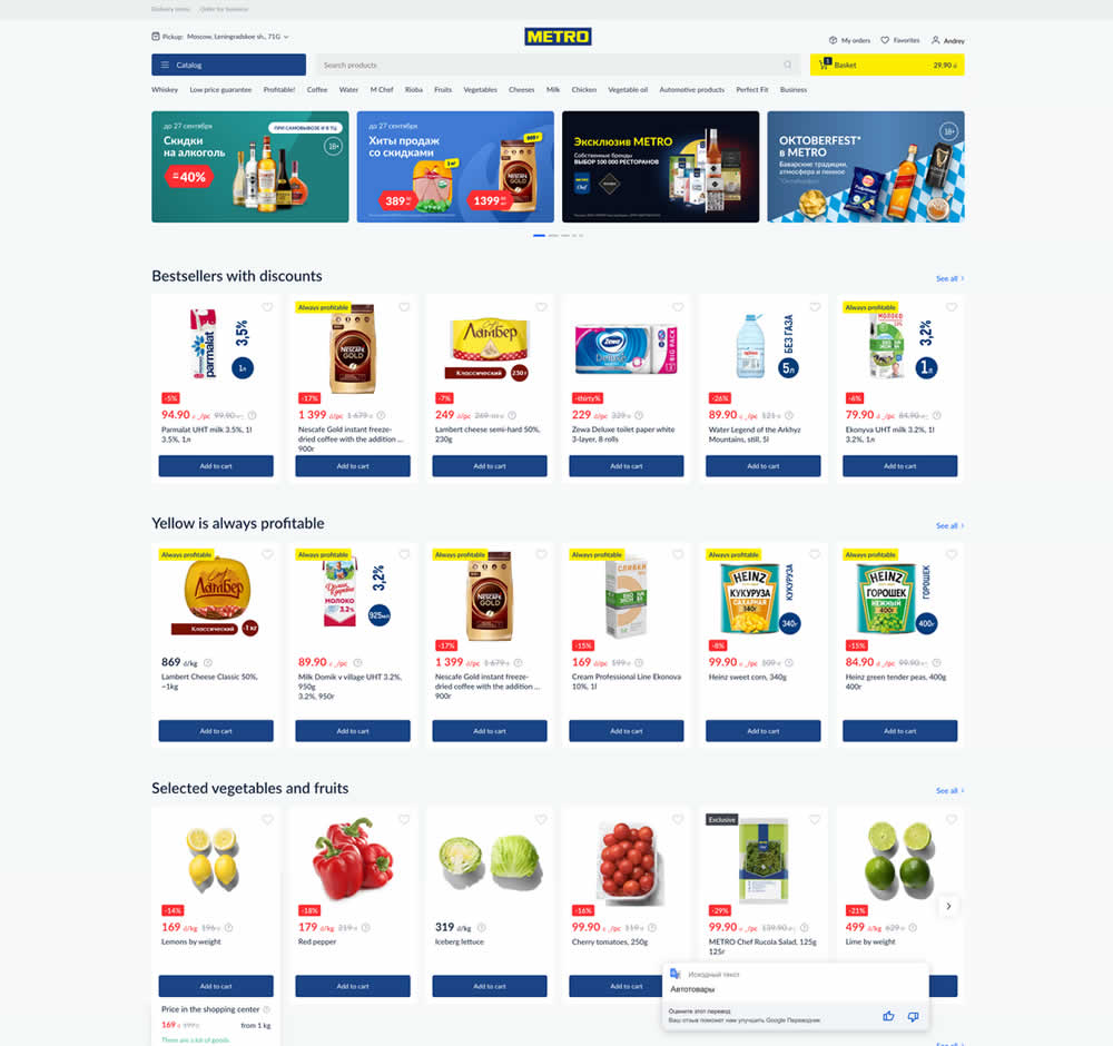
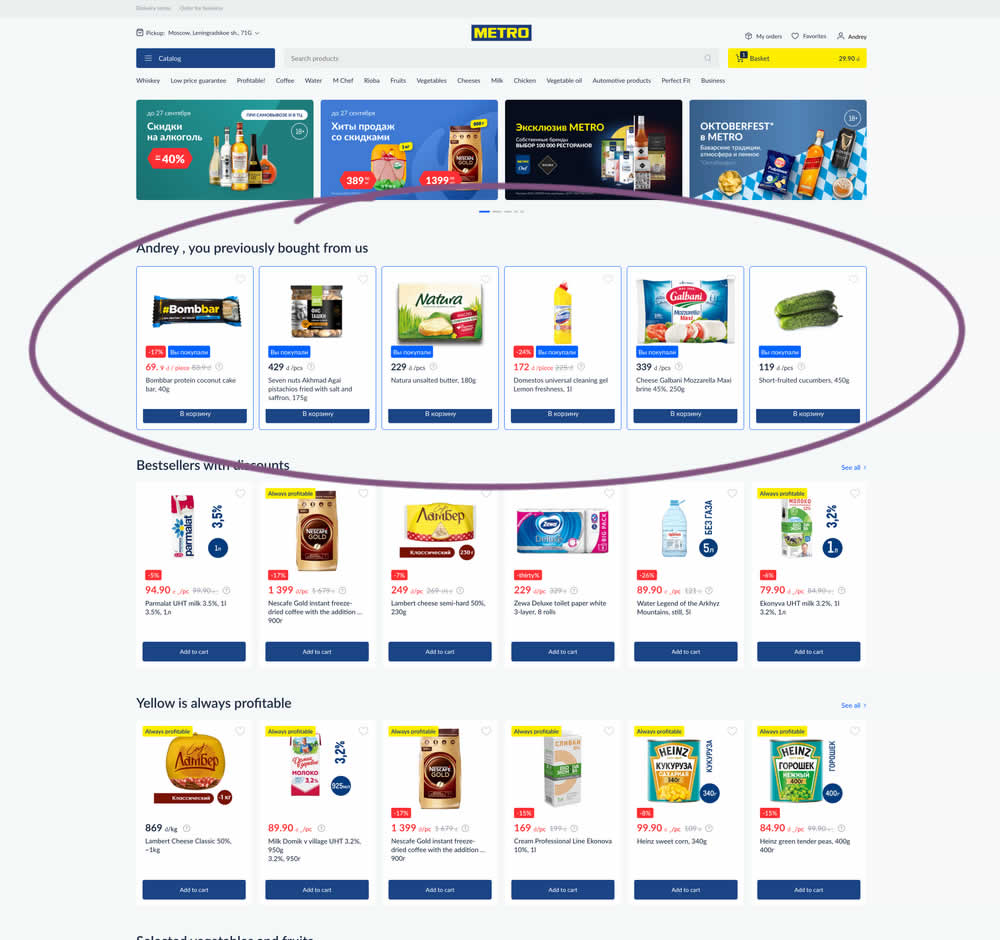
In this experiment, recently purchased products were appended at the top of the homepage. The test ran for loggedin users only. Impact on add-to-cart, sales and revenue was measured.
Test #474 on
Rollbar.com
by
 Mike Smith
May 27, 2023
Desktop
Mobile
Home & Landing
Mike Smith Tested Pattern #4: Testimonials In Test #474 On Rollbar.com
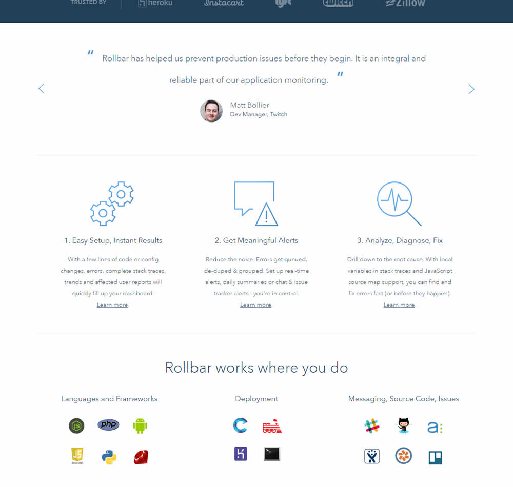
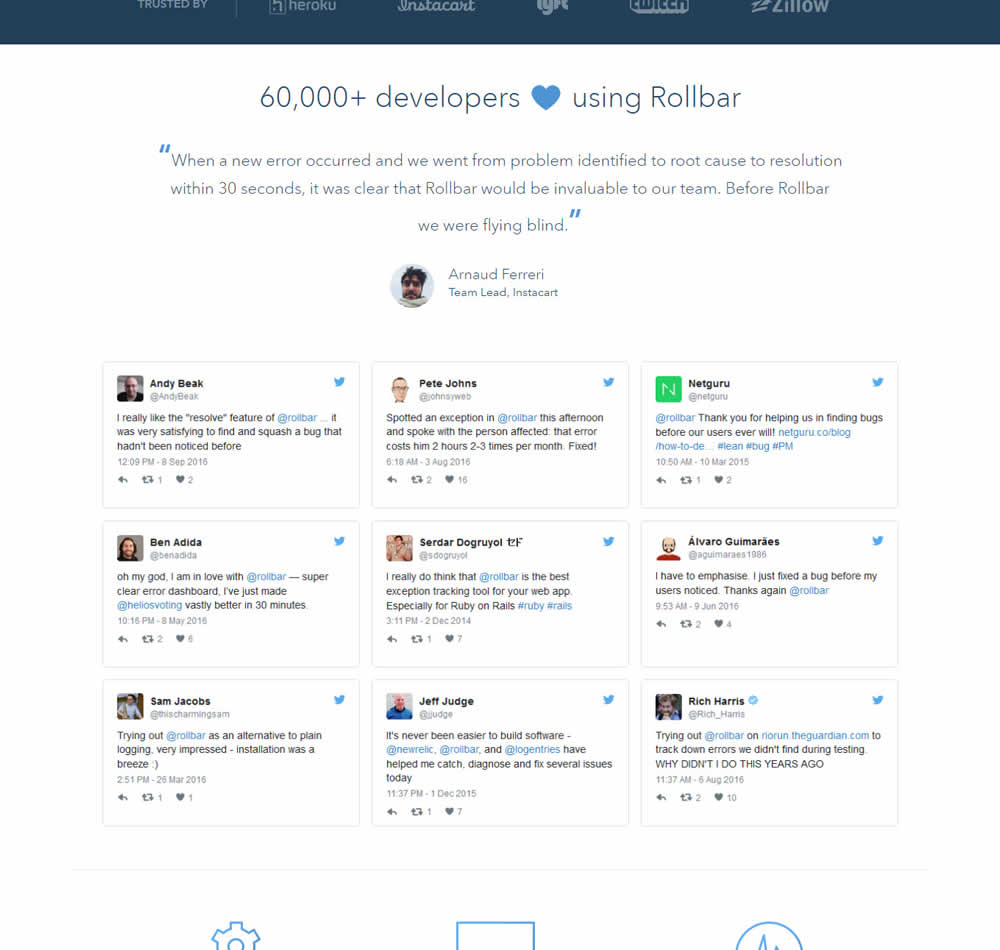
In this experiment, 9 Twitter card style testimonials were appended onto the homepage of Rollbar. These were image / screenshots recreations without links to the actual tweets.
Test #473 on
by
 Jakub Linowski
May 26, 2023
Desktop
Home & Landing
Jakub Linowski Tested Pattern #19: Benefit Testimonials In Test #473
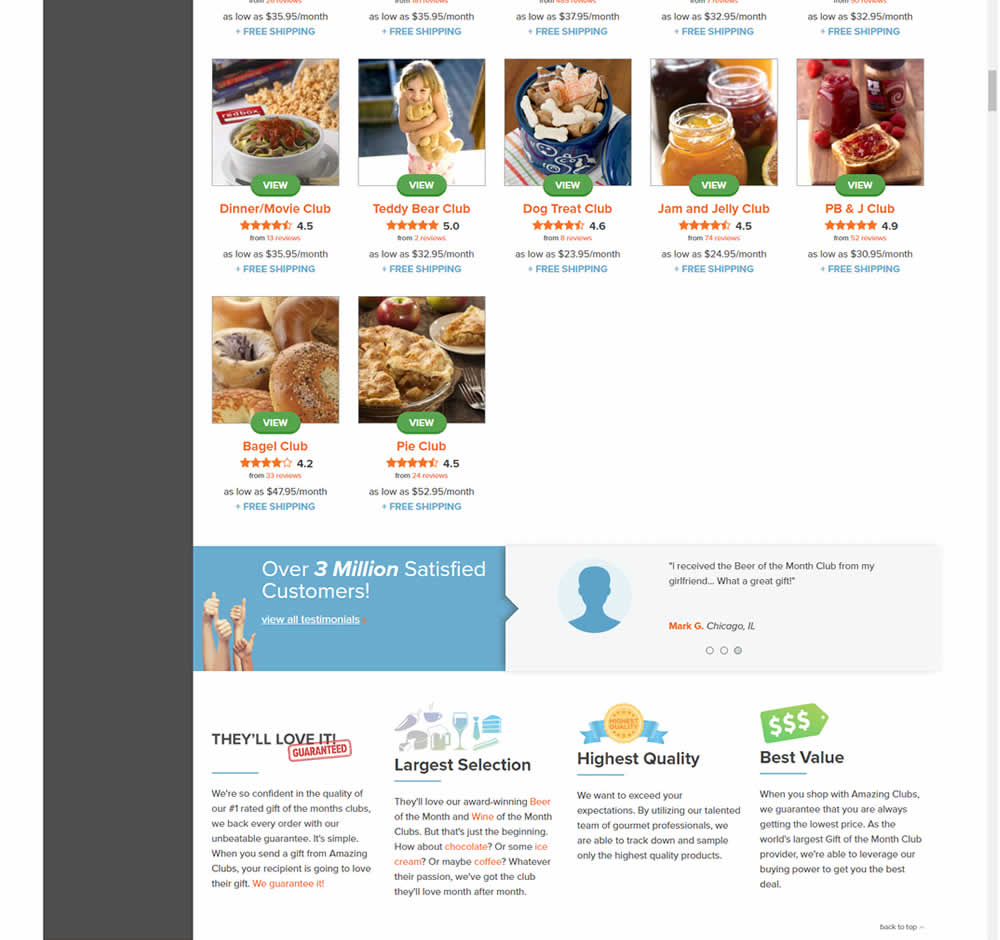
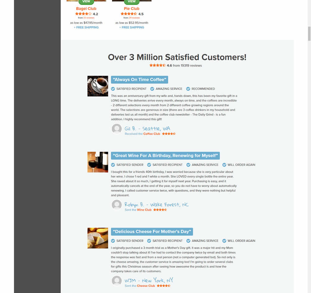
In this experiment, very short form testimonials (with a reference to over 3 million customers) were replaced with 3 more elaborate ones. These elaborate or benefit testimonials contained: highlighted statements, star reviews, emphasized location, tag summaries and photos of the purchased product. The control also contained a 3 testimonial carousel interaction.
This test appeared at the bottom of a longer homepage with additional product listings above.
Test #471 on
Expertinstitute.com
by
 Ardit Veliu
May 25, 2023
Desktop
Mobile
Home & Landing
Ardit Veliu Tested Pattern #48: Video Testimonials In Test #471 On Expertinstitute.com
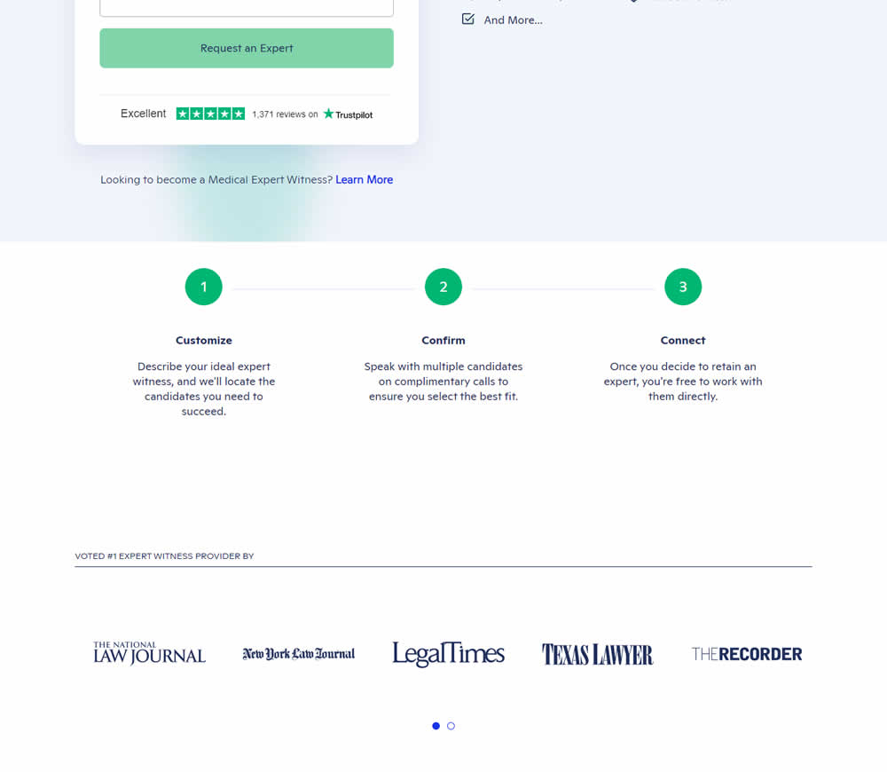
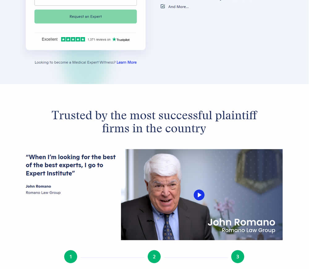
In this experiment, a video testimonial was added mid page onto a signup / lead form page.
Test #472 on
Expertinstitute.com
by
 Ardit Veliu
May 25, 2023
Desktop
Mobile
Home & Landing
Ardit Veliu Tested Pattern #48: Video Testimonials In Test #472 On Expertinstitute.com

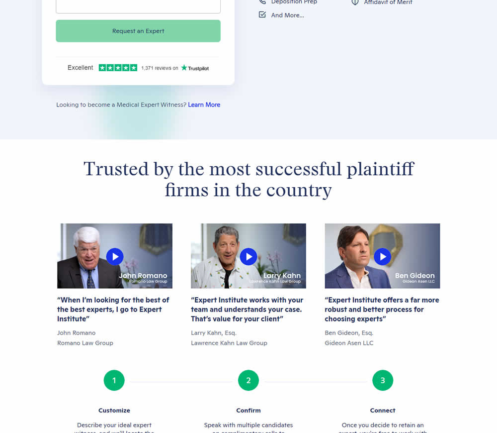
In this experiment, three video testimonials were added mid page onto a signup / lead form page.
Test #468 on
Umbraco.com
by
 Lars Skjold Iversen
Apr 28, 2023
Desktop
Mobile
Home & Landing
Lars Skjold Iversen Tested Pattern #6: Customer Star Ratings In Test #468 On Umbraco.com
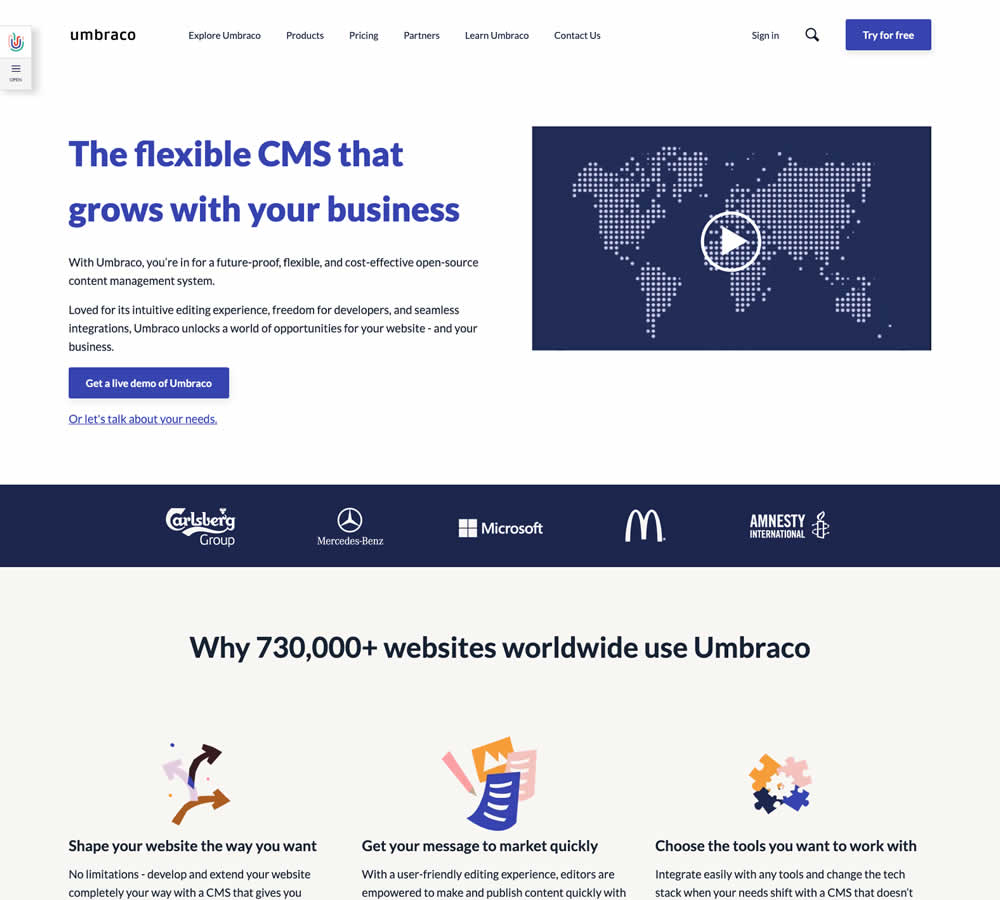
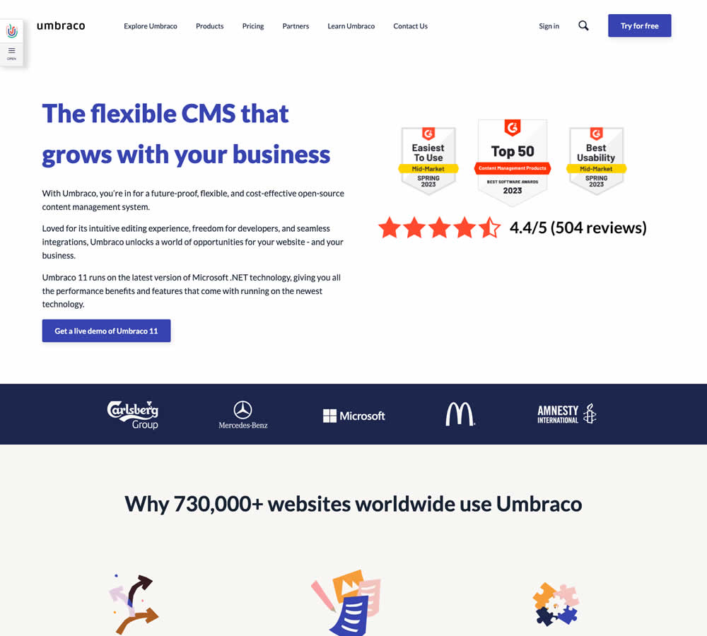
In this homepage experiment a number of changes were introduced - with perhaps the most prominent one being the replacement of a video component with customer review badges. Additional copy changes included reinforcement of the latest version number (v11) throughout the page, as well as a dedicated (v11) section in the middle of the page. Impact on demo signups was measured.
Test #464 on
Expertinstitute.com
by
 Ardit Veliu
Mar 31, 2023
Desktop
Mobile
Home & Landing
Ardit Veliu Tested Pattern #7: Social Counts In Test #464 On Expertinstitute.com
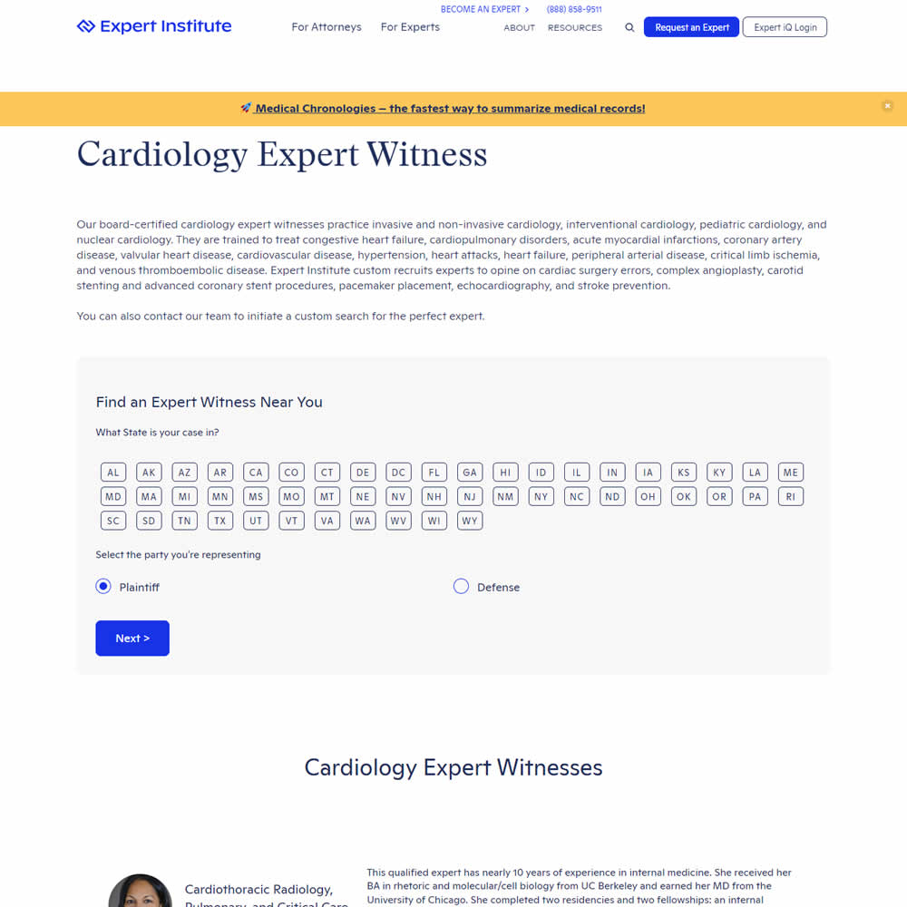
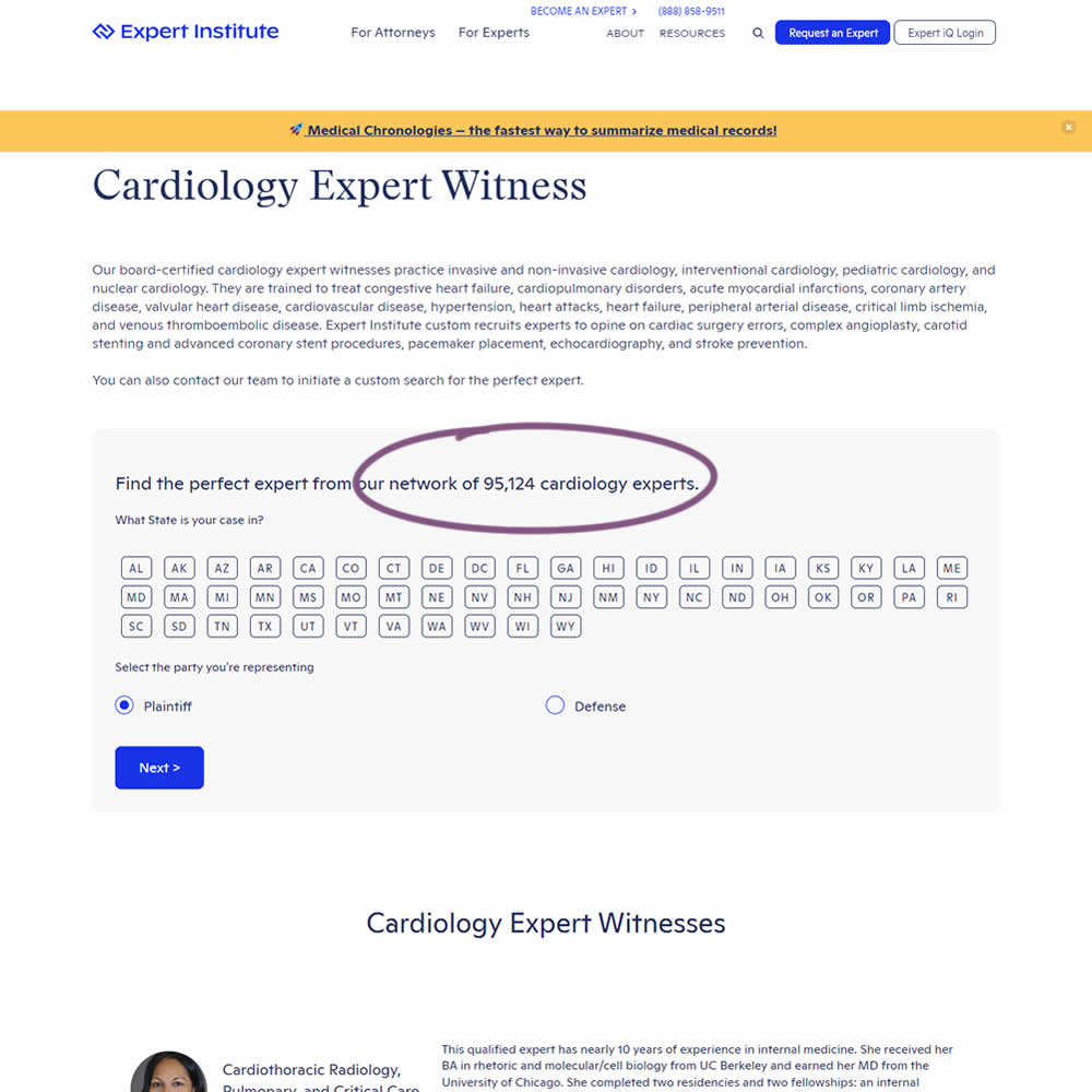
In this experiment, copy was added which showed the number of experts (in a given category) a person may gain access to after filling out a lead form. The context of this is a lead-gen landing page where people are seeking experts for legal purposes. Impact on initial progression (of a multi step form) and completed leads was measured.
Test #455 on
Expertinstitute.com
by
 Ardit Veliu
Feb 16, 2023
Desktop
Mobile
Home & Landing
Ardit Veliu Tested Pattern #117: Company Logos In Test #455 On Expertinstitute.com
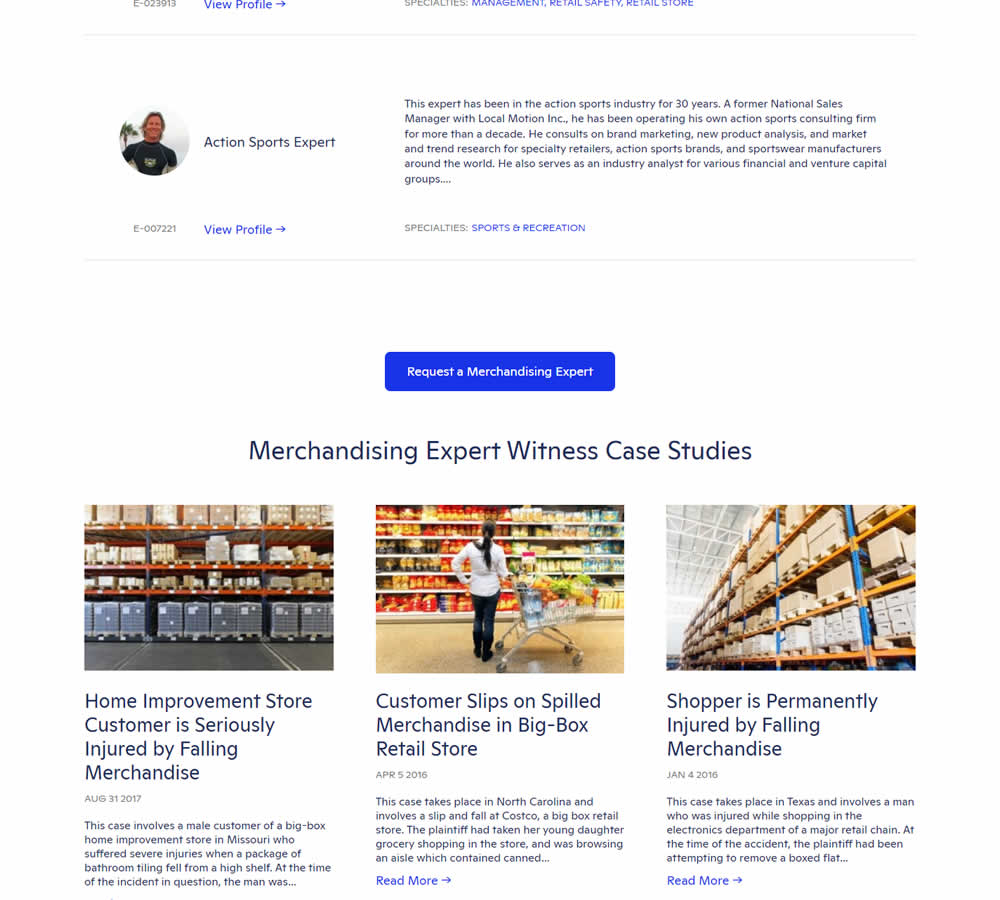
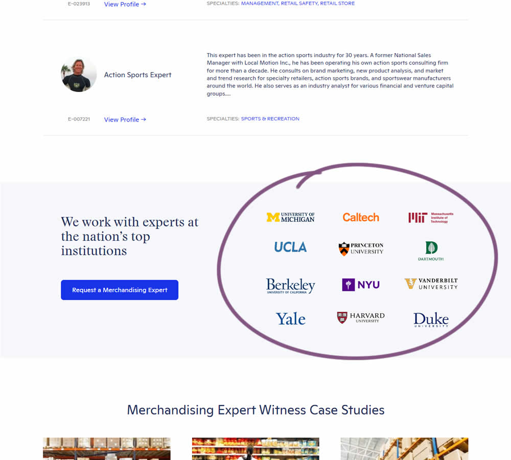
In this experiment, supporting university logos were appended near the primary call to action for additional credibility. These logos were placed around the middle of long landing pages on Expert Institute's web site (where experts for legal advice are searched). Impact on total leads was measured.
Test #445 on
Phorest.com
by
 Sorcha Mullis
Dec 14, 2022
Desktop
Mobile
Home & Landing
Sorcha Mullis Tested Pattern #33: Example Situations In Test #445 On Phorest.com
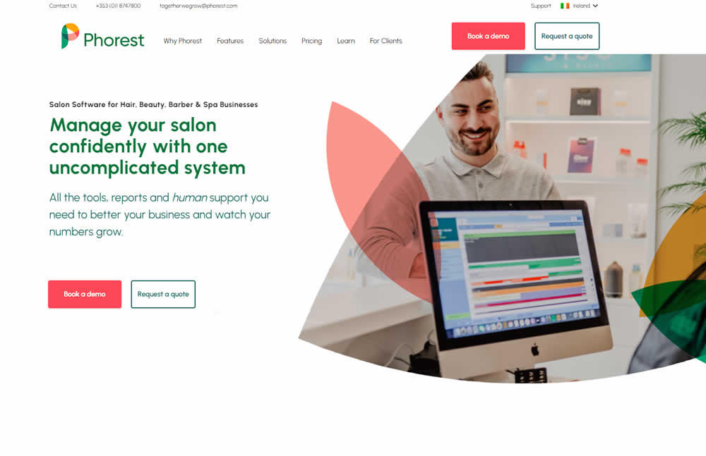
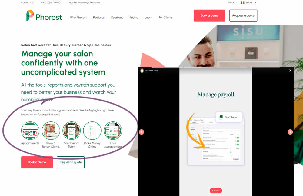
In this experiment, five clickable feature elements were surfaced on the homepage. Clicking on any of these 5 elements launched an Instastory-like short 10 second video in full screen. These videos explained the key features of the software being offered. Impact on lead generation was measured.