All Latest 556 A/B Tests
Become a member to unlock the abiltiy to see the highest impact a/b tests. Being able to see the actual test results and sort by impact allows growth and experimentation teams to take action on the biggest gains first
MOST RECENT TESTS
Test #504 on
Volders.de
by
Michal Fiech
Nov 17, 2023
Desktop
Mobile
Pricing
Michal Fiech Tested Pattern #113: More Or Fewer Plans In Test #504 On Volders.de
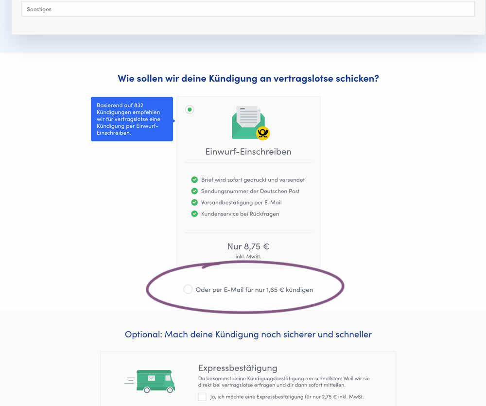
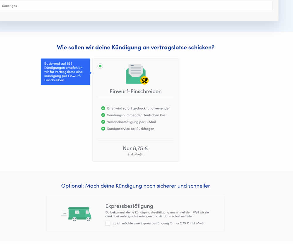
In this experiment, the cheapest pricing plan was removed from a set of 2 options. This only left the most expensive pricing plan as the option. Impact on sales and revenue was measured.
Test #501 on
Volders.de
by
 Daria Kurchinskaia
Nov 02, 2023
Desktop
Mobile
Pricing
Daria Kurchinskaia Tested Pattern #132: One Time Payment Copy In Test #501 On Volders.de
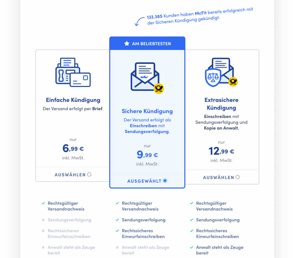
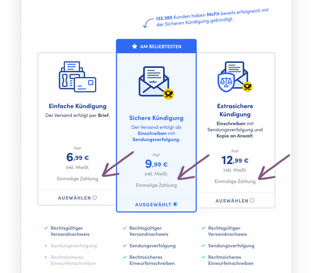
In this experiment, the wording "one-time payment" was appended below all three pricing plans for a contract cancelation service. Impact on orders placed was measured. (Translated from German: "Einmalige Zahlung").
Test #487 on
Learnwithhomer.com
by
 Stanley Zuo
Aug 10, 2023
Mobile
Pricing
Stanley Zuo Tested Pattern #78: Tags, Badges And Structured Information In Test #487 On Learnwithhomer.com
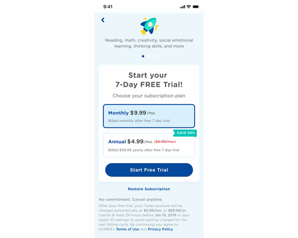
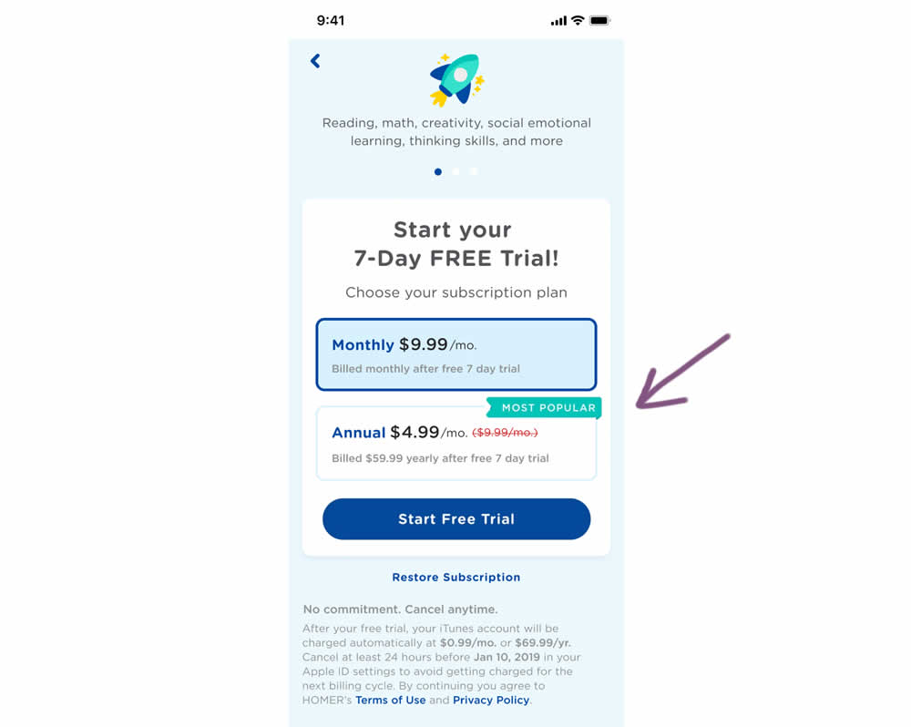
In this experiment, a "save 50%" badge was replaced with a "most popular" one with the intent of encouraging more users to select the higher priced plan. Impact on total and annual trial starts was measured.
Test #431 on
Volders.de
by
 Daria Kurchinskaia
Sep 23, 2022
Desktop
Mobile
Pricing
Daria Kurchinskaia Tested Pattern #21: What It's Worth In Test #431 On Volders.de
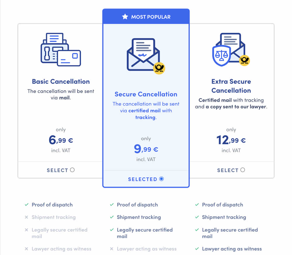
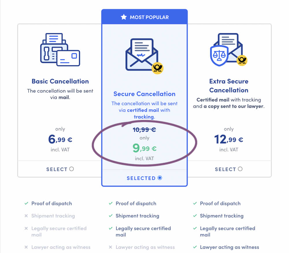
In this experiment, a historically higher price point was added as a crossed out anchor. The control only showed the current price. The variation showed the current price with the higher price crossed out. Impact on sales was measured.
Test #386 on
Learnwithhomer.com
by
 Stanley Zuo
Nov 29, 2021
Desktop
Pricing
Stanley Zuo Tested Pattern #112: Lower Price Frames In Test #386 On Learnwithhomer.com
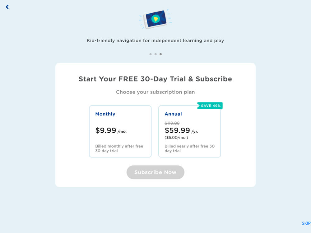
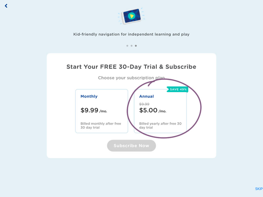
In this experiment, the annual plan was standardized and framed in a monthly price context (during the iOS signup flow). This made the annual plan more comparable to the monthly plan price. Impact on overall sales and annual plan sales was measured.
Test #379 on
Learnwithhomer.com
by
 Stanley Zuo
Oct 15, 2021
Mobile
Pricing
Stanley Zuo Tested Pattern #112: Lower Price Frames In Test #379 On Learnwithhomer.com
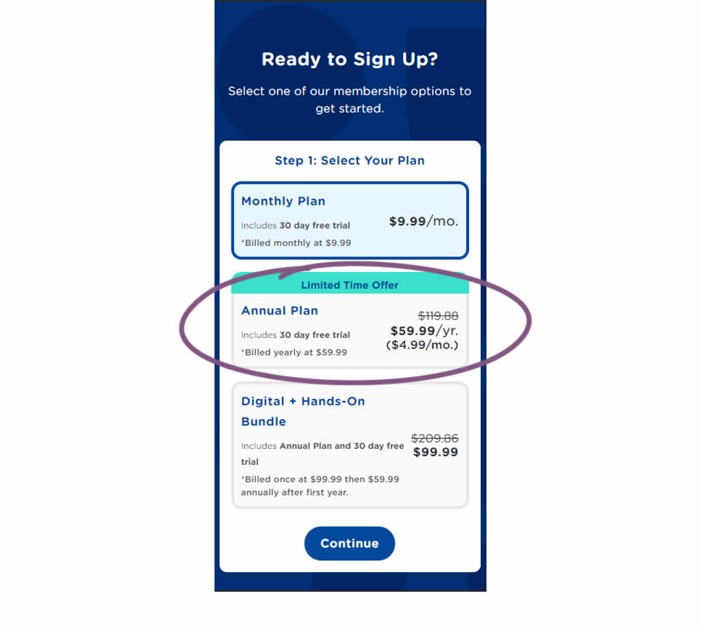
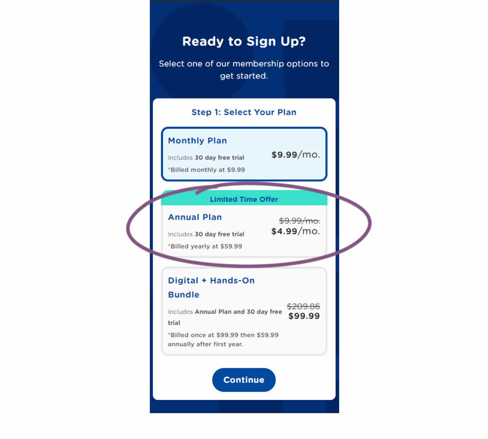
In this experiment, the annual plan was standardized and framed in a monthly price context. This was more comparable with the monthly plan price above. Please also note that the annual billing price was also kept and clearly stated. Impact on overall sales and annual plan sales was measured.
Test #357 on
Baremetrics.com
by
 Brian Sierakowski
Jun 02, 2021
Desktop
Mobile
Pricing
Brian Sierakowski Tested Pattern #113: More Or Fewer Plans In Test #357 On Baremetrics.com
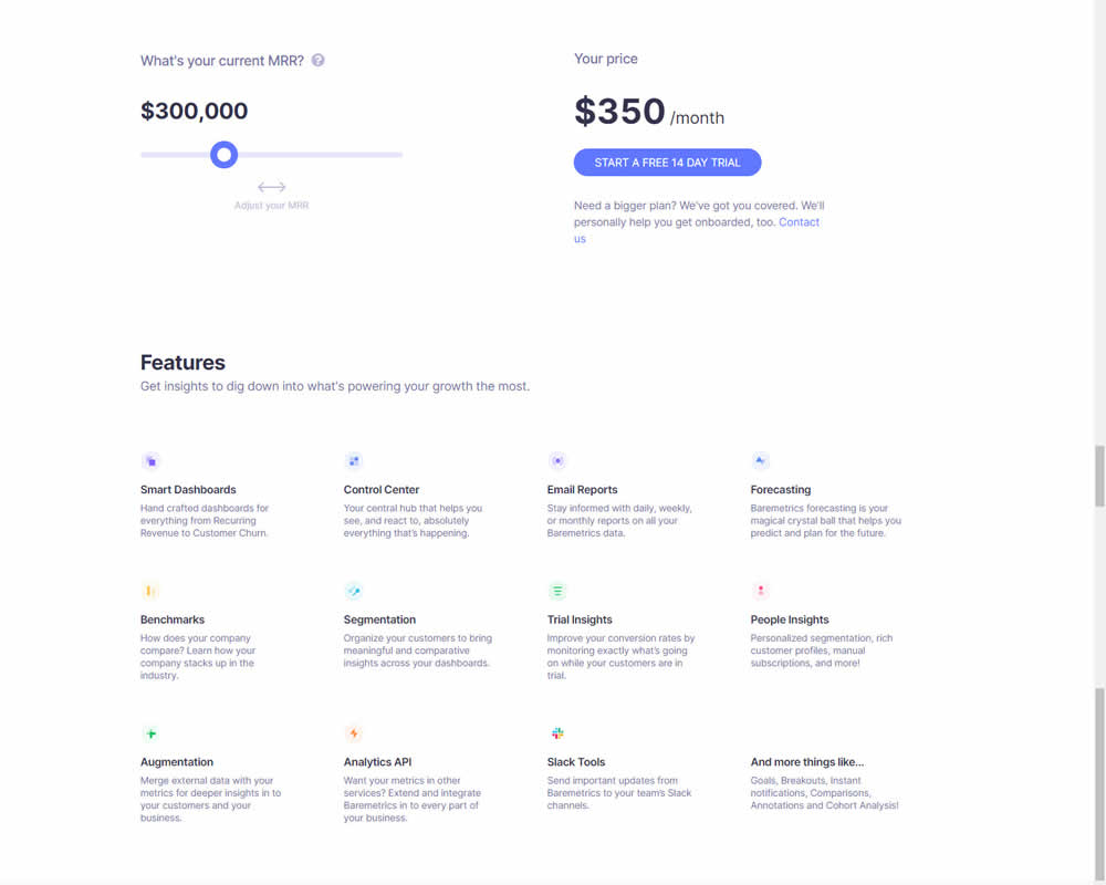
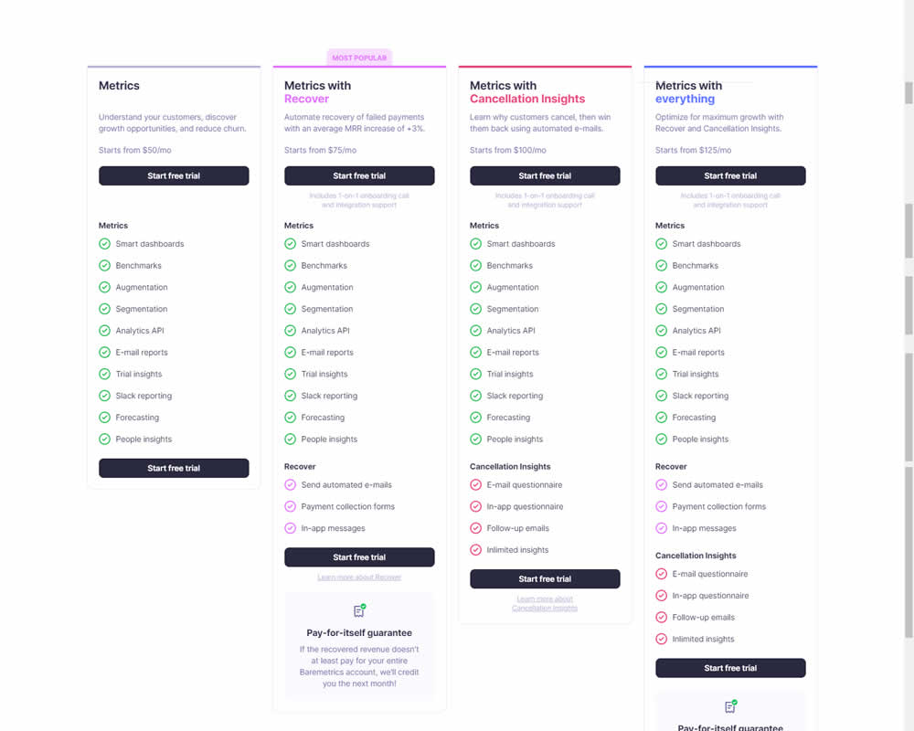
In this experiment, a single focus signup was transformed into a pricing comparison table. Impact on signups was measured.
Test #319 on
Backstage.com
by
 Stanley Zuo
Sep 30, 2020
Desktop
Pricing
Stanley Zuo Tested Pattern #113: More Or Fewer Plans In Test #319 On Backstage.com
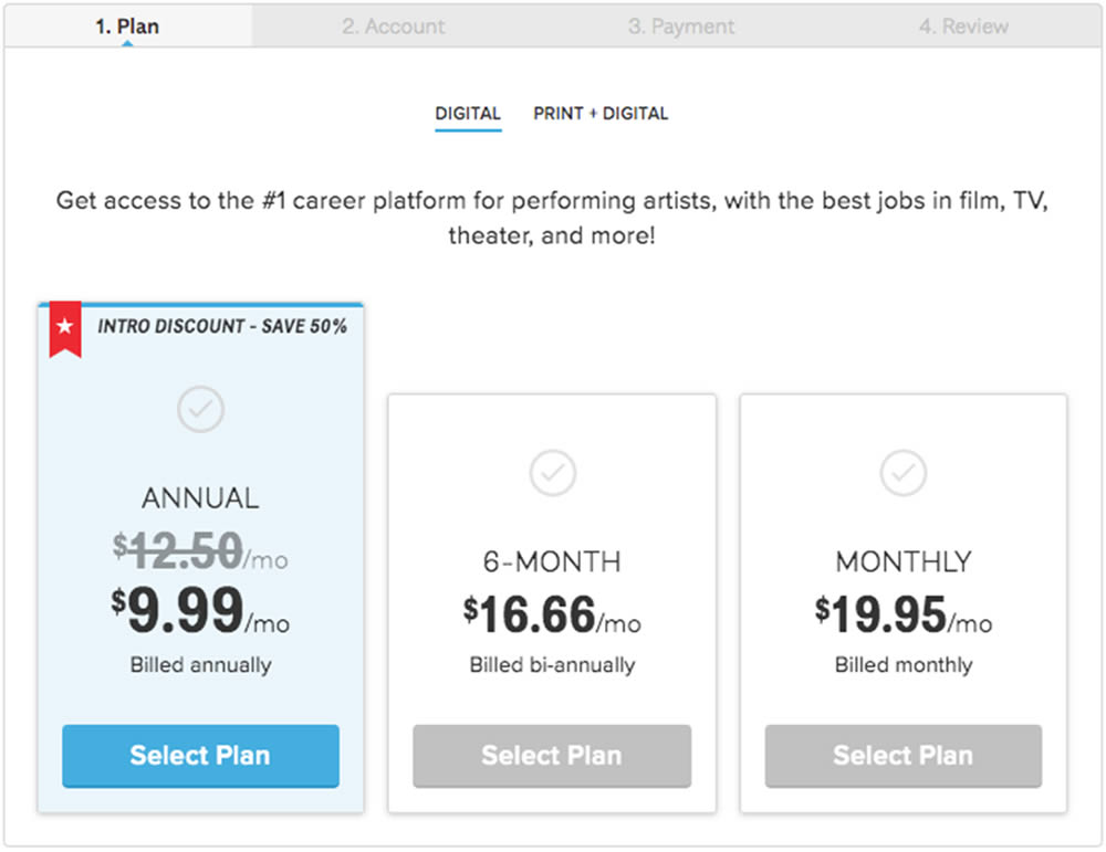
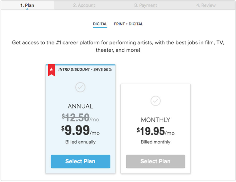
In this experiment, a 3 plan vs 2 plan pricing page was shown to potential customers. Impact on sales and revenue were measured.
Test #306 on
Backstage.com
by
 Stanley Zuo
Jul 09, 2020
Desktop
Mobile
Pricing
Stanley Zuo Tested Pattern #69: Autodiscounting In Test #306 On Backstage.com
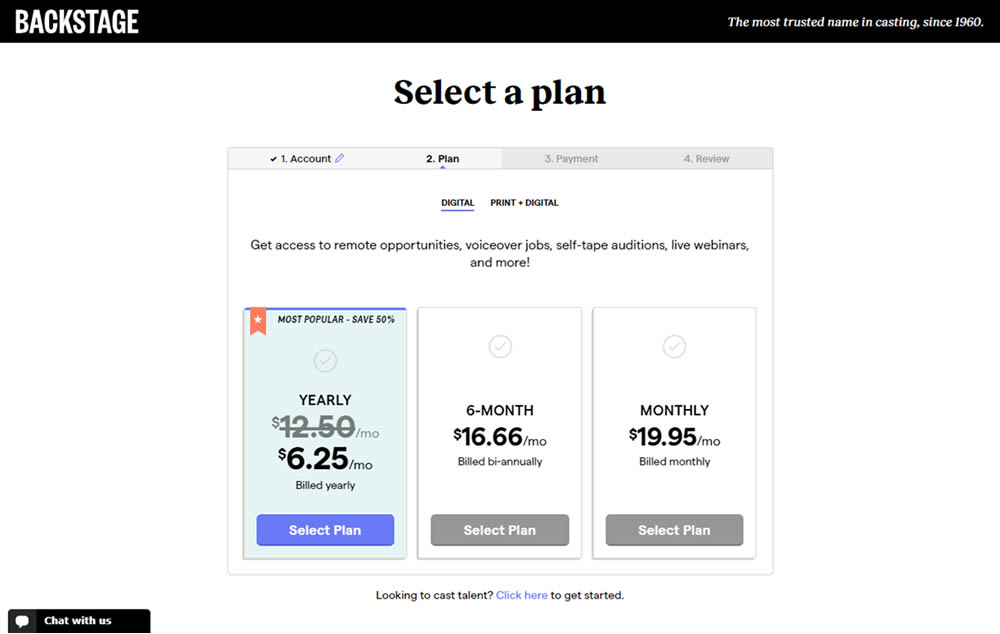
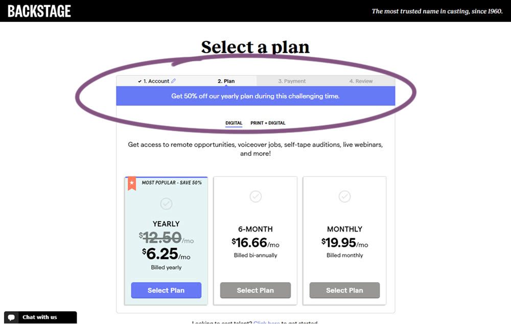
In this experiment, the only change was an added message at the top of the pricing screen, clarifying that there is an active discount on a yearly plan. The discount was already communicated with a strike-through price on the control version as well. The variation simply emphasized this aggressively.
Test #294 on
Umbraco.com
by
 Lars Skjold Iversen
Apr 23, 2020
Desktop
Pricing
Lars Skjold Iversen Tested Pattern #115: Pricing Comparison Table In Test #294 On Umbraco.com
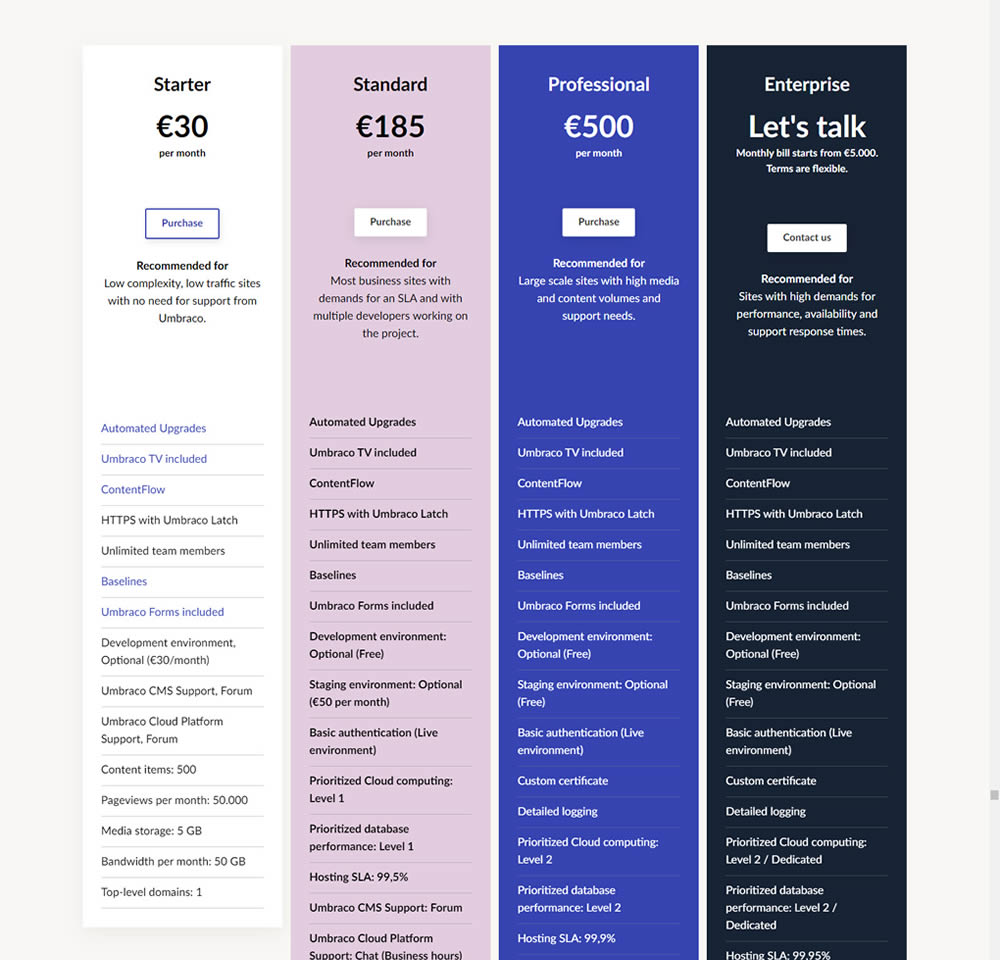
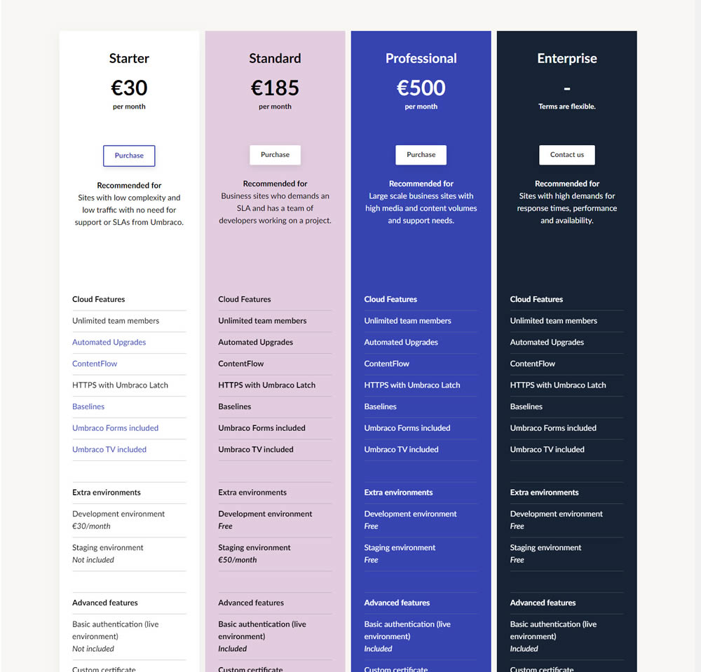
In this experiment, plan properties on a pricing page were horizontally aligned (for easier comparison). More so, labels and values were also broken on separate lines.
Test #289 on
Prepagent.com
by
 Arthur Sparks
Mar 23, 2020
Desktop
Pricing
Arthur Sparks Tested Pattern #17: Least Or Most Expensive First In Test #289 On Prepagent.com
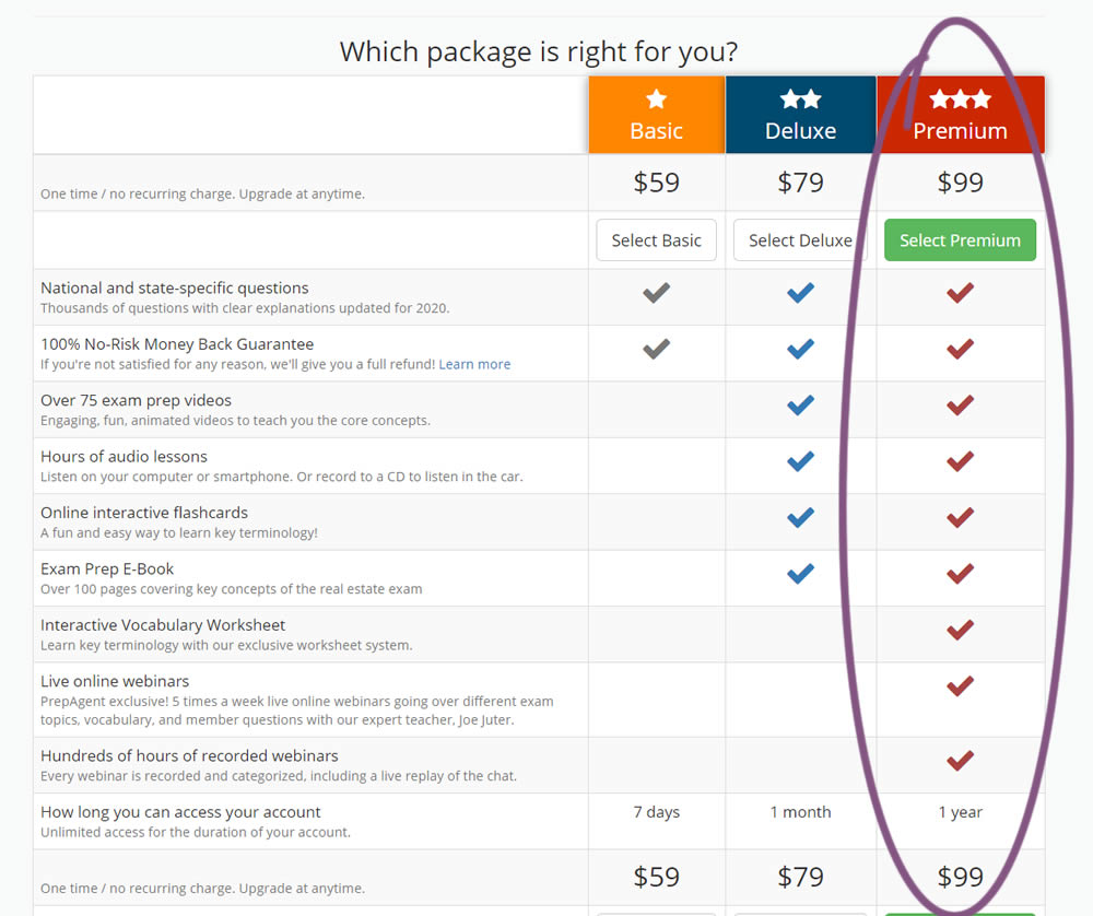
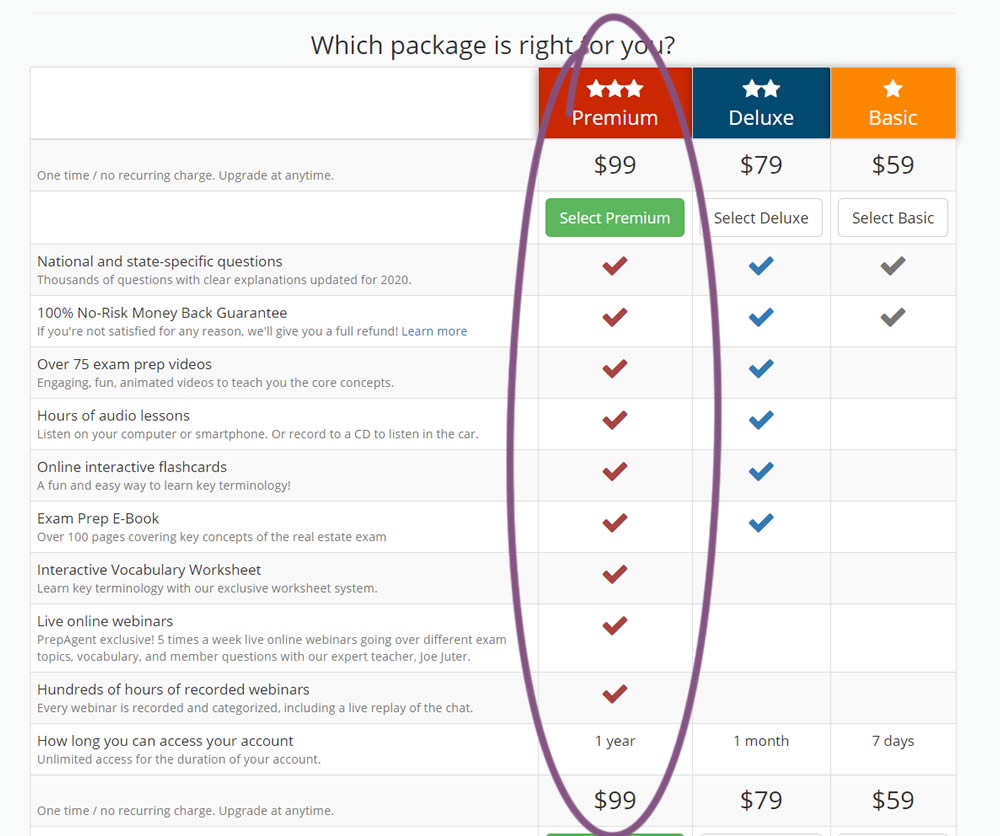
In this experiment, the order of pricing plans was rearranged as to show the most expensive one first.
Test #290 on
Prepagent.com
by
 Arthur Sparks
Mar 23, 2020
Desktop
Pricing
Arthur Sparks Tested Pattern #14: Exposed Menu Options In Test #290 On Prepagent.com
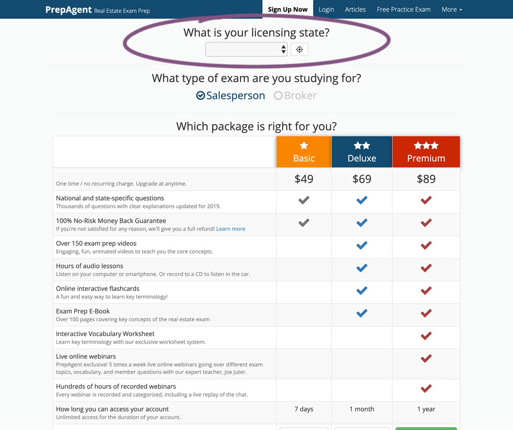
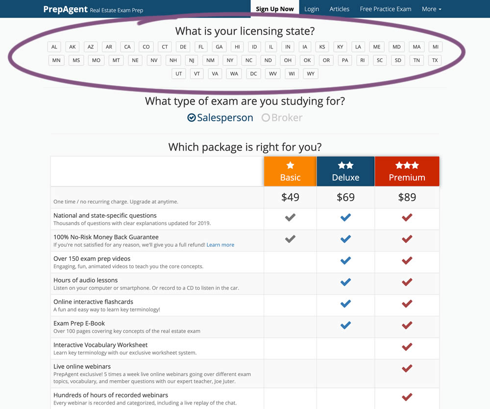
In this experiment, a simple pulldown menu (for US state selection) was replaced with all state options shown as selectable buttons. The states were also abbreviated.
Test #287 on
Goodui.org
by
 Jakub Linowski
Mar 04, 2020
Desktop
Mobile
Pricing
Jakub Linowski Tested Pattern #117: Company Logos In Test #287 On Goodui.org
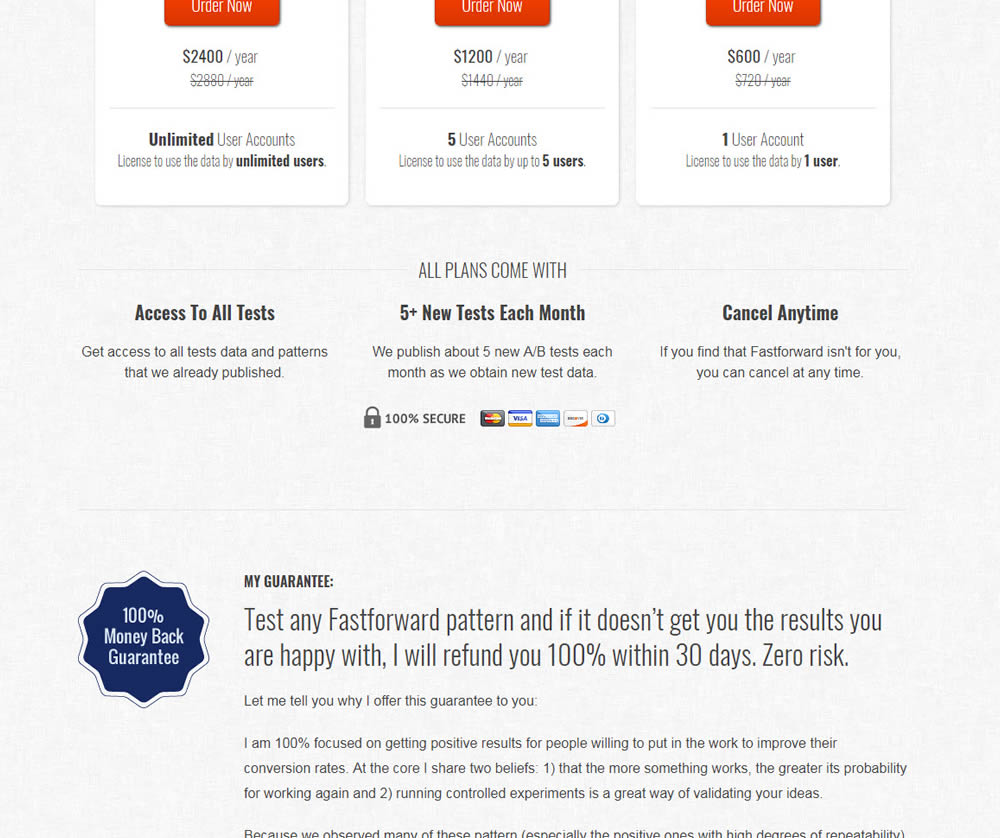
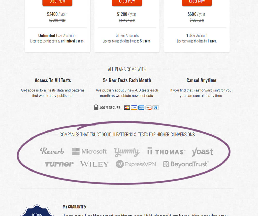
In this experiment, a handful of customers and contributors from GoodUI were added on a pricing page to test the effect on sales.
Test #277 on
Prepagent.com
by
 Arthur Sparks
Jan 03, 2020
Desktop
Pricing
Arthur Sparks Tested Pattern #115: Pricing Comparison Table In Test #277 On Prepagent.com
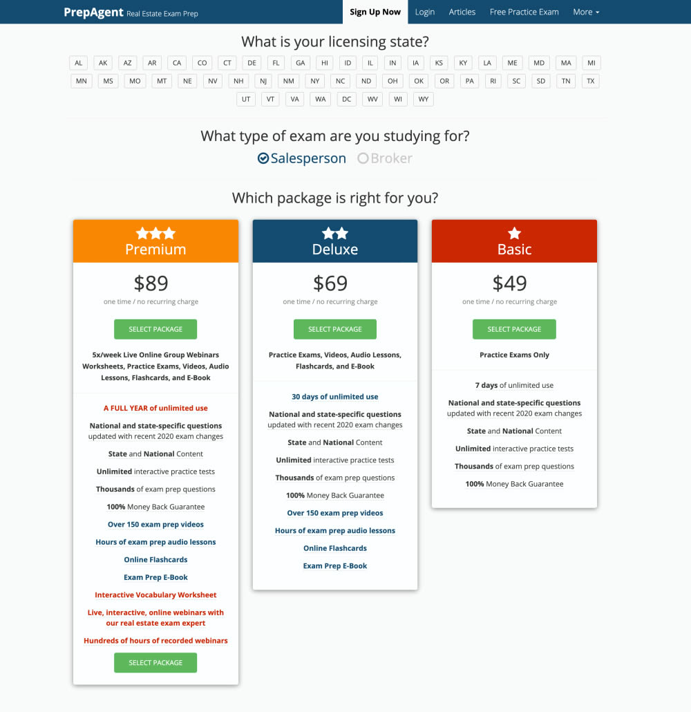
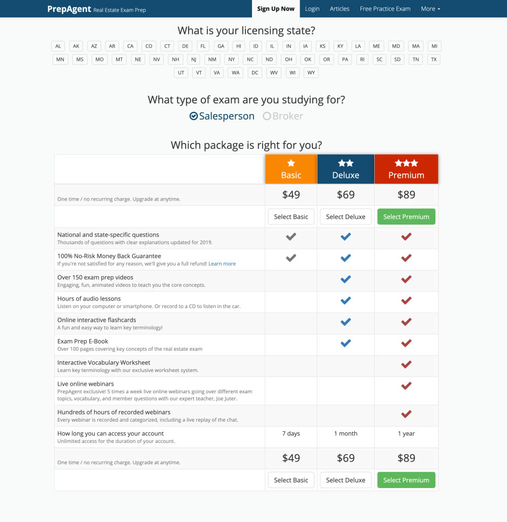
In this experiment, side-by-side plan features were aligned and changed to a comparison table with checkmarks for easier comparison.
Test #275 on
Prepagent.com
by
 Arthur Sparks
Dec 31, 2019
Desktop
Pricing
Arthur Sparks Tested Pattern #114: Less Or More Visible Prices In Test #275 On Prepagent.com
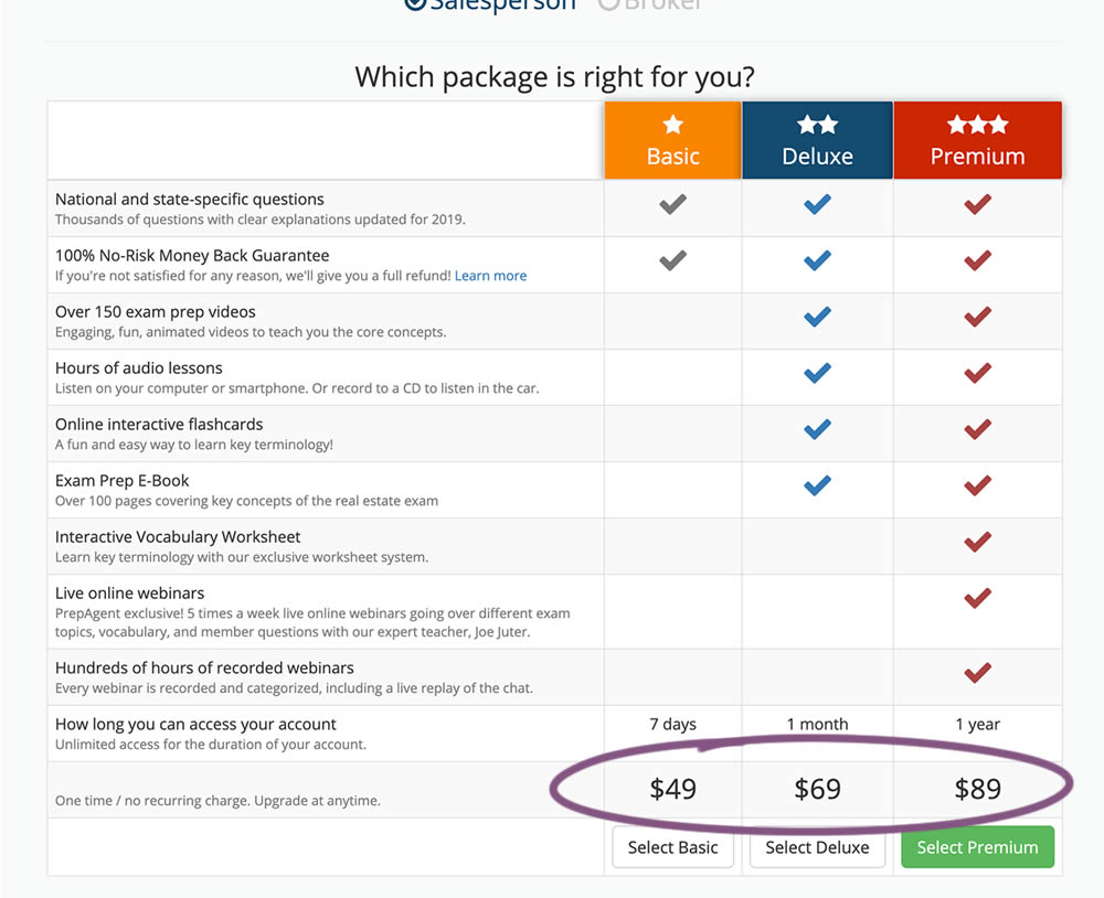
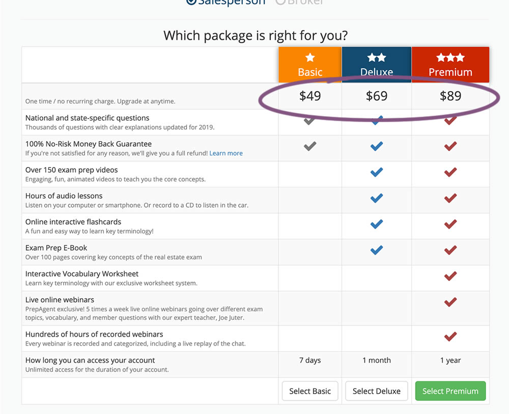
In this experiment, all three prices of each plan were shifted higher for greater visibility.
Test #272 on
Backstage.com
by
 Stanley Zuo
Dec 03, 2019
Desktop
Pricing
Stanley Zuo Tested Pattern #113: More Or Fewer Plans In Test #272 On Backstage.com
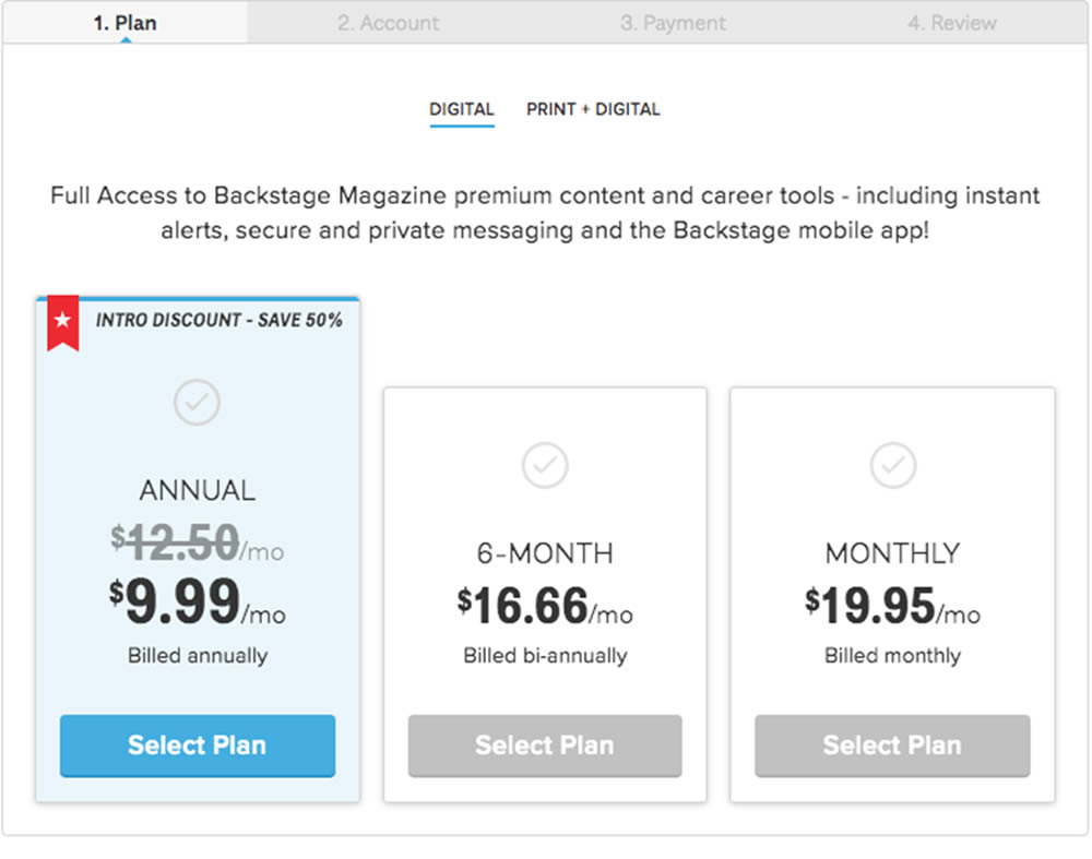
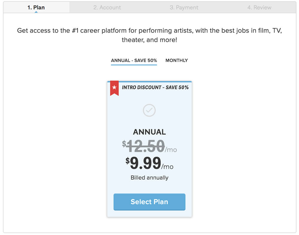
In this experiment, the three pricing plans were condensed into a single recommended plan (annual), with a secondary option to choose the monthly plan.
Test #265 on
Poll-app.com
by
 Pierre Olivier Martel
Oct 17, 2019
Desktop
Mobile
Pricing
Pierre Olivier Martel Tested Pattern #112: Lower Price Frames In Test #265 On Poll-app.com
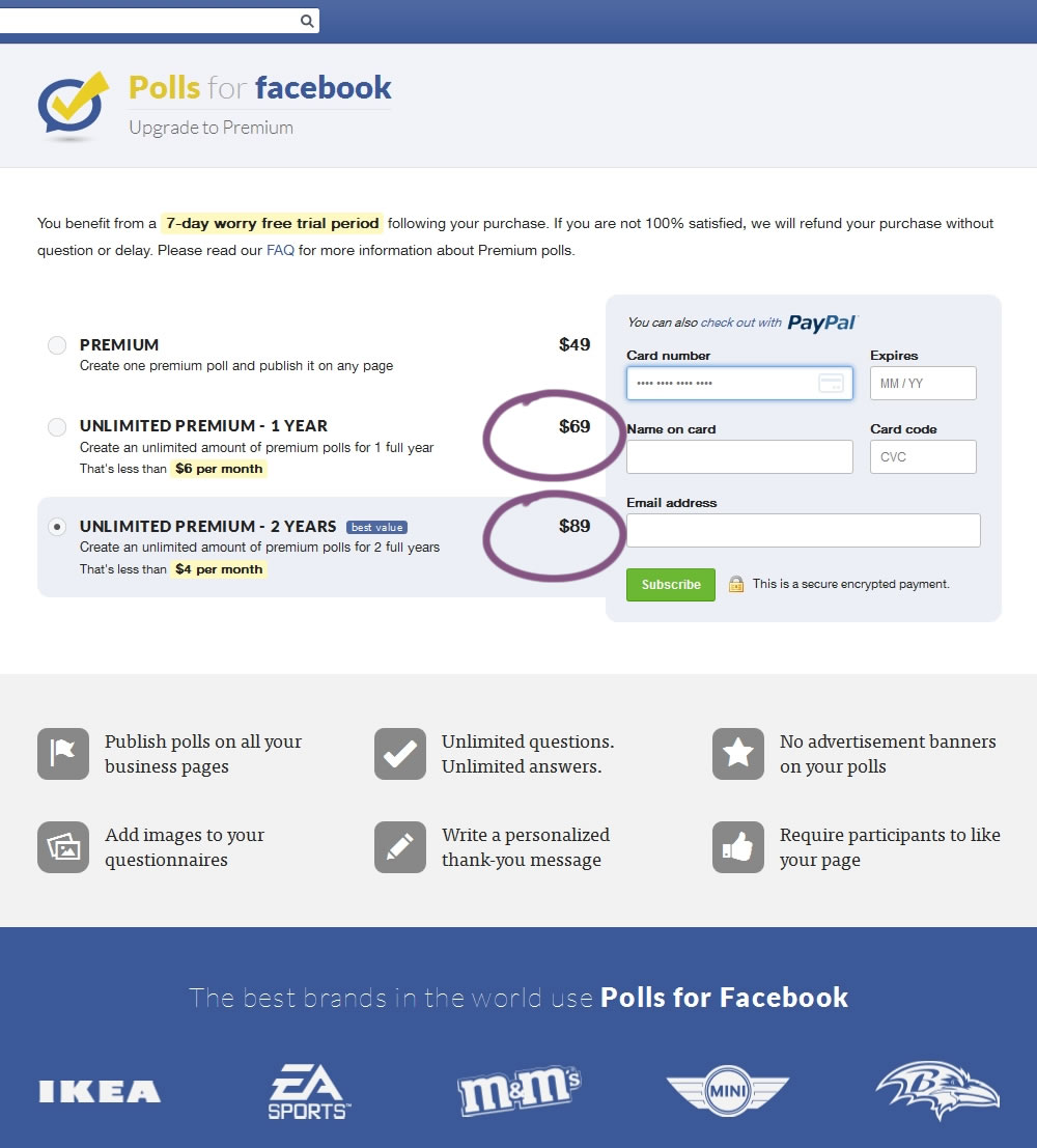
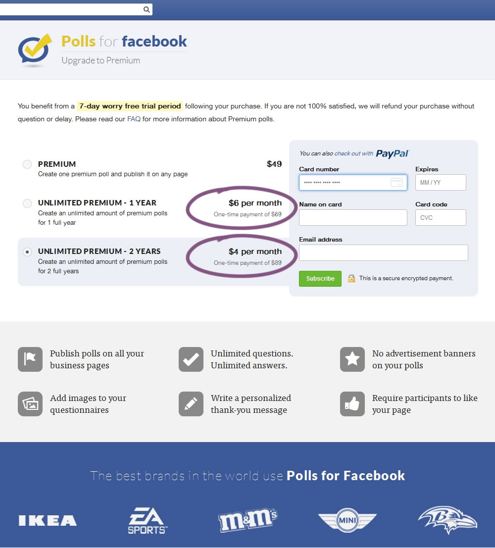
In this experiment, the $69 payment was explained as $6 per month over 1 year, and the $89 was explained as $4 per month over 2 years.
Test #139 on
Examine.com
by
 Martin Wong
Jan 04, 2018
Desktop
Pricing
Martin Wong Tested Pattern #51: Shortcut Buttons In Test #139 On Examine.com
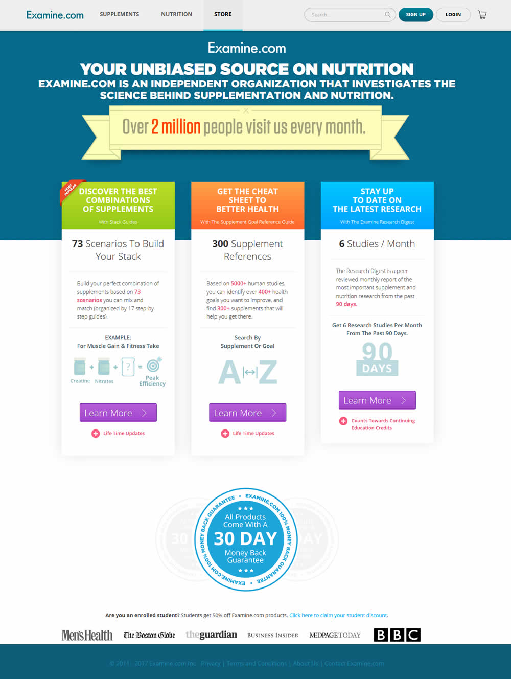
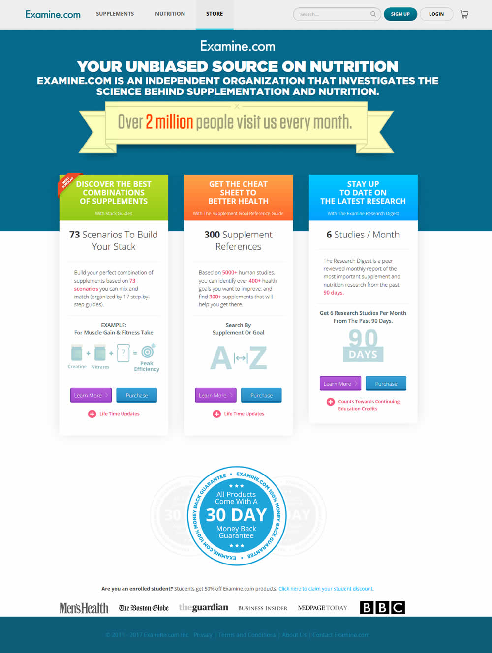
In this test an additional "Purchase" button was shown along side a "Learn More" button. The "Purchase" button went straight to checkout, whereas the "Learn More" button went to a product overview page.
Test #130 on
Kenhub.com
by
 Niels Hapke
Dec 07, 2017
Desktop
Pricing
Niels Hapke Tested Pattern #17: Least Or Most Expensive First In Test #130 On Kenhub.com
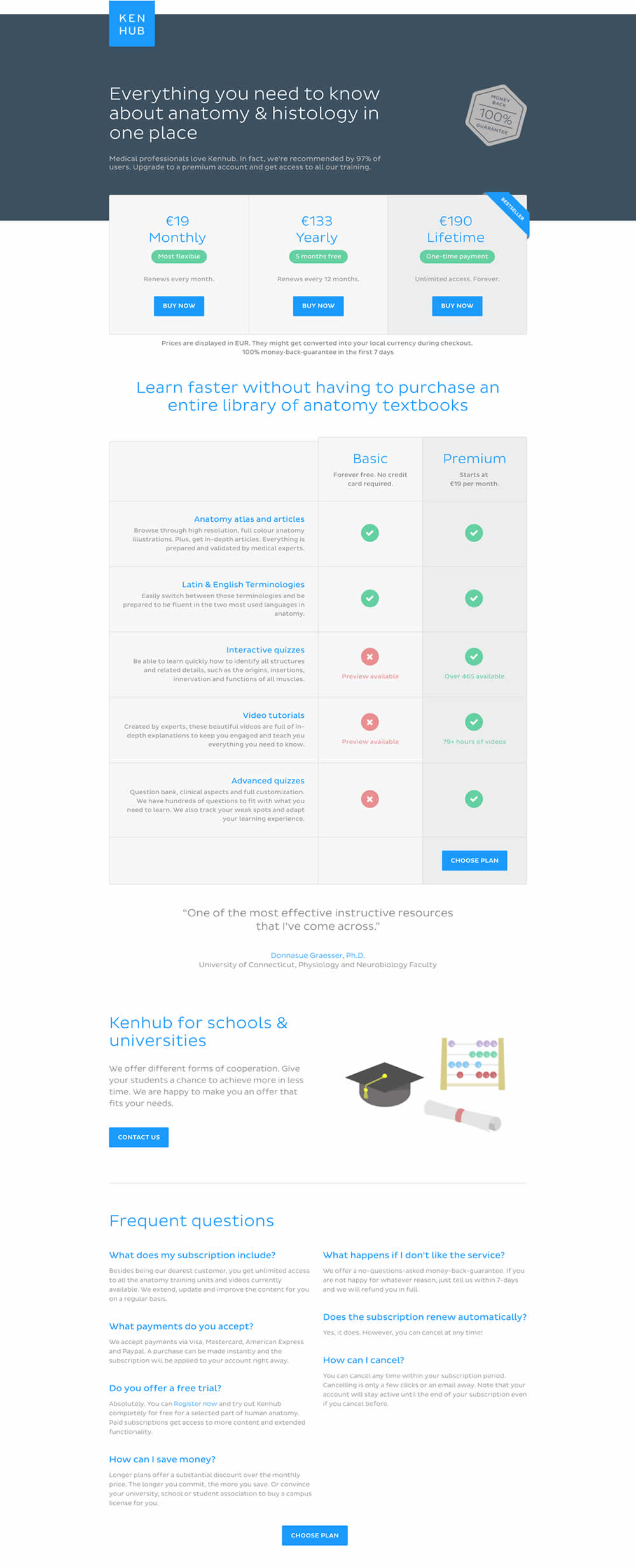
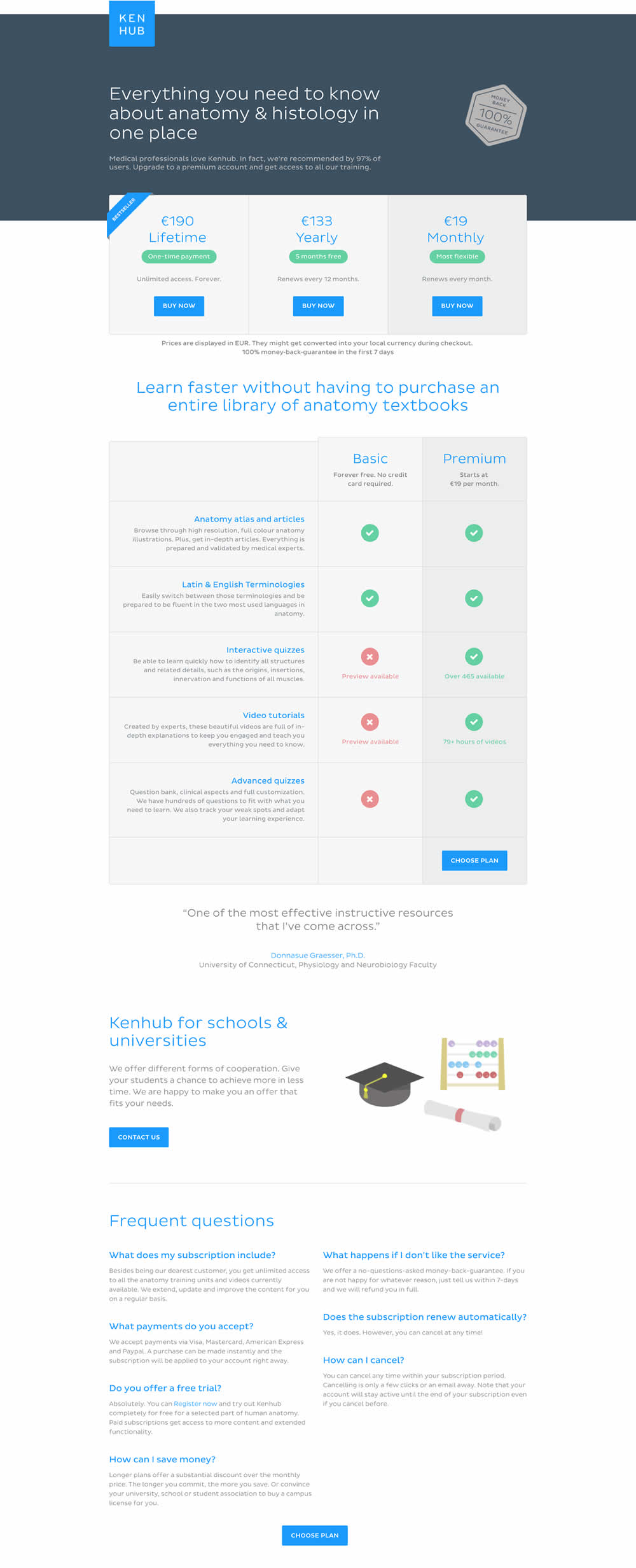
In this experiment, the plans were sorted by the most expensive first, left to right (variation).
Test #70 on
Uptowork.com
by
 Kuba Koziej
Nov 01, 2016
Desktop
Pricing
Kuba Koziej Tested Pattern #17: Least Or Most Expensive First In Test #70 On Uptowork.com
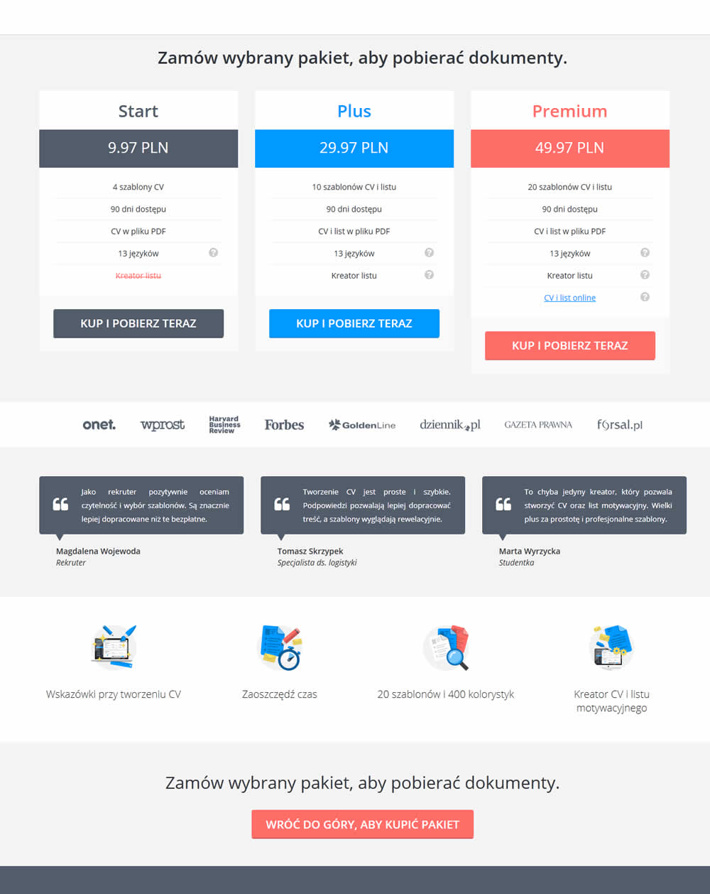
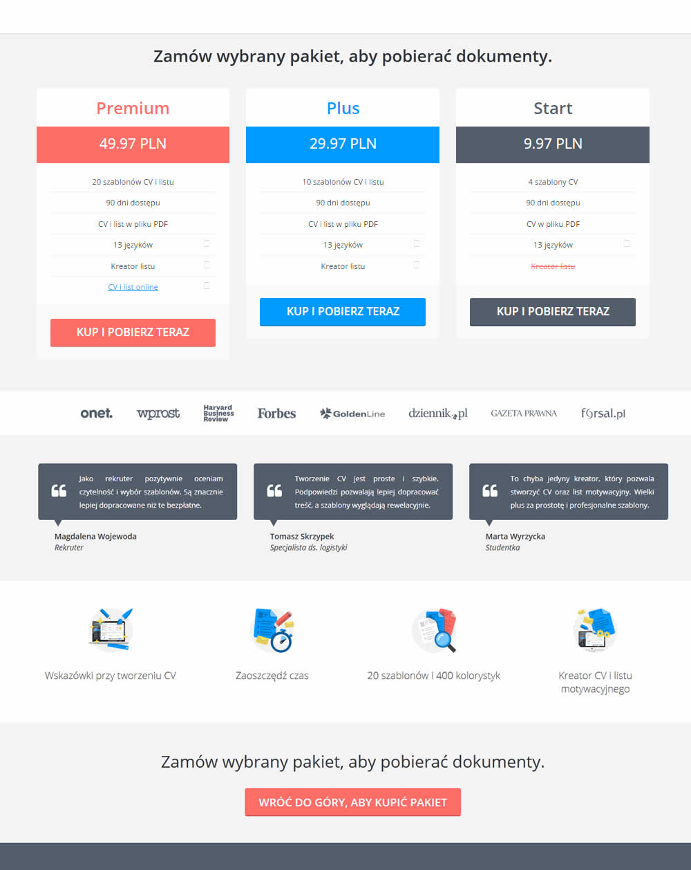
This test simply ordered the pricing plans from highest to most expensive. Overall sales decreased by an insignificant -1% with a possible +14% increase to the most expensive plan. The net effect was an insignificant 0.9% increase the the premium plans.