6 Tests By  Michal Fiech
Tests
Test #504 on
Volders.de
by
Michal Fiech
Nov 17, 2023
Desktop
Mobile
Michal Fiech Tested Pattern #113: More Or Fewer Plans In Test #504 On Volders.de
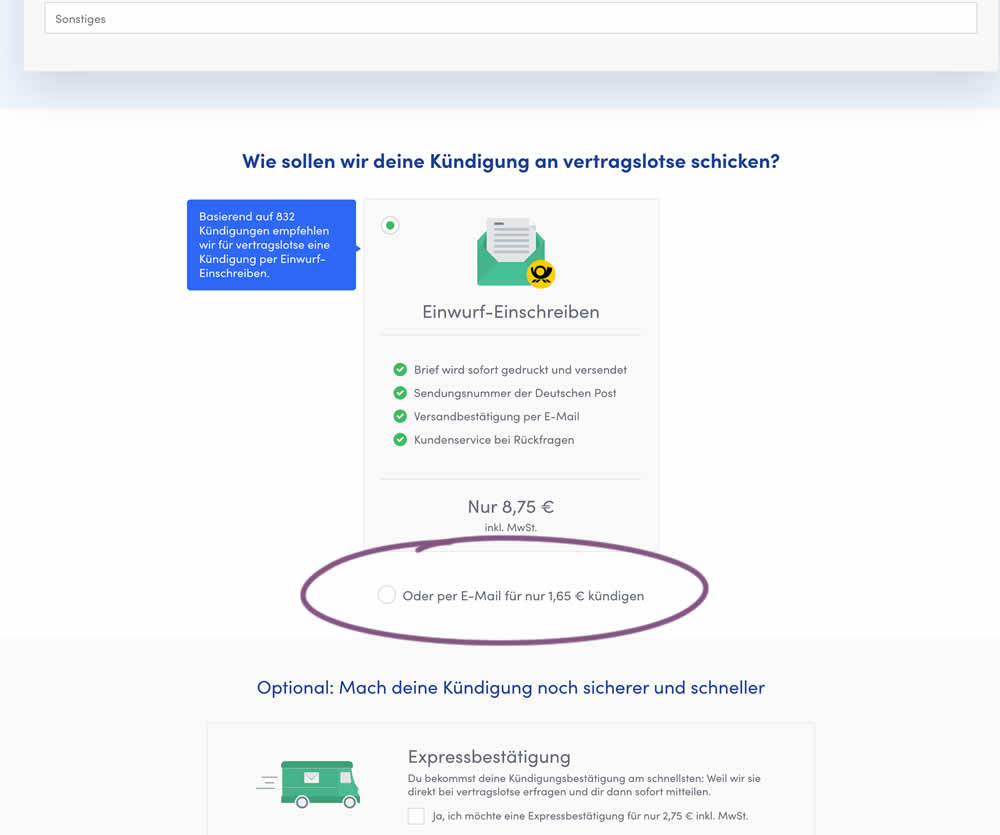
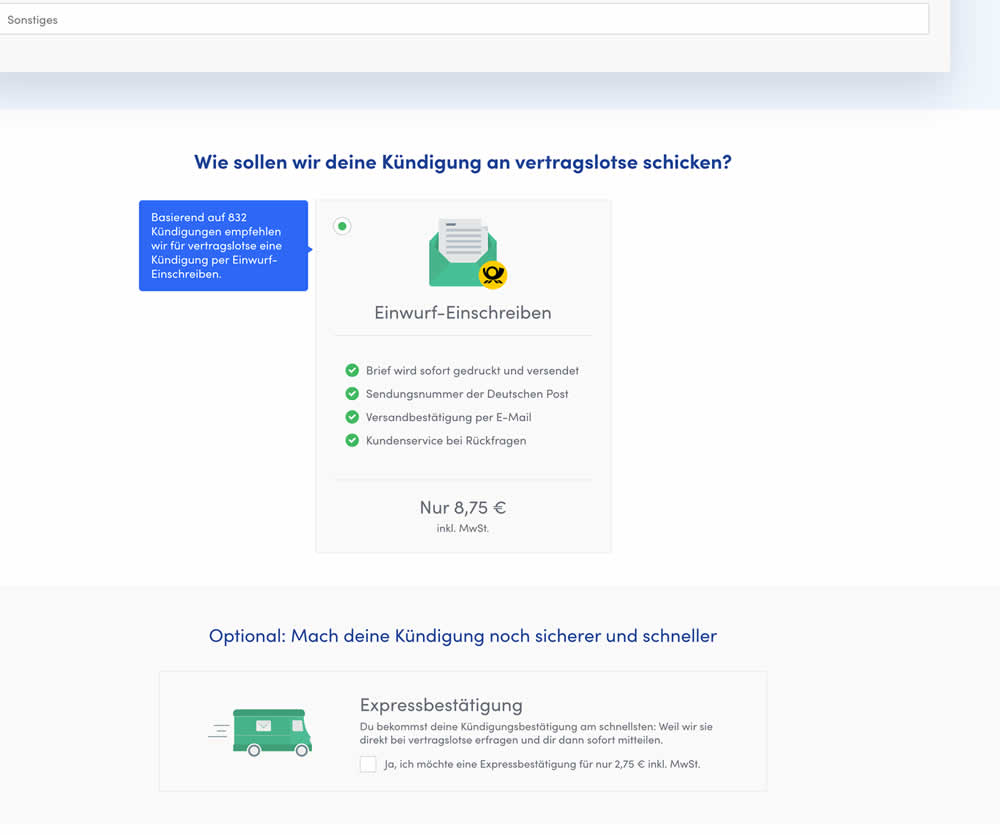
In this experiment, the cheapest pricing plan was removed from a set of 2 options. This only left the most expensive pricing plan as the option. Impact on sales and revenue was measured.
Test #317 on
Volders.com
by
Michal Fiech
Sep 28, 2020
Mobile
Michal Fiech Tested Pattern #119: Unselected Or Selected Defaults In Test #317 On Volders.com
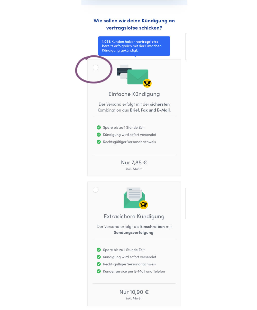
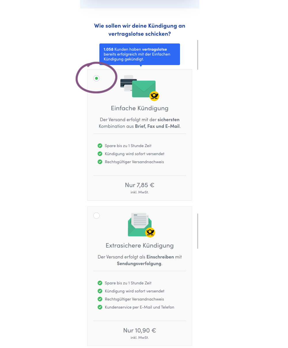
In this mobile experiment, an unselected vs selected payment plan was tested for its impact on sales. The experiment ran on a mid page of a signup funnel where customers were being asked to select one of two payment plans.
Test #307 on
Volders.de
by
Michal Fiech
Jul 17, 2020
Desktop
Michal Fiech Tested Pattern #77: Filled Or Ghost Buttons In Test #307 On Volders.de
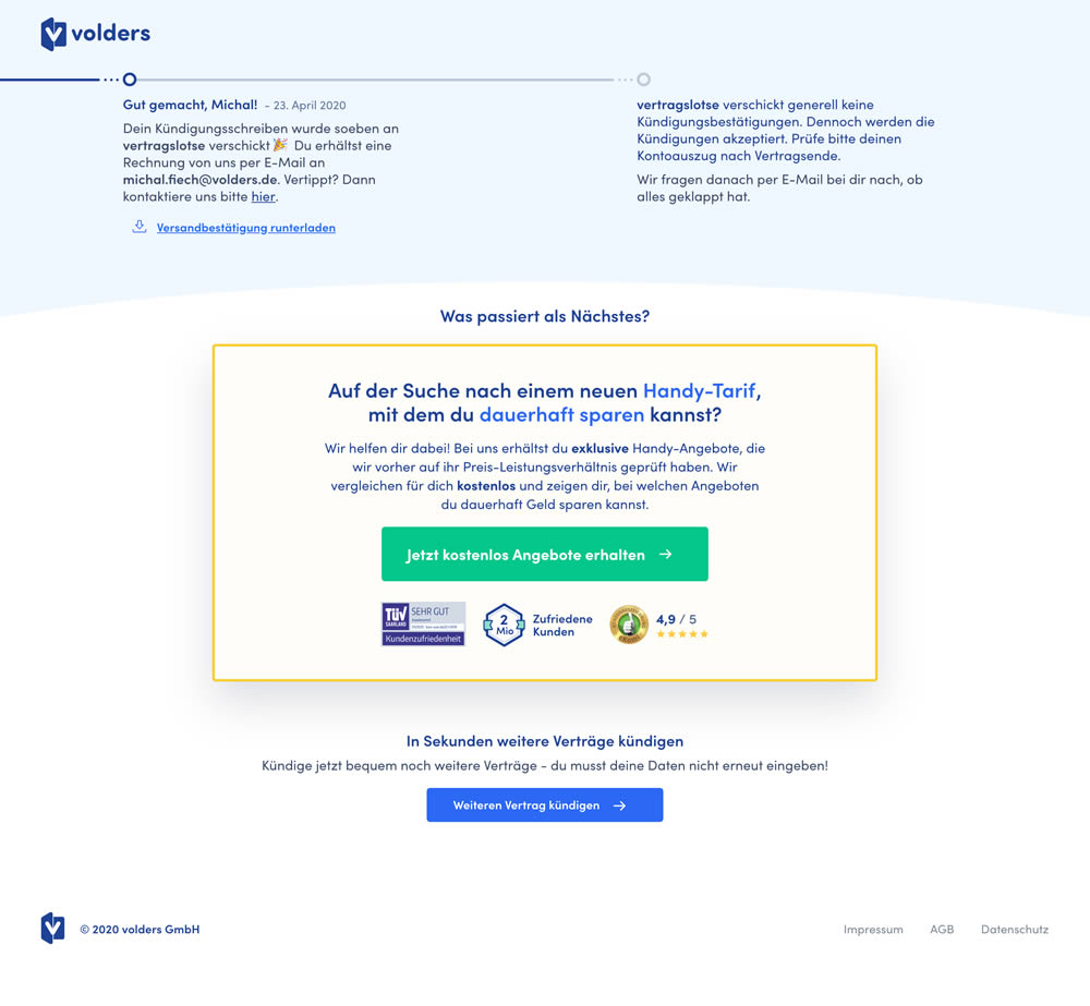
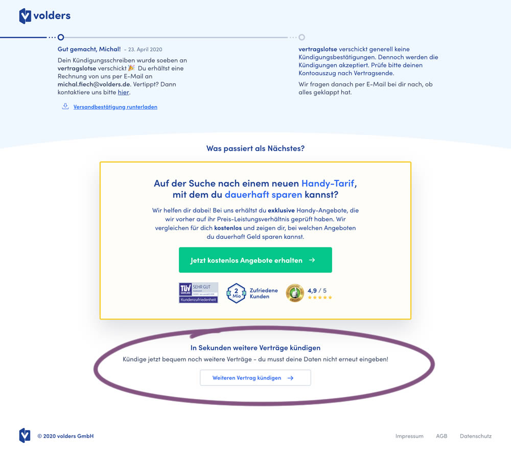
This experiment measured a shallow click goal on a button that would encourage to repeated the action that was just completed (in this case a contract cancellation). In the control version (A) a thank-you screen shows a filled button style, and the variant (B) there was a ghost button. As a note, I also flipped the A-B in this experiment for the purpose of matching it to our ghost button pattern, which means that Volders in fact was starting out with a ghost button to begin with.
Test #305 on
Volders.de
by
Michal Fiech
Jun 30, 2020
Mobile
Desktop
Michal Fiech Tested Pattern #94: Visible Search In Test #305 On Volders.de

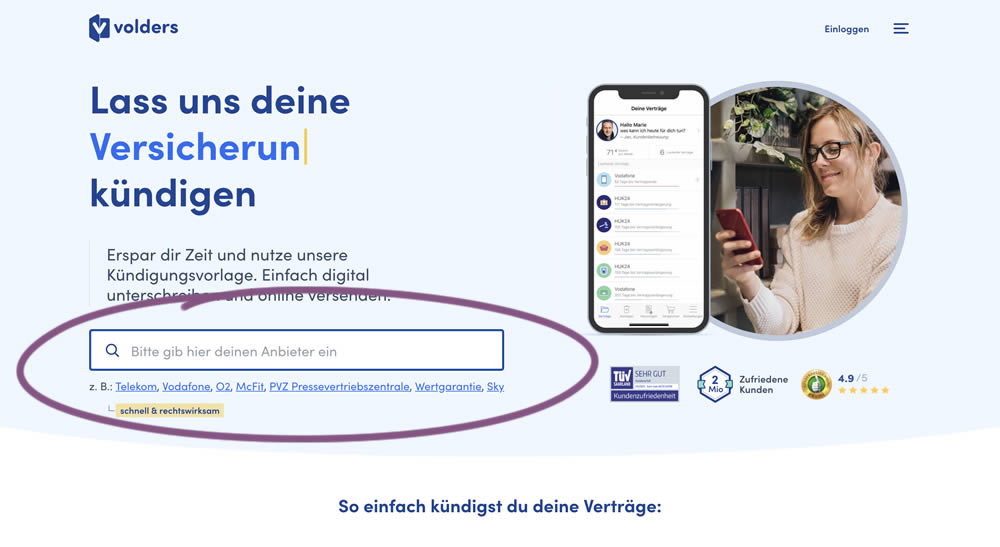
In this experiment, a search input field (to look for companies) along with most popular links (also company names) were displayed on the homepage of a leading contract cancellation service. The control (A) version instead had a button that sent users to a next page where the same selection could be made - only later. The measurable success criteria were the number of paid cancellations - a few steps down the funnel.
Test #302 on
Volders.de
by
Michal Fiech
Jun 09, 2020
Desktop
Mobile
Michal Fiech Tested Pattern #83: Progressive Fields In Test #302 On Volders.de
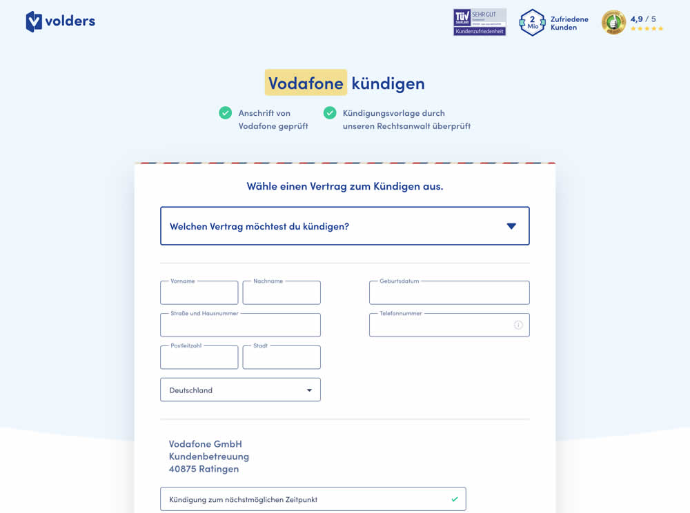
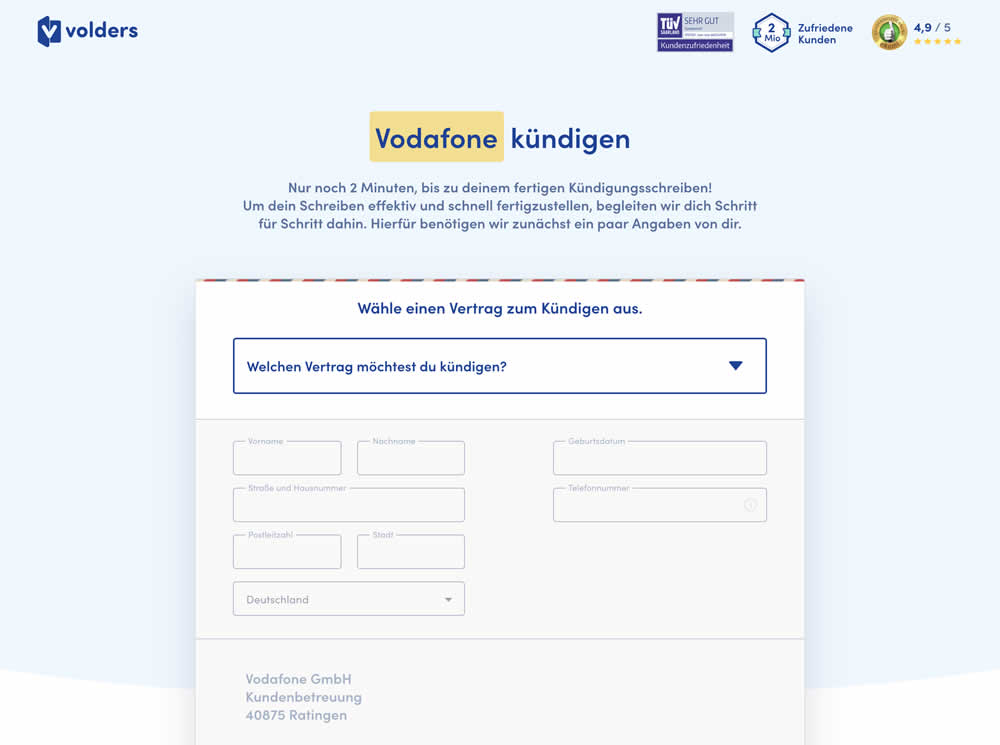
In this experiment a long form (A) was replaced with a progressive form interaction (B). Most of the form fields would appear in a grey-disabled style, until the prerequioste fields were first filled out.
Test #300 on
Volders.de
by
Michal Fiech
May 25, 2020
Desktop
Mobile
Michal Fiech Tested Pattern #3: Fewer Form Fields In Test #300 On Volders.de
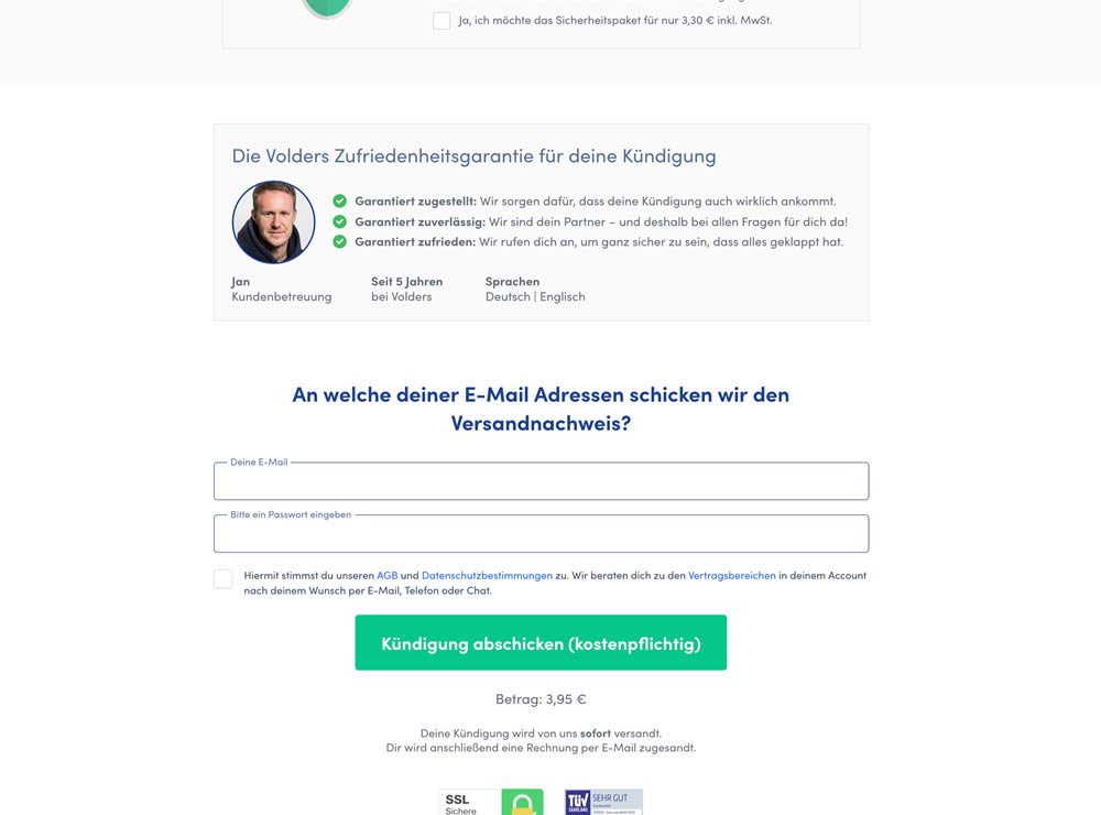
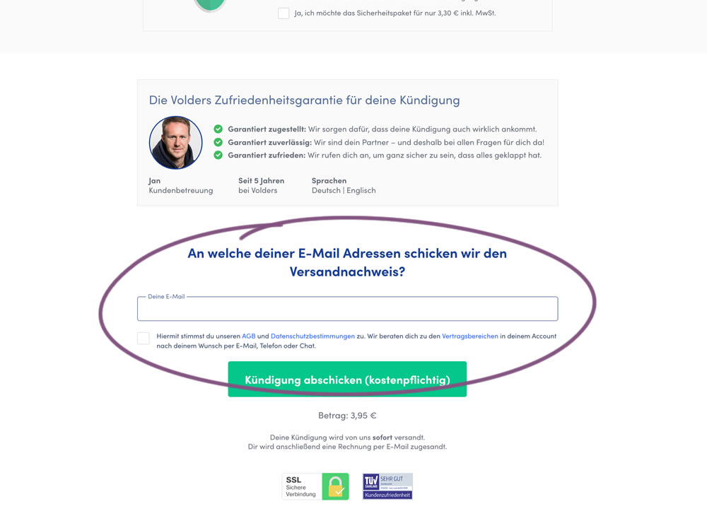
In this experiment, a password field was removed on a contract cancellation form (Volders).
In the control version, users were required to enter their email address and a password. If the email address was associated with an existing account, then the password was used to authenticate the user (and validated). When users entered a new email address, then the password field was used to create a new account.
In the variation, the password field was removed, as the authentication happened after the conversion itself using other backend mechanisms.