All Latest 556 A/B Tests
Become a member to unlock the abiltiy to see the highest impact a/b tests. Being able to see the actual test results and sort by impact allows growth and experimentation teams to take action on the biggest gains first
MOST RECENT TESTS
Test #580 on
Finn.com
by
 Tim Karcher
Mar 06, 2025
Mobile
Signup
Tim Karcher Tested Pattern #91: Forced Action In Test #580 On Finn.com
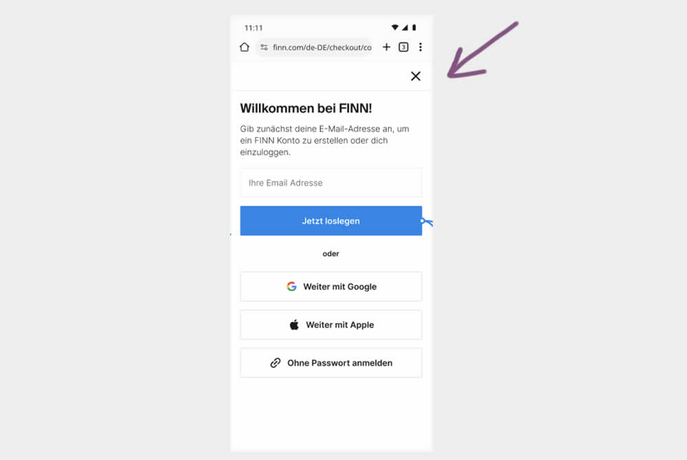
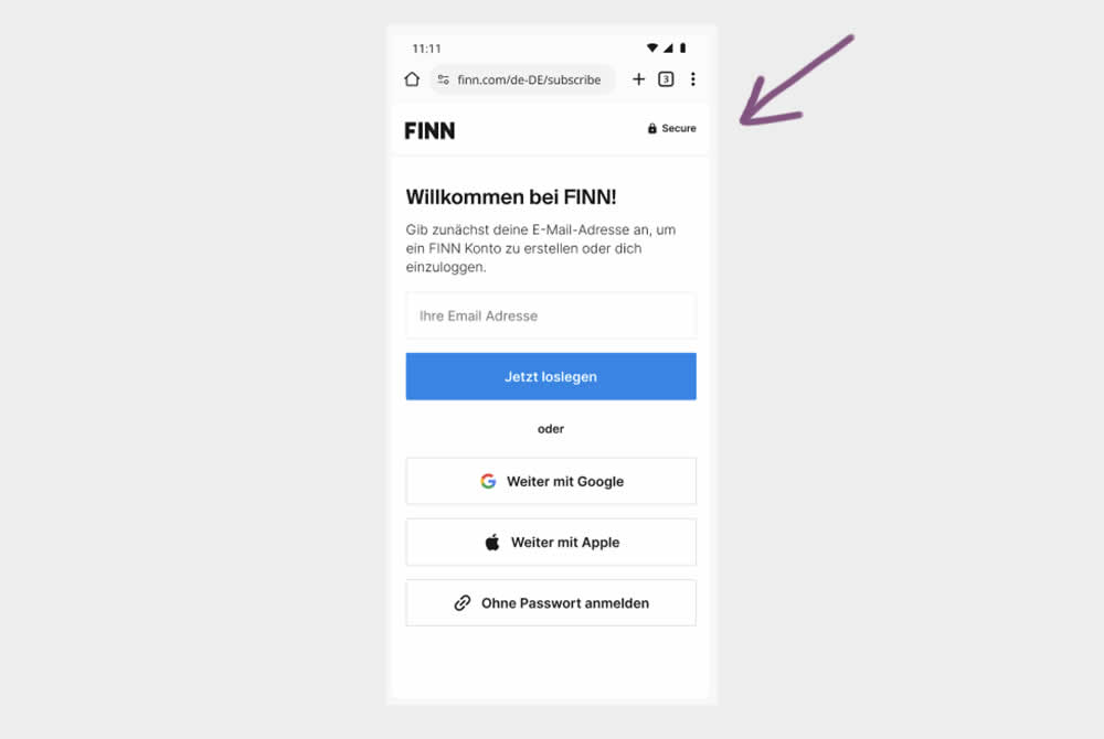
In this experiment, the control shows an (X) close option within a signup flow, whereas the variation had it removed. Clicking the close icon would collapse the signup modal and show the product page. Users were still able use the back and forward functionality.
(The test was inversed in order to fit the pattern). Impact on signups was measured.
Test #561 on
Aboalarm.de
by
 Katharina Lay
Nov 07, 2024
Desktop
Signup
Katharina Lay Tested Pattern #40: Blurred Product Background In Test #561 On Aboalarm.de
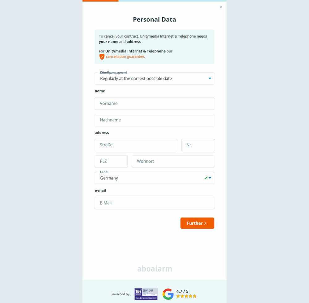
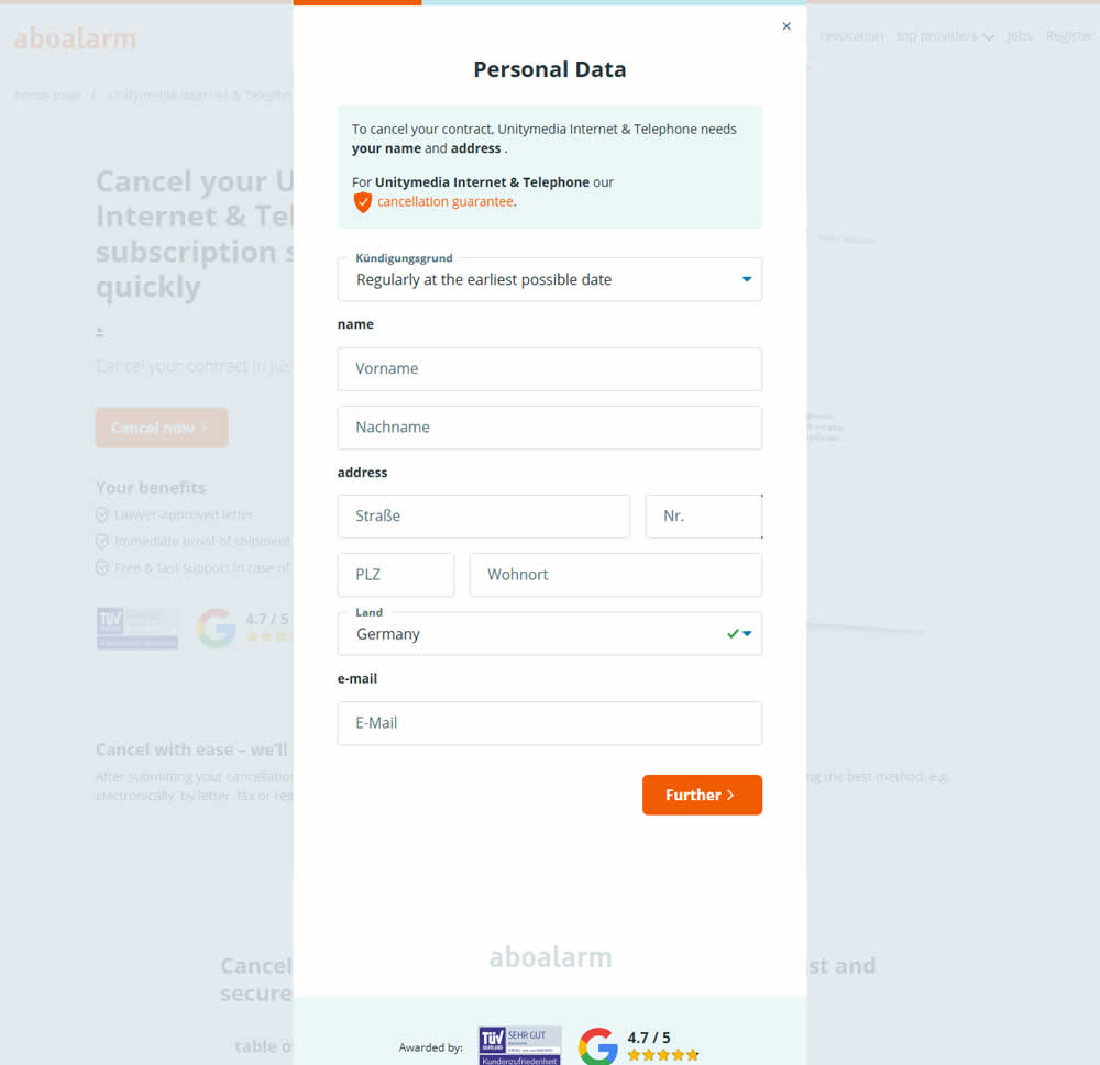
In this experiment, as a multi-step sign up funnel launched as a modal, there was a different treatment of the background. In the A version the background was a flat color, whereas in the B version the background used a transparent opacity to show through the landing page underneath. Impact on sign ups was measured.
Test #547 on
Aboalarm.de
by
 Katharina Lay
Aug 12, 2024
Mobile
Signup
Katharina Lay Tested Pattern #6: Customer Star Ratings In Test #547 On Aboalarm.de
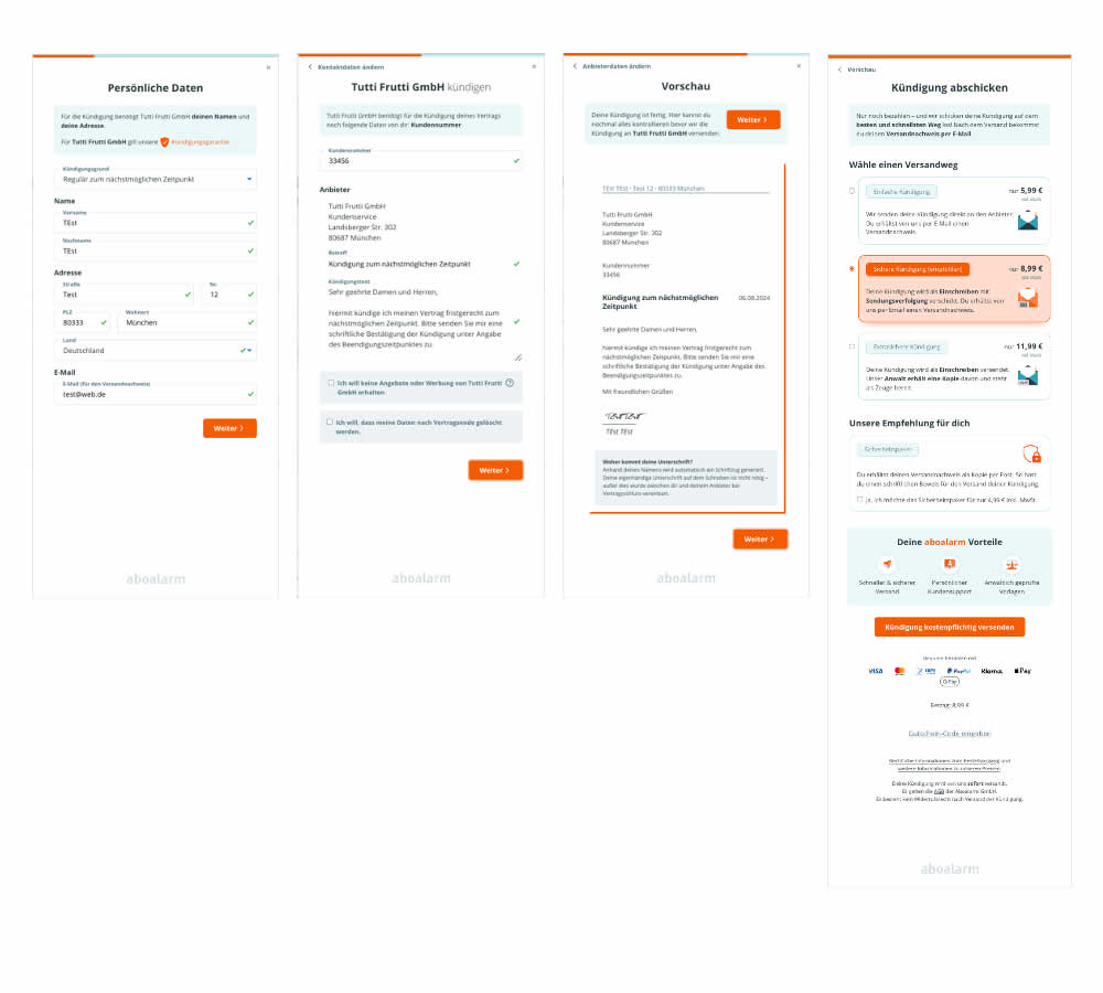
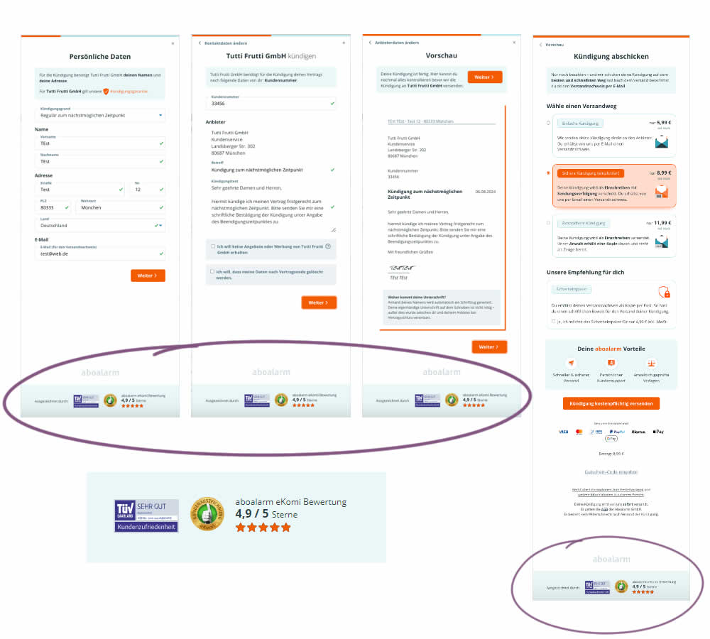
In this 4 step signup funnel experiment, social proof and customer reviews were appended at the bottom of the screen. Impact on conversions was measured.
Test #546 on
Finn.com
by
 Maksim Meged
Aug 01, 2024
Desktop
Signup
Maksim Meged Tested Pattern #129: Right Or Left Aligned Forms In Test #546 On Finn.com
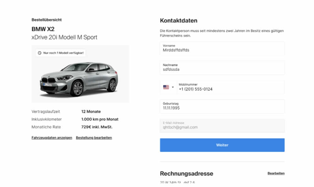
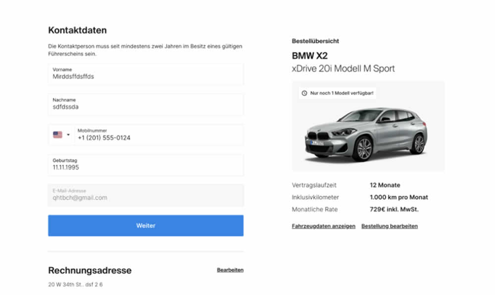
In this signup flow experiment, form fields on the right hand side (control) were shifted to the left column (variation). Impact on account creations and checkouts was measured.
Test #505 on
Shmoodyapp.com
by
 Michael McSweeney
Nov 28, 2023
Mobile
Signup
Michael McSweeney Tested Pattern #52: How It Works In Test #505 On Shmoodyapp.com
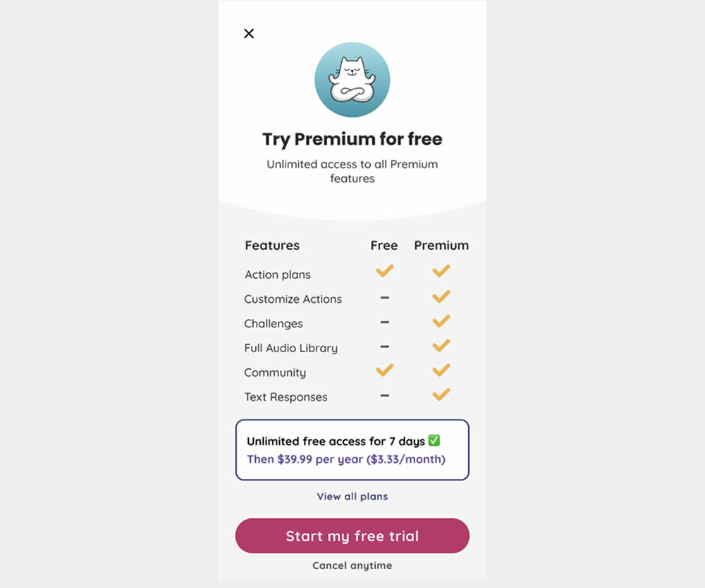
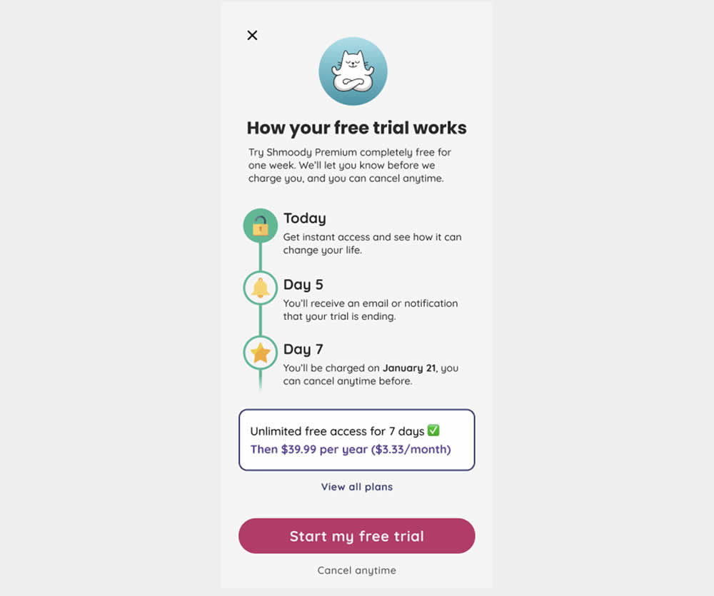
In this experiment, new paywall copy and messaging was used to encourage more users to signup and pay for access to a mental health app. The variation reinforced that users would be receiving a full featured application, with reminders about the upcoming billing. It reinforced that users will have a full week to decide and potentially cancel their application. Impact on lagging +7 day later transactions was measured.
Test #499 on
Shmoodyapp.com
by
 Michael McSweeney
Oct 20, 2023
Mobile
Signup
Michael McSweeney Tested Pattern #99: Progress Bar In Test #499 On Shmoodyapp.com
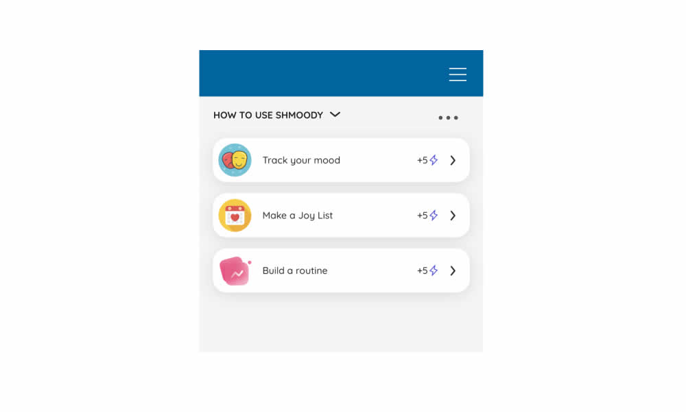
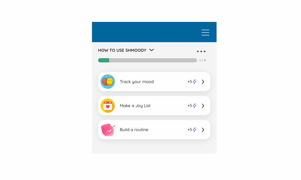
In this experiment, a progress bar was added to a signup flow of a mental health app. It appeared on numerous steps of a onboarding flow. Impact on signup completions and checkouts was measured.
Test #495 on
Formelskin.de
by
 Alexander Krieger
Sep 25, 2023
Mobile
Signup
Alexander Krieger Tested Pattern #9: Multiple Steps In Test #495 On Formelskin.de
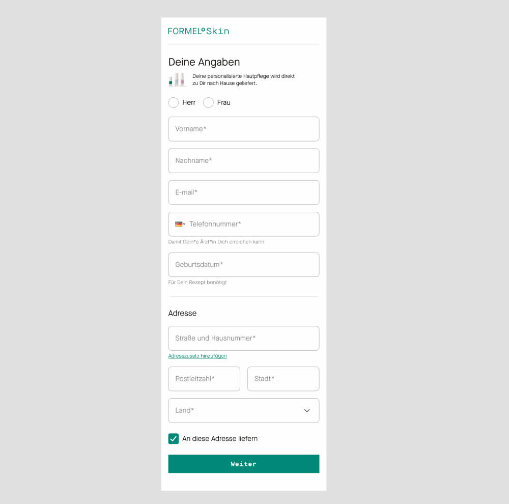
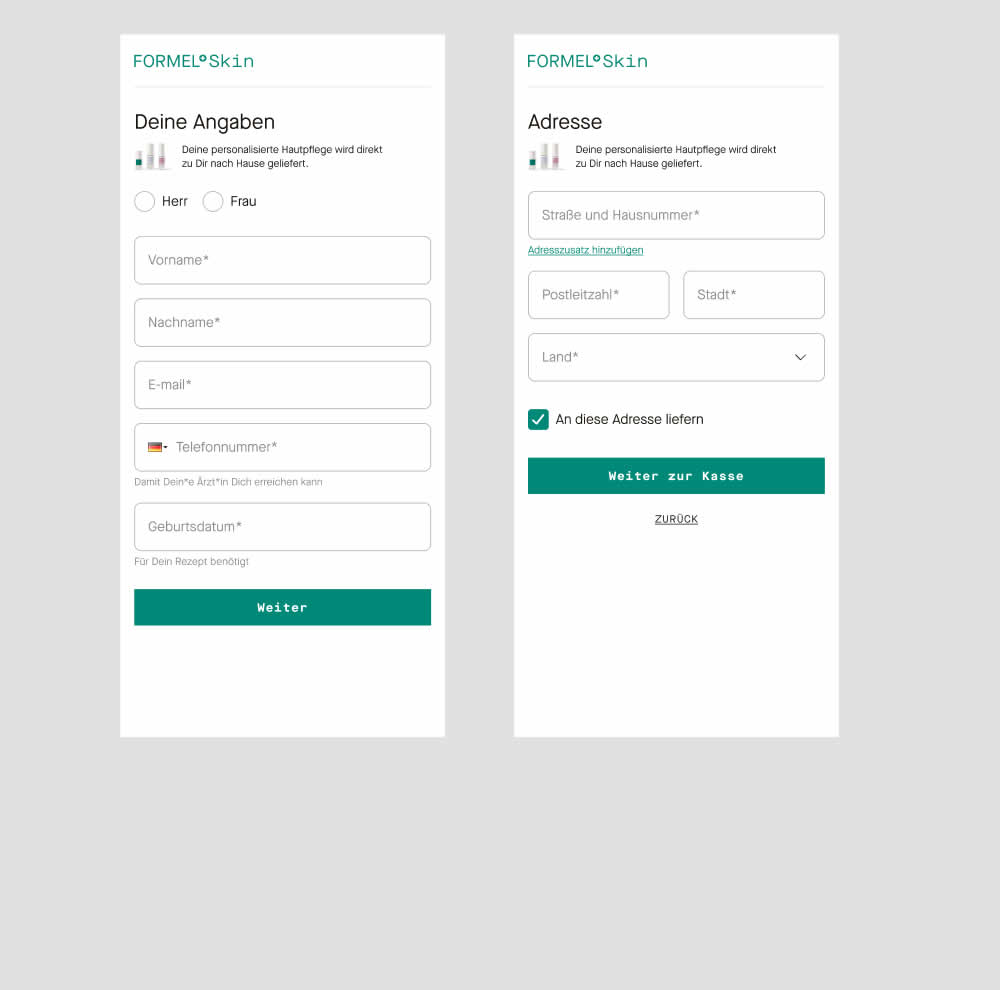
In this experiment two sections of a form on a single page (control) were broken out into 2 separate steps (variation). The two sections included personal details and shipping information. This step appeared after having received a product recommendation when filling out a questionnaire for a skin care product. Impact on next step progression and purchases was measured.
Test #492 on
Formelskin.de
by
 Alexander Krieger
Sep 15, 2023
Mobile
Signup
Alexander Krieger Tested Pattern #131: Authority In Test #492 On Formelskin.de
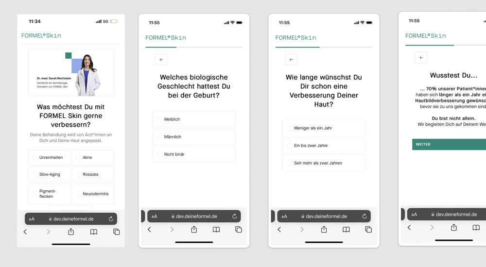
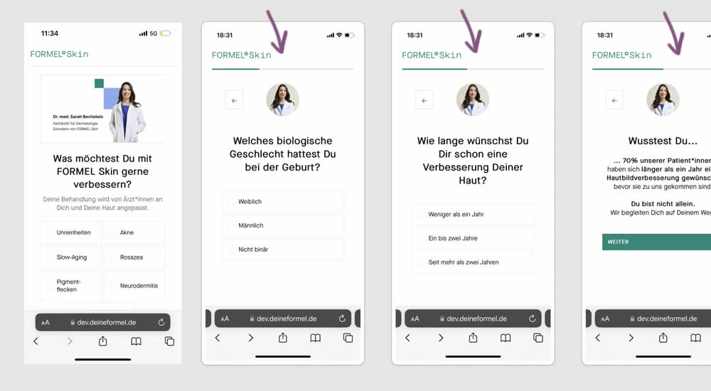
This experiment was a retest of a previously tested test 491. Simiarly, a photo of the real doctor behind a skin care product was shown throughout a signup / questionnaire flow in the variation.
Test #491 on
Formelskin.de
by
 Alexander Krieger
Sep 08, 2023
Mobile
Signup
Alexander Krieger Tested Pattern #131: Authority In Test #491 On Formelskin.de
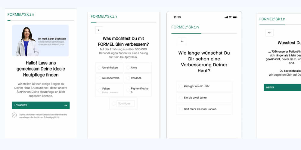
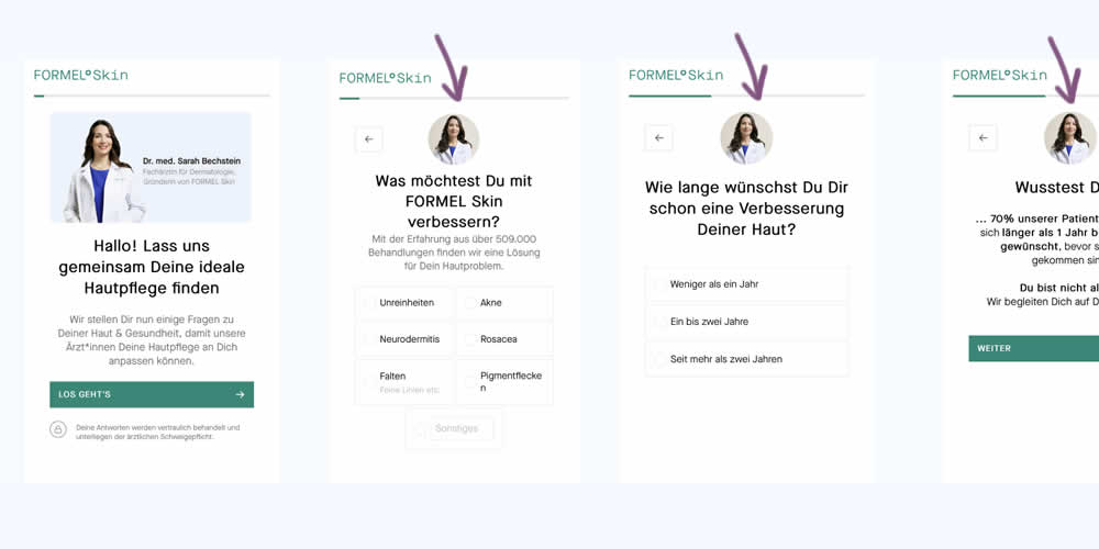
In this experiment, a photo of the real doctor behind a skin care product was shown throughout a signup / questionnaire flow. In the control version, the photo with introduction was only shown on the first screen. In the variation, the photo appeared on the first and all other screens - reinforcing expertise, authority and the idea of a consultation. Impact on signups and purchases was measured.
Test #470 on
Formelskin.de
by
 Alexander Krieger
May 12, 2023
Mobile
Signup
Alexander Krieger Tested Pattern #3: Fewer Form Fields In Test #470 On Formelskin.de
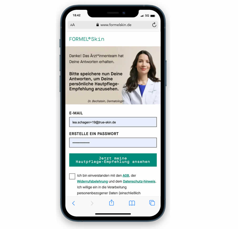
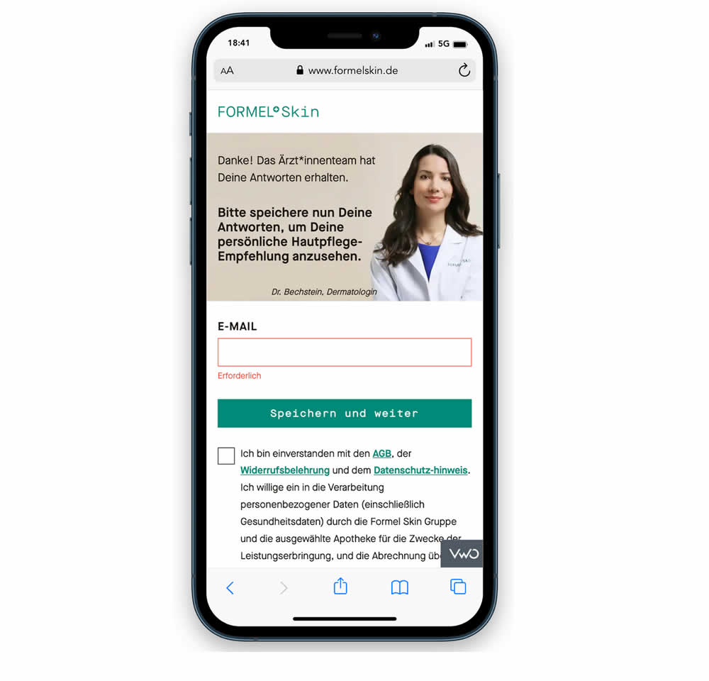
In this experiment, a password field was removed from a signup / account creation step. Instead of asking for a password, users received an email with an auto-generated password. This experiment ran on mobile and impact on sales (post-signup) was measured.
Test #469 on
by
 Ardit Veliu
Apr 28, 2023
Desktop
Signup
Ardit Veliu Tested Pattern #129: Right Or Left Aligned Forms In Test #469
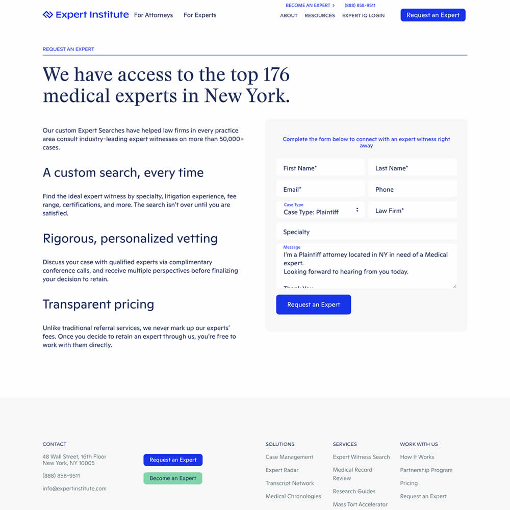
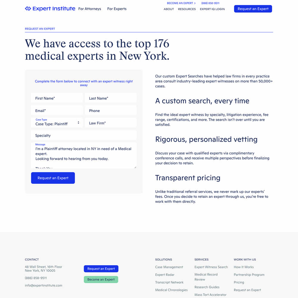
In this experiment, a right side form shifted in position to the left. Impact on leads was measured.
Test #466 on
Volders.de
by
 Daria Kurchinskaia
Apr 26, 2023
Desktop
Signup
Daria Kurchinskaia Tested Pattern #4: Testimonials In Test #466 On Volders.de
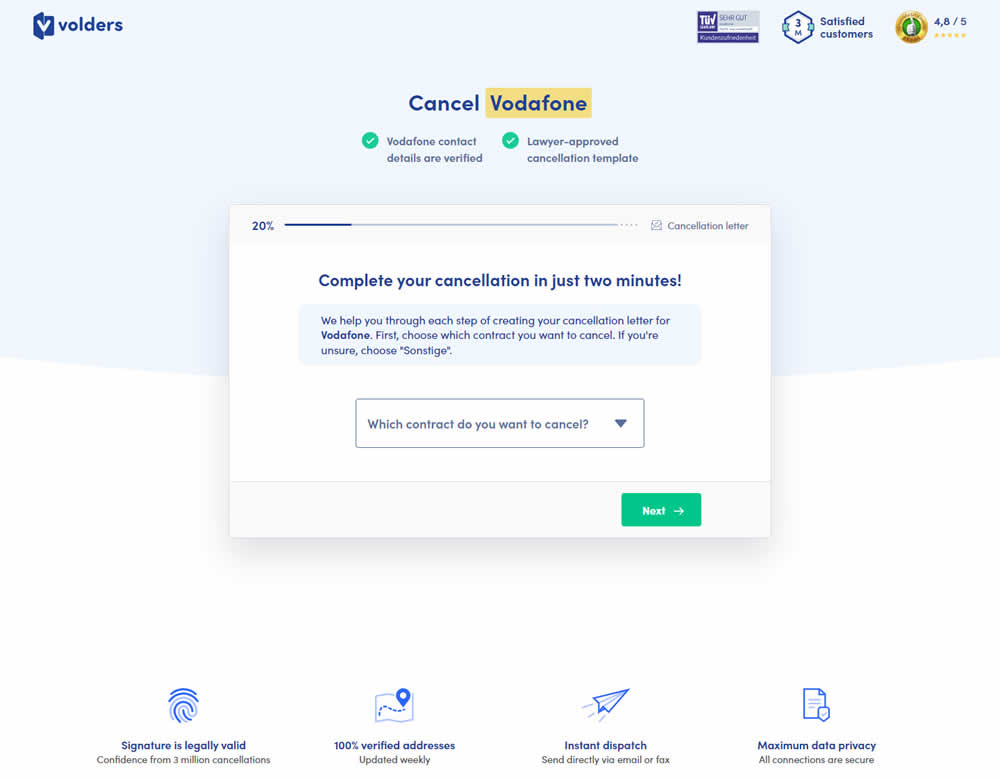
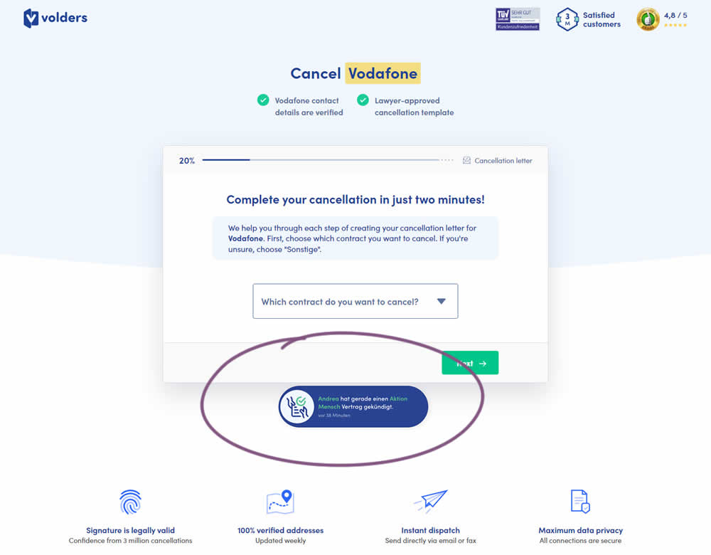
In this experiment, a social proof popups were added to the signup / funnel pages for a contract cancellation service. The added social testimonials appeared as other customers used the service, anywhere except on the final checkout page. Additionaly, the interval at which these messaged appeared was 60 seconds, and they were shown for 10s. The messages translated to "[Name] had recently canncelled a contract with [Company], in the last 38 minutes". Impact on sales was measured.
Test #456 on
Aboalarm.de
by
 Daria Kurchinskaia
Feb 23, 2023
Desktop
Mobile
Signup
Daria Kurchinskaia Tested Pattern #28: Easiest Fields First In Test #456 On Aboalarm.de
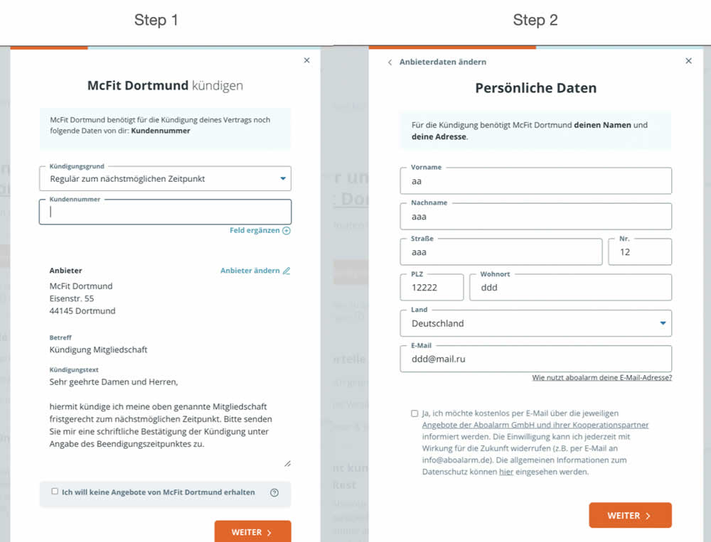
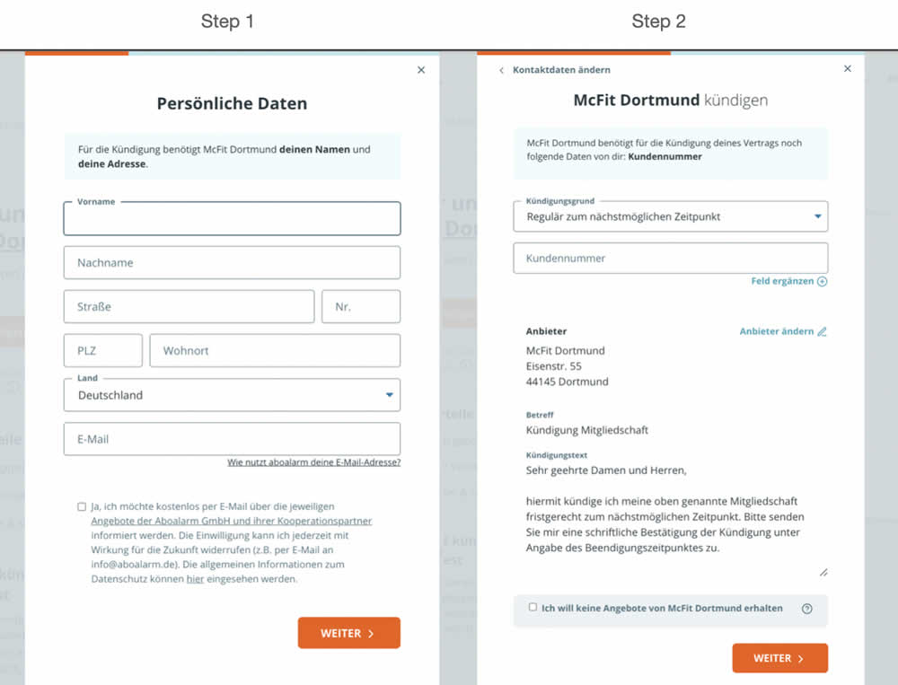
In this experiment, a more difficult step of a contract cancelation service flow was rearranged toward a later step. In the variation, the easier step (hypothetically) with personal details and address fields was placed as the first step. Whereas the step with contract or account numbers (hypothetically more difficult) were placed as the second step.
Test #440 on
Formelskin.de
by
 Alexander Krieger
Nov 17, 2022
Mobile
Signup
Alexander Krieger Tested Pattern #49: Above The Fold Call To Action In Test #440 On Formelskin.de
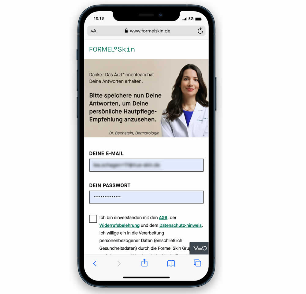
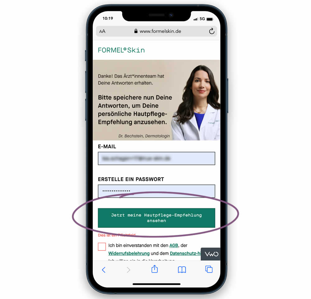
In this experiment, the call to action or button was raised above the legal text to be visible right away without scrolling. Additionally a error message was added for users that did not activate the checkbox to remind them that this is mandatory. Impact on signups and eventual follow-through to purchases (3 steps later) was measured.
Test #433 on
Expertinstitute.com
by
 Ardit Veliu
Sep 30, 2022
Desktop
Mobile
Signup
Ardit Veliu Tested Pattern #20: Canned Response In Test #433 On Expertinstitute.com
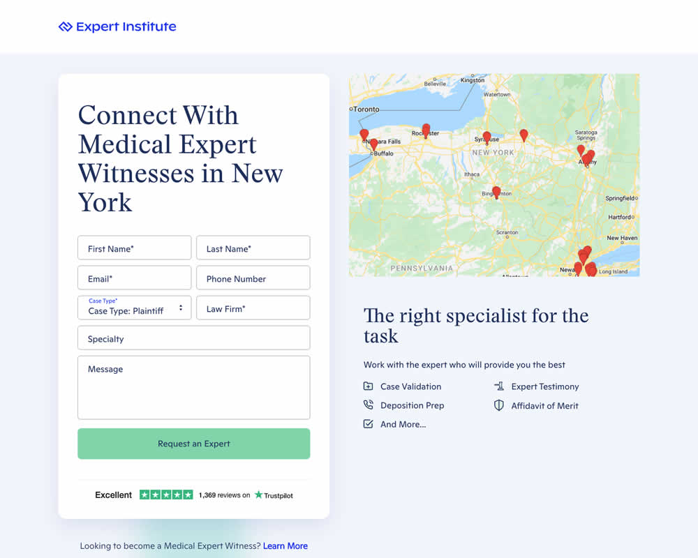
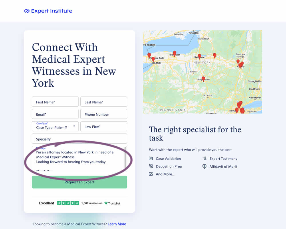
In this experiment a dynamic canned response was added to a lead form. The contents of the copy reflected a handful of user choices from other form field selections. Impact on leads / form submissions was measured.
Test #434 on
Learnwithhomer.com
by
 Stanley Zuo
Sep 30, 2022
Mobile
Signup
Stanley Zuo Tested Pattern #66: Complementary Upsell In Test #434 On Learnwithhomer.com
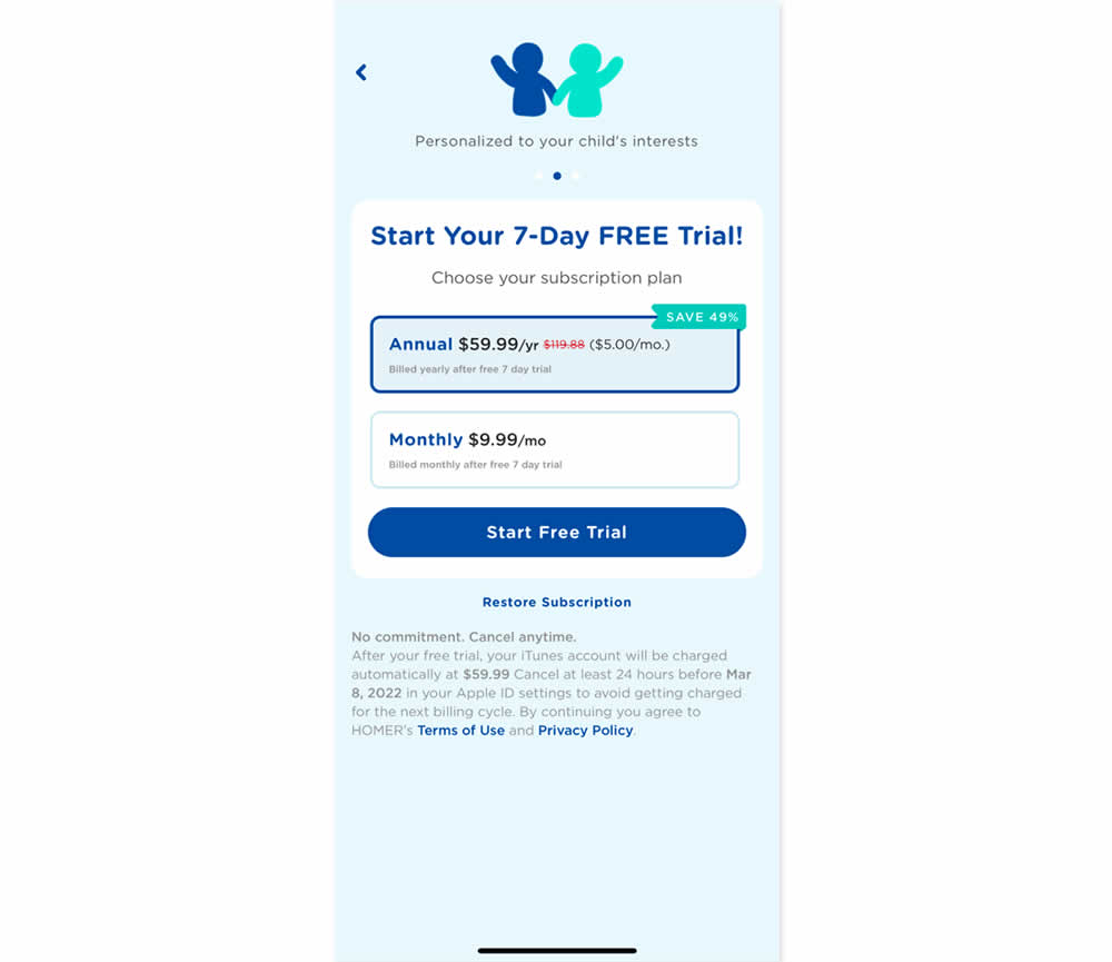
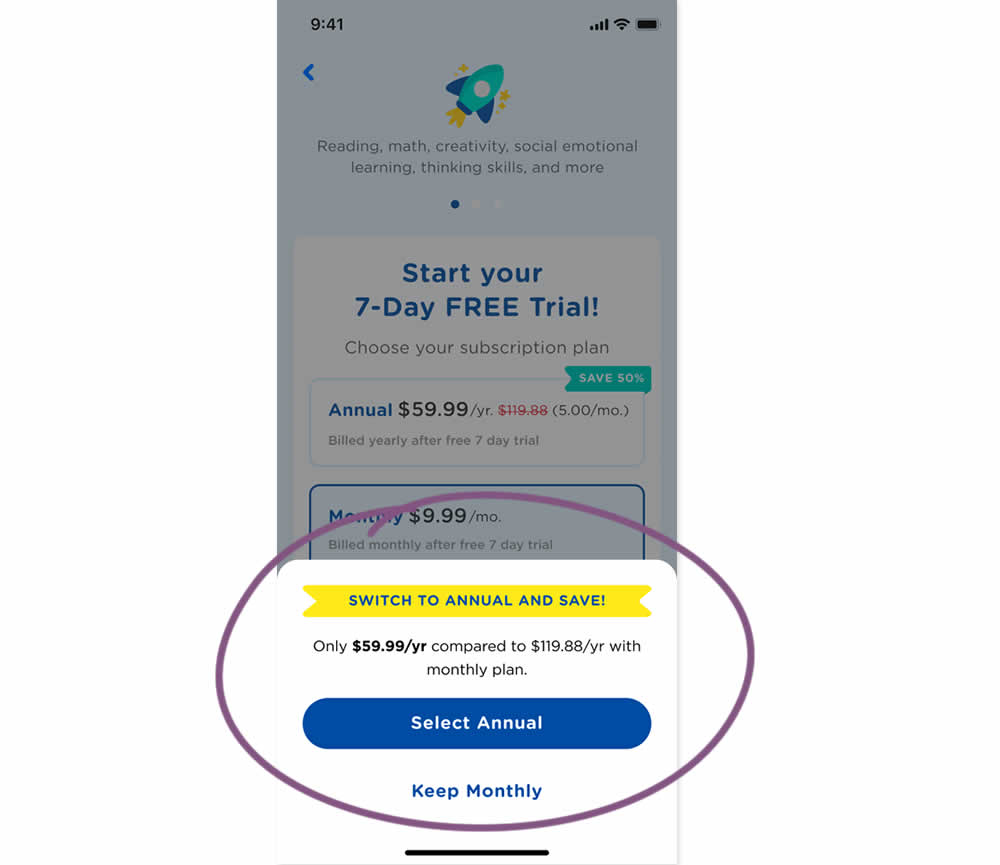
In this experiment, an upsell modal appeared during a signup funnel. In the variation, if users did not select a monthly plan, they were nudged to an annual one. Impact on overall and annual signups was measured.
Test #428 on
Volders.de
by
 Daria Kurchinskaia
Aug 16, 2022
Desktop
Mobile
Signup
Daria Kurchinskaia Tested Pattern #26: Cart Reminder And Recently Viewed In Test #428 On Volders.de
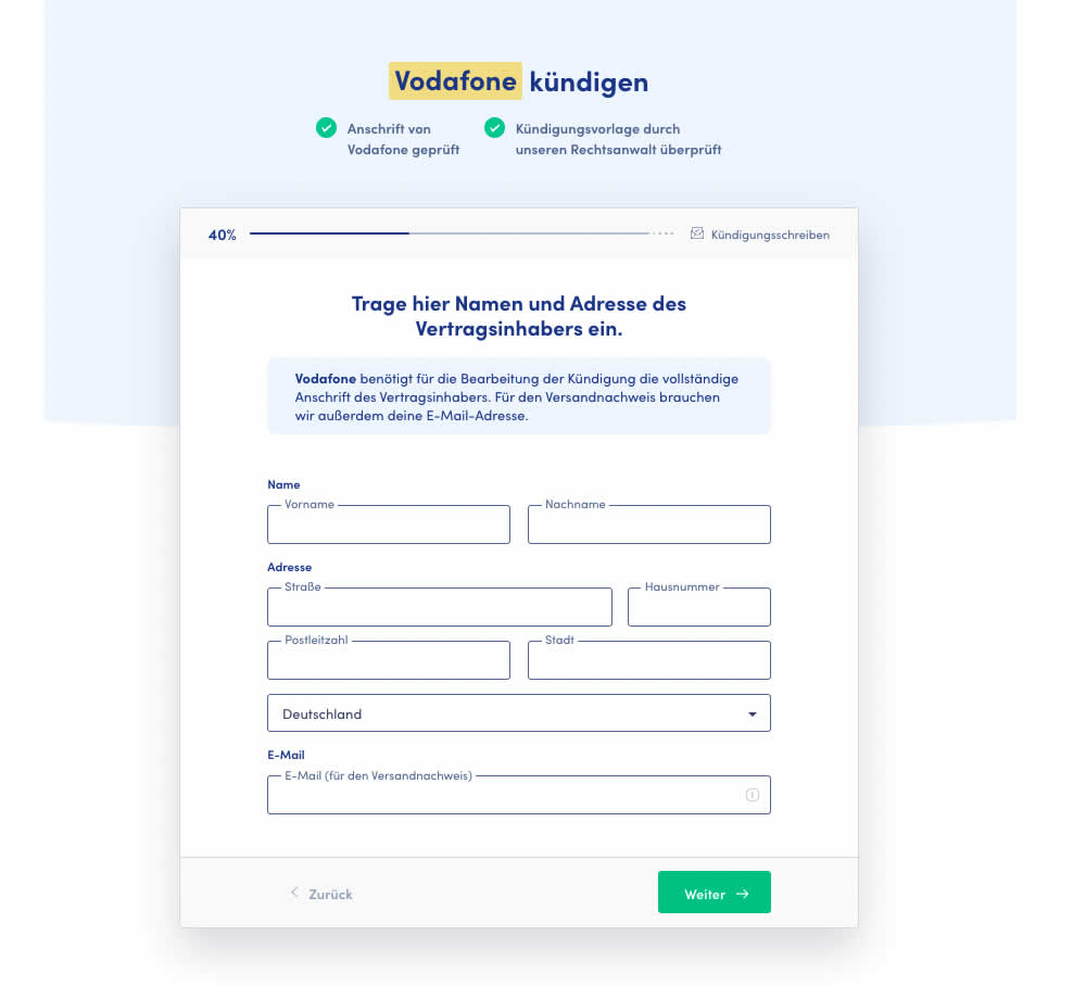
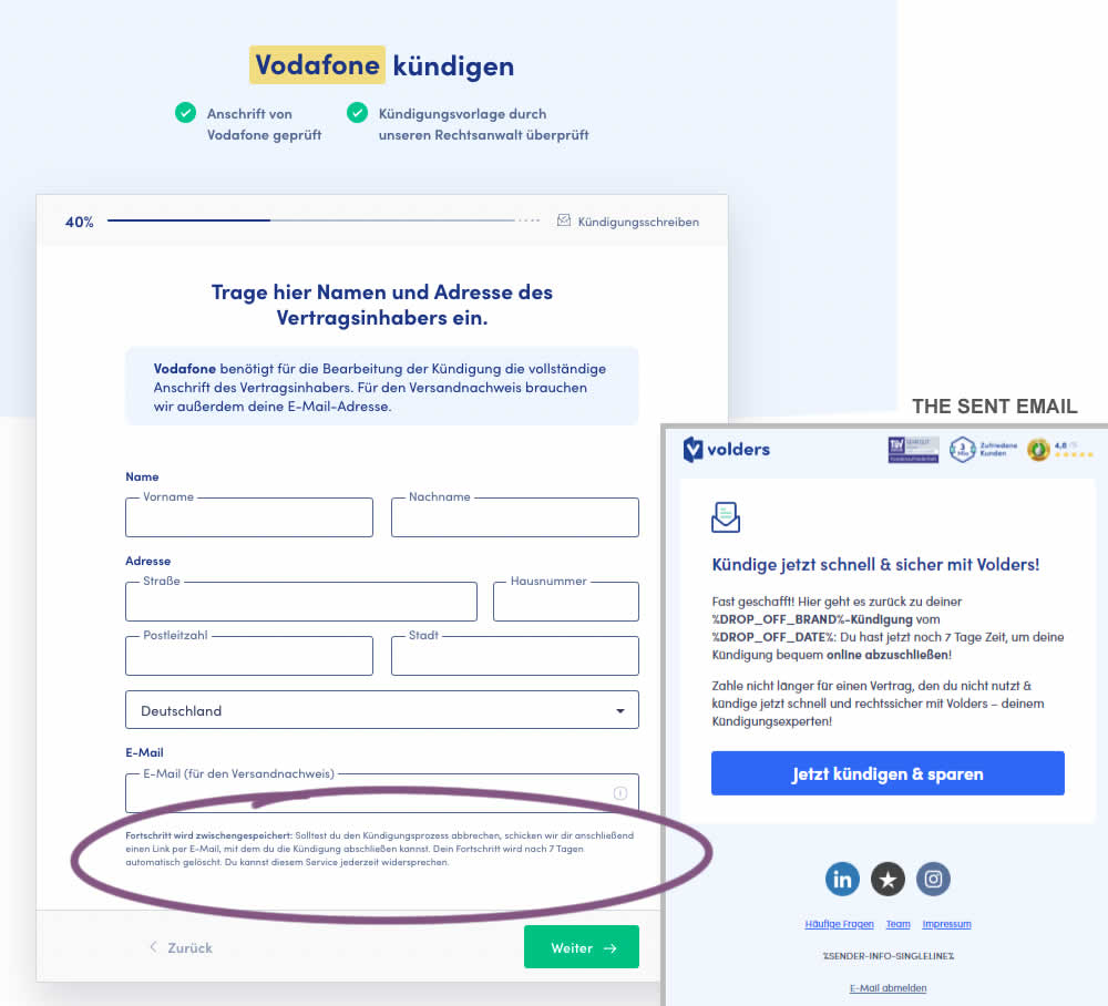
In this test 1) a passive hint communicated to users that their data will be saved for 7 days for them to be able to continue their cancellation later and 2) dropped off users were targeted with an email campaign within the first 4 hours after drop off. The reminder email linked users to a shipping page (checkout page) without them requiring to fill out their personal, contract information one more time.
Test #417 on
Cxl.com
by
 Ognjen Bošković
Jun 27, 2022
Desktop
Mobile
Signup
Ognjen Bošković Tested Pattern #127: Vague Or Specific Benefits In Test #417 On Cxl.com
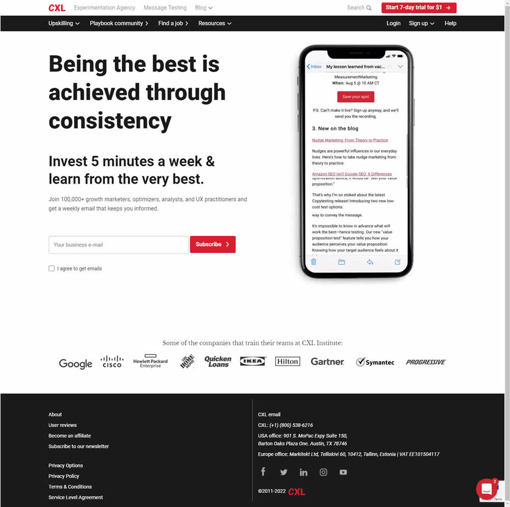
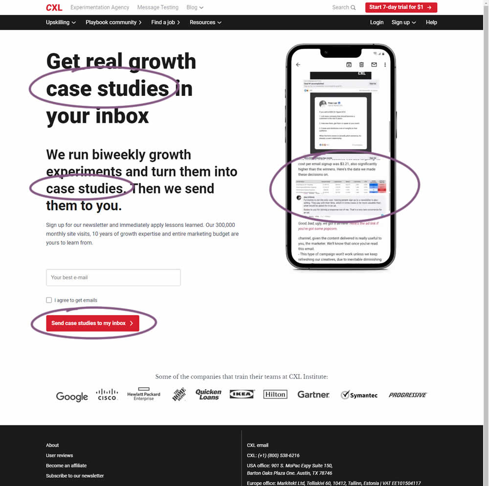
CXL ran an interesting experiment that (1) added more specificity on a newsletter subscription page as well as (2) reinforced it consistently. Most visibly, an abstract or vague headline statement (control) was changed to a benefit oriented one - hinting that subscribers will eventually receive valuable case studies. This message was further reinforced with supporting copy that explained where these case studies are obtained from along with the frequency of the delivery. This same message was also reinforced with an image of actual case studies. The call to action button was also adjusted to mimic the benefit.
Impact on newsletter signups was measured.
Test #409 on
Expertinstitute.com
by
 Ardit Veliu
Apr 30, 2022
Desktop
Mobile
Signup
Ardit Veliu Tested Pattern #20: Canned Response In Test #409 On Expertinstitute.com
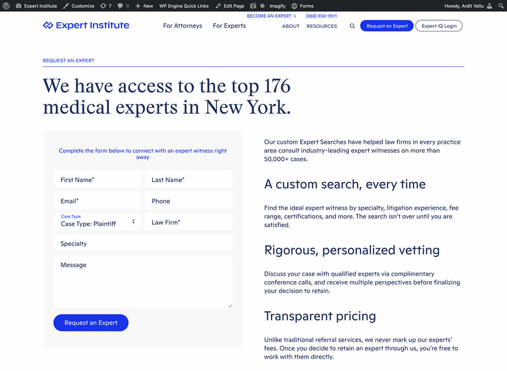
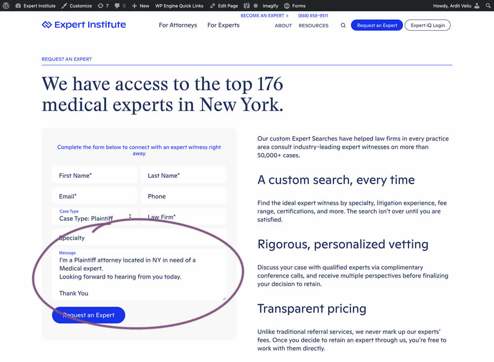
In this experiment, the copy of an input textarea on a lead form was used to summarize a user's choices. Instead of showing using a generic "Message" statement, the variation use the following formula: "I'm a [Lead Type] located in [State] looking for [Expert Type]. Looking forward to hearing from you today. Thank You." Impact of leads was measured.
Test #405 on
Learnwithhomer.com
by
 Stanley Zuo
Apr 07, 2022
Mobile
Signup
Stanley Zuo Tested Pattern #119: Unselected Or Selected Defaults In Test #405 On Learnwithhomer.com
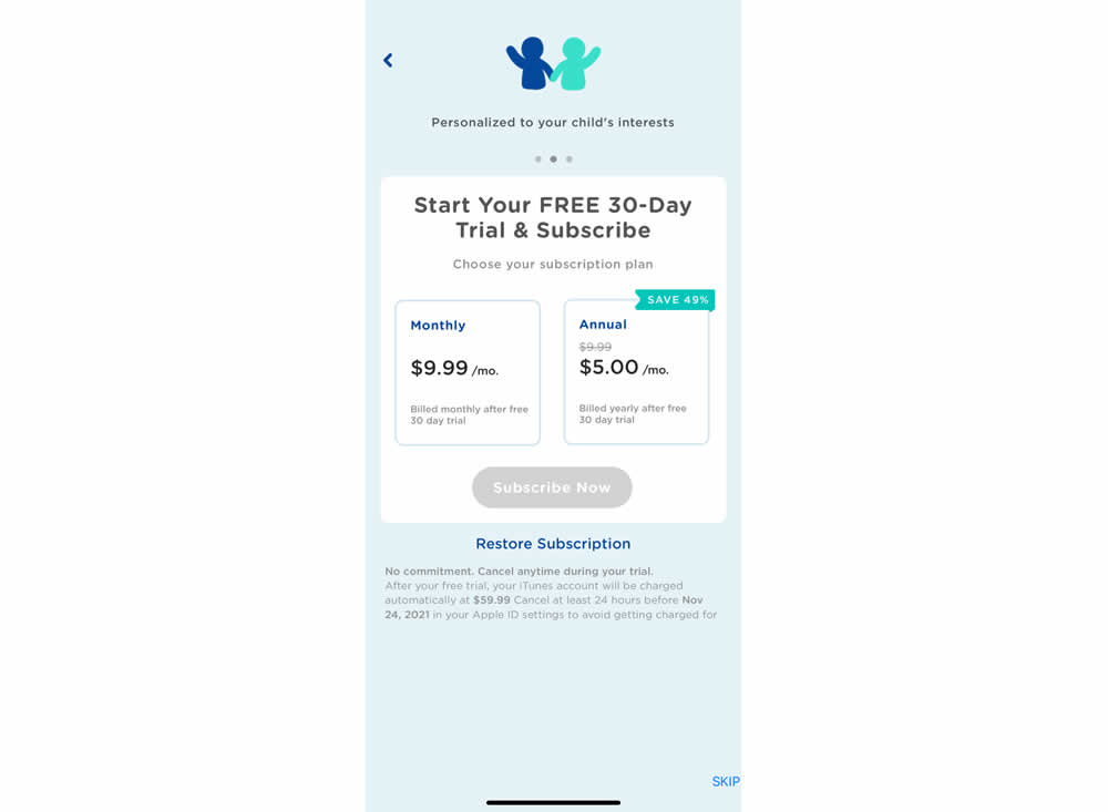
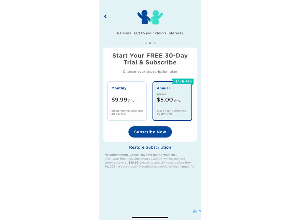
In this experiment, the annual plan was preselected instead of starting off unselected in the control. Impact on two metrics was measured: any plan and annual plan purchases.