15 Tests By  Alexander Krieger
Tests
Test #510 on
Formelskin.de
by
 Alexander Krieger
Dec 21, 2023
Mobile
Alexander Krieger Tested Pattern #26: Cart Reminder And Recently Viewed In Test #510 On Formelskin.de
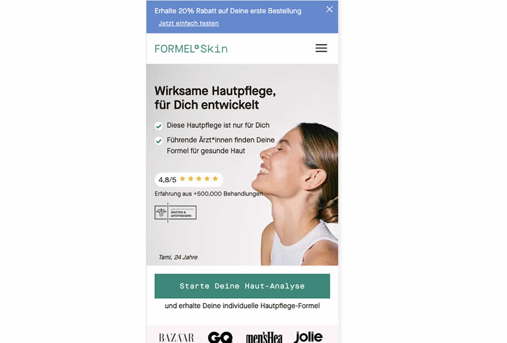
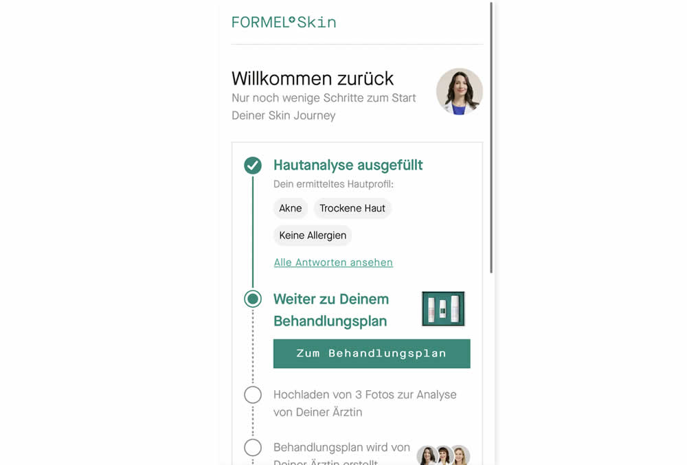
In this experiment, users that did not complete a purchase and came back to the homepage were shown two different experiences. In the control, users would see the homepage (essentially having to restart the purchase flow). Whereas, in the variation, users would be shown a "Welcome Back" summary view with the completed steps shown as completed and a quick resume button to the next incomplete step. Impact on completed sales was measured.
Test #495 on
Formelskin.de
by
 Alexander Krieger
Sep 25, 2023
Mobile
Alexander Krieger Tested Pattern #9: Multiple Steps In Test #495 On Formelskin.de
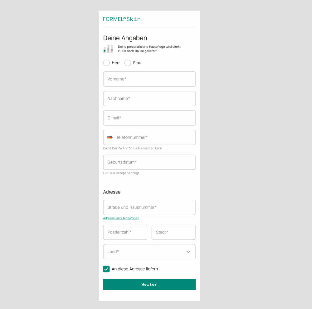
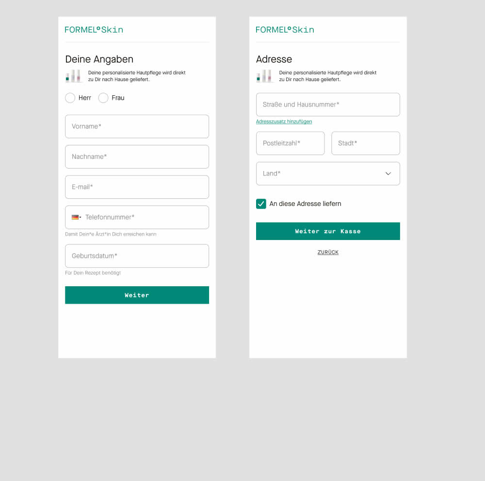
In this experiment two sections of a form on a single page (control) were broken out into 2 separate steps (variation). The two sections included personal details and shipping information. This step appeared after having received a product recommendation when filling out a questionnaire for a skin care product. Impact on next step progression and purchases was measured.
Test #492 on
Formelskin.de
by
 Alexander Krieger
Sep 15, 2023
Mobile
Alexander Krieger Tested Pattern #131: Authority In Test #492 On Formelskin.de
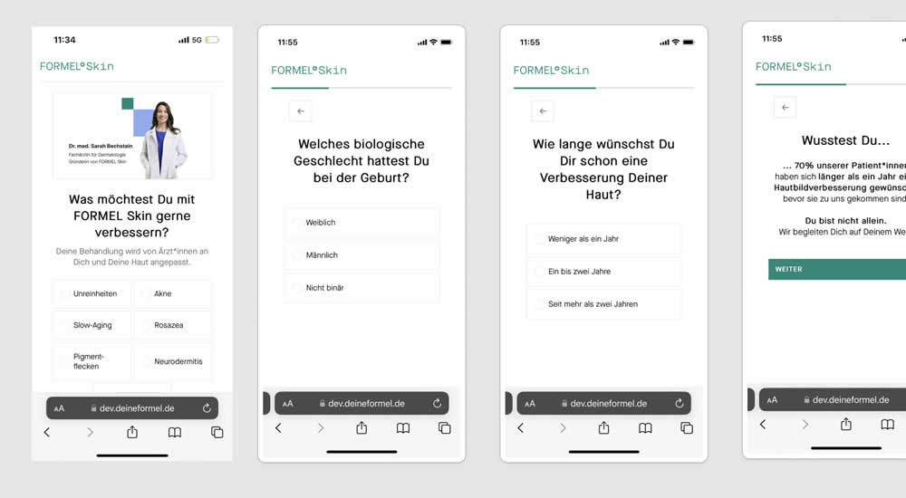
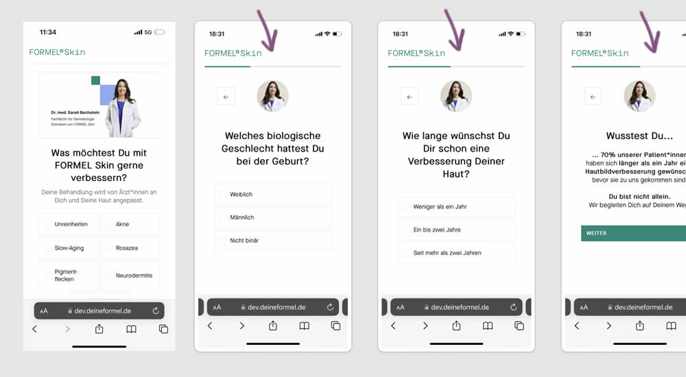
This experiment was a retest of a previously tested test 491. Simiarly, a photo of the real doctor behind a skin care product was shown throughout a signup / questionnaire flow in the variation.
Test #491 on
Formelskin.de
by
 Alexander Krieger
Sep 08, 2023
Mobile
Alexander Krieger Tested Pattern #131: Authority In Test #491 On Formelskin.de
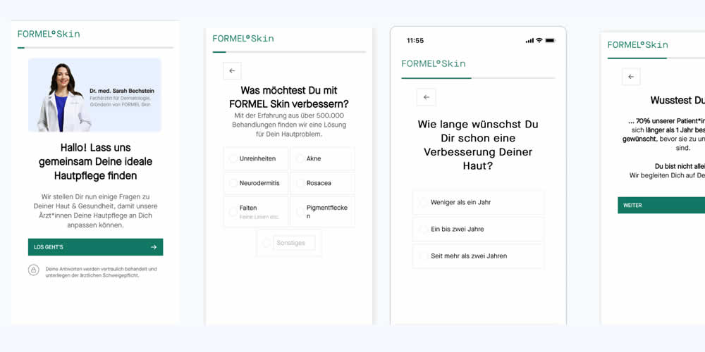
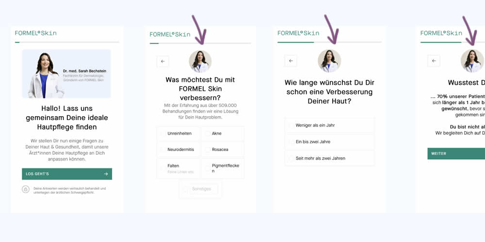
In this experiment, a photo of the real doctor behind a skin care product was shown throughout a signup / questionnaire flow. In the control version, the photo with introduction was only shown on the first screen. In the variation, the photo appeared on the first and all other screens - reinforcing expertise, authority and the idea of a consultation. Impact on signups and purchases was measured.
Test #470 on
Formelskin.de
by
 Alexander Krieger
May 12, 2023
Mobile
Alexander Krieger Tested Pattern #3: Fewer Form Fields In Test #470 On Formelskin.de
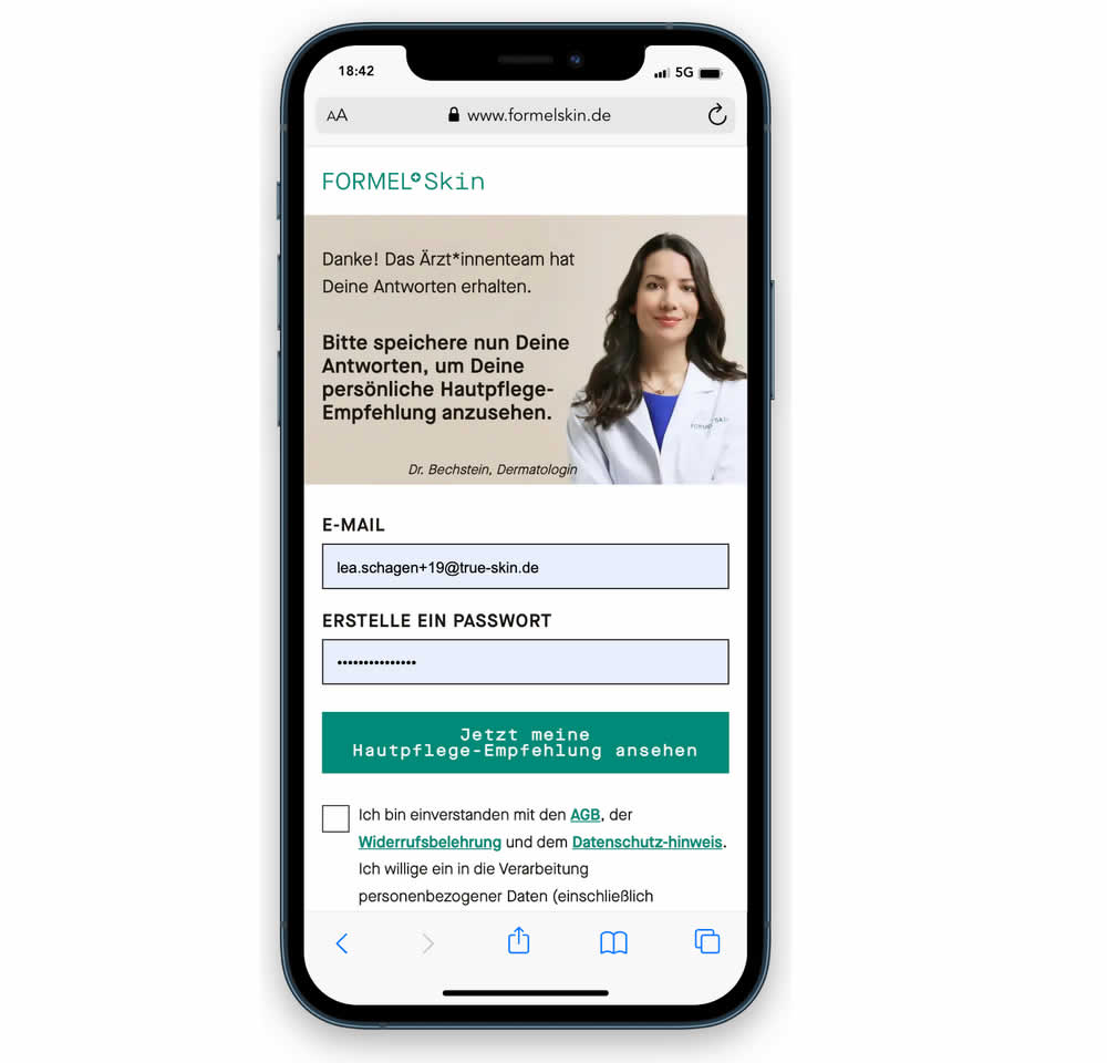
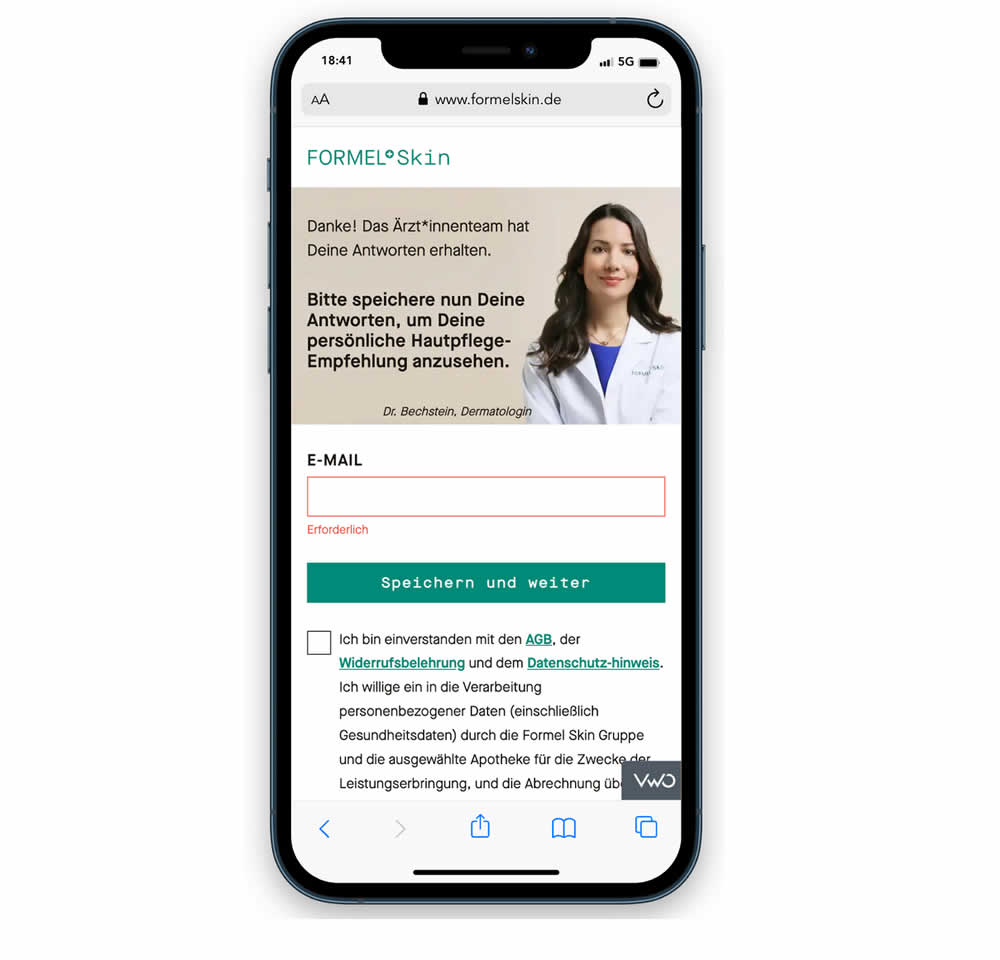
In this experiment, a password field was removed from a signup / account creation step. Instead of asking for a password, users received an email with an auto-generated password. This experiment ran on mobile and impact on sales (post-signup) was measured.
Test #440 on
Formelskin.de
by
 Alexander Krieger
Nov 17, 2022
Mobile
Alexander Krieger Tested Pattern #49: Above The Fold Call To Action In Test #440 On Formelskin.de
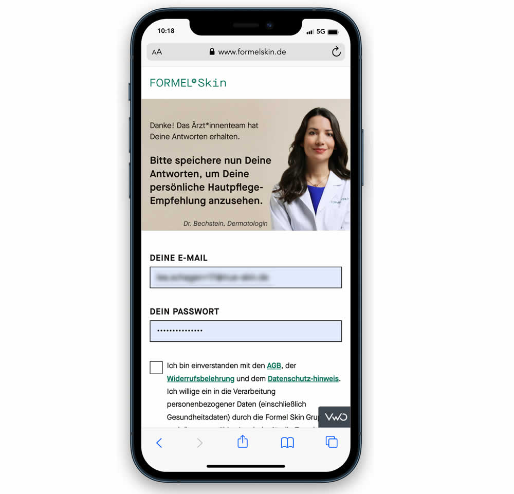
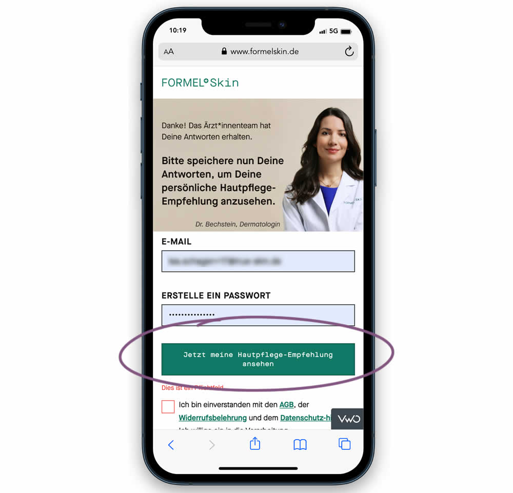
In this experiment, the call to action or button was raised above the legal text to be visible right away without scrolling. Additionally a error message was added for users that did not activate the checkbox to remind them that this is mandatory. Impact on signups and eventual follow-through to purchases (3 steps later) was measured.
Test #286 on
Volders.de
by
 Alexander Krieger
Feb 28, 2020
Desktop
Mobile
Alexander Krieger Tested Pattern #9: Multiple Steps In Test #286 On Volders.de
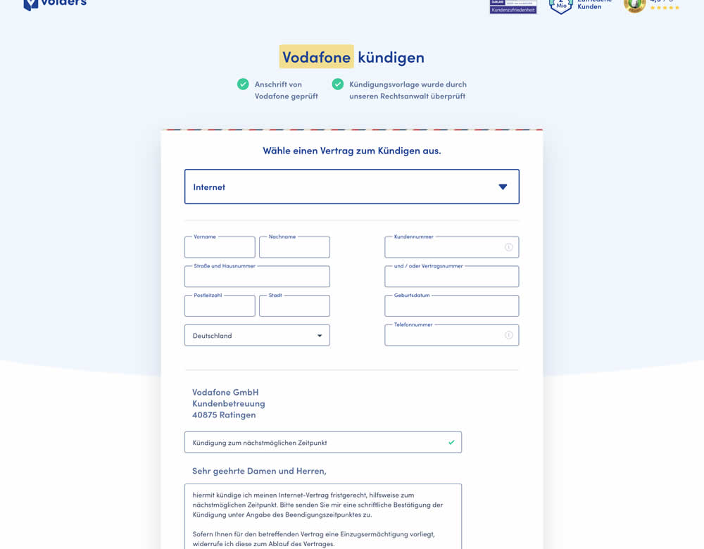
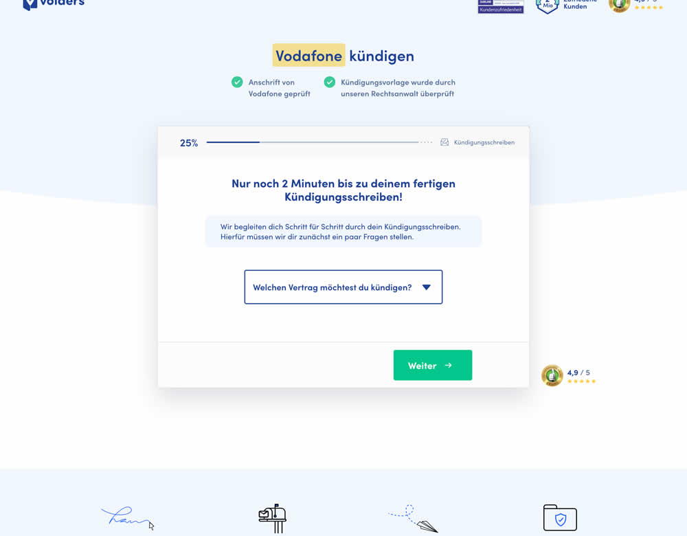
In this experiment, a long contract cancellation landing page (control) was broken down into 4 steps with 1 final summary step (variation).
Test #280 on
Volders.de
by
 Alexander Krieger
Jan 24, 2020
Desktop
Mobile
Alexander Krieger Tested Pattern #3: Fewer Form Fields In Test #280 On Volders.de
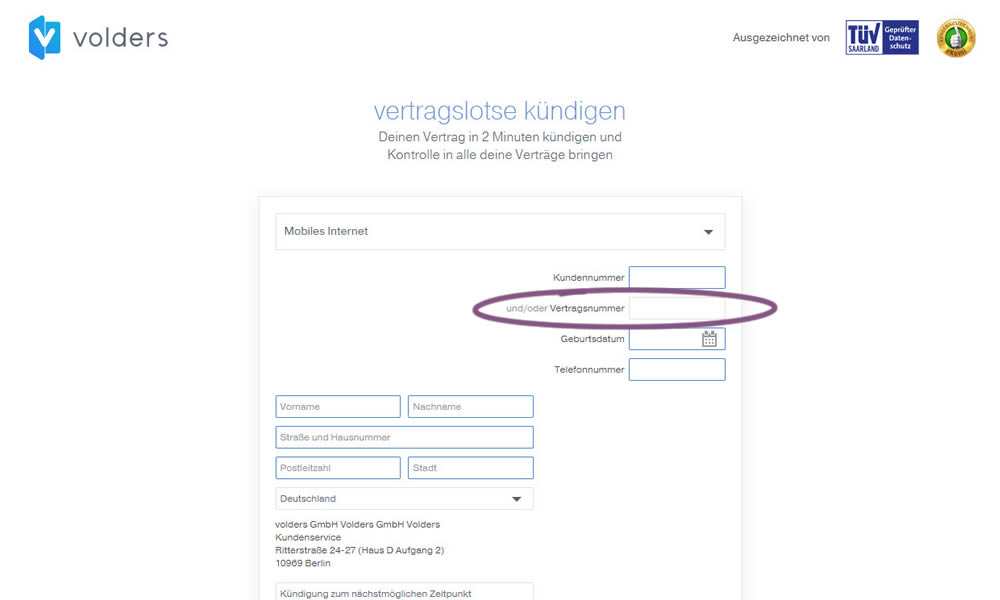
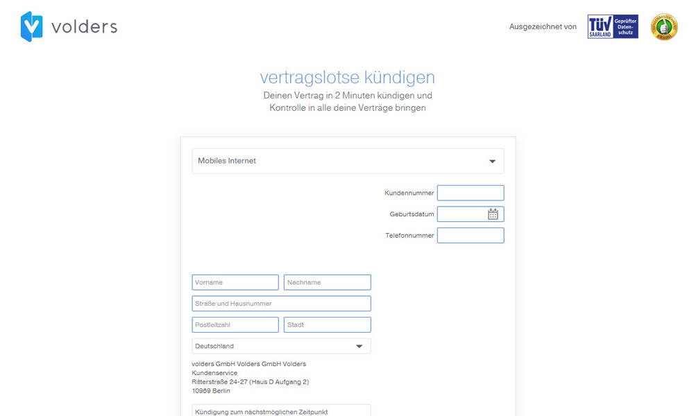
In this experiment on a contract cancellation funnel, one field was removed - a secondary contract ID. The control and variation both had a primary "customer ID" with which to identify and cancel someone's contract with.
Test #254 on
Volders.de
by
 Alexander Krieger
Aug 16, 2019
Desktop
Mobile
Alexander Krieger Tested Pattern #17: Least Or Most Expensive First In Test #254 On Volders.de
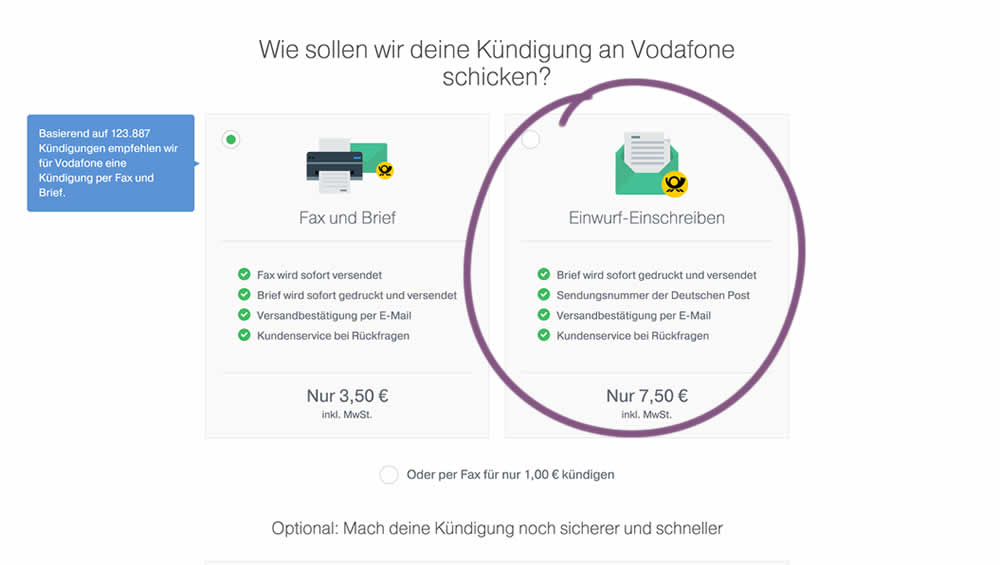
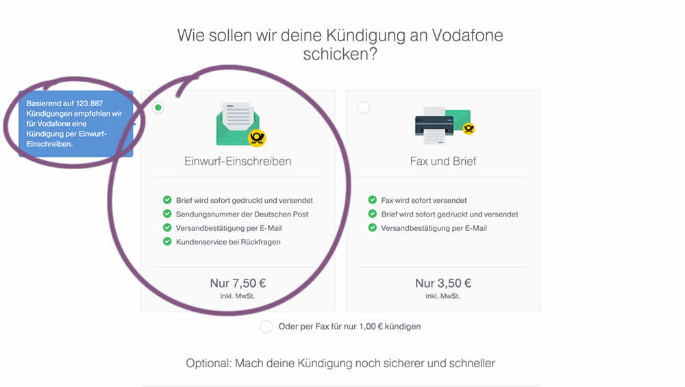
In this experiment, 4 things were adjusted in the variation: the highest pricing plan was shifted to the left, it was set as the default one, the recommendation was also adjusted to point to the highest plan, and one benefit from the lowest plan was removed (customer support).
Test #253 on
Volders.de
by
 Alexander Krieger
Aug 08, 2019
Desktop
Mobile
Alexander Krieger Tested Pattern #17: Least Or Most Expensive First In Test #253 On Volders.de
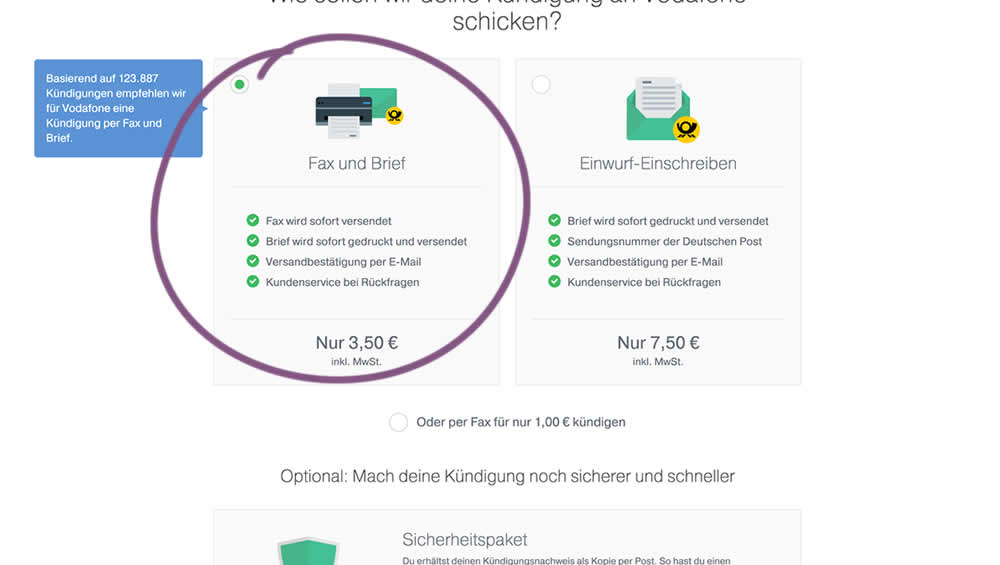
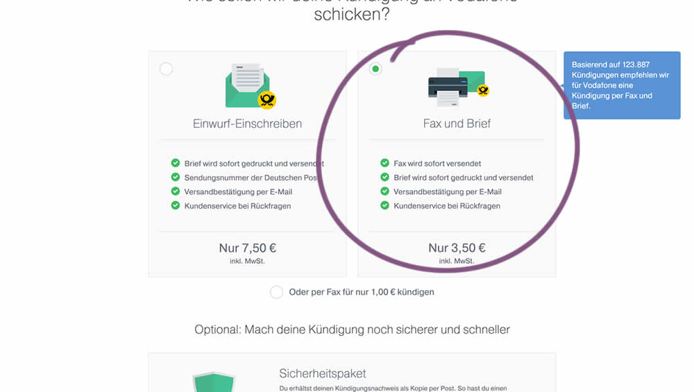
In this experiment, two pricing plans were inverted to show the most expensive plan first (in the variation).
Test #250 on
Volders.de
by
 Alexander Krieger
Jul 25, 2019
Desktop
Mobile
Alexander Krieger Tested Pattern #106: Back Buttons In Test #250 On Volders.de
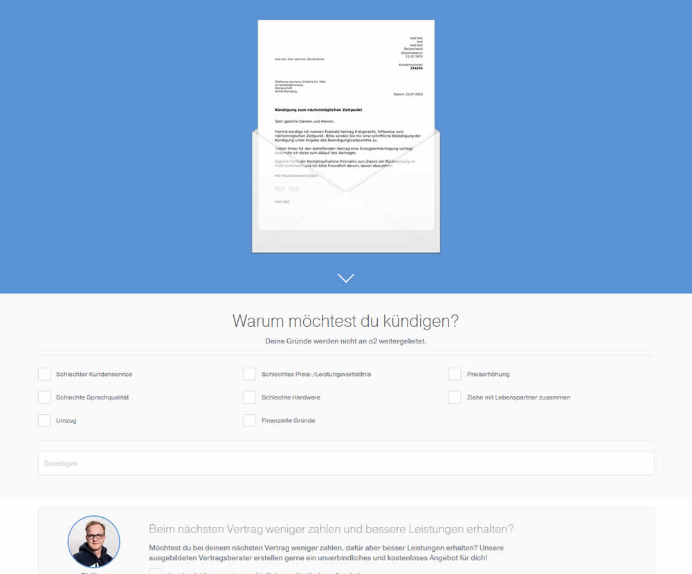
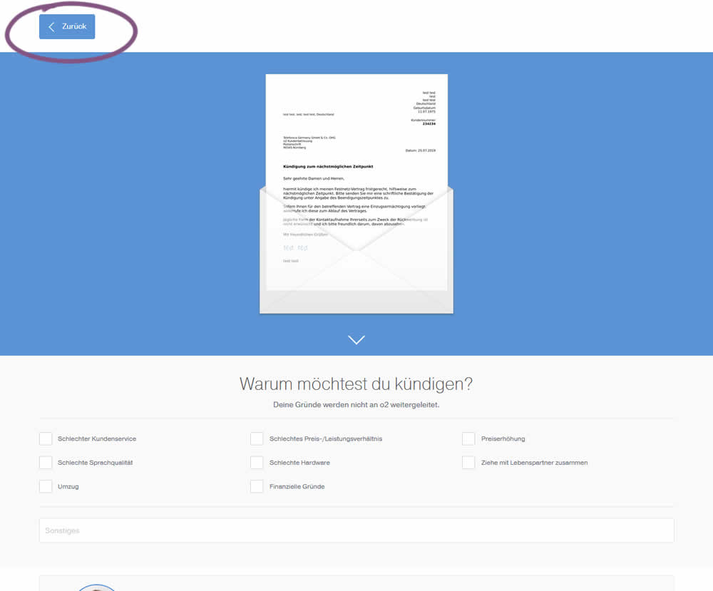
In this experiment, a version without a back button was tested against a one where it was positioned in the upper left corner. This test occured on a second step of a contract cancellation service.
Test #248 on
Volders.de
by
 Alexander Krieger
Jul 16, 2019
Desktop
Alexander Krieger Tested Pattern #20: Canned Response In Test #248 On Volders.de

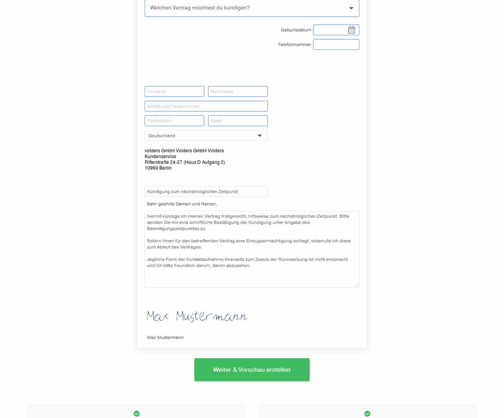
In this experiment, an editable contract cancellation letter was tested against a non-editable one. The editable letter first appeared in a text state, which required a click on a link in order for it to be transformed into an editable textarea field.
Test #239 on
Volders.de
by
 Alexander Krieger
May 02, 2019
Desktop
Alexander Krieger Tested Pattern #13: Centered Forms & Buttons In Test #239 On Volders.de
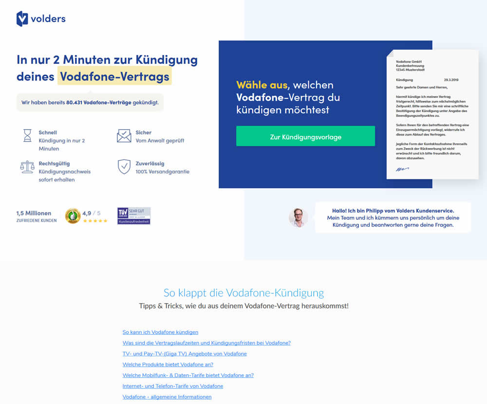
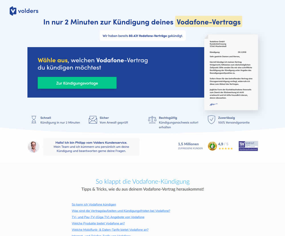
A contract cancellation landing page was tested for the effect of a single (wider CTA area with a left aligned button) vs two column layout (narrow CTA area with a right aligned button).
Test #227 on
Volders.de
by
 Alexander Krieger
Mar 04, 2019
Desktop
Alexander Krieger Tested Pattern #99: Progress Bar In Test #227 On Volders.de
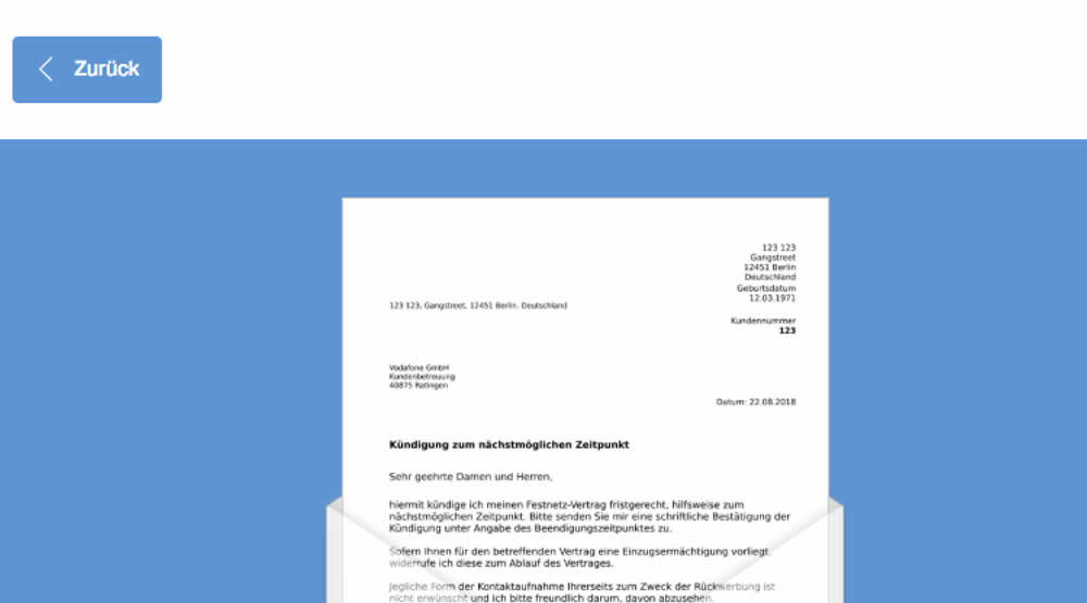
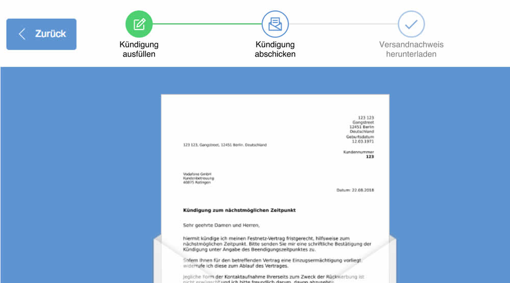
In this experiment, a simple progress bar was added to a 2nd step of contract cancellation funnel. The progress bar used separate styles to show which steps were completed, what the current step was, as well as the future step.
Translation of the 3 steps from German are as follows:
- Fill out the termination
- Send termination
- Proof of termination
Test #223 on
Volders.de
by
 Alexander Krieger
Feb 01, 2019
Desktop
Mobile
Alexander Krieger Tested Pattern #12: Payment First In Test #223 On Volders.de
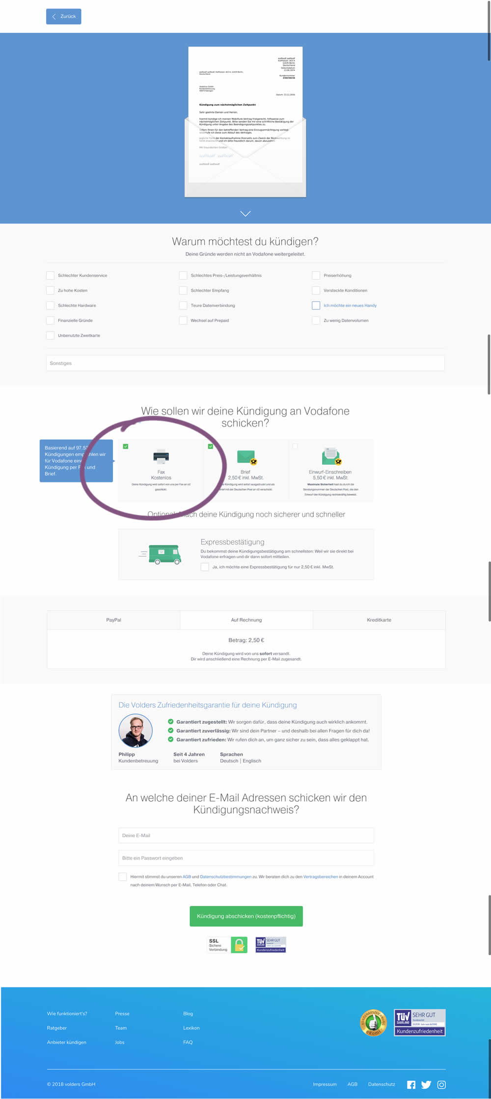
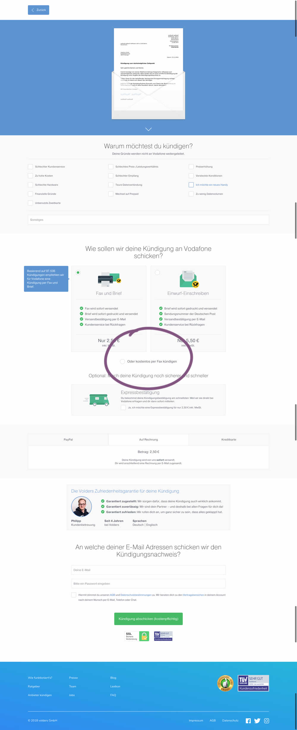
This test deprioritized the free option (kostenlos) of cancelling a contract. It did so by placing it under the paid options as small text link / radio option.