All Latest 556 A/B Tests
Become a member to unlock the abiltiy to see the highest impact a/b tests. Being able to see the actual test results and sort by impact allows growth and experimentation teams to take action on the biggest gains first
MOST RECENT TESTS
Test #404 on
Expertinstitute.com
by
 Ardit Veliu
Mar 31, 2022
Desktop
Mobile
Signup
Ardit Veliu Tested Pattern #97: Bigger Form Fields In Test #404 On Expertinstitute.com
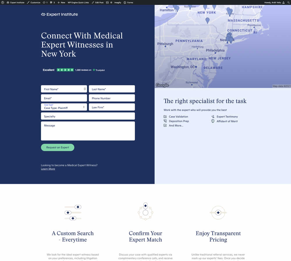
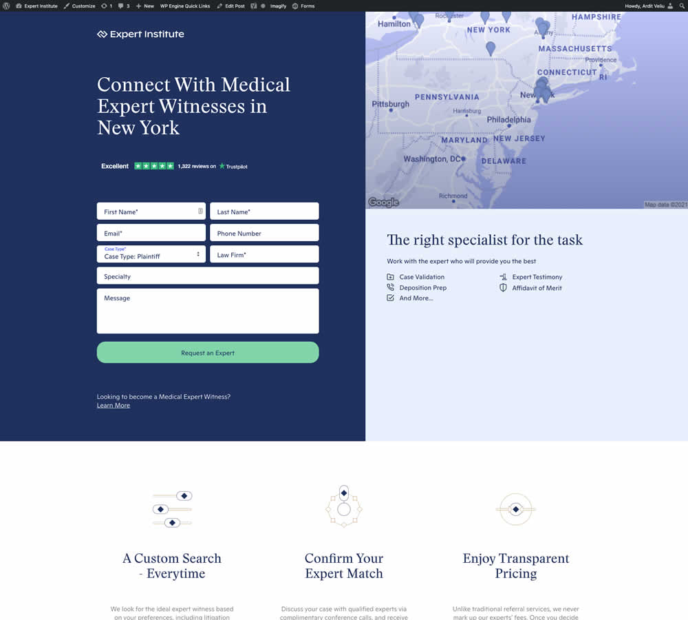
In this experiment, the button width was extended to the full width of the form above. Impact on leads was measured.
Test #367 on
Backstage.com
by
 Stanley Zuo
Jul 22, 2021
Desktop
Mobile
Signup
Stanley Zuo Tested Pattern #124: Confirmed Selection In Test #367 On Backstage.com
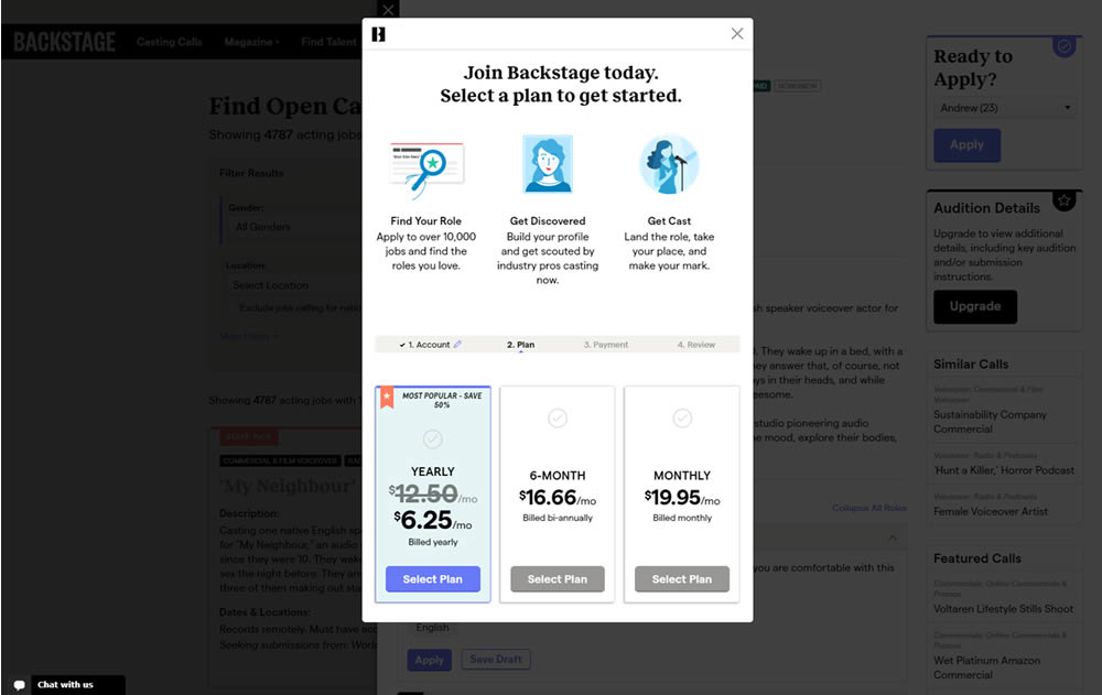
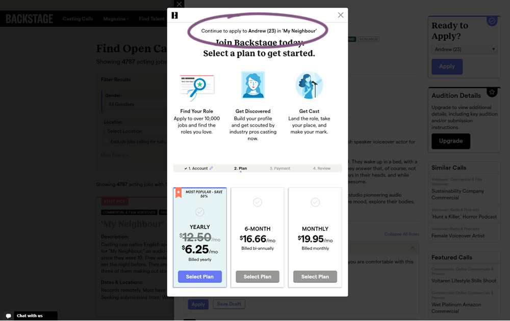
In this experiment, a confiming text was added at the top of a signup modal. The text reinforced the selection from a previous listing page, giving a good reason for continuing the signup process.
Test #341 on
by
 Alex James
Feb 25, 2021
Desktop
Mobile
Signup
Alex James Tested Pattern #35: Floating Labels In Test #341
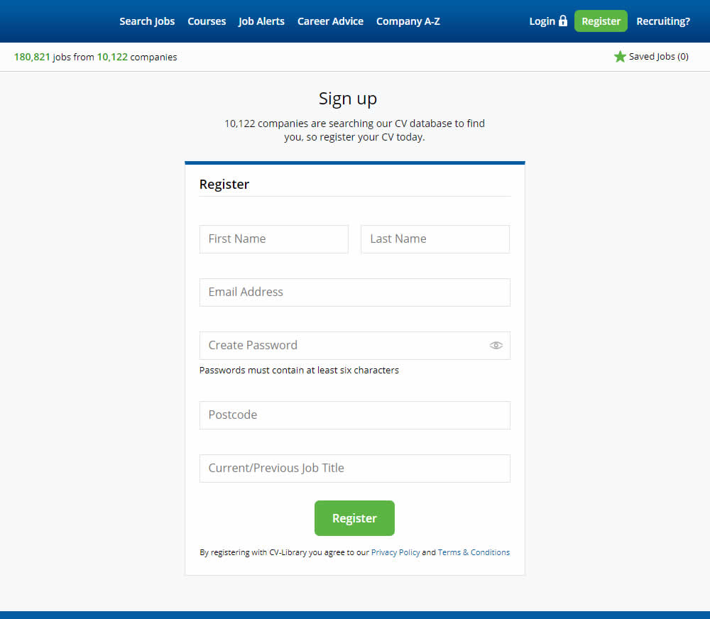
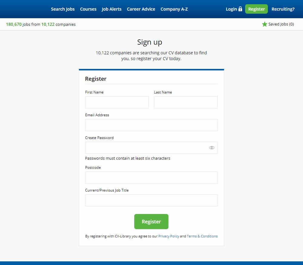
This experiment shows a comparison between floating-field labels vs top-aligned labels. In the control, the form labels first appeared inline and as users would begin typing, they floated to the top of the field. The variation had fixed field labels above the form fields at all times. Impact on signups was measured.
Test #327 on
Backstage.com
by
 Stanley Zuo
Nov 26, 2020
Desktop
Signup
Stanley Zuo Tested Pattern #120: Supporting Theme Images In Test #327 On Backstage.com
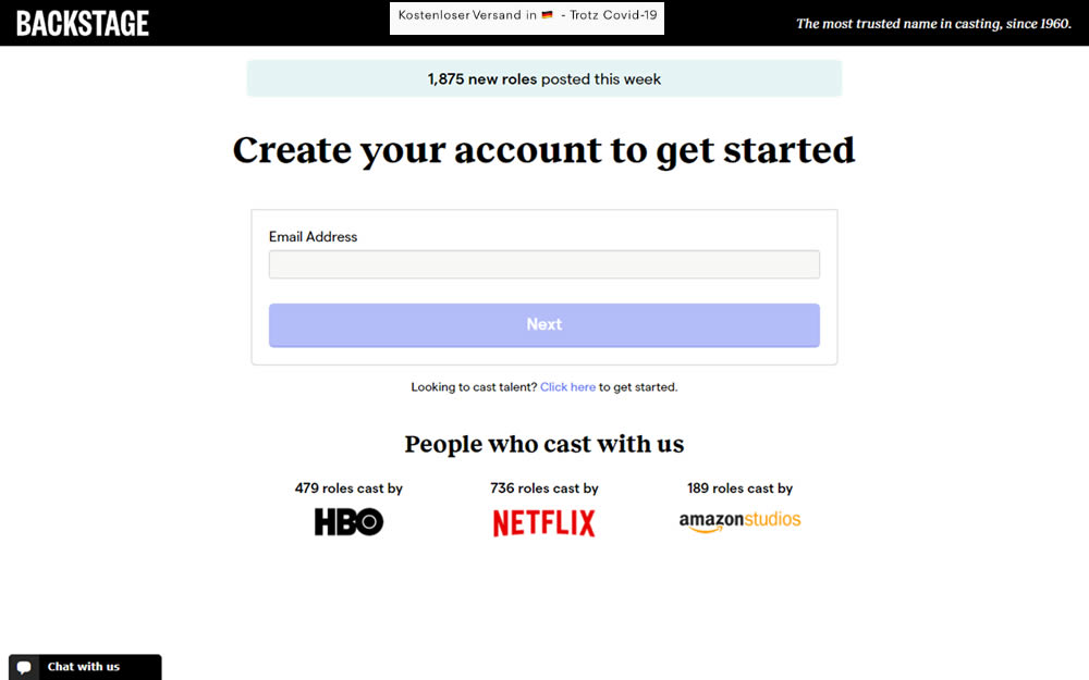
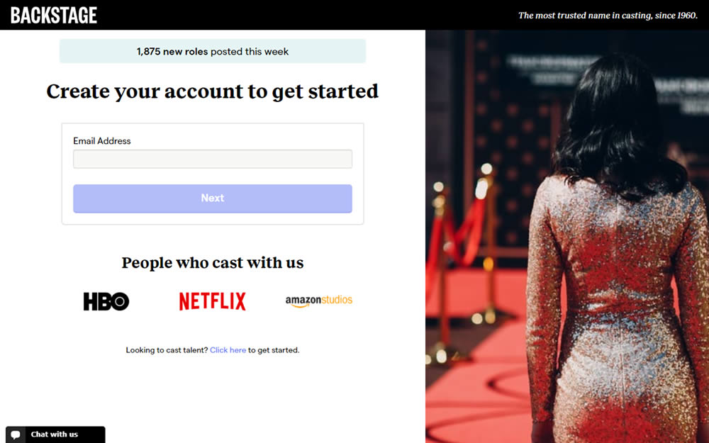
In this experiment, an aspirational photo was shown on the right side panel - reinforcing the theme of casting calls. The experiment measured progression to the next step and completed signups.
Test #323 on
Backstage.com
by
 Stanley Zuo
Oct 29, 2020
Mobile
Signup
Stanley Zuo Tested Pattern #117: Company Logos In Test #323 On Backstage.com
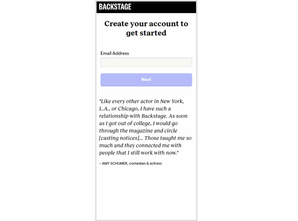
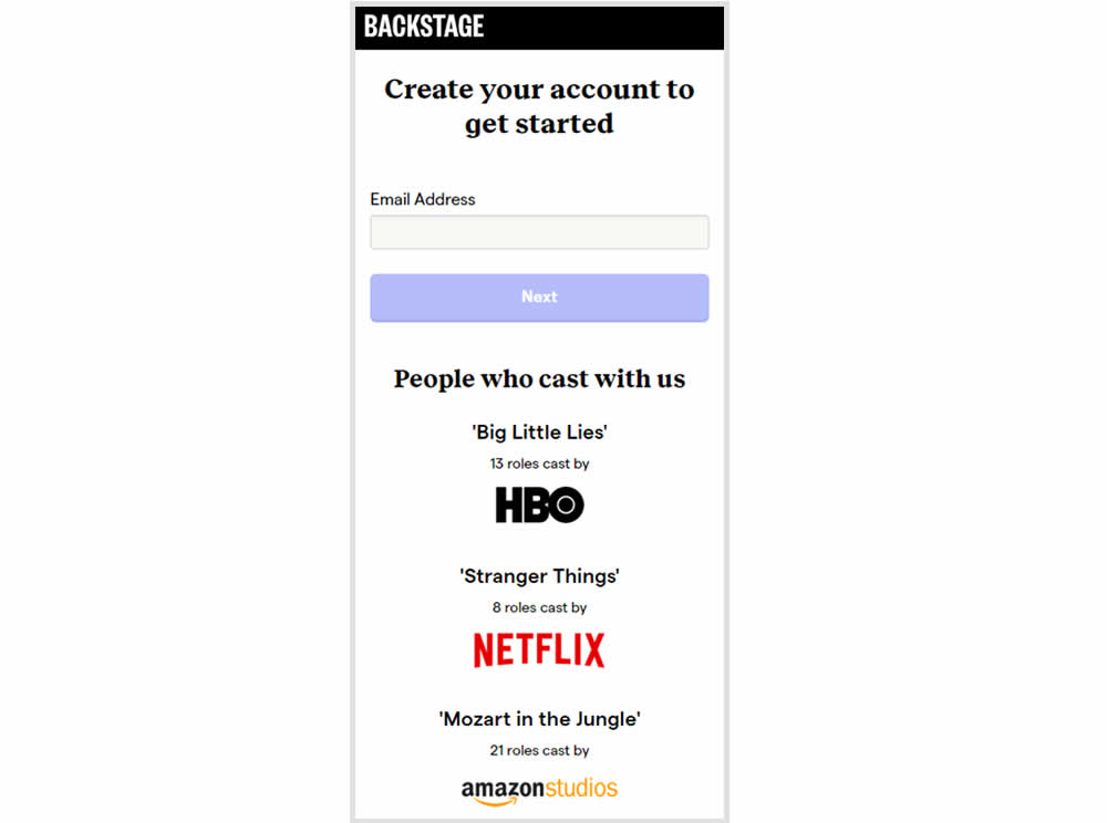
In this experiment, the variation replaced a text testimonial with high-profile production companies that have cast with Backstage. The logos were shown during the signup and checkout flow.
Test #317 on
Volders.com
by
Michal Fiech
Sep 28, 2020
Mobile
Signup
Michal Fiech Tested Pattern #119: Unselected Or Selected Defaults In Test #317 On Volders.com
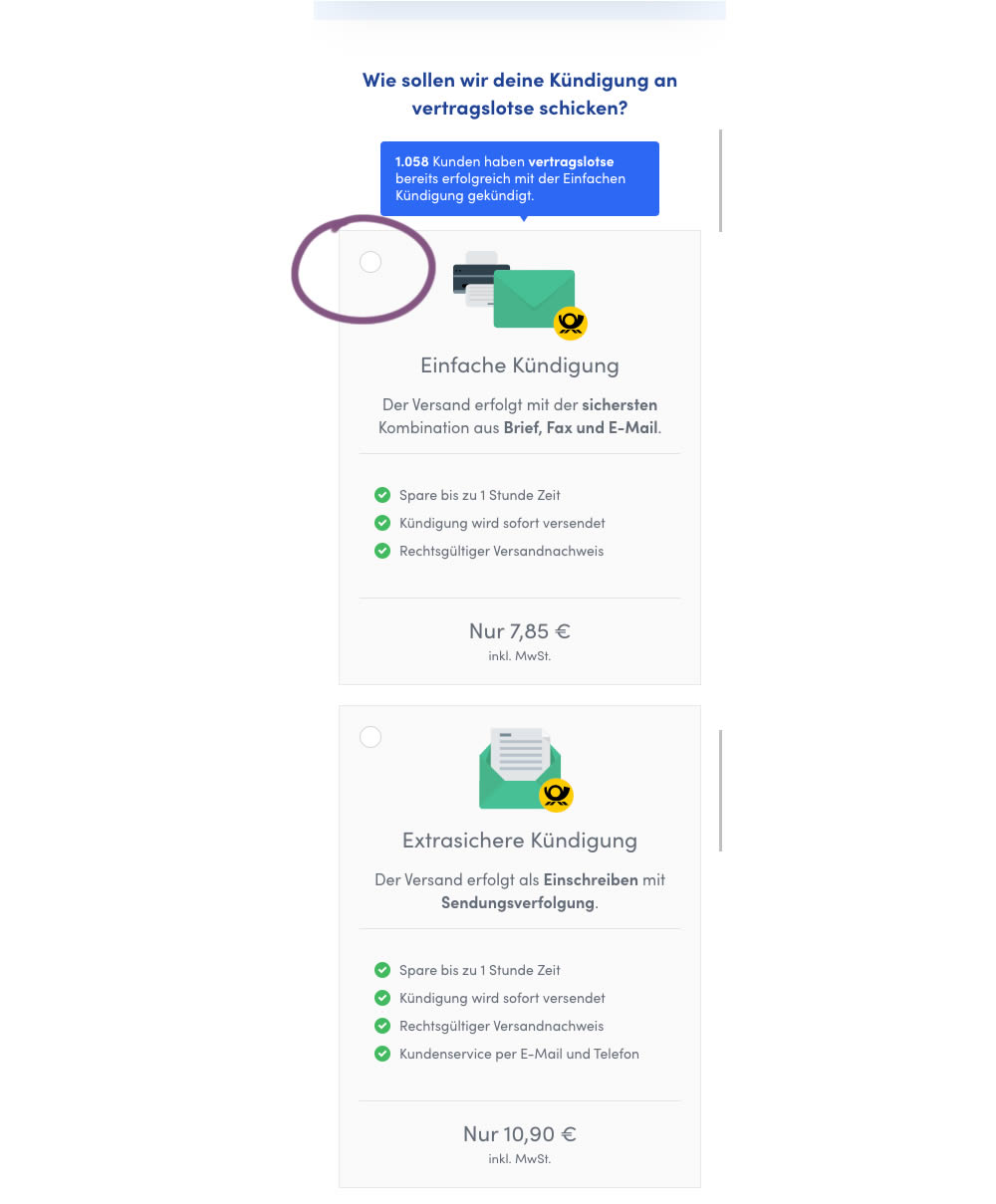
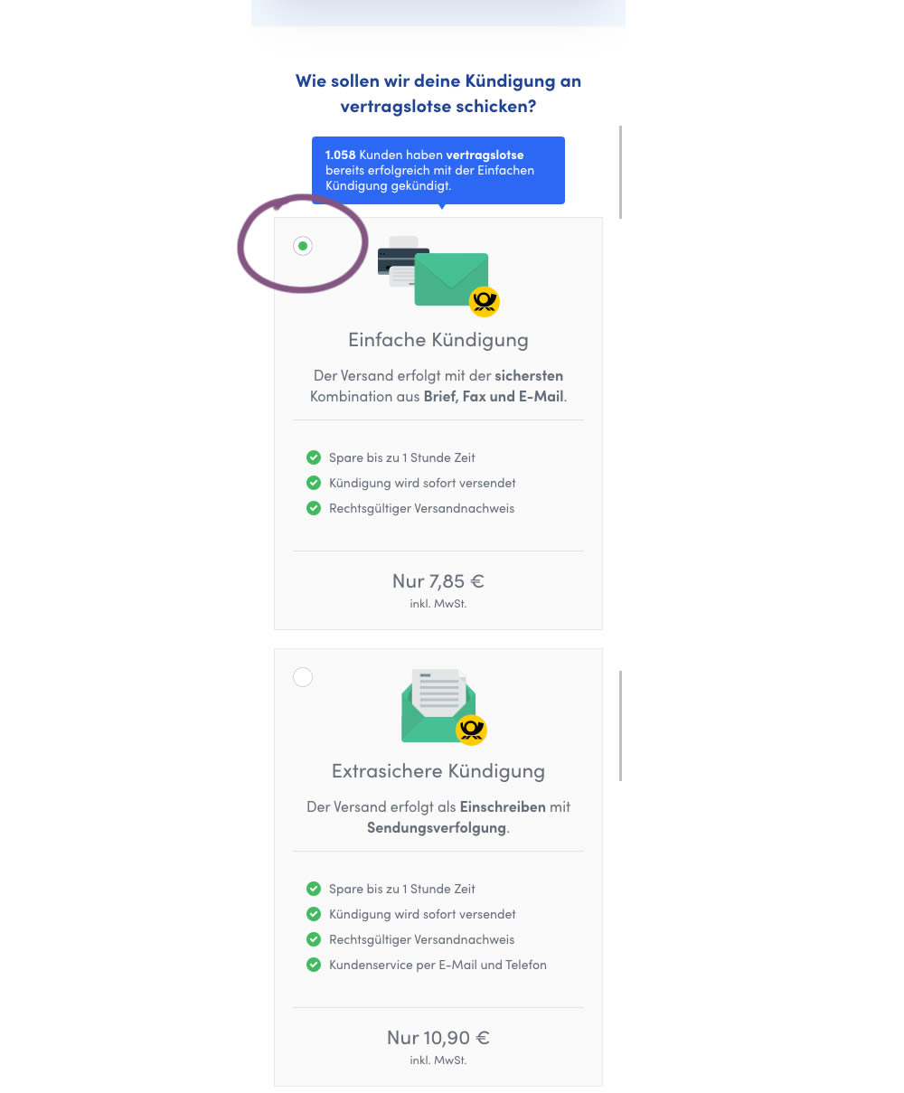
In this mobile experiment, an unselected vs selected payment plan was tested for its impact on sales. The experiment ran on a mid page of a signup funnel where customers were being asked to select one of two payment plans.
Test #315 on
Backstage.com
by
 Stanley Zuo
Aug 22, 2020
Mobile
Signup
Stanley Zuo Tested Pattern #7: Social Counts In Test #315 On Backstage.com
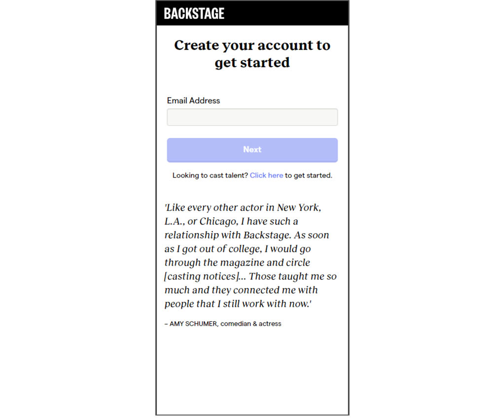
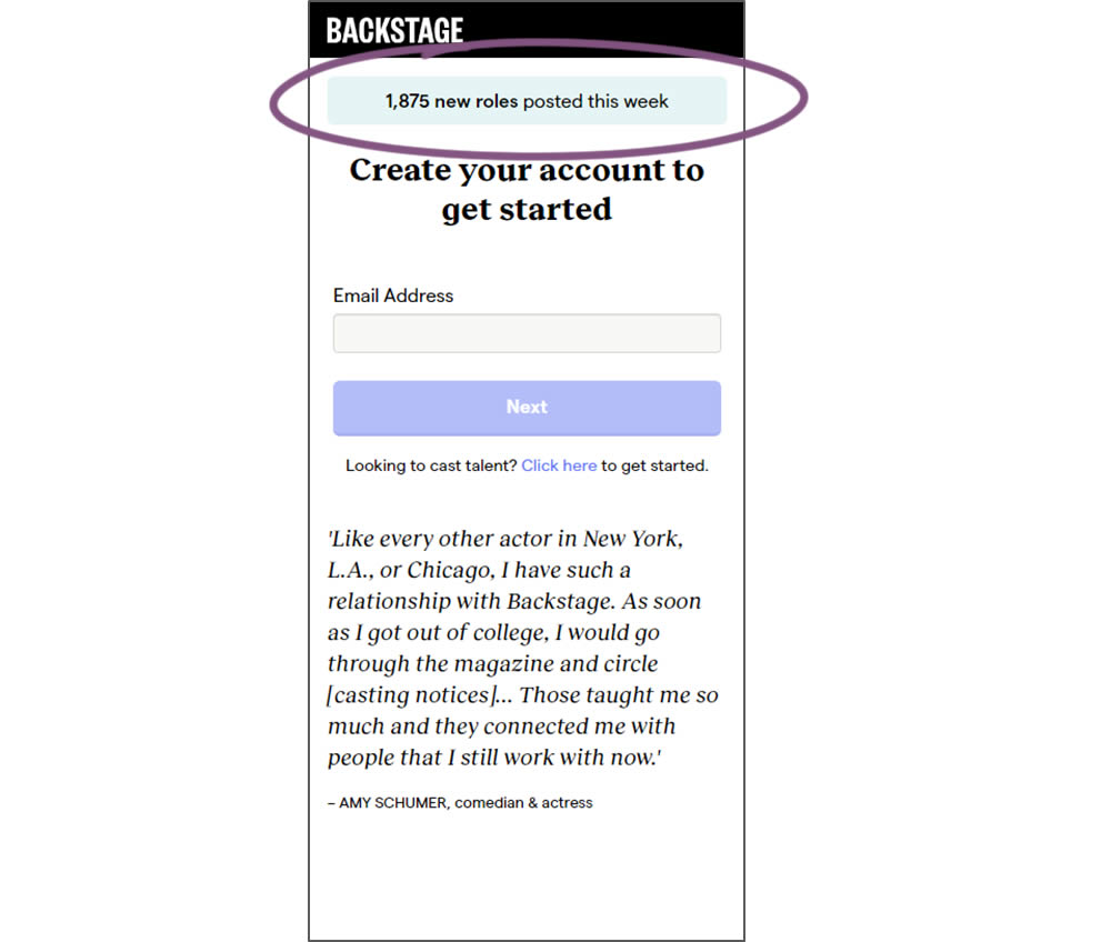
In this experiment, a dynamic number of job postings was displayed during the signup process - reinforcing the value of signing up for membership access.
Test #302 on
Volders.de
by
Michal Fiech
Jun 09, 2020
Desktop
Mobile
Signup
Michal Fiech Tested Pattern #83: Progressive Fields In Test #302 On Volders.de
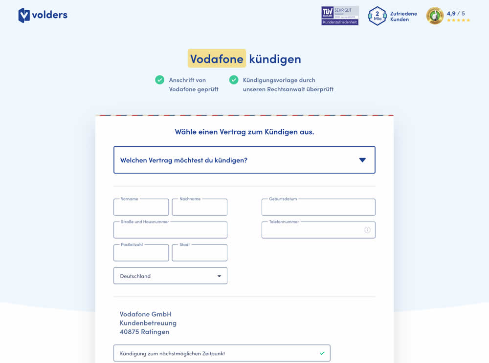
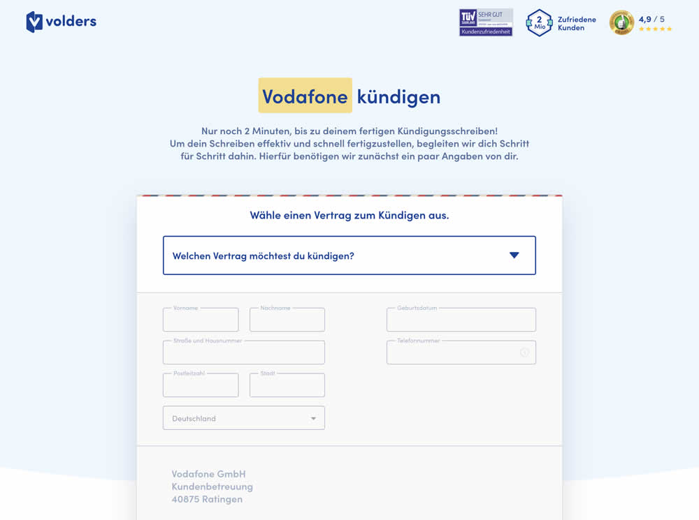
In this experiment a long form (A) was replaced with a progressive form interaction (B). Most of the form fields would appear in a grey-disabled style, until the prerequioste fields were first filled out.
Test #300 on
Volders.de
by
Michal Fiech
May 25, 2020
Desktop
Mobile
Signup
Michal Fiech Tested Pattern #3: Fewer Form Fields In Test #300 On Volders.de
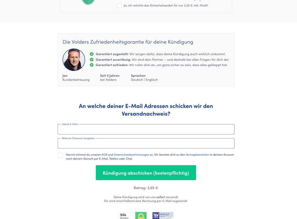
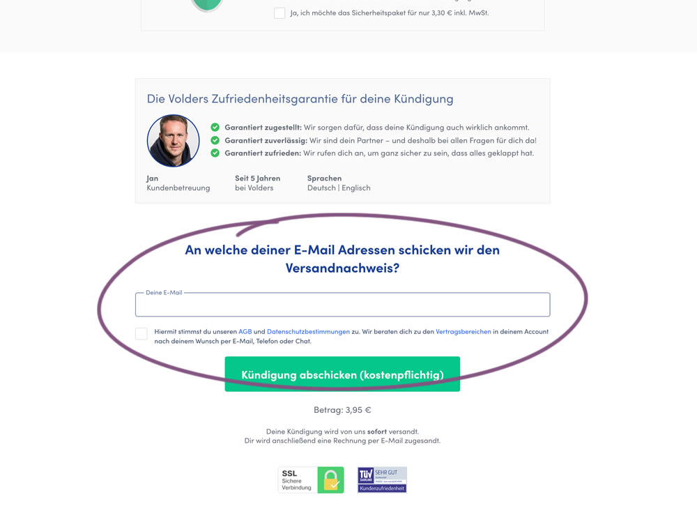
In this experiment, a password field was removed on a contract cancellation form (Volders).
In the control version, users were required to enter their email address and a password. If the email address was associated with an existing account, then the password was used to authenticate the user (and validated). When users entered a new email address, then the password field was used to create a new account.
In the variation, the password field was removed, as the authentication happened after the conversion itself using other backend mechanisms.
Test #291 on
Elevate App
by
 Jesse Germinario
Mar 30, 2020
Mobile
Signup
Jesse Germinario Tested Pattern #91: Forced Action In Test #291
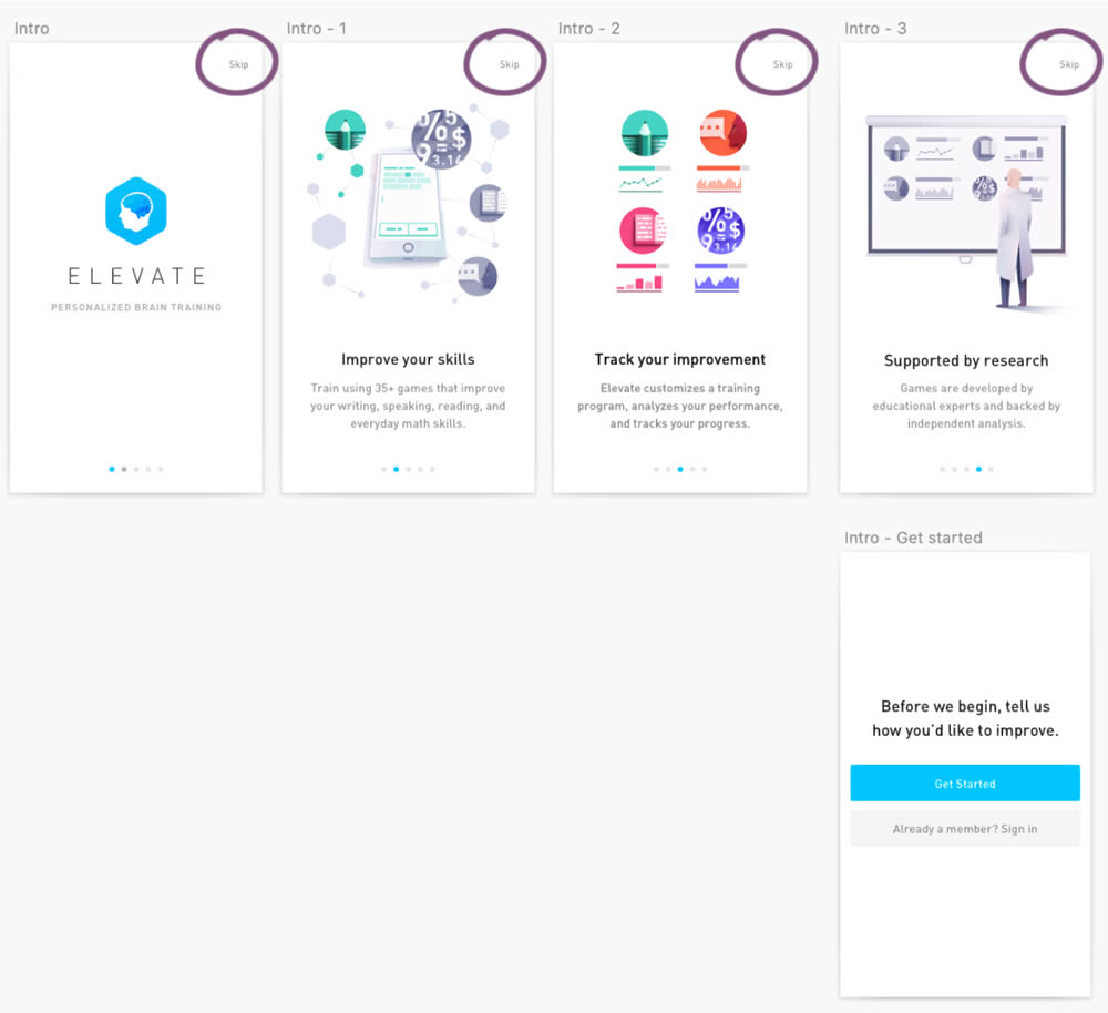
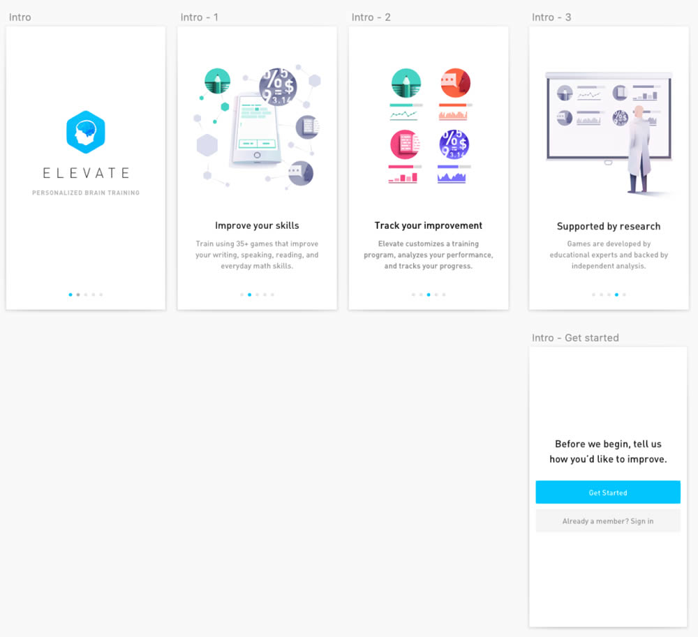
This experiment was ran on the initial onboarding screens of the Elevate App - right after installing and launching the app for the first time. The change was the removal of subtle "skip" links that fast tracked users to the signup/login screen (Get Started). Hence in the variation, all users had to scroll through the 4 introductory messages before being asked to create an account.
Test #280 on
Volders.de
by
 Alexander Krieger
Jan 24, 2020
Desktop
Mobile
Signup
Alexander Krieger Tested Pattern #3: Fewer Form Fields In Test #280 On Volders.de
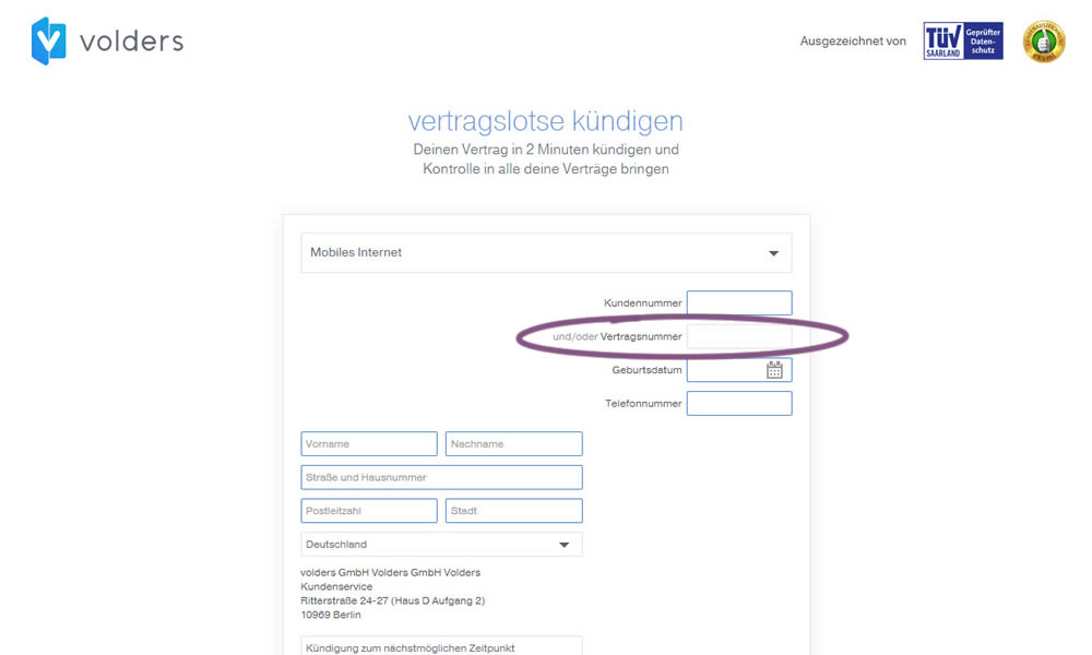
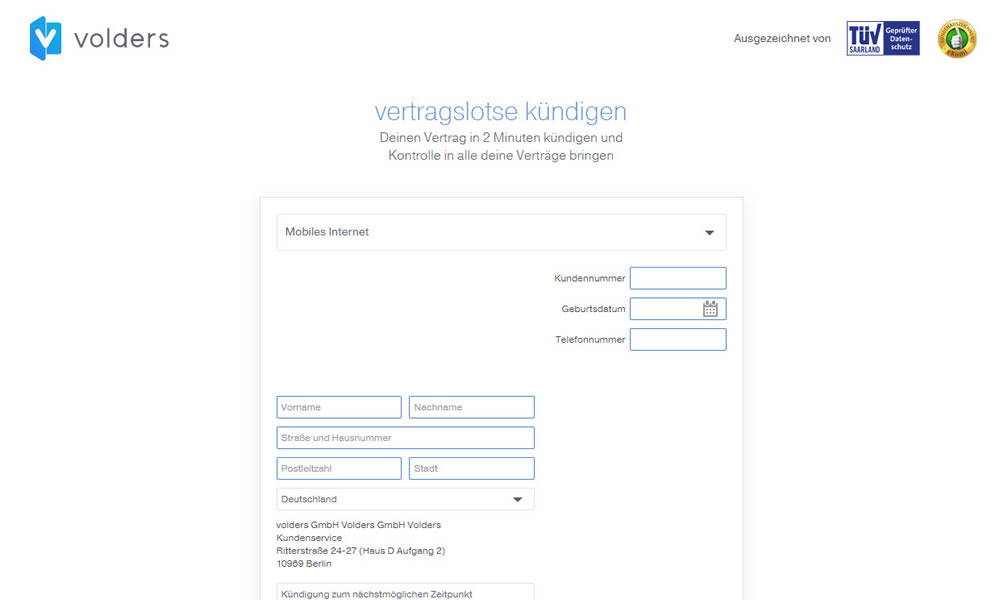
In this experiment on a contract cancellation funnel, one field was removed - a secondary contract ID. The control and variation both had a primary "customer ID" with which to identify and cancel someone's contract with.
Test #273 on
Elevate App
by
 Jesse Germinario
Dec 19, 2019
Mobile
Signup
Jesse Germinario Tested Pattern #9: Multiple Steps In Test #273
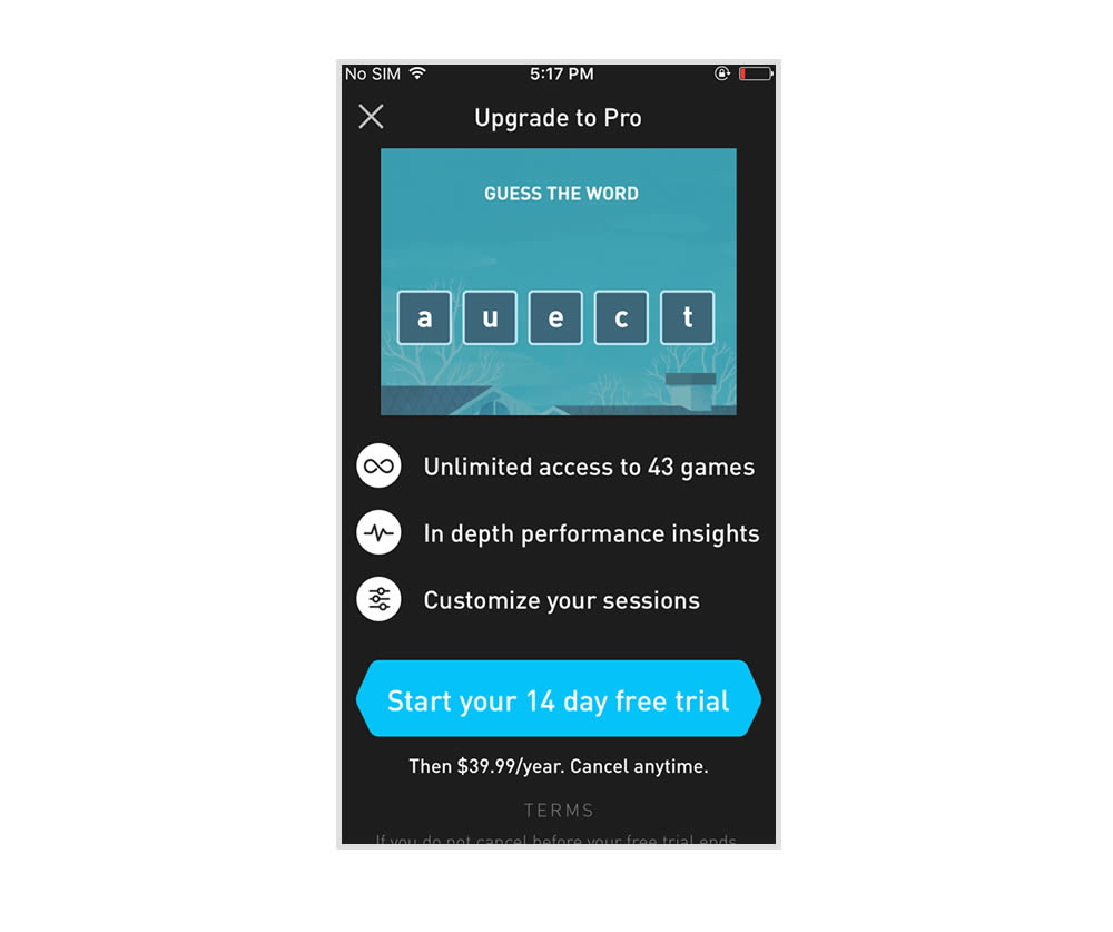
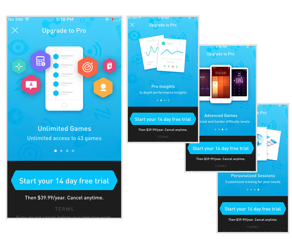
This experiment tests the impact of a different paywall screen on iOS. The current control paywall screen for 100% of iOS users was the animated pro screen. In this screen, users see an animation that gives shows glimpses of several Elevate games in action, as well as a bulleted list of key selling points for Pro. The proposed change (variant B) features a swipeable carousel of pages where each page has an image and some accompanying text explaining a different benefit of subscribing to Pro. The hypothesis is that we can lift conversion by showing users the alternate swiping paywall screen.
Test #271 on
Analytics-toolkit.co...
by
 Georgi Z. Georgiev
Nov 24, 2019
Desktop
Mobile
Signup
Georgi Z. Georgiev Tested Pattern #4: Testimonials In Test #271 On Analytics-toolkit.co...
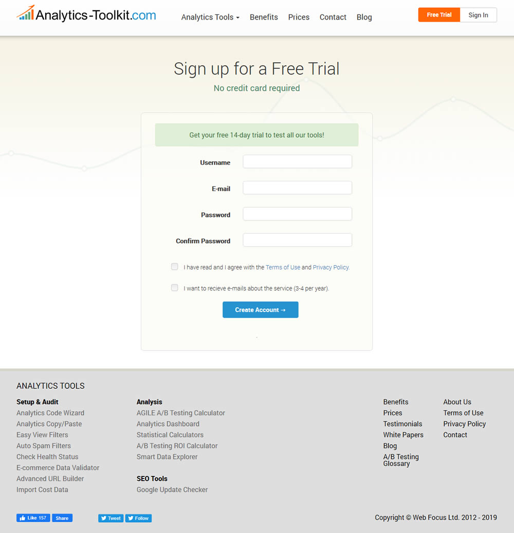
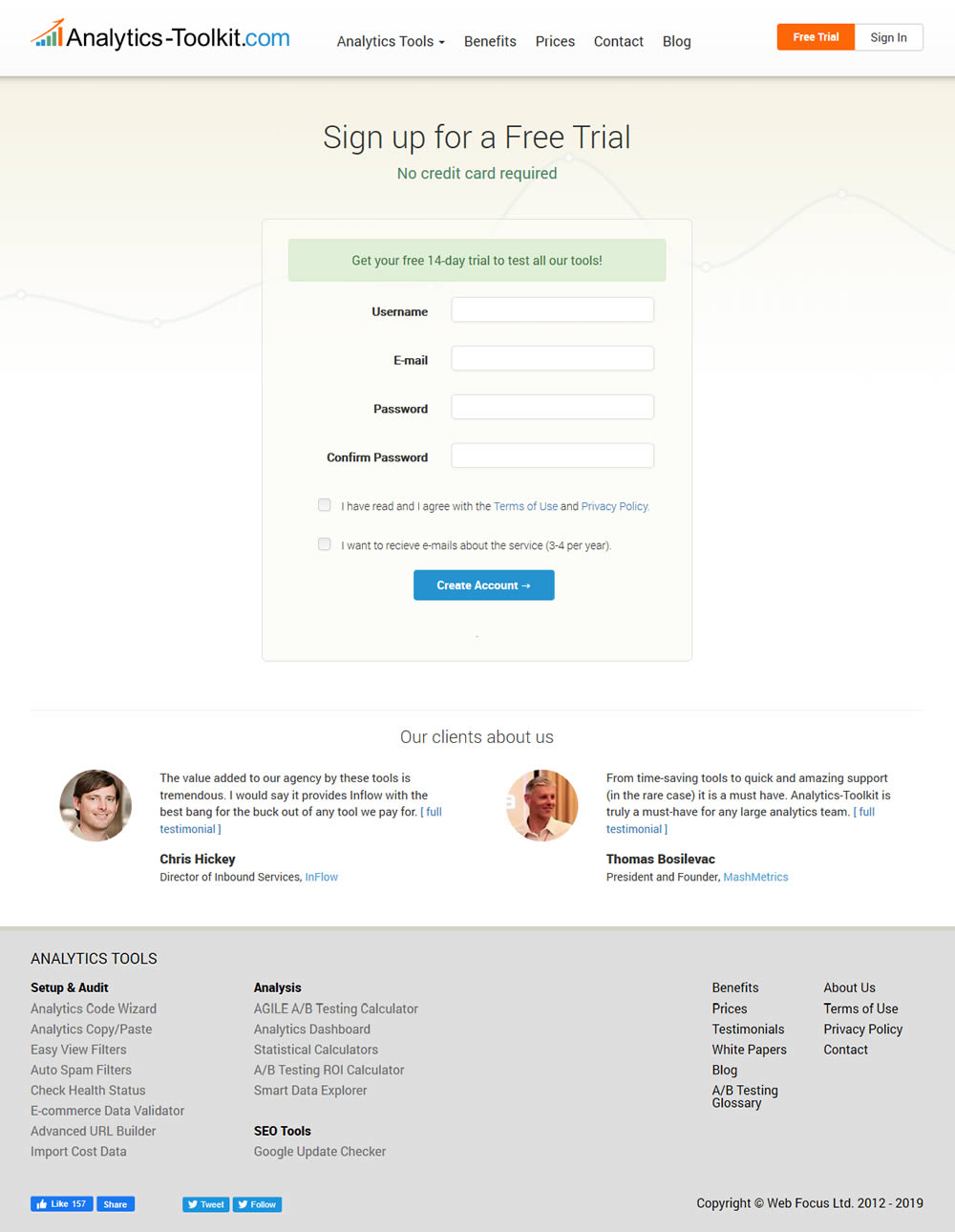
In this experiment, the test variant showed 2 testimonials on the user registration / free trial registration page at Analytics-Toolkit.com
Test #105 on
Inktweb.nl
by
 Martijn Oud
Sep 23, 2019
Desktop
Mobile
Signup
Martijn Oud Tested Pattern #111: Field Explanations In Test #105 On Inktweb.nl
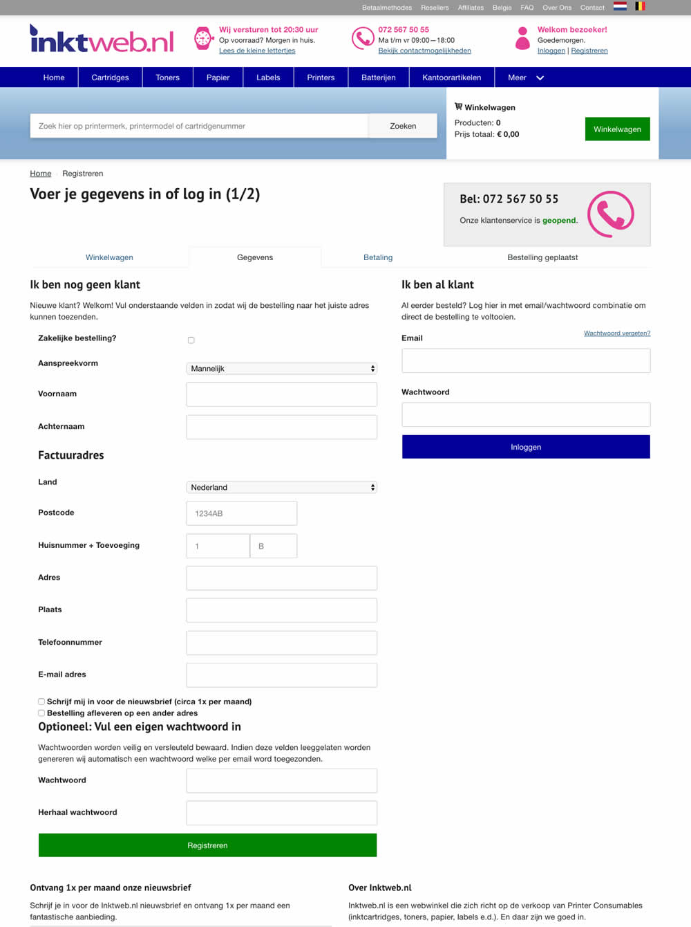
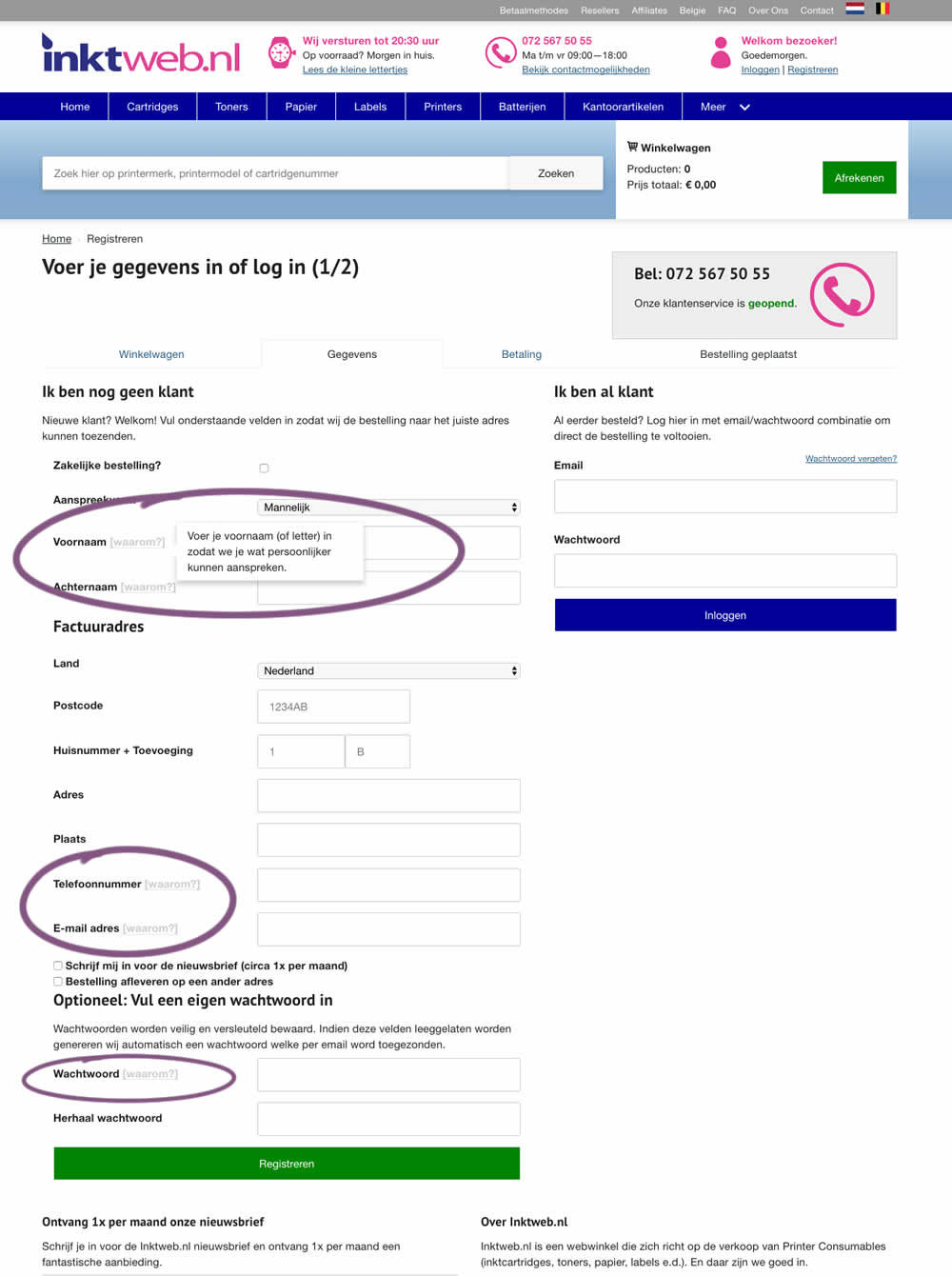
In this experiment, onhover tooltip explanations were added to selected fields (Firstname, Lastname, Phone, Email and Password). One translation example of the Firstname tooltip was the following "Enter your first name (or letter) so that we can address you in a more personal way".
Test #258 on
Thomasnet.com
by
 Julian Gaviria
Sep 12, 2019
Desktop
Mobile
Signup
Julian Gaviria Tested Pattern #110: Optional Field Labels In Test #258 On Thomasnet.com

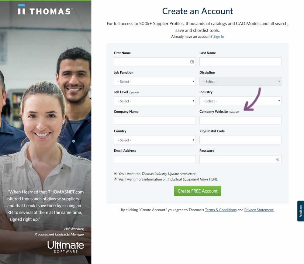
In this variation an optional field label was added.
Test #259 on
Thomasnet.com
by
 Julian Gaviria
Sep 12, 2019
Desktop
Mobile
Signup
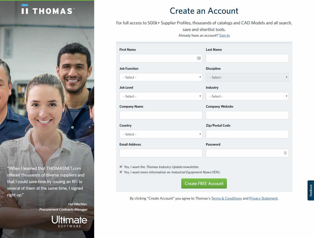
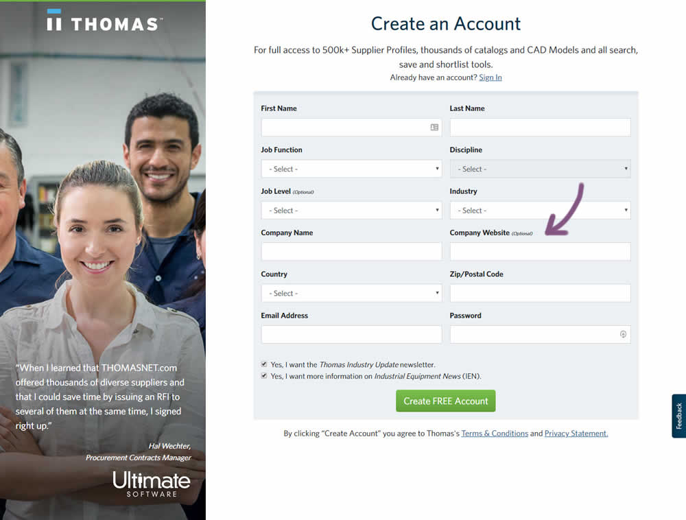
Julian Gaviria Tested Pattern #110: Optional Field Labels In Test #259 On Thomasnet.com
Test #257 on
Thomasnet.com
by
 Julian Gaviria
Sep 09, 2019
Desktop
Mobile
Signup
Julian Gaviria Tested Pattern #109: Required Field Labels In Test #257 On Thomasnet.com


In this followup experiment, field labels without and with a marked asterisk were tested.
Test #256 on
by
 Alex James
Aug 23, 2019
Desktop
Mobile
Signup
Alex James Tested Pattern #109: Required Field Labels In Test #256
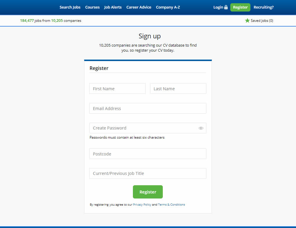
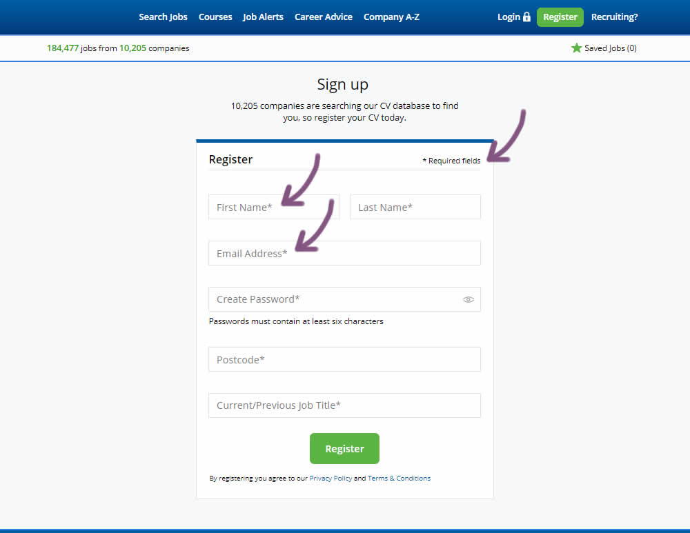
The original had no fields marked as required. The variant had all fields marked as required with an asterisk (and a reference note).
Test #255 on
Thomasnet.com
by
 Julian Gaviria
Aug 22, 2019
Desktop
Mobile
Signup
Julian Gaviria Tested Pattern #109: Required Field Labels In Test #255 On Thomasnet.com
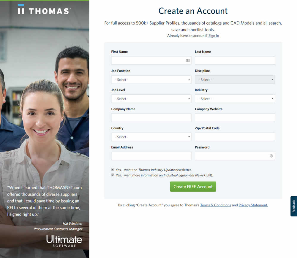

In this experiment, field labels without and with a marked asterisk were tested.
Test #254 on
Volders.de
by
 Alexander Krieger
Aug 16, 2019
Desktop
Mobile
Signup
Alexander Krieger Tested Pattern #17: Least Or Most Expensive First In Test #254 On Volders.de
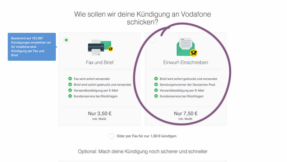
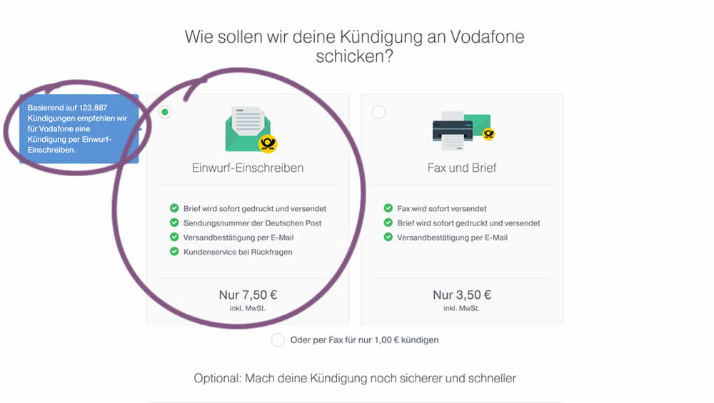
In this experiment, 4 things were adjusted in the variation: the highest pricing plan was shifted to the left, it was set as the default one, the recommendation was also adjusted to point to the highest plan, and one benefit from the lowest plan was removed (customer support).