7 Tests By  Alex James
Tests
Test #341 on
by
 Alex James
Feb 25, 2021
Desktop
Mobile
Alex James Tested Pattern #35: Floating Labels In Test #341
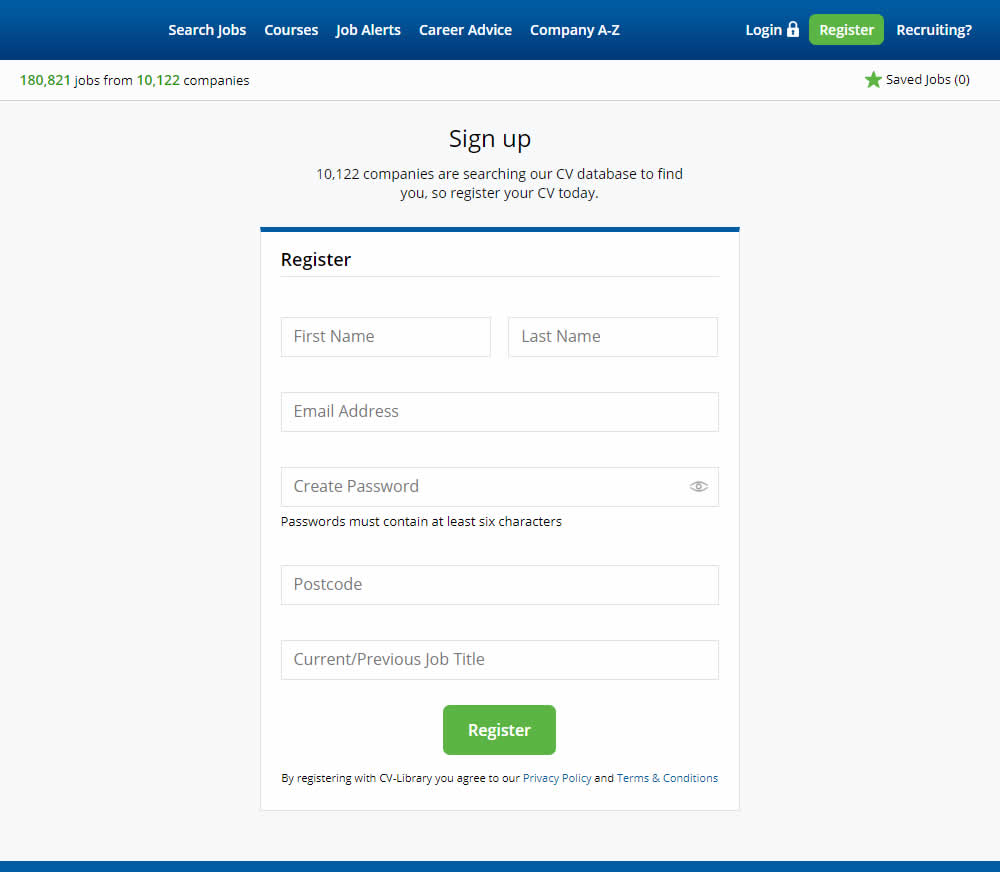
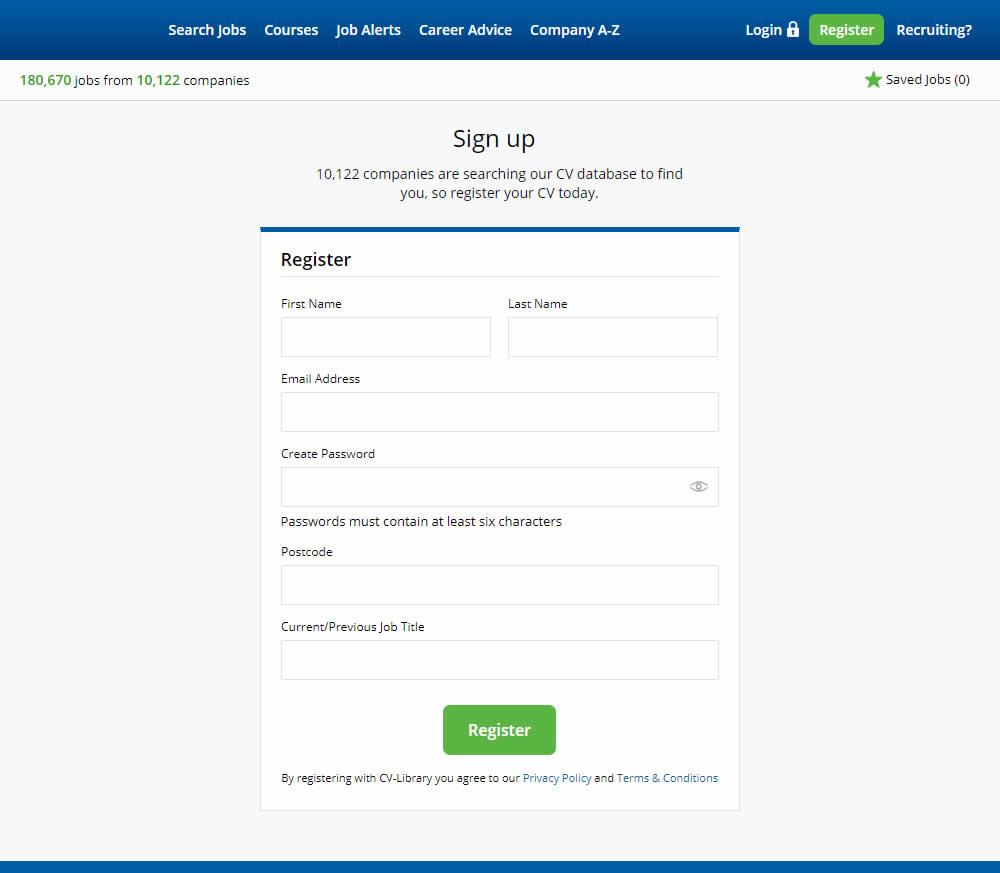
This experiment shows a comparison between floating-field labels vs top-aligned labels. Form labels first appeared inline and as users would begin typing, they floated to the top of the field. In the other version, fixed field labels were shown above the form fields at all times. Impact on signups was measured.
Test #256 on
by
 Alex James
Aug 23, 2019
Desktop
Mobile
Alex James Tested Pattern #109: Required Field Labels In Test #256
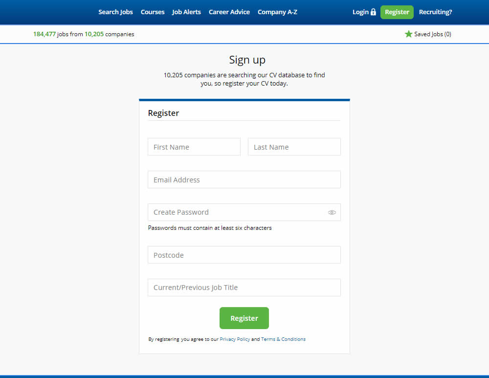
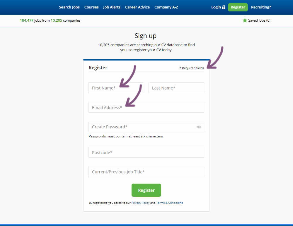
The original had no fields marked as required. The variant had all fields marked as required with an asterisk (and a reference note).
Test #242 on
by
 Alex James
May 27, 2019
Desktop
Mobile
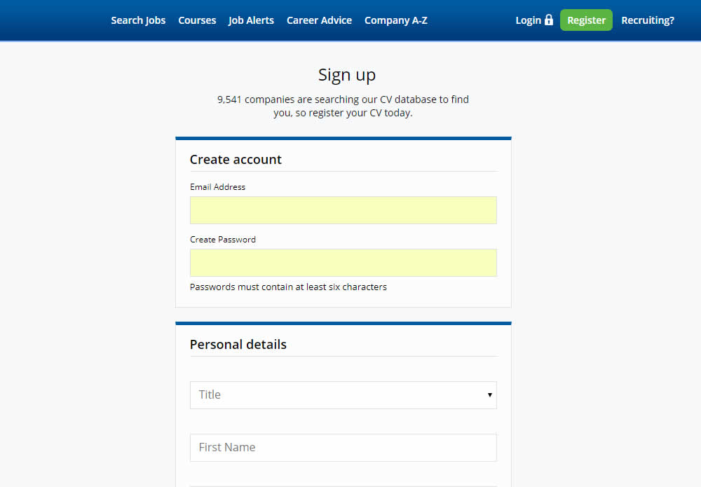
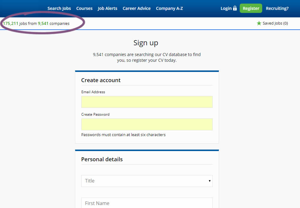
Alex James Tested Pattern #7: Social Counts In Test #242
Test #236 on
by
 Alex James
Apr 04, 2019
Desktop
Alex James Tested Pattern #9: Multiple Steps In Test #236
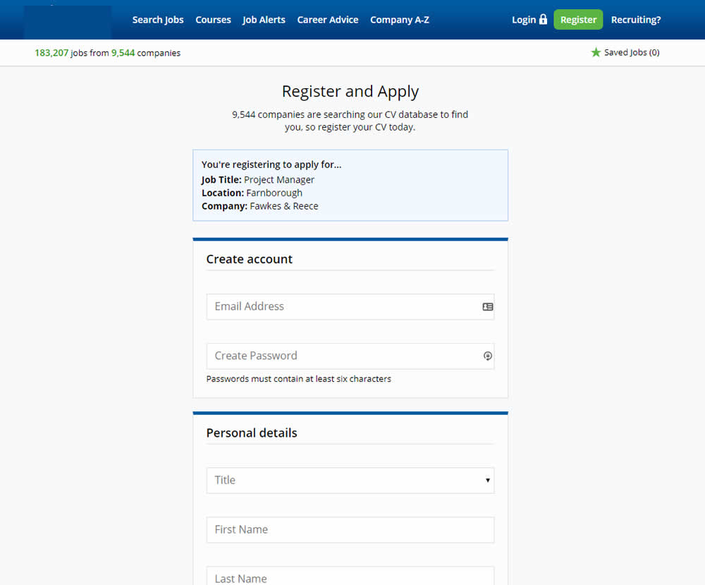
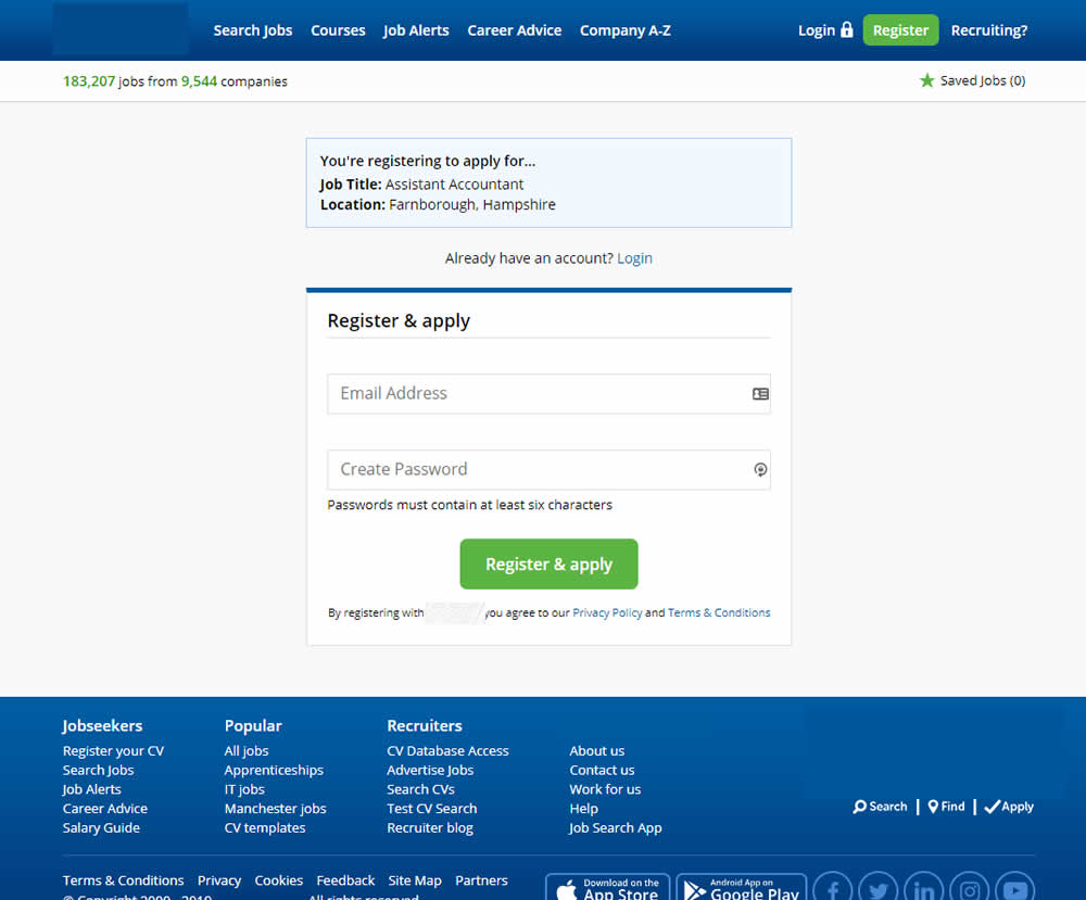
In this experiment a single screen signup process was broken into 2 separate steps: account creation & details.
Test #234 on
by
 Alex James
Apr 01, 2019
Desktop
Alex James Tested Pattern #101: Search Keyword Highlighting In Test #234


In this experiment, a different style for keyword highlighting was used.
Test #224 on
by
 Alex James
Feb 11, 2019
Desktop
Alex James Tested Pattern #3: Fewer Form Fields In Test #224
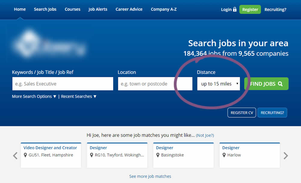
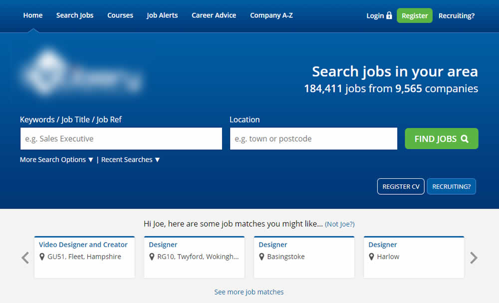
This experiment reduced the search form by removing the distance field.
Test #220 on
by
 Alex James
Jan 18, 2019
Desktop
Alex James Tested Pattern #34: Open In A New Tab In Test #220
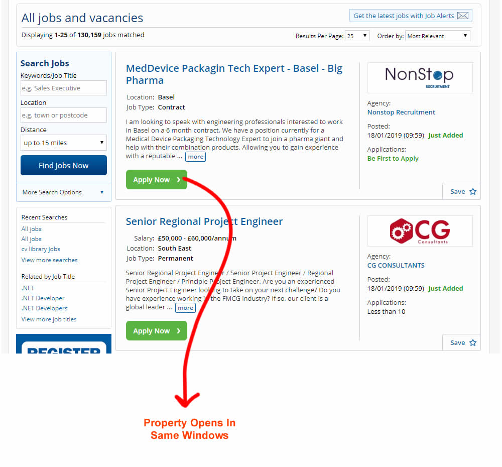
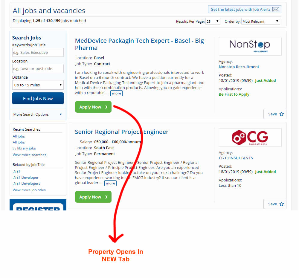
This experiment measured the effect of opening new listing (job applications) in a new tab, against opening them in the same window. The experiment A-B was inversed to match the pattern (in reality, the original already opened the tabs in a new window).