25 Tests By  Julian Gaviria
Tests
Test #370 on
Thomasnet.com
by
 Julian Gaviria
Aug 16, 2021
Desktop
Mobile
Julian Gaviria Tested Pattern #88: Action Button In Test #370 On Thomasnet.com

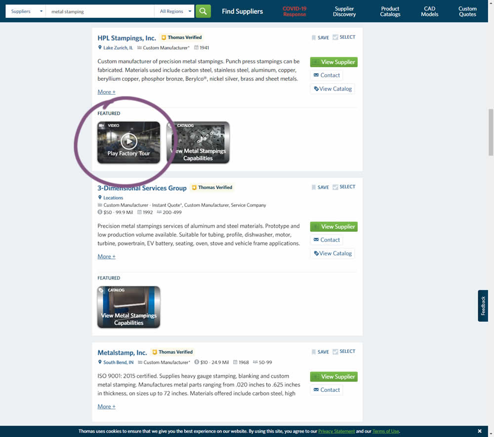
This experiment added the simple verb ("play") before the "factory video" label to encourage more video plays. Impact on progression / clicks was measured.
Test #309 on
Thomasnet.com
by
 Julian Gaviria
Jul 24, 2020
Desktop
Julian Gaviria Tested Pattern #72: Priming Step In Test #309 On Thomasnet.com
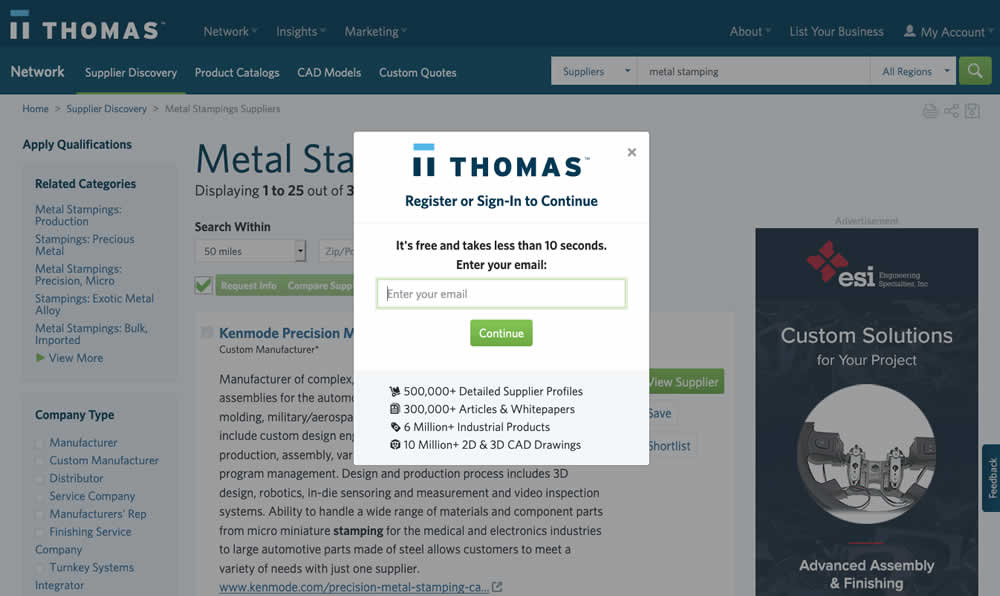
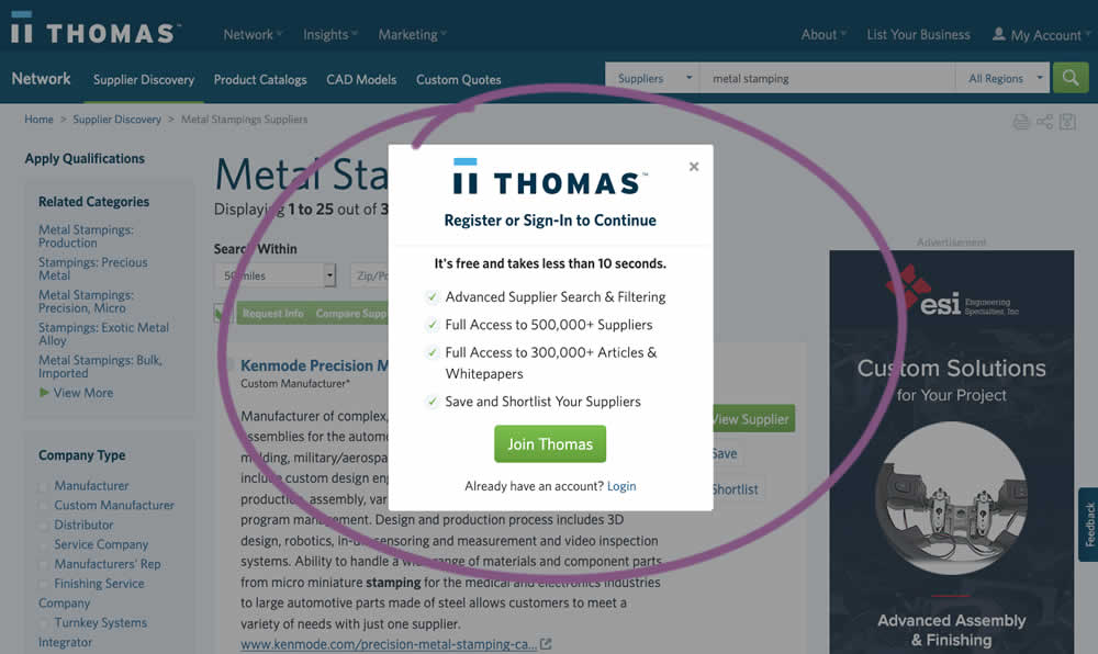
In this experiment, an extra step was prepended at the beginning of a multiple step signup modal flow. The signup modal would appear on listing pages after requests to contact a listed company. The idea was to prime users with benefits of signing up in order to increase their motivation to do so. The experiment measured the impact on the initial progression (to the step with the email form).
Test #303 on
Thomasnet.com
by
 Julian Gaviria
Jun 26, 2020
Desktop
Mobile
Julian Gaviria Tested Pattern #14: Exposed Menu Options In Test #303 On Thomasnet.com

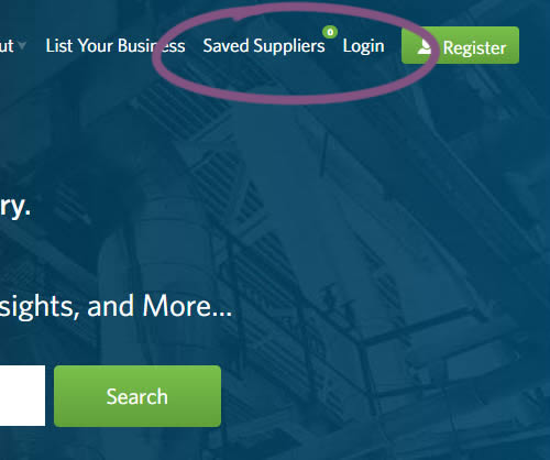
In this experiment variation, the saved suppliers feature was surfaced in the global navigation.It was already possible to save supplier companies from listing and specific company pages. This experiment aimed to increase the saving functions visibility and possibly increase more leads.
Test #295 on
Thomasnet.com
by
 Julian Gaviria
Apr 29, 2020
Desktop
Mobile
Julian Gaviria Tested Pattern #25: Nagging Results In Test #295 On Thomasnet.com
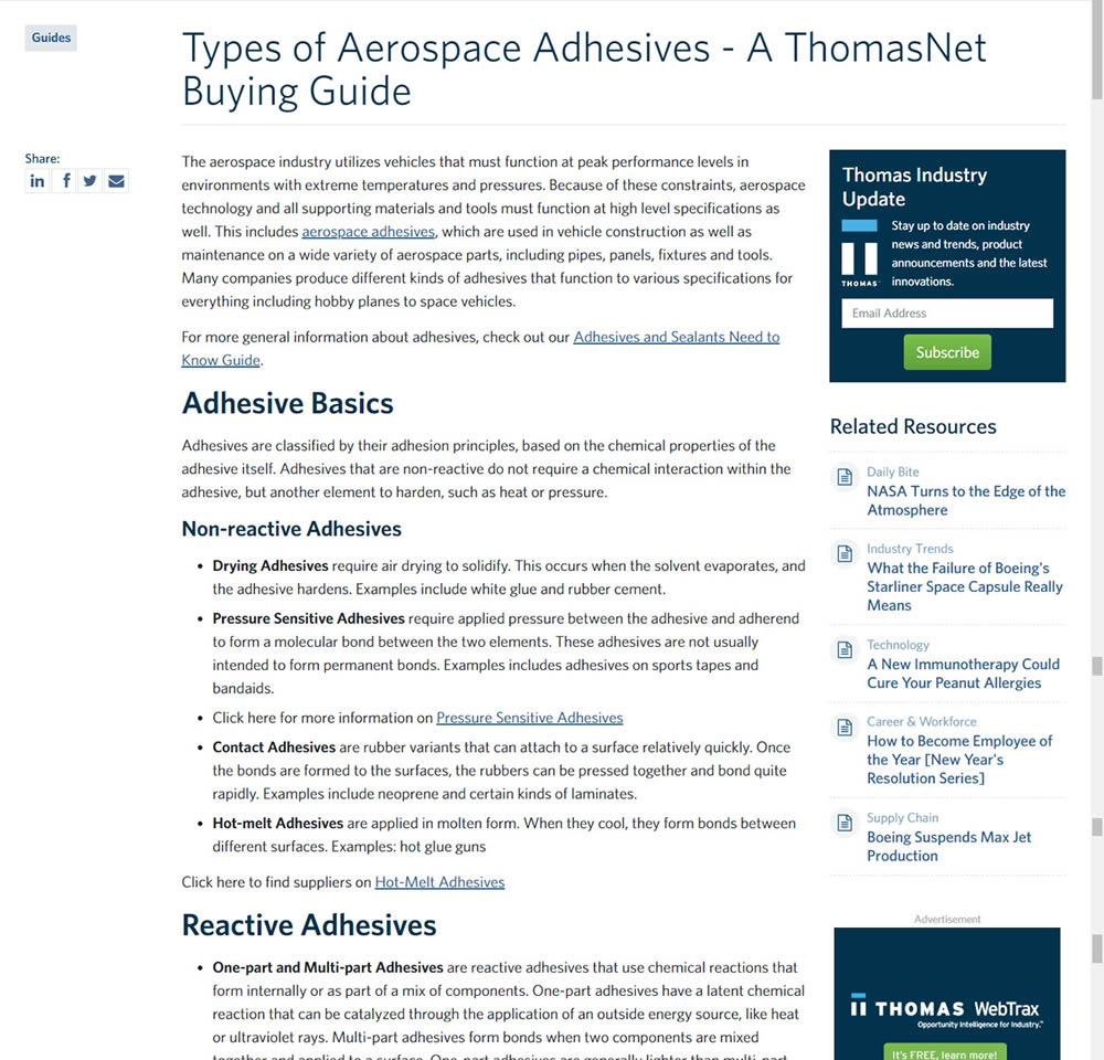
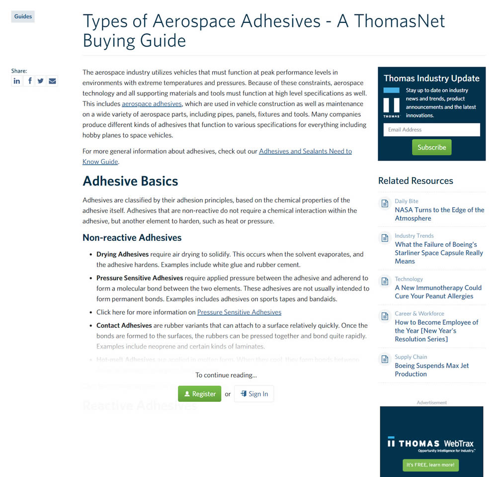
In this experiment, blog article pages were hidden behind a registration wall - requing a signup to access. The registration wall would appear after the first paragraph using gradual opacity to cover the rest of the article. We have published the effects of this change on registrations (signups) and on engagement (users viewing other more important company detail pages).
Test #284 on
Thomasnet.com
by
 Julian Gaviria
Feb 19, 2020
Desktop
Mobile
Julian Gaviria Tested Pattern #78: Tags, Badges And Structured Information In Test #284 On Thomasnet.com
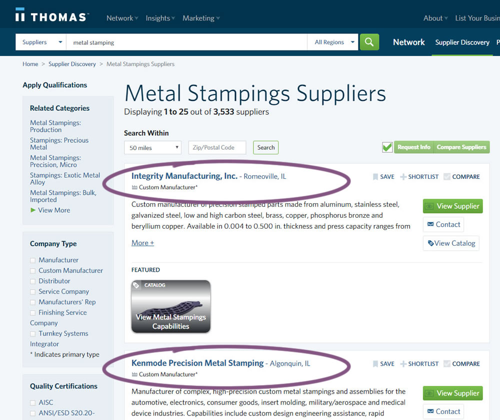
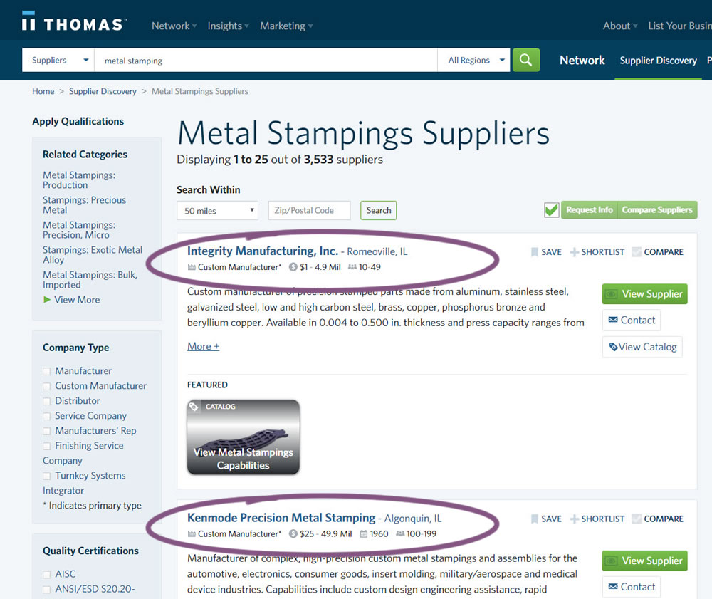
In this experiment, structured data tags were displayed on a listing page to help potential buyers make better decisions. The additional information about the listed companies included: annual revenue, employee count, and year of establishment.
Test #282 on
Thomasnet.com
by
 Julian Gaviria
Feb 07, 2020
Desktop
Mobile
Julian Gaviria Tested Pattern #51: Shortcut Buttons In Test #282 On Thomasnet.com
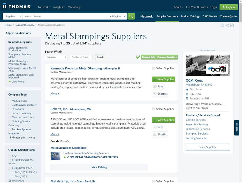
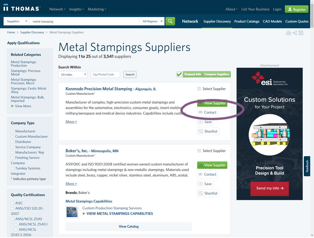
In this experiment, a contact button was added to a listing / search results page to make it faster to contact a company. This same button was also visible on the company detail page.
Test #269 on
Thomasnet.com
by
 Julian Gaviria
Nov 15, 2019
Desktop
Julian Gaviria Tested Pattern #14: Exposed Menu Options In Test #269 On Thomasnet.com


In this experiment, the variation exposed 6 of the options from the pulldown menu as tabs.
Test #262 on
Thomasnet.com
by
 Julian Gaviria
Oct 03, 2019
Desktop
Mobile
Julian Gaviria Tested Pattern #32: Condensed List In Test #262 On Thomasnet.com
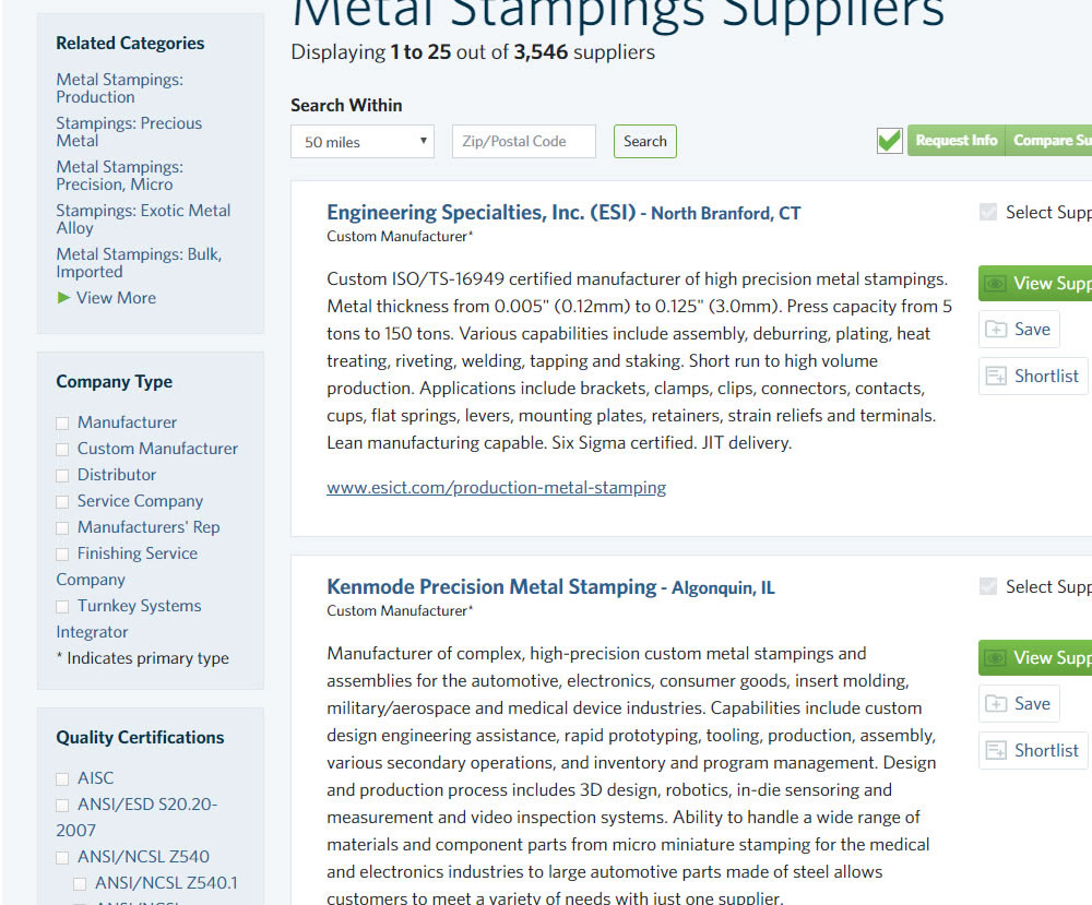
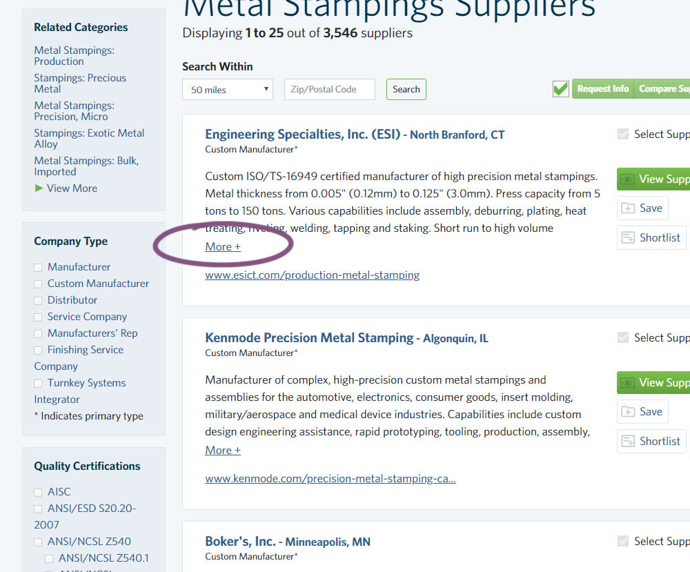
In this experiment, the B version condensed the company listings. This was done by showing less of the description and introducing a "more" and "less" dynamic links that would expand and collapse the description.
Test #258 on
Thomasnet.com
by
 Julian Gaviria
Sep 12, 2019
Desktop
Mobile
Julian Gaviria Tested Pattern #110: Optional Field Labels In Test #258 On Thomasnet.com

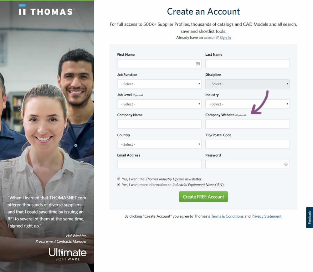
In this variation an optional field label was added.
Test #259 on
Thomasnet.com
by
 Julian Gaviria
Sep 12, 2019
Desktop
Mobile
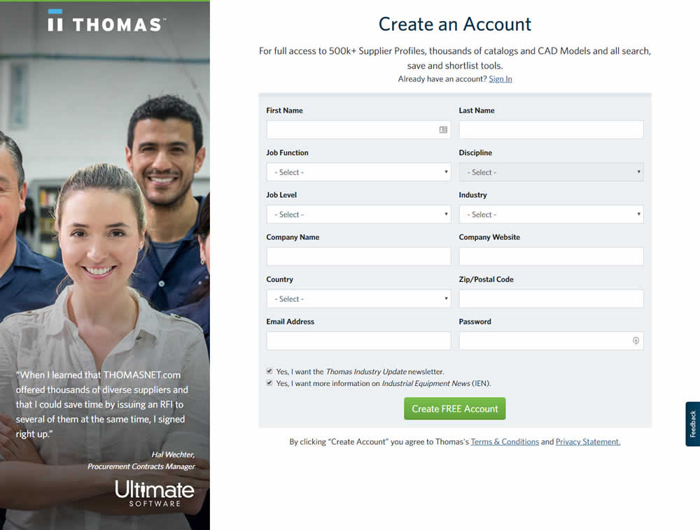
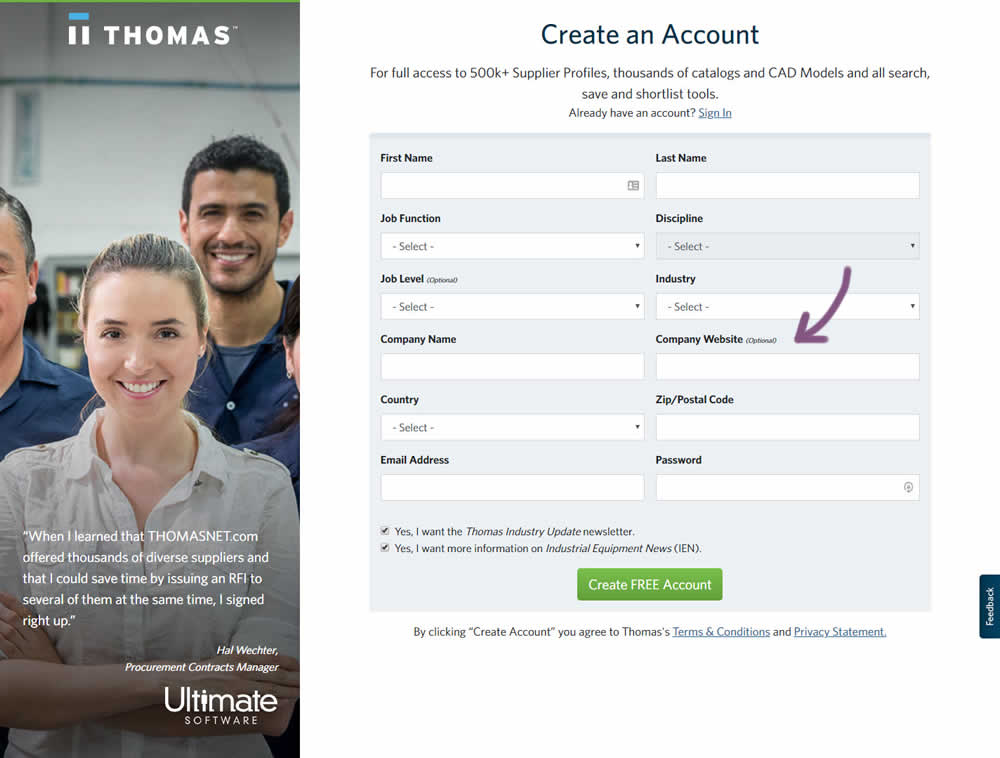
Julian Gaviria Tested Pattern #110: Optional Field Labels In Test #259 On Thomasnet.com
Test #257 on
Thomasnet.com
by
 Julian Gaviria
Sep 09, 2019
Desktop
Mobile
Julian Gaviria Tested Pattern #109: Required Field Labels In Test #257 On Thomasnet.com


In this followup experiment, field labels without and with a marked asterisk were tested.
Test #255 on
Thomasnet.com
by
 Julian Gaviria
Aug 22, 2019
Desktop
Mobile
Julian Gaviria Tested Pattern #109: Required Field Labels In Test #255 On Thomasnet.com
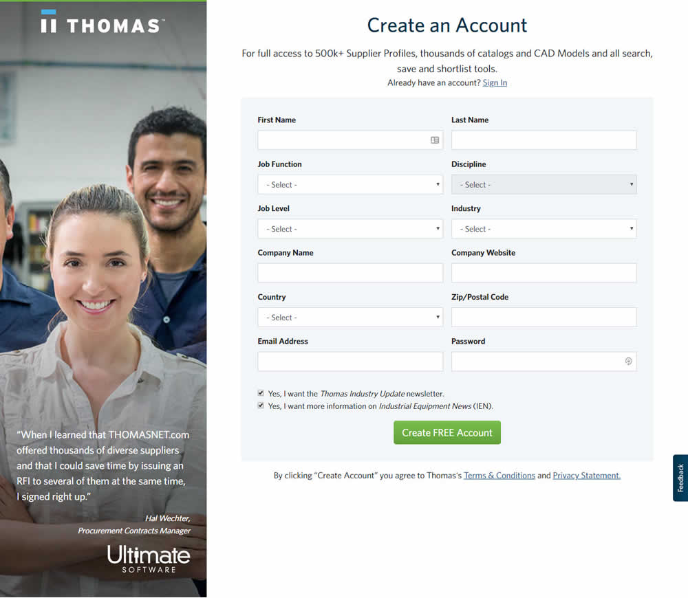

In this experiment, field labels without and with a marked asterisk were tested.
Test #252 on
Thomasnet.com
by
 Julian Gaviria
Jul 30, 2019
Desktop
Mobile
Julian Gaviria Tested Pattern #107: Contrast Links & Buttons In Test #252 On Thomasnet.com
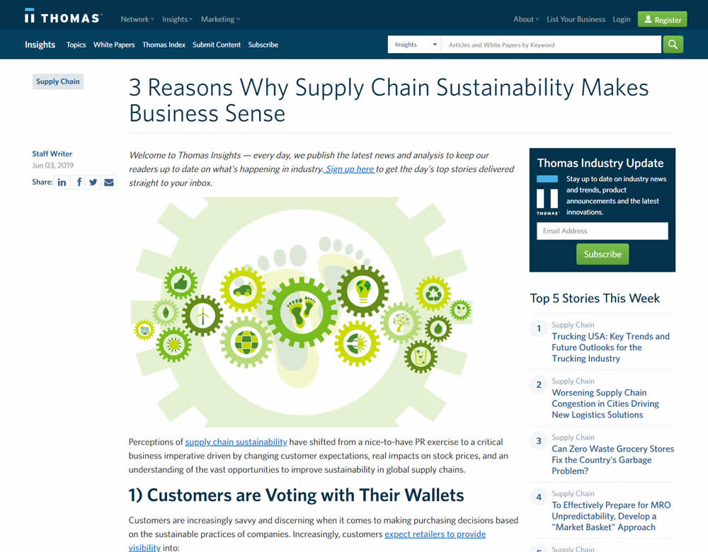
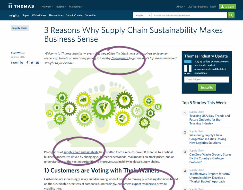
In this experiment a light blue bold link was tested against a darker blue bold link.
Test #247 on
Thomasnet.com
by
 Julian Gaviria
Jun 13, 2019
Desktop
Mobile
Julian Gaviria Tested Pattern #41: Sticky Call To Action In Test #247 On Thomasnet.com
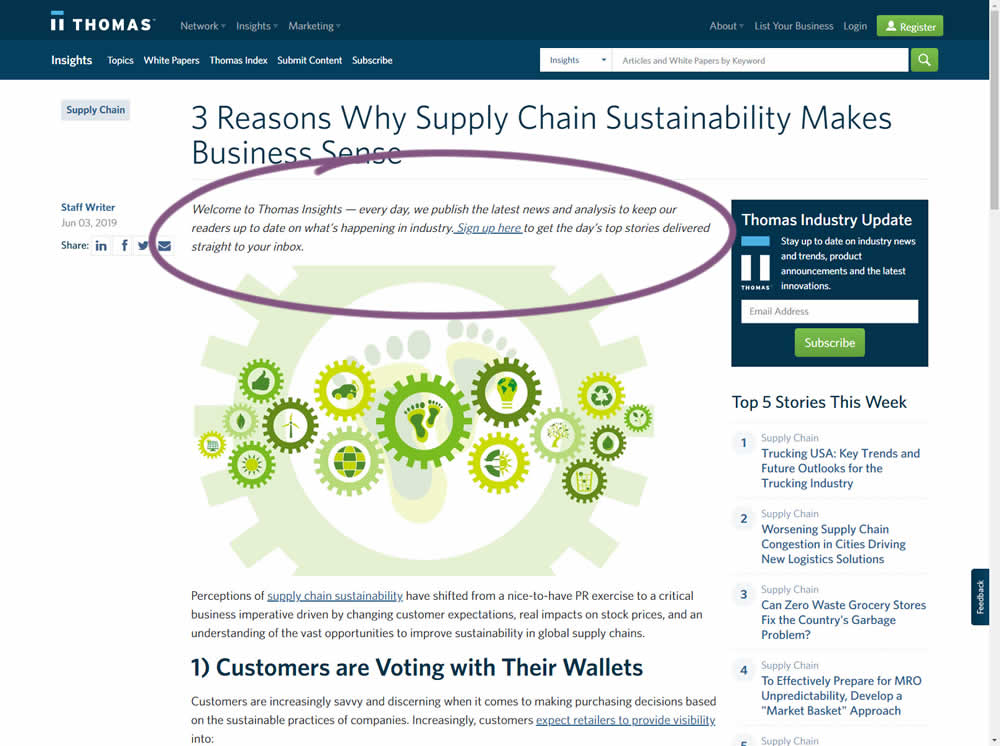
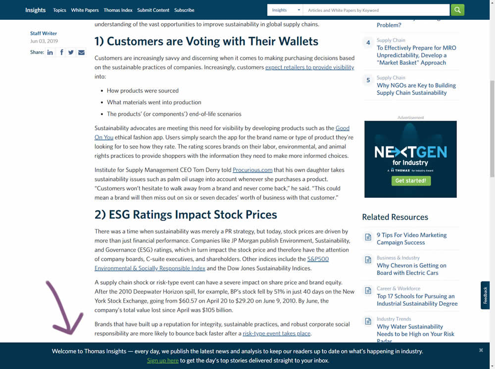
In this experiment, the same message (with a link) for signing up to a newsletter was shown in two distinct ways. The control (A) showed the signup message as inline one that preceded the content of the article at the very top. The variant showed the same signup message as a scroll-delayed sticky interaction at the bottom of the screen. The background color of the B variant was also inverted to match the style of the footer.
Test #246 on
Thomasnet.com
by
 Julian Gaviria
Jun 12, 2019
Desktop
Mobile
Julian Gaviria Tested Pattern #88: Action Button In Test #246 On Thomasnet.com
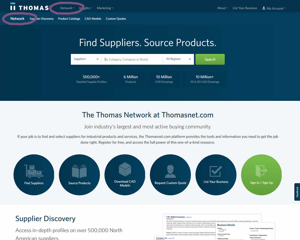
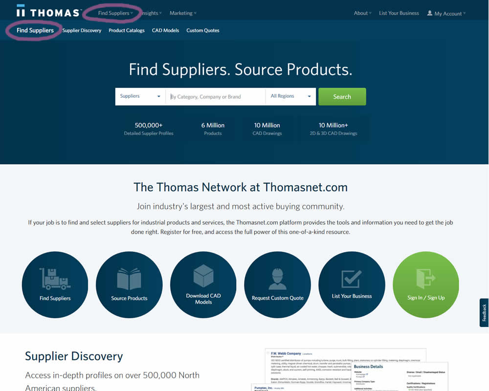
In this experiment, the navigation label was changed from "Network" to "Find Suppliers". The idea was to make use of an action label with a clearer benefit.
Test #240 on
Thomasnet.com
by
 Julian Gaviria
May 16, 2019
Desktop
Julian Gaviria Tested Pattern #13: Centered Forms & Buttons In Test #240 On Thomasnet.com
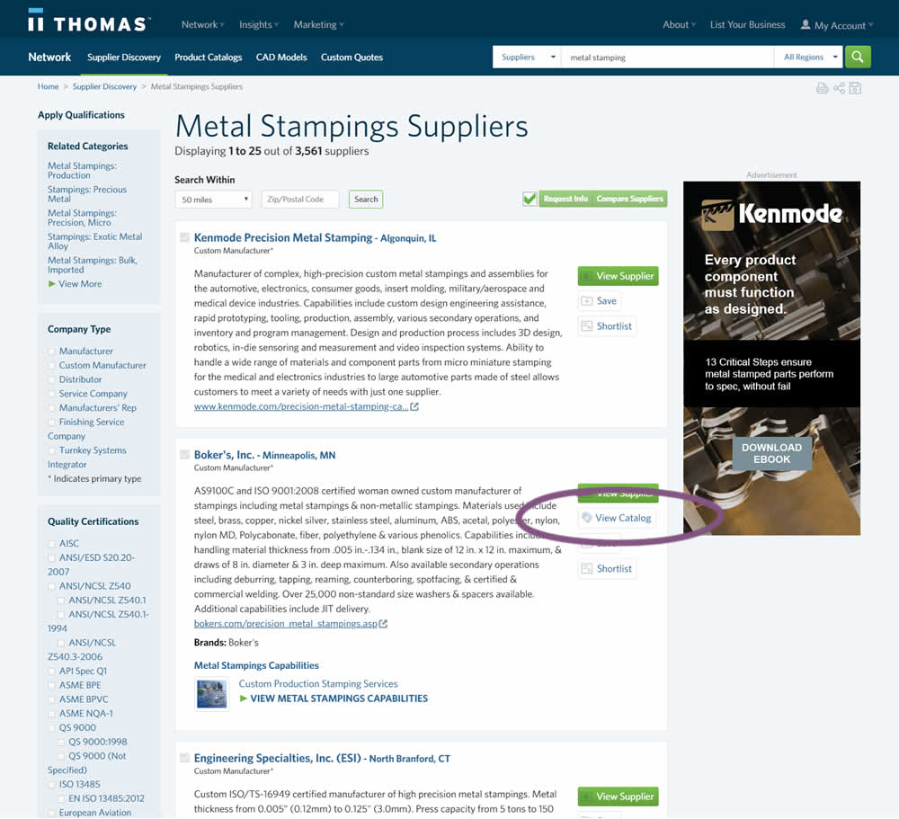
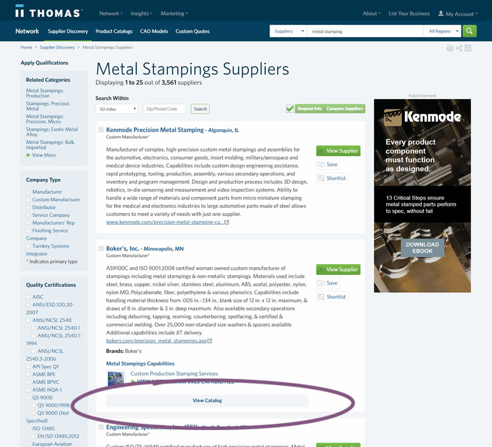
In this experiment, two different positions of the View Catalog button were compared. In version A the button was smaller and on the right. In version B the button was wider and more central. (The actual test was inverted before publishing to match the A-B of the pattern.)
Test #235 on
Thomasnet.com
by
 Julian Gaviria
Apr 02, 2019
Desktop
Mobile
Julian Gaviria Tested Pattern #102: Expanded Or Condensed Layout In Test #235 On Thomasnet.com
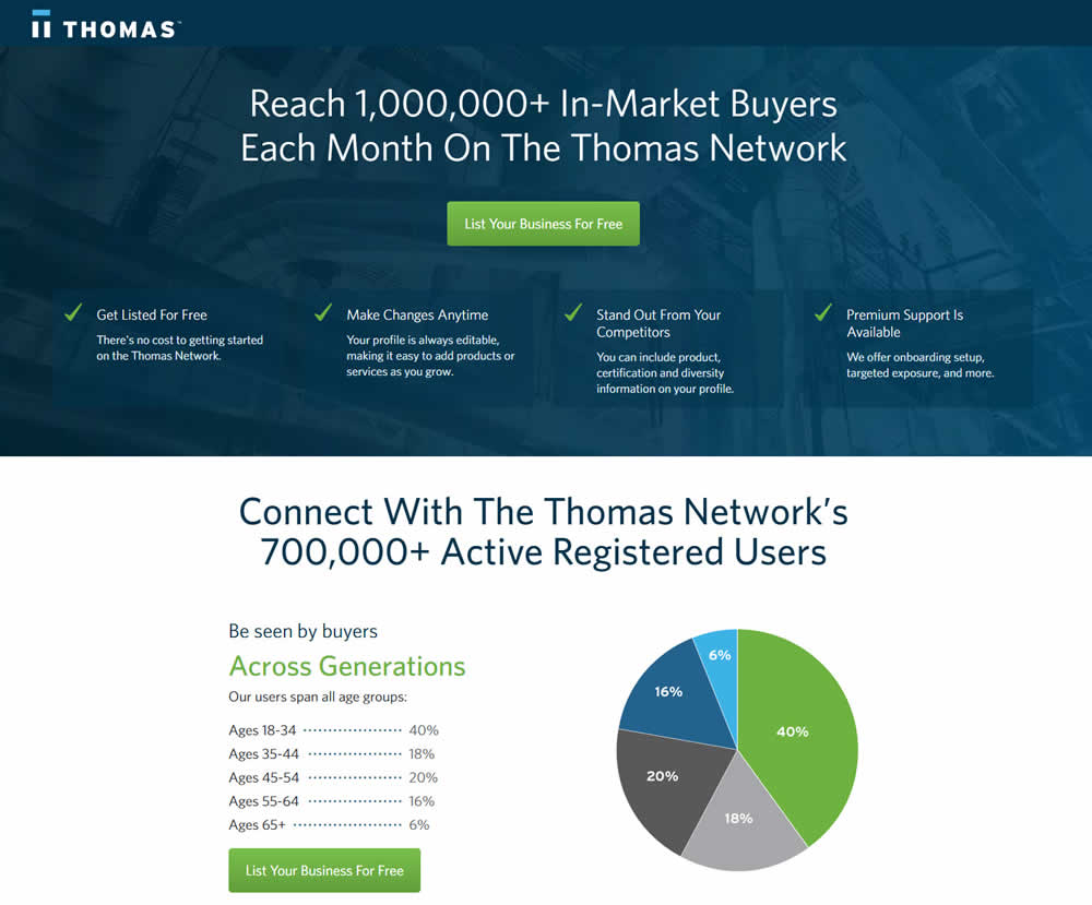
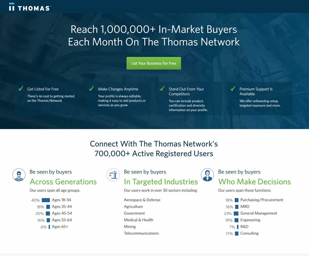
In this experiment, the layout was condensed from a taller to a shorter one.
Test #222 on
Thomasnet.com
by
 Julian Gaviria
Feb 01, 2019
Desktop
Julian Gaviria Tested Pattern #7: Social Counts In Test #222 On Thomasnet.com
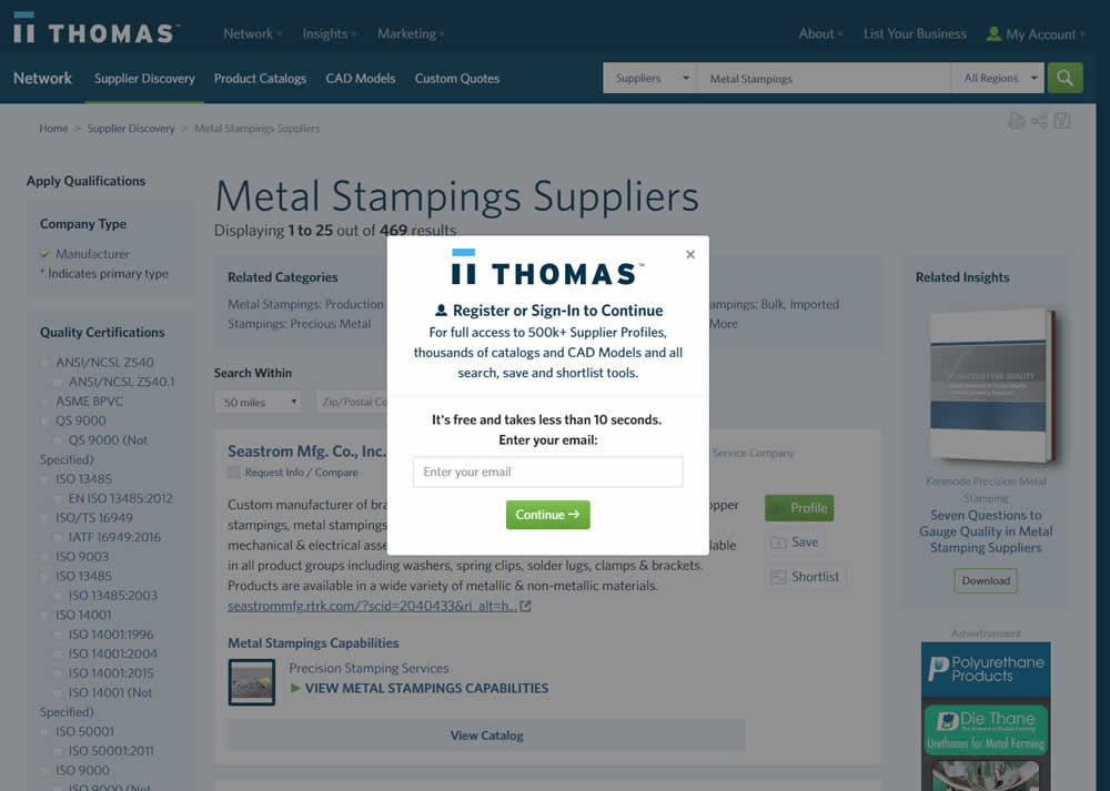
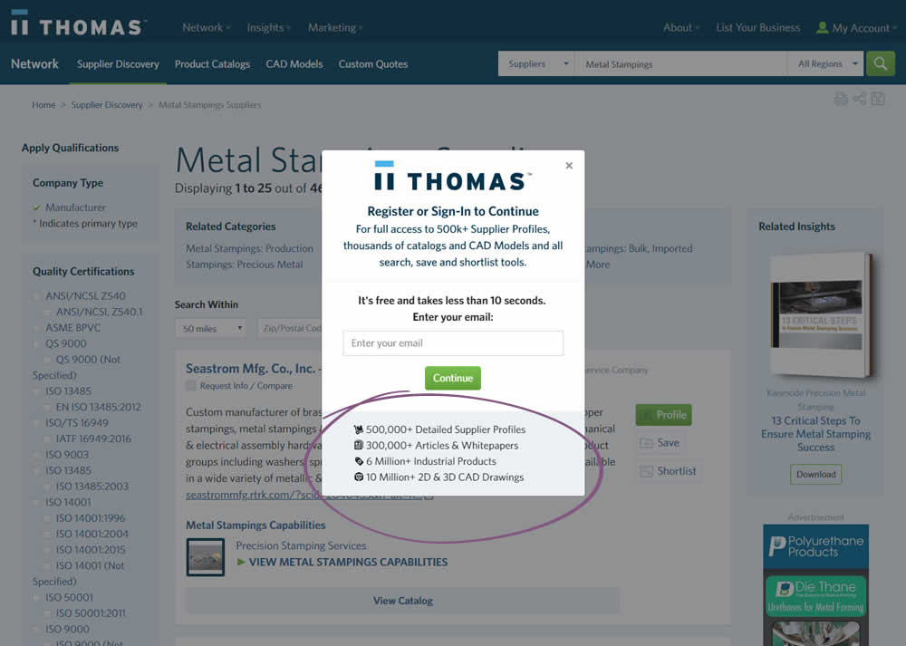
In this variation, a number of social proof references were added to a signup modal.
Test #217 on
Thomasnet.com
by
 Julian Gaviria
Jan 03, 2019
Desktop
Mobile
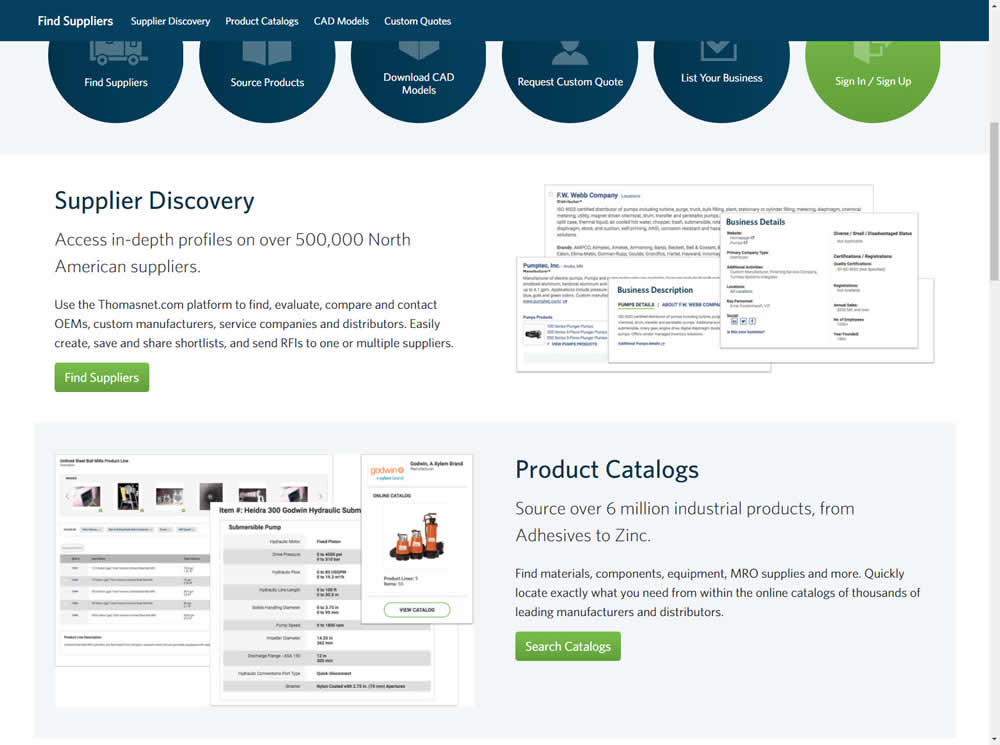
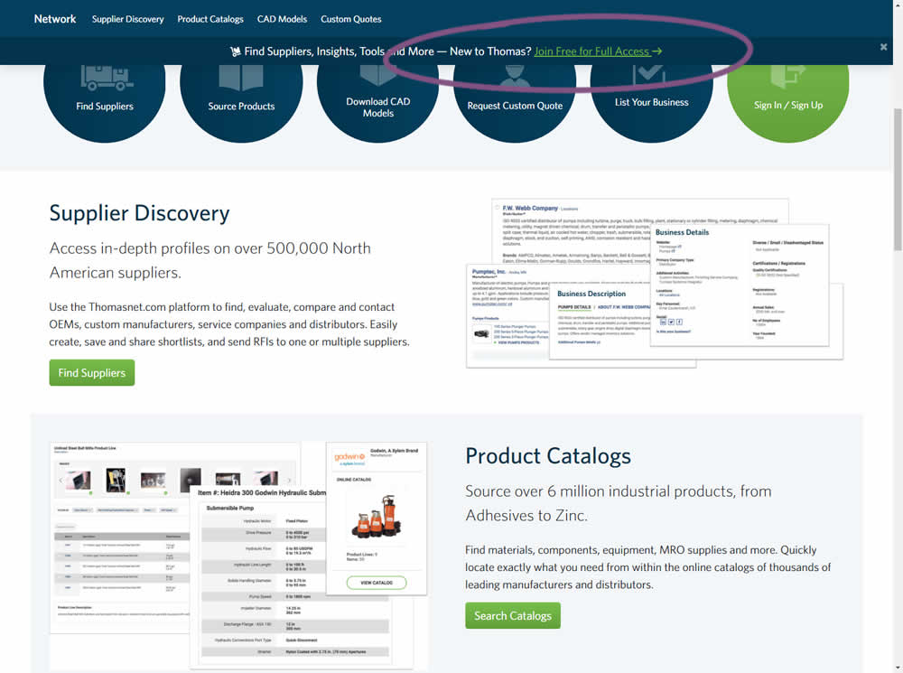
Julian Gaviria Tested Pattern #41: Sticky Call To Action In Test #217 On Thomasnet.com
Test #208 on
Thomasnet.com
by
 Julian Gaviria
Nov 02, 2018
Desktop
Mobile
Julian Gaviria Tested Pattern #88: Action Button In Test #208 On Thomasnet.com
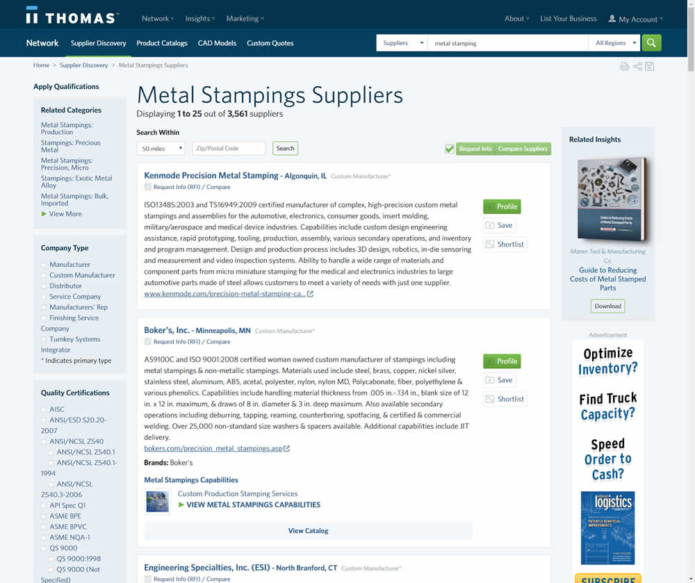
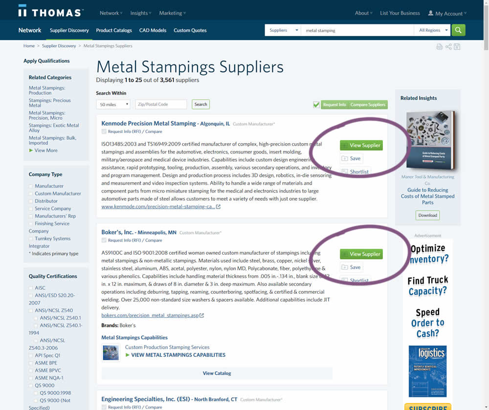
In this variation, the button labels were changed from "Profile" to "View Supplier".