All Latest 556 A/B Tests
Become a member to unlock the abiltiy to see the highest impact a/b tests. Being able to see the actual test results and sort by impact allows growth and experimentation teams to take action on the biggest gains first
MOST RECENT TESTS
Test #584 on
Snocks.com
by
 Melina Hess
Mar 31, 2025
Mobile
Listing
Melina Hess Tested Pattern #6: Customer Star Ratings In Test #584 On Snocks.com
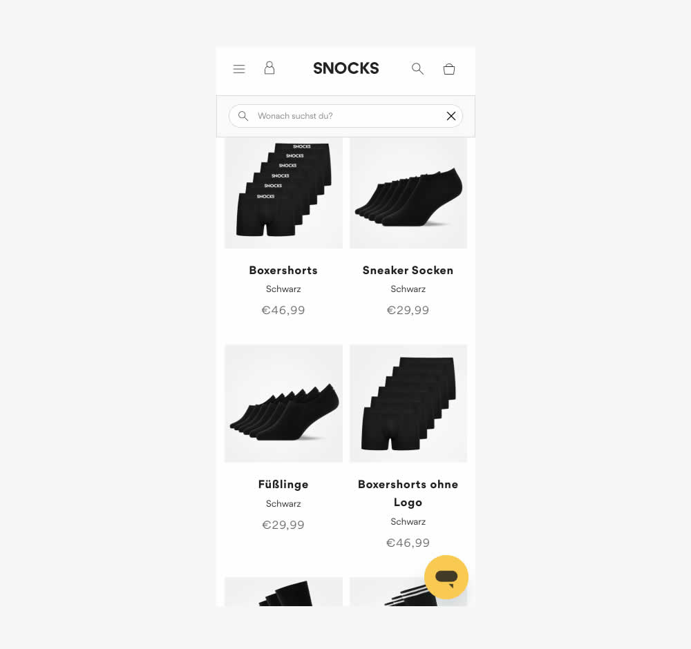
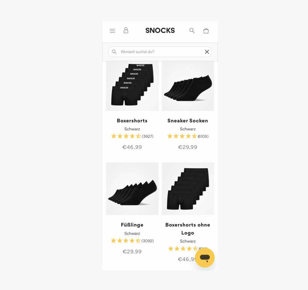
This experiment tested the presence of customer review (in the variation). As a result of adding customer reviews, the product page density decreased (requiring a bit more scrolling from longer product tiles). Impact on conversion was measured.
Also the test originally ran as a "removal of customer reviews" test. However it was flipped here to align with the pattern.
Test #583 on
Backstage.com
by
 Stanley Zuo
Mar 30, 2025
Desktop
Mobile
Listing
Stanley Zuo Tested Pattern #24: Visible Availability In Test #583 On Backstage.com
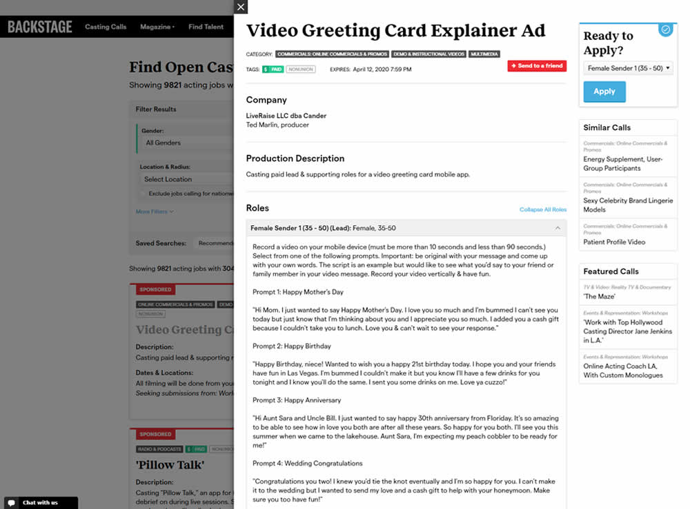
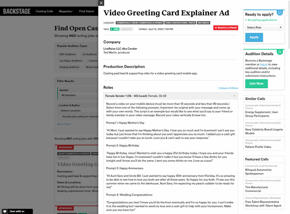
In this experiment, the active availability of a casting call (job offer) was was made more prominent using green text: "Accepting applications". The variation also made the "Join Now" button more prominent as an alternative path to signing up for a membership. The experiment reports on three metrics: clicks on apply, application starts and premium membership sales (measured a few steps further in the funnel).
Test #582 on
Online.metro-cc.ru
by
 Andrey Andreev
Mar 22, 2025
Desktop
Mobile
Listing
Andrey Andreev Tested Pattern #77: Filled Or Ghost Buttons In Test #582 On Online.metro-cc.ru
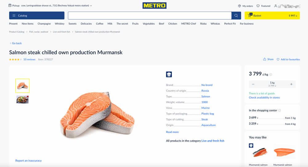
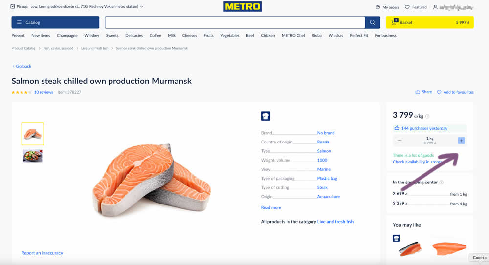
In this experiment, the plus and minus quantity icons near the add to cart button were made more visible. In the variation they gained a higher contrast from a full background color. Impact on add to cart and sales was measured.
Test #575 on
Finn.com
by
 Tim Karcher
Feb 12, 2025
Desktop
Listing
Tim Karcher Tested Pattern #34: Open In A New Tab In Test #575 On Finn.com
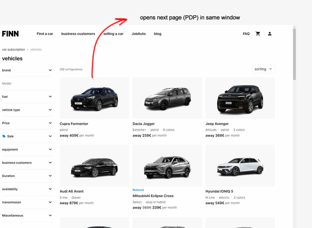
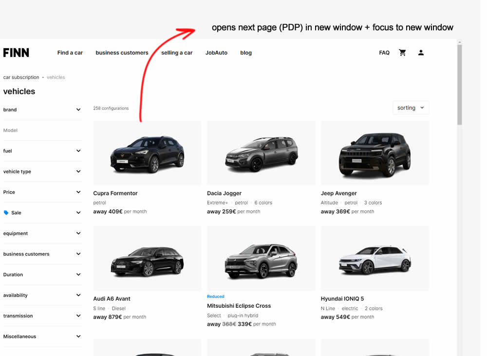
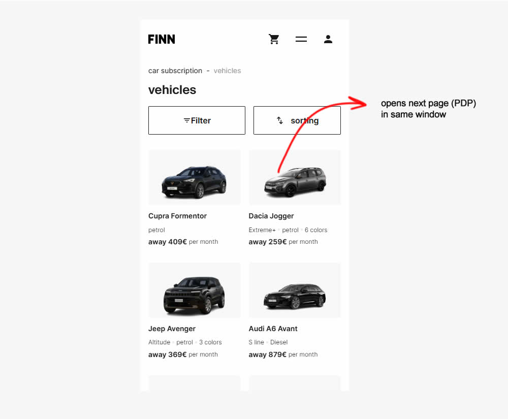
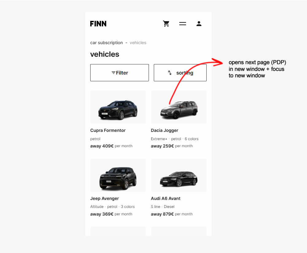
In this experiment, product listing were either opened in the same window (control) or opened in a new tab and focused on (variation). Impact on signups and sales was measured.
Test #576 on
Finn.com
by
 Tim Karcher
Feb 12, 2025
Mobile
Listing
Tim Karcher Tested Pattern #34: Open In A New Tab In Test #576 On Finn.com
Test #559 on
Tourradar.com
by
 Clemens Grave
Oct 18, 2024
Desktop
Listing
Clemens Grave Tested Pattern #137: Visible Filters In Test #559 On Tourradar.com
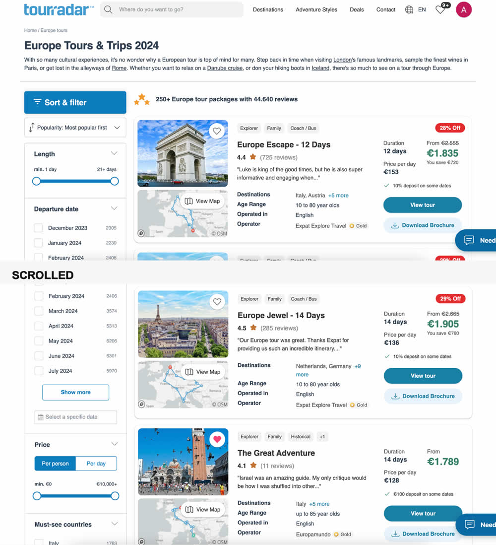
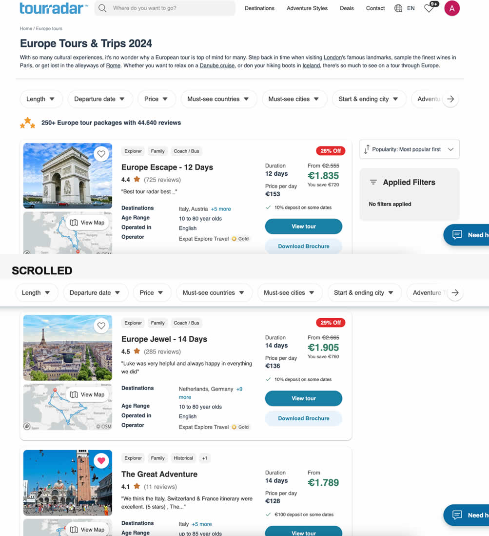
In this experiment, left column filters (control) were tested against top-aligned and sticky filters (variation). The hypothesis was to increase their visibility. Impact on their use and progression to next step (product/tour detail page) were measured.
Test #550 on
Online.metro-cc.ru
by
 Andrey Andreev
Aug 14, 2024
Mobile
Listing
Andrey Andreev Tested Pattern #137: Visible Filters In Test #550 On Online.metro-cc.ru
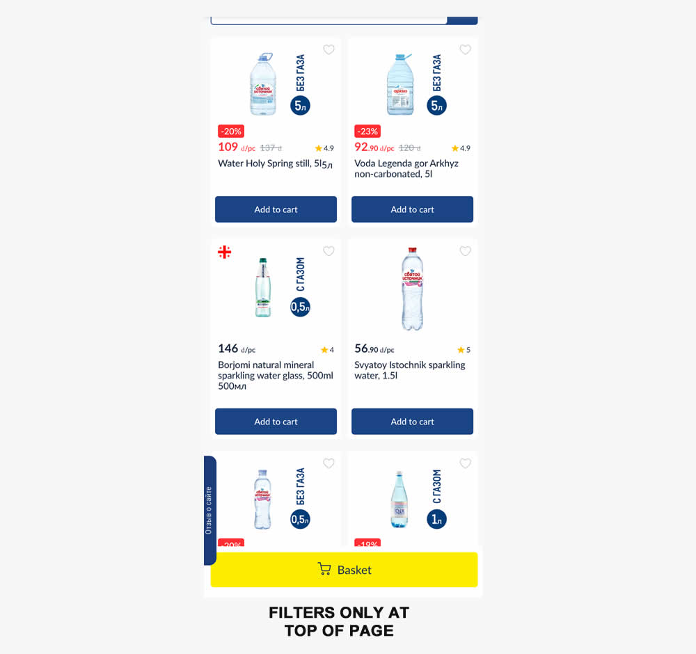
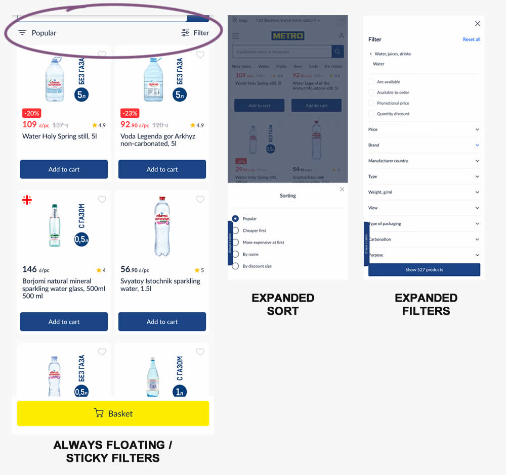
Instead of only displaying sort and filters at the top of a listing page, the variation always had them visible with a sticky/floating interaction. Impact on sales was measured.
Test #549 on
Kay.com
by
 Craig Kistler
Aug 13, 2024
Desktop
Listing
Craig Kistler Tested Pattern #138: Visible Payment Options In Test #549 On Kay.com
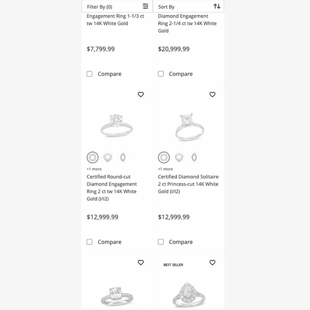
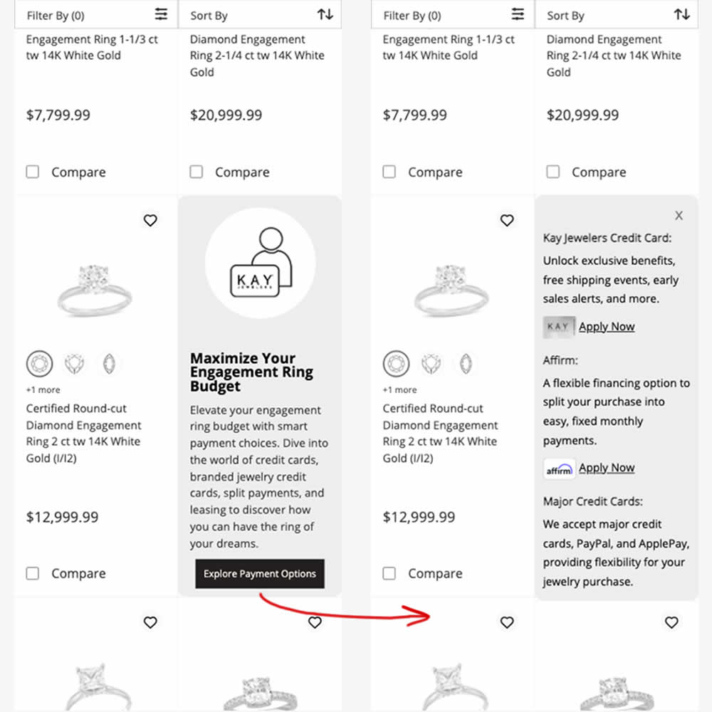
In this experiment, an inline panel was shown as a product tile. The panel informed customers about a variety of payment options (with detailed information being further presented after a button click). Impact on sales was measured.
Test #541 on
Online.metro-cc.ru
by
 Andrey Andreev
Jul 10, 2024
Desktop
Listing
Andrey Andreev Tested Pattern #137: Visible Filters In Test #541 On Online.metro-cc.ru
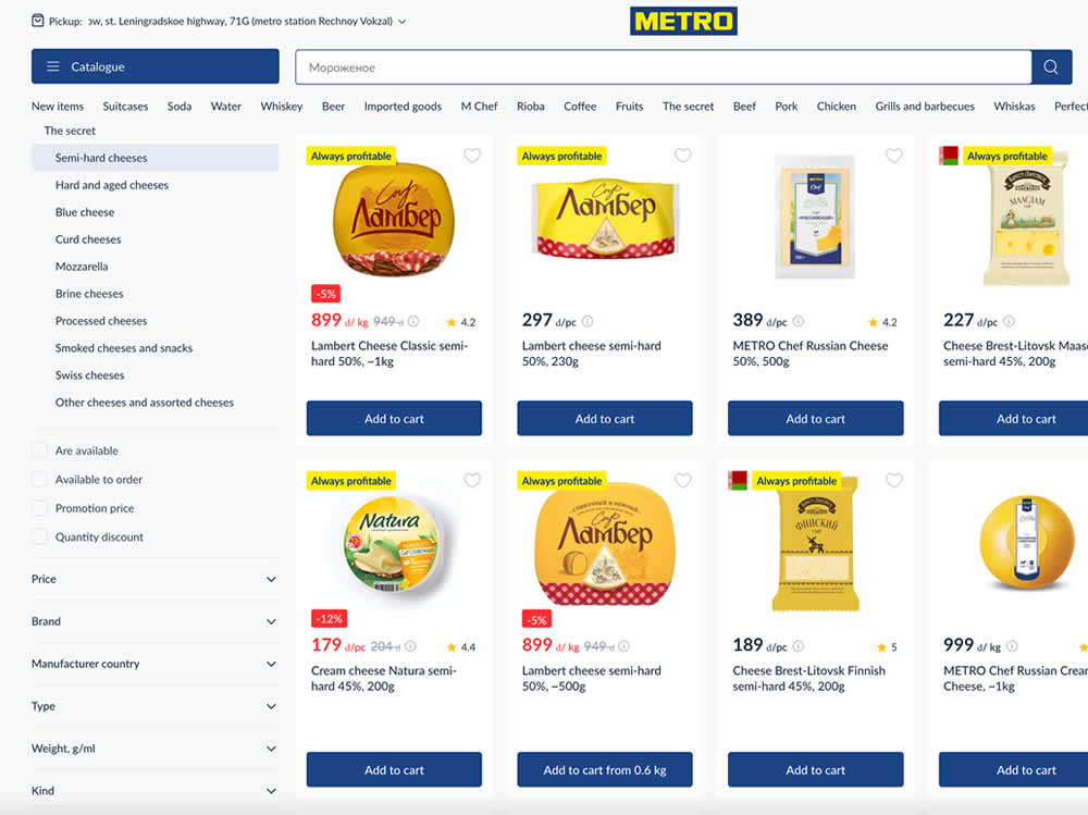
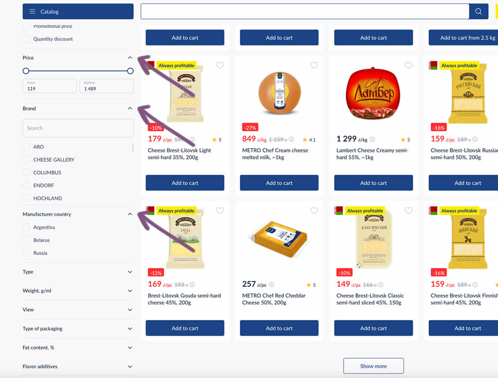
In this experiment, some side column filters were made more visible by being automatically expanded. These included: brand, price and country of manufacturing.
Test #540 on
by
 Maksim Meged
Jun 28, 2024
Mobile
Listing
Maksim Meged Tested Pattern #136: Earliest Availability In Test #540
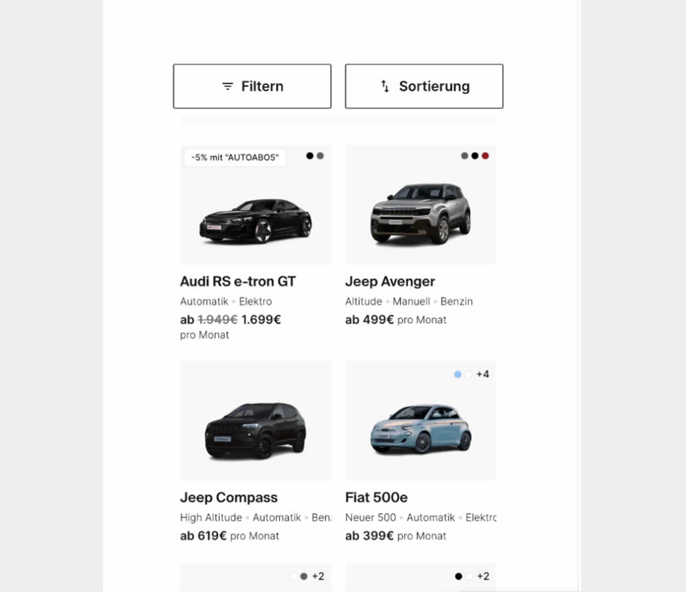
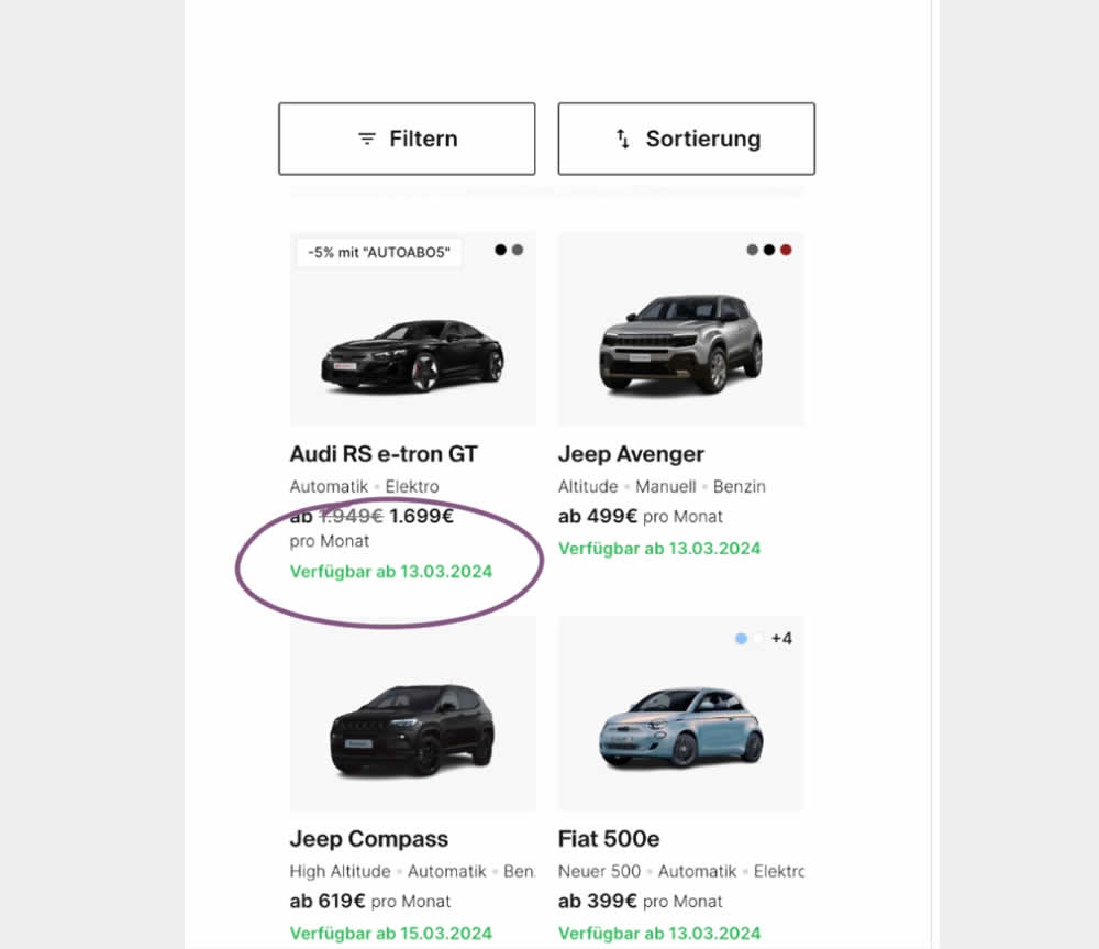
In this experiment, the earliest availability dates were displayed underneath product tiles on listing pages. This was a/b tested on a car rental service website. Impact on product adds-to-cart as well as transactions was measured.
Test #535 on
686.com
by
 Adan Archila
May 31, 2024
Desktop
Listing
Adan Archila Tested Pattern #120: Supporting Theme Images In Test #535 On 686.com
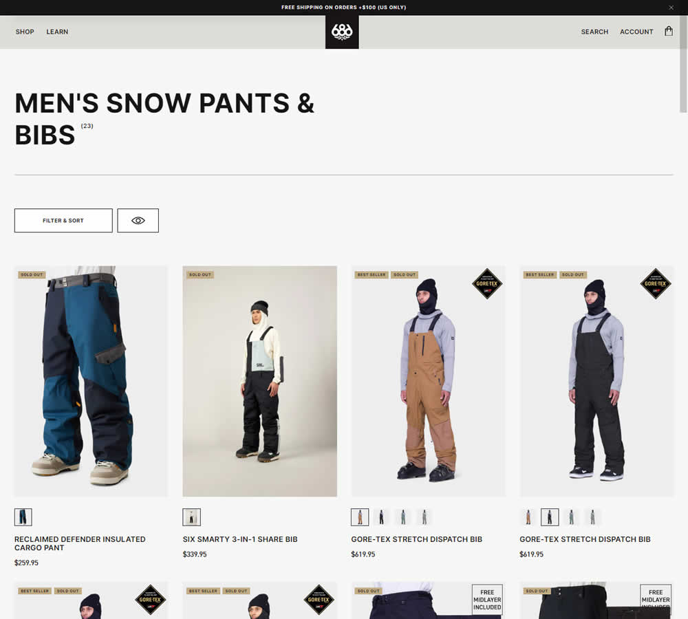
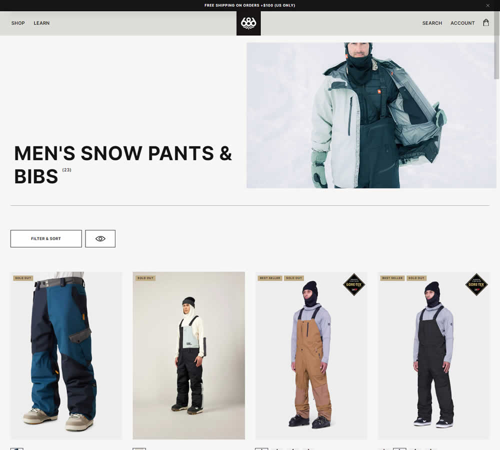
In this experiment, a static category theme image at the top of a listing page was tested against the same page but without the extra image. Impact on sales was measured.
Test #532 on
Finn.com
by
 Maksim Meged
May 10, 2024
Mobile
Listing
Maksim Meged Tested Pattern #76: Infinite Scrolling Or Pagination In Test #532 On Finn.com
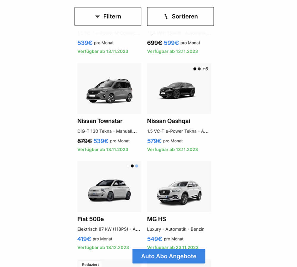
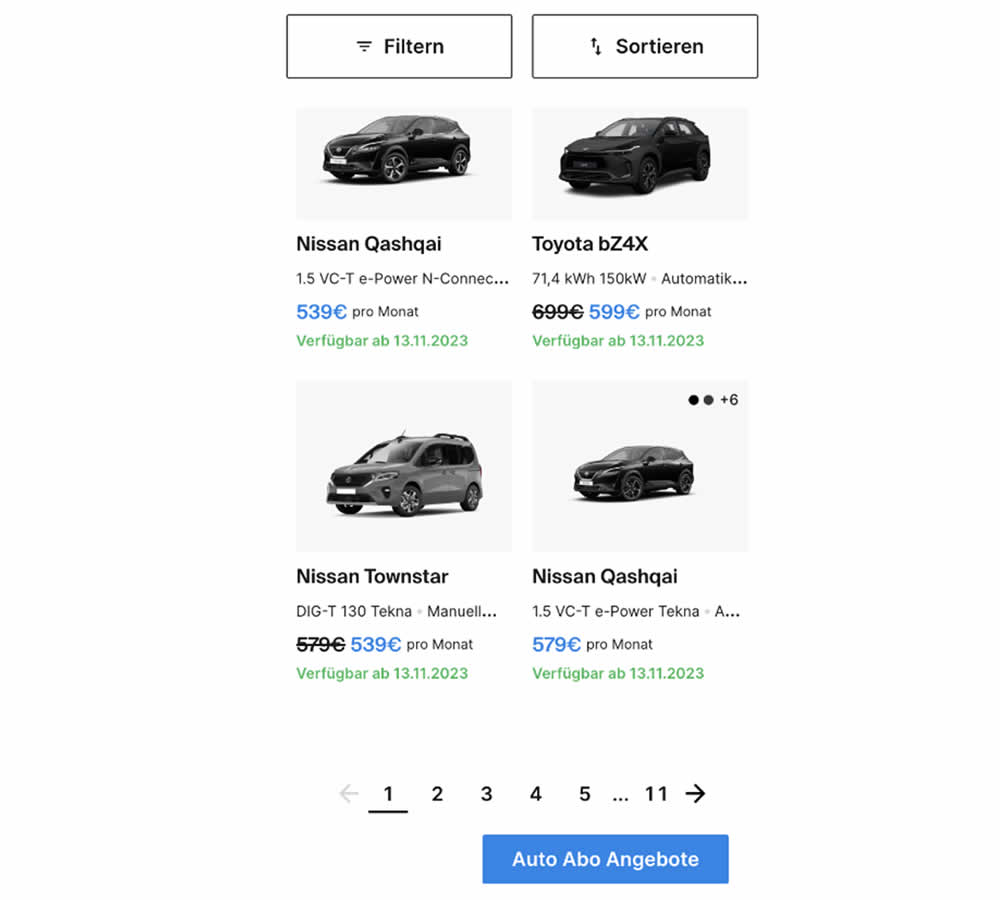
In this experiment, infinite scrolling was a/b tested against a paginated one.
Test #529 on
Jared.com
by
 Craig Kistler
Apr 29, 2024
Mobile
Desktop
Listing
Craig Kistler Tested Pattern #55: Conversational Filters In Test #529 On Jared.com
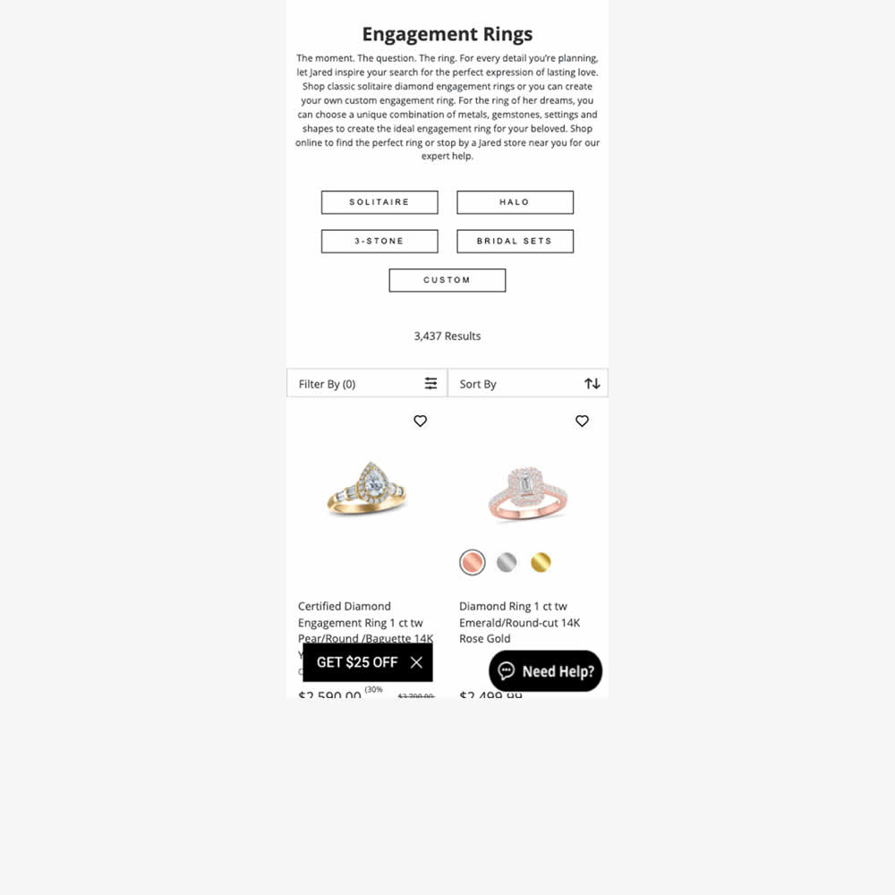
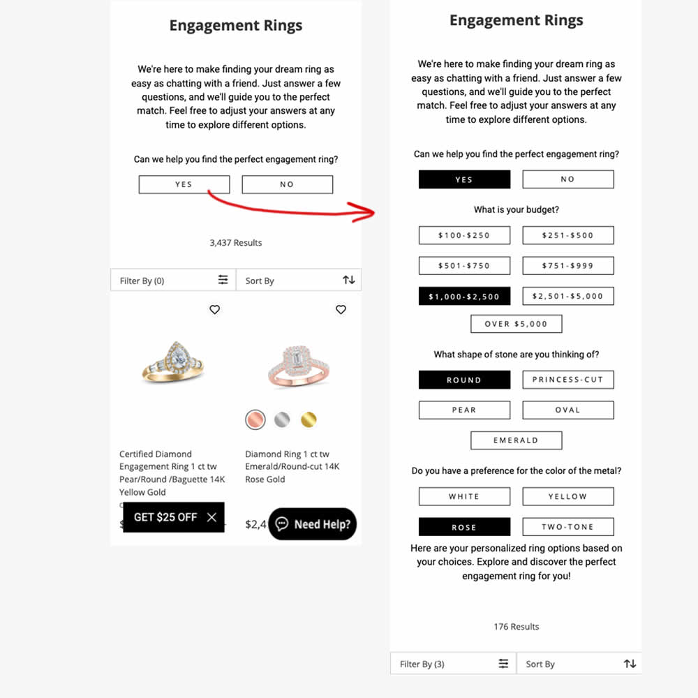
In this experiment, conversational filters were tested at the top of some listing pages. Instead of showing one set of product filters, customers were shown three sets of product questions. After selecting each answer, product results would narrow and update further down on the page. Impact on adds to cart and sales were measured.
Test #528 on
686.com
by
 Adan Archila
Apr 26, 2024
Mobile
Listing
Adan Archila Tested Pattern #120: Supporting Theme Images In Test #528 On 686.com
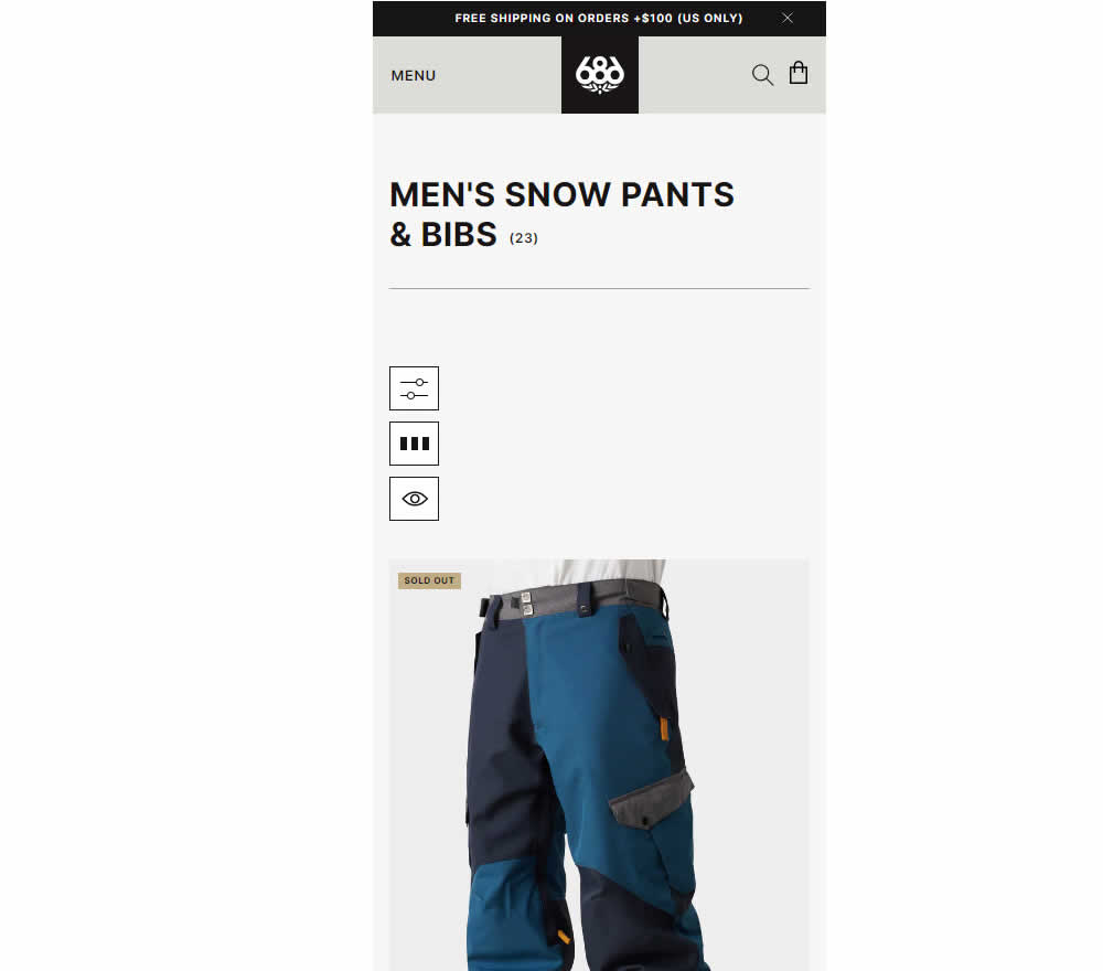
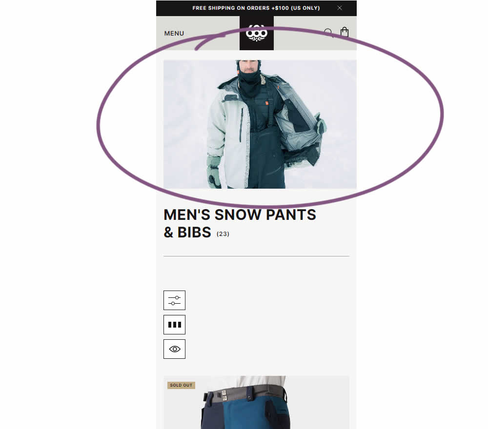
In this experiment, the effect of having additional static category themed images was tested on category listing pages. Impact on sales was measured.
Test #524 on
Jared.com
by
 Craig Kistler
Mar 26, 2024
Mobile
Listing
Craig Kistler Tested Pattern #79: Product Highlights In Test #524 On Jared.com
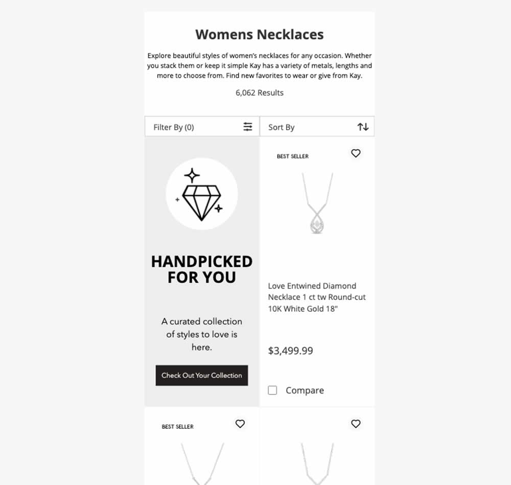
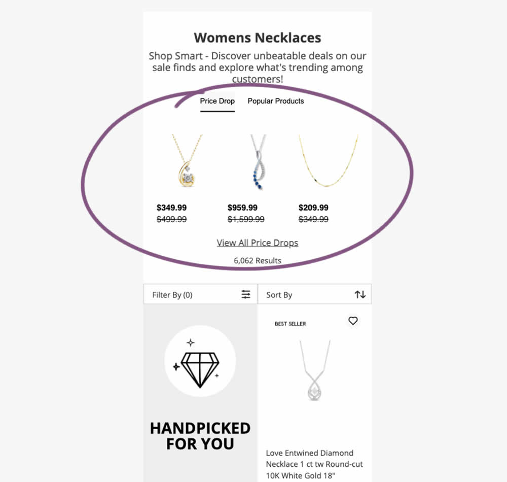
In this experiment, additional (discounted) products were shown at the top of category listing pages with a link to see more such products ("View All Price Drops"). Impact on overall sales was measured.
Test #522 on
686.com
by
 Adan Archila
Mar 18, 2024
Desktop
Listing
Adan Archila Tested Pattern #37: List Or Grid View In Test #522 On 686.com
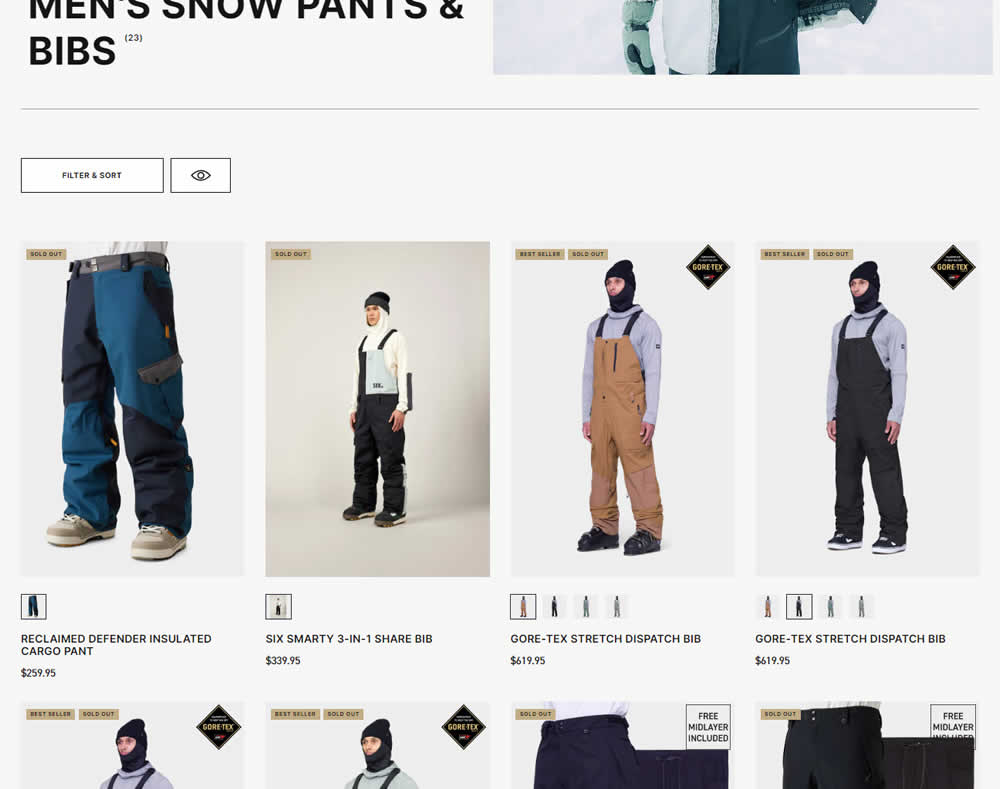
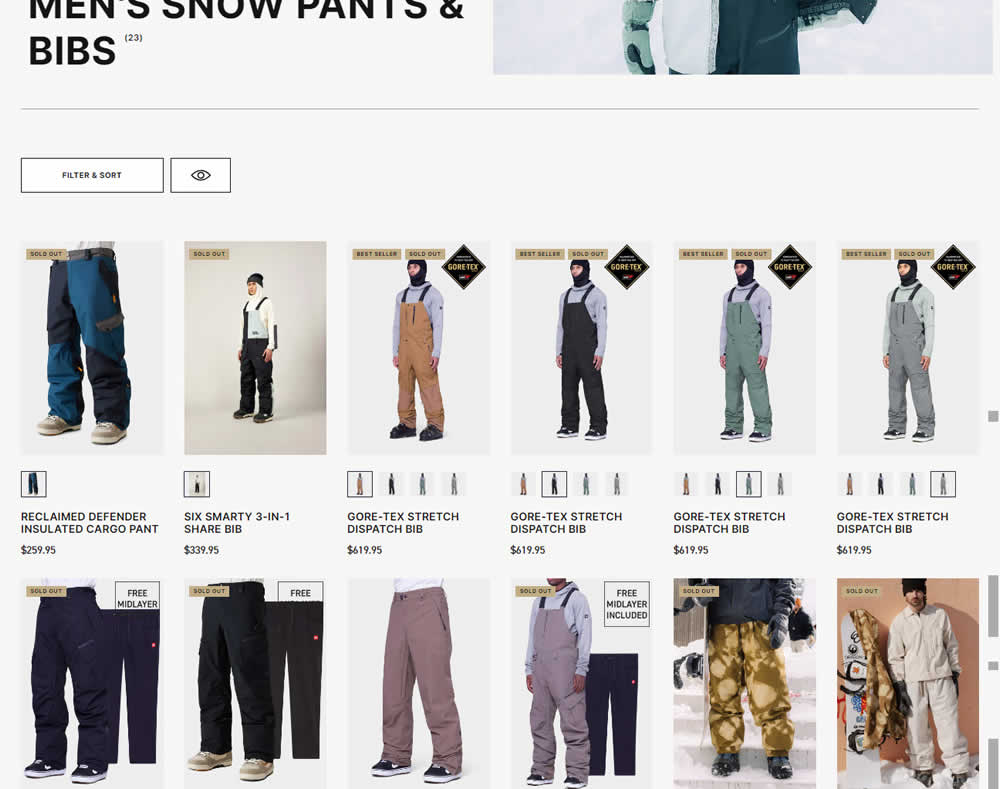
In this desktop experiment, 4 product tiles per page (control) were tested against 6. Impact on sales was measured.
Test #516 on
686.com
by
 Adan Archila
Feb 05, 2024
Mobile
Listing
Adan Archila Tested Pattern #37: List Or Grid View In Test #516 On 686.com
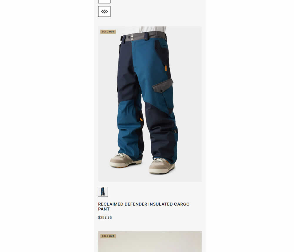
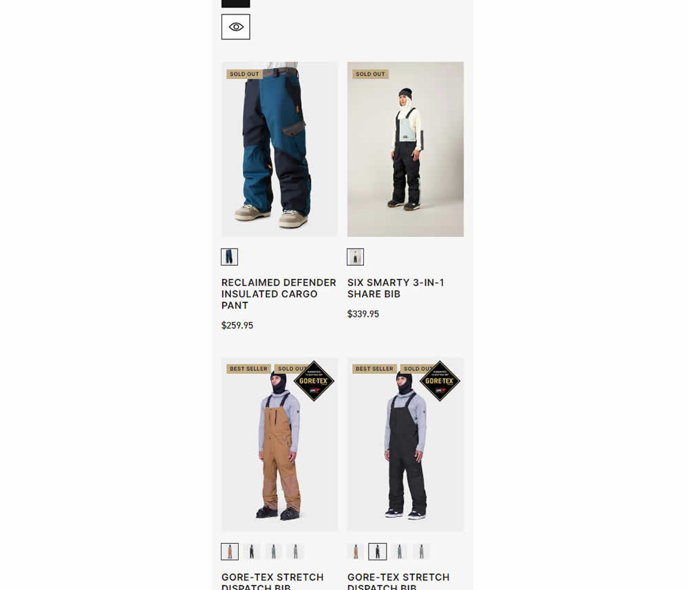
In this experiment, a one large product photo (control) was tested against a two-column layout with two smaller images (variation). Impact on sales was measured.
Test #514 on
Backstage.com
by
 Stanley Zuo
Jan 24, 2024
Desktop
Listing
Stanley Zuo Tested Pattern #97: Bigger Form Fields In Test #514 On Backstage.com
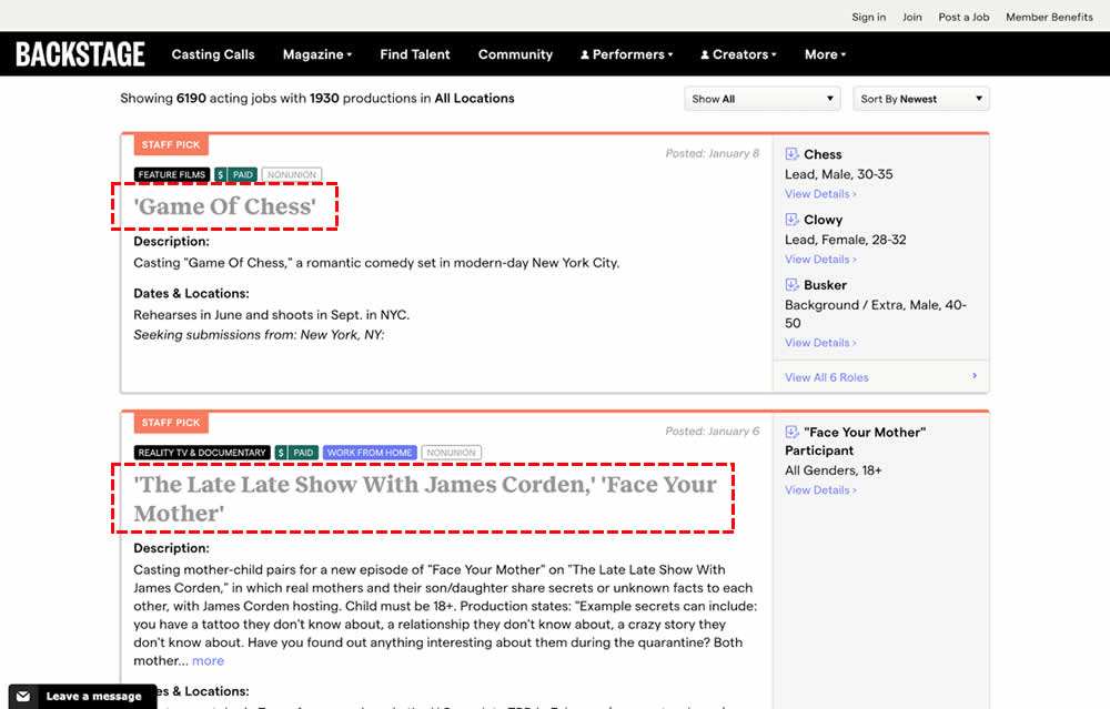
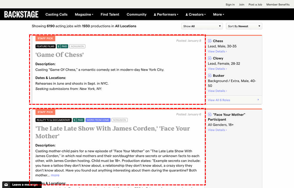
In this experiment, the click area of job listing tiles was expanded to the size of the full job tile. In the control, the click area was smaller - mostly only the job headline, along with additional "view more" links on the right hand column. Clicking the tile or headline would open up a new job details page in both control and variation. Impact on progression and membership sales was measured.
Test #507 on
Fairment.de
by
 Jona Eisenberger
Dec 11, 2023
Mobile
Listing
Jona Eisenberger Tested Pattern #133: Product Availability In Test #507 On Fairment.de
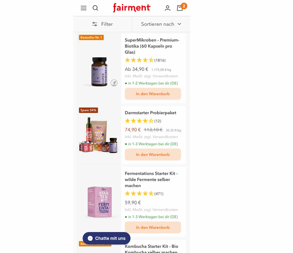
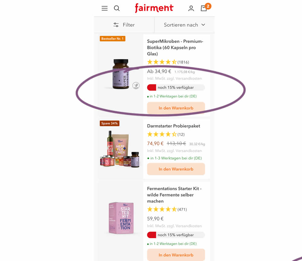
In this experiment, product availabiltiy bars were shown on products with low stock. This was shown on listing pages. Impact on adds to cart and sales was measured.
Test #502 on
Fairment.de
by
 Jona Eisenberger
Nov 06, 2023
Mobile
Listing
Jona Eisenberger Tested Pattern #37: List Or Grid View In Test #502 On Fairment.de
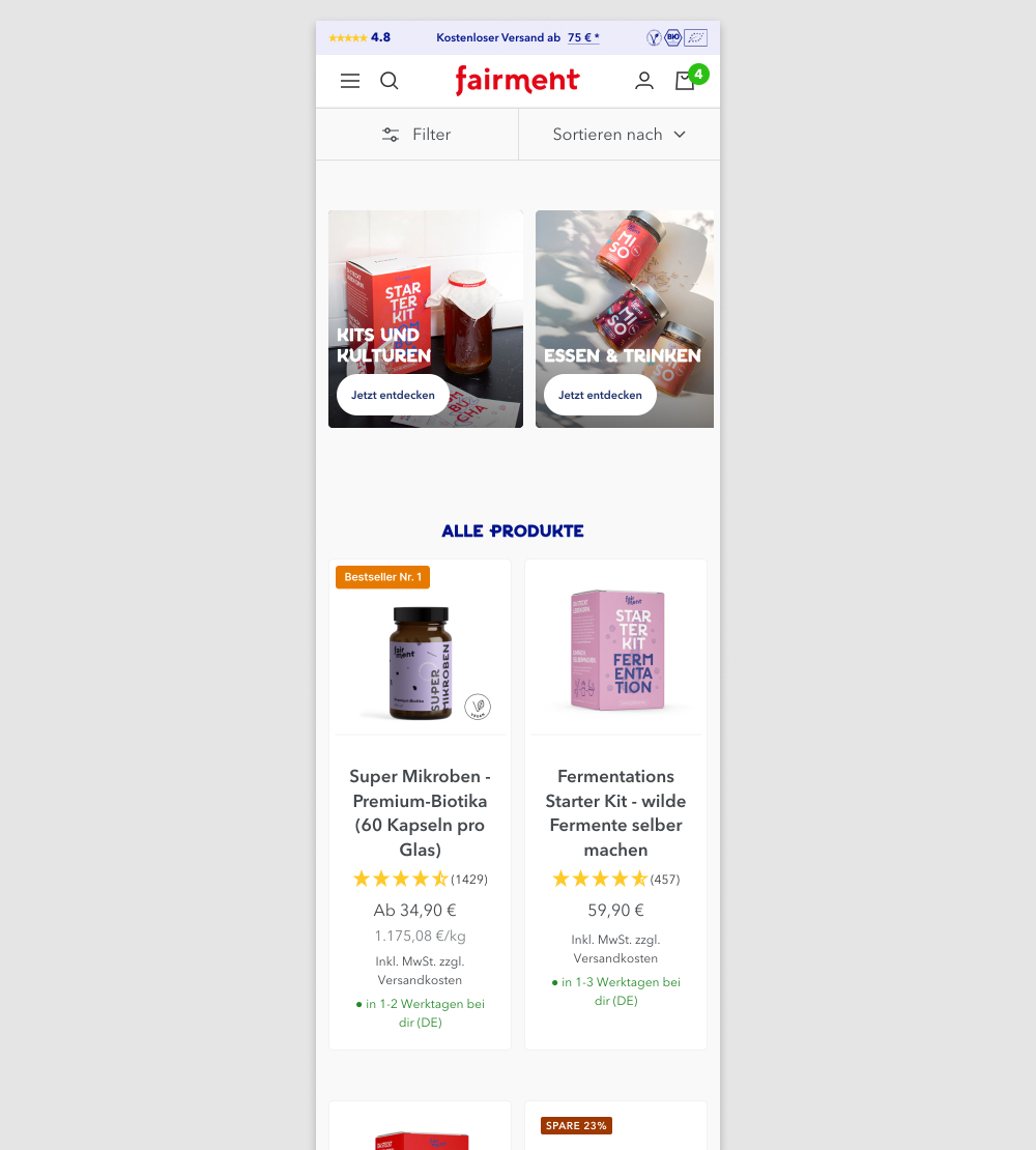
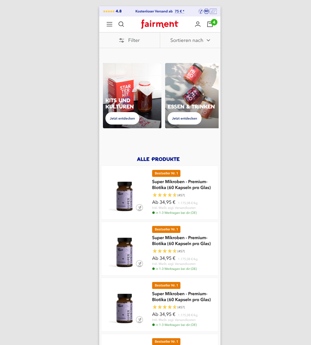
In this experiment, a two column grid layout (control) was tested against single column layout (variation) with the product information shown to the right. Please note that the screenshot shows repeated products only because it's been sourced from a Figma design file. In reality, the products in the variation were equally diverse as in the control.
(We've also flipped the A and B to match up with our grid pattern.)