All Latest 571 A/B Tests
Become a member to unlock the abiltiy to see the highest impact a/b tests. Being able to see the actual test results and sort by impact allows growth and experimentation teams to take action on the biggest gains first
MOST RECENT TESTS
Test #310 on
Backstage.com
by
 Stanley Zuo
Jul 25, 2020
Mobile
Listing
Stanley Zuo Tested Pattern #77: Filled Or Ghost Buttons In Test #310 On Backstage.com
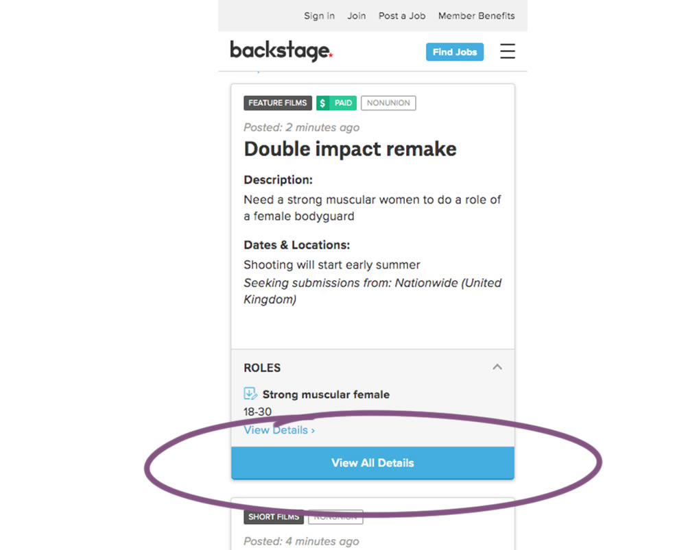
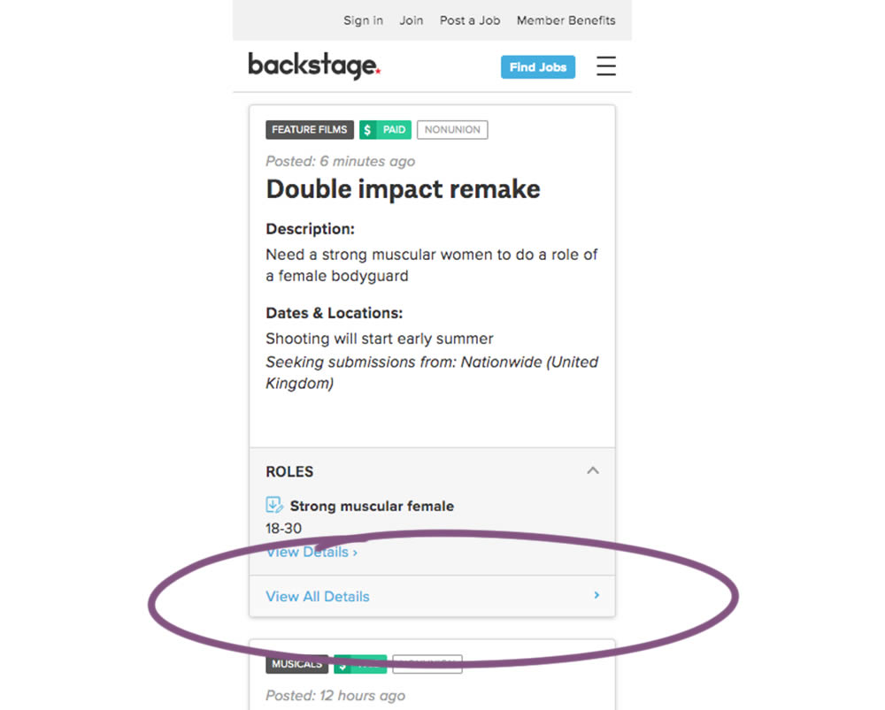
In this experiment, the style of a button leading to view detailed casting calls on a listing page was changed. In version the style was a filled high contrast blue background, and the the B variation there was a feint "ghost button" style.
Test #309 on
Thomasnet.com
by
 Julian Gaviria
Jul 24, 2020
Desktop
Listing
Julian Gaviria Tested Pattern #72: Priming Step In Test #309 On Thomasnet.com
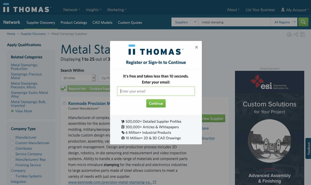
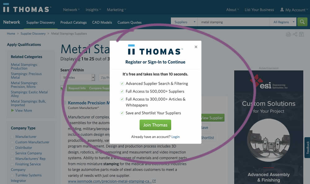
In this experiment, an extra step was prepended at the beginning of a multiple step signup modal flow. The signup modal would appear on listing pages after requests to contact a listed company. The idea was to prime users with benefits of signing up in order to increase their motivation to do so. The experiment measured the impact on the initial progression (to the step with the email form).
Test #299 on
Backstage.com
by
 Stanley Zuo
May 22, 2020
Desktop
Mobile
Listing
Stanley Zuo Tested Pattern #60: Repeated Bottom Call To Action In Test #299 On Backstage.com
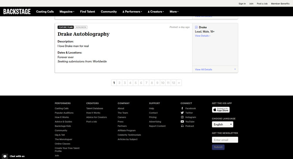
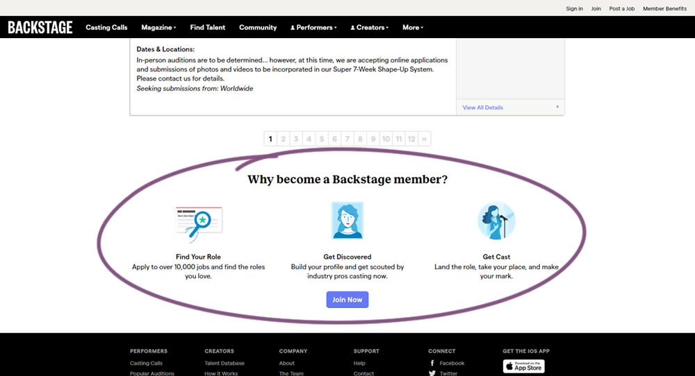
In this experiment, at the bottom of a search results screen, a membership join button was added along with 3 encouraging reasons. The experiment measured membership funnel starts, as well as paid membership transactions (sales).
Test #298 on
Zapimoveis.com.br
by
 Vinicius Barros Peixoto
May 14, 2020
Desktop
Mobile
Listing
Vinicius Barros Peixoto Tested Pattern #36: Fewer Or More Results In Test #298 On Zapimoveis.com.br
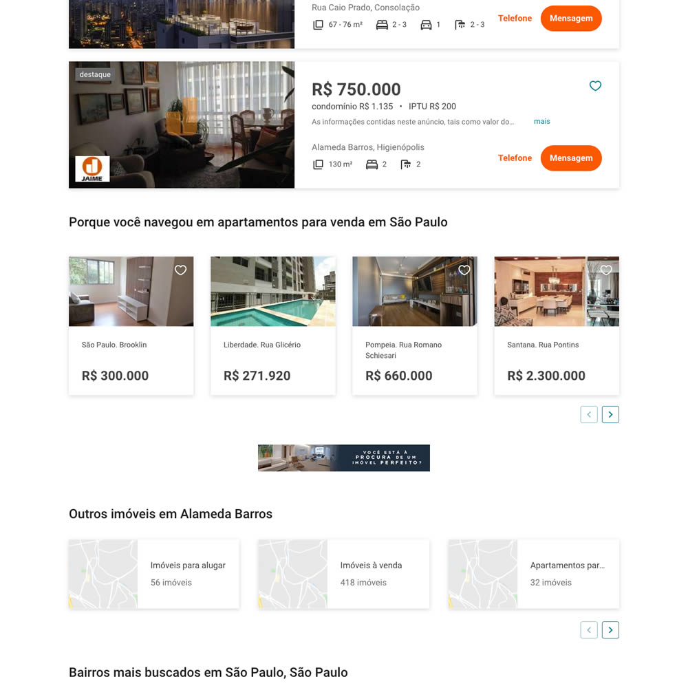
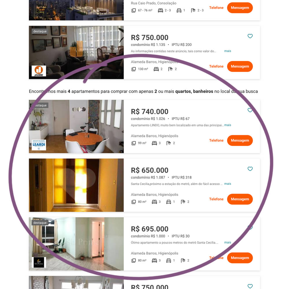
In this experiment on a listing page, the search was expanded to show more listings (variation B). Conditionally, if there were fewer than 36 results, set basic filters such as number bedrooms and bathrooms were expanded and appended to the results. Hence if someone chose 2 bedrooms and 2 bathrooms in variation A, they would only see listing with that filter. In variation B however they would first see the filtered results, and later they would also see results with 3 or more of each.
Test #292 on
Backstage.com
by
 Stanley Zuo
Apr 13, 2020
Desktop
Mobile
Listing
Stanley Zuo Tested Pattern #24: Visible Availability In Test #292 On Backstage.com
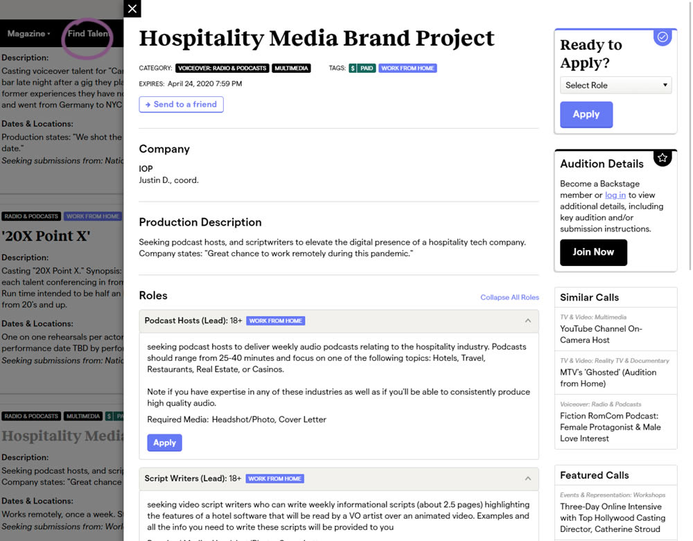
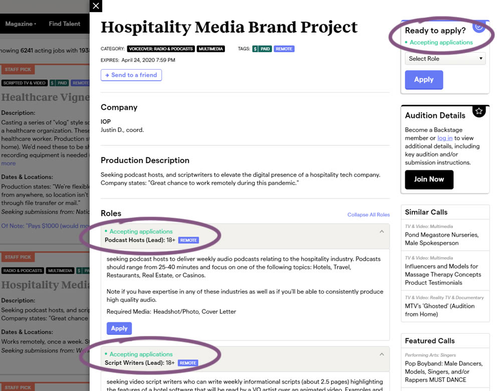
The core hypothesis of this experiment was that by showing clear availability (in green text) beside each casting call, more users would apply and become premium members. The experiment reports on two metrics: application starts (the first progression metric), and premium membership sales (measured a few steps further in the funnel).
Test #284 on
Thomasnet.com
by
 Julian Gaviria
Feb 19, 2020
Desktop
Mobile
Listing
Julian Gaviria Tested Pattern #78: Tags, Badges And Structured Information In Test #284 On Thomasnet.com
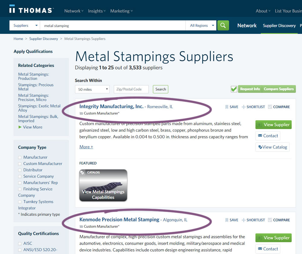
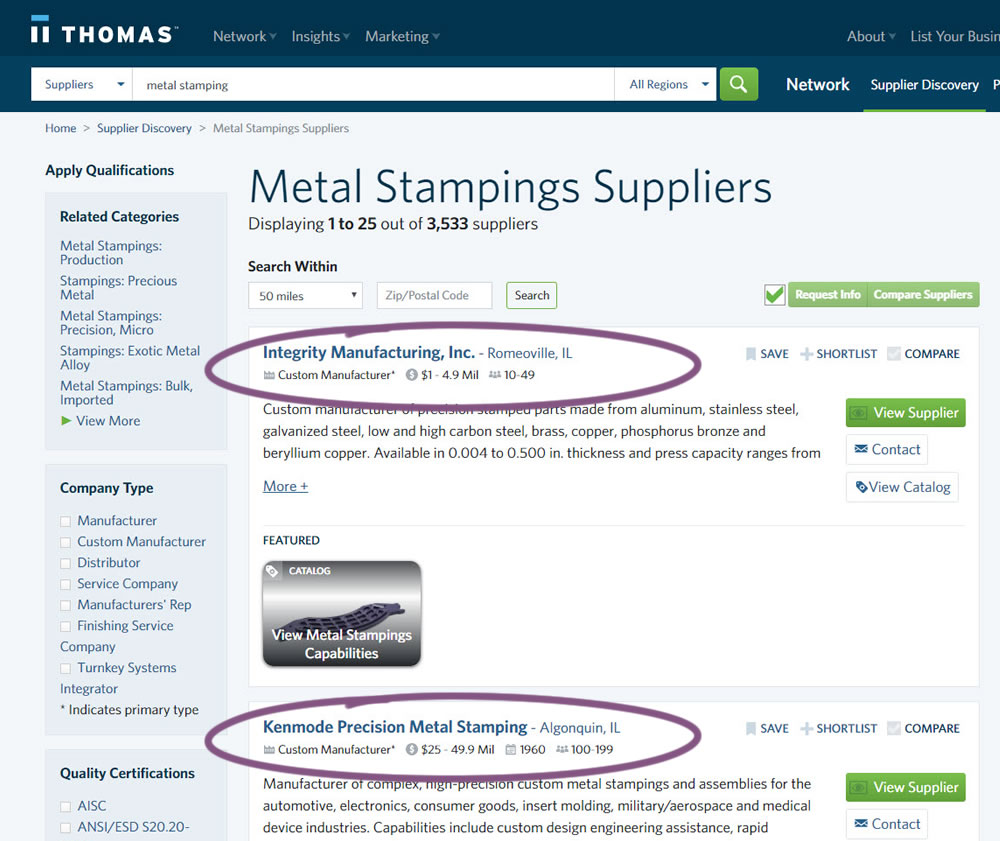
In this experiment, structured data tags were displayed on a listing page to help potential buyers make better decisions. The additional information about the listed companies included: annual revenue, employee count, and year of establishment.
Test #282 on
Thomasnet.com
by
 Julian Gaviria
Feb 07, 2020
Desktop
Mobile
Listing
Julian Gaviria Tested Pattern #51: Shortcut Buttons In Test #282 On Thomasnet.com
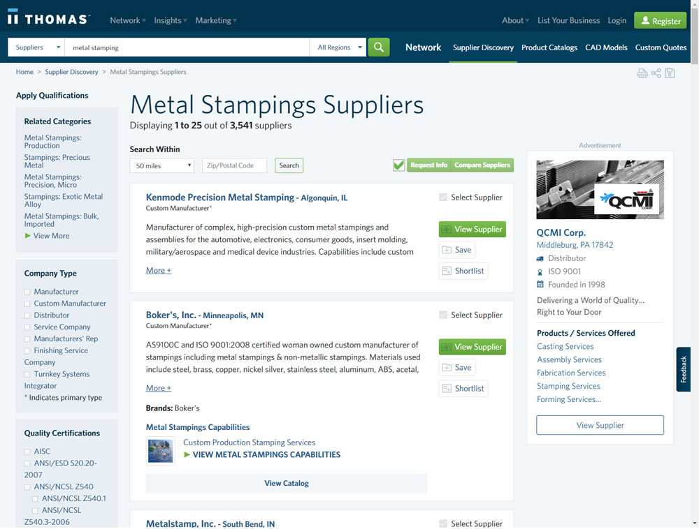
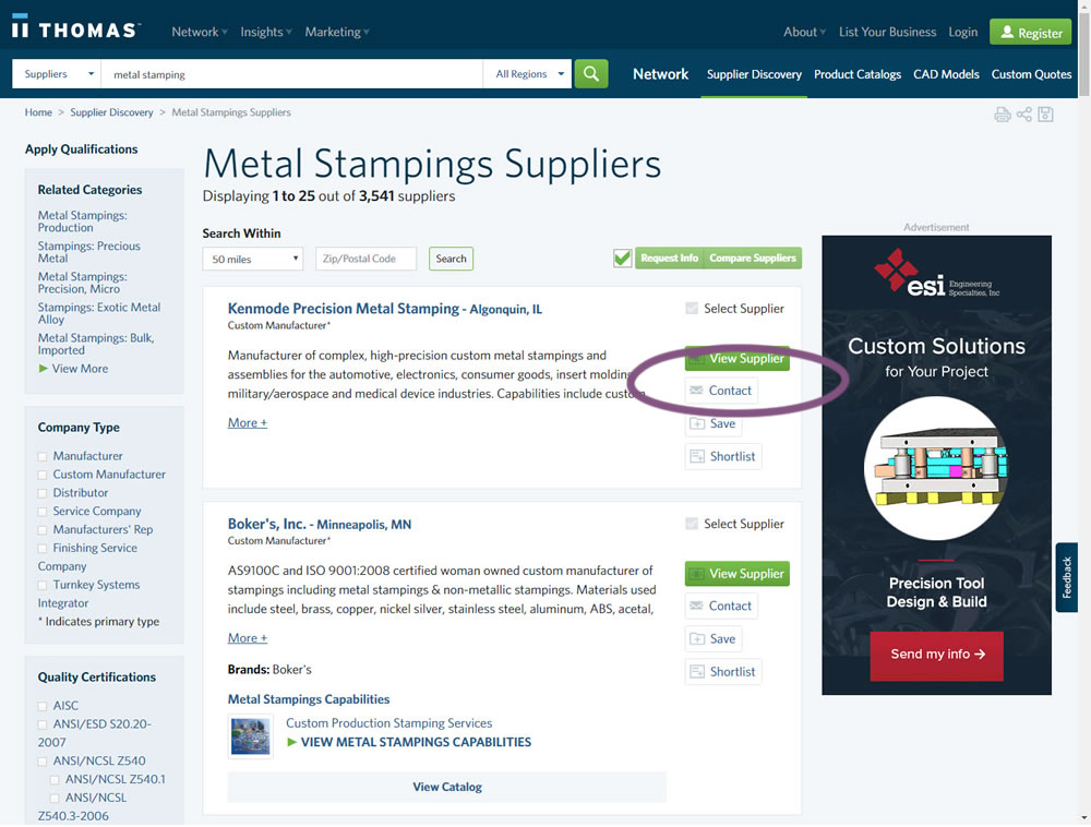
In this experiment, a contact button was added to a listing / search results page to make it faster to contact a company. This same button was also visible on the company detail page.
Test #281 on
Backstage.com
by
 Stanley Zuo
Jan 31, 2020
Desktop
Listing
Stanley Zuo Tested Pattern #116: Links Or Buttons In Test #281 On Backstage.com
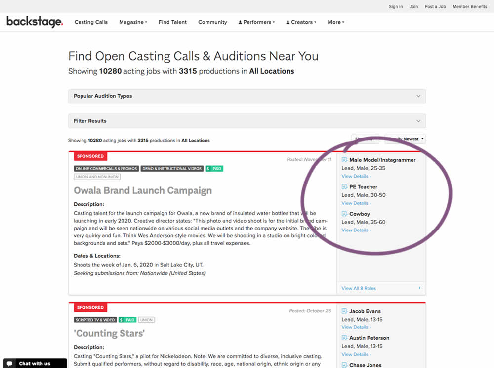
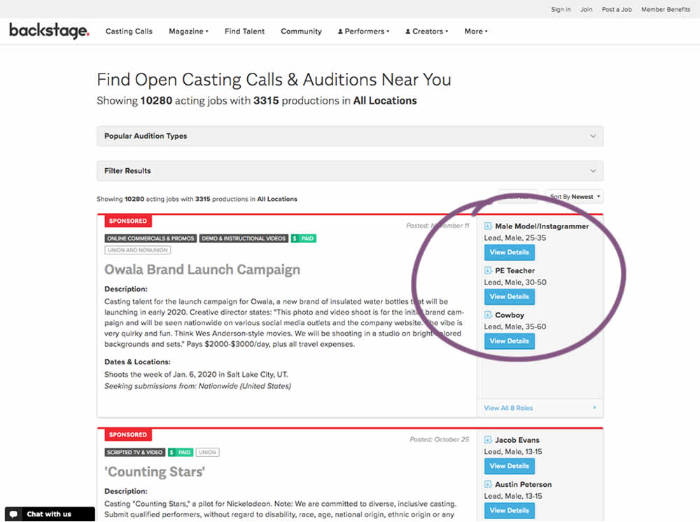
In this experiment, multiple view detail links for a listing tile were turned into higher contrast buttons.
Test #270 on
Dentalplans.com
by
 J.R. Hernandez
Nov 19, 2019
Desktop
Listing
J.R. Hernandez Tested Pattern #37: List Or Grid View In Test #270 On Dentalplans.com
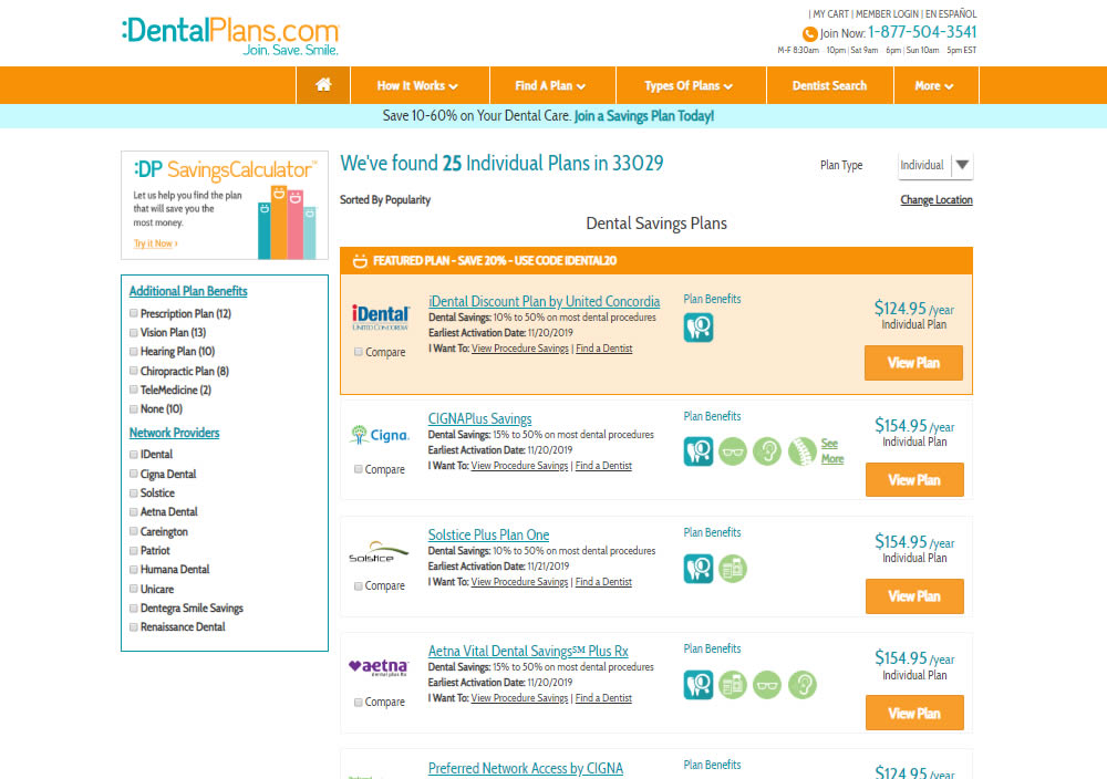
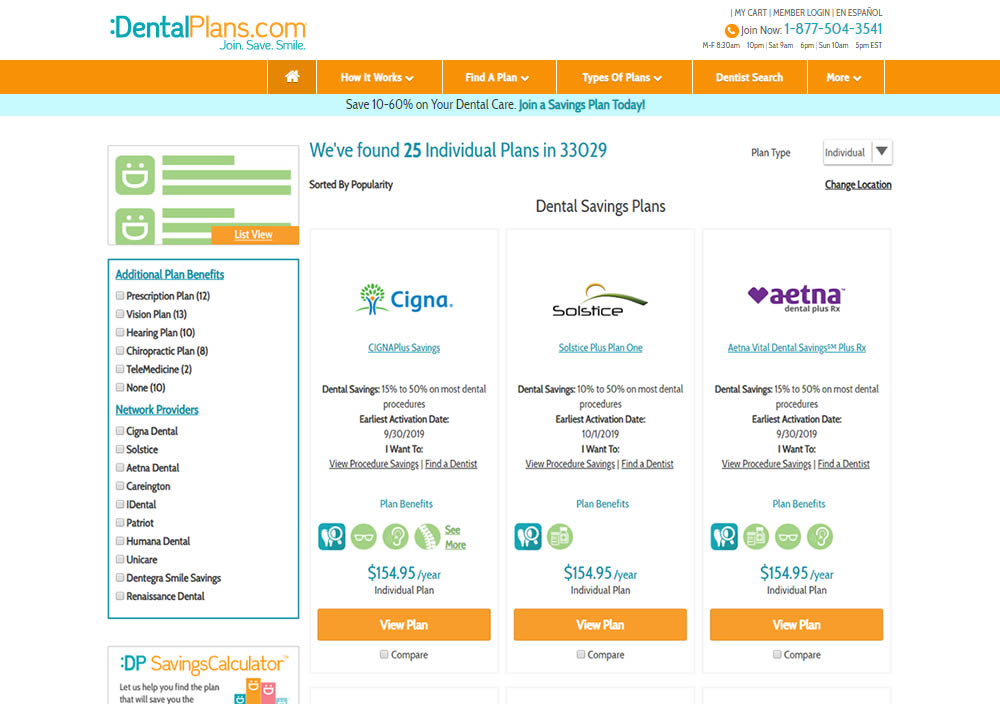
In this experiment, a list view was tested against a grid view.
Test #268 on
Backstage.com
by
 Stanley Zuo
Nov 08, 2019
Mobile
Listing
Stanley Zuo Tested Pattern #14: Exposed Menu Options In Test #268 On Backstage.com
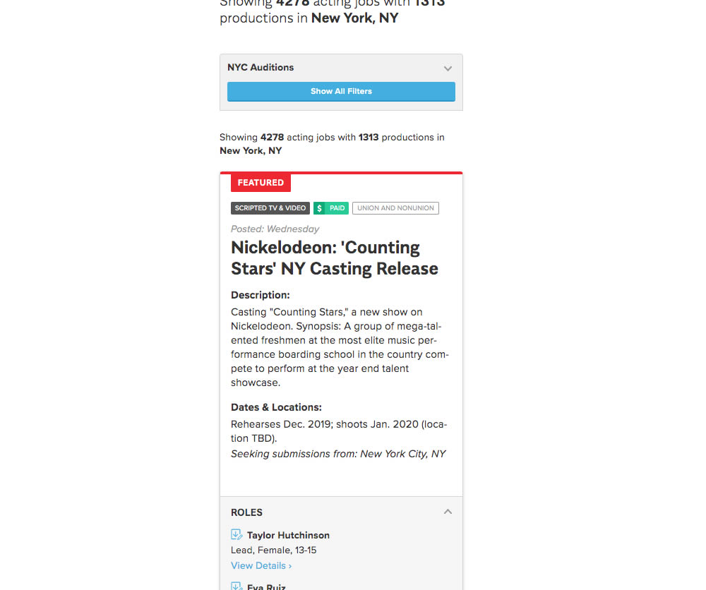
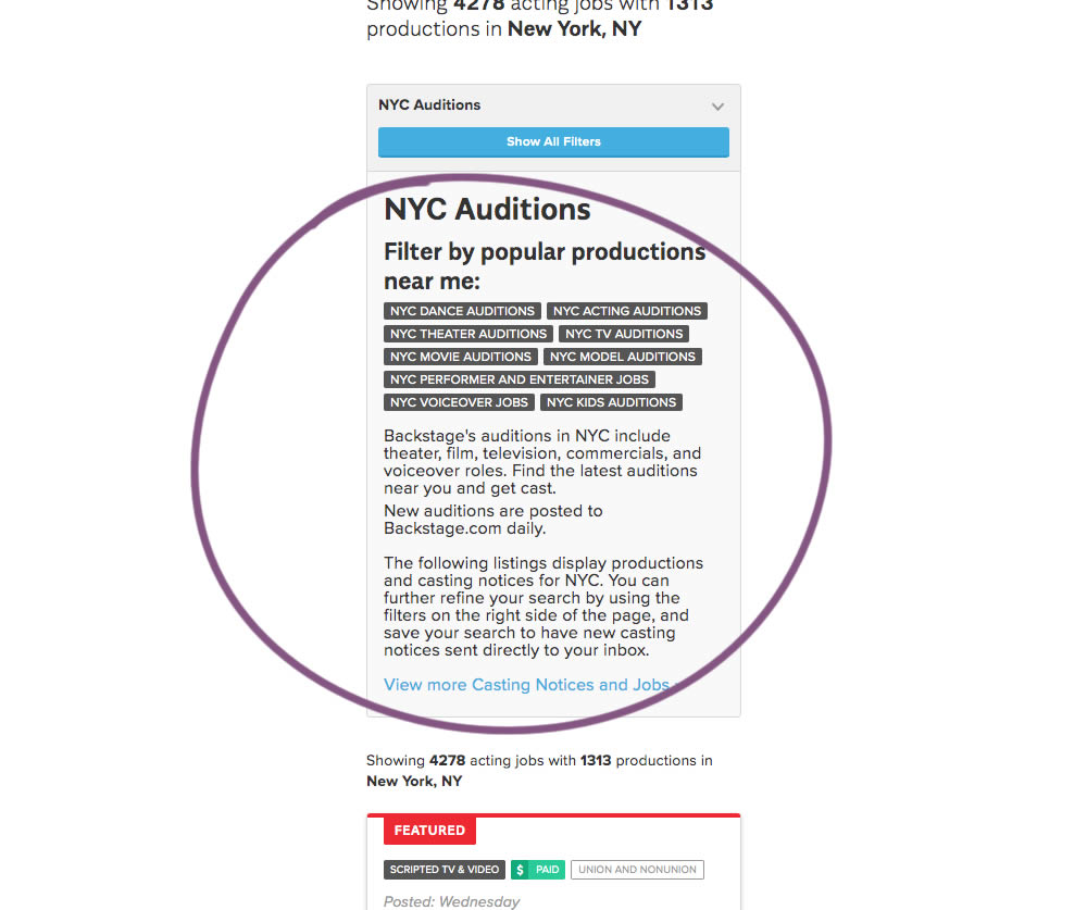
The change in this experiment was an exposed SEO panel (B) with a number of clickable filter options.
Test #262 on
Thomasnet.com
by
 Julian Gaviria
Oct 03, 2019
Desktop
Mobile
Listing
Julian Gaviria Tested Pattern #32: Condensed List In Test #262 On Thomasnet.com
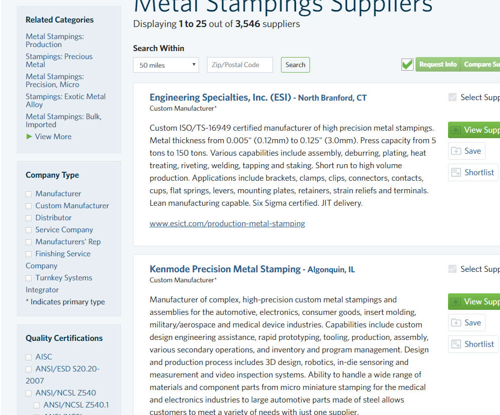
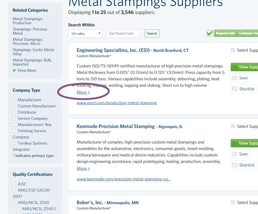
In this experiment, the B version condensed the company listings. This was done by showing less of the description and introducing a "more" and "less" dynamic links that would expand and collapse the description.
Test #240 on
Thomasnet.com
by
 Julian Gaviria
May 16, 2019
Desktop
Listing
Julian Gaviria Tested Pattern #13: Centered Forms & Buttons In Test #240 On Thomasnet.com
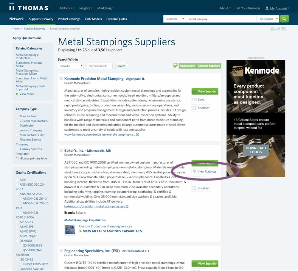
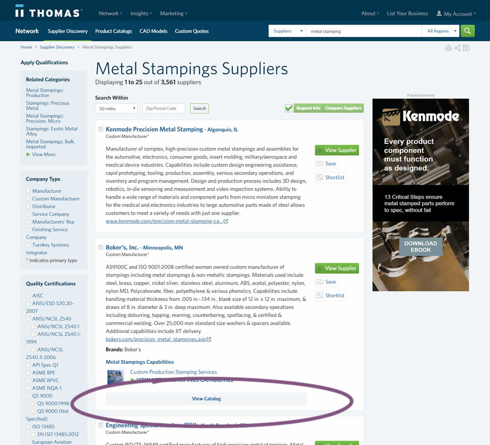
In this experiment, two different positions of the View Catalog button were compared. In version A the button was smaller and on the right. In version B the button was wider and more central. (The actual test was inverted before publishing to match the A-B of the pattern.)
Test #237 on
Goodui.org
by
 Jakub Linowski
Apr 29, 2019
Desktop
Mobile
Listing
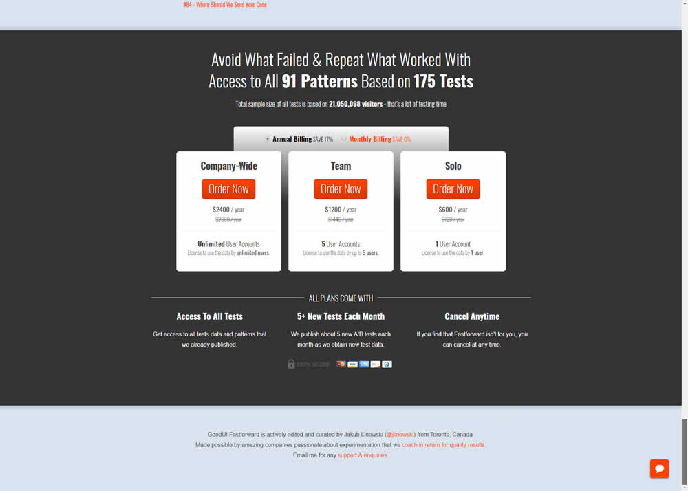
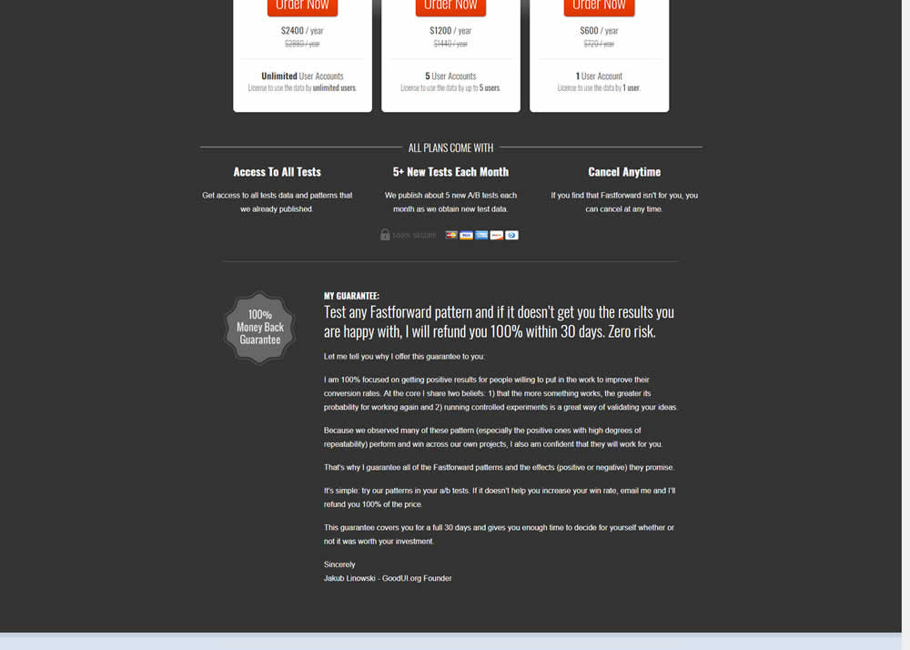
Jakub Linowski Tested Pattern #103: Money Back Guarantee In Test #237 On Goodui.org
Test #234 on
by
 Alex James
Apr 01, 2019
Desktop
Listing
Alex James Tested Pattern #101: Search Keyword Highlighting In Test #234


In this experiment, a different style for keyword highlighting was used.
Test #230 on
Goodui.org
by
 Jakub Linowski
Mar 09, 2019
Desktop
Mobile
Listing
Jakub Linowski Tested Pattern #56: Hover Button In Test #230 On Goodui.org
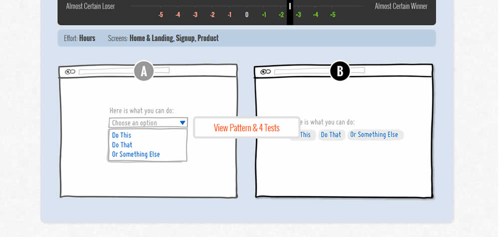
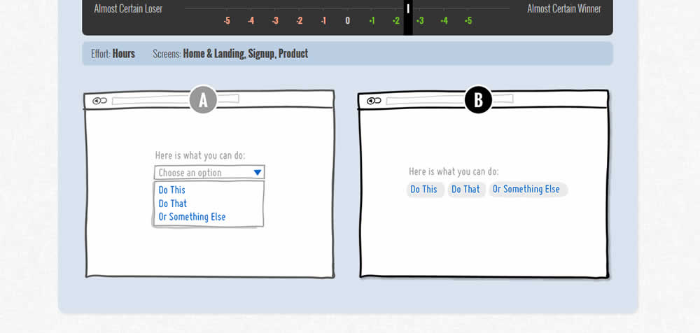
In this test we tested onhover buttons (variant) versus more traditional always exposed and visible ones.
Test #222 on
Thomasnet.com
by
 Julian Gaviria
Feb 01, 2019
Desktop
Listing
Julian Gaviria Tested Pattern #7: Social Counts In Test #222 On Thomasnet.com
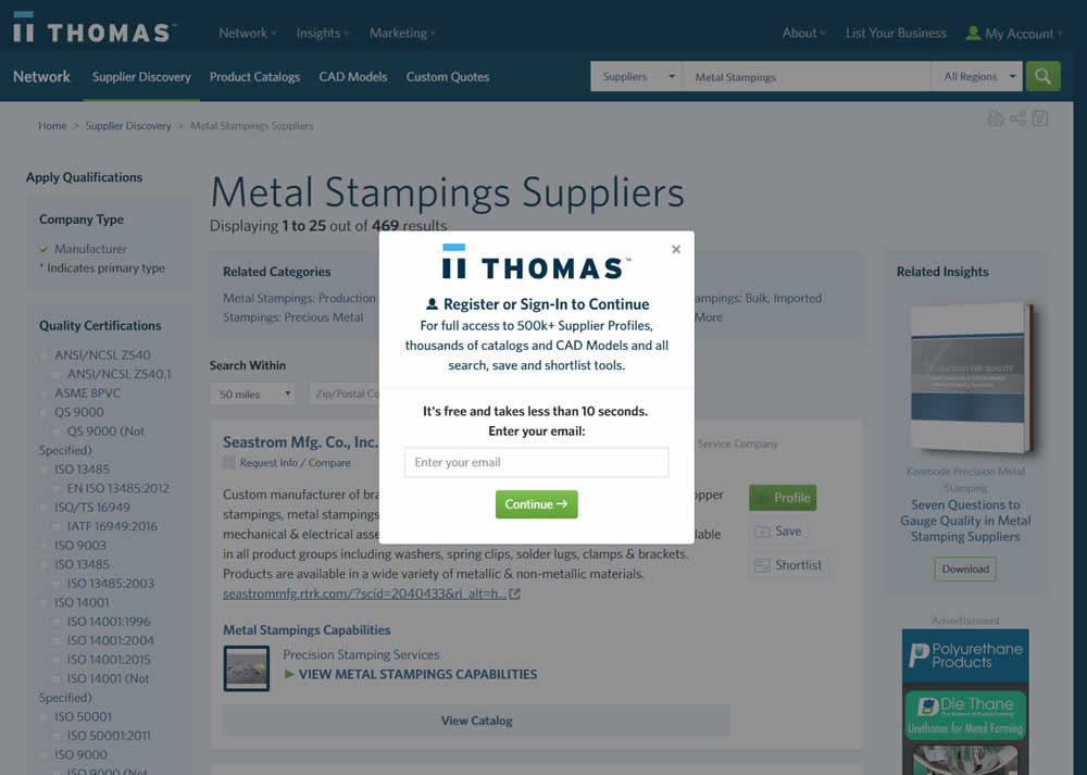
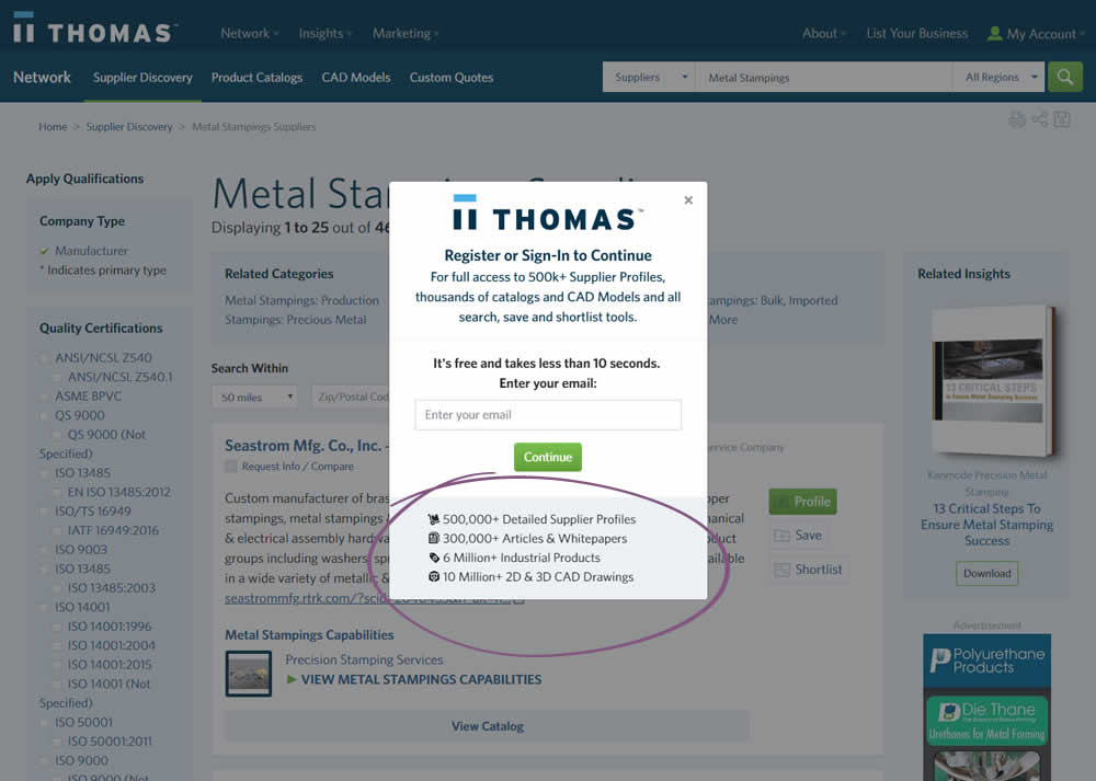
In this variation, a number of social proof references were added to a signup modal.
Test #220 on
by
 Alex James
Jan 18, 2019
Desktop
Listing
Alex James Tested Pattern #34: Open In A New Tab In Test #220
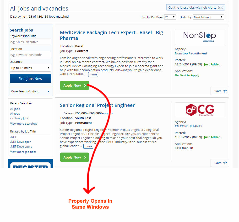
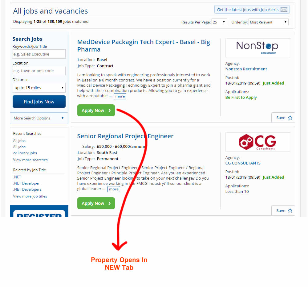
This experiment measured the effect of opening new listing (job applications) in a new tab, against opening them in the same window. The experiment A-B was inversed to match the pattern (in reality, the original already opened the tabs in a new window).
Test #215 on
Vivareal.com.br
by
 Vinicius Barros Peixoto
Dec 21, 2018
Mobile
Listing
Vinicius Barros Peixoto Tested Pattern #92: Already Viewed Label In Test #215 On Vivareal.com.br


The idea of this test was to add a "Viewed" label on a listing page to indicate listings which have already been viewed by users.
Test #209 on
Vivareal.com.br
by
 Vinicius Barros Peixoto
Nov 12, 2018
Mobile
Listing
Vinicius Barros Peixoto Tested Pattern #34: Open In A New Tab In Test #209 On Vivareal.com.br
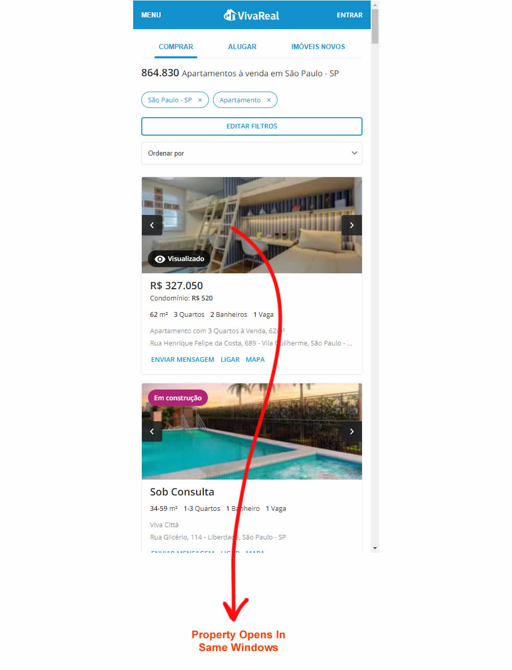

The idea of this experiment was taking advantage of mobile browser behavior. When a link is open in a new tab on mobile browsers, and users hit the back button, the tab closes and users get back exactly where they were before without any new result page load.
Test #208 on
Thomasnet.com
by
 Julian Gaviria
Nov 02, 2018
Desktop
Mobile
Listing
Julian Gaviria Tested Pattern #88: Action Button In Test #208 On Thomasnet.com
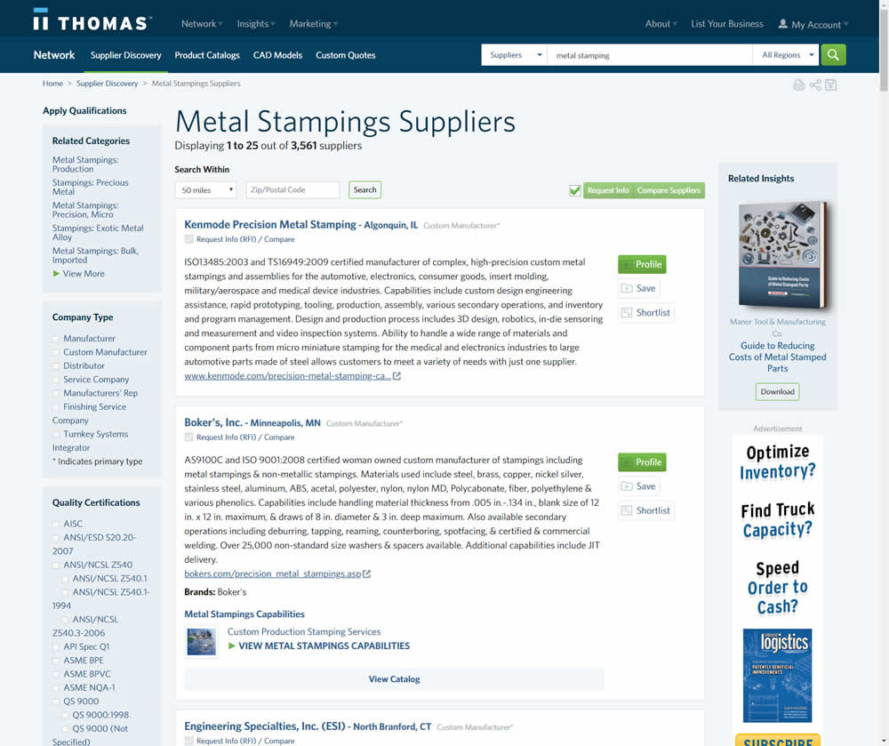
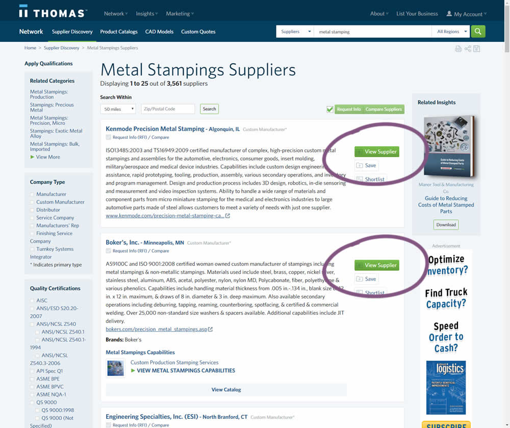
In this variation, the button labels were changed from "Profile" to "View Supplier".