73 Tests By  Jakub Linowski
Tests
Test #610 on
by
 Jakub Linowski
Sep 04, 2025
Desktop
Jakub Linowski Tested Pattern #111: Field Explanations In Test #610
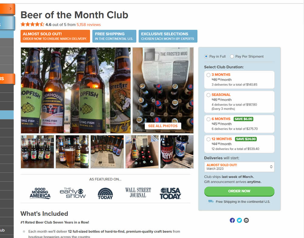
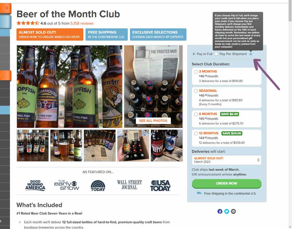
In this product detail page experiment, the variation showed a tooltip icon. Upon hovering on the icon it expanded additional information explaining the difference between pay in full and pay per shipment. Impact on sales was measured.
Test #605 on
by
 Jakub Linowski
Aug 21, 2025
Desktop
Mobile
Jakub Linowski Tested Pattern #113: More Or Fewer Plans In Test #605
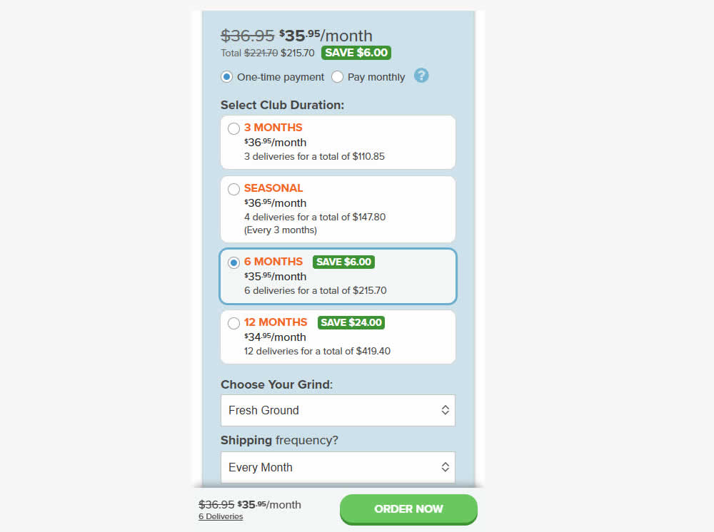
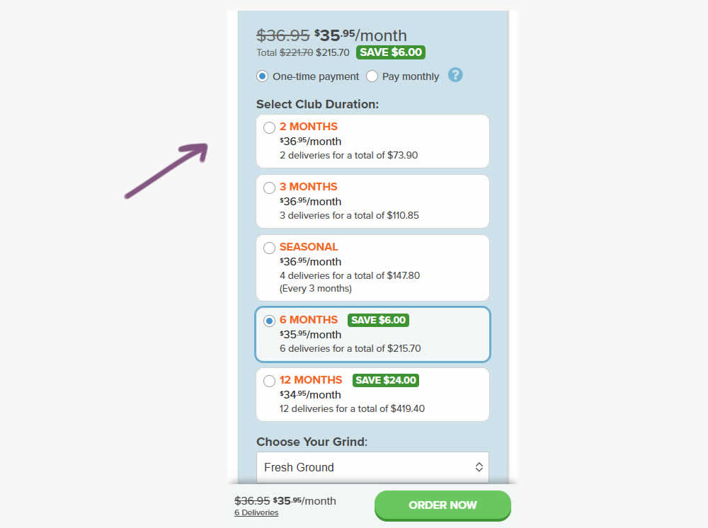
A less expensive product choice (club duration) was added at the beginning of the options. Impact on adds-to-cart, sales and revenue were measured.
Test #600 on
by
 Jakub Linowski
Jul 18, 2025
Desktop
Mobile
Jakub Linowski Tested Pattern #63: Trust Seals In Test #600
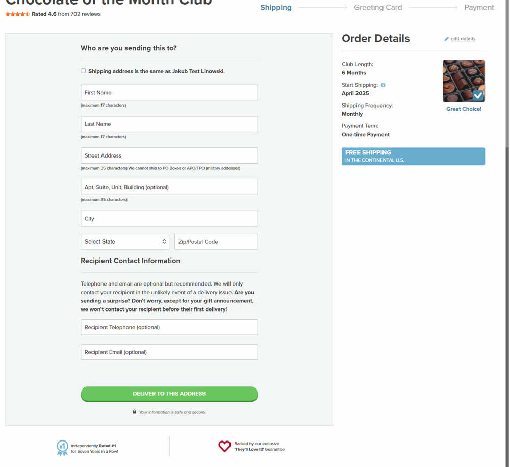
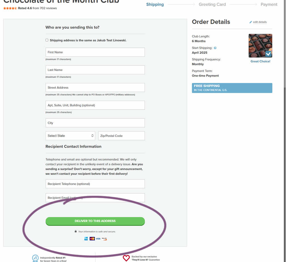
In this experiment, 4 accepted credit card icons were added to an add-to-cart and checkout flow. Impact on sales was measured.
Test #598 on
by
 Jakub Linowski
Jun 27, 2025
Desktop
Mobile
Jakub Linowski Tested Pattern #26: Cart Reminder And Recently Viewed In Test #598
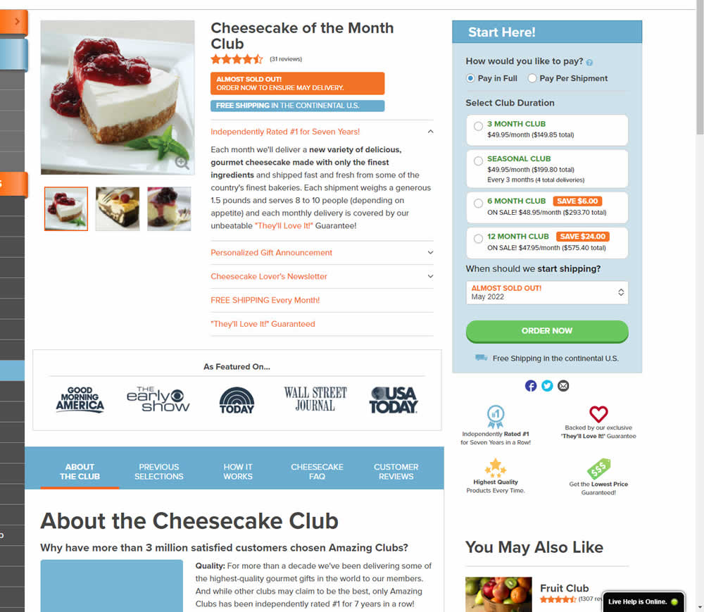
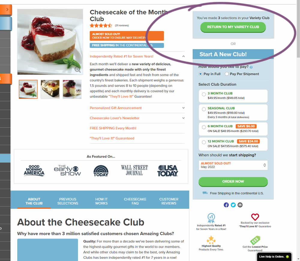
This experiment started when a user started a custom product build and visited any other product page. In the variation, a resume button appeared that would bring the customers back to their custom build. Impact on checkouts and sales was measured.
Test #595 on
by
 Jakub Linowski
Jun 09, 2025
Mobile
Jakub Linowski Tested Pattern #114: Less Or More Visible Prices In Test #595
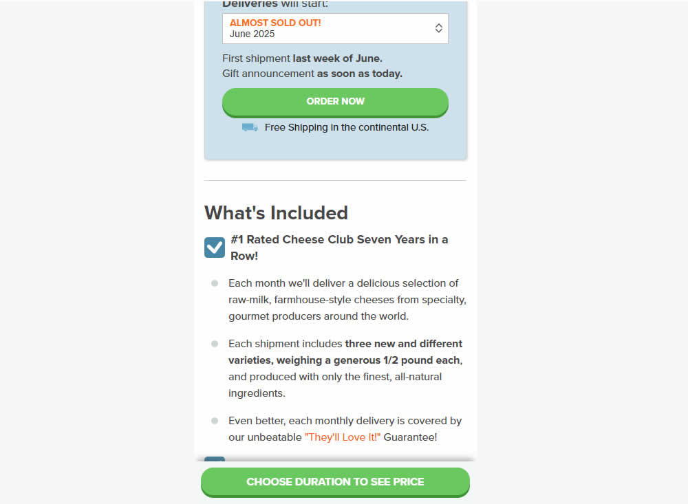
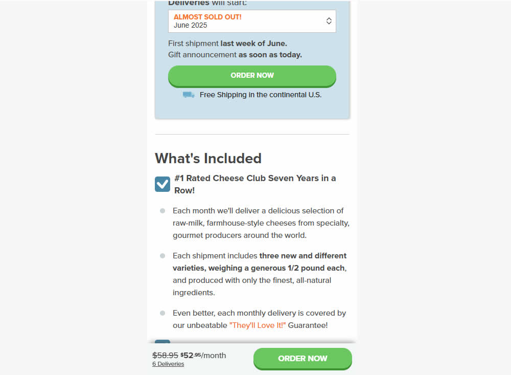
In this mobile product page experiment, the variation changed the look of the floating button area once a product was chosen.
The variation showed a button with 1) pricing totals along with 2) a link back to the edit area and 3) a button that allowed to add to cart directly. Whereas the control only linked back to the top of the page where the product selction was possible. Impact on adds-to-cart and sales was measured.
Test #589 on
by
 Jakub Linowski
Apr 30, 2025
Desktop
Jakub Linowski Tested Pattern #68: Welcome Discount In Test #589
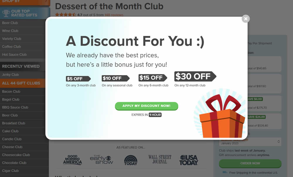
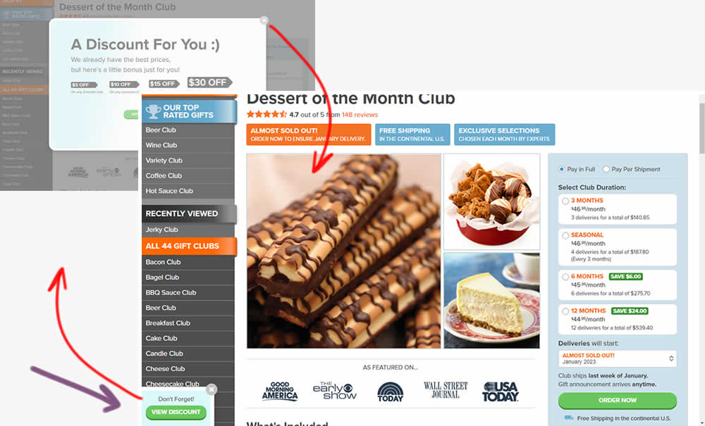
This experiment added one extra layer of persistence to an appearing welcome discount offer. In the variation, a welcome discount appeared on product pages after some inactivity behavior combined with a delay. In the variation, the only thing that was modified was the "collapse" behavior - basically creating a small floating micro modal in the bottom right. The micro modal allowed users to return to the larger modal or collaping it for good (with a second X collapse button). Impact on sales was measured.
Test #586 on
by
 Jakub Linowski
Apr 25, 2025
Mobile
Jakub Linowski Tested Pattern #48: Video Testimonials In Test #586
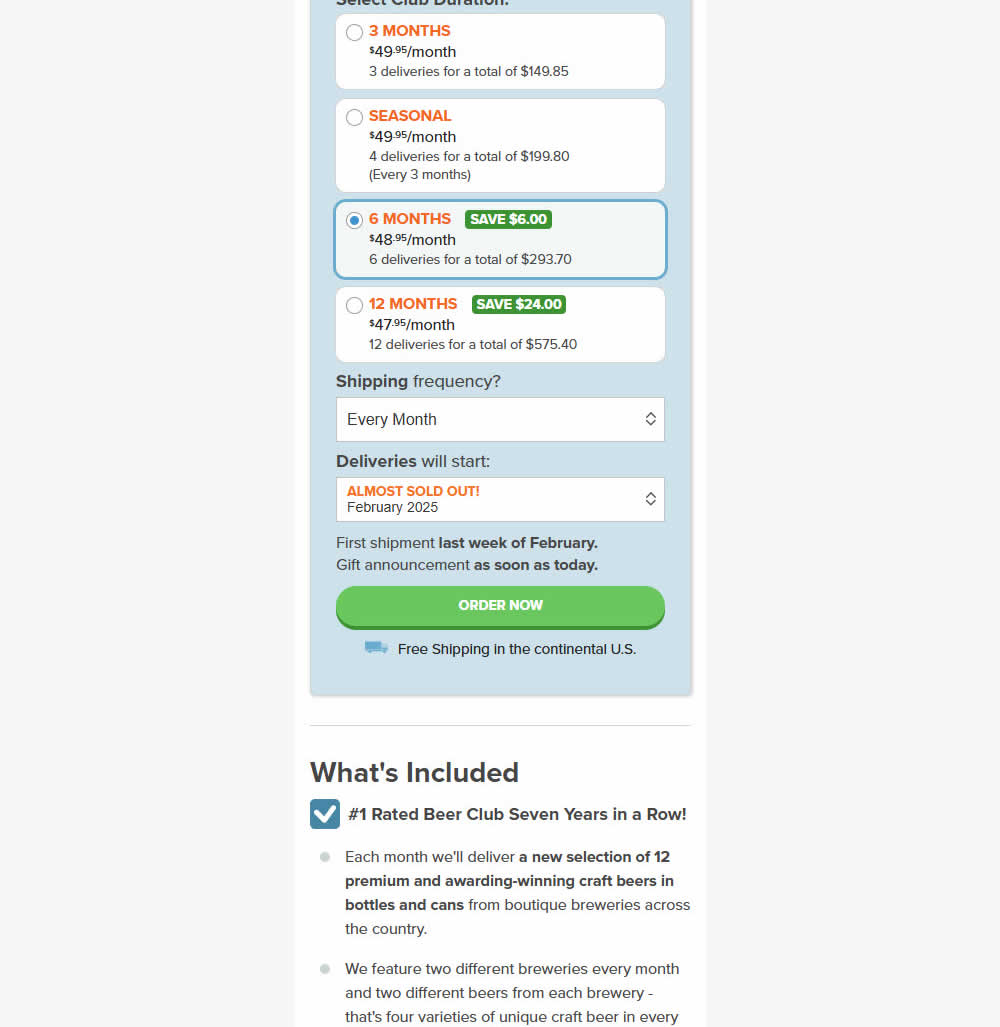
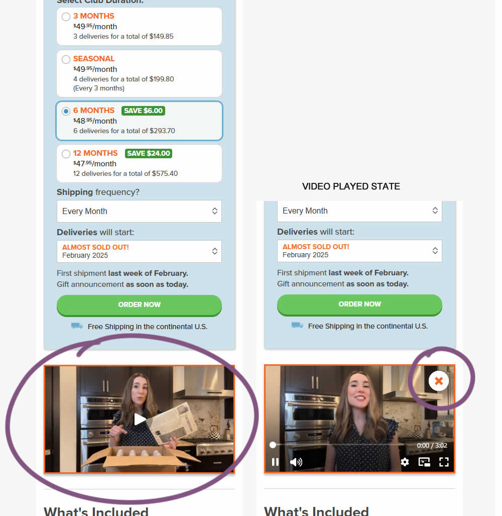
In this experiment, a video unboxing and product overview video was added on product pages (below the buy box). After pressing play, the video started playing with a visible "close" control to allow stopping of the video.
Impact on adds to cart and sales was measured.
Test #578 on
by
 Jakub Linowski
Feb 20, 2025
Mobile
Jakub Linowski Tested Pattern #48: Video Testimonials In Test #578
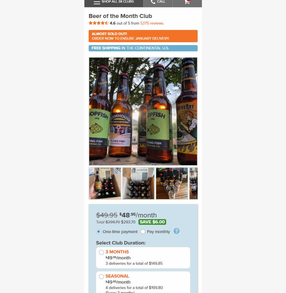
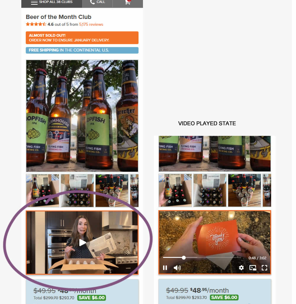
In this experiment, a video unboxing and product overview video was added on product pages. After pressing play, the video started playing with the controls only appearing for a short time before fading away.
Notice the confounding from pushing the buy box further down.
Impact on adds to cart and sales was measured.
Test #577 on
by
 Jakub Linowski
Feb 19, 2025
Desktop
Jakub Linowski Tested Pattern #48: Video Testimonials In Test #577
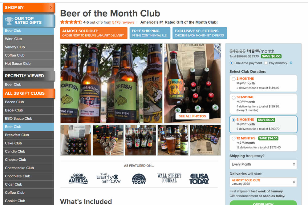
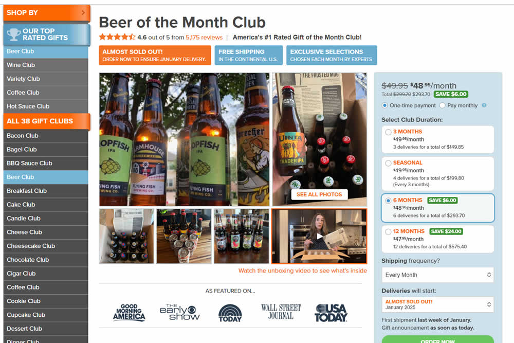
In this experiment, a video unboxing and product overview video was added on product pages. After pressing play, the video expanded to a full column width (taking over the middle column while replacing the 5 small square photo tiles and growing in height.) The video in its play state also contained a prominent (X) icon that allowed users to stop and revert to the original state.
Impact on adds to cart and sales was measured.
Test #571 on
by
 Jakub Linowski
Jan 03, 2025
Desktop
Mobile
Jakub Linowski Tested Pattern #30: Authentic Photos In Test #571
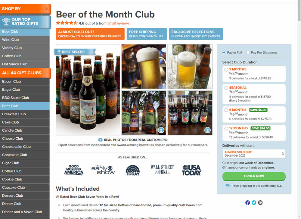
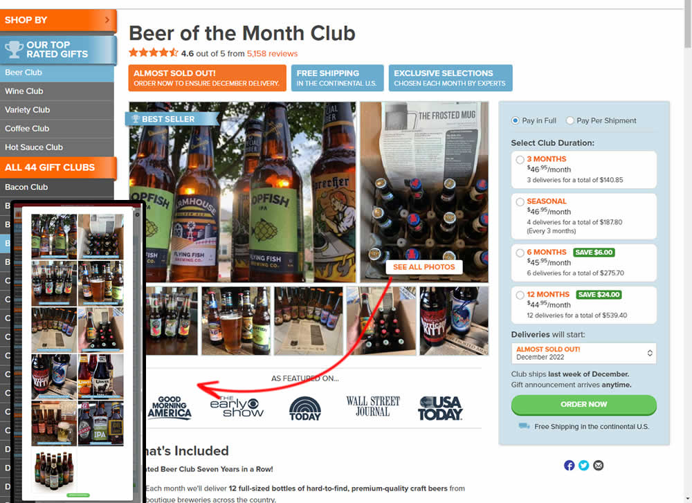
In this experiment, additional customer product photos were shown at the top of the product page. A "Show More Photos" button was also added which launched a modal with additional and larger images. Impact on sales was measured.
Test #568 on
by
 Jakub Linowski
Dec 22, 2024
Jakub Linowski Tested Pattern #80: Persistent Filters In Test #568
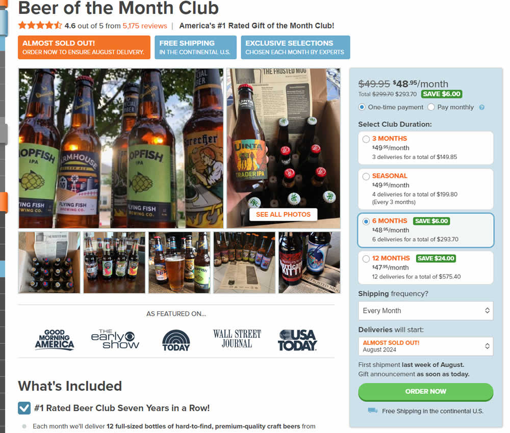
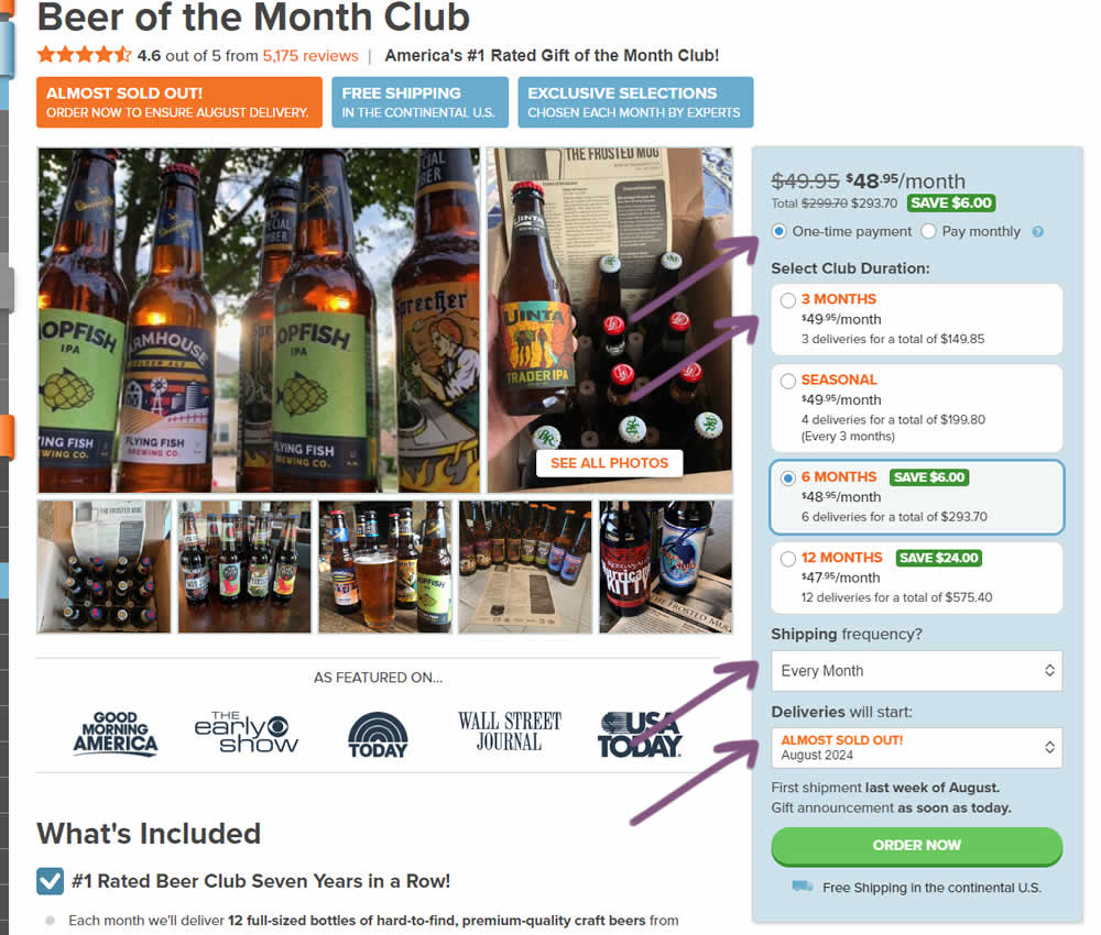
In this experiment, "persistence" of 4 product choices was added in the variation. When users made a product selection such as: duration, payment terms, starting month or shipping frequency, their choices were remembered and defaulted on next visits, reloads or when viewing other products. Impact on adds to cart and sales was measured.
Test #562 on
by
 Jakub Linowski
Nov 13, 2024
Desktop
Mobile
Jakub Linowski Tested Pattern #99: Progress Bar In Test #562
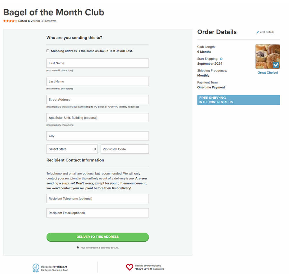
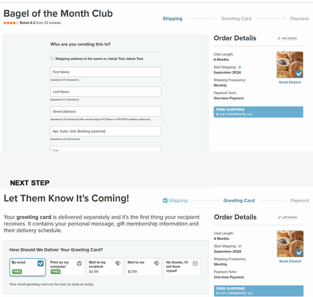
In this experiment, a 3 step progress bar was added starting on a checkout funnel (dedicated add-to-cart page, greeting card step and order summary). The progress bar also showed any completed steps as a "checked off" state. More so, users were able to use the progress bar as a navigation item to any previously completed and currently active steps. Impact on sales was measured.
Test #543 on
by
 Jakub Linowski
Jul 22, 2024
Desktop
Mobile
Jakub Linowski Tested Pattern #7: Social Counts In Test #543
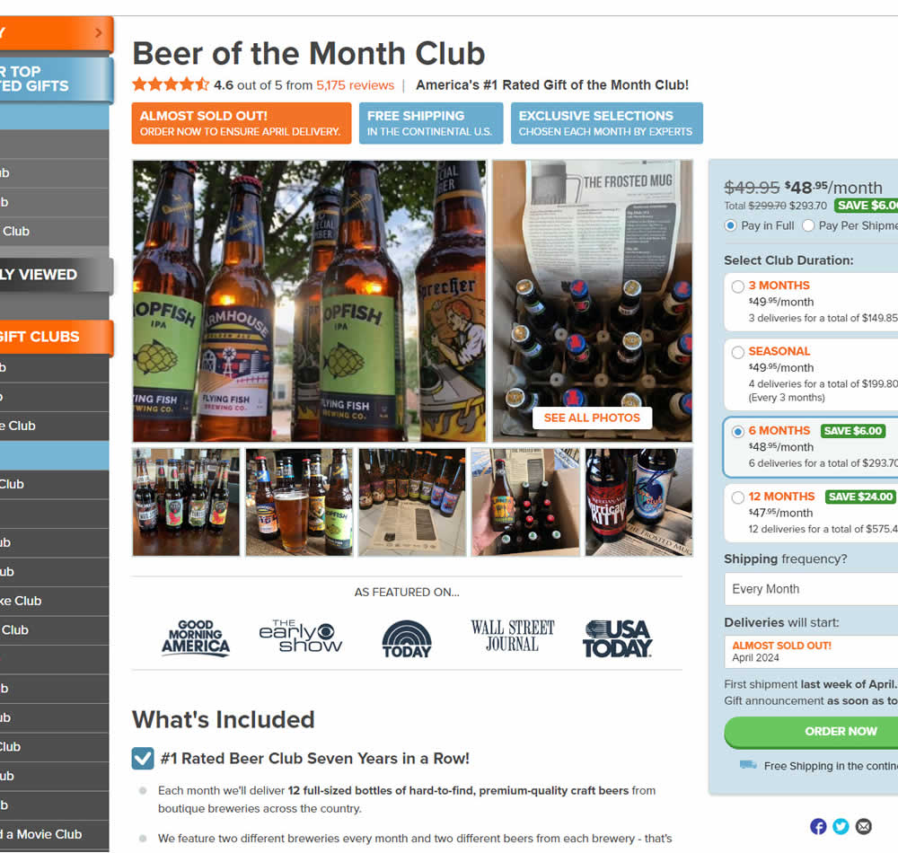
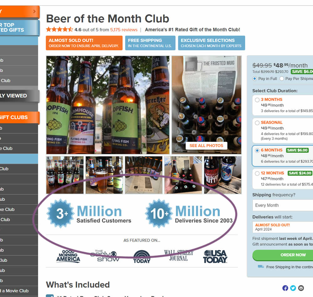
In this experiment, social proof copy was added just below product photos. The copy emphasied that "3 million satisfied customers" and "10 million deliveries since 2003". Impact on sales was measured.
Test #536 on
by
 Jakub Linowski
Jun 14, 2024
Desktop
Mobile
Jakub Linowski Tested Pattern #28: Easiest Fields First In Test #536
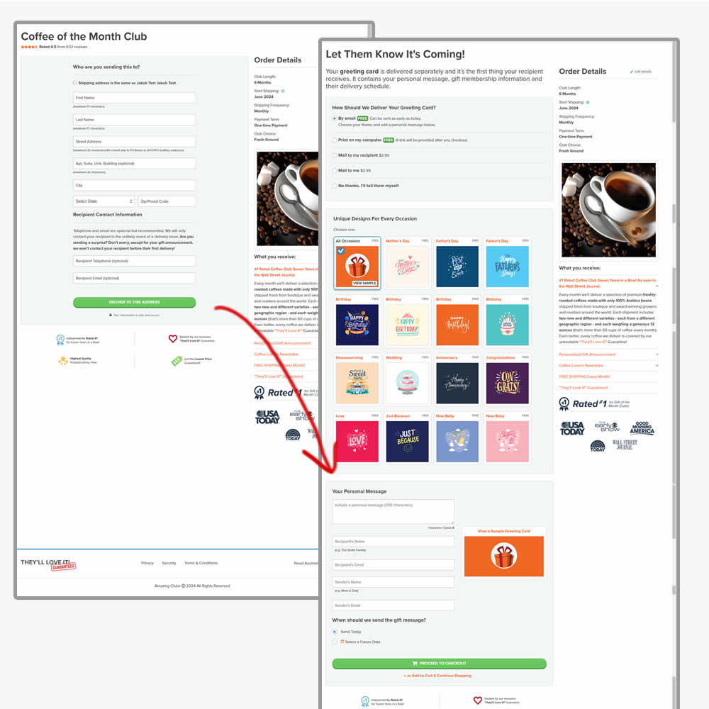
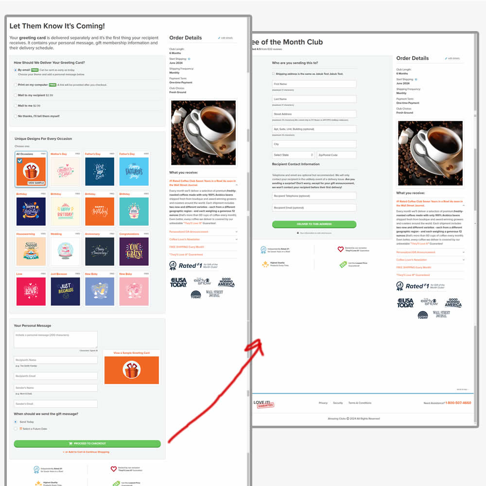
In this experiment, the order of the checkout flow was rearranged. In the control the first step of the checkout flow started with the shipping information step, followed by greeting card selection. In the variation this was rearranged (hypothesis was that the greeting card step was easier). Impact on sales was measured.
Test #533 on
by
 Jakub Linowski
May 23, 2024
Desktop
Jakub Linowski Tested Pattern #94: Visible Search In Test #533
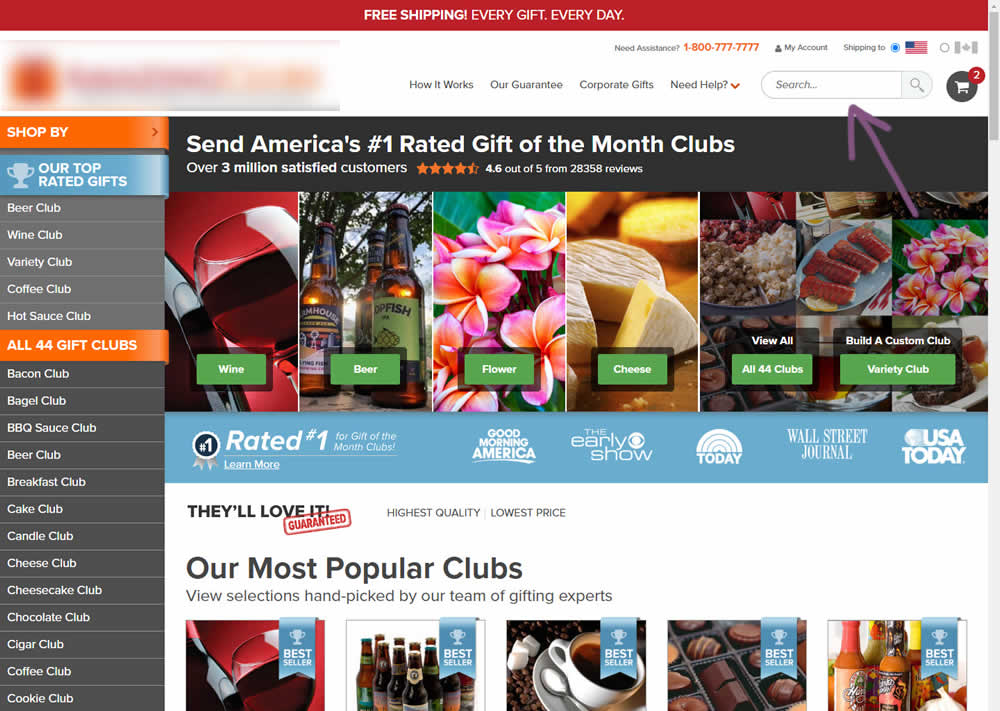

In this experiment, the presence of a search bar was tested against no search bar altogether. The control had search, and in the variation it was removed. The variation also exposed items from within the "Need Help?" menu, making "My account", "Contact Us" and "FAQ" more prominent.
(Here the AB test is inverted / flipped to match the pattern).
Test #527 on
by
 Jakub Linowski
Apr 23, 2024
Desktop
Mobile
Jakub Linowski Tested Pattern #132: One Time Payment Copy In Test #527
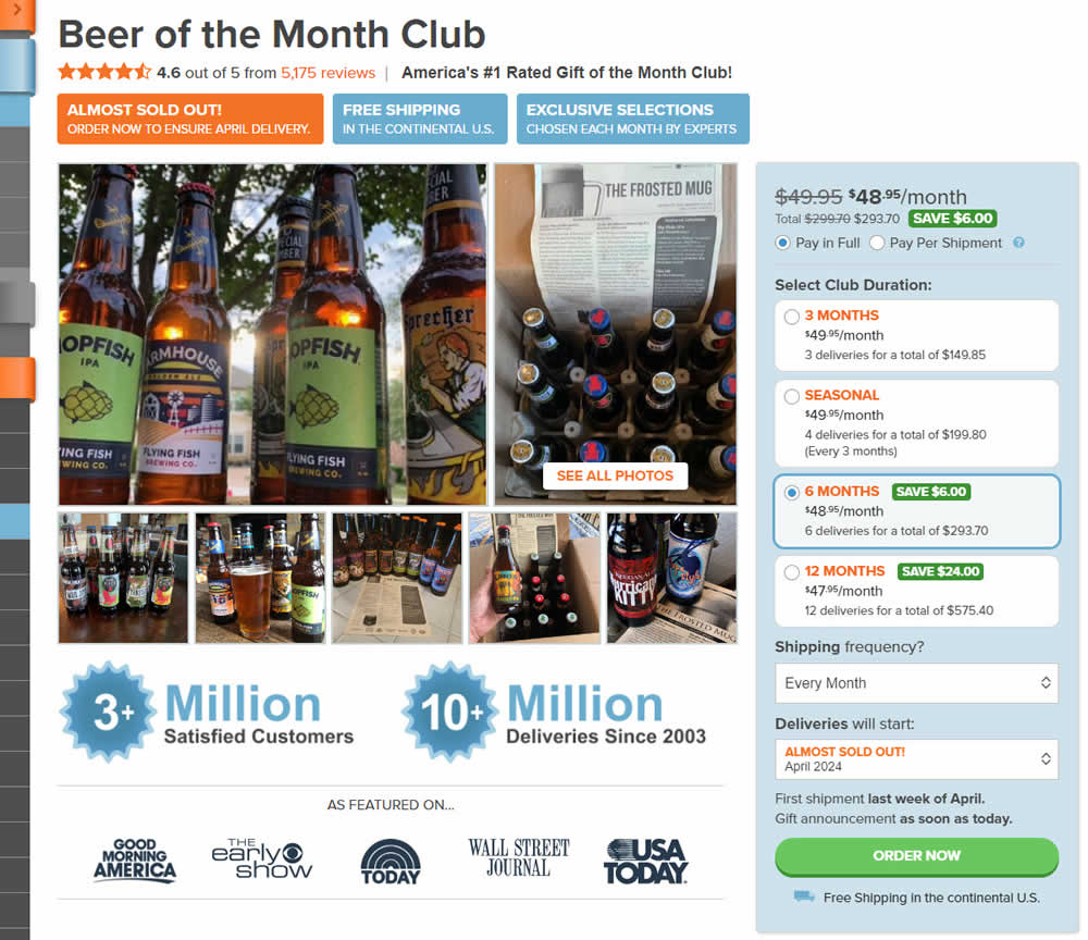
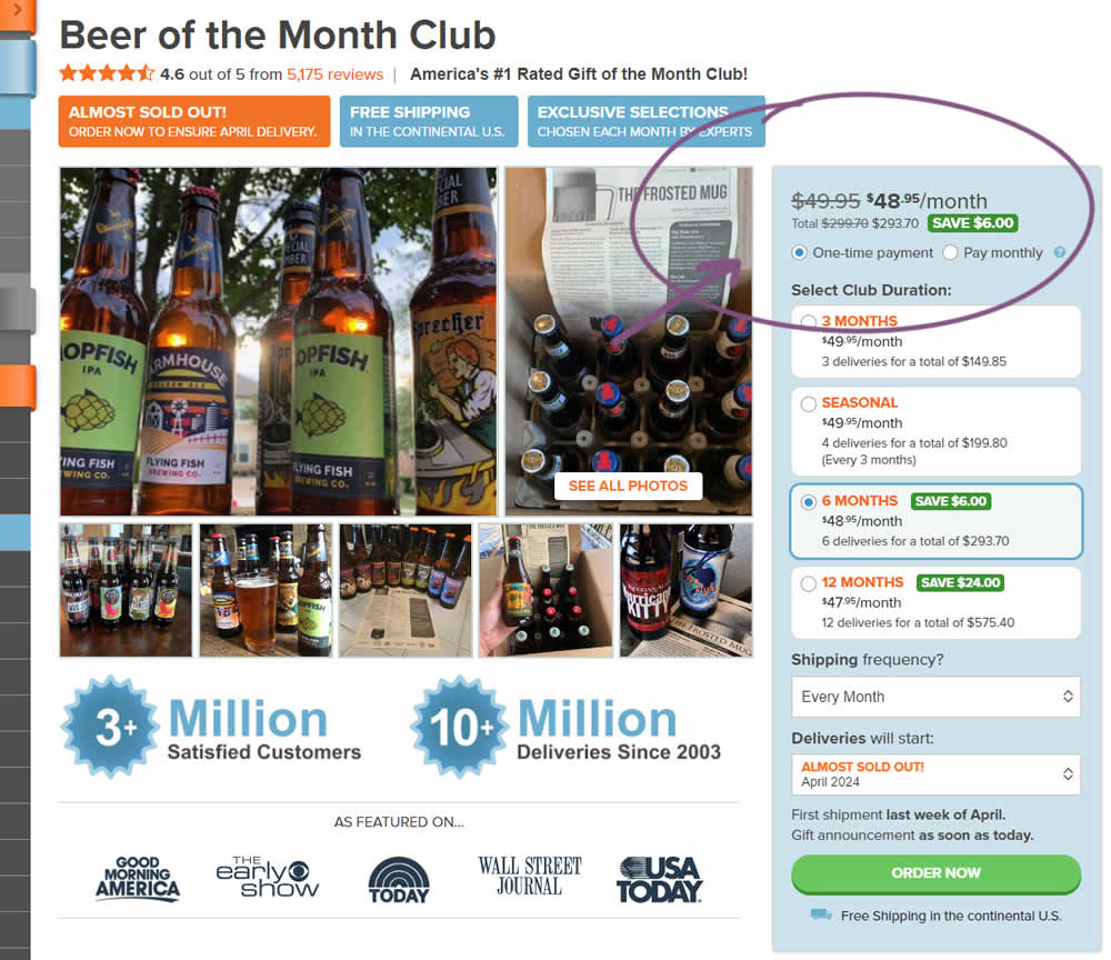
In this experiment, copy related to payment duration types (paid in full or ongoing) was changed. In the the control, one of the option used the "Pay in Full" copy, whereas the variation changed this to "One-time payment". Impact on sales was measured.
Test #525 on
by
 Jakub Linowski
Mar 27, 2024
Desktop
Mobile
Jakub Linowski Tested Pattern #119: Unselected Or Selected Defaults In Test #525
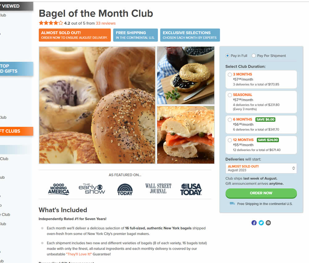
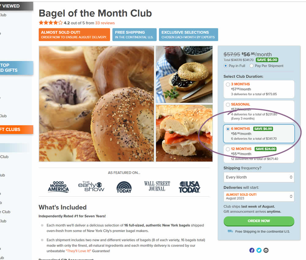
In this experiment, a club subscription duration was preselected to 6 in the variation. The control had no club durations preselected. As a result of preselecting a club duration, a more visible price also appeared at the top (sooner in the variation). Impact on sales was measured.
Test #518 on
by
 Jakub Linowski
Feb 14, 2024
Mobile
Jakub Linowski Tested Pattern #64: Tunnel In Test #518
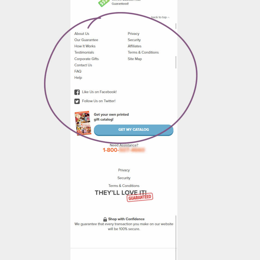
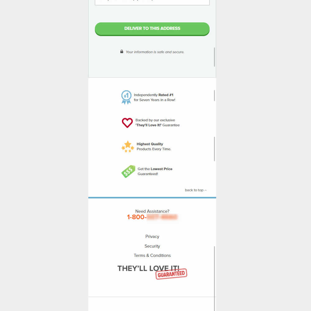
This was an experiment on the first checkout step where users would enter shipping information. The control had a longer footer with more additional sitewide links and a call to action to a newsletter. The variation removed these elements and kept the focus on the shipping information task. Impact on progression to next step and sales was measured.
Test #515 on
by
 Jakub Linowski
Jan 31, 2024
Desktop
Mobile
Jakub Linowski Tested Pattern #69: Autodiscounting In Test #515
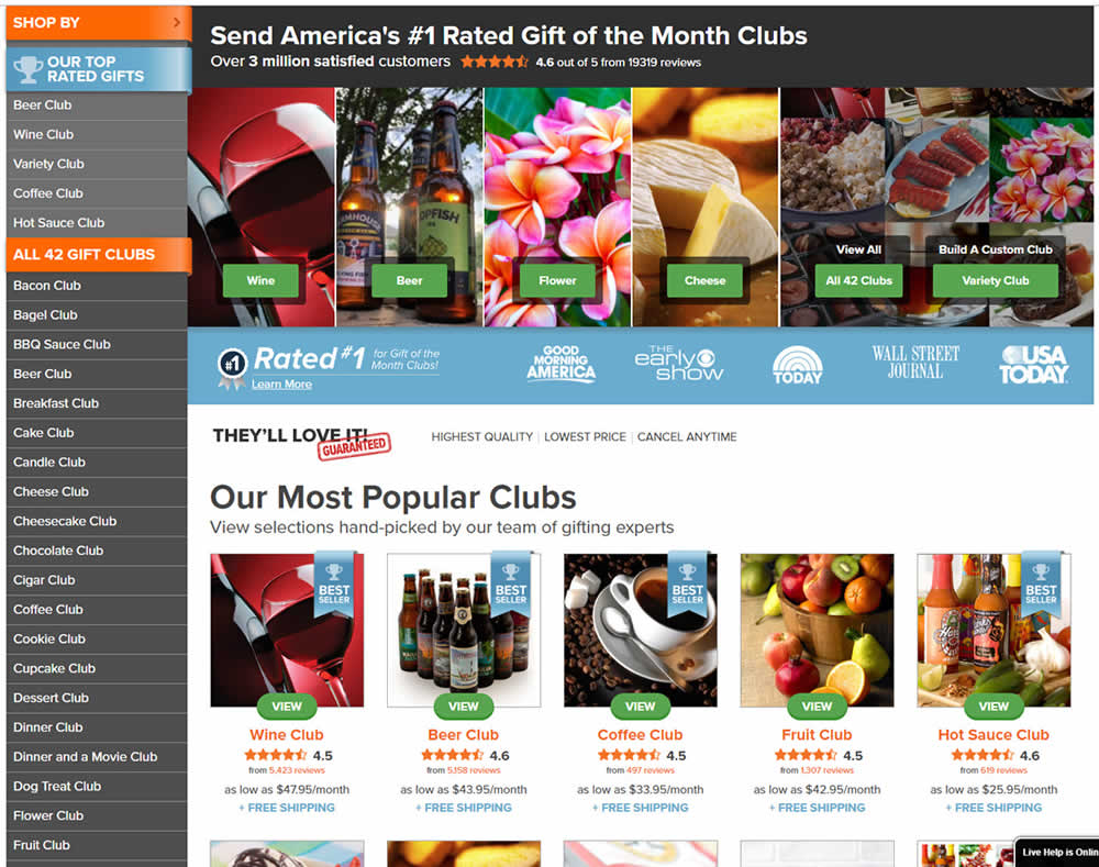
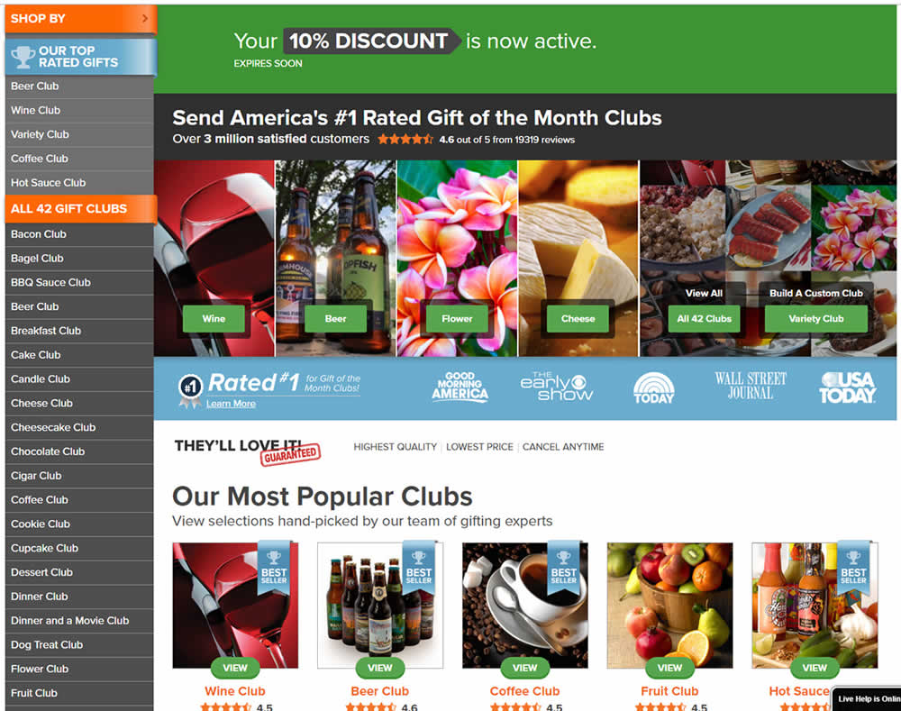
In this experiment, people who saw an offer (in an email or popup) would see a more visible site wide reinforcement of their earned discount being active. In the control, the discount was only shown during checkout. In the variation, it was shown throughout the web site on the homepage and product detail pages.
Test #506 on
by
 Jakub Linowski
Dec 07, 2023
Desktop
Mobile
Jakub Linowski Tested Pattern #4: Testimonials In Test #506
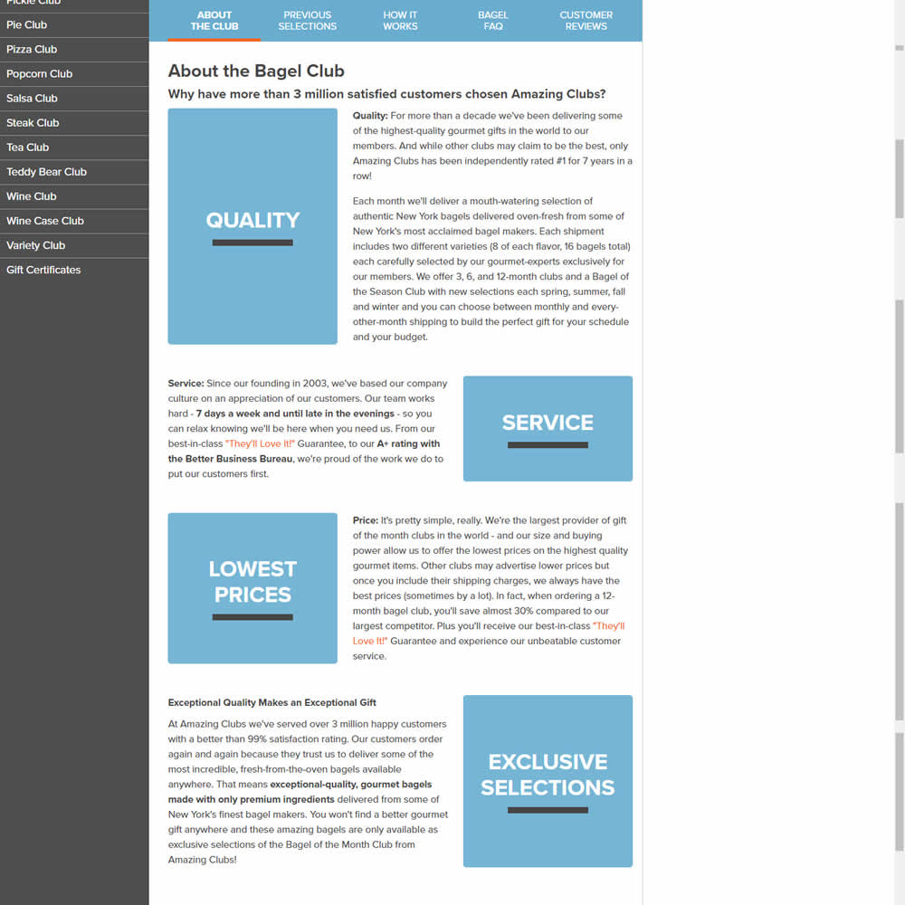
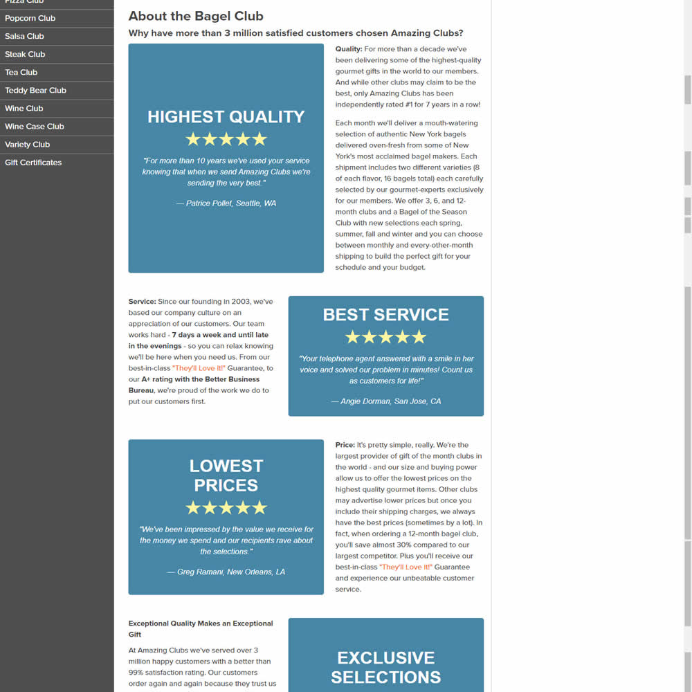
In this experiments, reinforcing section tiles were replaced with additional customer testimonials. Impact on adds to cart and sales was measured.