73 Tests By  Jakub Linowski
Tests
Test #392 on
by
 Jakub Linowski
Dec 31, 2021
Desktop
Mobile
Jakub Linowski Tested Pattern #122: Zigzag Layout In Test #392
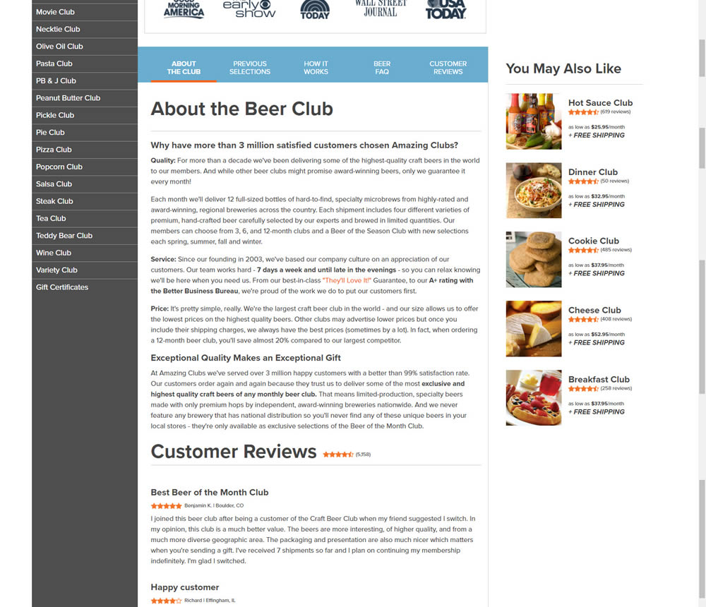
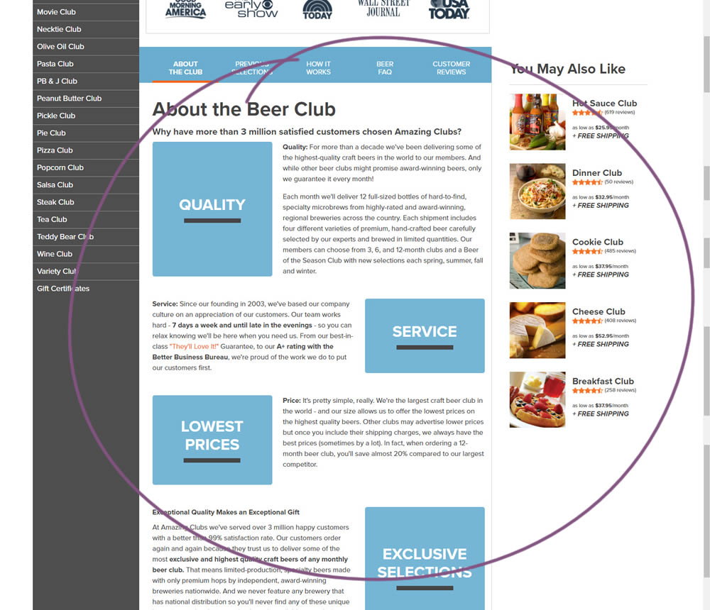
In this experiment, paragraph style copy was reorganized into a zig zag layout with key sections being reinforiced with copy-as-image statements. Impact on adds-to-cart and sales was measured.
Test #388 on
by
 Jakub Linowski
Dec 09, 2021
Mobile
Jakub Linowski Tested Pattern #51: Shortcut Buttons In Test #388
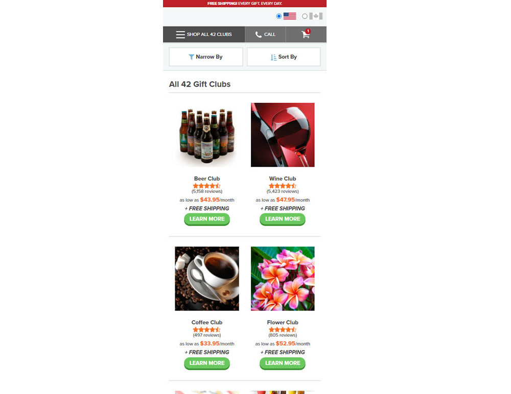
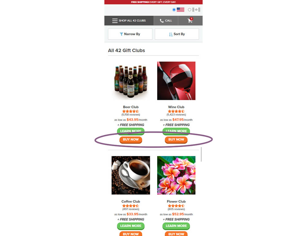
In this experiment, extra "buy now" buttons were added on a listing page. These buttons were shortcuts to an add to cart flow, whereas the "learn more" buttons lead customers to product detail pages (visible in both control and variation). Impact on adds-to-cart and sales was measured.
Test #387 on
by
 Jakub Linowski
Nov 30, 2021
Mobile
Jakub Linowski Tested Pattern #88: Action Button In Test #387
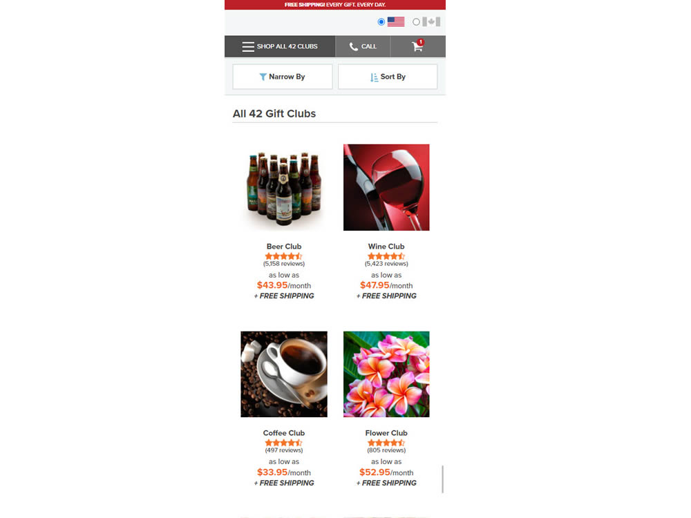
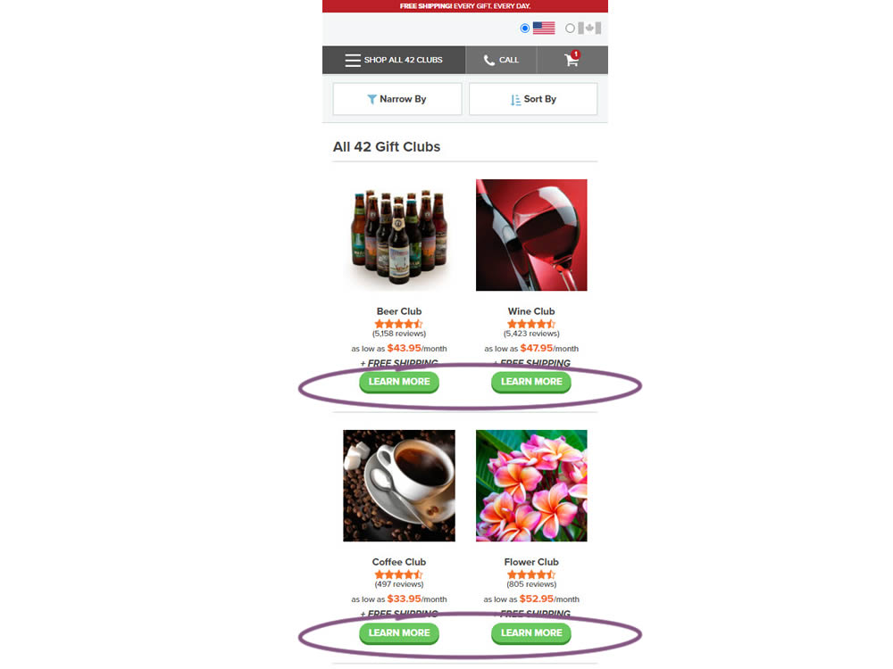
In this experiment, simple "Learn More" buttons were added underneath each product thumbnail. These buttons were additional triggers that linked to product detail pages on top of the existing thumbnails and product names (that also linked to the PDPs). Impact on product visits and sales was measured.
Test #383 on
by
 Jakub Linowski
Nov 11, 2021
Desktop
Jakub Linowski Tested Pattern #123: Single Or Double Column Form Fields In Test #383
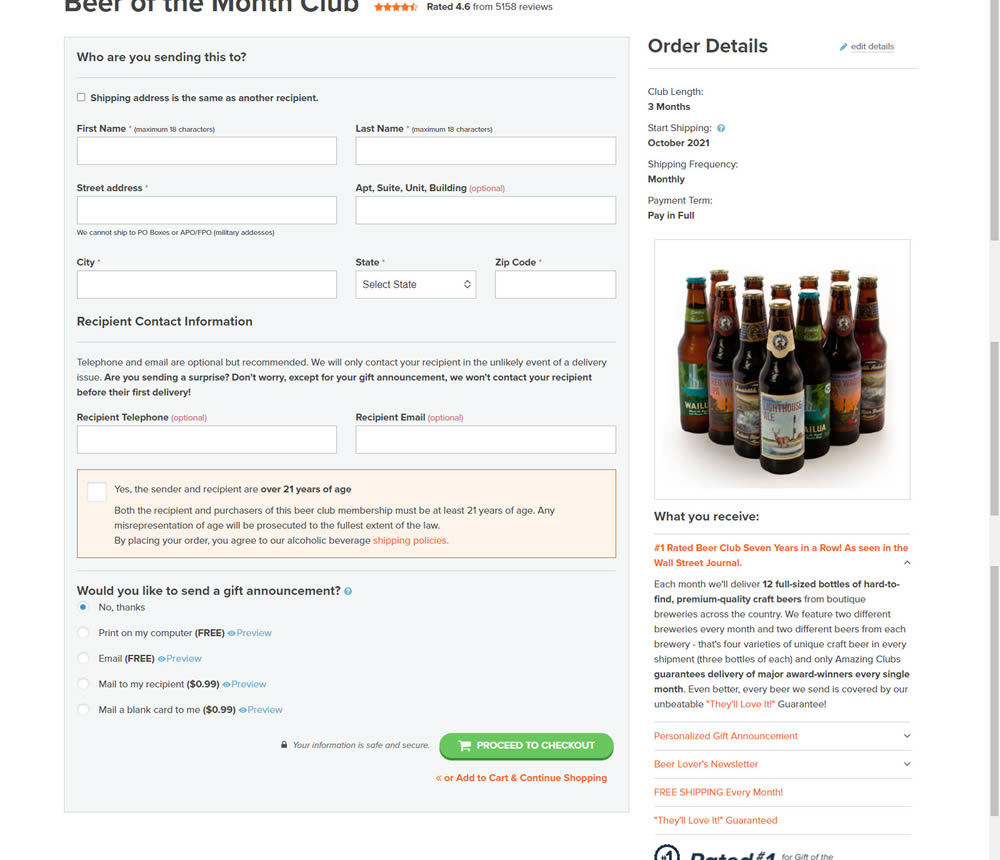
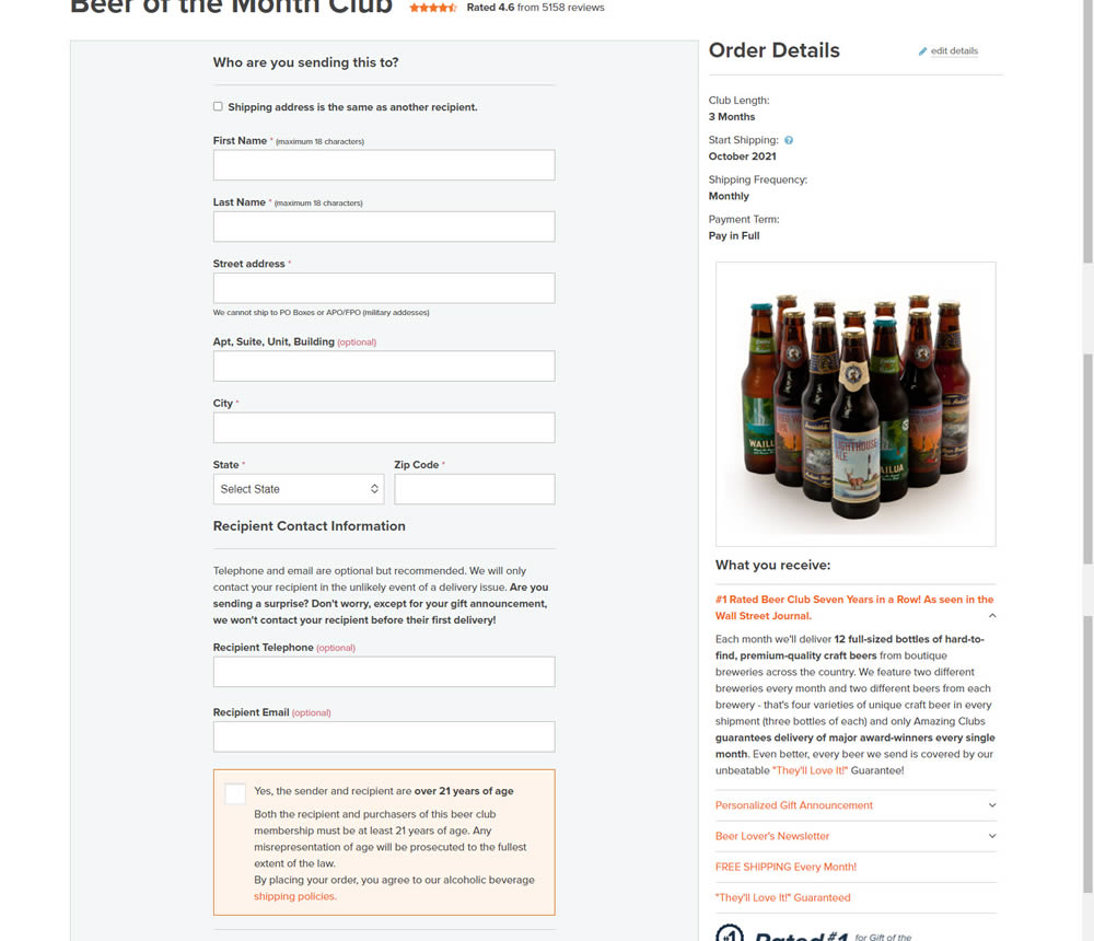
In this simple [inverted] experiment, the variation organized the form fields into a single column. The control had two columns of form fields.
Test #378 on
by
 Jakub Linowski
Oct 07, 2021
Desktop
Mobile
Jakub Linowski Tested Pattern #119: Unselected Or Selected Defaults In Test #378

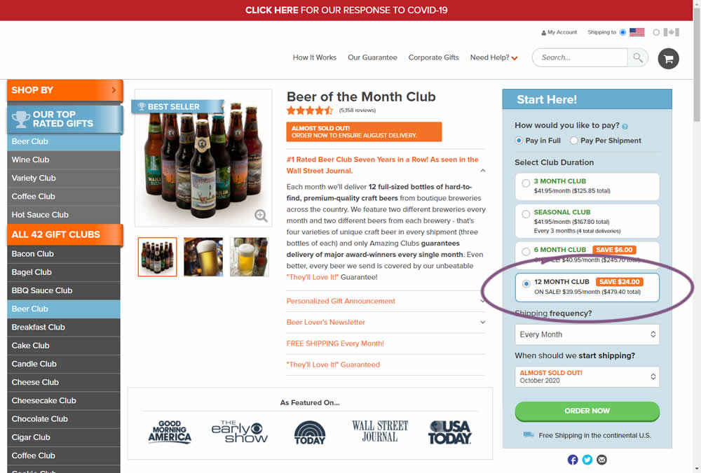
Here we have an experiment with a variation that preselected an option for a club duration. The control required customers to first express the choice for how many months they would like to order a product for. Whereas the variation defaulted to 12 months from the beginning.
Impact on adds-to-cart and sales was measured. The experiment unfortunately had to be stopped early due to another embedded variation that was performing poorly. And so it does not have many transactions.
Test #377 on
Adoramapix.com
by
 Jakub Linowski
Sep 30, 2021
Desktop
Jakub Linowski Tested Pattern #121: Free Shipping In Test #377 On Adoramapix.com
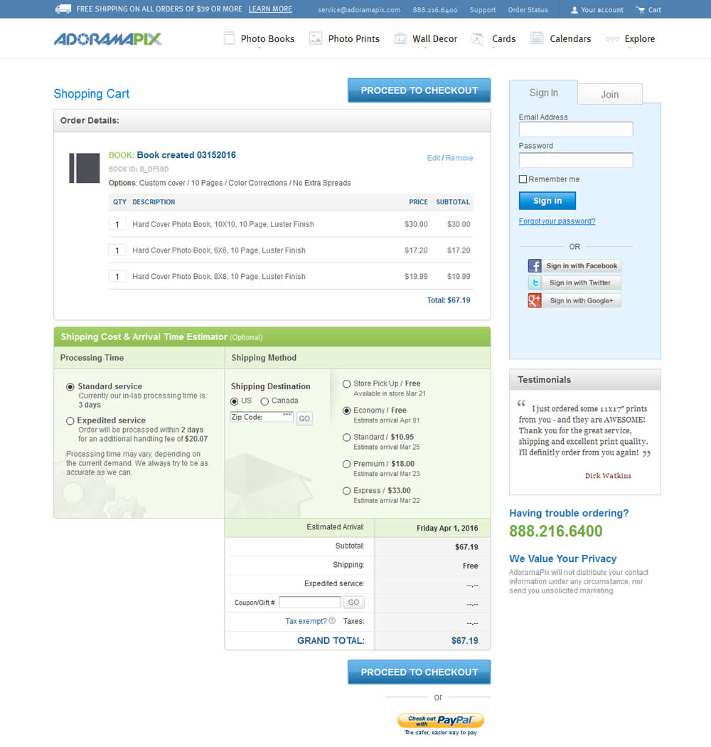
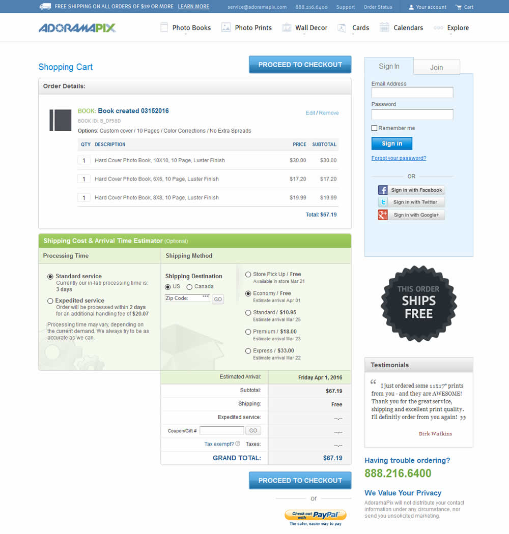
In this experiment, a big "free shipping" badge was added and defaulted to when available. Impact on progression to checkouts and completed sales was measured.
Test #371 on
by
 Jakub Linowski
Aug 18, 2021
Desktop
Jakub Linowski Tested Pattern #51: Shortcut Buttons In Test #371
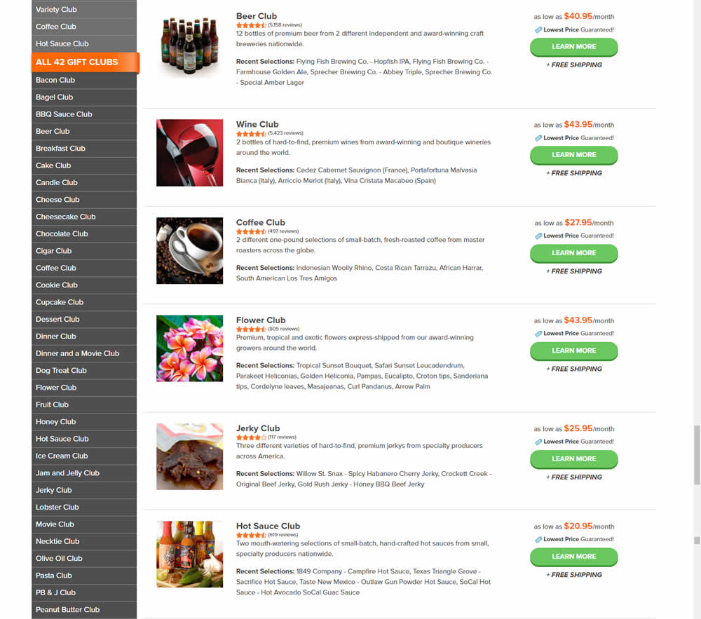
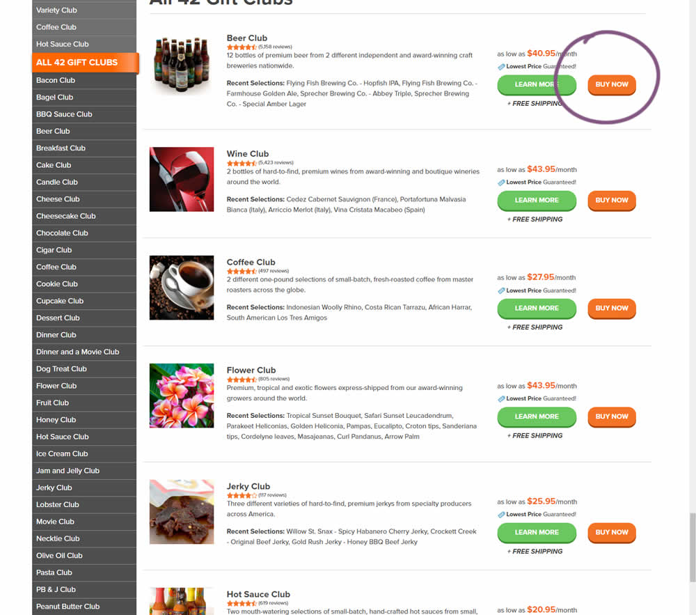
In this experiment, the variation added an extra "Buy Now" button that linked directly into the cart process. The variation only had a learn more button linking directly to a product page.
Test #363 on
by
 Jakub Linowski
Jul 05, 2021
Desktop
Mobile
Jakub Linowski Tested Pattern #30: Authentic Photos In Test #363
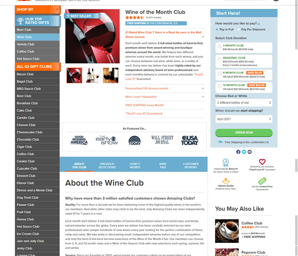
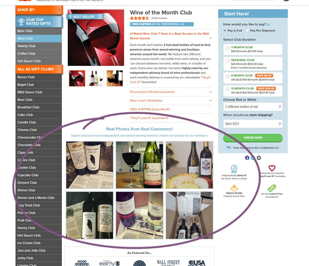
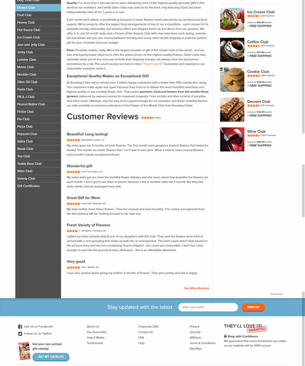
In this experiment, six product photos from were added which showed the actual products (including unboxing images).
Test #360 on
by
 Jakub Linowski
Jun 16, 2021
Desktop
Jakub Linowski Tested Pattern #60: Repeated Bottom Call To Action In Test #360
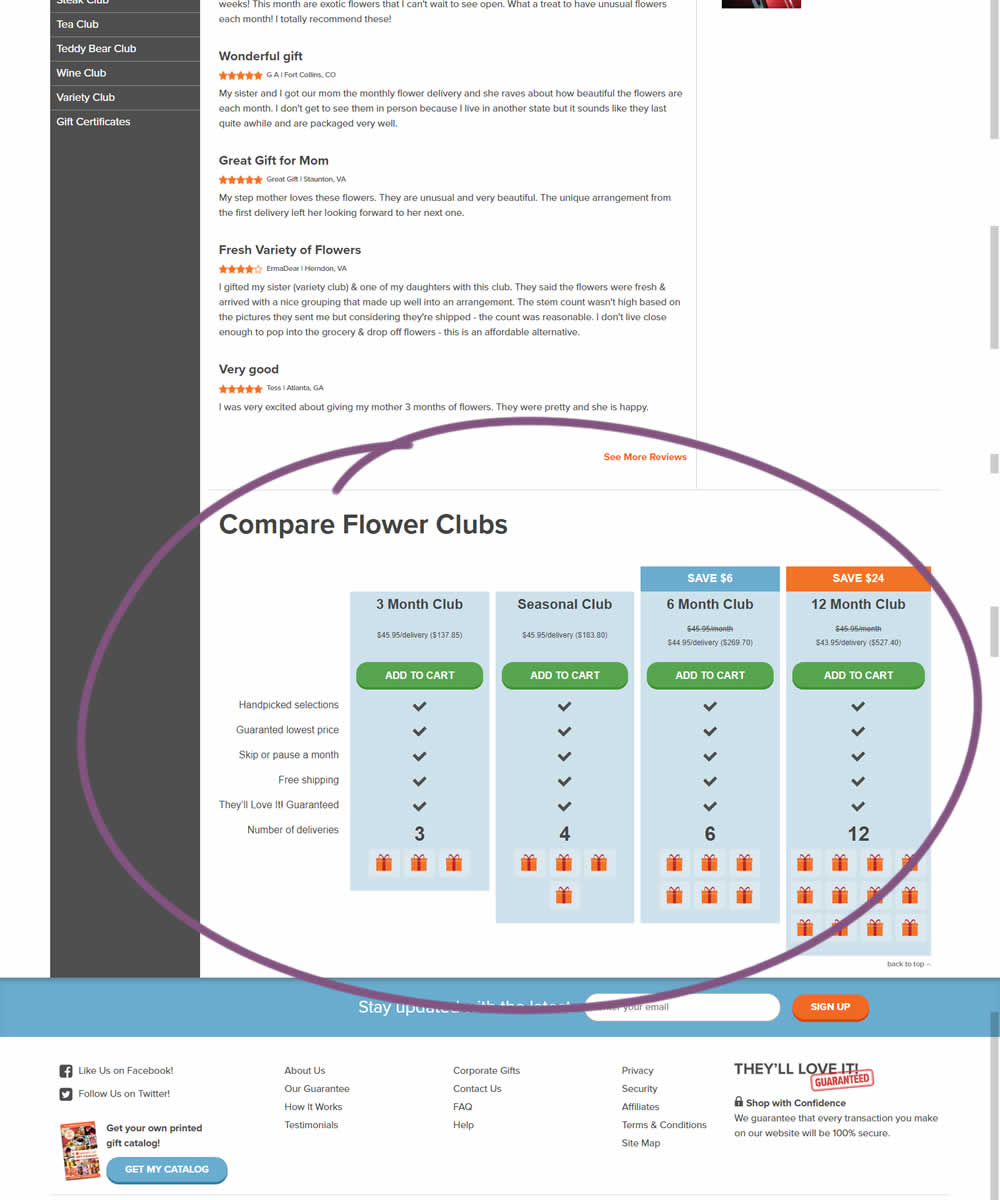
In this experiment, a comparison chart with various purchasing options was appended at the bottom of a product page.
Test #355 on
by
 Jakub Linowski
May 28, 2021
Desktop
Mobile
Jakub Linowski Tested Pattern #79: Product Highlights In Test #355
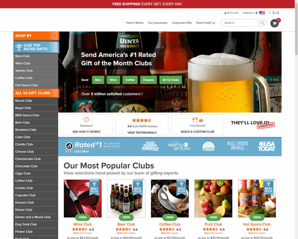
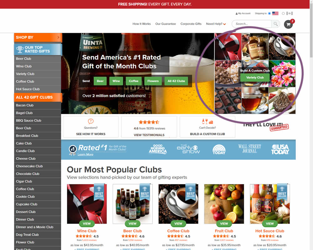
In this experiment, an extra product choice was added to the header of a homepage. Instead of only highlighting a set of four specific products, the option to build custom variety one, was added.
Test #347 on
by
 Jakub Linowski
Apr 07, 2021
Desktop
Mobile
Jakub Linowski Tested Pattern #26: Cart Reminder And Recently Viewed In Test #347

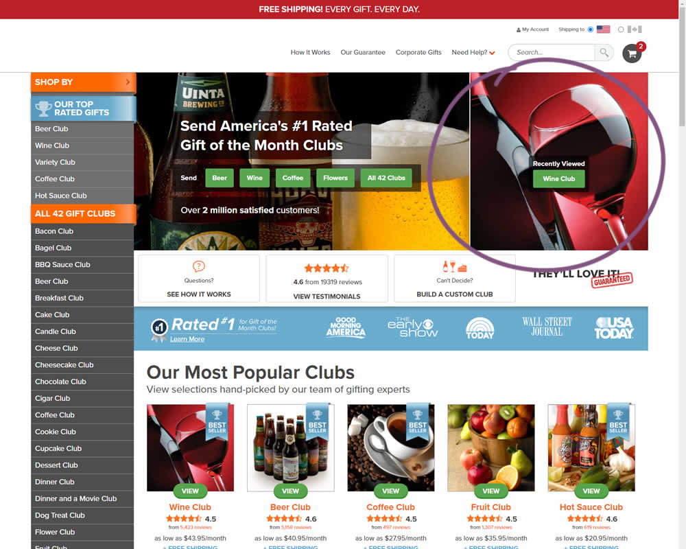
In this experiment, when customers viewed a product and returned to the homepage, they would then see the most recently viewed one - a delicate nudge. The experiment ran with full traffic and impact on sales was measured.
Test #344 on
by
 Jakub Linowski
Mar 11, 2021
Desktop
Jakub Linowski Tested Pattern #108: Frequently Asked Questions In Test #344
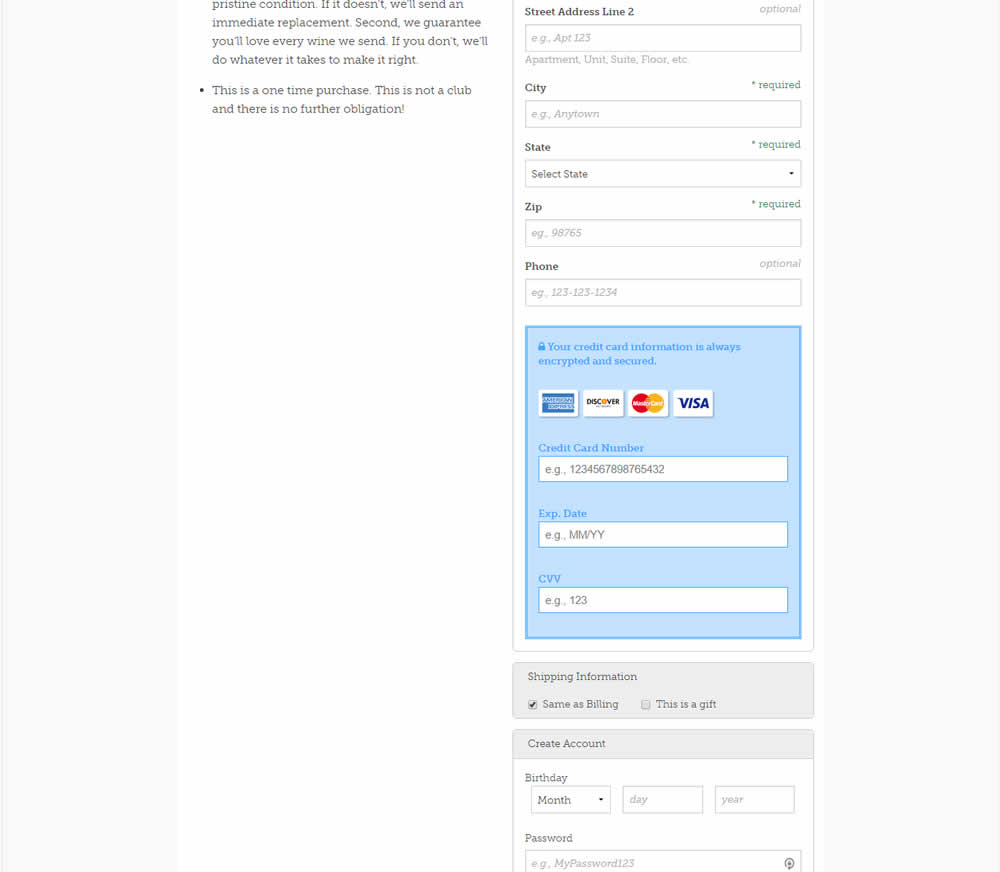
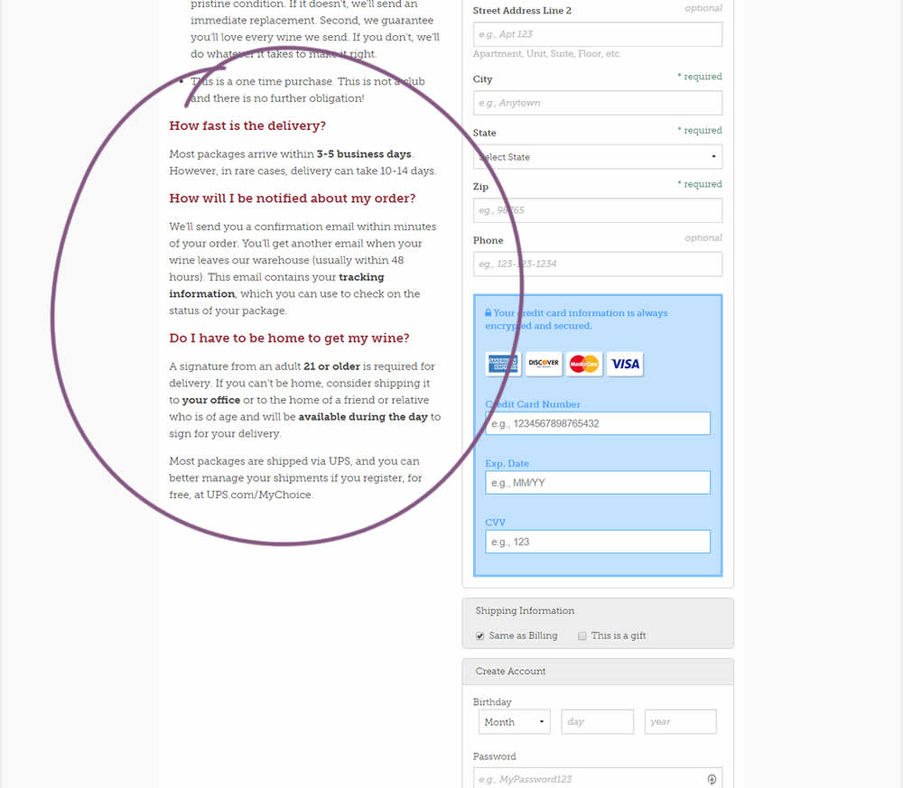
Three common delivery questions were answered at the bottom of a checkout page.
Test #340 on
by
 Jakub Linowski
Feb 25, 2021
Desktop
Jakub Linowski Tested Pattern #114: Less Or More Visible Prices In Test #340

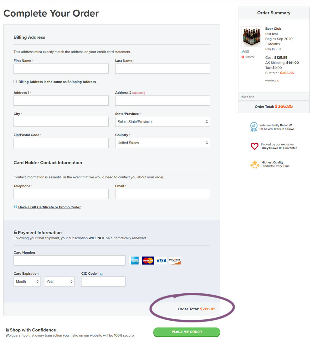
In this experiment, the variation added a second total price at the bottom of the checkout screen just above the checkout button. The impact on sales was measured.
Test #335 on
by
 Jakub Linowski
Jan 27, 2021
Desktop
Mobile
Jakub Linowski Tested Pattern #32: Condensed List In Test #335
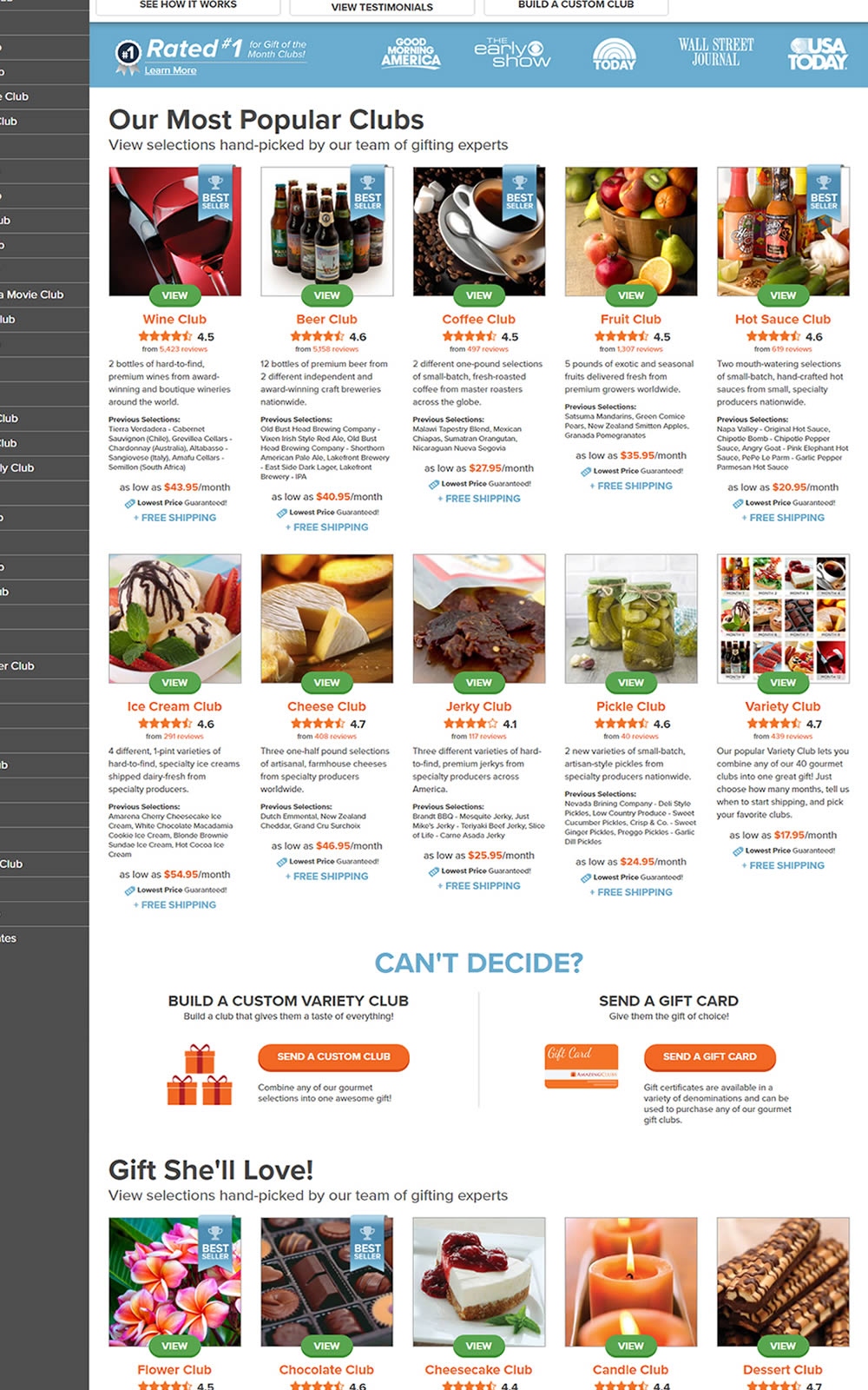
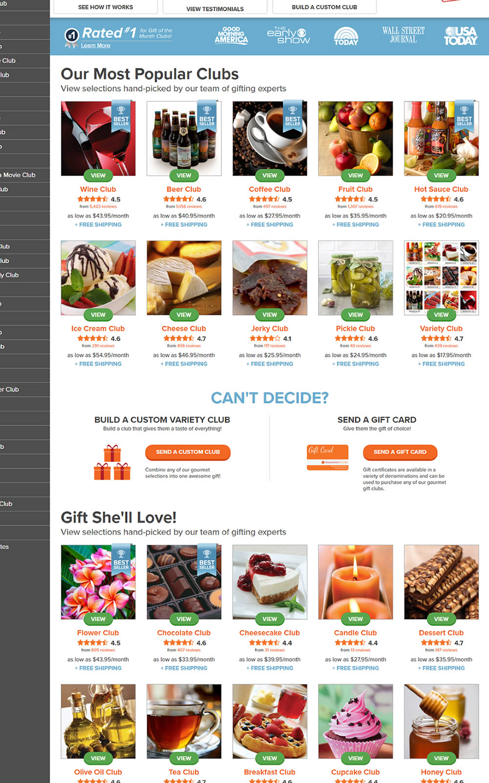
The variation here has more condensed product tiles being shown on a homepage. Two pieces of information were removed: product descriptions and past selections. Impact on product page visits and total sales was measured.
Test #331 on
by
 Jakub Linowski
Dec 30, 2020
Desktop
Mobile
Jakub Linowski Tested Pattern #121: Free Shipping In Test #331

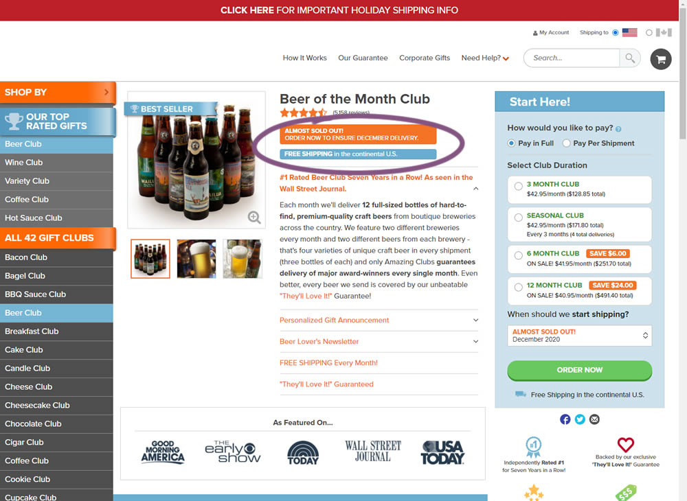
In this little experiment, an extra "Free Shipping" message was added on a product page. It's prominence was increased by using white copy on a darker blue background. Impact on adds-to-cart and total sales was measured.
Test #332 on
by
 Jakub Linowski
Dec 30, 2020
Desktop
Mobile
Jakub Linowski Tested Pattern #121: Free Shipping In Test #332
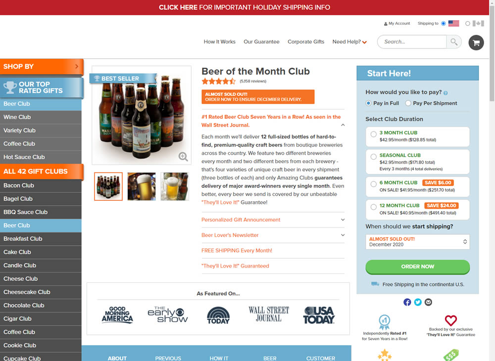
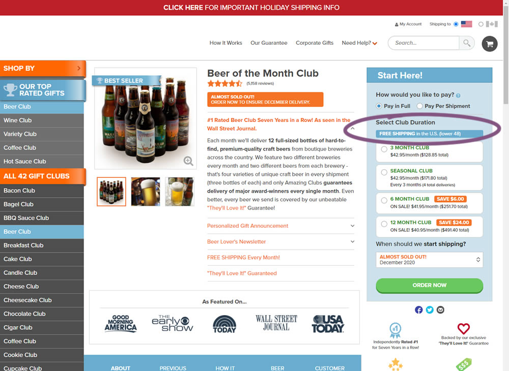
In this experiment, an extra "Free Shipping" message was added on a product page - at the top of the buy box with an add-to-cart call to action. It's prominence was increased by using white copy on a darker blue background. Impact on adds-to-cart and total sales was measured.
Test #324 on
by
 Jakub Linowski
Oct 30, 2020
Desktop
Mobile
Jakub Linowski Tested Pattern #17: Least Or Most Expensive First In Test #324
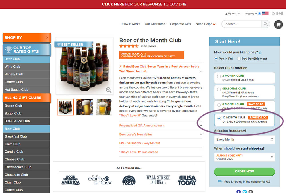
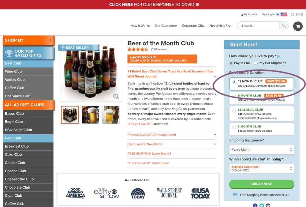
This experiment tested the order of purchase plans. The control version sorted the purchase options by the least expensive while the variation sorted them by the most expensive first. Impact on sales and revenue was measured.
Test #320 on
by
 Jakub Linowski
Oct 20, 2020
Desktop
Jakub Linowski Tested Pattern #49: Above The Fold Call To Action In Test #320
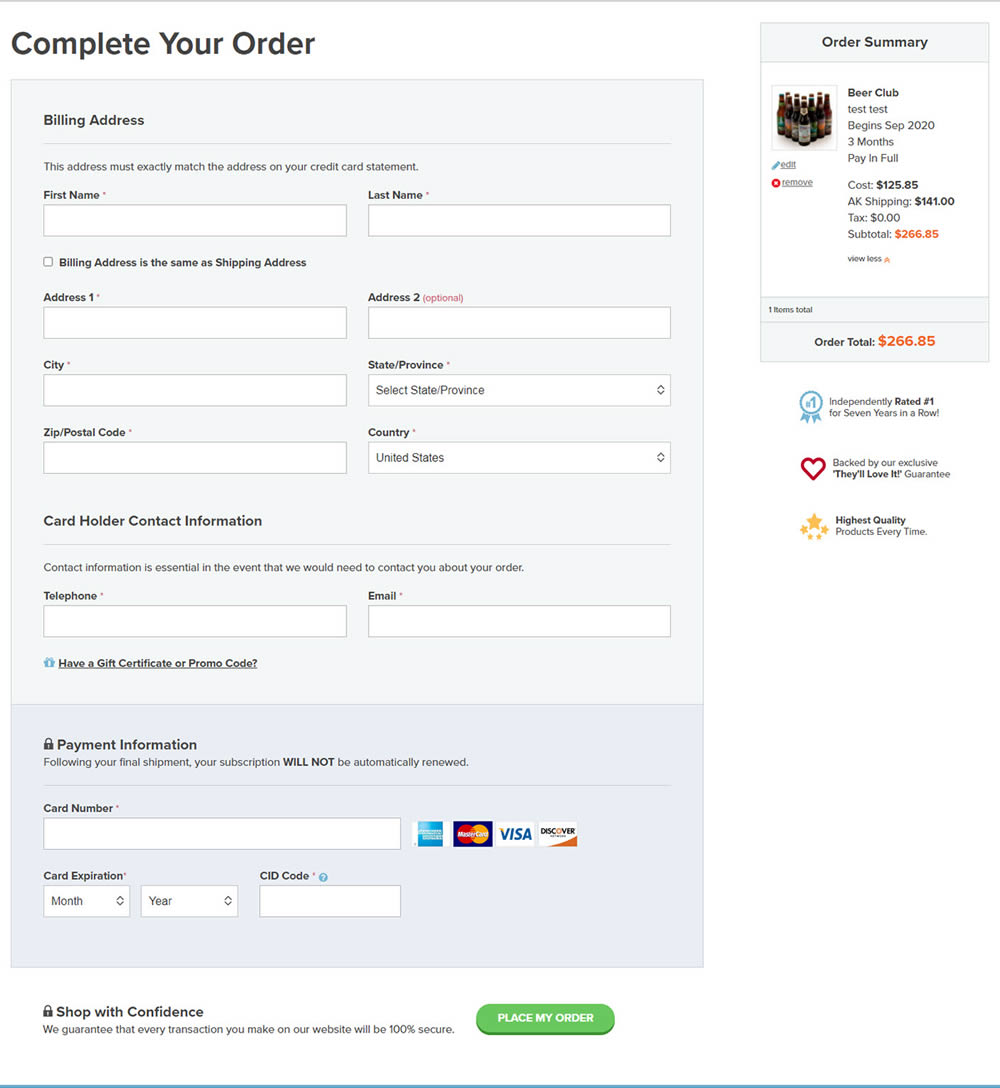
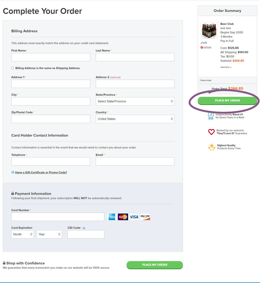
An extra "Place Order" button was duplicated above the fold on this checkout page. The control had a similar button further down at the bottom of the screen. The impact on total sales was measured from this change.
Test #312 on
by
 Jakub Linowski
Aug 14, 2020
Desktop
Mobile
Jakub Linowski Tested Pattern #83: Progressive Fields In Test #312
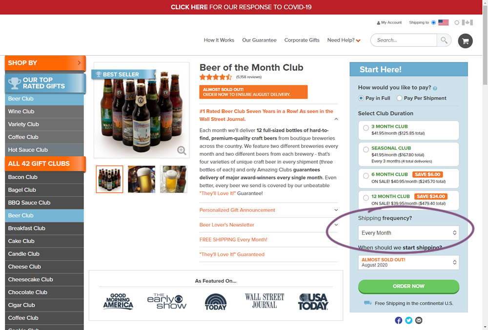
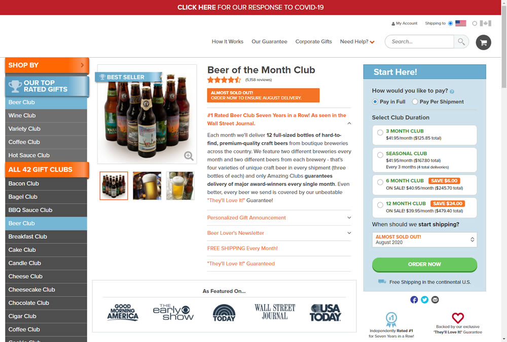
In this experiment, we tested a visible "Shipping Frequency" (A) option against a progressively displayed one (B) that would only appear after someone first chose a duration option. Thus in variation B, the buy box component would initially appear with fewer fields and smaller. The experiment measured initial progression and actual sales.
Note on the data: the experiment was run a little shorter than usual, as one of the variations triggered a stop rule to protect losses (so the effect might be somewhat inflated from a lower power).
Test #287 on
Goodui.org
by
 Jakub Linowski
Mar 04, 2020
Desktop
Mobile
Jakub Linowski Tested Pattern #117: Company Logos In Test #287 On Goodui.org
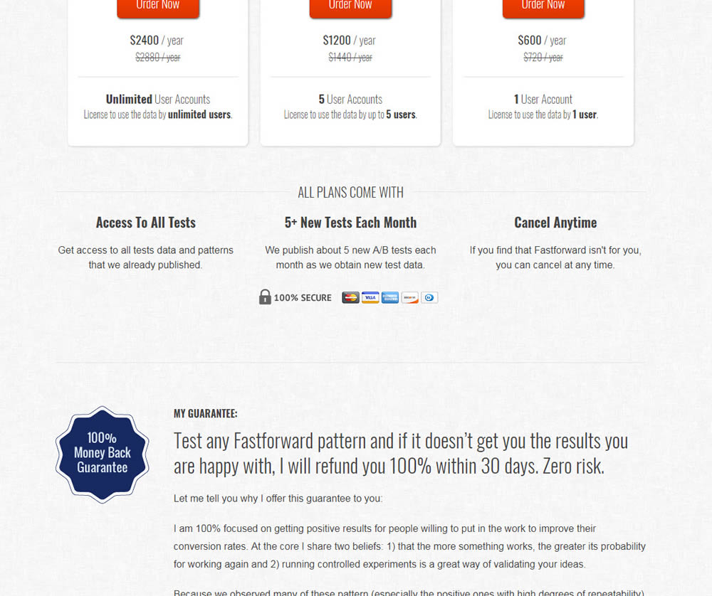
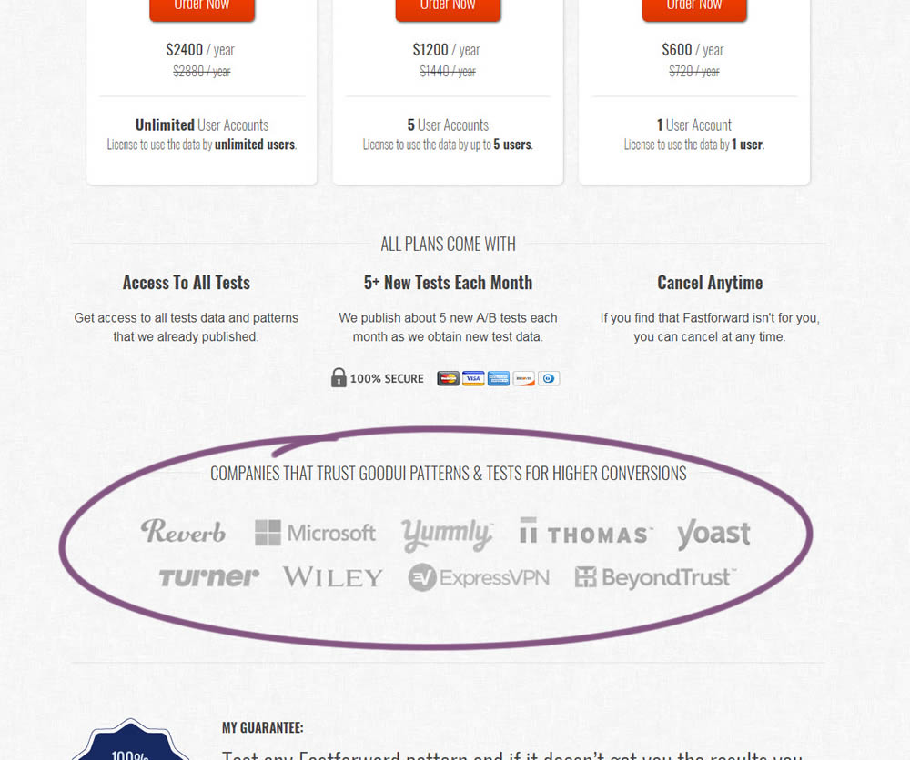
In this experiment, a handful of customers and contributors from GoodUI were added on a pricing page to test the effect on sales.