All Latest 556 A/B Tests
Become a member to unlock the abiltiy to see the highest impact a/b tests. Being able to see the actual test results and sort by impact allows growth and experimentation teams to take action on the biggest gains first
MOST RECENT TESTS
Test #475 on
Online.metro-cc.ru
by
 Andrey Andreev
Jun 07, 2023
Desktop
Mobile
Listing
Andrey Andreev Tested Pattern #36: Fewer Or More Results In Test #475 On Online.metro-cc.ru
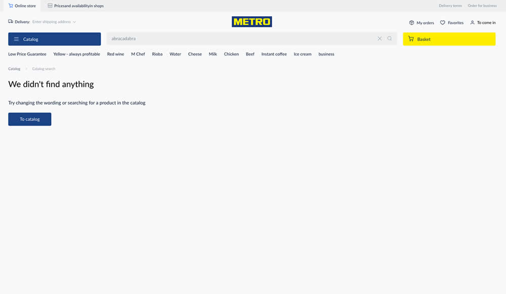
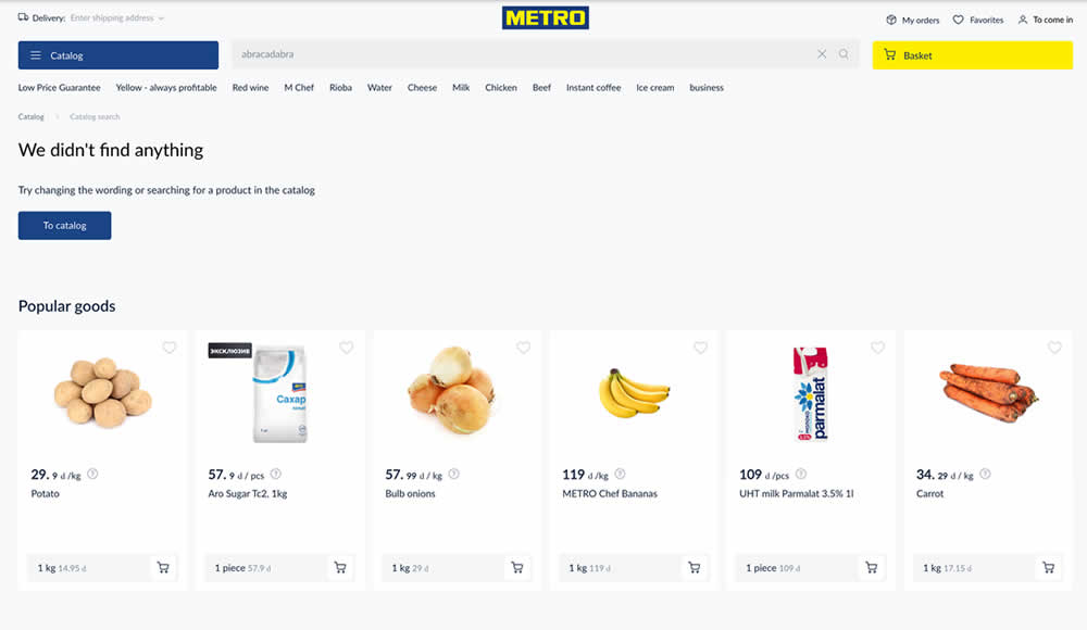
Are more (popular) product results better than none at all? In this experiment, popular products were shown during an empty search result. Impact on sales was measured.
Test #460 on
Backstage.com
by
 Stanley Zuo
Mar 21, 2023
Mobile
Listing
Stanley Zuo Tested Pattern #41: Sticky Call To Action In Test #460 On Backstage.com
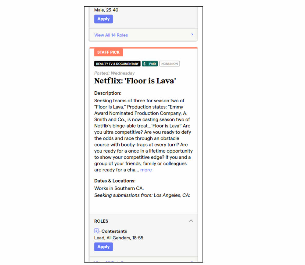
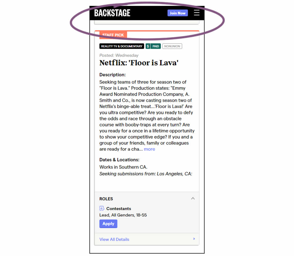
In this experiment, a floating top navigation was shown with a "Join" button. In the control, the navigation was only visible at the top of the page. Also keep in mind that signup starts were also triggered throughout multiple CTAs throughout the page and from particular job detail pages. The a/b test ran on a listing page of Backstage - a casting call job site. Impact on signups and checkouts was measured.
Test #459 on
Snocks.com
by
 Melina Hess
Feb 28, 2023
Desktop
Mobile
Listing
Melina Hess Tested Pattern #36: Fewer Or More Results In Test #459 On Snocks.com
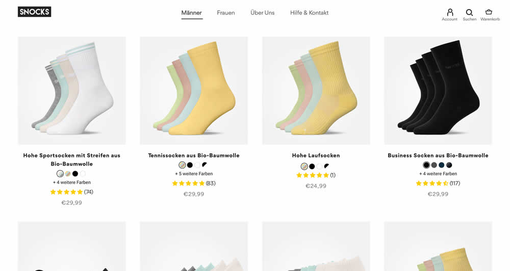
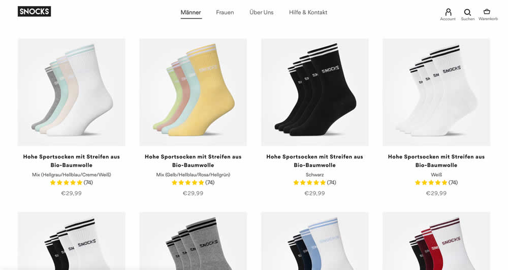
In this listing page experiment, color sets of the same product were tested against individual products with unique colors (with additional product tiles). Essentially, the A version here contained fewer product items (with color sets), while the B version contained more results and tiles (with grouped products). Impact on total sales was measured.
(The original control and variation was inverted, but was flipped to match the fewer or more results pattern).
Test #447 on
Vivareal.com.br
by
 Vinicius Barros Peixoto
Dec 23, 2022
Mobile
Listing
Vinicius Barros Peixoto Tested Pattern #18: Single Or Alternative Buttons In Test #447 On Vivareal.com.br
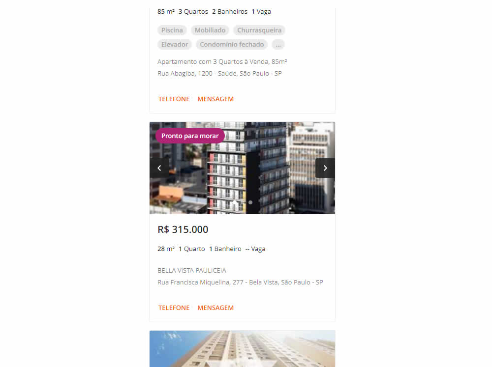
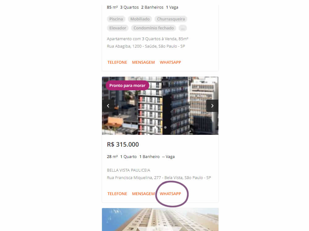
In this experiment, an additional call to action (Whatsapp link) was added on a listing page of one of Brazil's largest real estate sites.In the variation the 3 calls to action include: a link that launched the phone interaction, a general contact lead form, and finally the Whatsapp link (added in the variant). Impact on total lead starts and completions was measured.
Test #437 on
Vivareal.com.br
by
 Rodrigo Maués
Oct 28, 2022
Desktop
Mobile
Listing
Rodrigo Maués Tested Pattern #18: Single Or Alternative Buttons In Test #437 On Vivareal.com.br

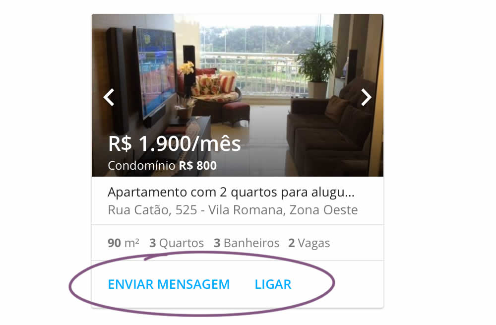
In this experiment, an additional and alternative text based call to action link was added on real estate properity listings. Instead of only having "Ligar" ("Call"), "Enviar mensagem" was also appended ("Send Message"). This additional link lead to a lead-gen form.
Test #396 on
Depositphotos.com
by
 Gleb Hodorovskiy
Feb 13, 2022
Desktop
Listing
Gleb Hodorovskiy Tested Pattern #124: Confirmed Selection In Test #396 On Depositphotos.com
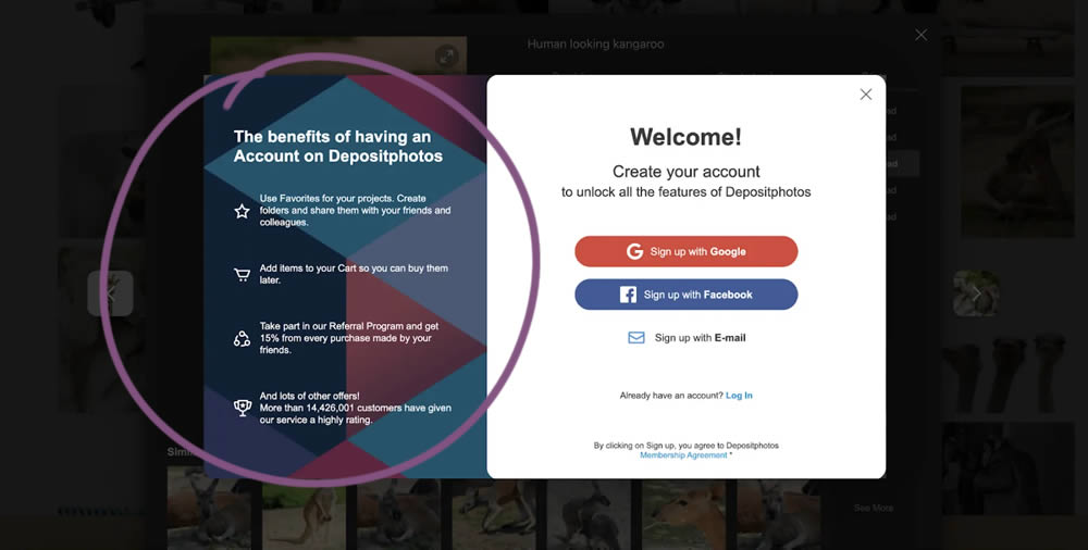
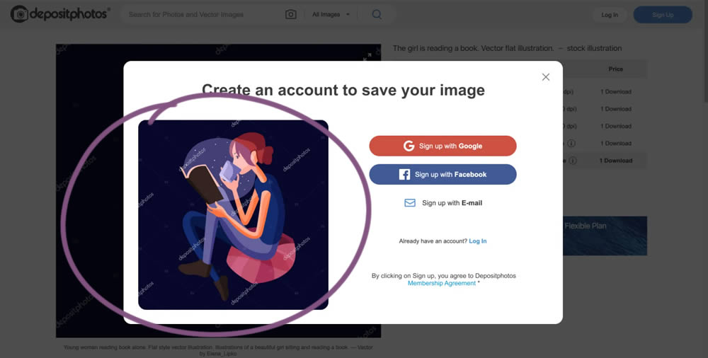
In this experiment from Conversionrate.store, the framing of the registration message was changed from a generic account creation one to a specific image selected by the user. The experiment started on a listing page of a stock photography / illustration site. The control showed a more generic message with benefits for signing up and making the purchase. Whereas the variation repeated the actual image that customers clicked on from listing pages - establishing continuity as well as providing a reason for signing up. Impact on sales was measured.
Test #391 on
Backstage.com
by
 Stanley Zuo
Dec 30, 2021
Desktop
Mobile
Listing
Stanley Zuo Tested Pattern #82: Onboarding Callouts In Test #391 On Backstage.com
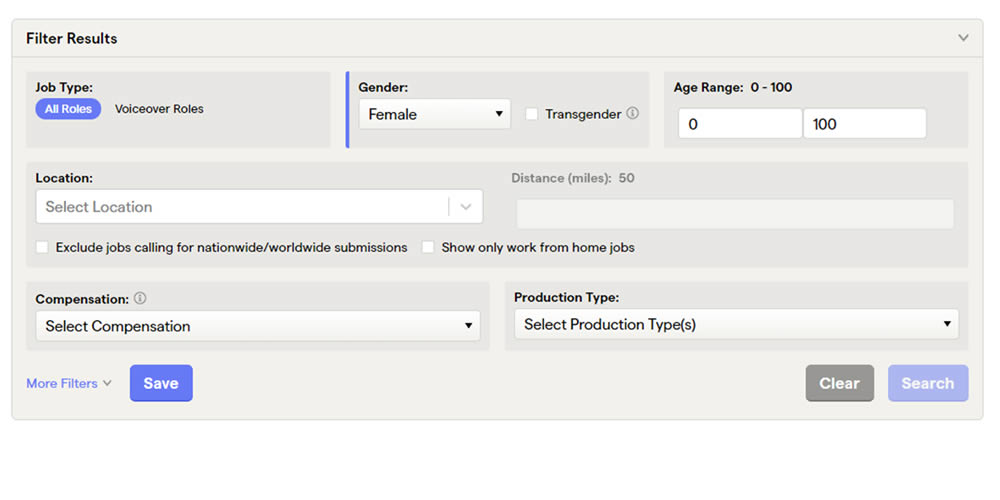
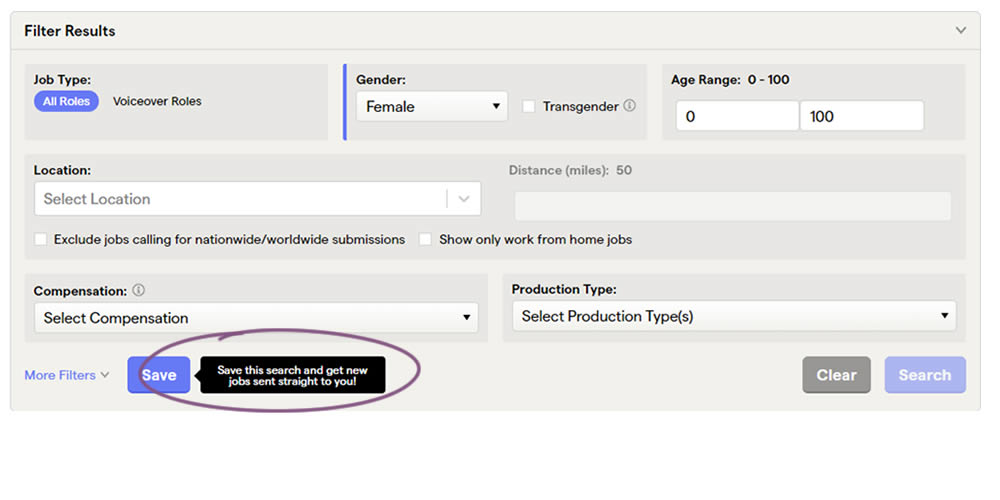
This experiment added a small nudge or callout to encourage more signups. Attention was directed towards the save function, which lead to the signup flow for anyone not signed it. Impact on signups was measured.
Test #388 on
by
 Jakub Linowski
Dec 09, 2021
Mobile
Listing
Jakub Linowski Tested Pattern #51: Shortcut Buttons In Test #388
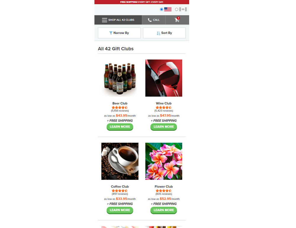
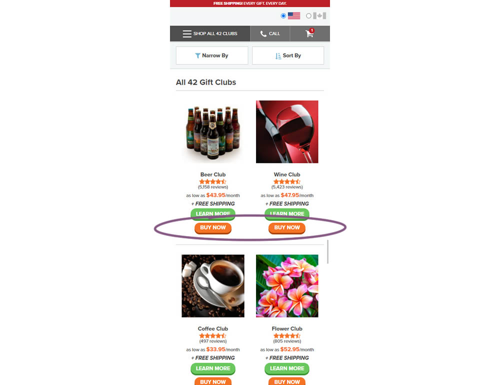
In this experiment, extra "buy now" buttons were added on a listing page. These buttons were shortcuts to an add to cart flow, whereas the "learn more" buttons lead customers to product detail pages (visible in both control and variation). Impact on adds-to-cart and sales was measured.
Test #387 on
by
 Jakub Linowski
Nov 30, 2021
Mobile
Listing
Jakub Linowski Tested Pattern #88: Action Button In Test #387
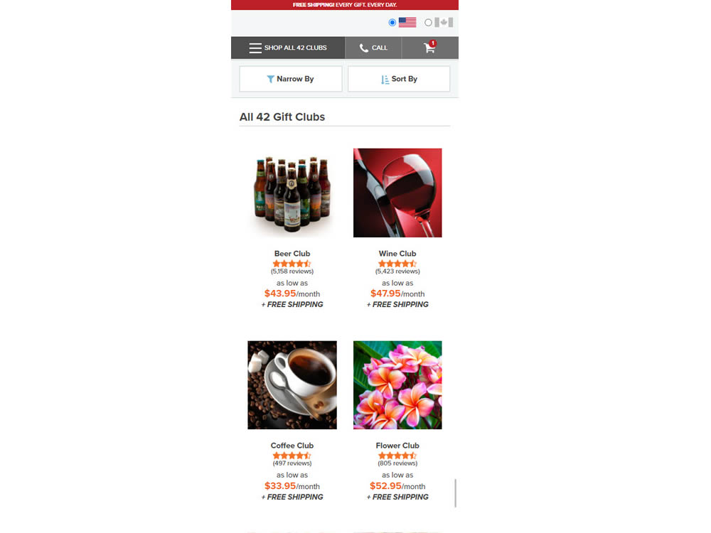
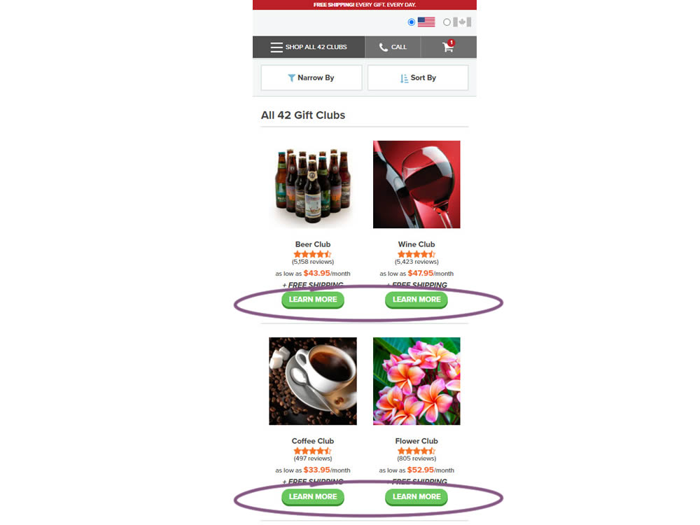
In this experiment, simple "Learn More" buttons were added underneath each product thumbnail. These buttons were additional triggers that linked to product detail pages on top of the existing thumbnails and product names (that also linked to the PDPs). Impact on product visits and sales was measured.
Test #375 on
Backstage.com
by
 Stanley Zuo
Sep 17, 2021
Mobile
Listing
Stanley Zuo Tested Pattern #32: Condensed List In Test #375 On Backstage.com
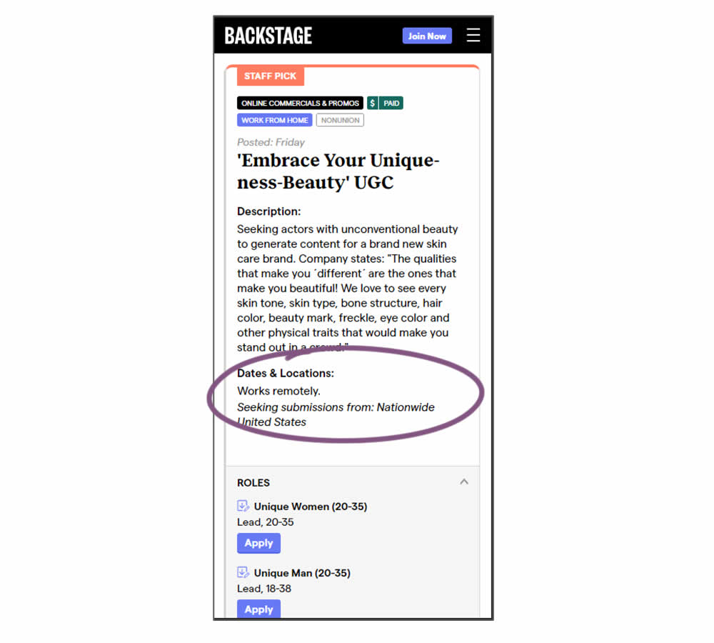
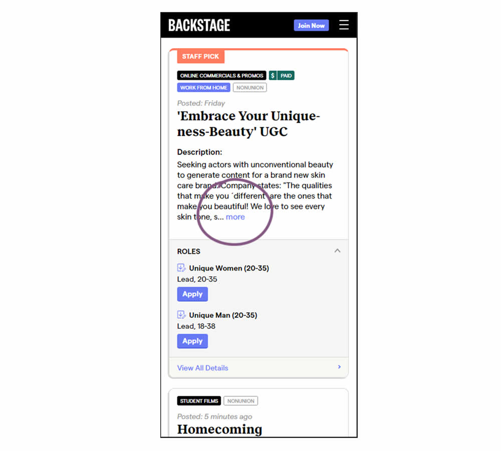
Similar to experiment 373, listing descriptions were shortened dynamically using exposable "more" links AND dates/location data was removed. This way, the variation showed shorter listings and therefore more listings per screens. Impact on listing clicks (progression) along with membership starts was measured.
Test #373 on
Backstage.com
by
 Stanley Zuo
Sep 06, 2021
Mobile
Listing
Stanley Zuo Tested Pattern #32: Condensed List In Test #373 On Backstage.com
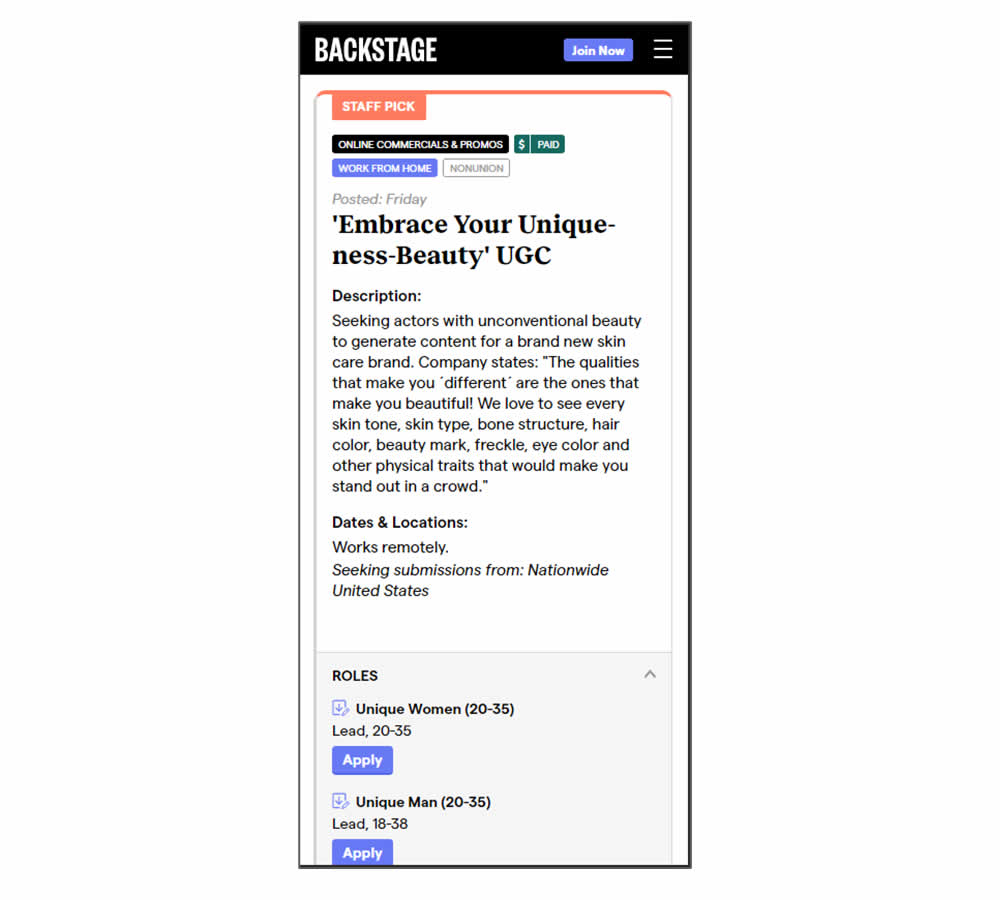
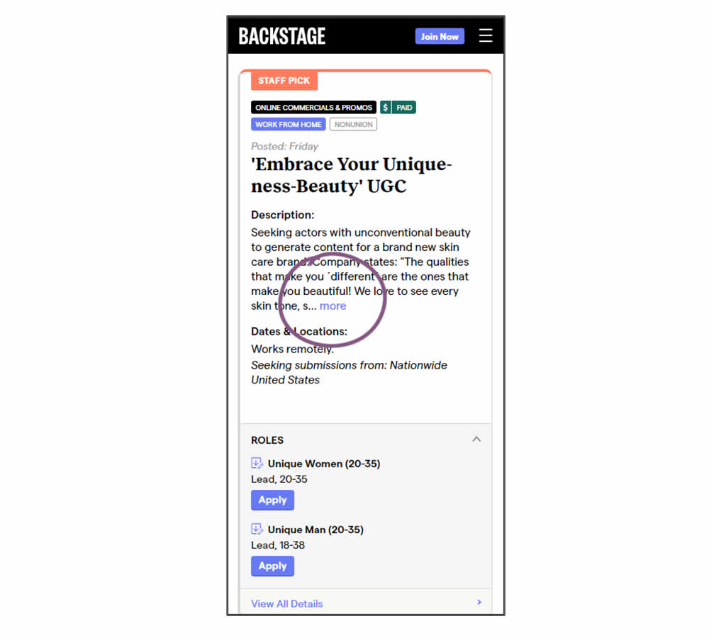
In this experiment, listing descriptions were shortened dynamically using exposable "more" links. This way, the variation showed shorter listings and therefore more listings per screens. Impact on listing clicks (progression) along with membership starts was measured.
Test #371 on
by
 Jakub Linowski
Aug 18, 2021
Desktop
Listing
Jakub Linowski Tested Pattern #51: Shortcut Buttons In Test #371
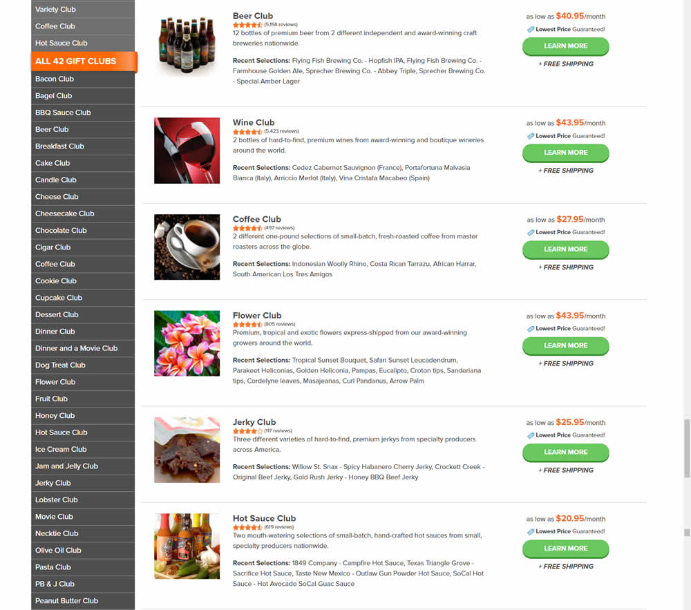
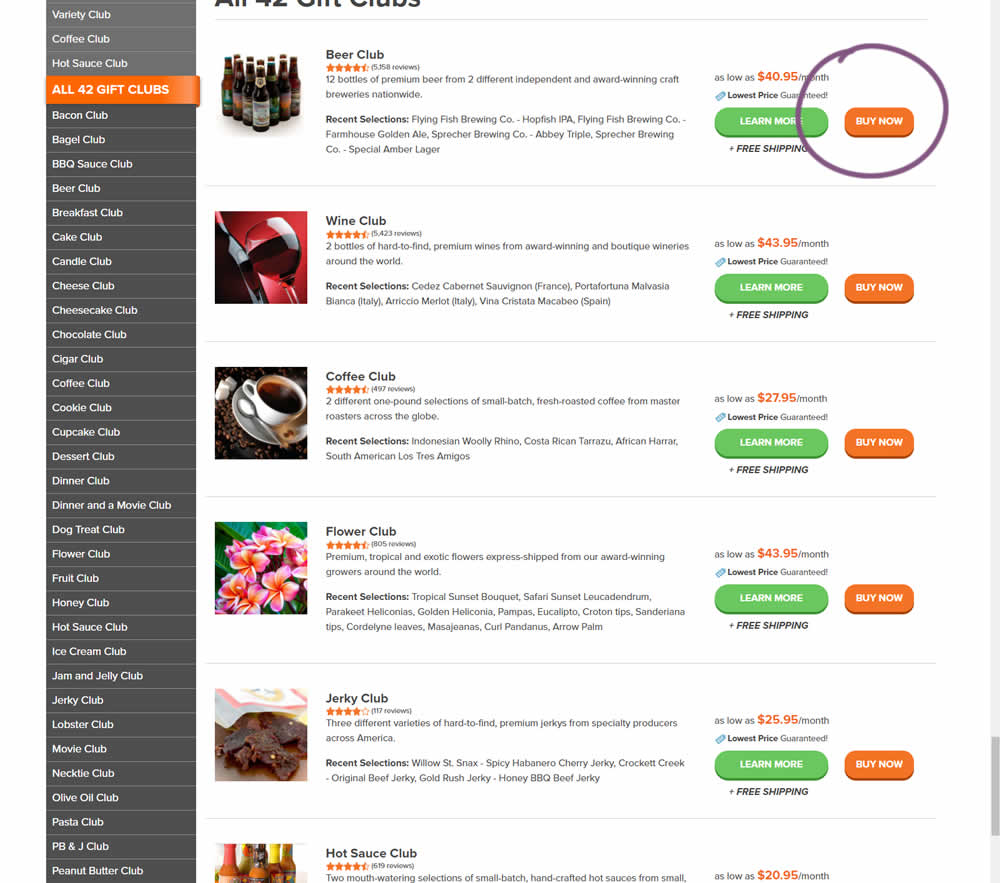
In this experiment, the variation added an extra "Buy Now" button that linked directly into the cart process. The variation only had a learn more button linking directly to a product page.
Test #370 on
Thomasnet.com
by
 Julian Gaviria
Aug 16, 2021
Desktop
Mobile
Listing
Julian Gaviria Tested Pattern #88: Action Button In Test #370 On Thomasnet.com

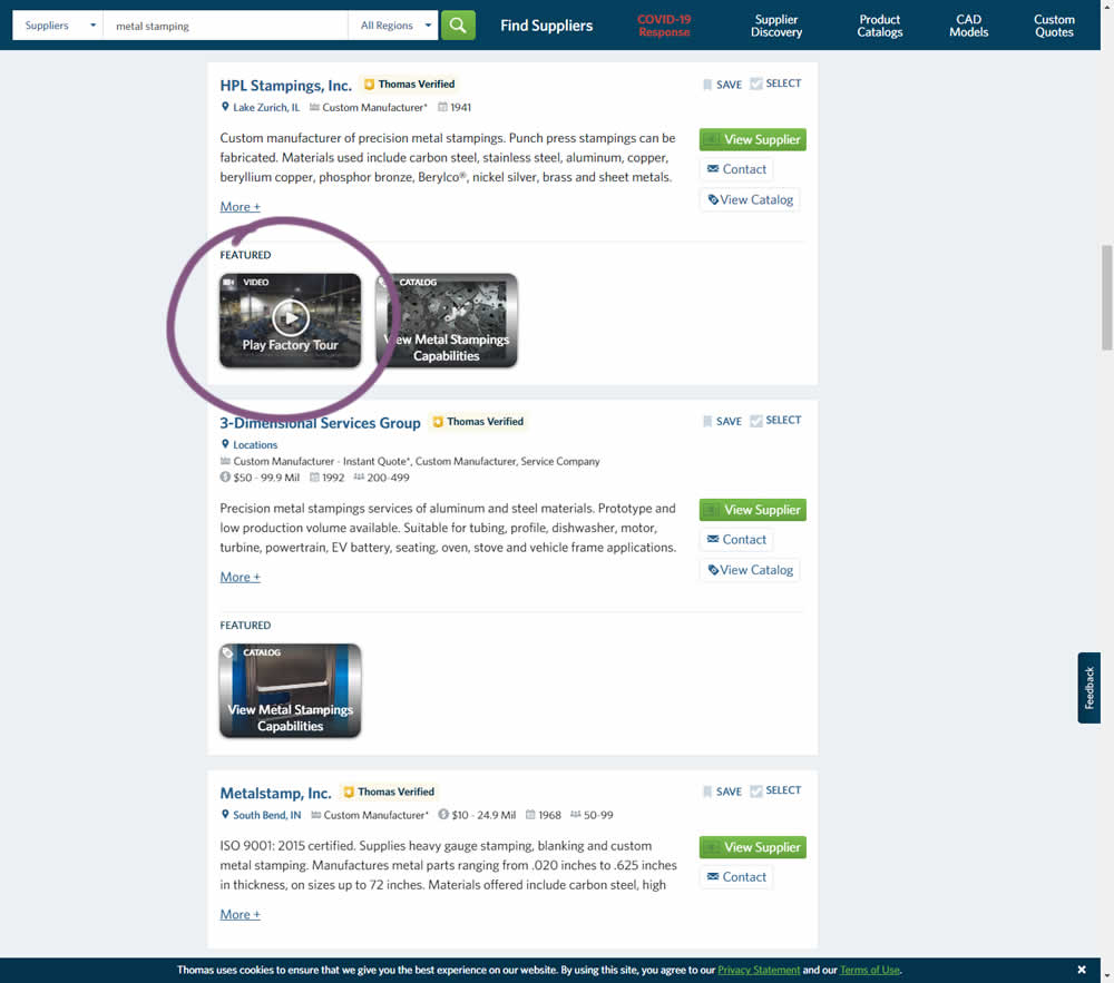
This experiment added the simple verb ("play") before the "factory video" label to encourage more video plays. Impact on progression / clicks was measured.
Test #78 on
Mvideo.ru
by
 Andrey Andreev
May 06, 2021
Desktop
Mobile
Listing
Andrey Andreev Tested Pattern #90: Out Of Stock Or In Stock Products In Test #78 On Mvideo.ru
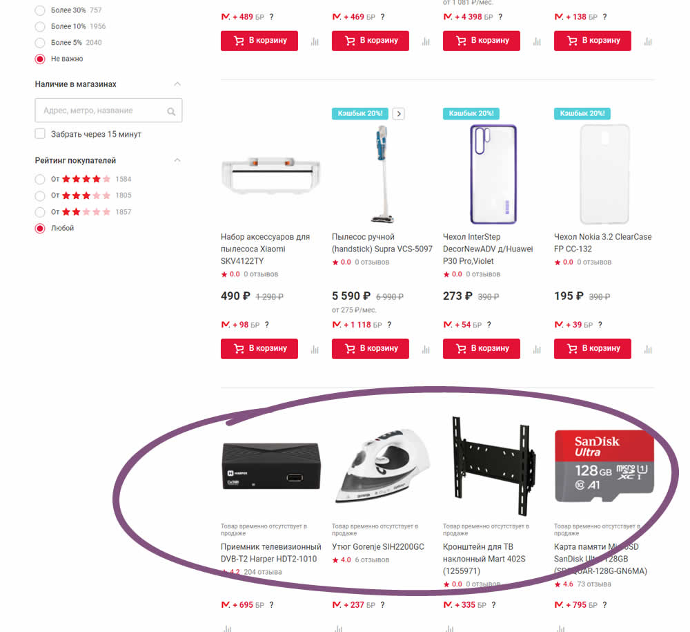
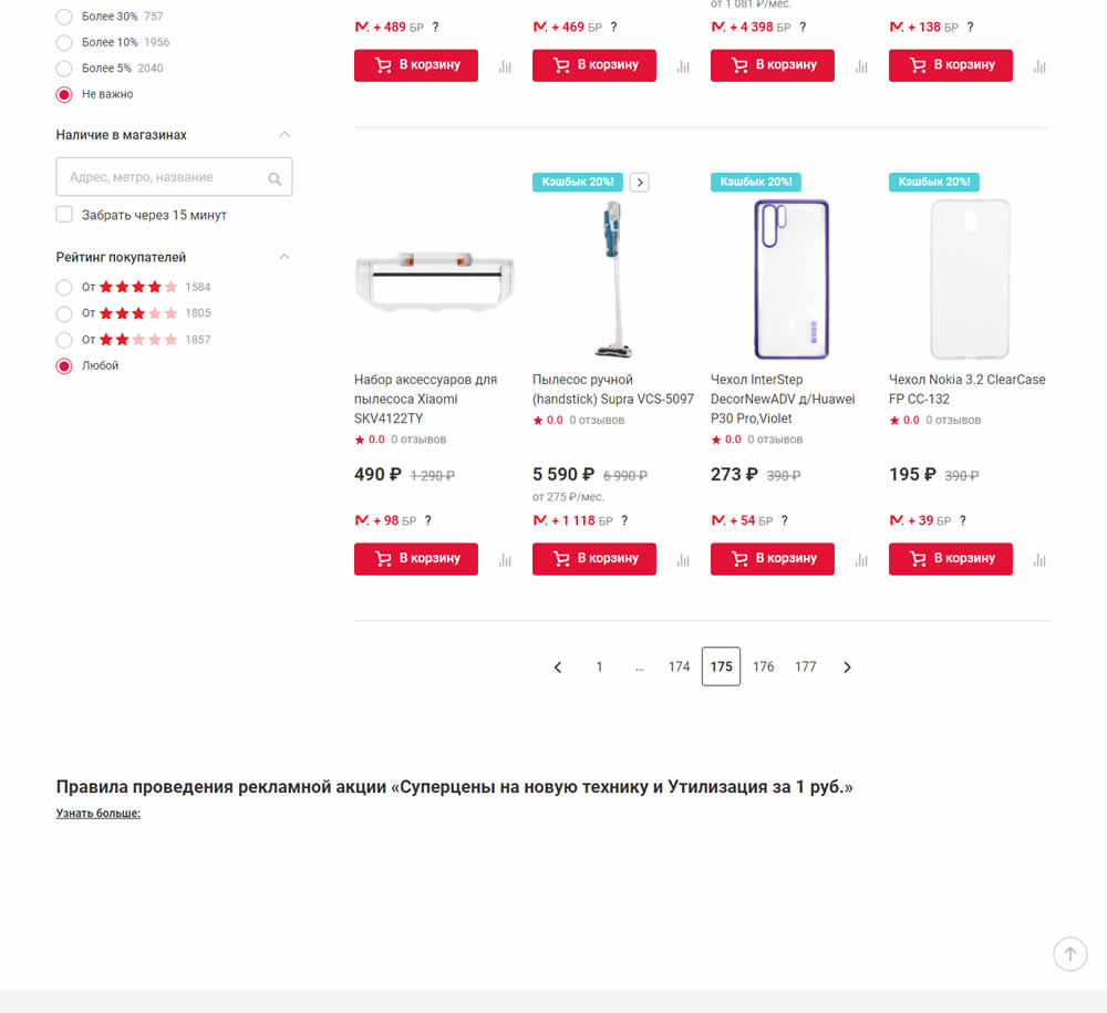
In this experiment, products which were out of stock were removed from listing pages and replaced with in stock ones (not visible in the screenshot).
Test #104 on
3dhubs.com
by
 Rob Draaijer
Mar 31, 2021
Desktop
Listing
Rob Draaijer Tested Pattern #15: Bulleted Reassurances In Test #104 On 3dhubs.com
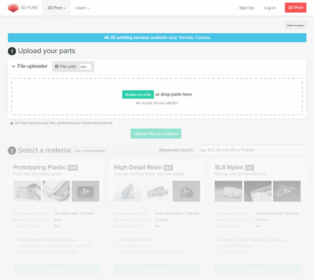
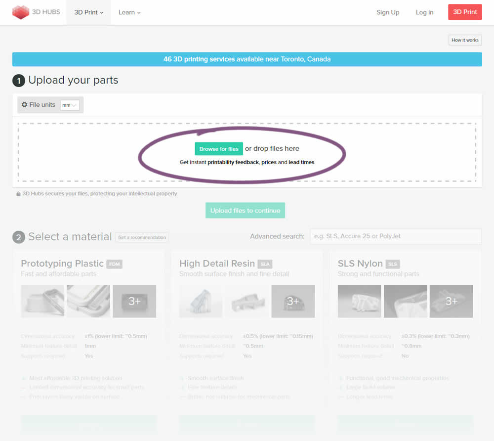
This experiment attempted to increase the number of leads on a lead-funnel. As the first step, users were being asked to upload a file. The control showed the file types that were allowed, whereas the variation changed the copy to show a number of benefits for taking that action. The text-based benefits included the: receiving feedback, prices and lead times.
Test #342 on
Backstage.com
by
 Stanley Zuo
Feb 28, 2021
Desktop
Mobile
Listing
Stanley Zuo Tested Pattern #25: Nagging Results In Test #342 On Backstage.com
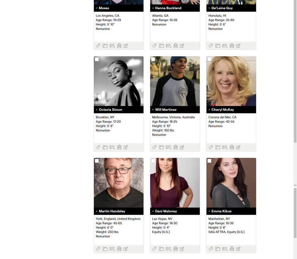
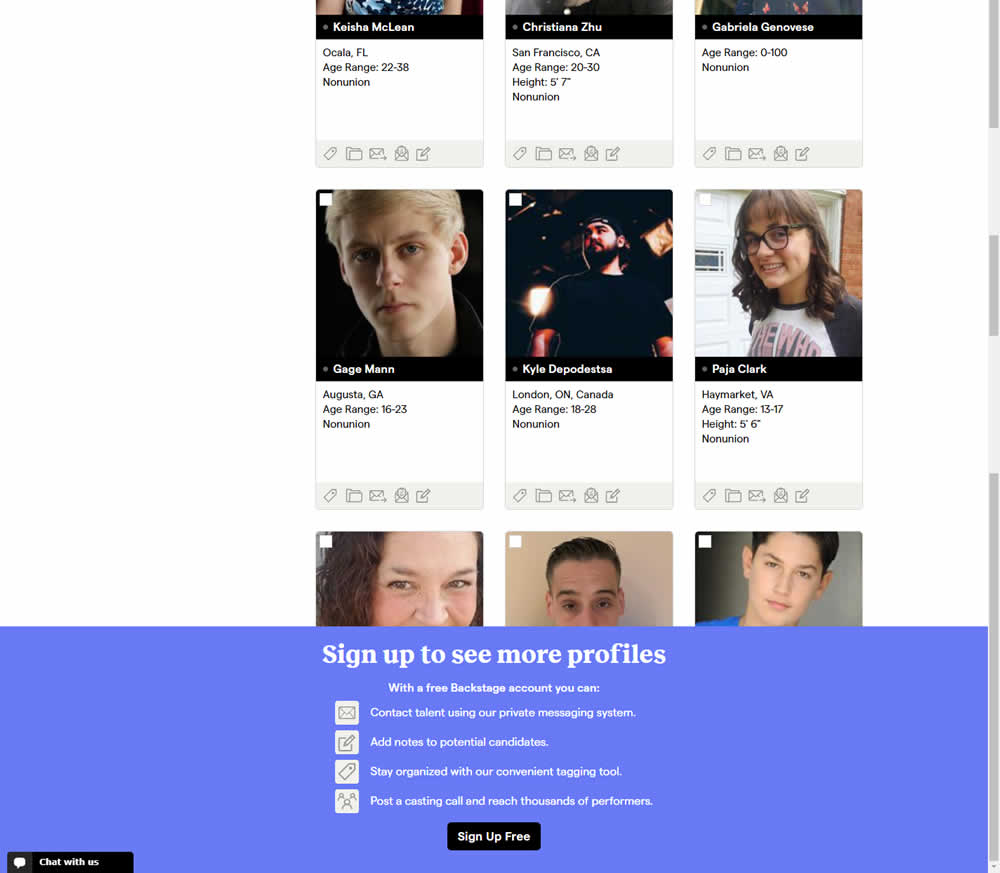
In this experiment, a registration wall was added on a listing page of casting call profiles. The registration wall appeared after the first 9 listings or so and encouraged users to sign up. Impact on registrations was measured, along with an engagement metric of "posting a job".
Test #336 on
Backstage.com
by
 Stanley Zuo
Jan 28, 2021
Desktop
Mobile
Listing
Stanley Zuo Tested Pattern #51: Shortcut Buttons In Test #336 On Backstage.com
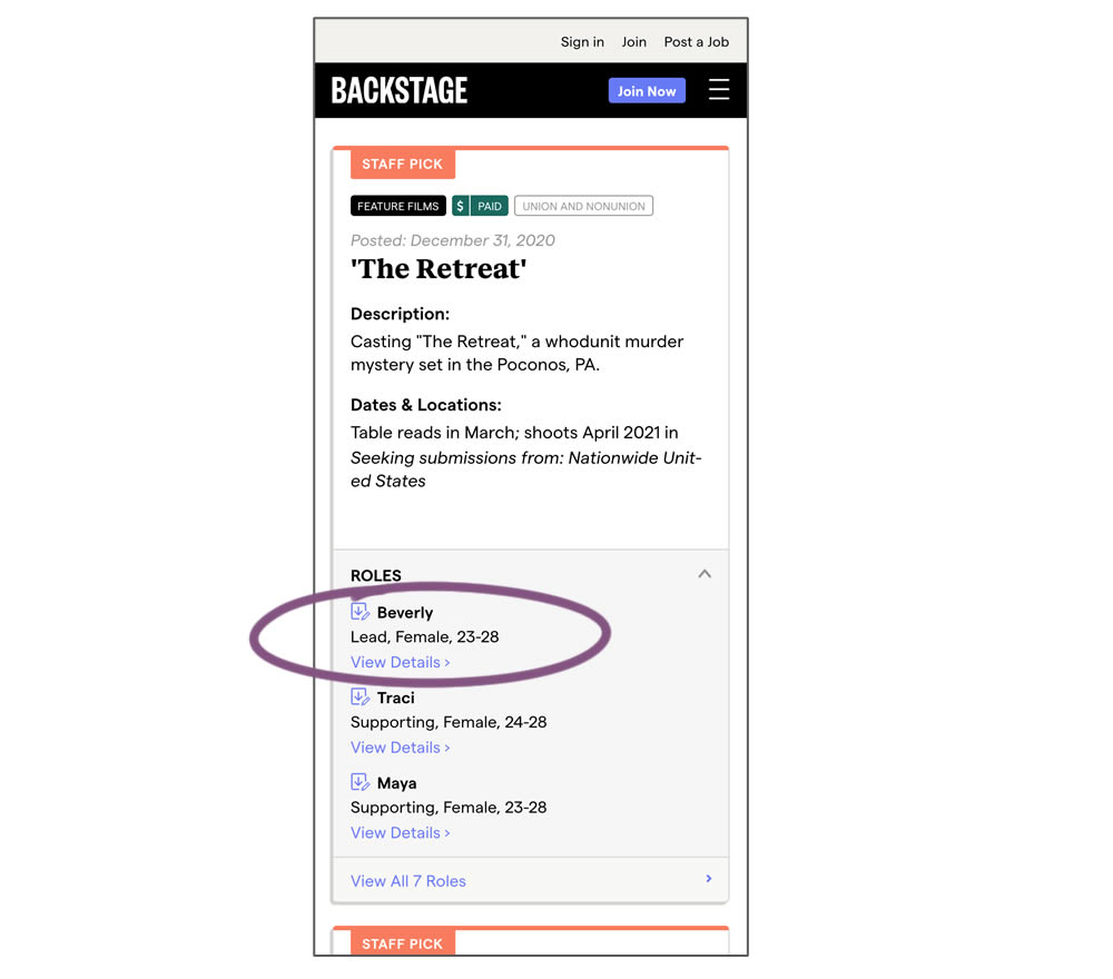
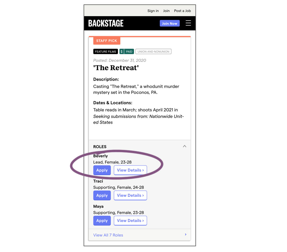
In this experiment, a listing page was expanded to show two actions (apply and view details) instead of a single one (view details only). This variation enabled users with a shortcut action to apply for roles one step earlier (and start membership flows for new users).
Test #337 on
Backstage.com
by
 Stanley Zuo
Jan 28, 2021
Desktop
Mobile
Listing
Stanley Zuo Tested Pattern #51: Shortcut Buttons In Test #337 On Backstage.com
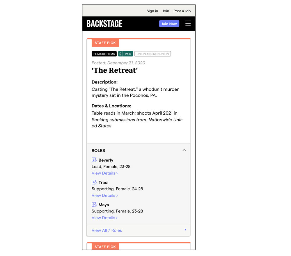
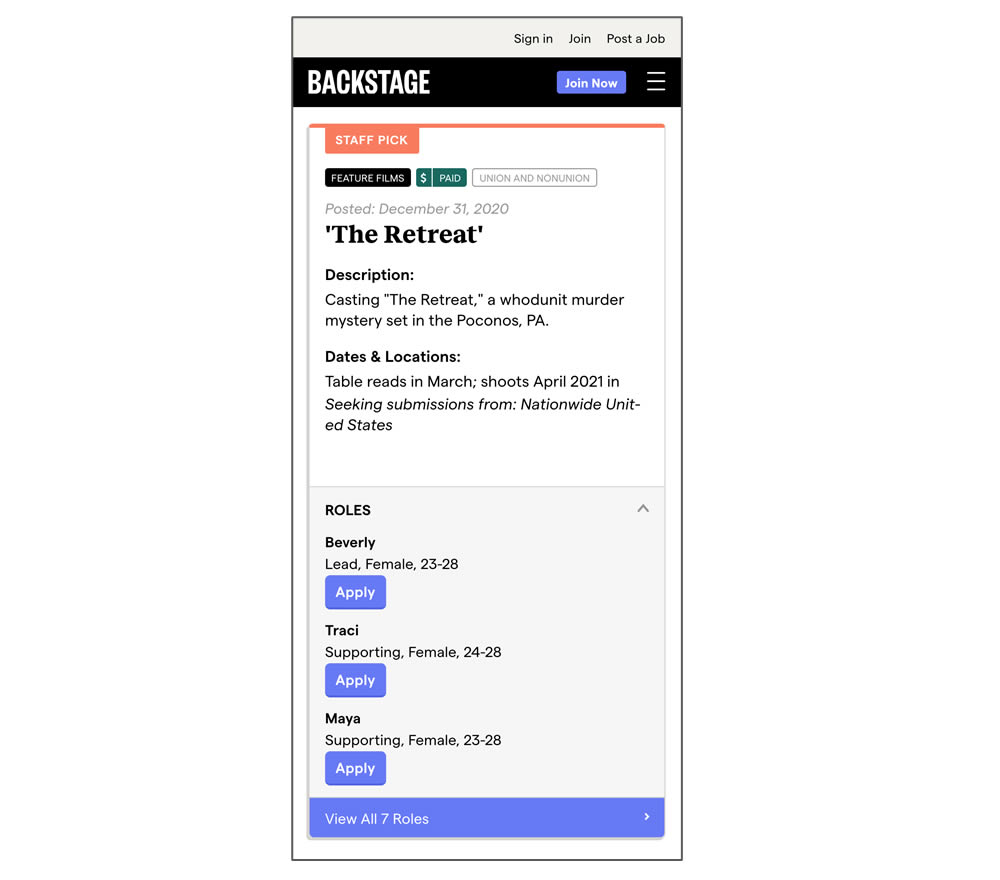
In this experiment, a listing page was expanded to show two actions (apply and view details) instead of a single one (view details only). In the variant, the "view detail" links were replaced with "apply links" starting a job application (and membership flows) sooner.
Test #98 on
3dhubs.com
by
 Rob Draaijer
Nov 30, 2020
Desktop
Mobile
Listing
Rob Draaijer Tested Pattern #24: Visible Availability In Test #98 On 3dhubs.com
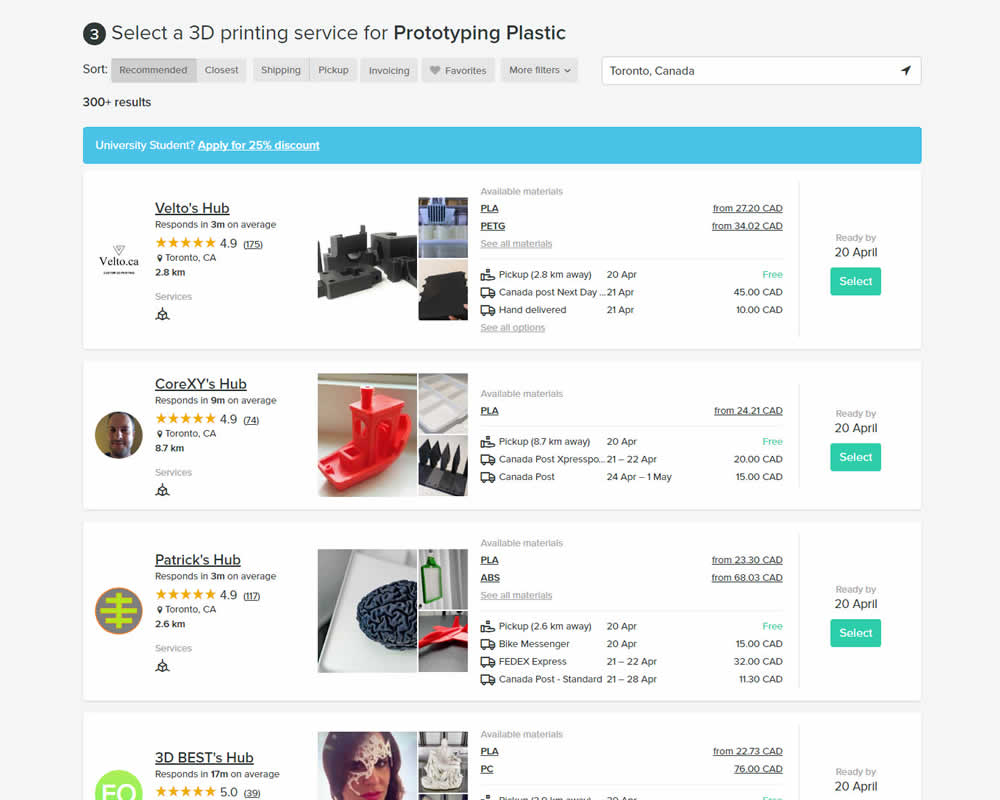
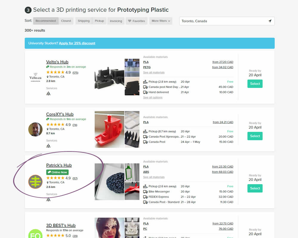
In this experiment, the variation showed a listing's owner online status as a badge, instead of showing their average "response time". More specifically, an "Online Now" badge was shown beside individual listings of a 3D printing marketplace site. The experiment measured completed quote / lead requests (a few steps further).
Test #310 on
Backstage.com
by
 Stanley Zuo
Jul 25, 2020
Mobile
Listing
Stanley Zuo Tested Pattern #77: Filled Or Ghost Buttons In Test #310 On Backstage.com
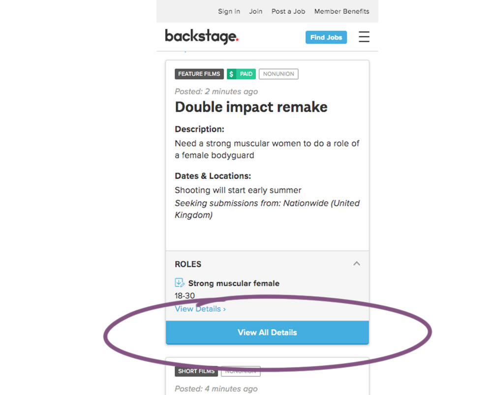
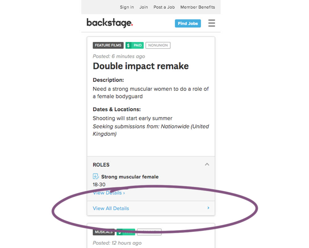
In this experiment, the style of a button leading to view detailed casting calls on a listing page was changed. In version the style was a filled high contrast blue background, and the the B variation there was a feint "ghost button" style.