24 Tests By  Melina Hess
Tests
Test #609 on
by
 Melina Hess
Aug 31, 2025
Mobile
Melina Hess Tested Pattern #46: Pay Later In Test #609
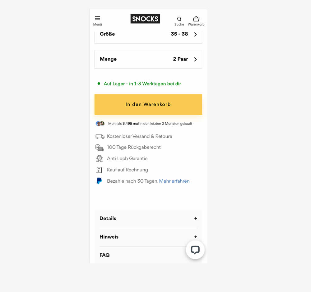
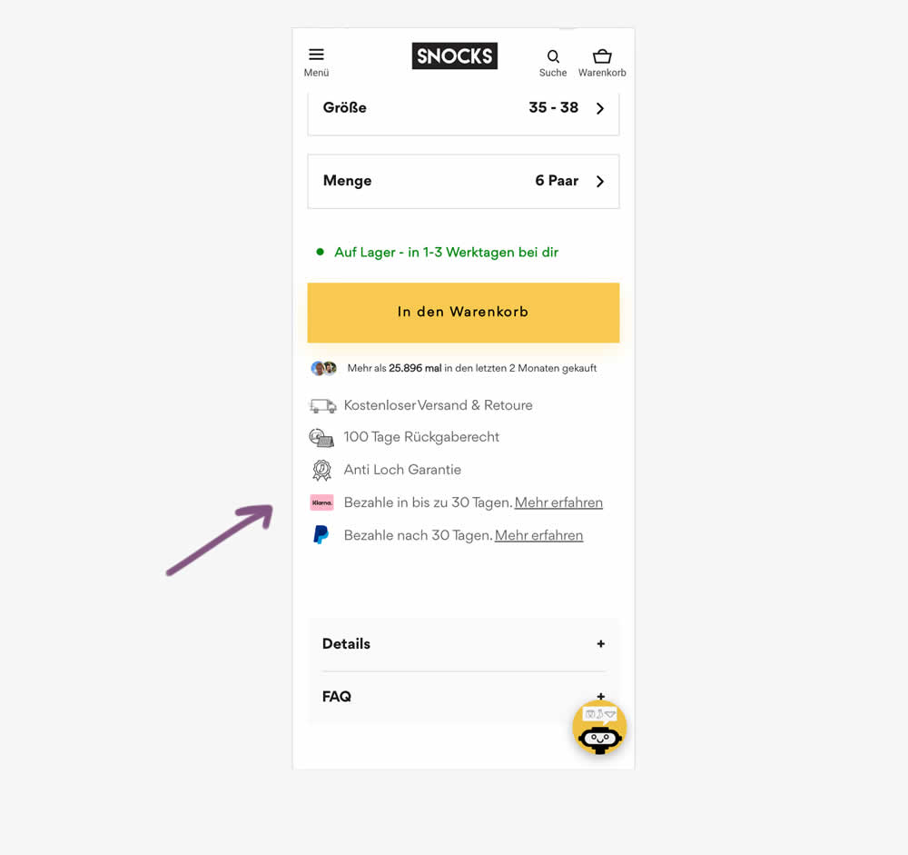
In this experiment, a Klarna buy now pay later badge was added to the PDP. It was added above the paypal buy now pay later badge in the benefit section below the ATC button. Impact on adds to cart and sales was measured.
Test #604 on
by
 Melina Hess
Jul 31, 2025
Mobile
Melina Hess Tested Pattern #46: Pay Later In Test #604
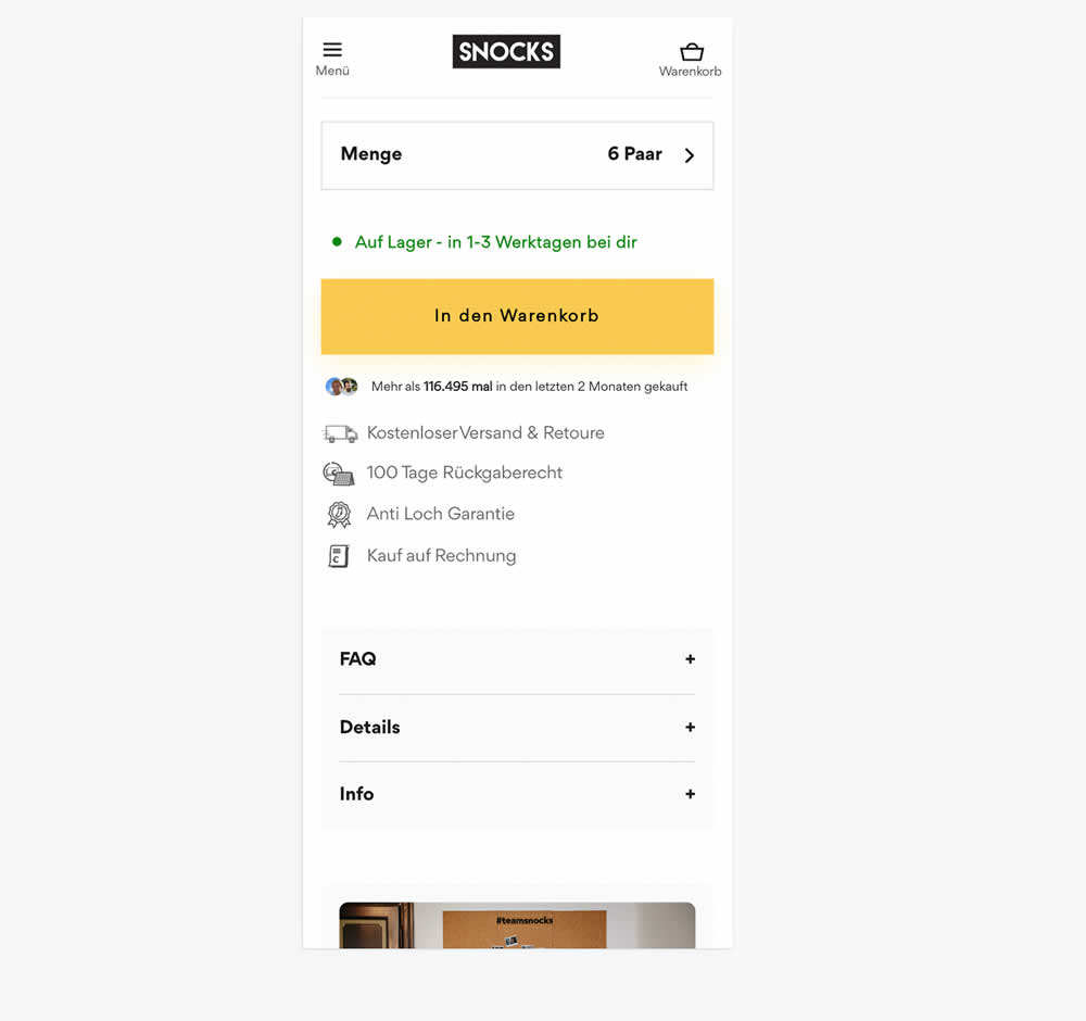
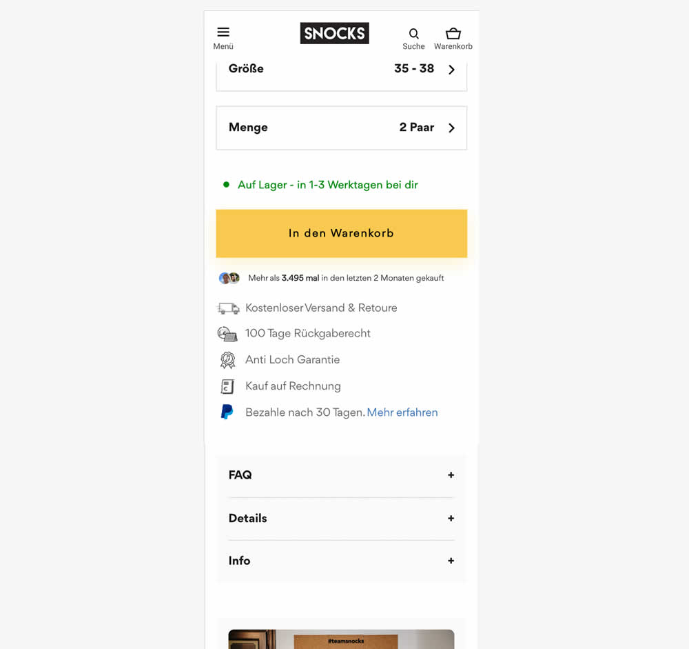
In this experiment, a Paypal badge with "buy now pay later" copy (pay within 30 days) was added underneath the add-to-cart button on product pages. Impact on adds to cart and sales was measured.
Test #584 on
Snocks.com
by
 Melina Hess
Mar 31, 2025
Mobile
Melina Hess Tested Pattern #6: Customer Star Ratings In Test #584 On Snocks.com
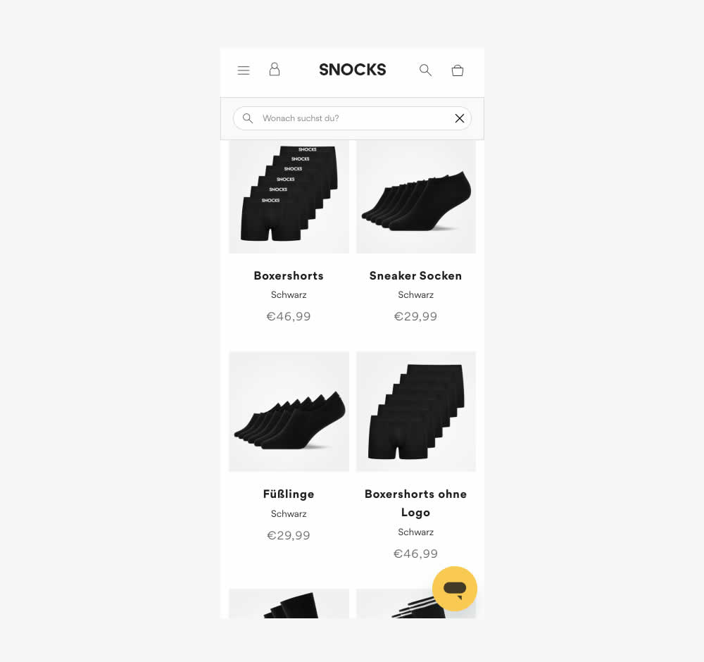
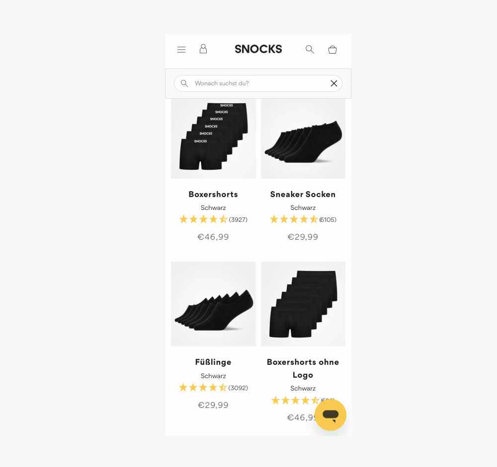
This experiment tested the presence of customer review (in the variation). As a result of adding customer reviews, the product page density decreased (requiring a bit more scrolling from longer product tiles). Impact on conversion was measured.
Also the test originally ran as a "removal of customer reviews" test. However it was flipped here to align with the pattern.
Test #570 on
Livefresh.de
by
 Melina Hess
Dec 30, 2024
Desktop
Mobile
Melina Hess Tested Pattern #79: Product Highlights In Test #570 On Livefresh.de
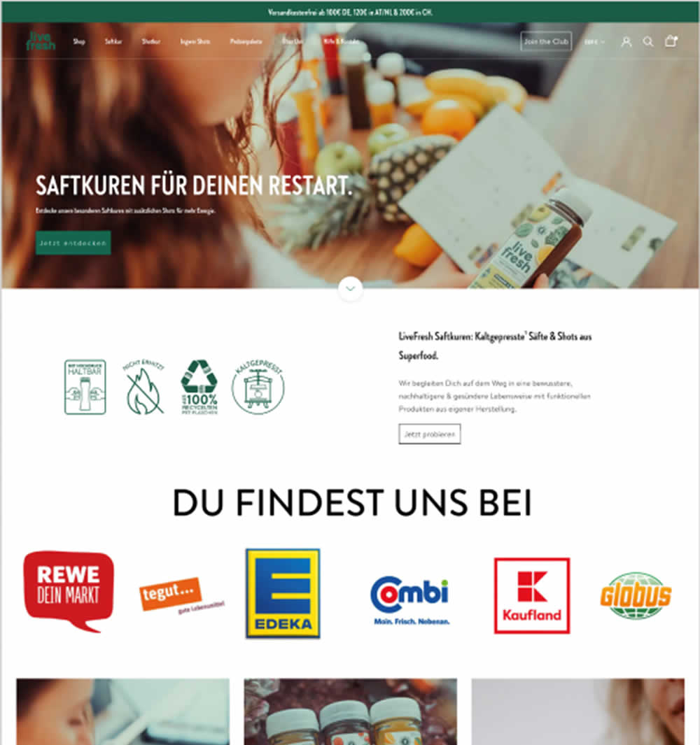
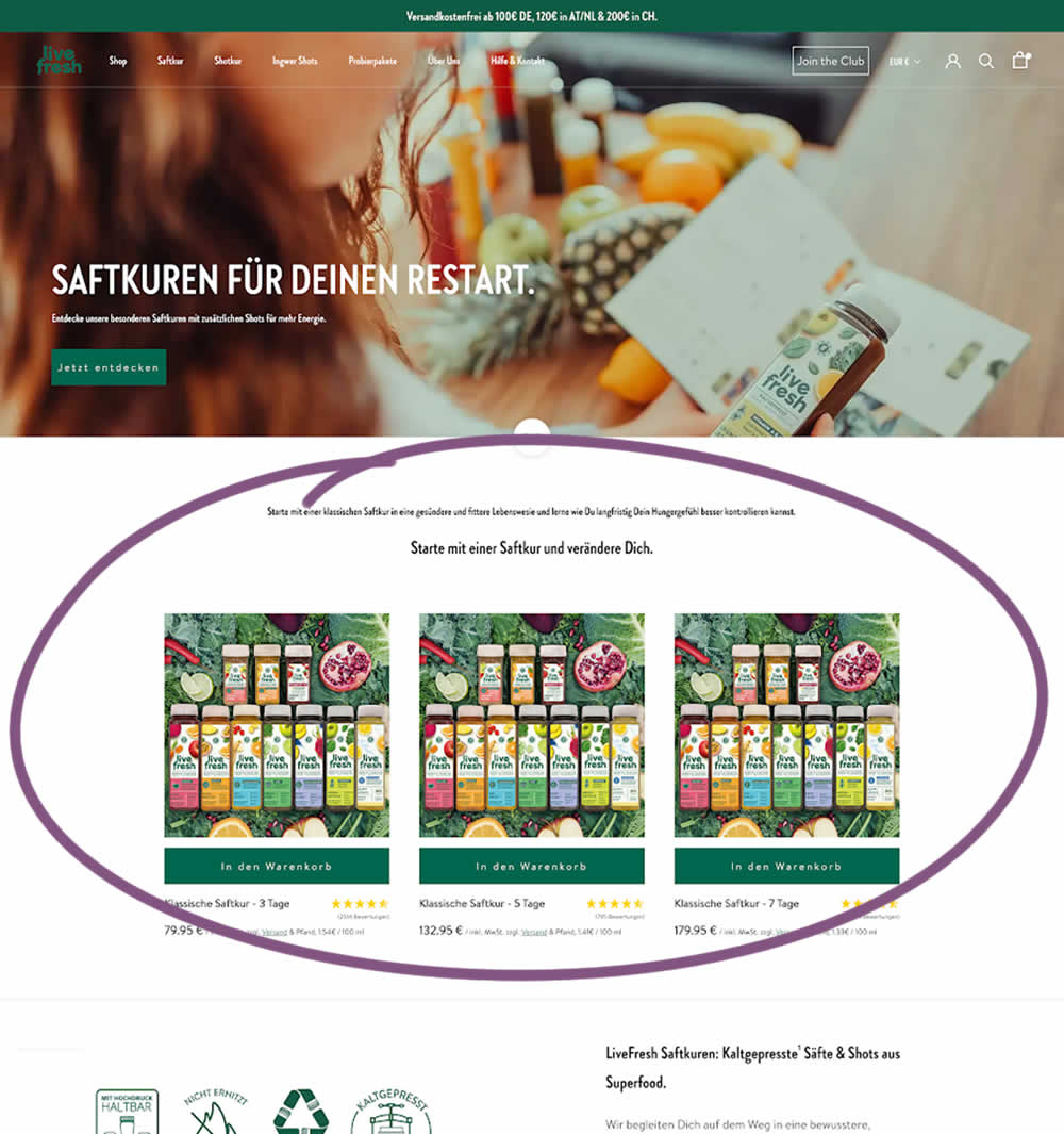
In this experiment, three popular juice products were shown higher on the variation (instead of lower in the control). Impact on sales was measured.
Test #569 on
Snocks.com
by
 Melina Hess
Dec 29, 2024
Mobile
Melina Hess Tested Pattern #124: Confirmed Selection In Test #569 On Snocks.com
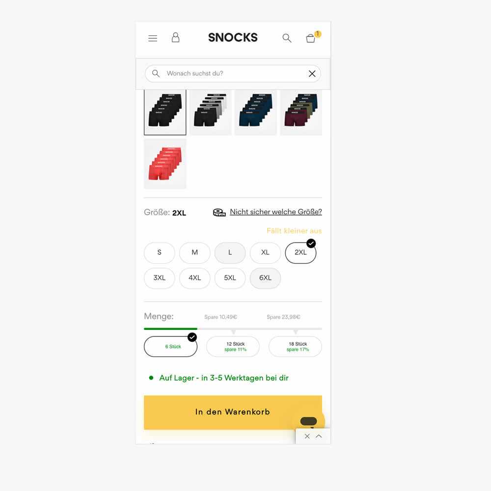
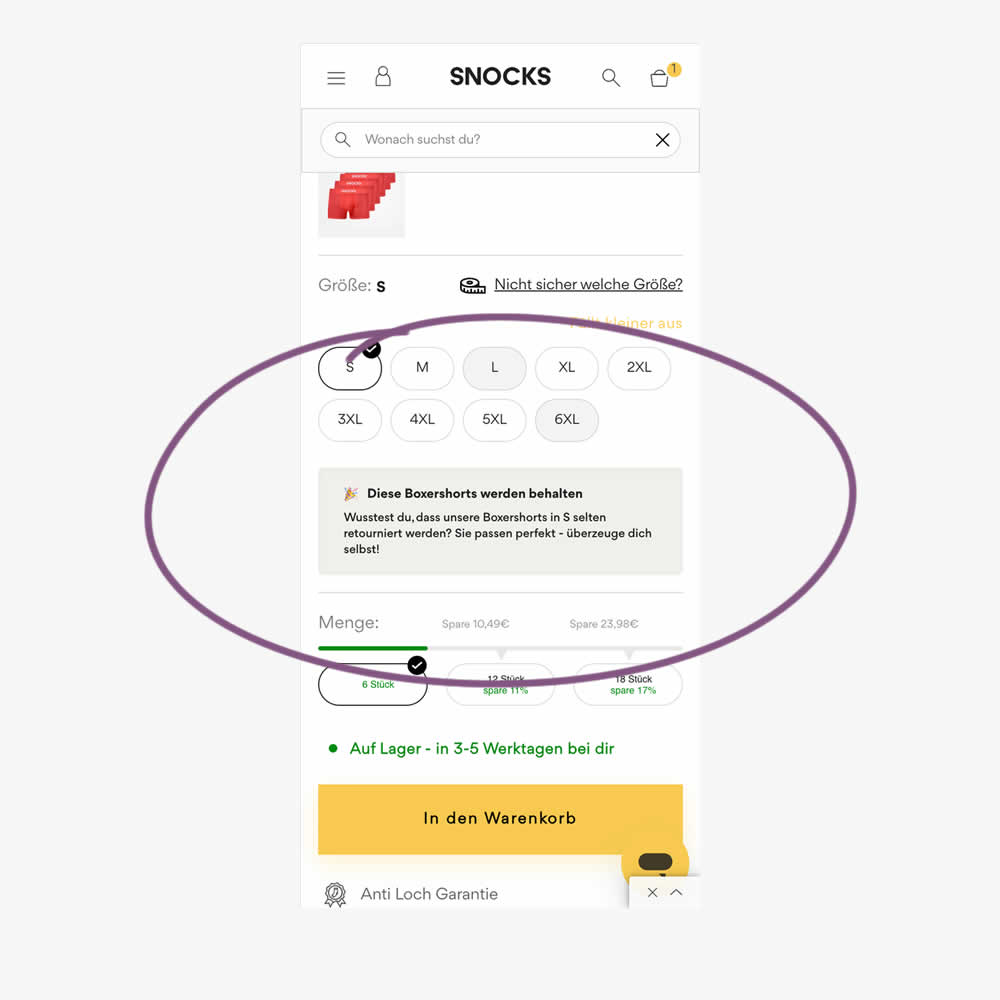
In this experiment, reaffirming copy was added for particular size options in the variation. Here is the translation from German:
"These boxer shorts will be kept. Did you know that our boxer shorts in S are rarely returned? They fit perfectly - see for yourself!"
Impact on sales was measured.
Test #556 on
Snocks.com
by
 Melina Hess
Oct 08, 2024
Mobile
Melina Hess Tested Pattern #65: Add More For Free Shipping In Test #556 On Snocks.com
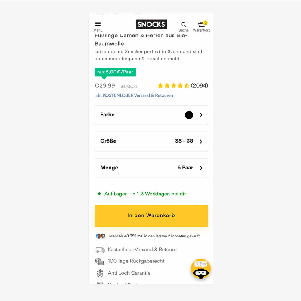
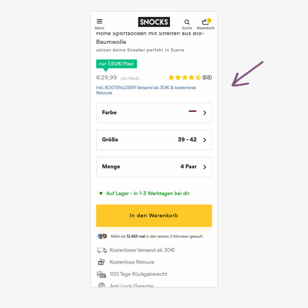
In this experiment, free shipping was a/b tested against free shipping with a 30€ purchase or higher. Hence, in the variation, customers needed to reach a cart amount total in order to be eligible for the free shipping.
Test #548 on
Livefresh.de
by
 Melina Hess
Aug 13, 2024
Desktop
Mobile
Melina Hess Tested Pattern #17: Least Or Most Expensive First In Test #548 On Livefresh.de
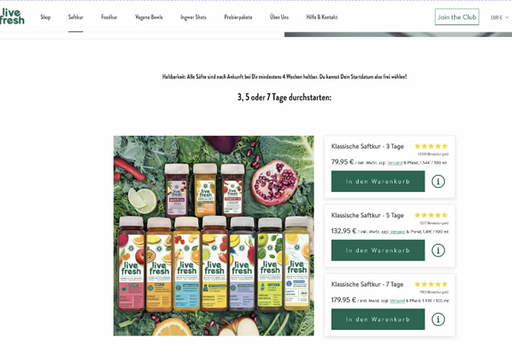
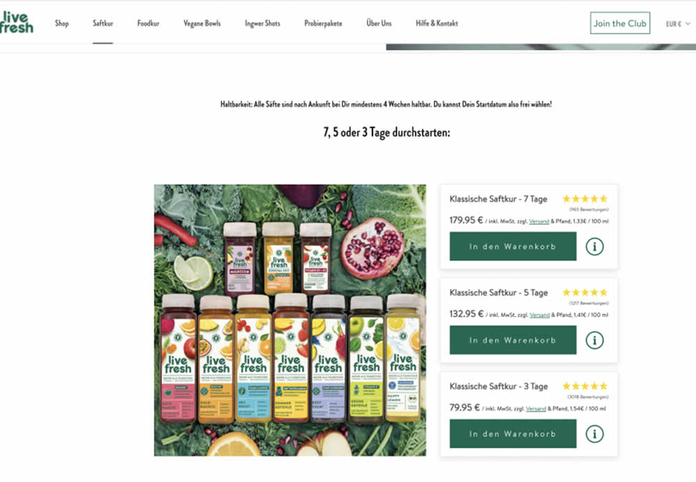
In this product landing page experiment, the plan sort order was rearranged. In the control it was sorted from least expensive to most expensive. In the variation, the plans were shown as most expensive first. Impact on sales and revenue was measured.
Test #539 on
Snocks.com
by
 Melina Hess
Jun 24, 2024
Desktop
Melina Hess Tested Pattern #135: Product Categories In Test #539 On Snocks.com
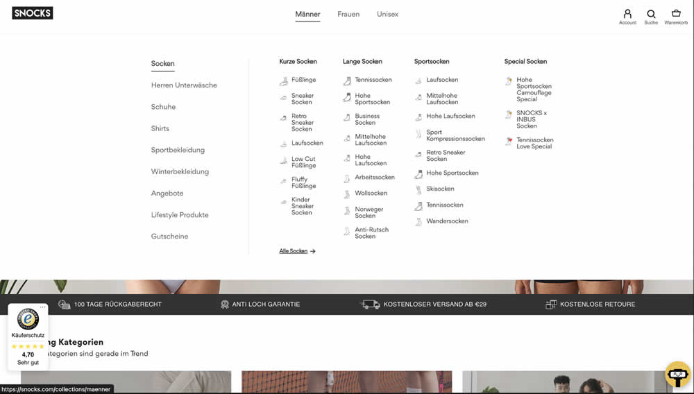
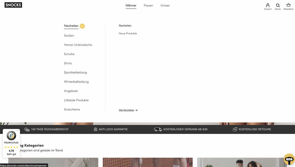
In this experiment, two different navigation defaults were tested against each other. In one version we can see 1) more popular products with 2) more categorical granularity being shown in the expanded state. In the other version we see "new products" being shown as the default (with a lot fewer product subcategories) to choose from.
Test #512 on
Snocks.com
by
 Melina Hess
Jan 17, 2024
Mobile
Melina Hess Tested Pattern #65: Add More For Free Shipping In Test #512 On Snocks.com
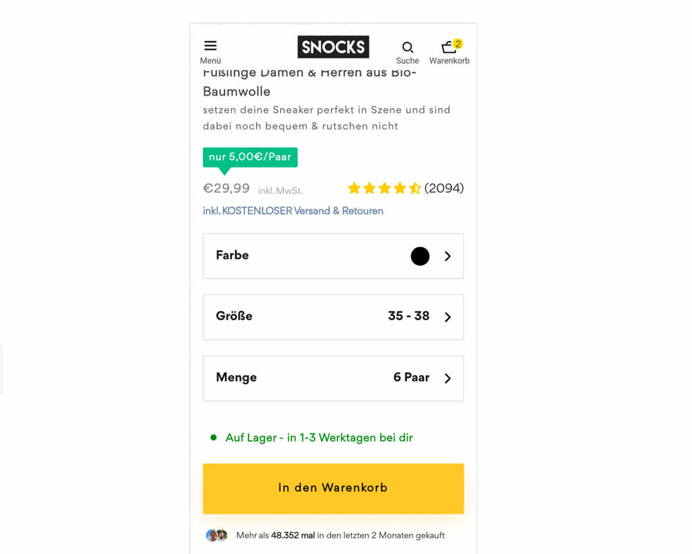
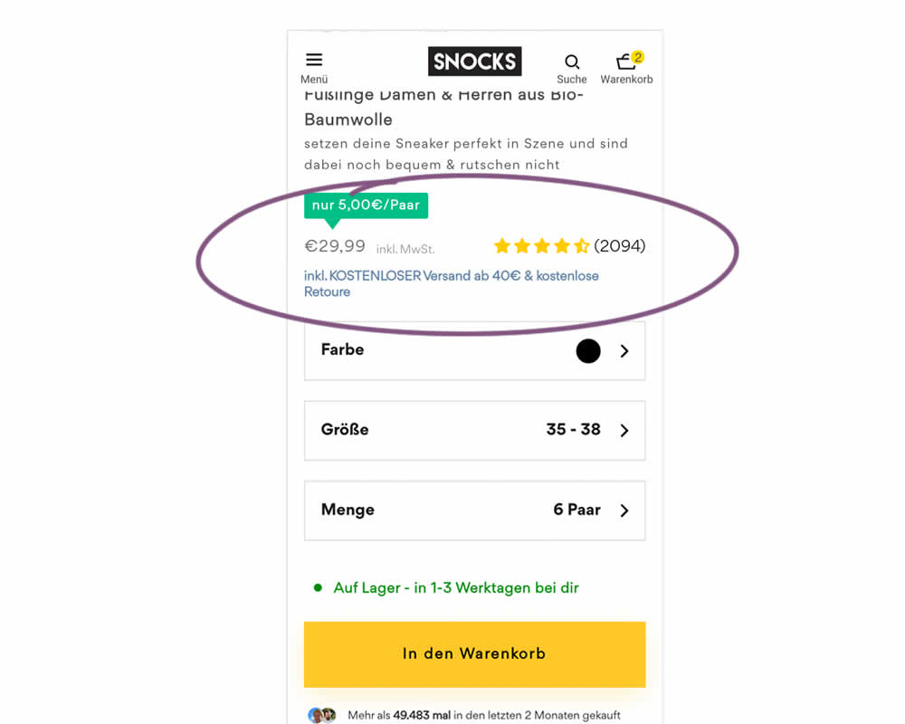
In this experiment, free shipping was a/b tested against free shipping with a 40€ purchase or higher. Hence, in the variation, customers needed to reach a cart amount total in order to be eligible for the free shipping.
Test #484 on
Snocks.com
by
 Melina Hess
Jul 21, 2023
Desktop
Mobile
Melina Hess Tested Pattern #80: Persistent Filters In Test #484 On Snocks.com
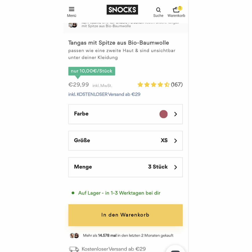
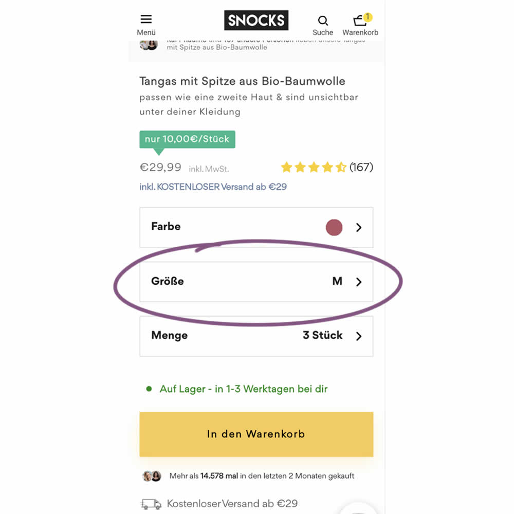
In this experiment, the variation remembered and prefilled user's size choices for the duration of the session. The control version always started with a fixed product size value (ex: XS). The variation prefilled them between products or screen refreshes. Impact on sales was measured.
Test #477 on
Snocks.com
by
 Melina Hess
Jun 09, 2023
Mobile
Desktop
Melina Hess Tested Pattern #95: Clickable Product Previews In Test #477 On Snocks.com
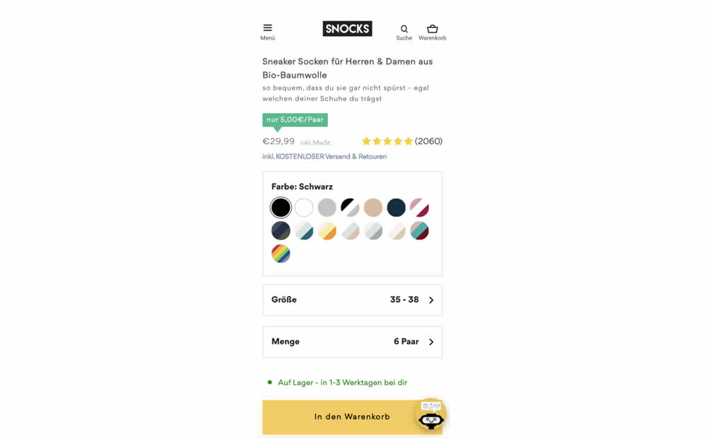
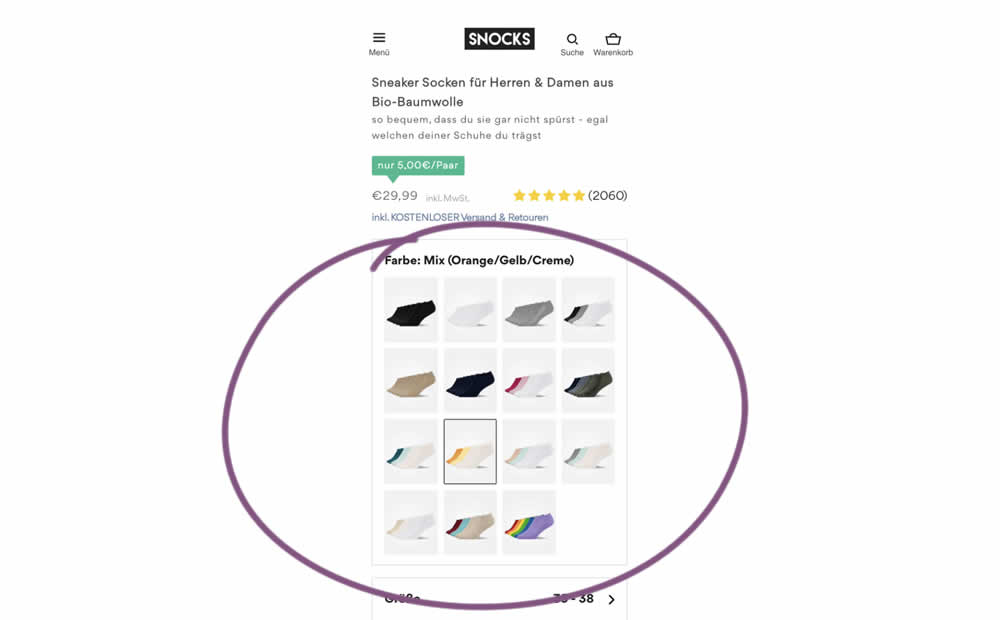
In this experiment, product color swatches were replaced with real product photos. Whereas the control showed the colors as more abstract circles. Impact on sales was measured.
Test #465 on
by
 Melina Hess
Apr 22, 2023
Desktop
Mobile
Melina Hess Tested Pattern #15: Bulleted Reassurances In Test #465
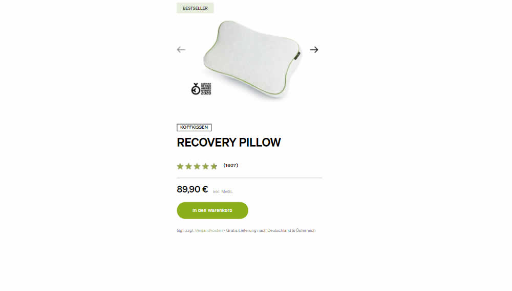
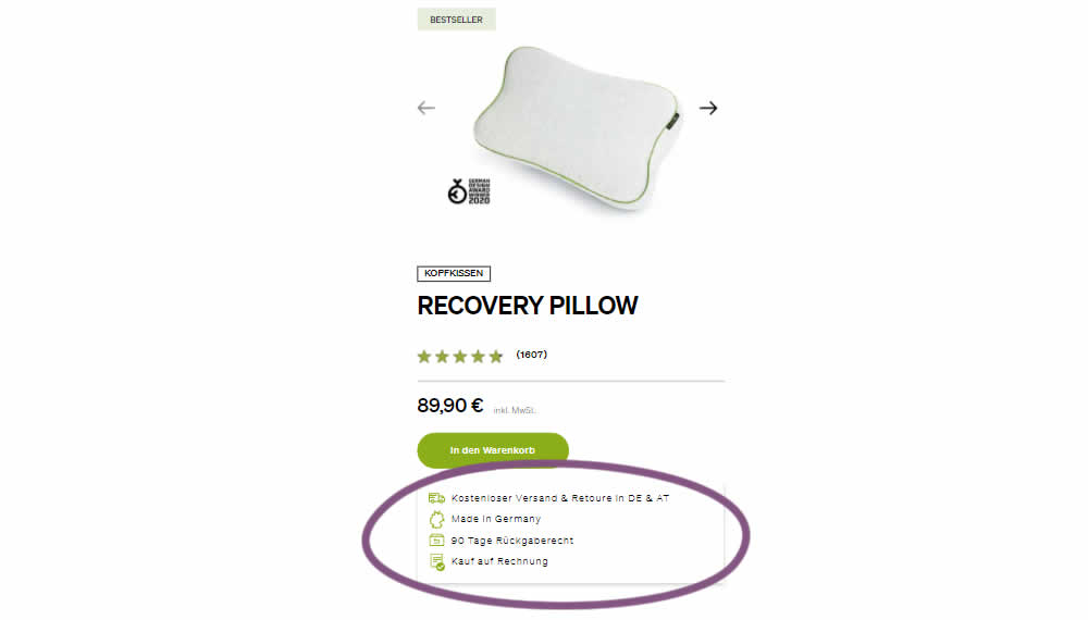
In this product detail page experiment, a number of reassurances were brought out visually in a lined or bulleted way. The 4 reassurances included: free shipping and returns; Made in Germany, 90 Day Returns; and Buy With Invoice (popular in Germany). Impact on revenue per user was measured. The control contained very feint copy (smaller and more subtle) about free shipping.
Test #461 on
Snocks.com
by
 Melina Hess
Mar 23, 2023
Mobile
Melina Hess Tested Pattern #15: Bulleted Reassurances In Test #461 On Snocks.com
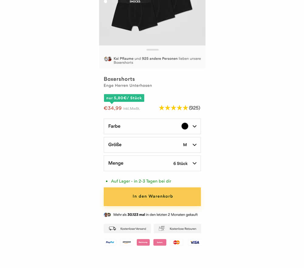
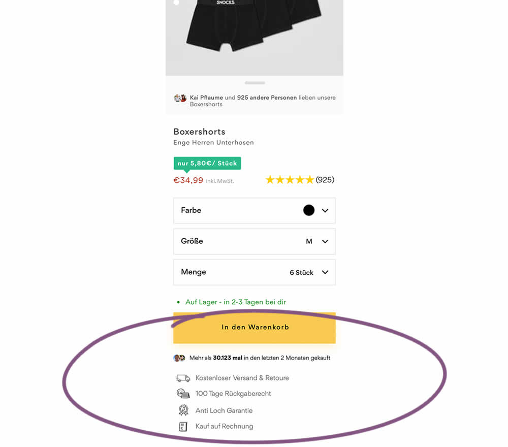
In this product detail page experiment, reassurances under the add-to-cart button were rearranged. The control contained copy about: free shipping and free returns formatted as two gray boxes, with a variety of payment methods and their corresponding logos underneath.
The variation used a more convention bulleted, line-by-line format. It also contained free shipping and returns, but also elaborated with "100 day returns", an "anti-hole guarantee", and "purchase with invoice" (perhaps more popular in Germany?). Impact on sales was measured.
Test #459 on
Snocks.com
by
 Melina Hess
Feb 28, 2023
Desktop
Mobile
Melina Hess Tested Pattern #36: Fewer Or More Results In Test #459 On Snocks.com
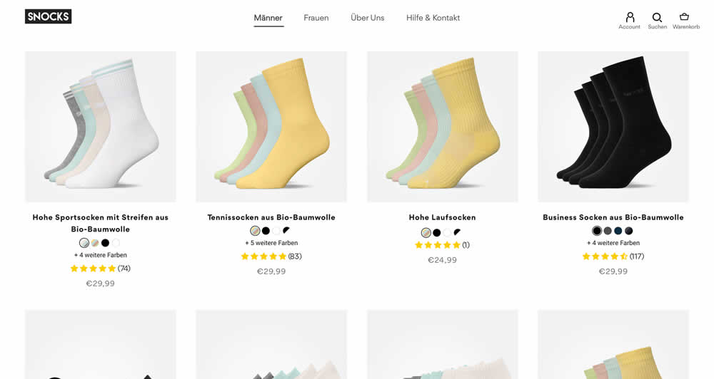
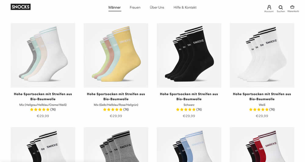
In this listing page experiment, color sets of the same product were tested against individual products with unique colors (with additional product tiles). Essentially, the A version here contained fewer product items (with color sets), while the B version contained more results and tiles (with grouped products). Impact on total sales was measured.
(The original control and variation was inverted, but was flipped to match the fewer or more results pattern).
Test #449 on
Snocks.com
by
 Melina Hess
Dec 31, 2022
Desktop
Mobile
Melina Hess Tested Pattern #78: Tags, Badges And Structured Information In Test #449 On Snocks.com
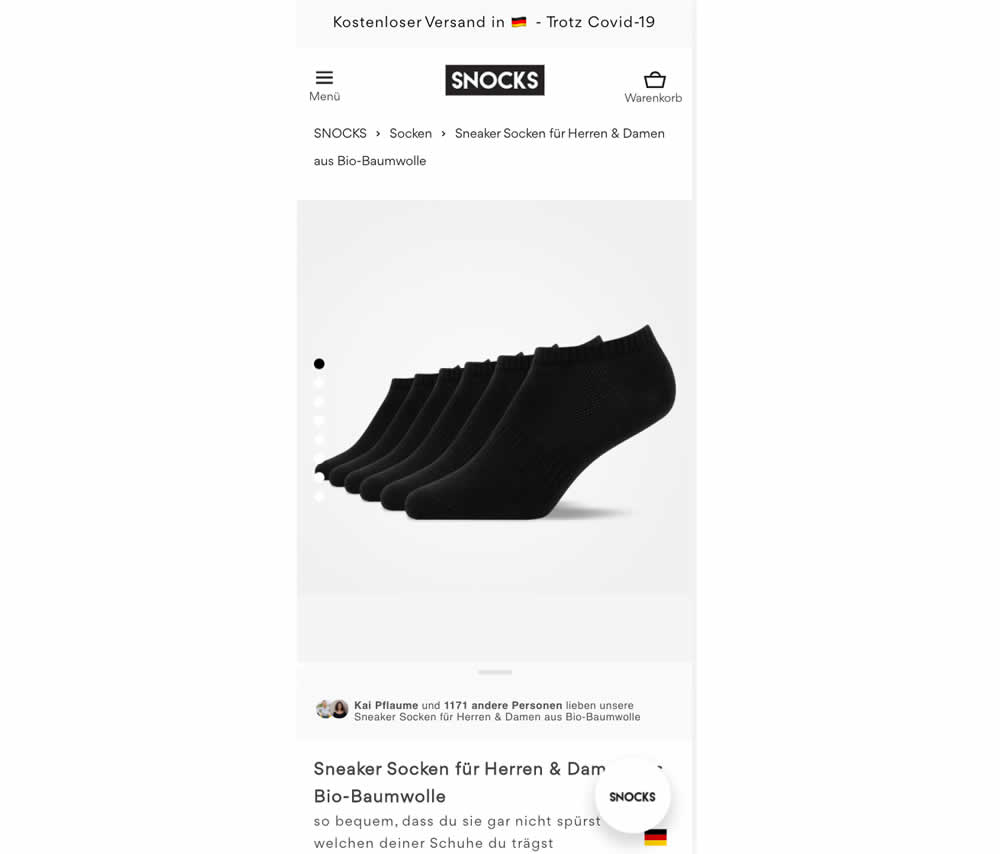
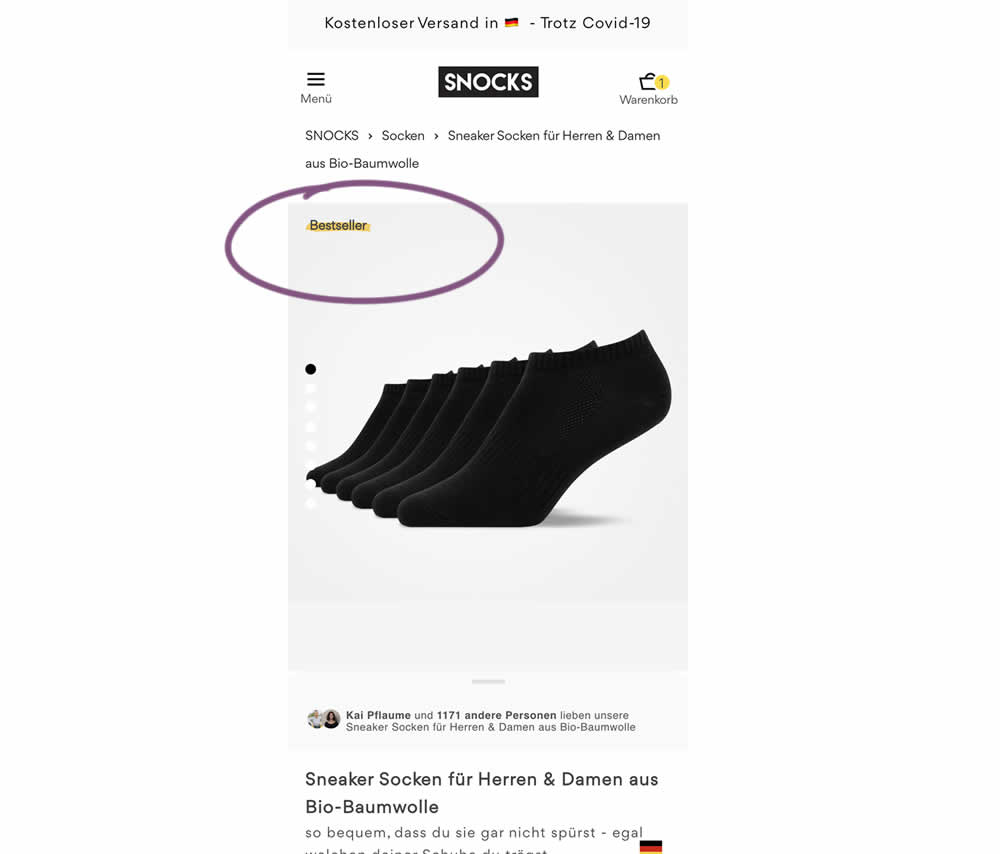
In this experiment, bestselling product colors were highlighted with a bestseller badge on product listing and product detail pages.
Test #444 on
by
 Melina Hess
Nov 30, 2022
Mobile
Melina Hess Tested Pattern #41: Sticky Call To Action In Test #444
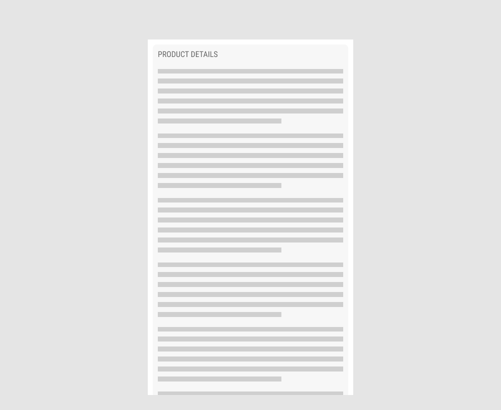
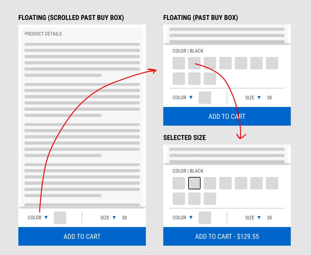
In this experiment, a floating add-to-cart with two product choices (color and size) were added on a product page. This appeared only after scrolling past the existing / embedded product selection buy box.
The floating add-to-cart widget had another layer of complexity in that it allowed customers to make a size and color selection with an expandable fly out. Making a selection would also append the total price to the add-to-cart button label.
Impact on total transactions was measured.
Test #441 on
by
 Melina Hess
Nov 23, 2022
Desktop
Mobile
Melina Hess Tested Pattern #41: Sticky Call To Action In Test #441
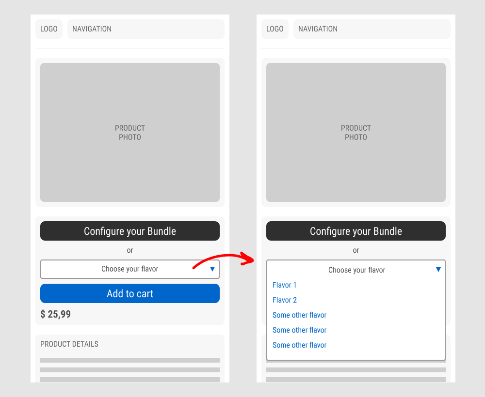
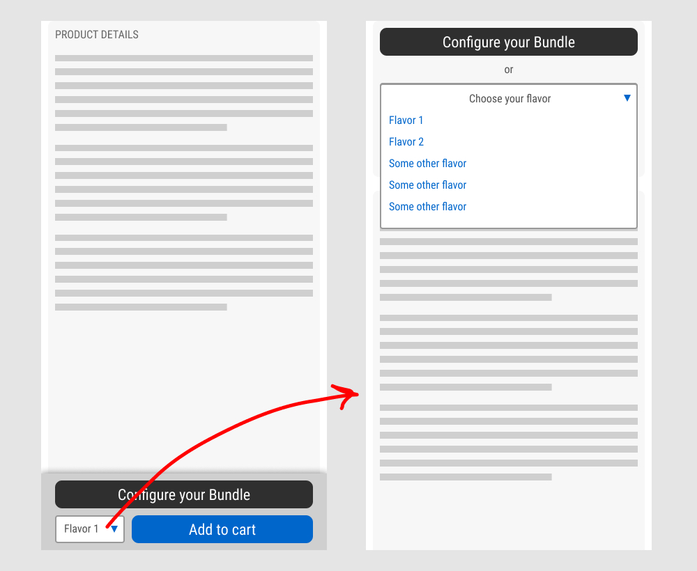
In this experiment, a floating sticky bar was added on product pages. The sticky elements only appeared after users scrolled beyond the fixed buy box area that is relatively high on the page (visible on the control screenshot). The sticky bar contained three elements: a button to configure up to three product choices, a flavor selection pulldown, and the add-to-cart button.
In the variation, when users clicked on the flavor pulldown three things happened. First, they were anchored back to the top of the buy box. Second, the floating sticky disappeared. And third, the flavors pulldown automatically expanded (overlapping the original primary add-to-cart button).
The control did not have any of the sticky behaviors.
Impact to total sales was measured.
Test #432 on
Snocks.com
by
 Melina Hess
Sep 29, 2022
Mobile
Melina Hess Tested Pattern #94: Visible Search In Test #432 On Snocks.com
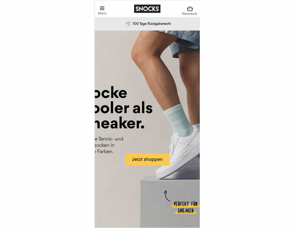
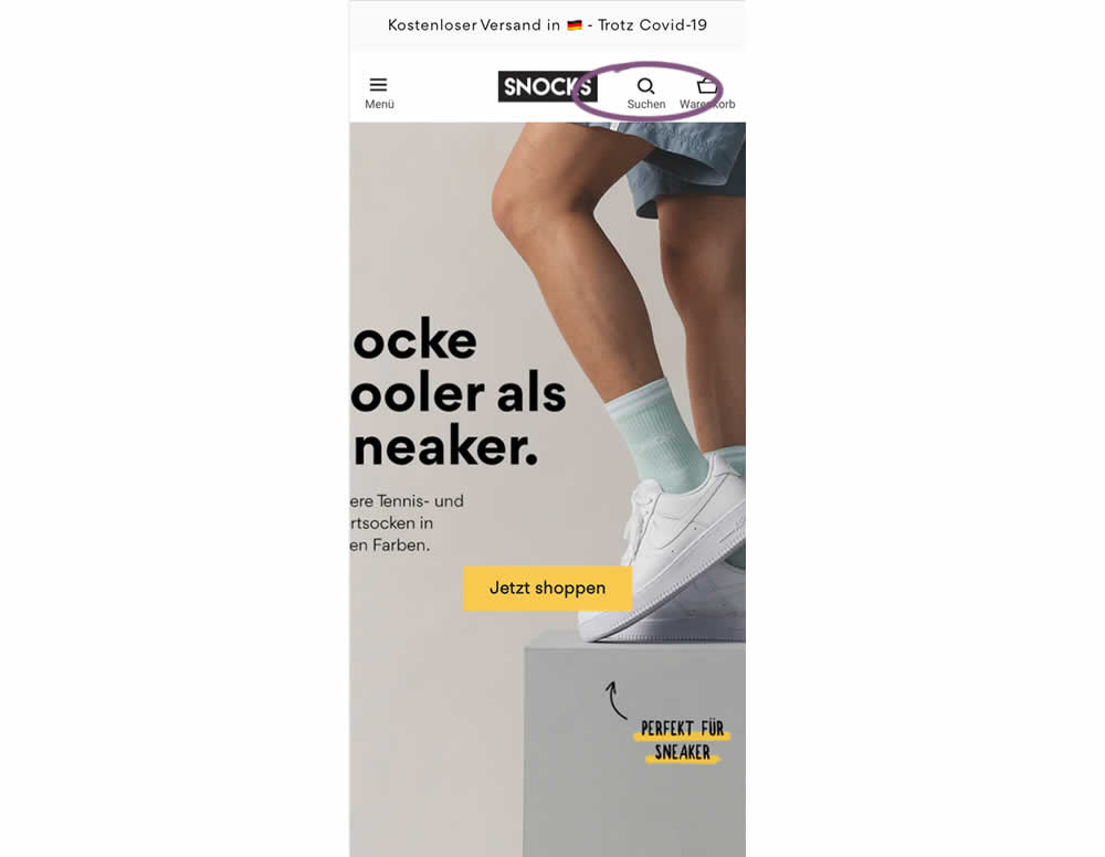
In this experiment, search functionality was added in the variation, globally on mobile. Impact on sales was measured
Test #429 on
Snocks.com
by
 Melina Hess
Aug 16, 2022
Mobile
Desktop
Melina Hess Tested Pattern #121: Free Shipping In Test #429 On Snocks.com
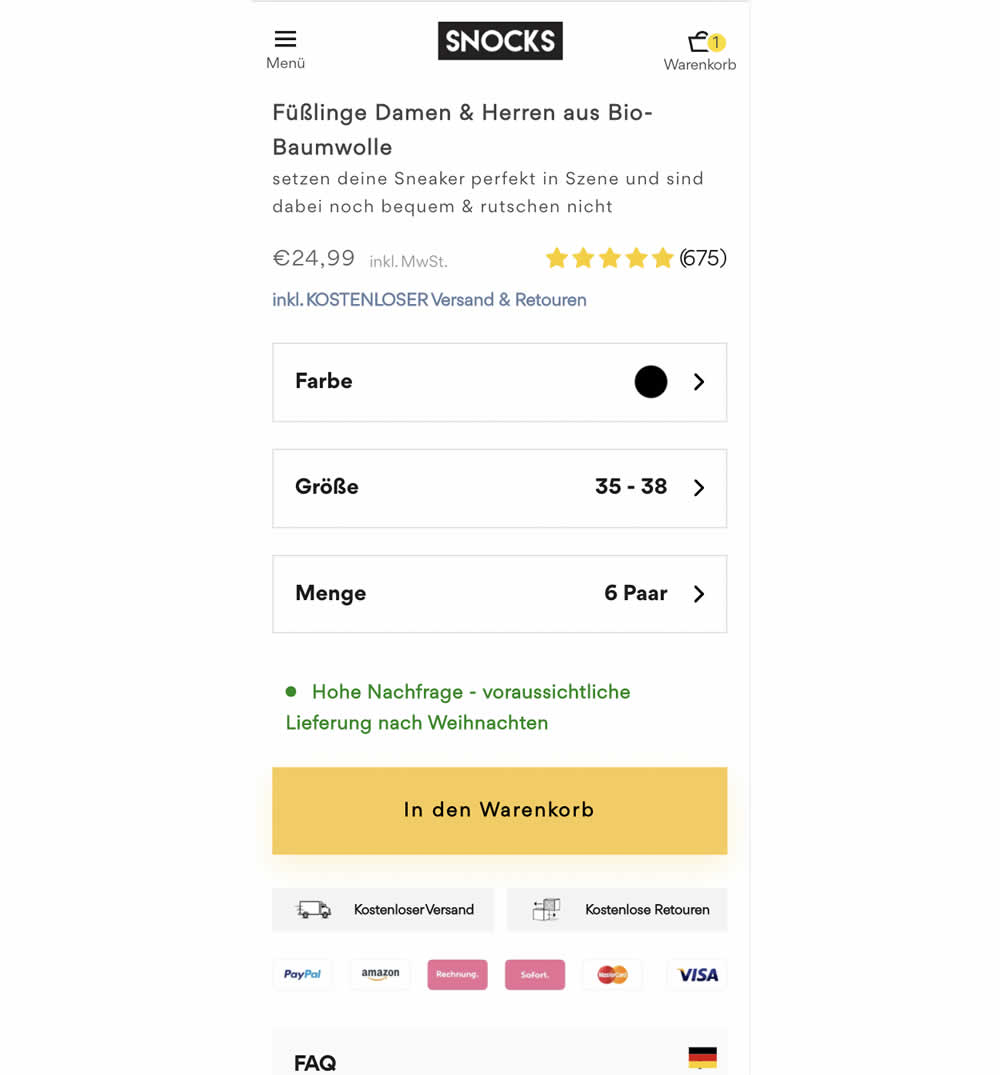
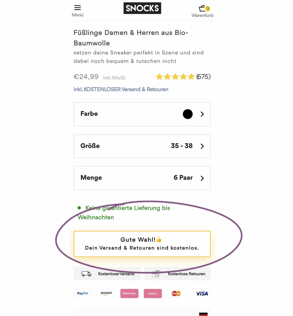
Upon clicking the Add-To-Cart button, the button label changed to a cheering message which congratulated the user on his choice and ensuring that shipping is free. Translation: "Good choice. Your shipping and returns are free."
Test #407 on
Snocks.com
by
 Melina Hess
Apr 22, 2022
Desktop
Mobile
Melina Hess Tested Pattern #125: Unit Prices In Test #407 On Snocks.com
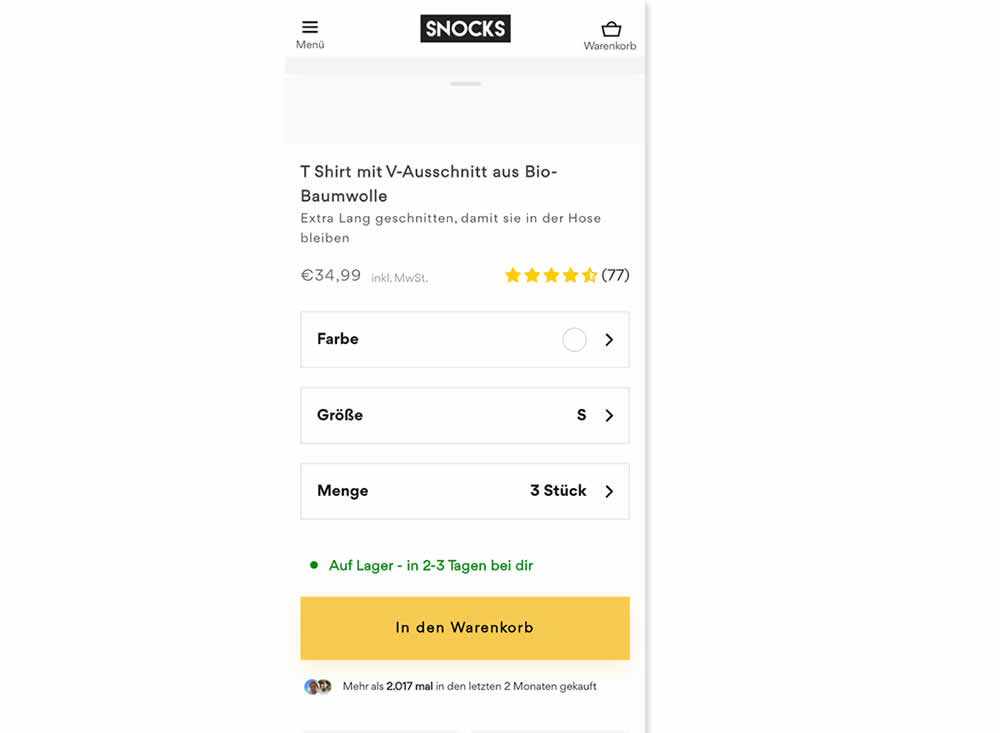
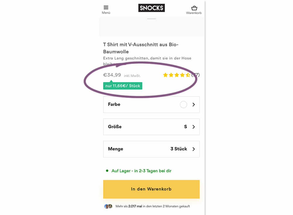
Here is an experiment with an added "price per pair" in the context of products with multiple items (packs).A high contrast badge-like copy was appended underneath the price which translates to "only $X per item". Impact on sales was measured.