5 Tests By  Adan Archila
Tests
Test #544 on
686.com
by
 Adan Archila
Jul 25, 2024
Desktop
Adan Archila Tested Pattern #104: Carousel Vs Static Grid Images In Test #544 On 686.com
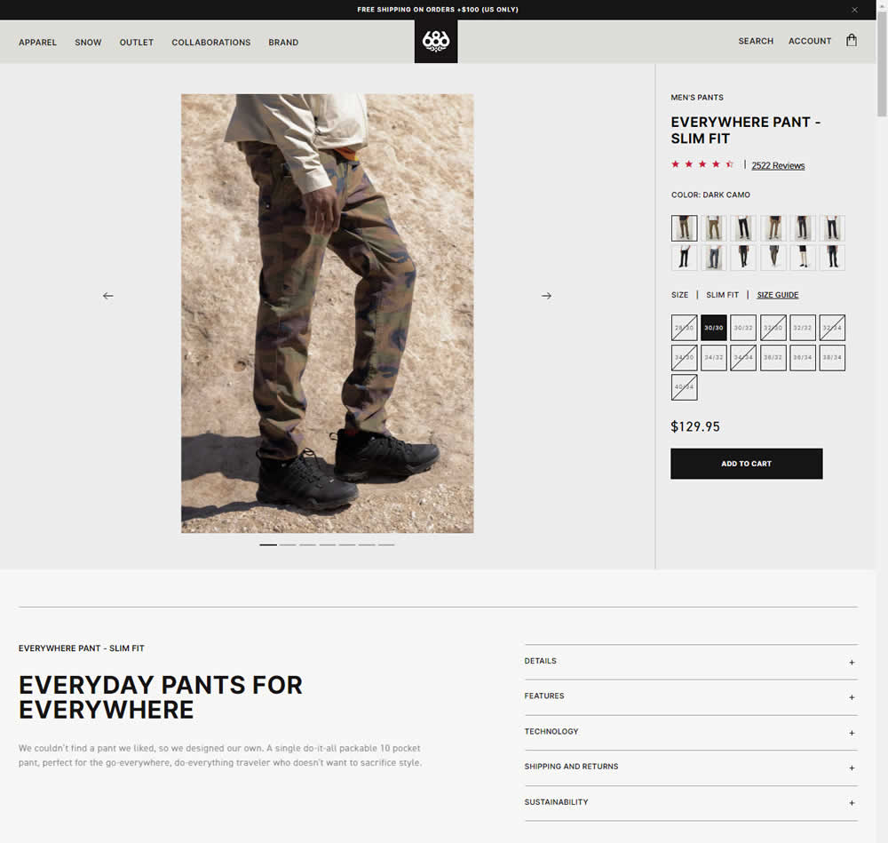
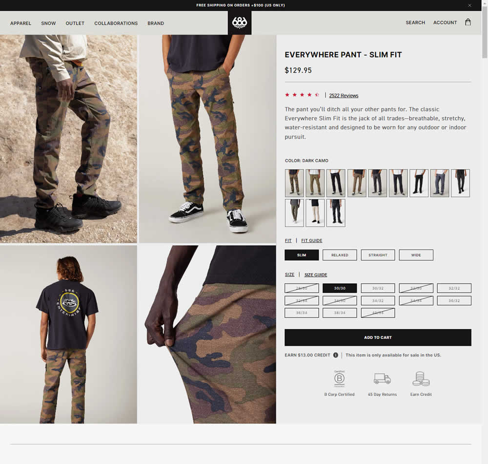
In this experiment, a single image carousel gallery was replaced with a grid gallery. In addition the variation also used: taller swatches; a wider size box, added fit (slim, relaxed, straight, wide) options; and used a wider Add to Cart CTA (full width of the column). Impact on sales was measured.
Test #535 on
686.com
by
 Adan Archila
May 31, 2024
Desktop
Adan Archila Tested Pattern #120: Supporting Theme Images In Test #535 On 686.com


In this experiment, a static category theme image at the top of a listing page was tested against the same page but without the extra image. Impact on sales was measured.
Test #528 on
686.com
by
 Adan Archila
Apr 26, 2024
Mobile
Adan Archila Tested Pattern #120: Supporting Theme Images In Test #528 On 686.com
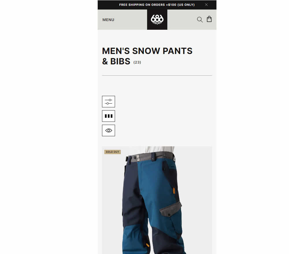
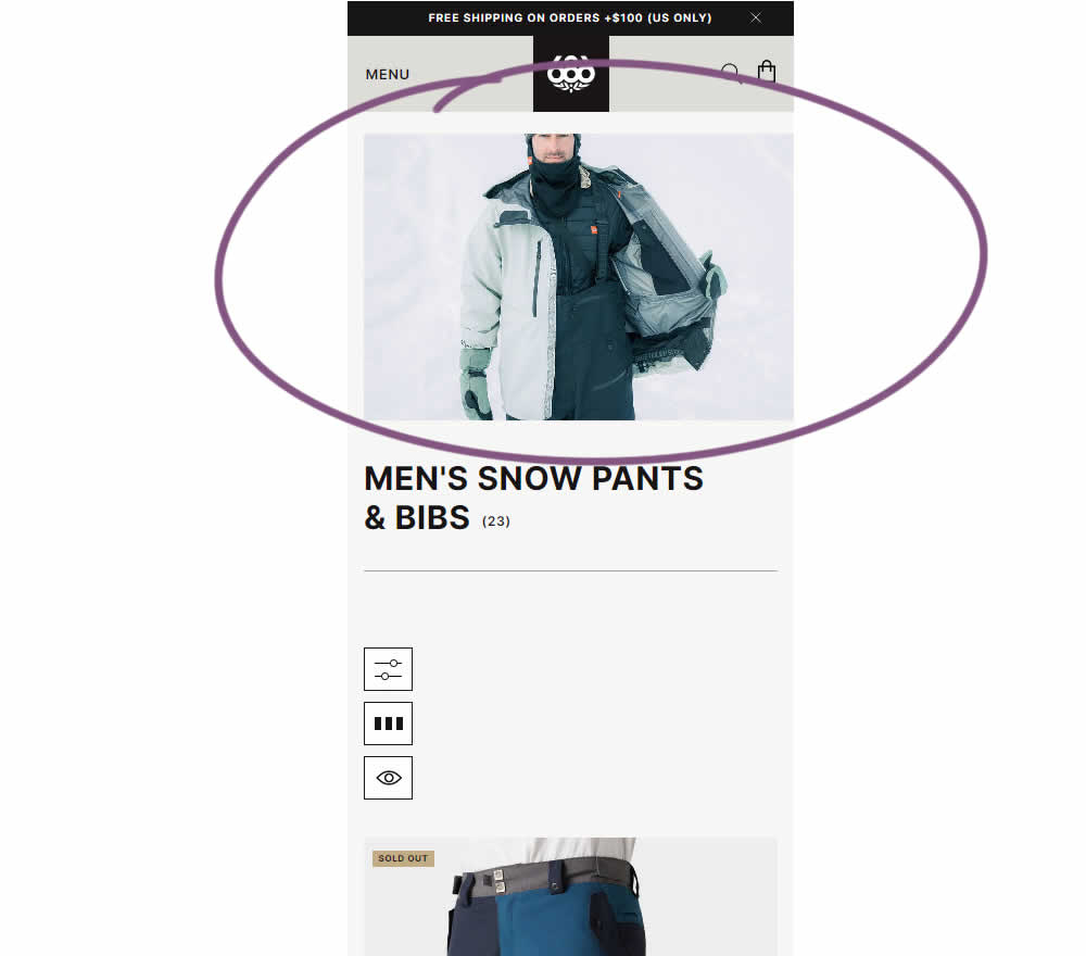
In this experiment, the effect of having additional static category themed images was tested on category listing pages. Impact on sales was measured.
Test #522 on
686.com
by
 Adan Archila
Mar 18, 2024
Desktop
Adan Archila Tested Pattern #37: List Or Grid View In Test #522 On 686.com


In this desktop experiment, 4 product tiles per page (control) were tested against 6. Impact on sales was measured.
Test #516 on
686.com
by
 Adan Archila
Feb 05, 2024
Mobile
Adan Archila Tested Pattern #37: List Or Grid View In Test #516 On 686.com
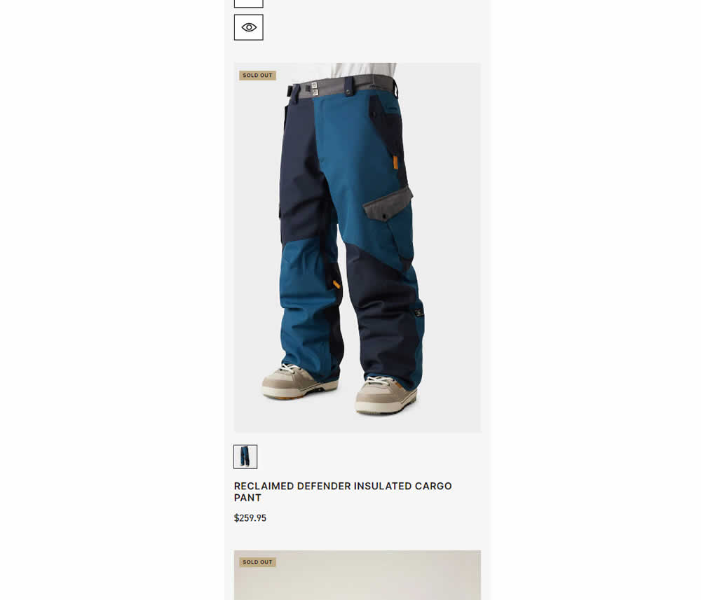
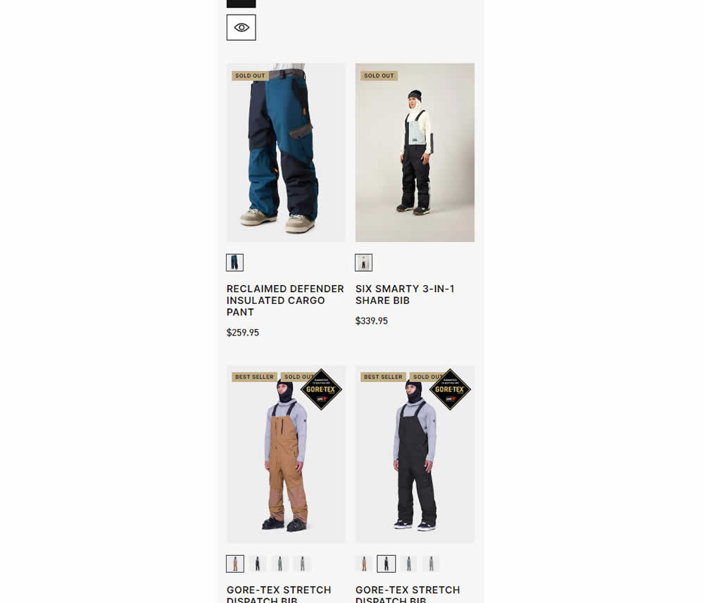
In this experiment, a one large product photo (control) was tested against a two-column layout with two smaller images (variation). Impact on sales was measured.