17 Tests By  Daria Kurchinskaia
Tests
Test #560 on
Finn.com
by
 Daria Kurchinskaia
Oct 22, 2024
Mobile
Desktop
Daria Kurchinskaia Tested Pattern #46: Pay Later In Test #560 On Finn.com
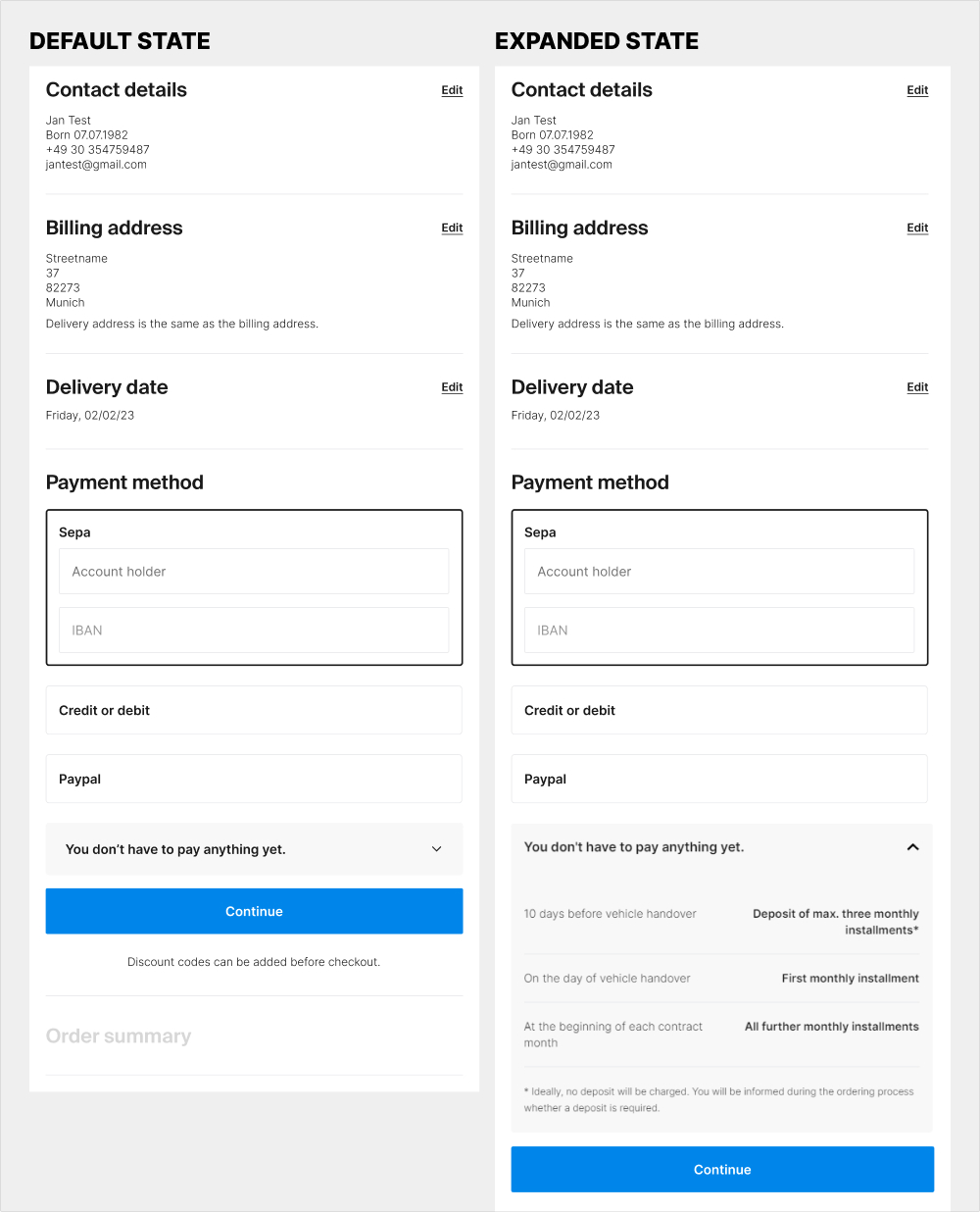
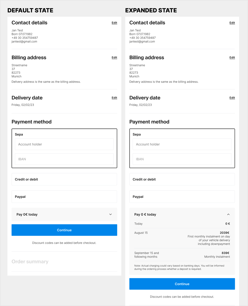
The idea of this experiment was at least two fold. 1) the variation attempted to clarify that there is no payment today with the copy "Pay 0€ today" on the collapsed state of the payment amount. 2) clarify the payment terms with exact dates and amounts for future payments.
Test #538 on
Volders.de
by
 Daria Kurchinskaia
Jun 20, 2024
Desktop
Mobile
Daria Kurchinskaia Tested Pattern #77: Filled Or Ghost Buttons In Test #538 On Volders.de
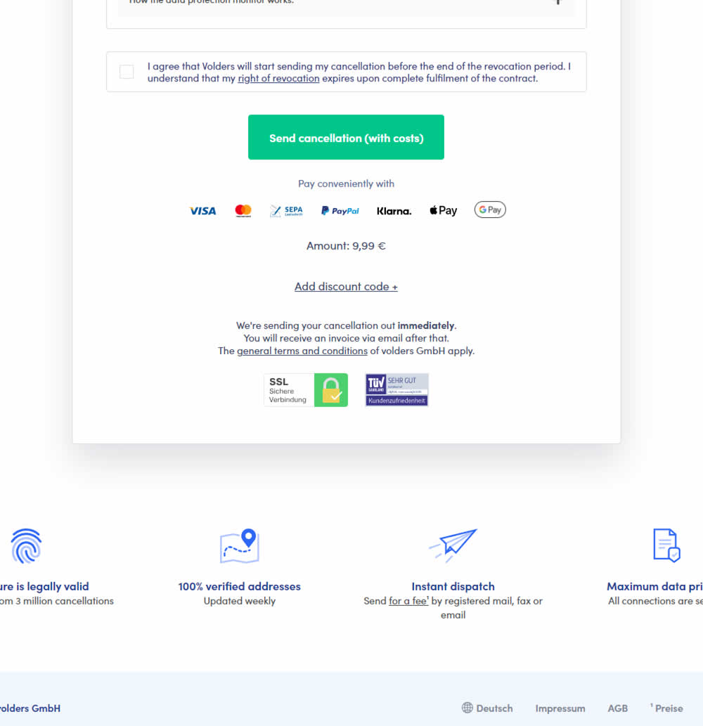
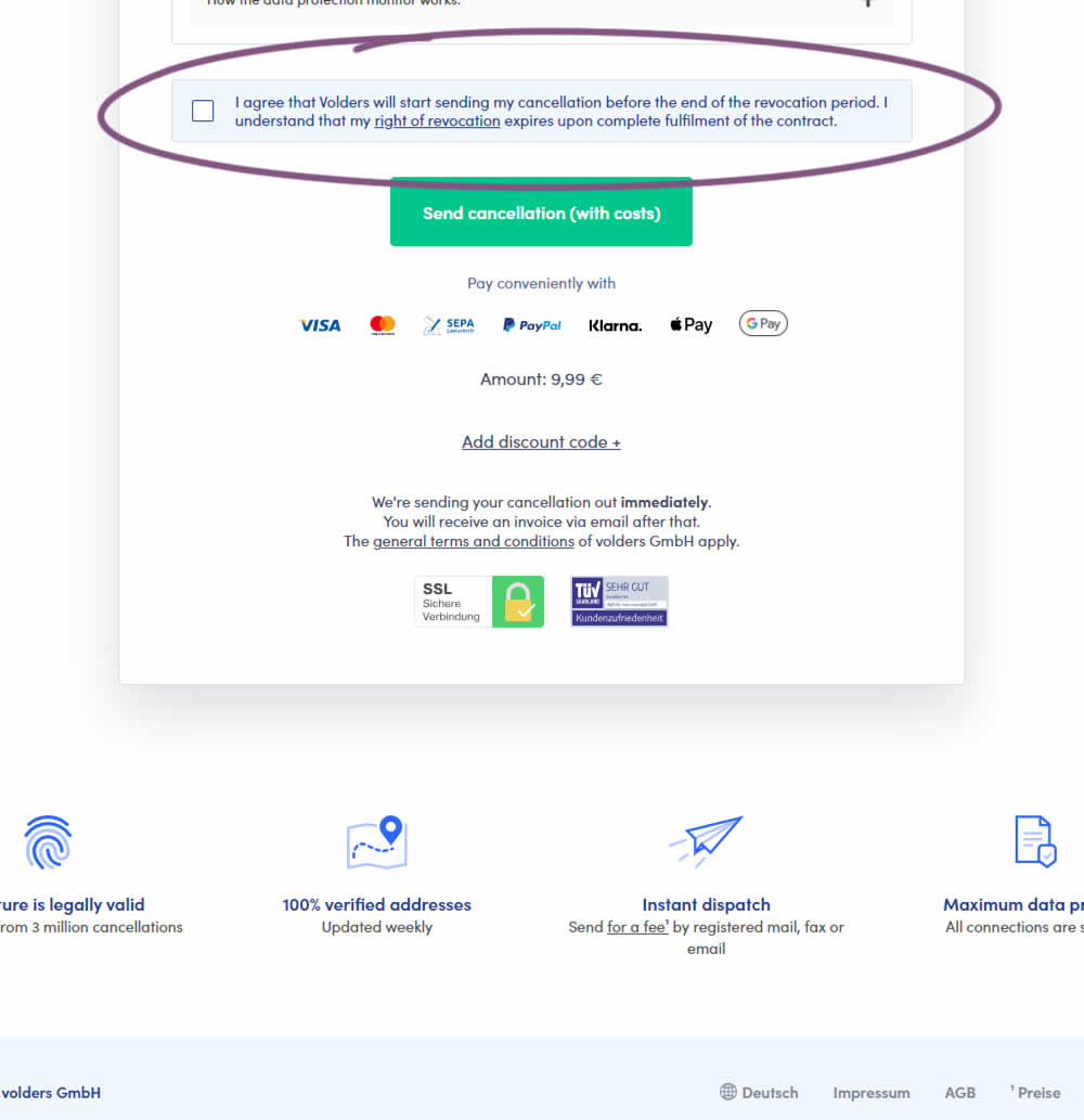
In this experiment, a less visible (ghost button style) legal confirmation box, was tested against a more visible one (filled state with higher contrast). Impact on error rates (from submitting an incomplete form) and sales was measured.
Test #517 on
Aboalarm.de
by
 Daria Kurchinskaia
Feb 12, 2024
Desktop
Daria Kurchinskaia Tested Pattern #78: Tags, Badges And Structured Information In Test #517 On Aboalarm.de
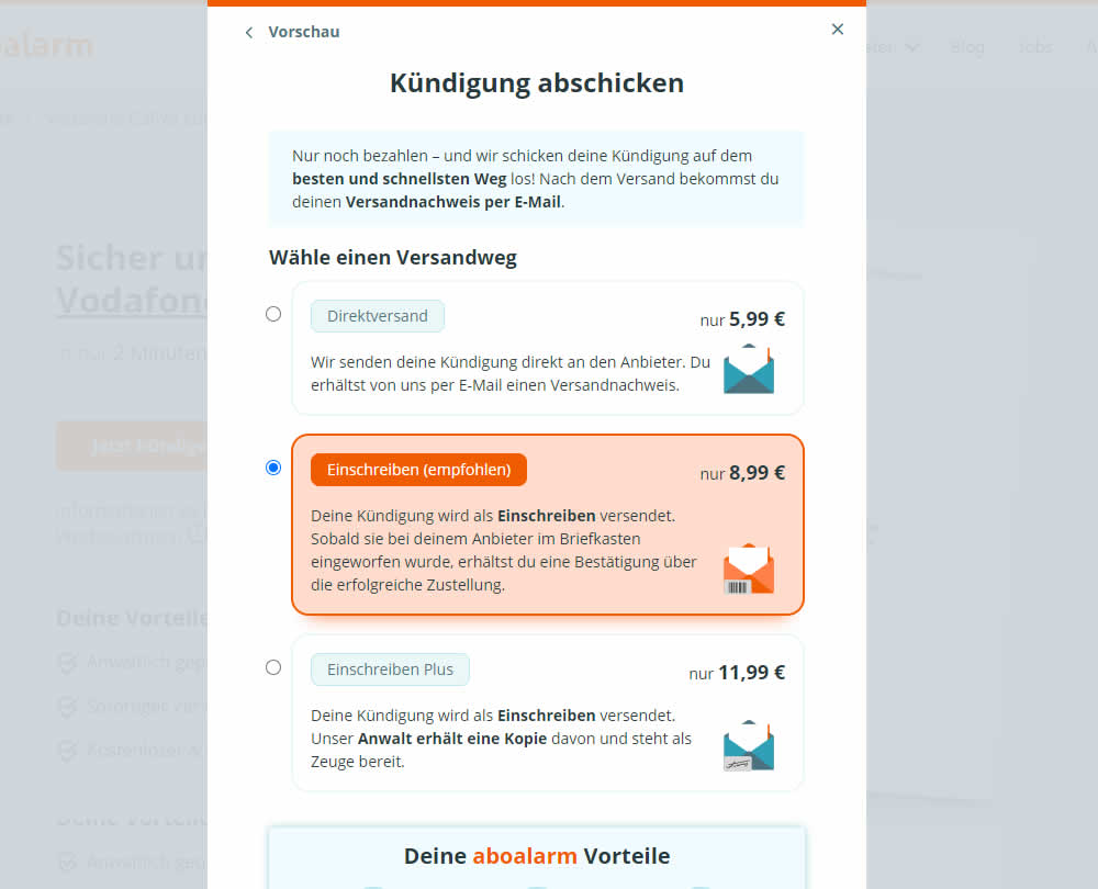
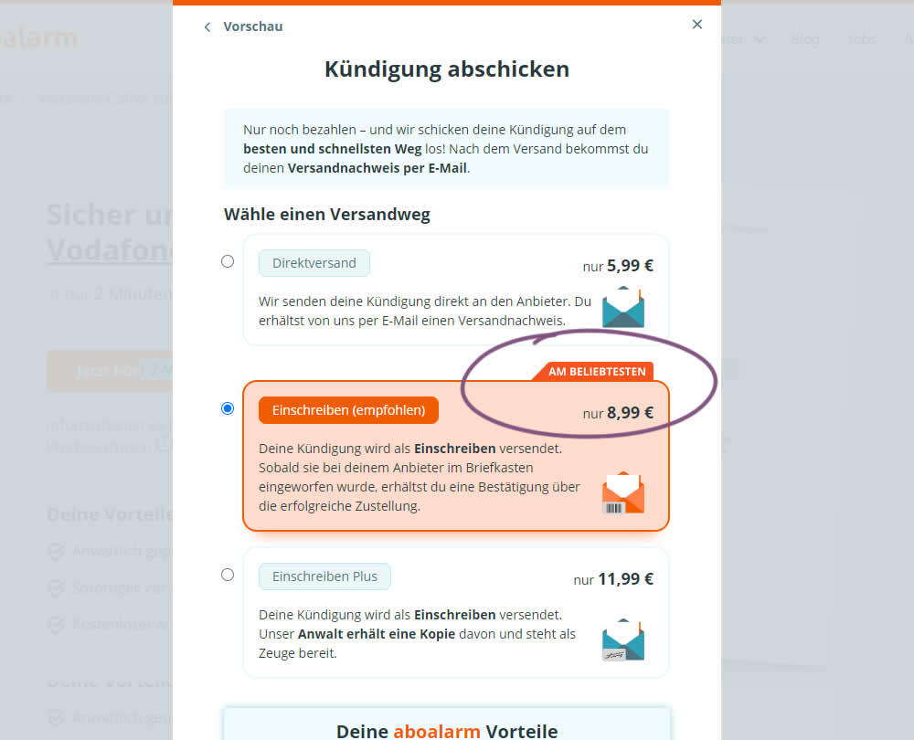
In this experiment, a "most popular" badge ("am beliebsten") was appended to the middle plan of a contract cancellation service. Impact on overall purchases and revenue was measured.
Test #501 on
Volders.de
by
 Daria Kurchinskaia
Nov 02, 2023
Desktop
Mobile
Daria Kurchinskaia Tested Pattern #132: One Time Payment Copy In Test #501 On Volders.de
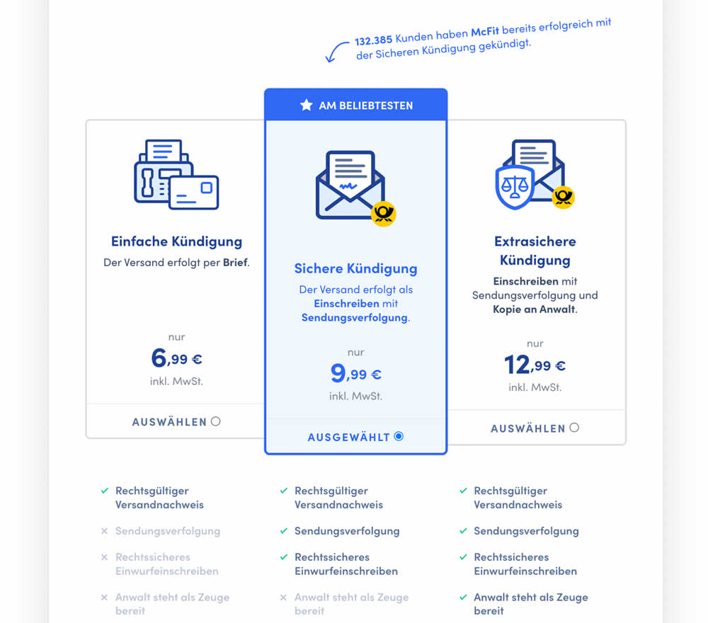
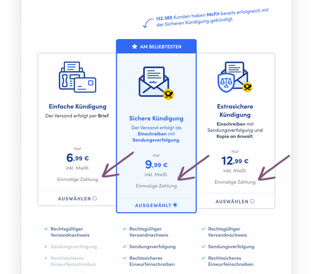
In this experiment, the wording "one-time payment" was appended below all three pricing plans for a contract cancelation service. Impact on orders placed was measured. (Translated from German: "Einmalige Zahlung").
Test #479 on
Aboalarm.de
by
 Daria Kurchinskaia
Jun 15, 2023
Desktop
Mobile
Daria Kurchinskaia Tested Pattern #15: Bulleted Reassurances In Test #479 On Aboalarm.de
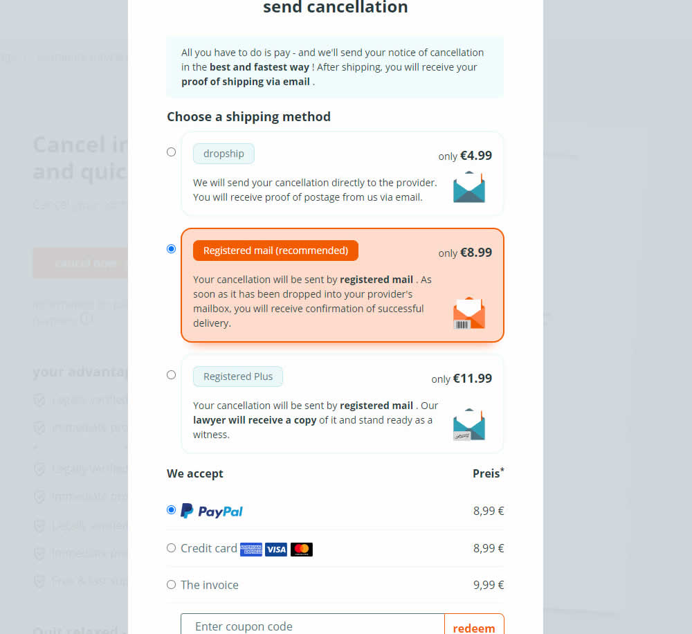
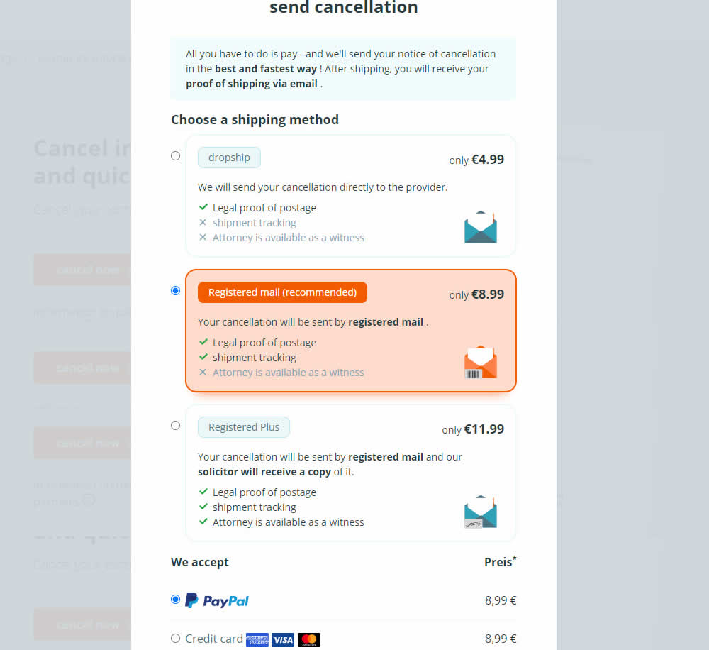
In this experiment, a list of benefits were shown for each of the 3 plans on the last step of a contract cancelation service. Benefit items not included in the lower plans were also shown with grayed out styles (and an "x"). Clearly the higher paid plan had all the benefits listed. Impact on transactions was measured.
Test #480 on
Aboalarm.de
by
 Daria Kurchinskaia
Jun 15, 2023
Desktop
Mobile
Daria Kurchinskaia Tested Pattern #15: Bulleted Reassurances In Test #480 On Aboalarm.de

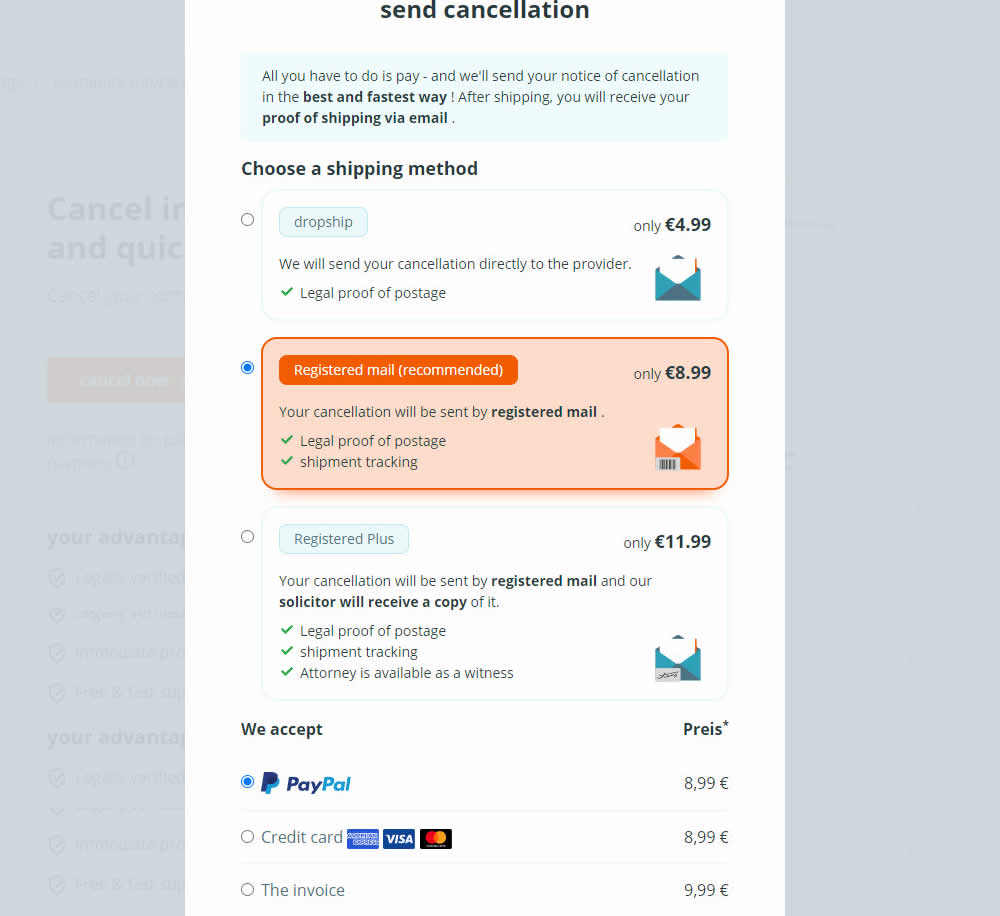
In this experiment, a list of benefits were shown for each of the 3 plans on the last step of a contract cancelation service. The lowest plan only had one benefit, whereas the highest plan had 3. Impact on transactions was measured.
Test #466 on
Volders.de
by
 Daria Kurchinskaia
Apr 26, 2023
Desktop
Daria Kurchinskaia Tested Pattern #4: Testimonials In Test #466 On Volders.de

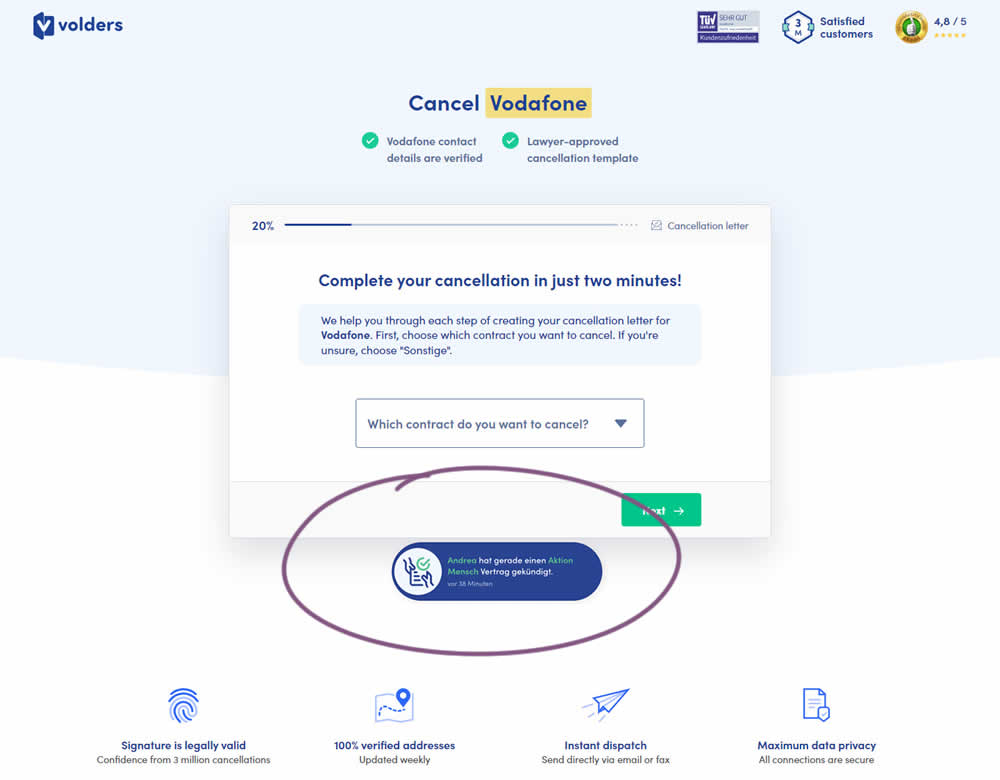
In this experiment, a social proof popups were added to the signup / funnel pages for a contract cancellation service. The added social testimonials appeared as other customers used the service, anywhere except on the final checkout page. Additionaly, the interval at which these messaged appeared was 60 seconds, and they were shown for 10s. The messages translated to "[Name] had recently canncelled a contract with [Company], in the last 38 minutes". Impact on sales was measured.
Test #463 on
Volders.de
by
 Daria Kurchinskaia
Mar 25, 2023
Desktop
Daria Kurchinskaia Tested Pattern #115: Pricing Comparison Table In Test #463 On Volders.de
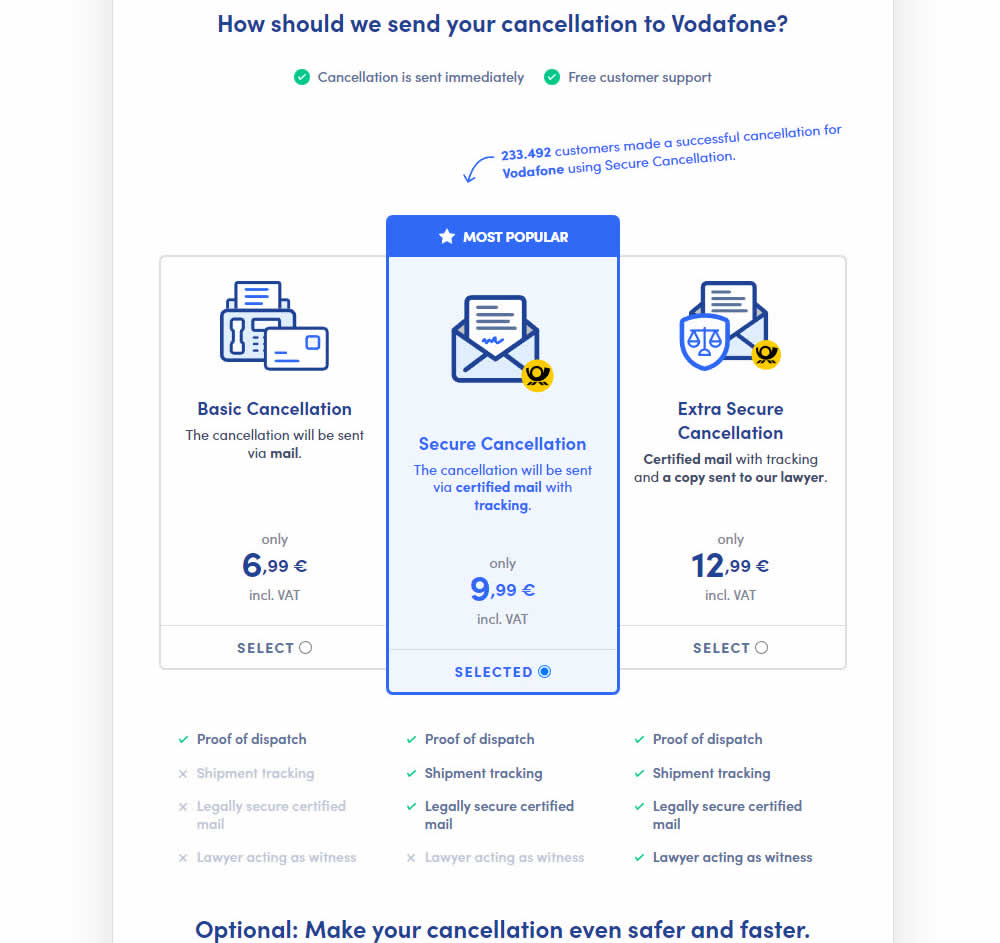
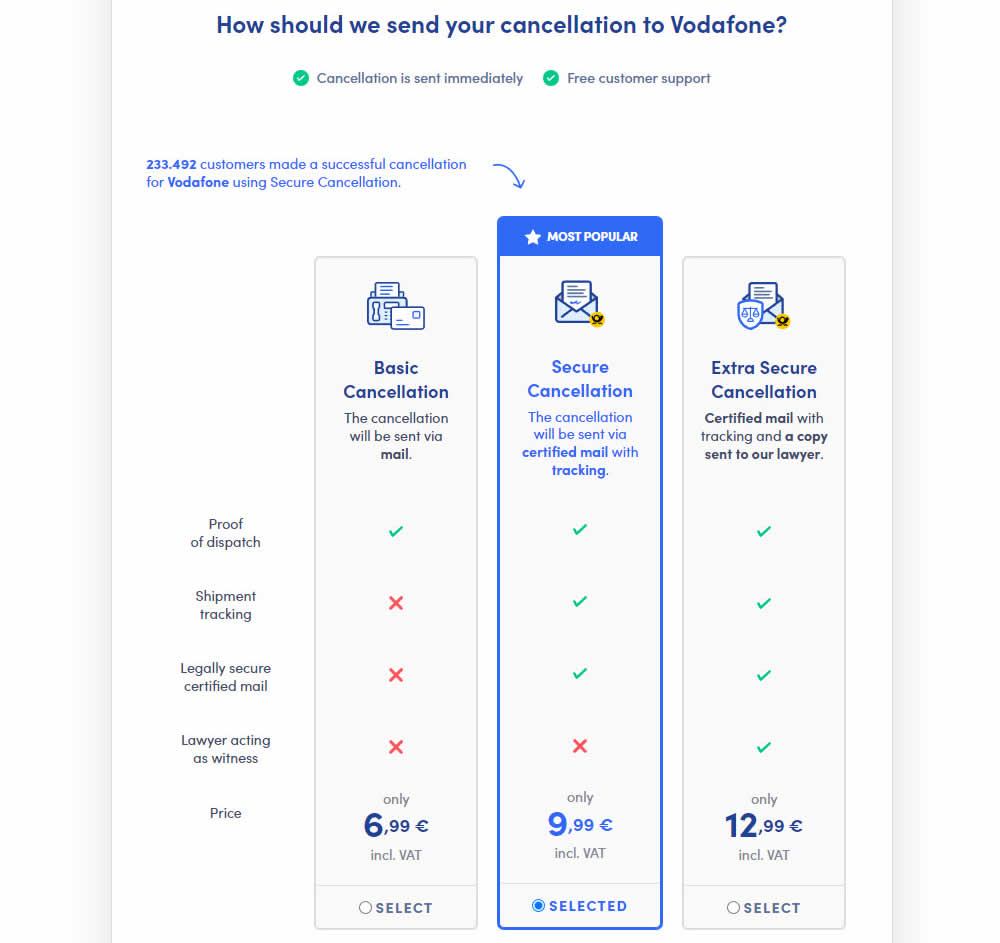
This experiment explored a pricing layout that enabled more feature comparisons. It also conveyed more clearly which features were missing between plans. The test has been inspired by this Netflix experiment. Impact on sales was measured.
Test #458 on
Volders.de
by
 Daria Kurchinskaia
Feb 27, 2023
Desktop
Mobile
Daria Kurchinskaia Tested Pattern #103: Money Back Guarantee In Test #458 On Volders.de
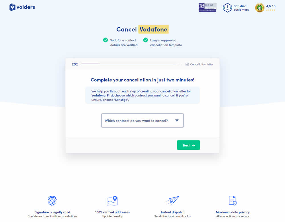
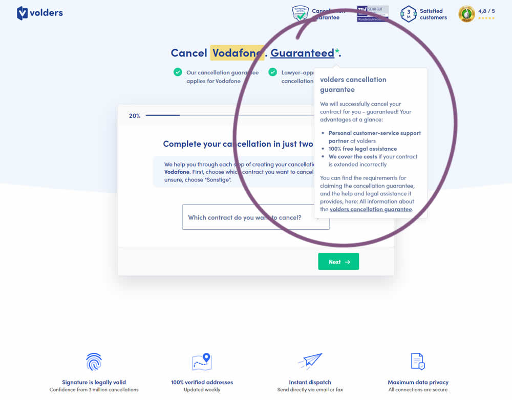
In this experiment, a cancelation guarantee was added believing it would make users feel safer while canceling their contracts with Volders (the paid service being offered). The variation appended a Guarantee in the headline as a hyperlink with an explanatory tooltip shown on hover. This variation change was added to multiple screens throughout the checkout flow (a 5 step process).
Test #456 on
Aboalarm.de
by
 Daria Kurchinskaia
Feb 23, 2023
Desktop
Mobile
Daria Kurchinskaia Tested Pattern #28: Easiest Fields First In Test #456 On Aboalarm.de
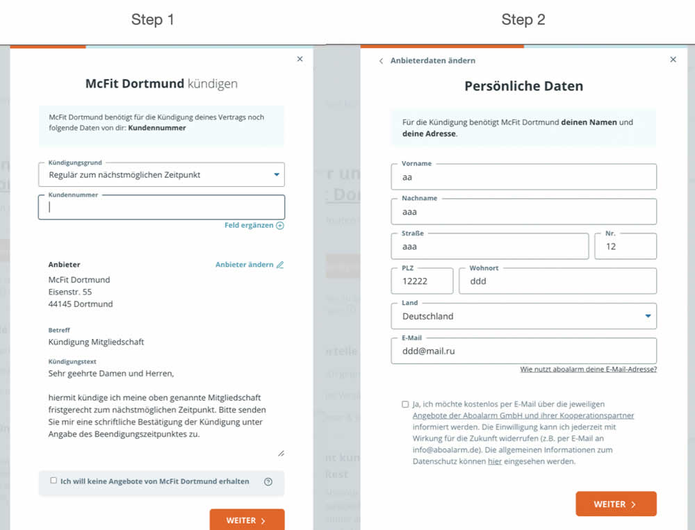
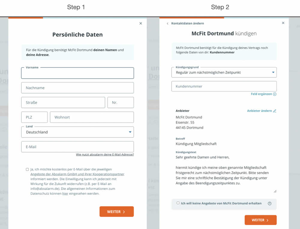
In this experiment, a more difficult step of a contract cancelation service flow was rearranged toward a later step. In the variation, the easier step (hypothetically) with personal details and address fields was placed as the first step. Whereas the step with contract or account numbers (hypothetically more difficult) were placed as the second step.
Test #452 on
Volders.de
by
 Daria Kurchinskaia
Jan 30, 2023
Desktop
Mobile
Daria Kurchinskaia Tested Pattern #62: Urgent Next Day Delivery In Test #452 On Volders.de
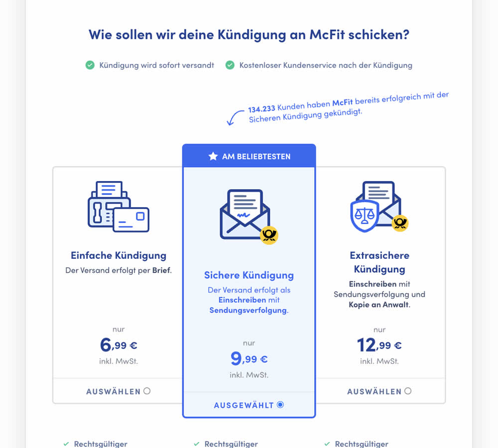
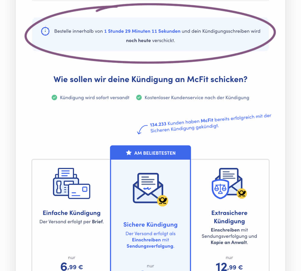
In this experiment, a count down timer was added near the top of a checkout page. The timer was only shown before 1pm and clarified that the serivce (contract cancellation) will be initiated on the same day if users act before a cut off time. Impact on completed payments was measured.
Test #442 on
Volders.de
by
 Daria Kurchinskaia
Nov 27, 2022
Desktop
Mobile
Daria Kurchinskaia Tested Pattern #4: Testimonials In Test #442 On Volders.de
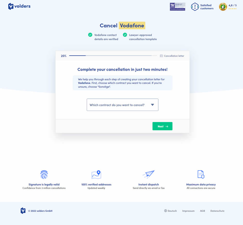
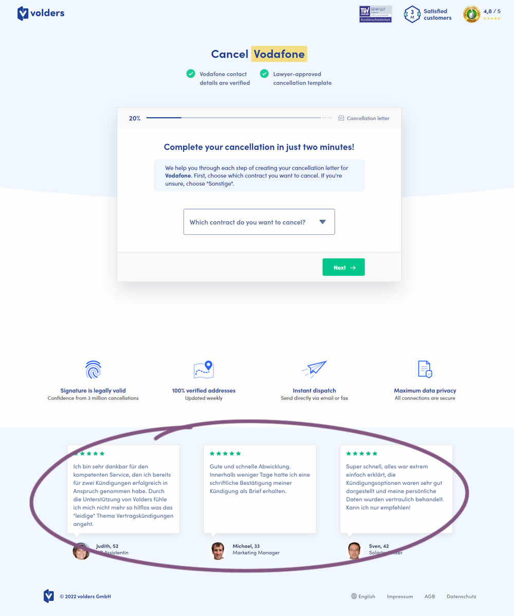
In this experiment, three testimonials were appended at the bottom of landing pages of a contract cancelation service (paid). These testimonials were also shown throughout the complete signup funnel (4 more steps). Impact on progression (step 2) and final completed purchases were measured.
Test #443 on
Volders.de
by
 Daria Kurchinskaia
Nov 27, 2022
Desktop
Mobile
Daria Kurchinskaia Tested Pattern #4: Testimonials In Test #443 On Volders.de

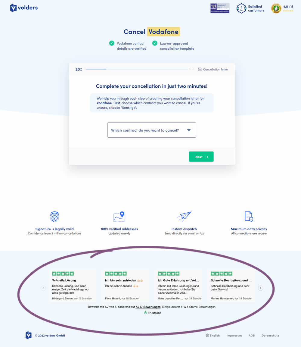
In this experiment, four TrustPilot reviews were appended at the bottom of landing pages of a contract cancelation service (paid). These reviews were also shown throughout the complete signup funnel (4 more steps). Impact on progression (step 2) and final completed purchases were measured.
Test #435 on
Volders.de
by
 Daria Kurchinskaia
Oct 17, 2022
Desktop
Mobile
Daria Kurchinskaia Tested Pattern #9: Multiple Steps In Test #435 On Volders.de
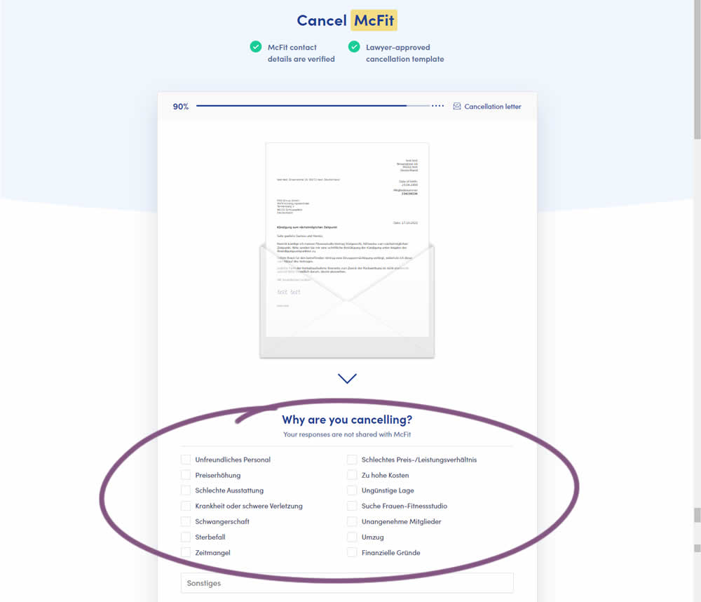
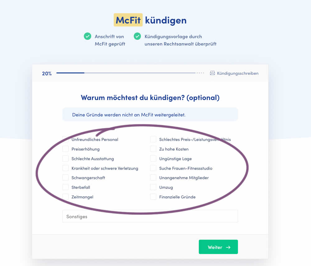
In this experiment, a question about a customer's reason for purchase was broken out into a separate step and moved earlier in the process. In the control, this question was asked in the final checkout step along with a plan selection (Step 4 of 4). In the variation, this question was shifted as a standalone first step (Step 1 of 5). Impact on completed purchases was measured (for a contract cancellation service in this case).
Test #431 on
Volders.de
by
 Daria Kurchinskaia
Sep 23, 2022
Desktop
Mobile
Daria Kurchinskaia Tested Pattern #21: What It's Worth In Test #431 On Volders.de
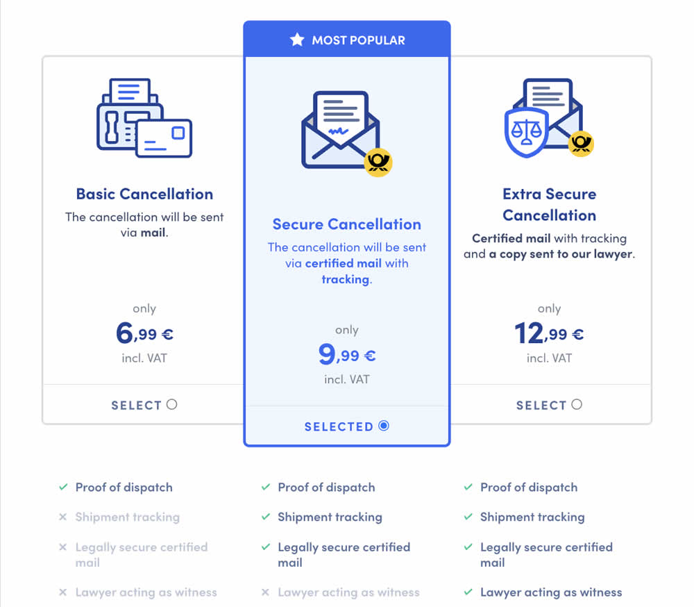
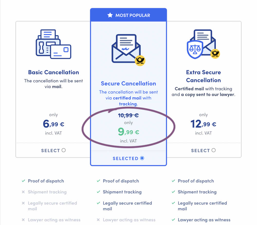
In this experiment, a historically higher price point was added as a crossed out anchor. The control only showed the current price. The variation showed the current price with the higher price crossed out. Impact on sales was measured.
Test #428 on
Volders.de
by
 Daria Kurchinskaia
Aug 16, 2022
Desktop
Mobile
Daria Kurchinskaia Tested Pattern #26: Cart Reminder And Recently Viewed In Test #428 On Volders.de
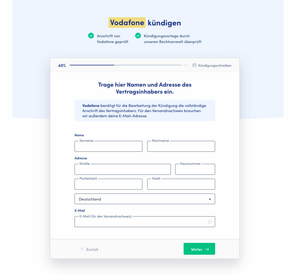
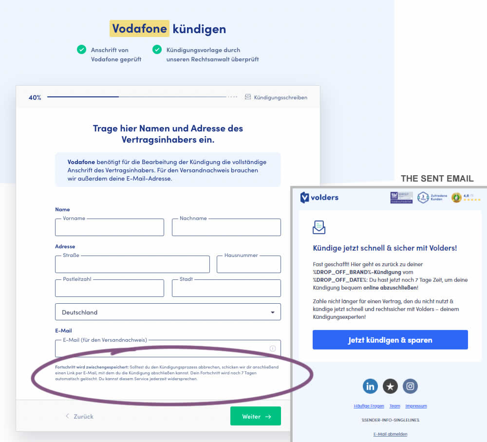
In this test 1) a passive hint communicated to users that their data will be saved for 7 days for them to be able to continue their cancellation later and 2) dropped off users were targeted with an email campaign within the first 4 hours after drop off. The reminder email linked users to a shipping page (checkout page) without them requiring to fill out their personal, contract information one more time.
Test #422 on
Volders.de
by
 Daria Kurchinskaia
Jul 22, 2022
Desktop
Mobile
Daria Kurchinskaia Tested Pattern #3: Fewer Form Fields In Test #422 On Volders.de
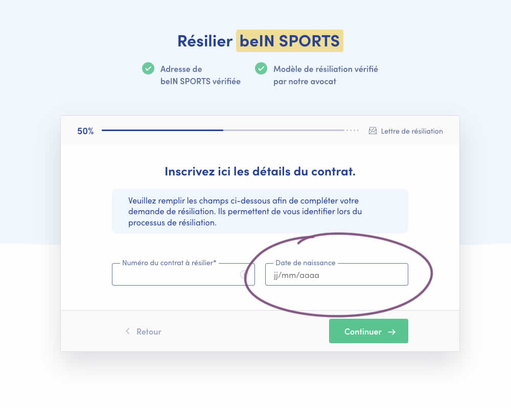
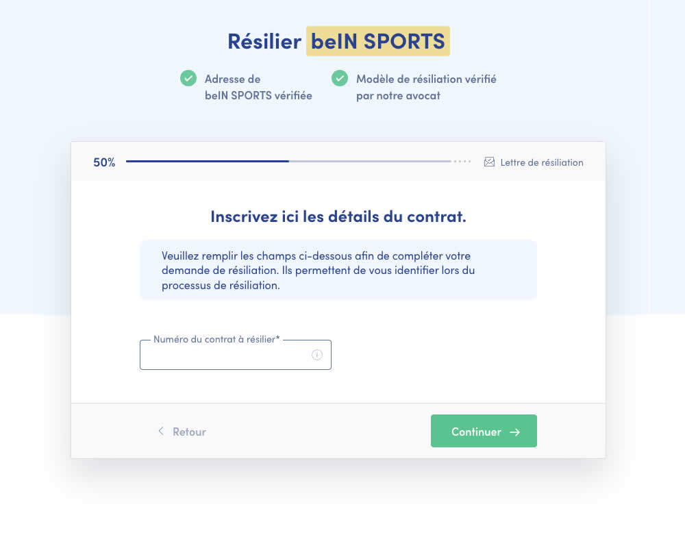
A birthdate field was removed during a signup process for a paid contract cancellation service. Impact on progression (next step) and sales (completed transactions) was measured.