7 Tests By  Someone
Tests
Test #61 on
by
 Someone
Jun 26, 2020
Desktop
Someone Tested Pattern #9: Multiple Steps In Test #61
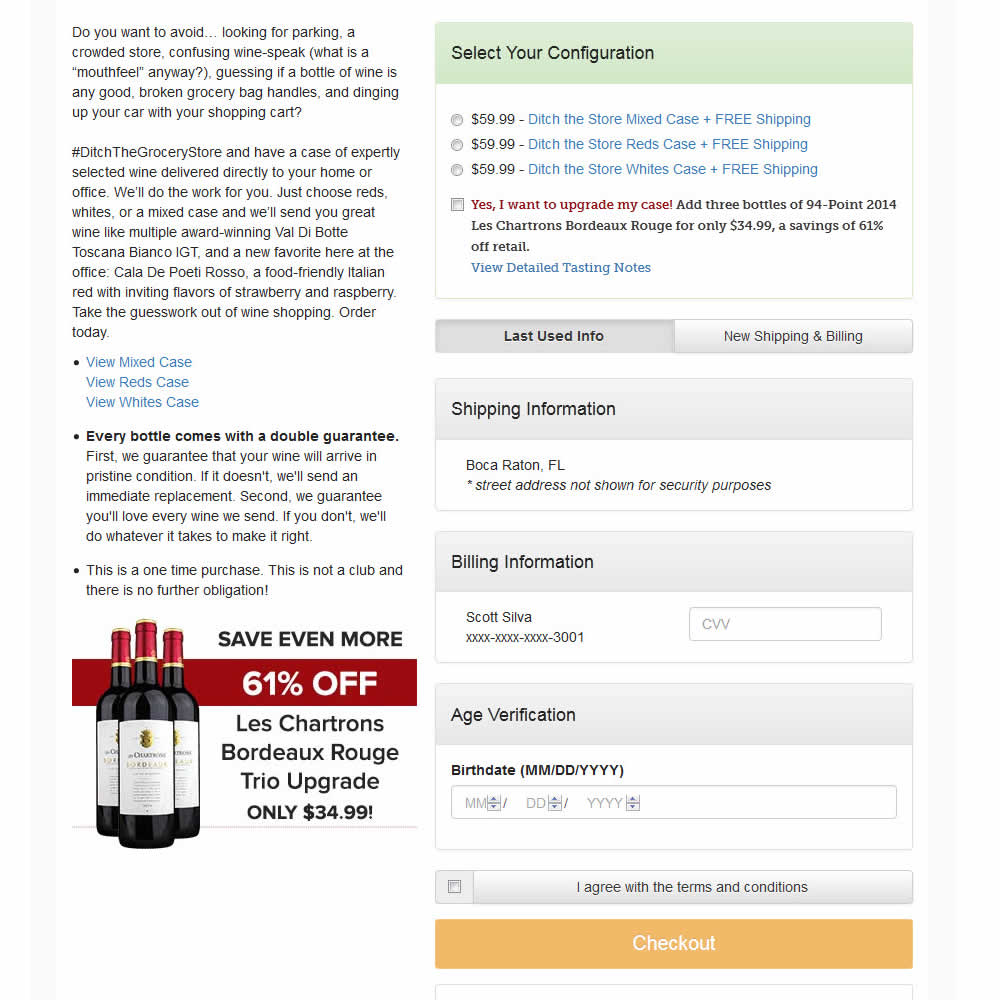
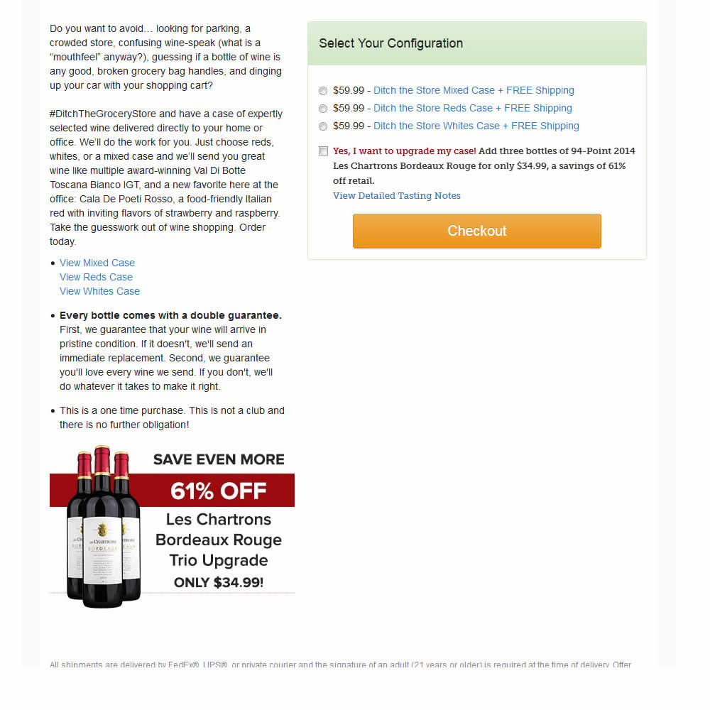
In this experiment, a single screen checkout was turned into a series of smaller steps in variation B. This was achieved by showing fewer fields on the first step, and shifting the remaining ones into a 3 step modal popup. The experiment measured successful transactions (sales).
Test #278 on
by
 Someone
Jan 15, 2020
Mobile
Someone Tested Pattern #64: Tunnel In Test #278
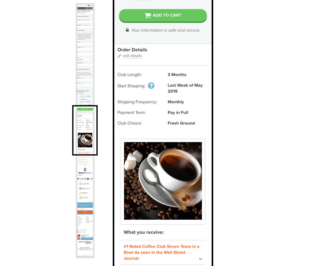
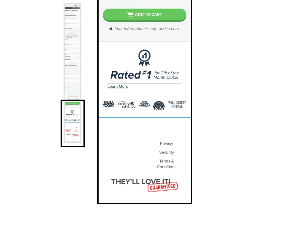
In this experiment, multiple elemenets were removed from the bottom of the cart page. This was done to see if they were potential distractions that hindered the purchase process. The elements included such things as: Order details (visible on other pages), large product photo, a "what you receive" section with selling points, more reassurances, and a newsletter subscribe box.
Test #274 on
by
 Someone
Dec 16, 2019
Desktop
Mobile
Someone Tested Pattern #1: Remove Coupon Fields In Test #274
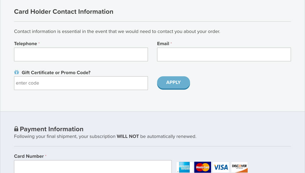
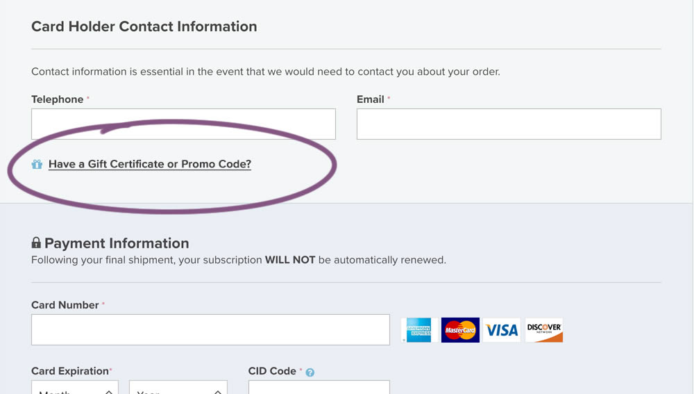
In this experiment, a fully visible coupon field (A) was made less visible by turning it into a default collaped link (B). Clicking on the link caused the coupon field to appear.
Test #266 on
by
 Someone
Oct 25, 2019
Desktop
Mobile
Someone Tested Pattern #4: Testimonials In Test #266
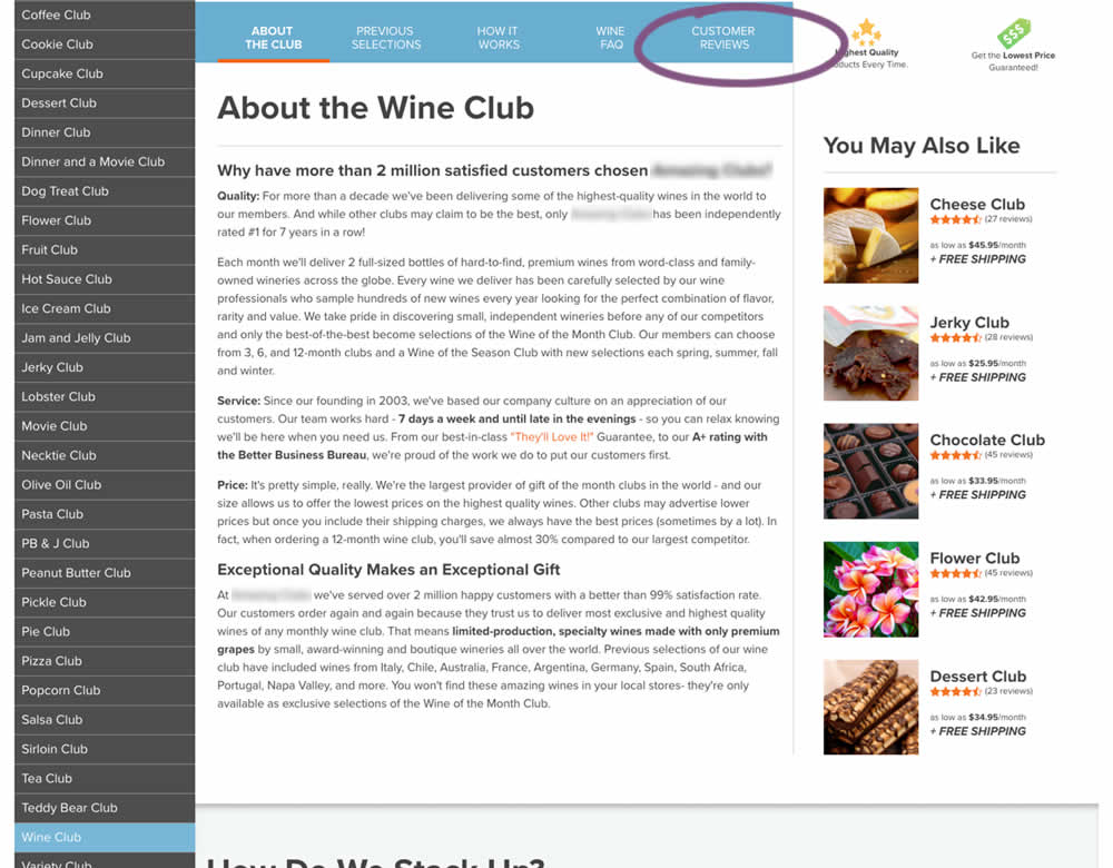
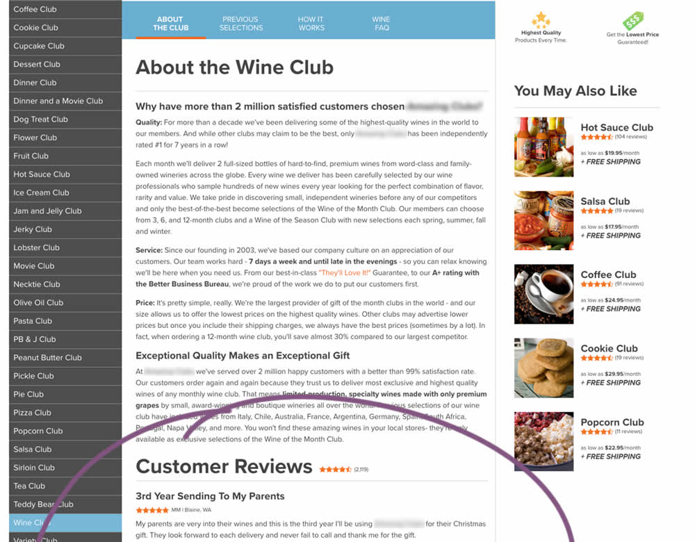
In this experiment, a product page showed customer reviews at the bottom of the page (B) instead of hiding them under a tab (A).
Test #35 on
by
 Someone
Apr 01, 2016
Desktop
Mobile
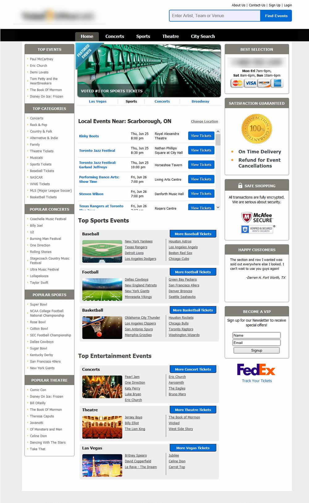
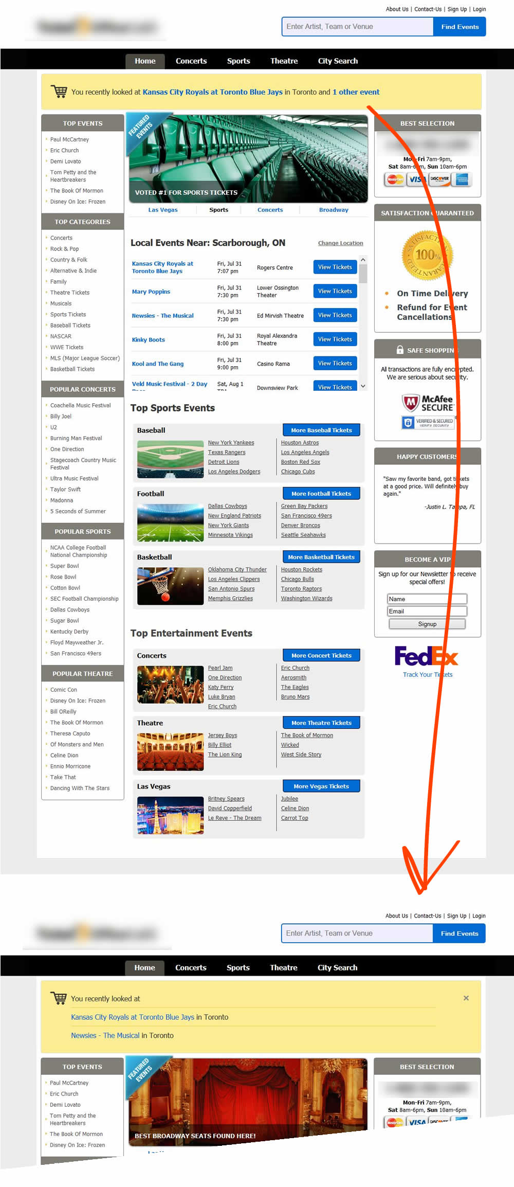
Someone Tested Pattern #26: Cart Reminder And Recently Viewed In Test #35
Test #53 on
by
 Someone
Aug 01, 2015
Desktop
Someone Tested Pattern #6: Customer Star Ratings In Test #53

