8 Tests By  Vito Mediavilla
Tests
Test #244 on
Mt.com
by
 Vito Mediavilla
Jun 06, 2019
Desktop
Vito Mediavilla Tested Pattern #49: Above The Fold Call To Action In Test #244 On Mt.com


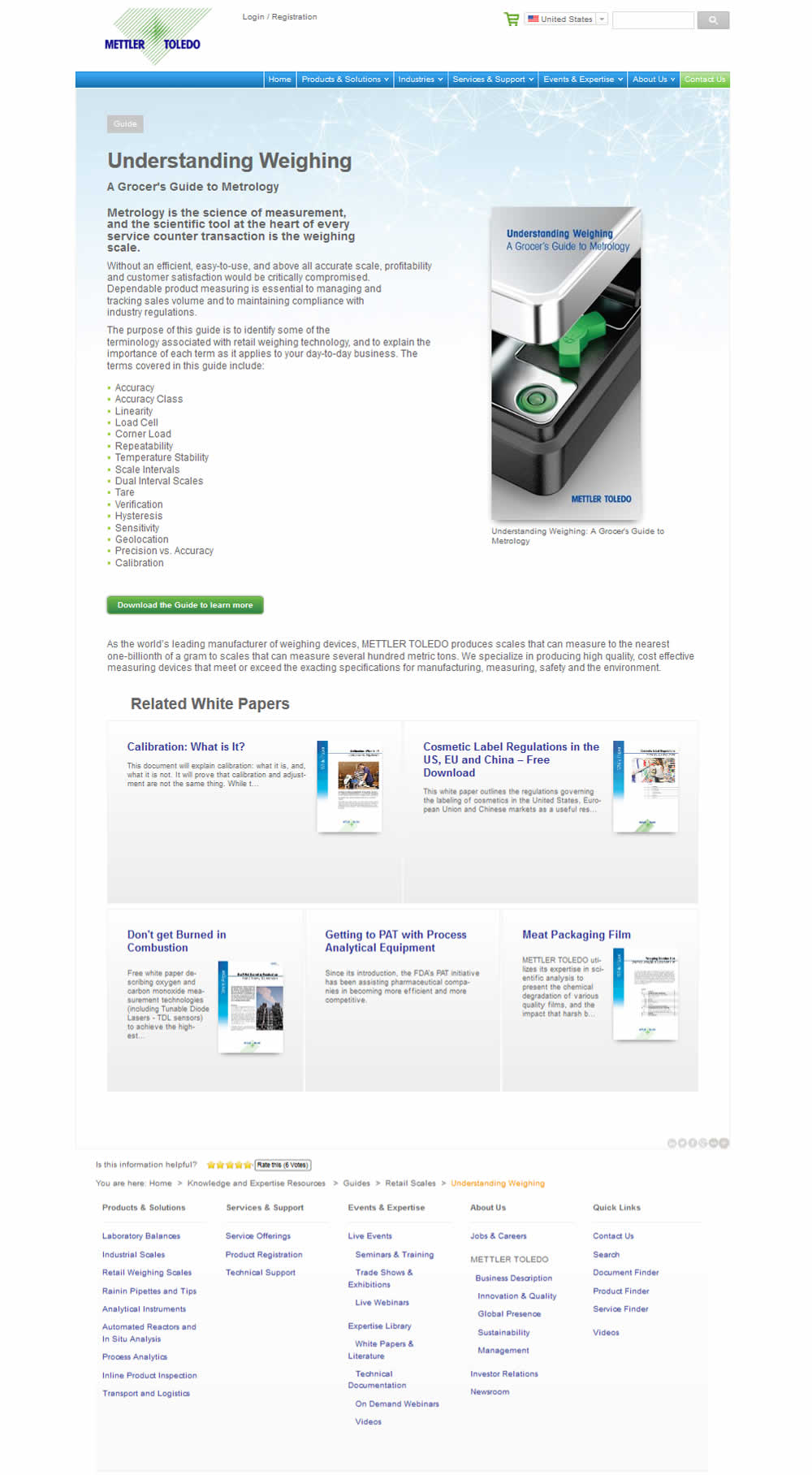
A product landing page with an image was tested against one without - raising the call to action above the fold.
Test #219 on
Mt.com
by
 Vito Mediavilla
Jan 14, 2019
Desktop
Mobile
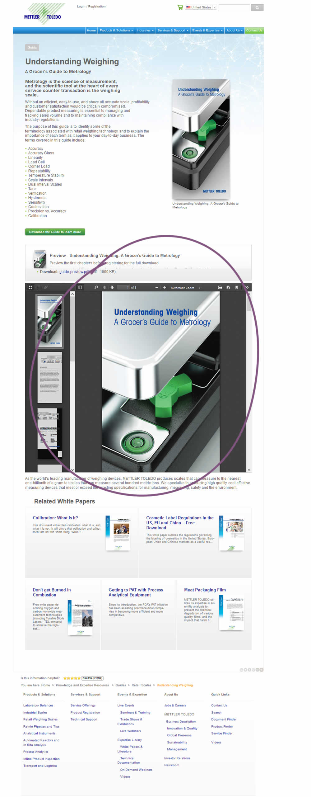
Vito Mediavilla Tested Pattern #95: Clickable Product Previews In Test #219 On Mt.com
Test #212 on
Mt.com
by
 Vito Mediavilla
Dec 04, 2018
Desktop
Mobile
Vito Mediavilla Tested Pattern #60: Repeated Bottom Call To Action In Test #212 On Mt.com

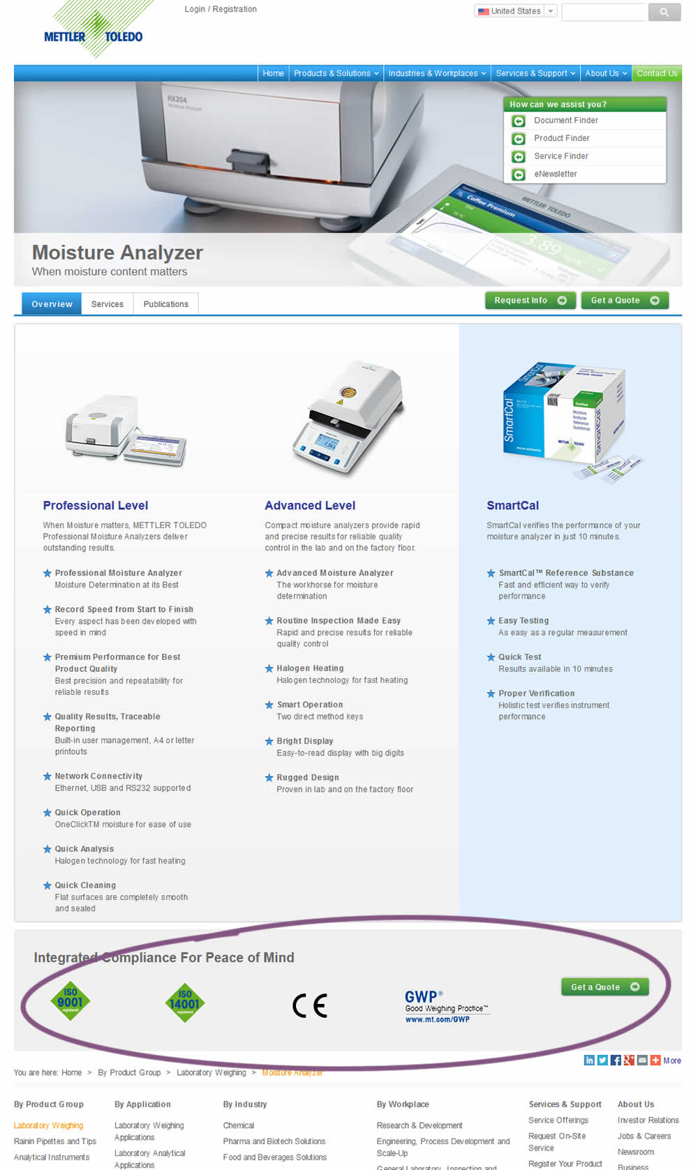
In this experiment, a call to action was repeated at the bottom of the product page. Additional certification icons were also added for additional reassurance.
Test #213 on
Mt.com
by
 Vito Mediavilla
Dec 04, 2018
Desktop
Mobile
Vito Mediavilla Tested Pattern #85: Benefit Button In Test #213 On Mt.com
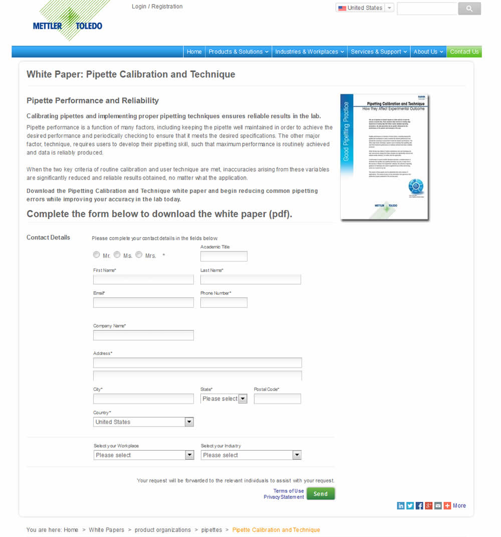
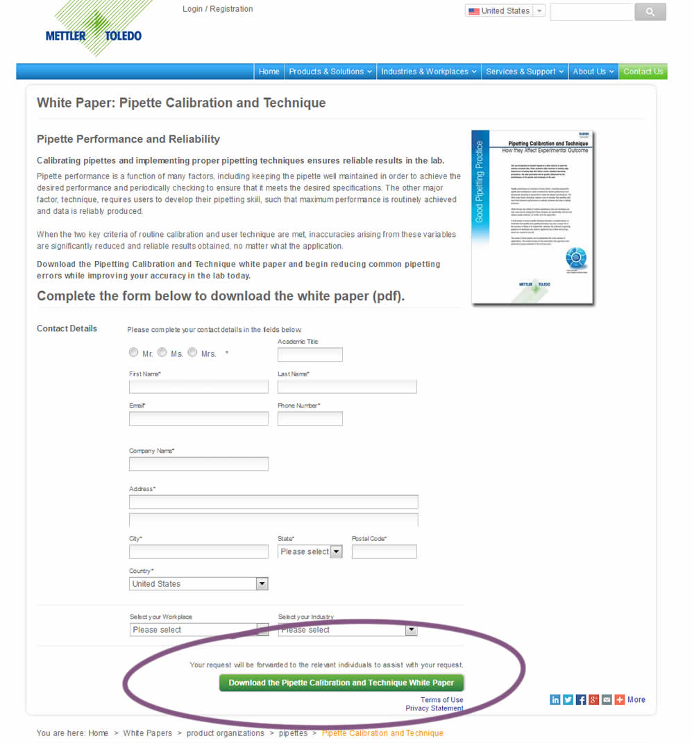
In this variation, a longer button label with a clearer benefit was tested against a shorter one.
Test #169 on
Mt.com
by
 Vito Mediavilla
Apr 24, 2018
Desktop
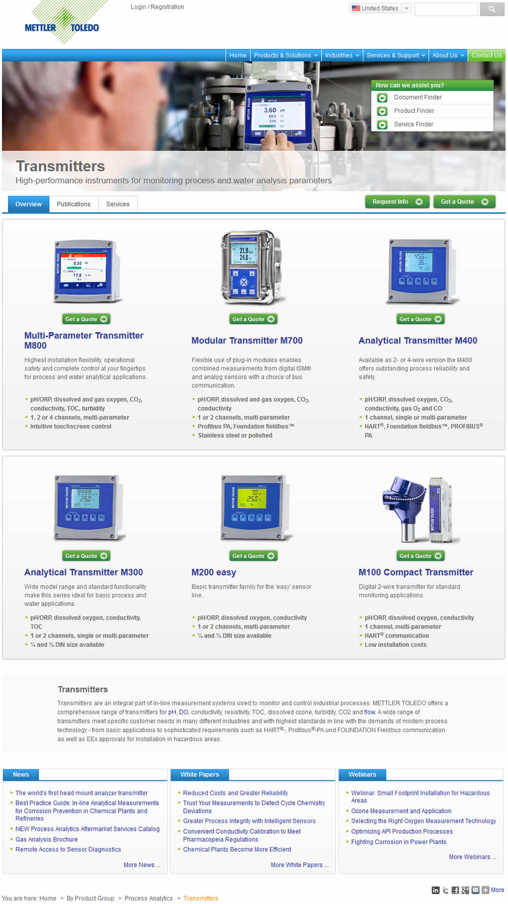
Vito Mediavilla Tested Pattern #37: List Or Grid View In Test #169 On Mt.com
Test #156 on
Mt.com
by
 Vito Mediavilla
Feb 25, 2018
Desktop
Vito Mediavilla Tested Pattern #60: Repeated Bottom Call To Action In Test #156 On Mt.com
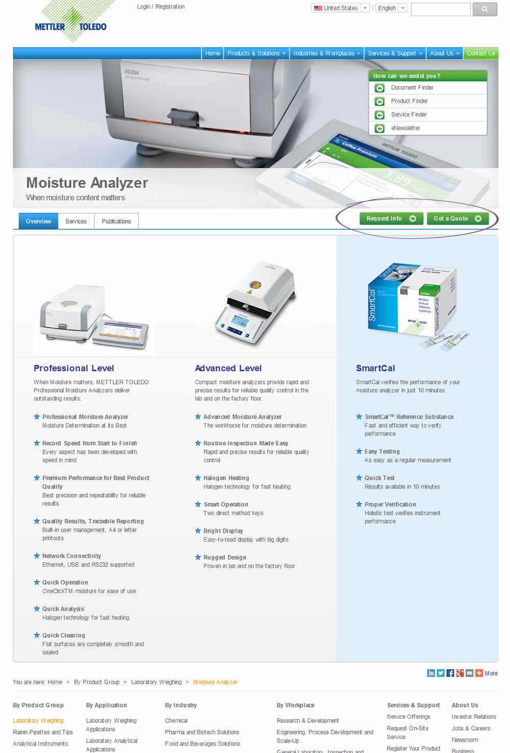
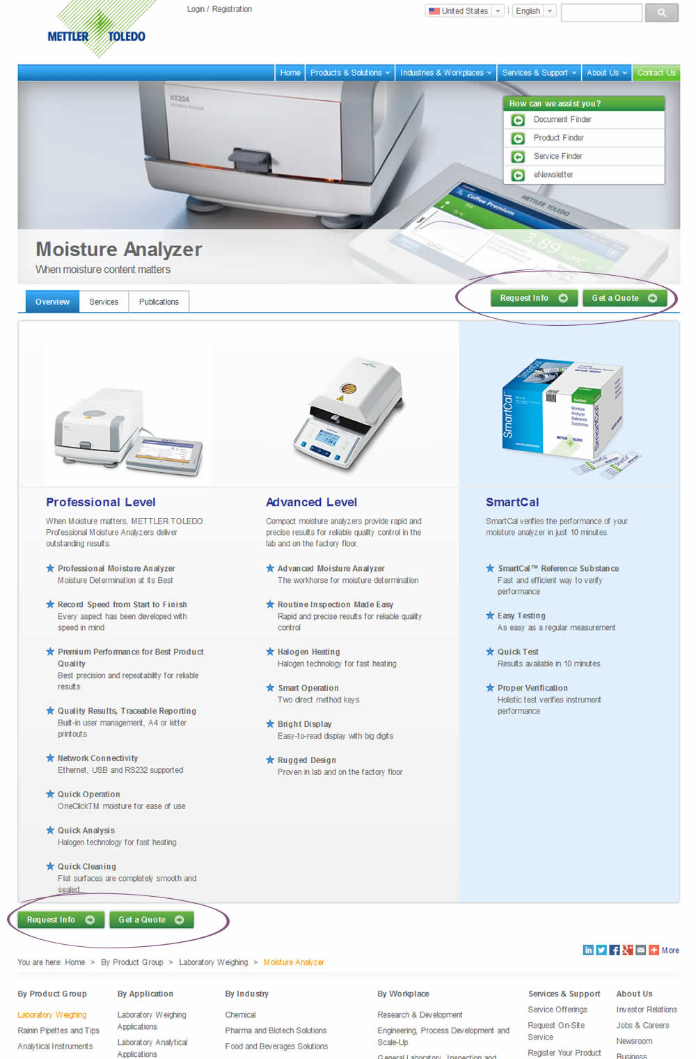
This test duplicated two buttons at the bottom of the page. However, the site already contained floating buttons (from the header).
Test #155 on
Mt.com
by
 Vito Mediavilla
Feb 22, 2018
Mobile
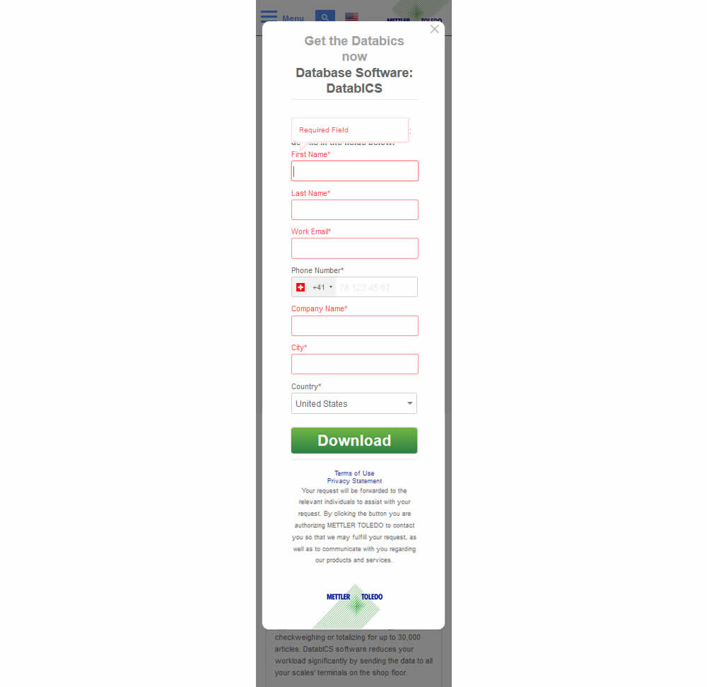
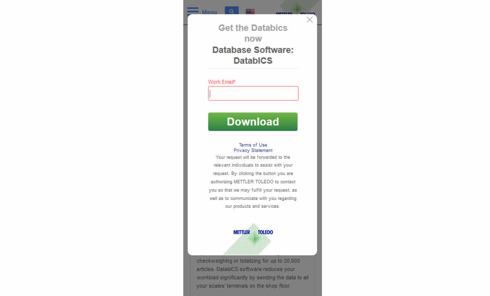
Vito Mediavilla Tested Pattern #3: Fewer Form Fields In Test #155 On Mt.com
Test #38 on
Mt.com
by
 Vito Mediavilla
May 01, 2016
Desktop
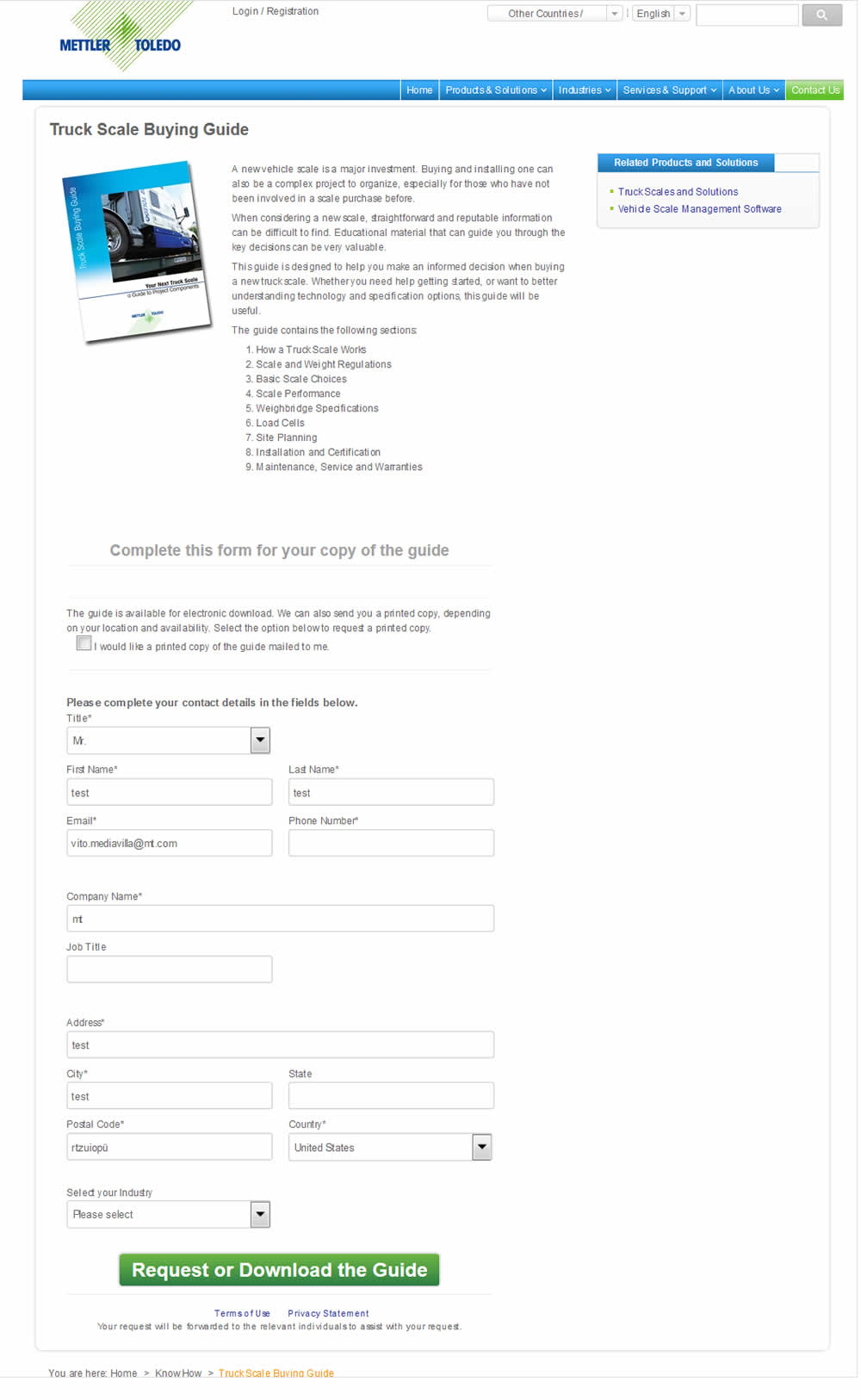
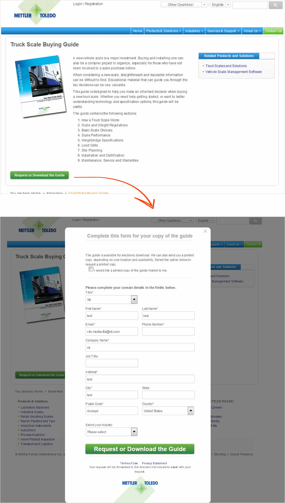
Vito Mediavilla Tested Pattern #10: Postponed Modal Forms In Test #38 On Mt.com
