All Latest 582 A/B Tests
Become a member to unlock the abiltiy to see the highest impact a/b tests. Being able to see the actual test results and sort by impact allows growth and experimentation teams to take action on the biggest gains first
MOST RECENT TESTS
Test #337 on
Backstage.com
by
 Stanley Zuo
Jan 28, 2021
Desktop
Mobile
Listing
Stanley Zuo Tested Pattern #51: Shortcut Buttons In Test #337 On Backstage.com
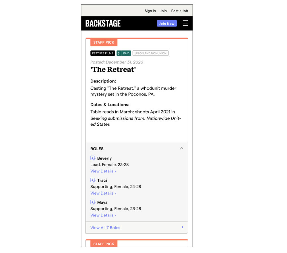
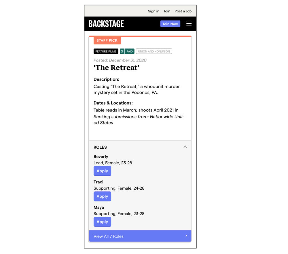
In this experiment, a listing page was expanded to show two actions (apply and view details) instead of a single one (view details only). In the variant, the "view detail" links were replaced with "apply links" starting a job application (and membership flows) sooner.
Test #335 on
by
 Jakub Linowski
Jan 27, 2021
Desktop
Mobile
Home & Landing
Jakub Linowski Tested Pattern #32: Condensed List In Test #335
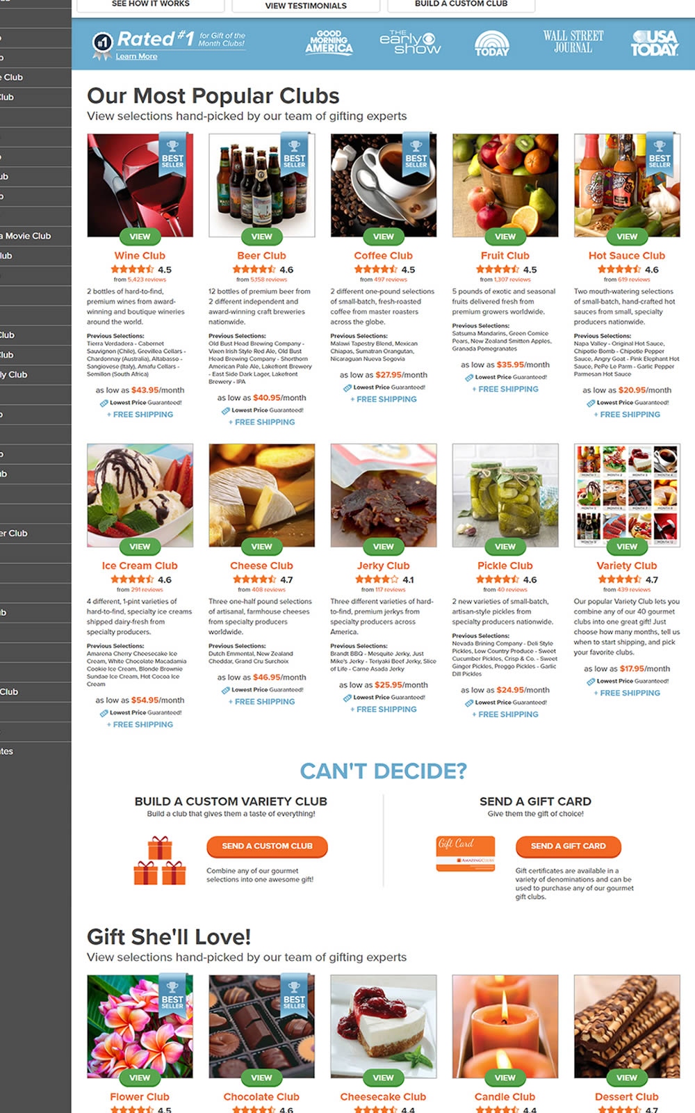
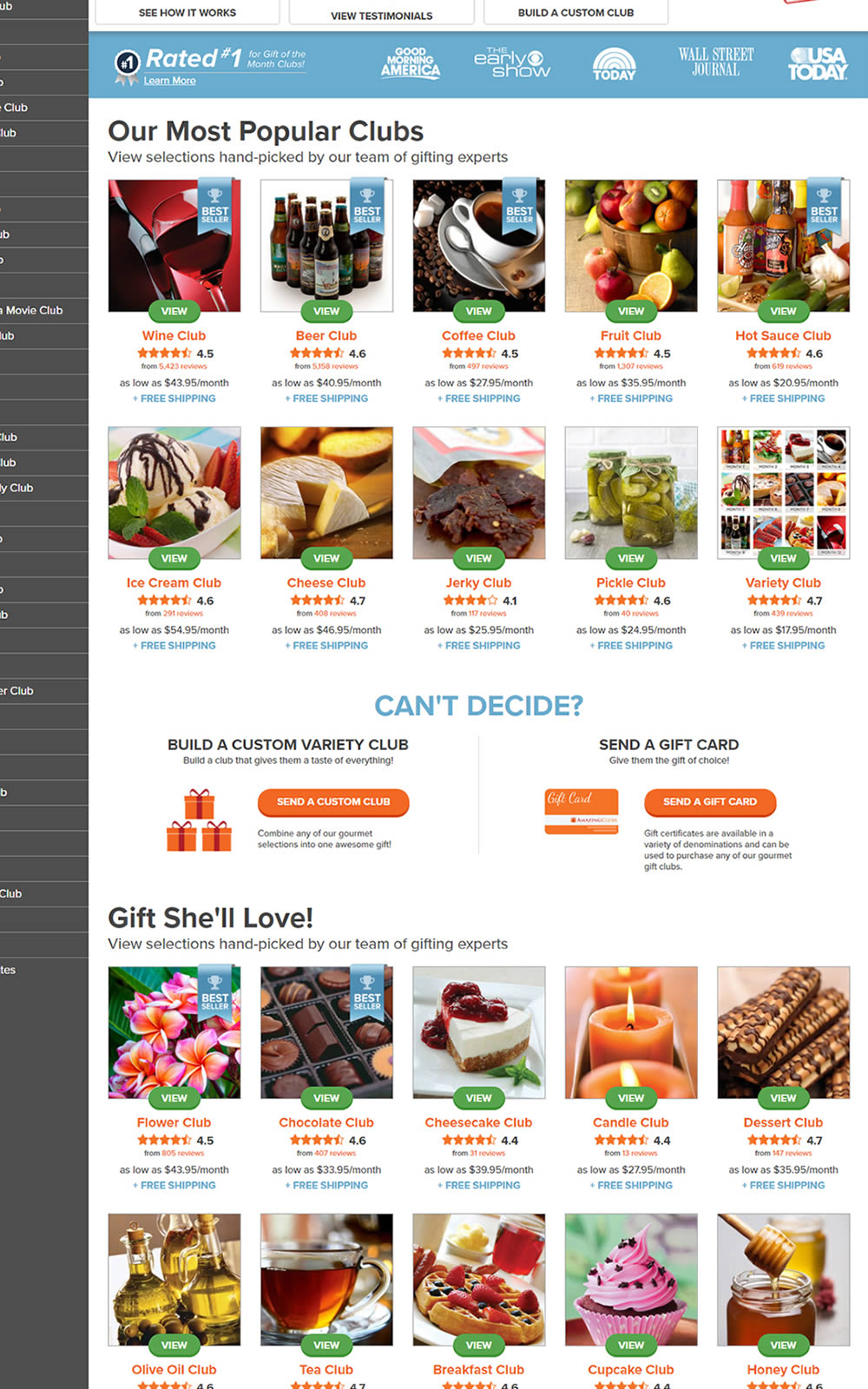
The variation here has more condensed product tiles being shown on a homepage. Two pieces of information were removed: product descriptions and past selections. Impact on product page visits and total sales was measured.
Test #334 on
Thomasnet.com
by
 Kyle Phillips
Jan 25, 2021
Desktop
Mobile
Global
Kyle Phillips Tested Pattern #2: Icon Labels In Test #334 On Thomasnet.com


This experiment measured the impact of adding text labels to three icon-only nav items.
Test #333 on
Expertinstitute.com
by
 Ardit Veliu
Dec 31, 2020
Desktop
Mobile
Home & Landing
Ardit Veliu Tested Pattern #11: Gradual Reassurance In Test #333 On Expertinstitute.com


In this experiment, the variation broke up a lead form into two parts. In the first step users were asked for their state followed by a standard contact form on a second step. All of the states were shown as selectable options. In the control version, the landing page only showed a button which lead to the full form. The experiment measured impact on lead form submissions.
Test #331 on
by
 Jakub Linowski
Dec 30, 2020
Desktop
Mobile
Product
Jakub Linowski Tested Pattern #121: Free Shipping In Test #331

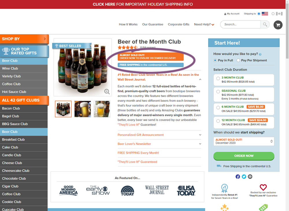
In this little experiment, an extra "Free Shipping" message was added on a product page. It's prominence was increased by using white copy on a darker blue background. Impact on adds-to-cart and total sales was measured.
Test #332 on
by
 Jakub Linowski
Dec 30, 2020
Desktop
Mobile
Product
Jakub Linowski Tested Pattern #121: Free Shipping In Test #332
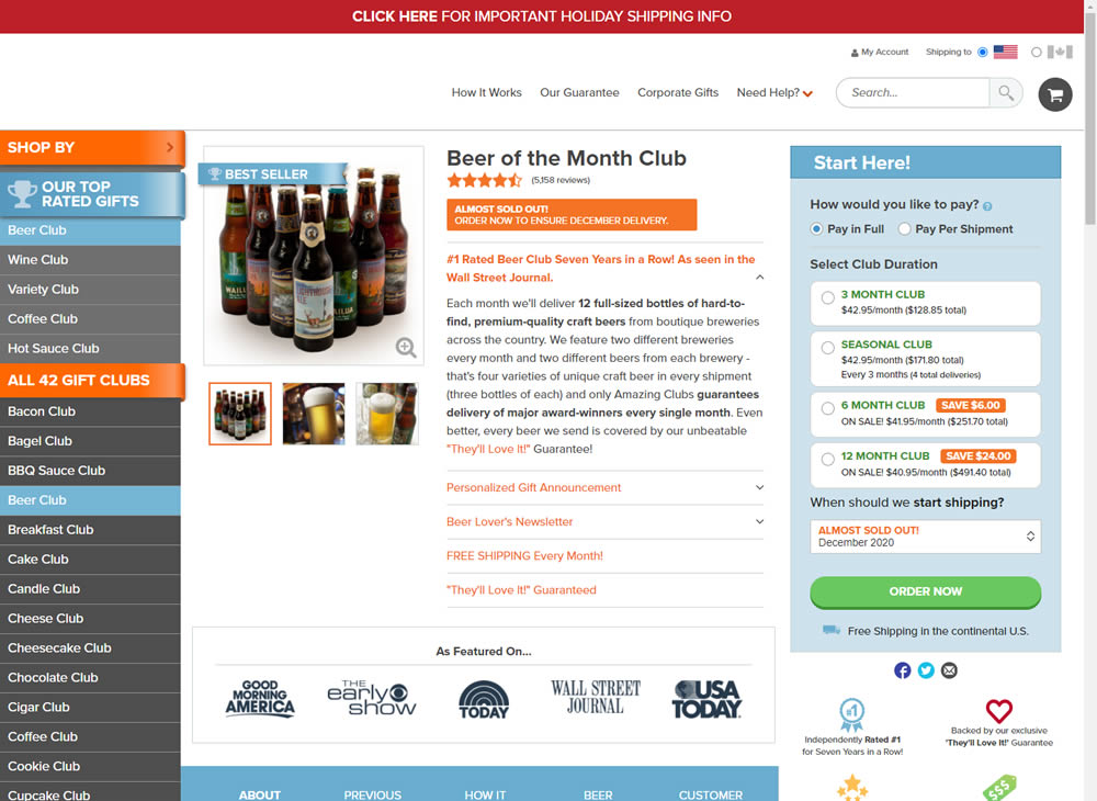
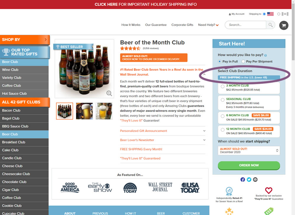
In this experiment, an extra "Free Shipping" message was added on a product page - at the top of the buy box with an add-to-cart call to action. It's prominence was increased by using white copy on a darker blue background. Impact on adds-to-cart and total sales was measured.
Test #330 on
Backstage.com
by
 Stanley Zuo
Dec 29, 2020
Desktop
Content
Stanley Zuo Tested Pattern #116: Links Or Buttons In Test #330 On Backstage.com
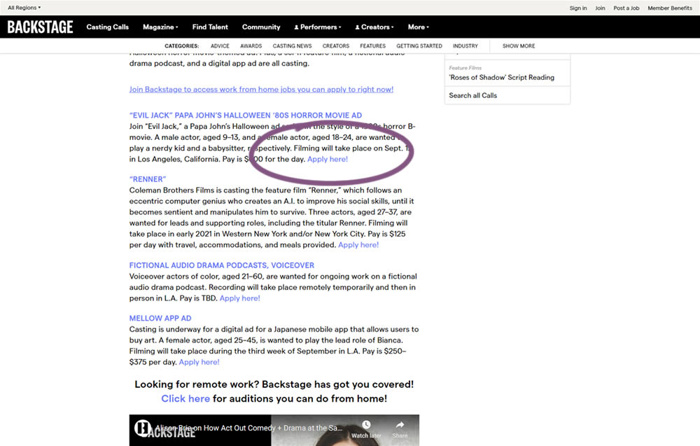
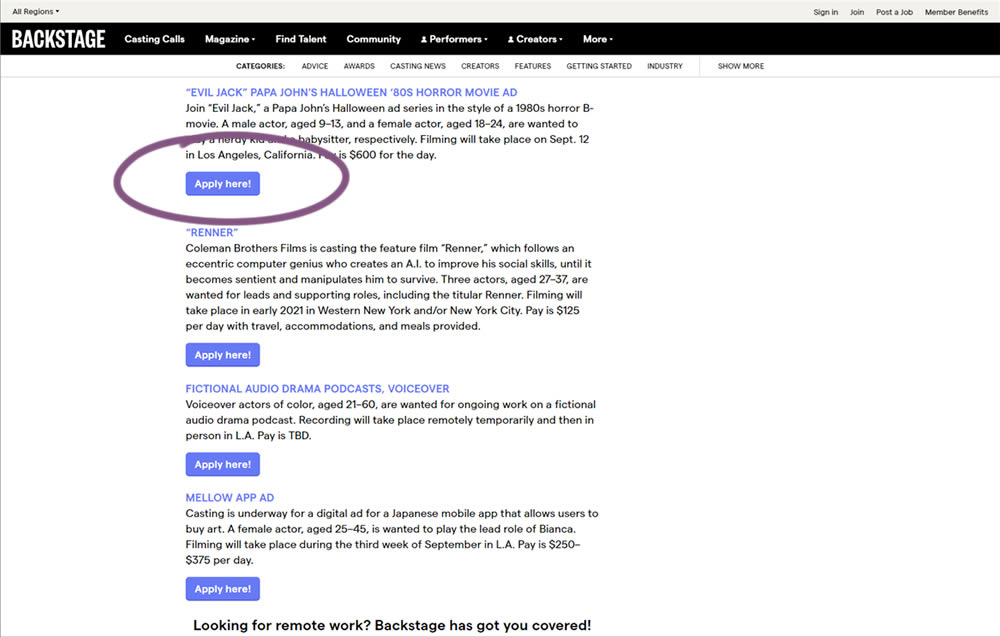
In this simple experiment on a content page, links were turned into more prominent buttons. The experiment measured clicks and signups.
Test #329 on
Snocks.com
by
 Samuel Hess
Dec 23, 2020
Mobile
Home & Landing
Samuel Hess Tested Pattern #14: Exposed Menu Options In Test #329 On Snocks.com
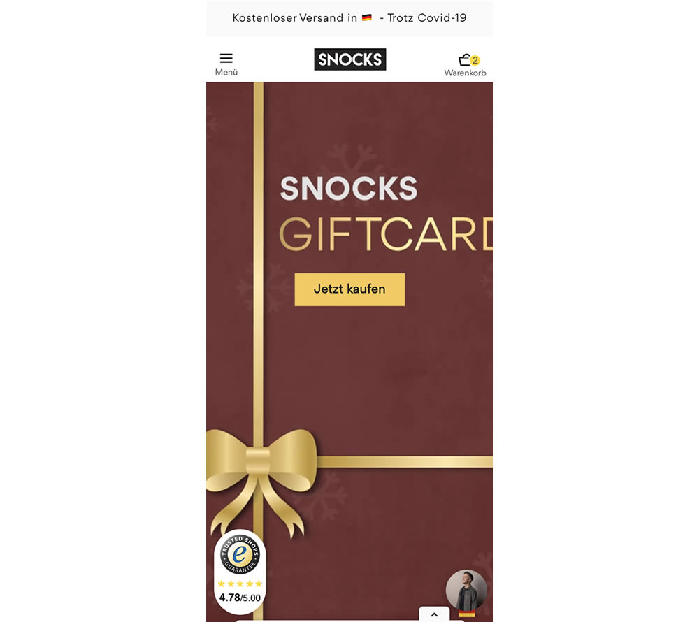
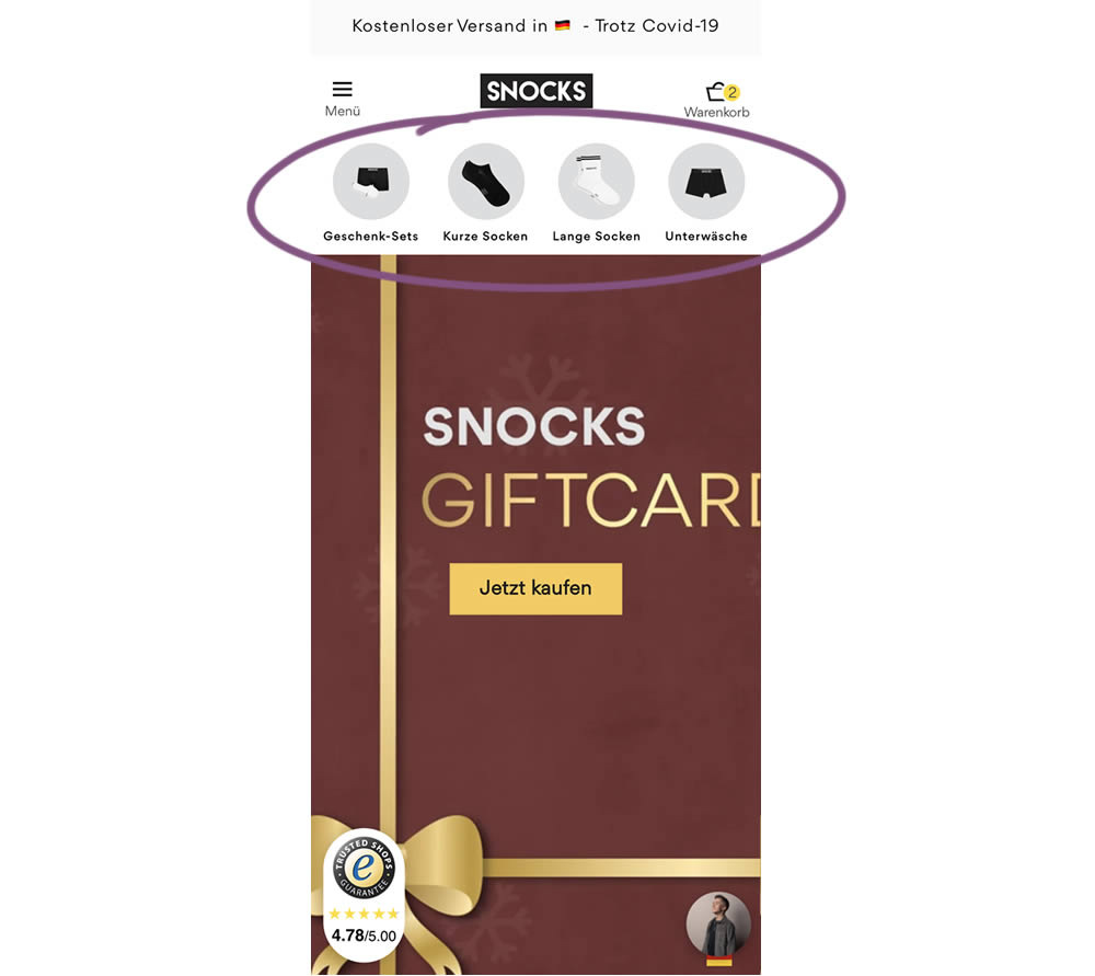
In this homepage experiment, a series of product categories were shown more visible near the top of the screen (instead of only being shown inside the hamburger menu). They linked up to corresponding listing pages with such items as: gifts, short socks, long socks, and underwear. Impact on adds-to-cart and total sales was measured.
Test #328 on
Umbraco.com
by
 Lars Skjold Iversen
Dec 21, 2020
Desktop
Mobile
Home & Landing
Lars Skjold Iversen Tested Pattern #60: Repeated Bottom Call To Action In Test #328 On Umbraco.com
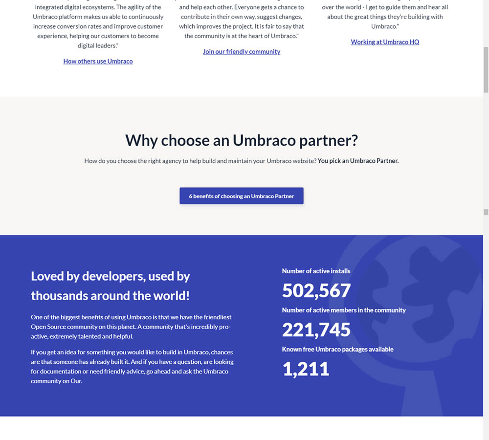
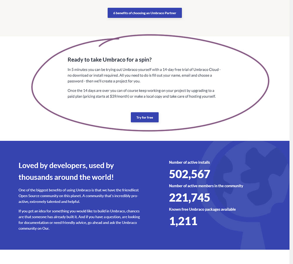
In this experiment, a trial signup section was added at the bottom of Umbraco's long homepage (CMS business). The experiment measured the impact on trial signups.
Test #98 on
3dhubs.com
by
 Rob Draaijer
Nov 30, 2020
Desktop
Mobile
Listing
Rob Draaijer Tested Pattern #24: Visible Availability In Test #98 On 3dhubs.com
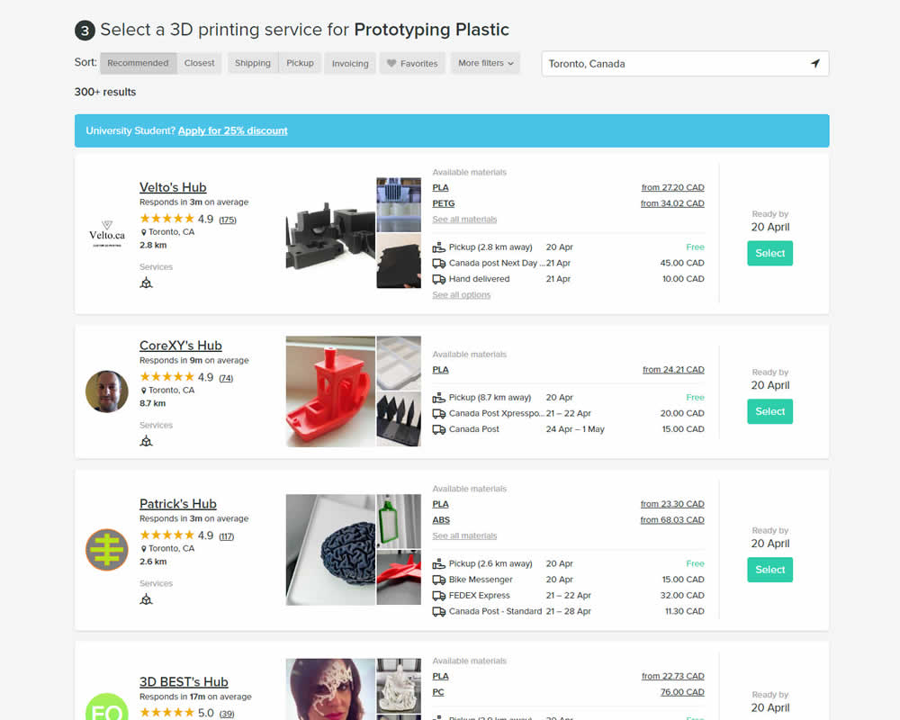
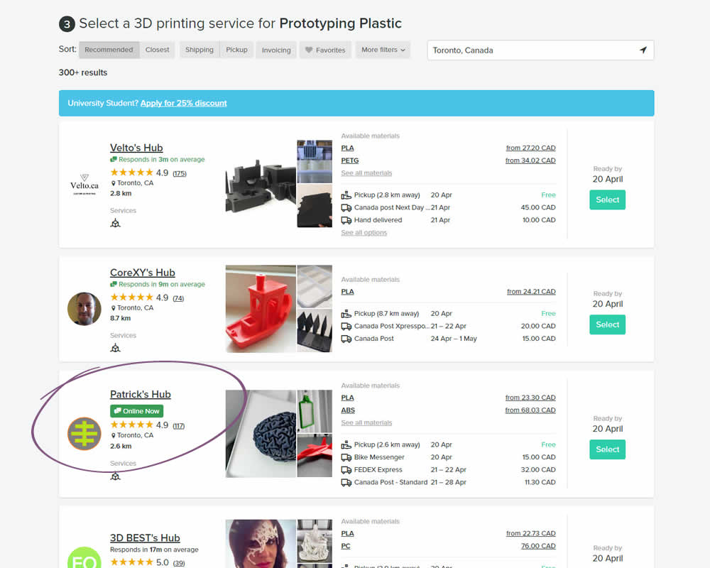
In this experiment, the variation showed a listing's owner online status as a badge, instead of showing their average "response time". More specifically, an "Online Now" badge was shown beside individual listings of a 3D printing marketplace site. The experiment measured completed quote / lead requests (a few steps further).
Test #10 on
Tradegecko.com
by
 Syed AtiF Husain
Nov 30, 2020
Desktop
Home & Landing
Syed AtiF Husain Tested Pattern #10: Postponed Modal Forms In Test #10 On Tradegecko.com


In this experiment, 3 form fields were removed (postponed to a next step) from the homepage leaving only a "Start Trail" button. When users clicked on the "Start A Free 14 Day Trial" button, in both the control and variation they've seen the same next registration page with all of the fields. The registration page repeated the same fields with their corresponding values, as well as asked for a password as an extra field. The experiment measured successful leads.
Test #327 on
Backstage.com
by
 Stanley Zuo
Nov 26, 2020
Desktop
Signup
Stanley Zuo Tested Pattern #120: Supporting Theme Images In Test #327 On Backstage.com
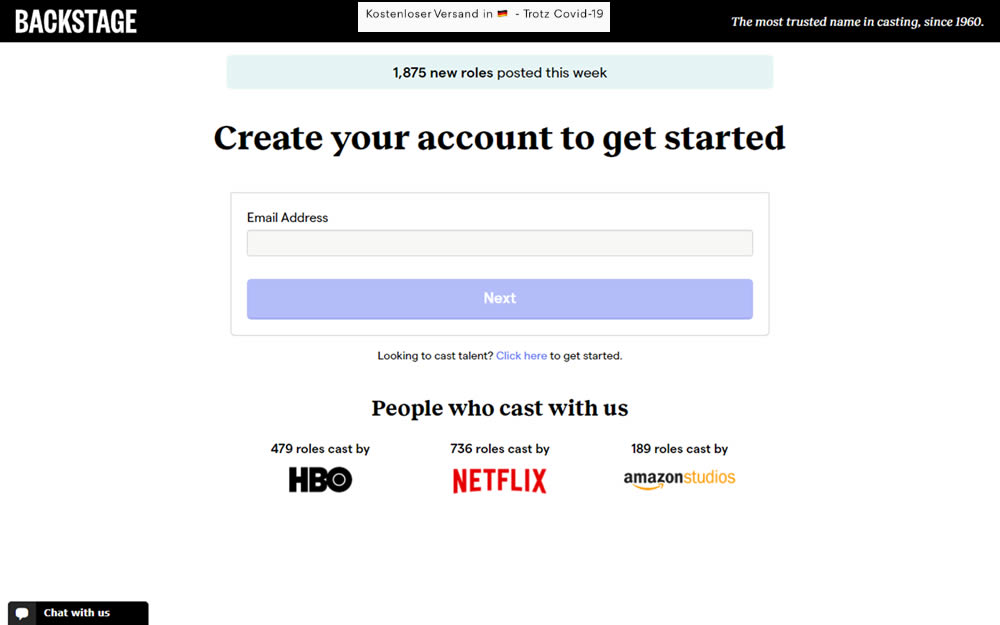
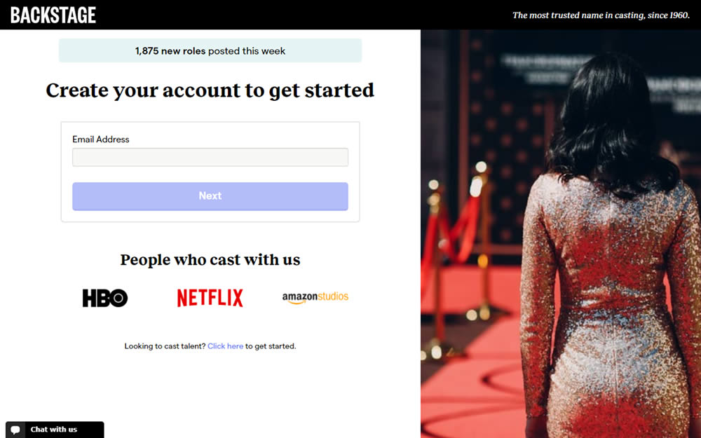
In this experiment, an aspirational photo was shown on the right side panel - reinforcing the theme of casting calls. The experiment measured progression to the next step and completed signups.
Test #326 on
Thomasnet.com
by
 Kyle Phillips
Nov 25, 2020
Desktop
Mobile
Content
Kyle Phillips Tested Pattern #41: Sticky Call To Action In Test #326 On Thomasnet.com


In this simple experiment on an article page, the variation slid out a sticky call to action linking to the next article. The sliding interaction triggered after some scrolling threshold (around 1000px or so). Afterwards, the sticky call to action maintained its floating position. The experiment measured clicks on this "next article" button.
Test #325 on
Snocks.com
by
 Samuel Hess
Nov 24, 2020
Desktop
Global
Samuel Hess Tested Pattern #45: Benefit Bar In Test #325 On Snocks.com
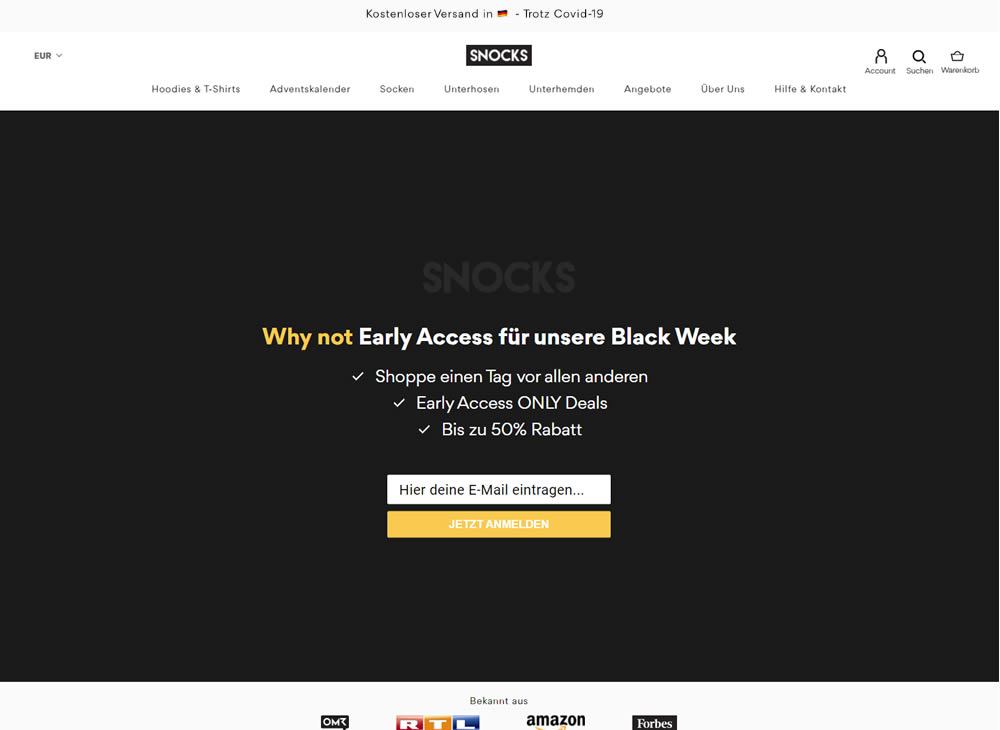
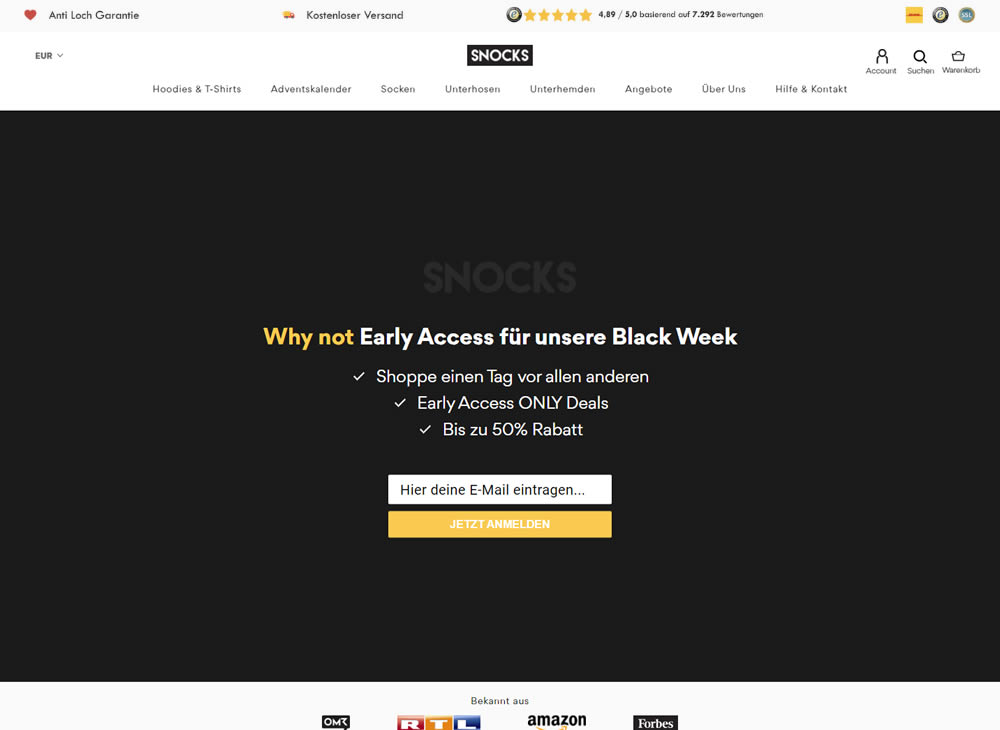
In this experiment, a set of reassurances and reviews were added in the header of this ecommerce website. Translating from German, these read: "Anti Hole Guarantee", "Free Shipping" and "X Ratings out of Y Reviews".
Test #324 on
by
 Jakub Linowski
Oct 30, 2020
Desktop
Mobile
Product
Jakub Linowski Tested Pattern #17: Least Or Most Expensive First In Test #324
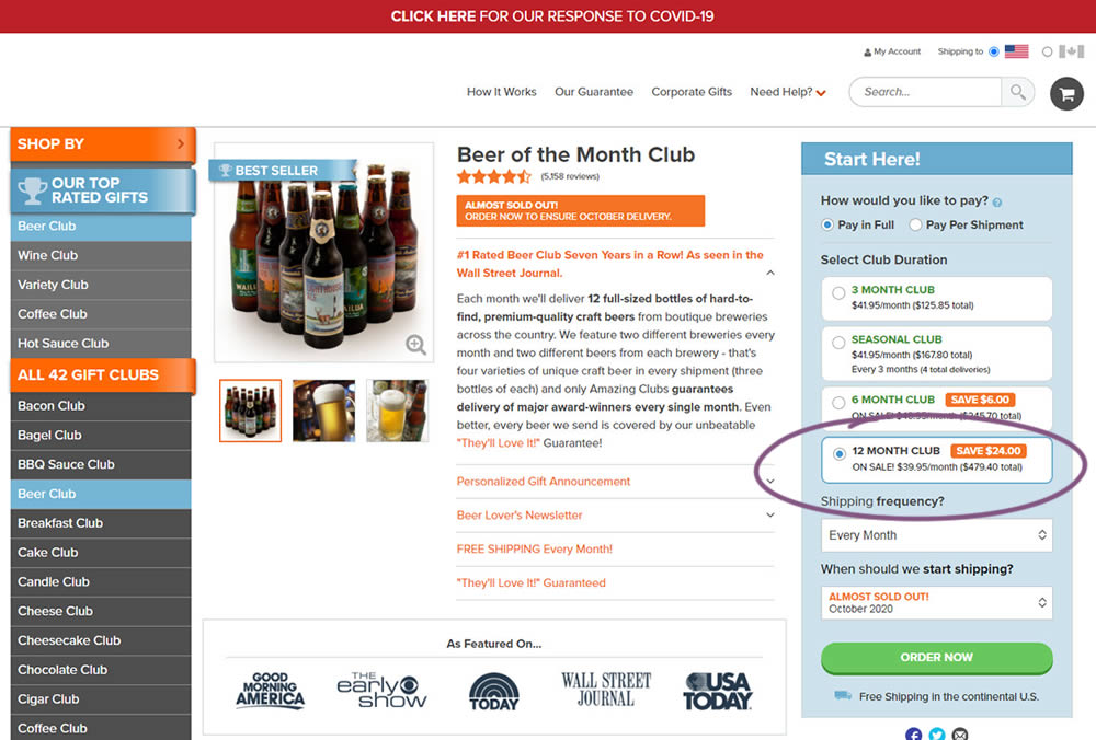
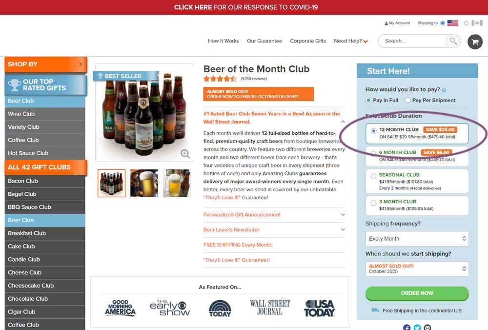
This experiment tested the order of purchase plans. The control version sorted the purchase options by the least expensive while the variation sorted them by the most expensive first. Impact on sales and revenue was measured.
Test #323 on
Backstage.com
by
 Stanley Zuo
Oct 29, 2020
Mobile
Signup
Stanley Zuo Tested Pattern #117: Company Logos In Test #323 On Backstage.com
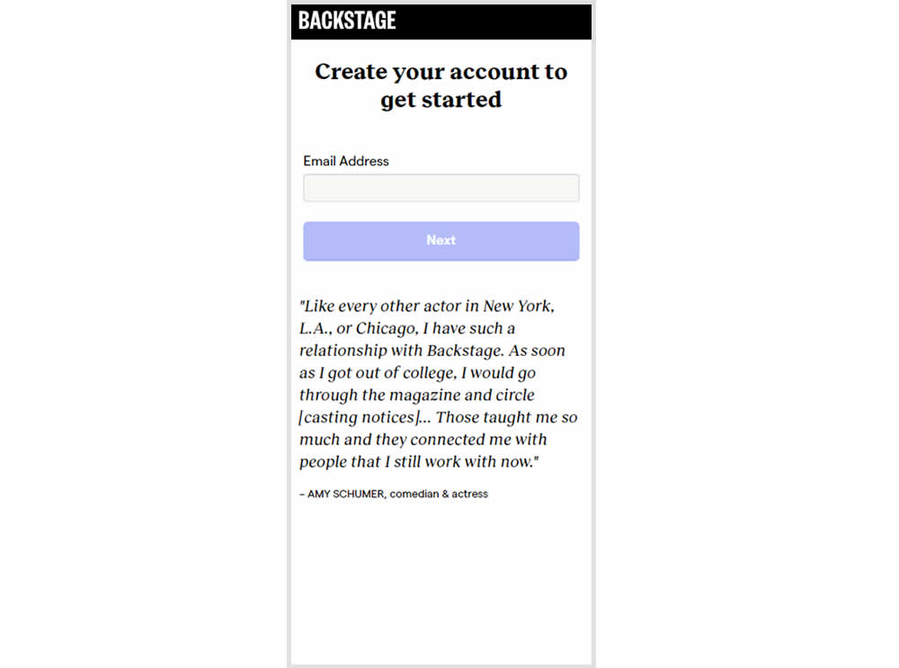
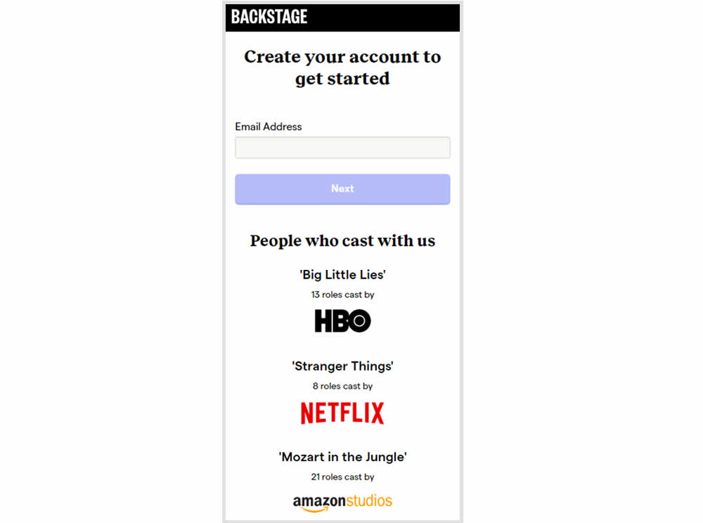
In this experiment, the variation replaced a text testimonial with high-profile production companies that have cast with Backstage. The logos were shown during the signup and checkout flow.
Test #322 on
Thomasnet.com
by
 Kyle Phillips
Oct 27, 2020
Desktop
Mobile
Product
Kyle Phillips Tested Pattern #82: Onboarding Callouts In Test #322 On Thomasnet.com
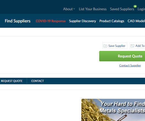
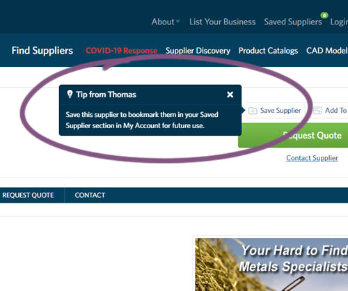
This experiment variation prompted users to save (bookmark) a company profile on a company detail page. Clicking on the save feature while logged out, would prompt a registration modal. Hence the save feature acted as an extra reason to signup. The number of people engaging or interacting with the feature was measured, as well as registrations.
Test #321 on
Elevate App App
by
 Jesse Germinario
Oct 23, 2020
Mobile
Jesse Germinario Tested Pattern #11: Gradual Reassurance In Test #321
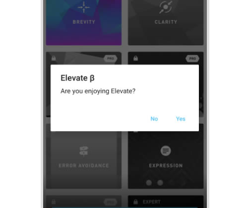
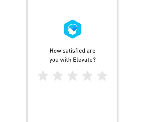
This experiment aimed to increase the number of application ratings from within the Elevate app. Success was measured by the number of users going towards Google Play to create the rating. The control version prompted users if they wanted to rate the app with a simple yes and no answer. The variation however presented the rating choice right away in the form of 5 stars - enabling users to express their choice sooner.
Test #320 on
by
 Jakub Linowski
Oct 20, 2020
Desktop
Checkout
Jakub Linowski Tested Pattern #49: Above The Fold Call To Action In Test #320
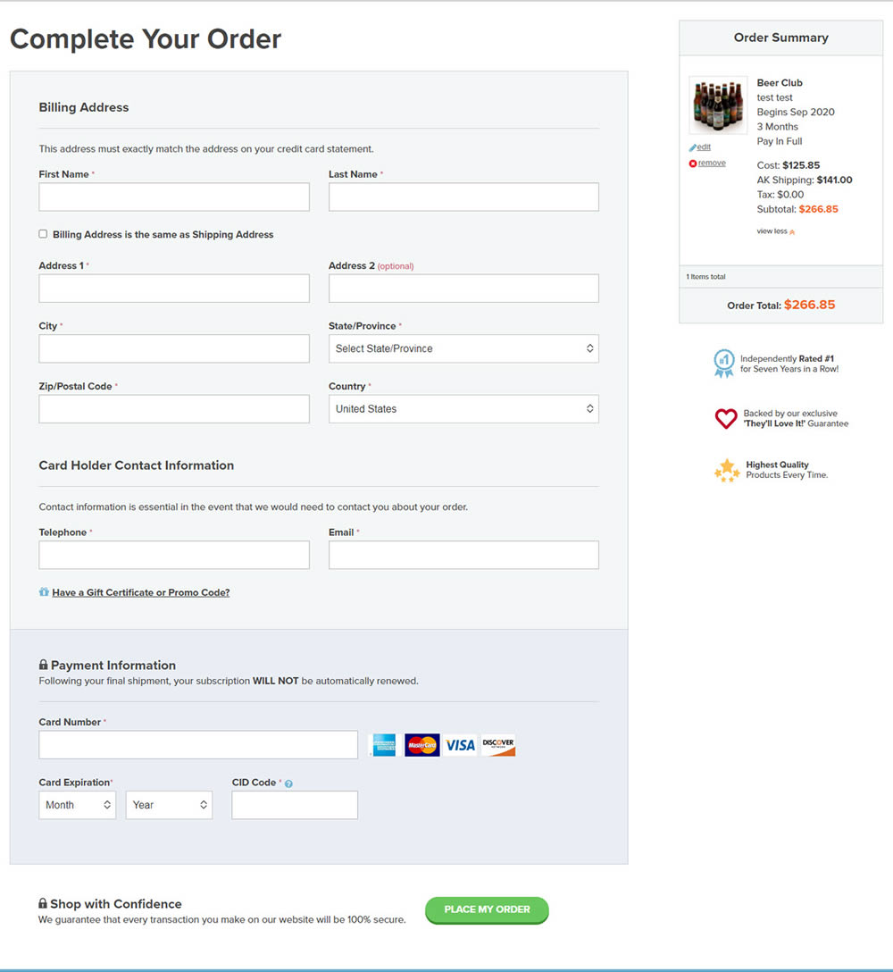
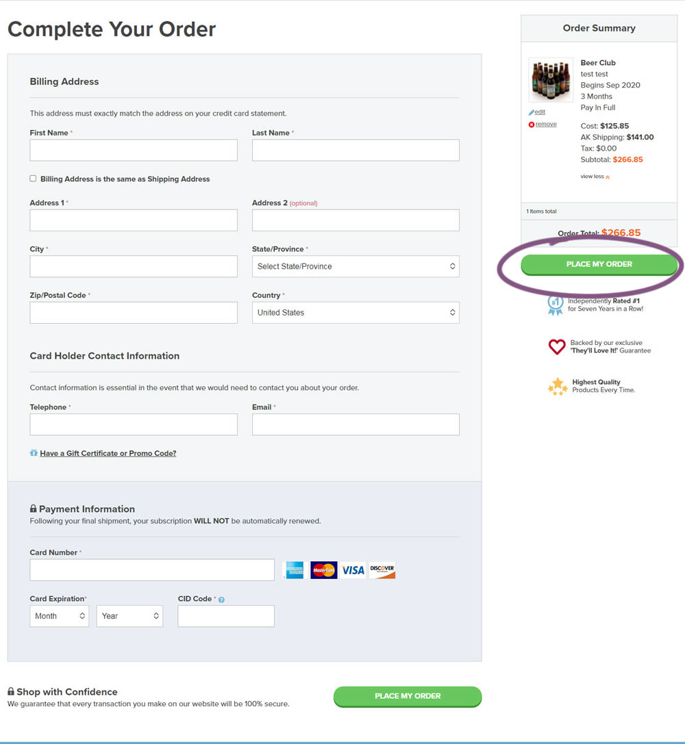
An extra "Place Order" button was duplicated above the fold on this checkout page. The control had a similar button further down at the bottom of the screen. The impact on total sales was measured from this change.
Test #319 on
Backstage.com
by
 Stanley Zuo
Sep 30, 2020
Desktop
Pricing
Stanley Zuo Tested Pattern #113: More Or Fewer Plans In Test #319 On Backstage.com
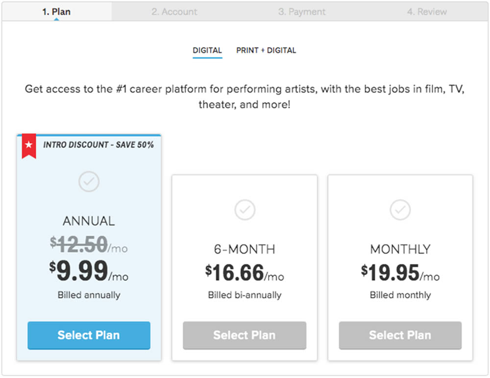
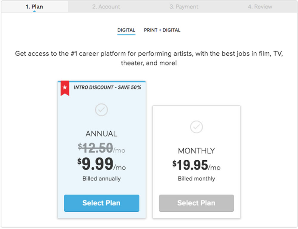
In this experiment, a 3 plan vs 2 plan pricing page was shown to potential customers. Impact on sales and revenue were measured.