8 Tests By  Samuel Hess
Tests
Test #385 on
Snocks.com
by
 Samuel Hess
Nov 25, 2021
Mobile
Samuel Hess Tested Pattern #63: Trust Seals In Test #385 On Snocks.com
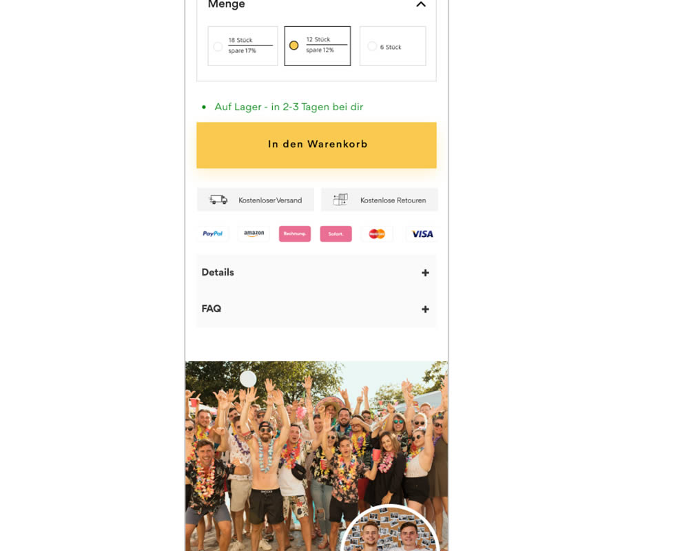
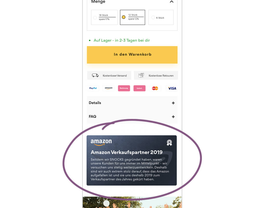
In this experiment, a simple Amazon badge was added on a product page. The translated (Google) language read: "Since we founded snocks, our customers have always been our focus - we are constantly trying to develop further. That's why we're extremely proud that Amazon attracted attention and that they named us Sales Partner of the Year in 2019."
Test #382 on
Snocks.com
by
 Samuel Hess
Oct 31, 2021
Desktop
Samuel Hess Tested Pattern #43: Long Titles In Test #382 On Snocks.com
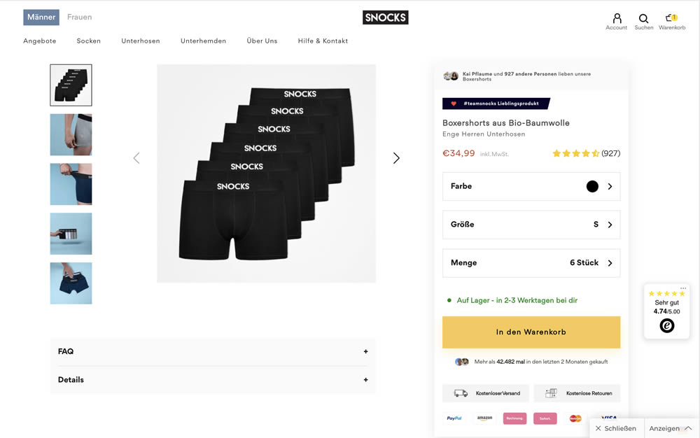
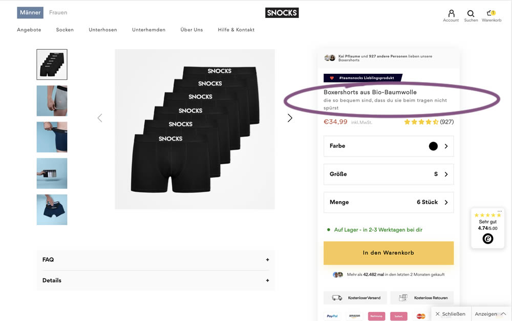
In this experiment, the variation contained a simple text change that described the quality of the product. According to Google Translate the text changed from "tight men's underpants" (control) to "are so comfortable that you don't feel them when you wear them" (variation).
Test #376 on
Snocks.com
by
 Samuel Hess
Sep 29, 2021
Mobile
Desktop
Samuel Hess Tested Pattern #15: Bulleted Reassurances In Test #376 On Snocks.com
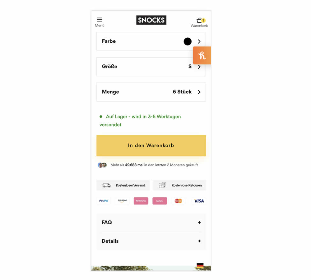
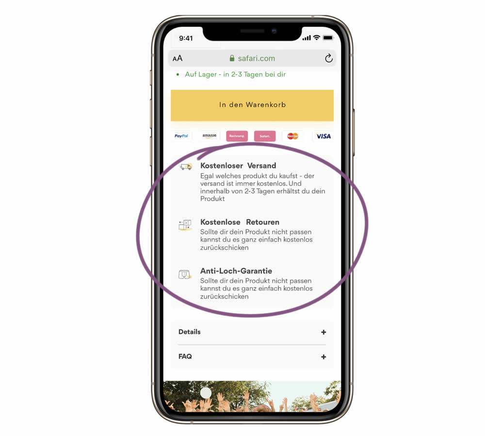
In this experiment, a series of reassurances were added just below the add to cart button. These included: "free shipping", "free returns" and an "anti-hole guarantee". The test ran on the product page of an socks ecommerce company. Impact on sales was measured.
Test #364 on
Lotuscrafts.eu
by
 Samuel Hess
Jul 06, 2021
Desktop
Samuel Hess Tested Pattern #122: Zigzag Layout In Test #364 On Lotuscrafts.eu
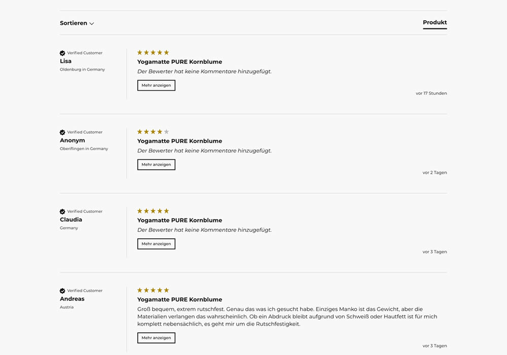
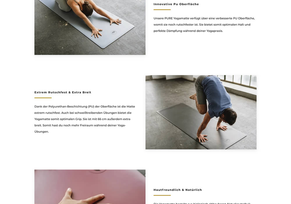
In this experiment, product descriptions or qualities were added using a zigzag layout pattern composed of photos and extra copy. This sections was appended between existing copy and testimonials. Some of the copy highlights included wording such as "innovative surface", "non-slip and wide", and "skin-friendly". Impact on adds-to-cart and sales was measured.
Test #359 on
Snocks.com
by
 Samuel Hess
Jun 11, 2021
Desktop
Mobile
Samuel Hess Tested Pattern #43: Long Titles In Test #359 On Snocks.com
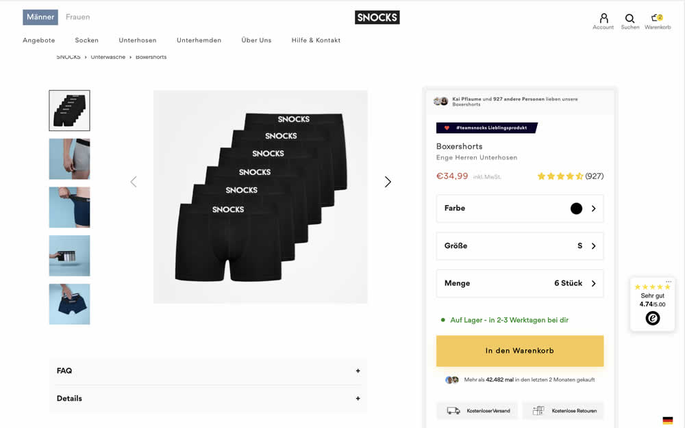
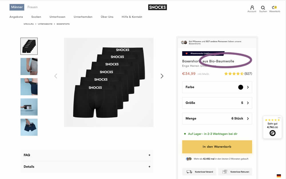
In this experiment, product titles were extended with descriptive copy. Instead of just showing the product name, "with organic cotton" was appended on product and category/listing pages. Impact to adds to cart and sales was measured.
Test #343 on
Snocks.com
by
 Samuel Hess
Mar 12, 2021
Desktop
Mobile
Samuel Hess Tested Pattern #122: Zigzag Layout In Test #343 On Snocks.com

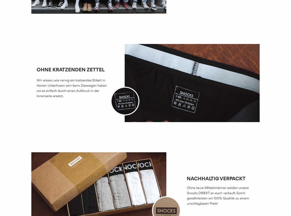
In this experiment, the content on a product page was reorganized into a zigzagging (alternating layout) along with reinforcing photos. Impact on adds-to-cart and total sales was measured.
Test #329 on
Snocks.com
by
 Samuel Hess
Dec 23, 2020
Mobile
Samuel Hess Tested Pattern #14: Exposed Menu Options In Test #329 On Snocks.com
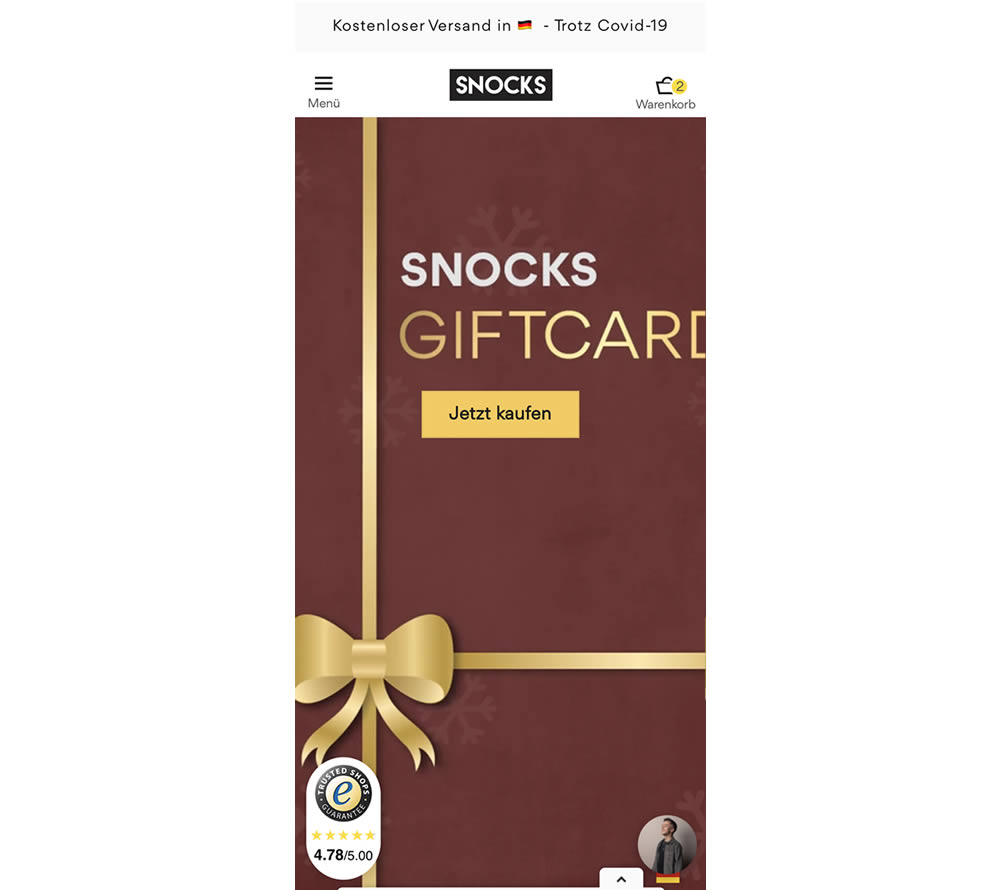
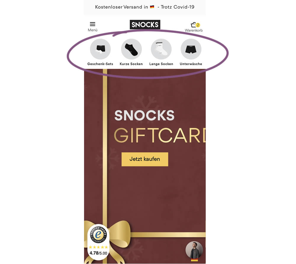
In this homepage experiment, a series of product categories were shown more visible near the top of the screen (instead of only being shown inside the hamburger menu). They linked up to corresponding listing pages with such items as: gifts, short socks, long socks, and underwear. Impact on adds-to-cart and total sales was measured.
Test #325 on
Snocks.com
by
 Samuel Hess
Nov 24, 2020
Desktop
Samuel Hess Tested Pattern #45: Benefit Bar In Test #325 On Snocks.com
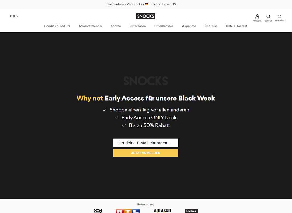
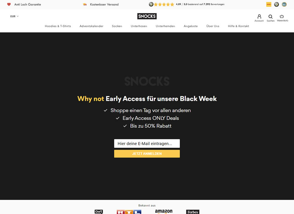
In this experiment, a set of reassurances and reviews were added in the header of this ecommerce website. Translating from German, these read: "Anti Hole Guarantee", "Free Shipping" and "X Ratings out of Y Reviews".