All Latest 582 A/B Tests
Become a member to unlock the abiltiy to see the highest impact a/b tests. Being able to see the actual test results and sort by impact allows growth and experimentation teams to take action on the biggest gains first
MOST RECENT TESTS
Test #204 on
Kenhub.com
by
 Niels Hapke
Oct 11, 2018
Desktop
Mobile
Global
Niels Hapke Tested Pattern #85: Benefit Button In Test #204 On Kenhub.com
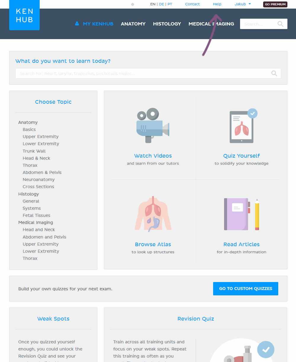
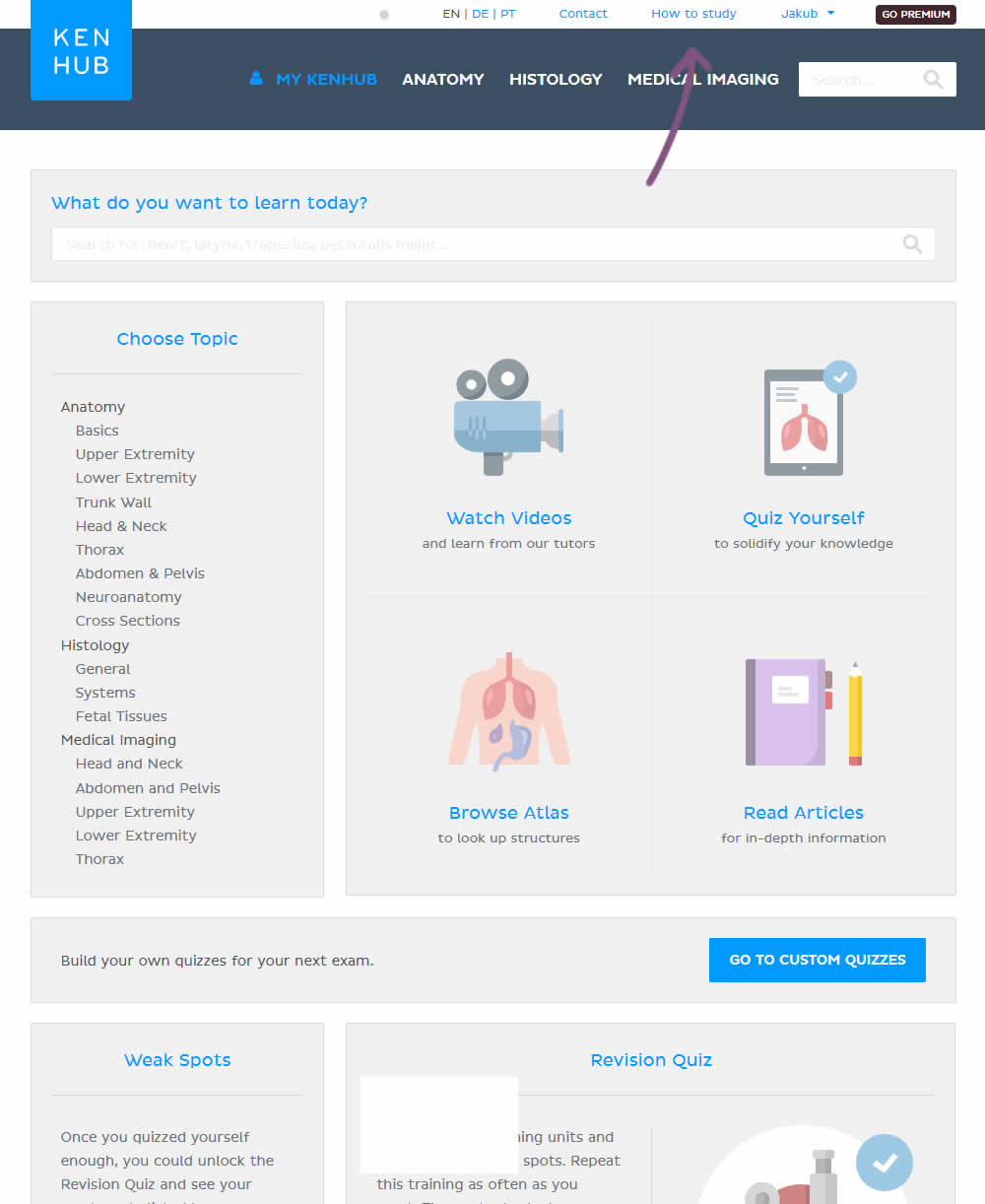
In the variation, the "Help" section was reworded to "How to study".
Test #203 on
Driving-tests.org
by
 Andrei Zakhareuski
Oct 10, 2018
Desktop
Global
Andrei Zakhareuski Tested Pattern #85: Benefit Button In Test #203 On Driving-tests.org
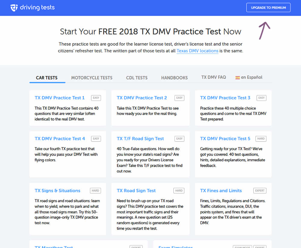
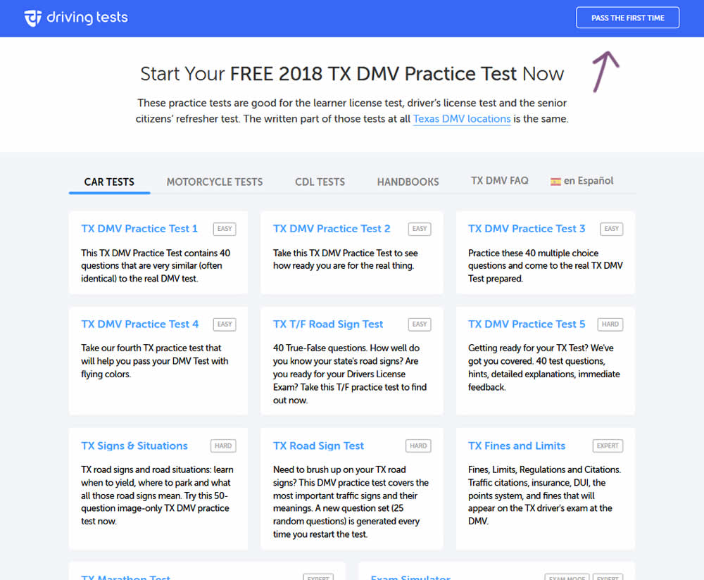
In the variation, the button label "Upgrade To Premium" was changed to one with a clearer benefit of "Pass The First Time".
Test #202 on
Kenhub.com
by
 Niels Hapke
Oct 01, 2018
Desktop
Mobile
Checkout
Niels Hapke Tested Pattern #13: Centered Forms & Buttons In Test #202 On Kenhub.com
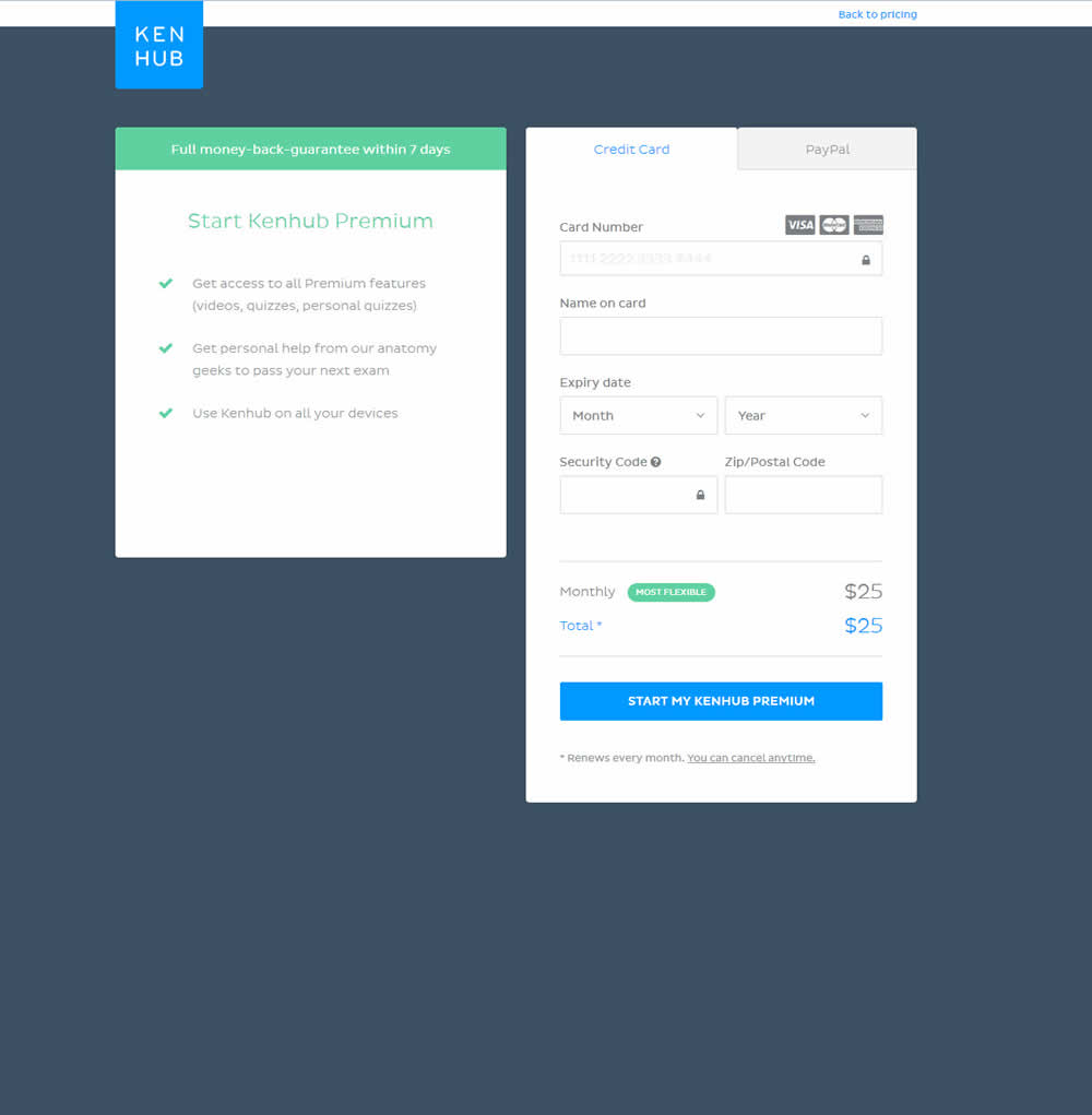
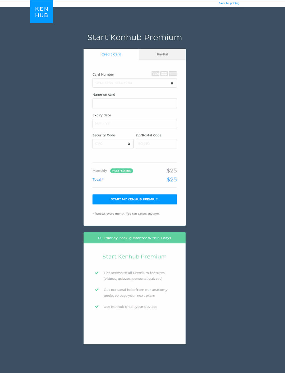
In this experiment, the form layout was adjusted by shifting the side benefits further down below the form.
Test #9 on
by
 Rick Dawson
Sep 28, 2018
Desktop
Mobile
Home & Landing
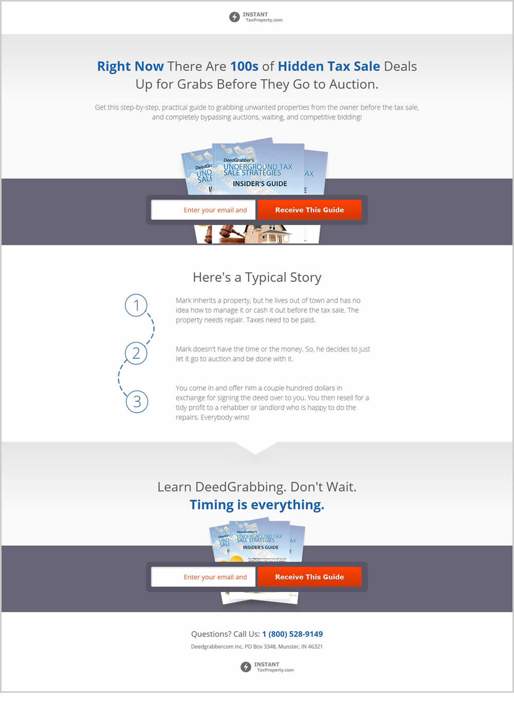
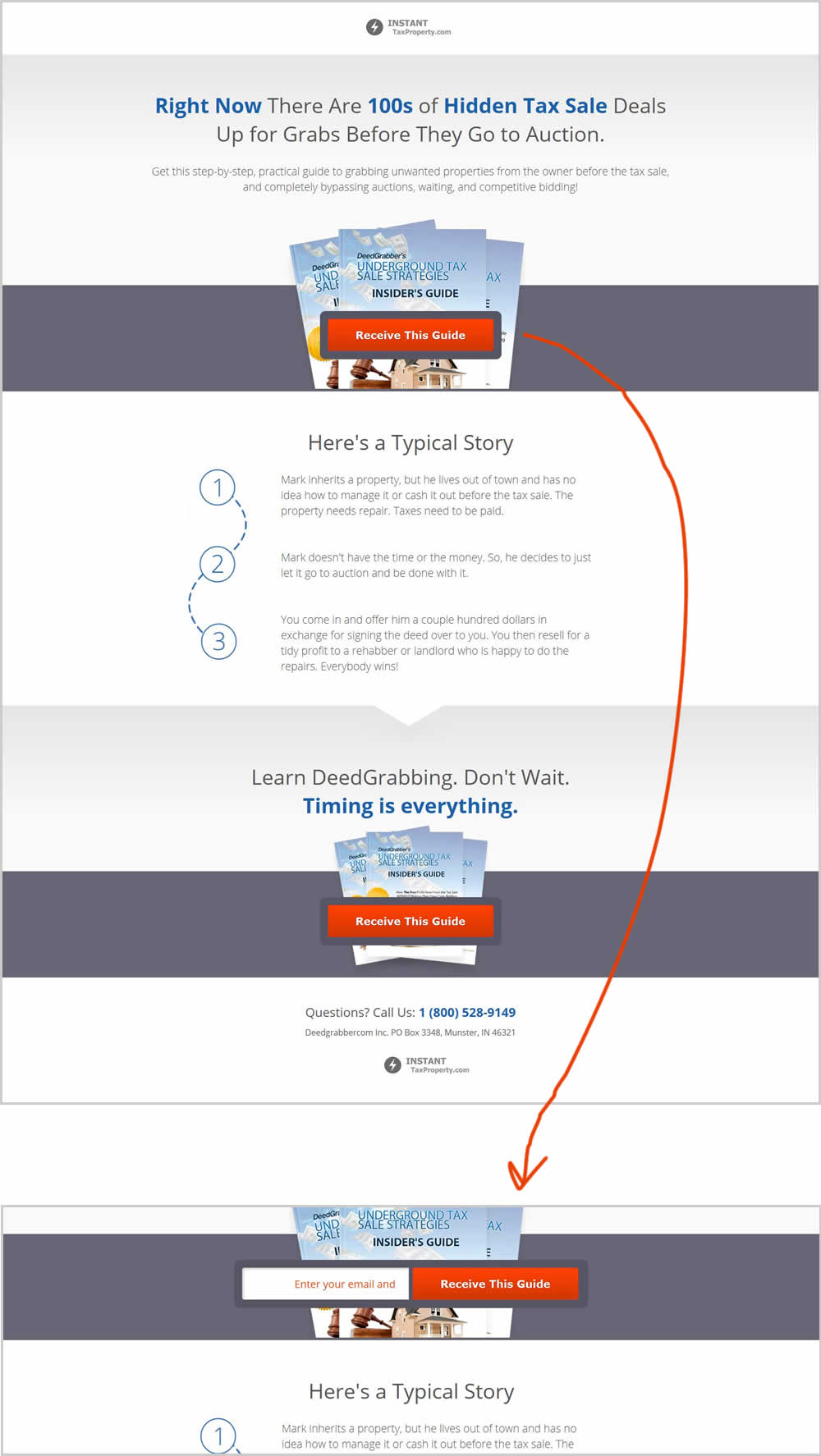
Rick Dawson Tested Pattern #83: Progressive Fields In Test #9
Test #201 on
by
 Ben Labay
Sep 19, 2018
Desktop
Mobile
Thank You
Ben Labay Tested Pattern #7: Social Counts In Test #201
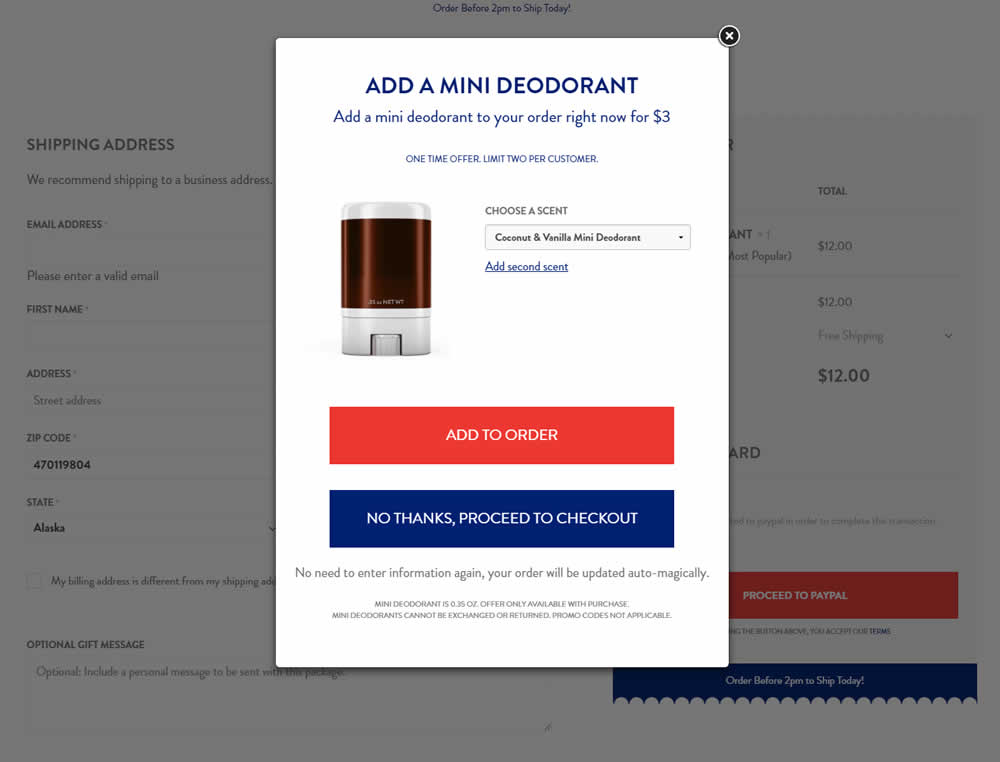
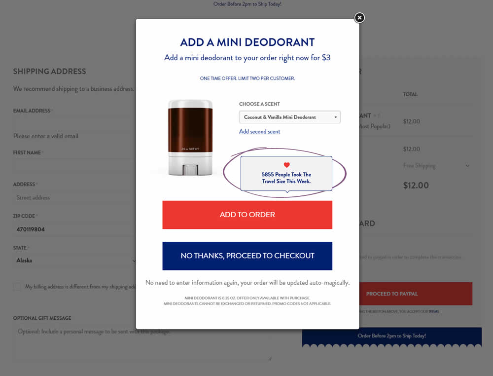
In this test the upsell modal had an added text box with number of people that day who took the offer. The test hypothesis was that social proof will add motivation to take an action and the offer.
Test #200 on
Trydesignlab.com
by
 Will Anderson
Sep 14, 2018
Desktop
Mobile
Home & Landing
Will Anderson Tested Pattern #52: How It Works In Test #200 On Trydesignlab.com
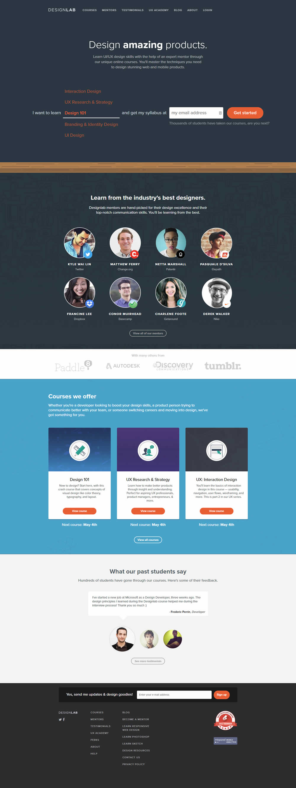

In this experiment, a "How It Works" content section was removed.
Test #199 on
Freshegg.co.uk
by
 Luke Hay
Sep 13, 2018
Desktop
Mobile
Home & Landing
Luke Hay Tested Pattern #77: Filled Or Ghost Buttons In Test #199 On Freshegg.co.uk
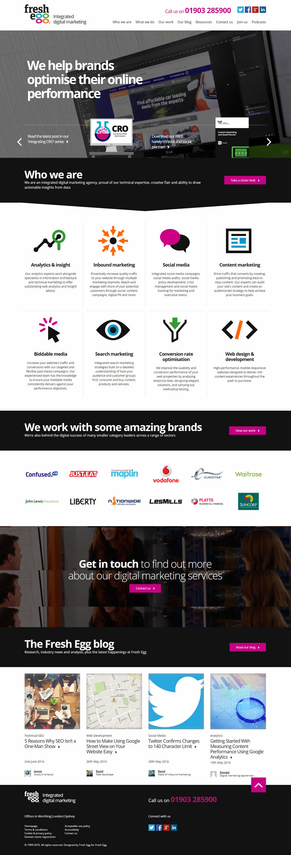
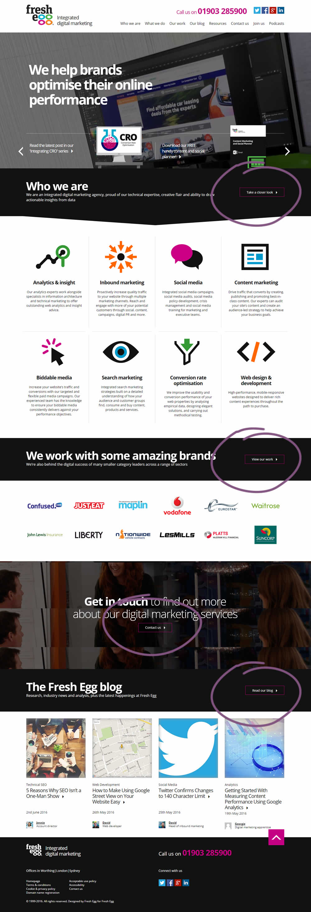
In this experiment, standard (filled) buttons were tested against ghost buttons.
Test #197 on
Reverb.com
by
 Nicholas Evans
Sep 04, 2018
Desktop
Product
Nicholas Evans Tested Pattern #4: Testimonials In Test #197 On Reverb.com
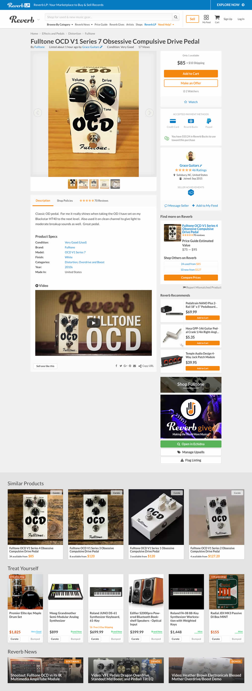

In the variation, customer reviews were exposed from a less visible tab view.
Test #198 on
Bomgar.com
by
 Lee Elkins
Sep 03, 2018
Desktop
Signup
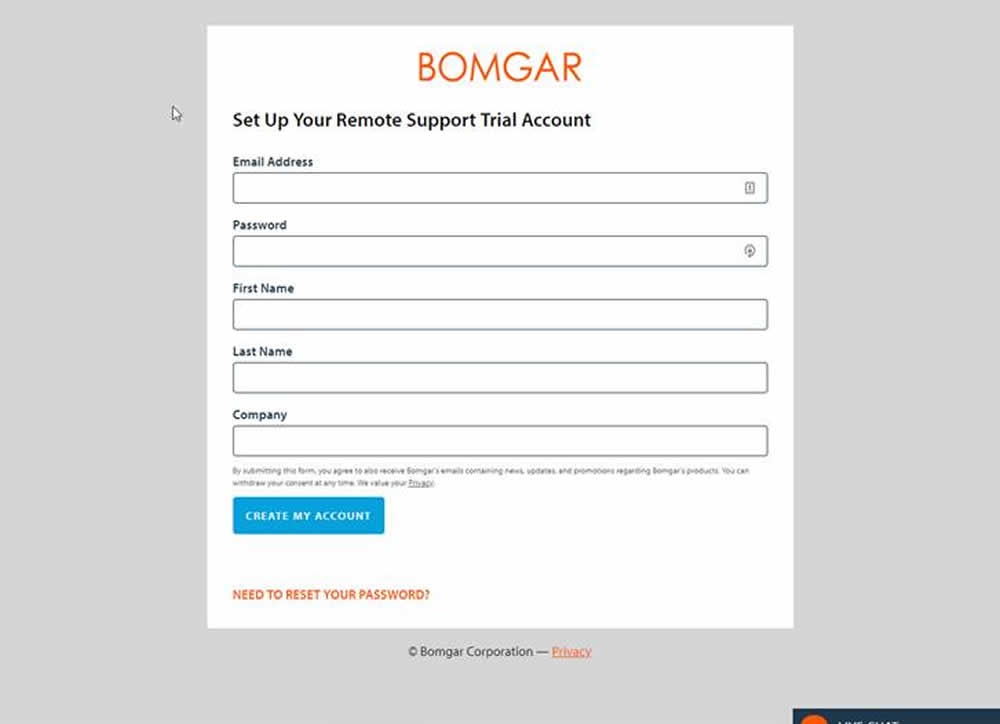
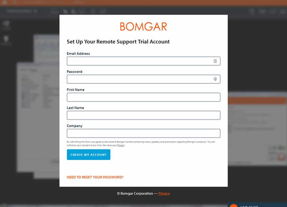
Lee Elkins Tested Pattern #40: Blurred Product Background In Test #198 On Bomgar.com
Test #196 on
Vivareal.com.br
by
 Vinicius Barros Peixoto
Aug 14, 2018
Mobile
Listing
Vinicius Barros Peixoto Tested Pattern #80: Persistent Filters In Test #196 On Vivareal.com.br
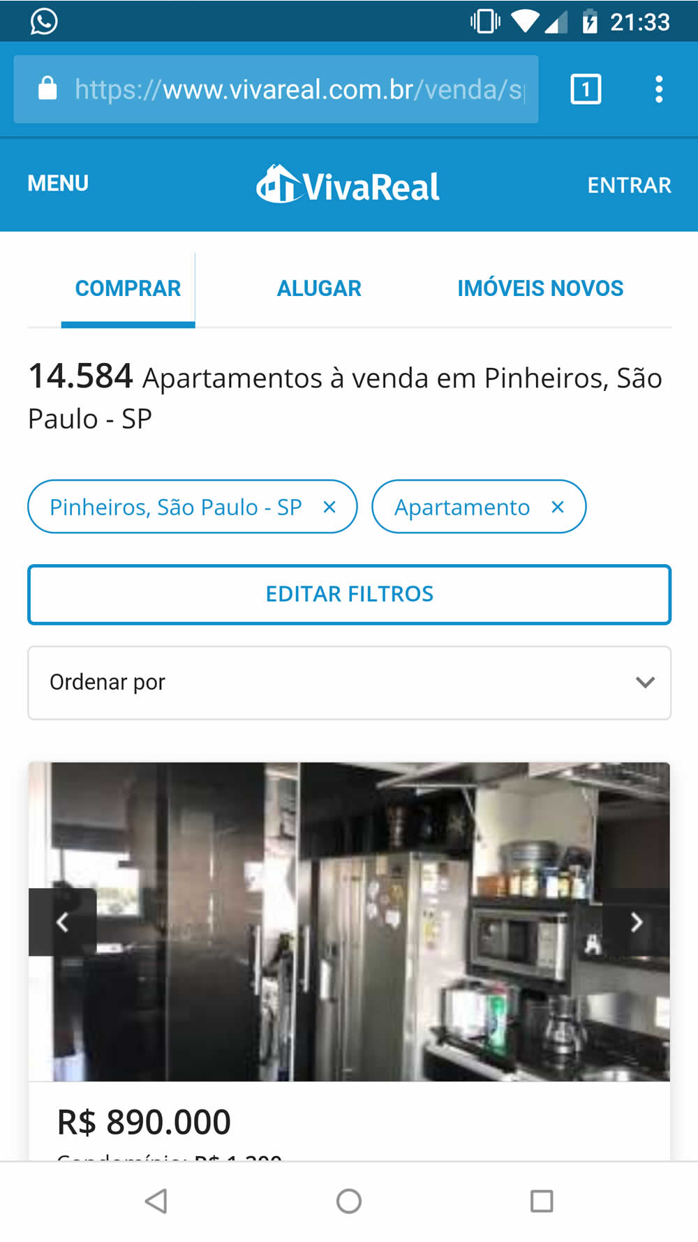

The experiment goal was automatically applying filters the users have already done in our result page, during their navigation to the site. The variation always applied the filters in the same session and asked users on new sessions.
Test #195 on
Yummly.com
by
 Kimberly Cheung
Aug 13, 2018
Desktop
Mobile
Listing
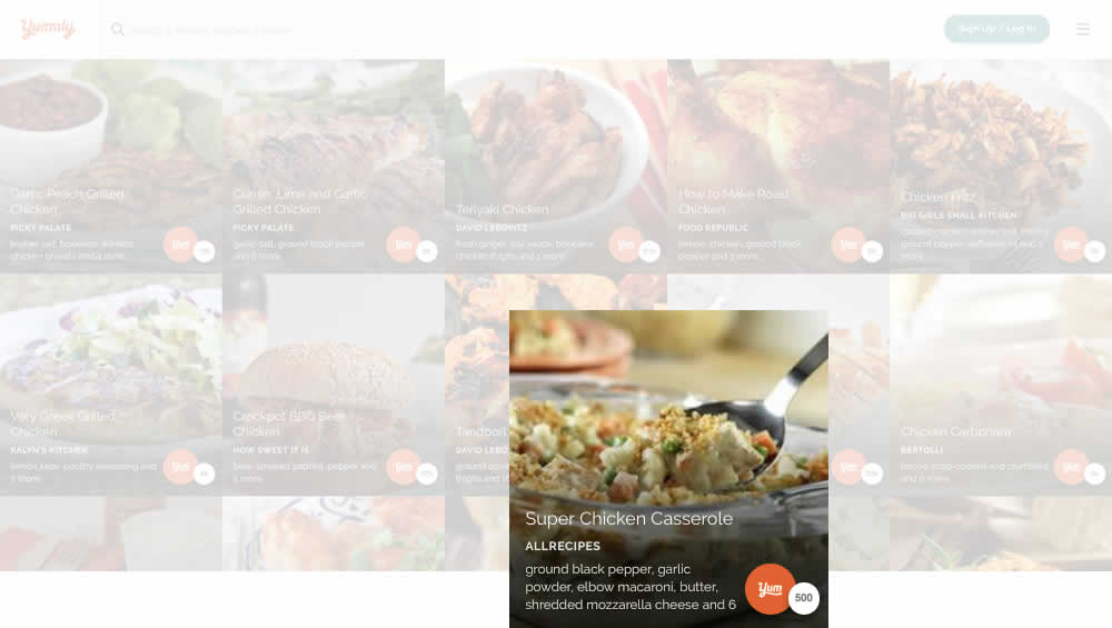
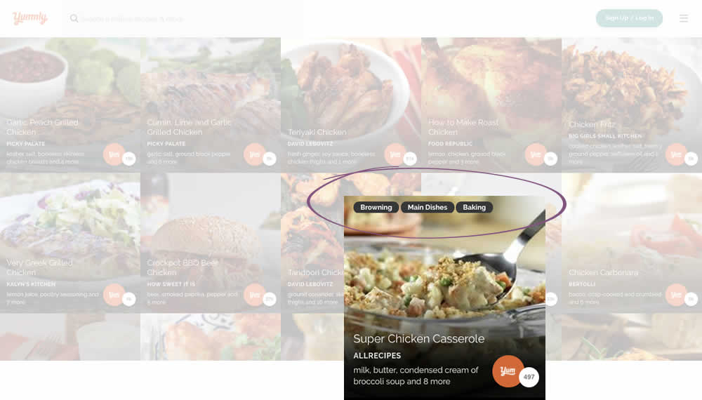
Kimberly Cheung Tested Pattern #78: Tags, Badges And Structured Information In Test #195 On Yummly.com
Test #194 on
Bomgar.com
by
 Lee Elkins
Aug 08, 2018
Desktop
Mobile
Home & Landing
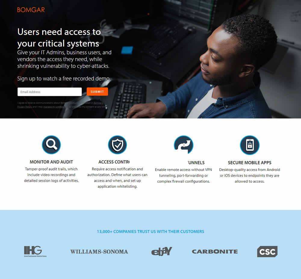
Lee Elkins Tested Pattern #22: Empowering Headline In Test #194 On Bomgar.com

Test #192 on
Refactoring.guru
by
 Alexander Shvets
Aug 07, 2018
Desktop
Mobile
Product
Alexander Shvets Tested Pattern #4: Testimonials In Test #192 On Refactoring.guru


In this experiment, a number of customer reviews were added at the middle of a product page.
Test #193 on
Yummly.com
by
 Marcos Ciarrocchi
Aug 07, 2018
Desktop
Mobile
Signup
Marcos Ciarrocchi Tested Pattern #91: Forced Action In Test #193 On Yummly.com
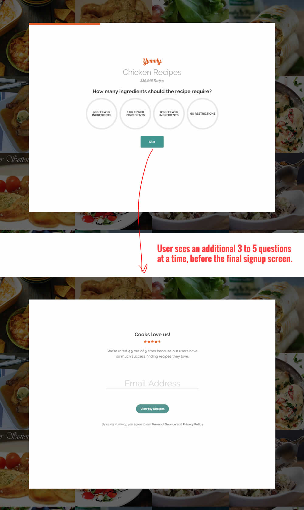
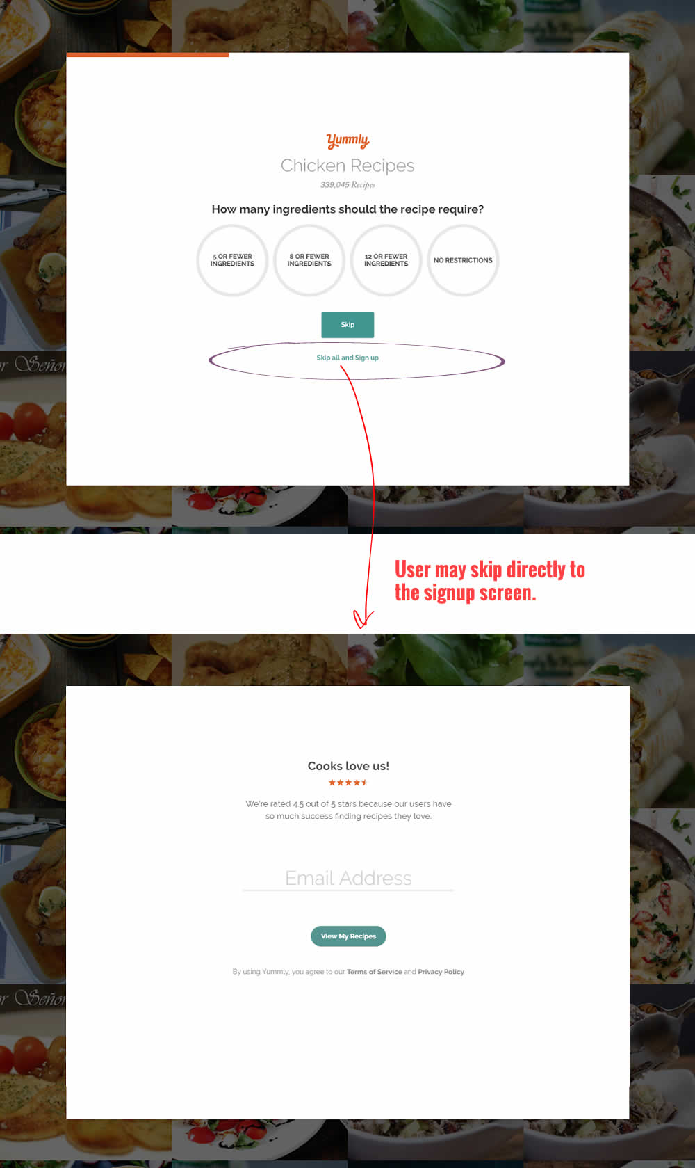
In this experiment, the presence of an additional "skip all" text link was tested on a multiple step signup flow. The skip all link allowed users to bypass personalization questions and go straight to their app dashboard. The control (A) shows its presence, and in variant B we can see it was removed.
Test #190 on
Diamondcandles.com
by
 Peep Laja
Jul 26, 2018
Mobile
Global
Peep Laja Tested Pattern #2: Icon Labels In Test #190 On Diamondcandles.com

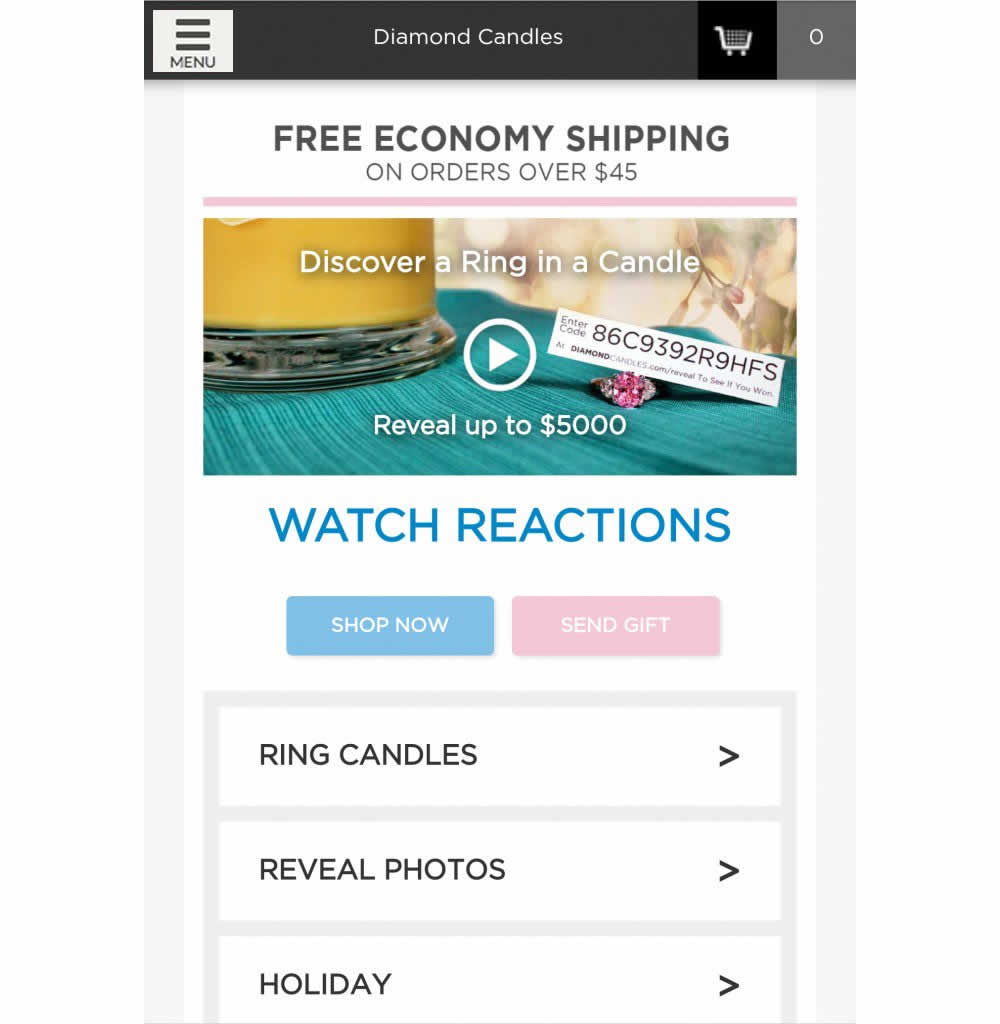
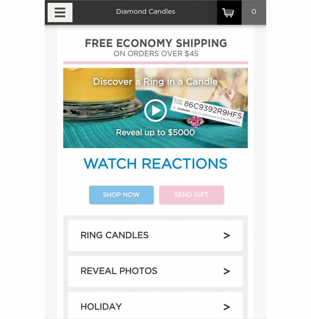
This test has explored numerous hamburger menu variations and has been covered in detail over at https://conversionxl.com/blog/testing-hamburger-icon-revenue/ - Thanks Peep Laja for sharing. Here we reported on a consistent increase in both menu clicks and sales.
Test #191 on
Diamondcandles.com
by
 Peep Laja
Jul 26, 2018
Mobile
Global
Peep Laja Tested Pattern #2: Icon Labels In Test #191 On Diamondcandles.com

Test #189 on
Yummly.com
by
 Kimberly Cheung
Jul 23, 2018
Desktop
Mobile
Signup
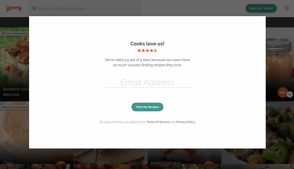
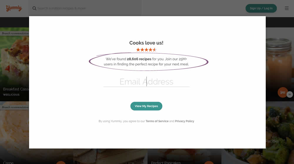
Kimberly Cheung Tested Pattern #7: Social Counts In Test #189 On Yummly.com
Test #188 on
Thomasnet.com
by
 Julian Gaviria
Jul 11, 2018
Desktop
Mobile
Home & Landing
Julian Gaviria Tested Pattern #4: Testimonials In Test #188 On Thomasnet.com
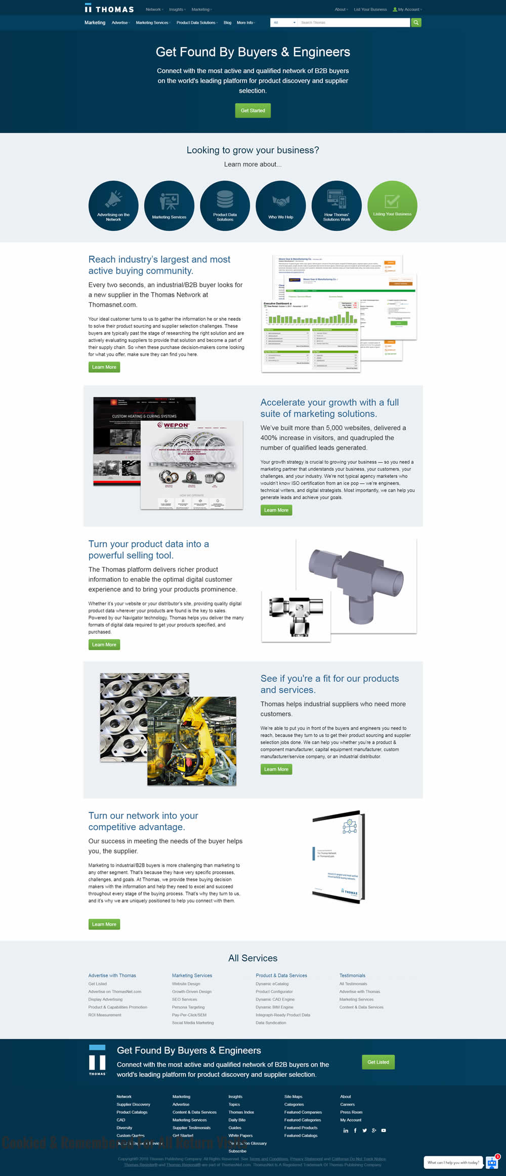
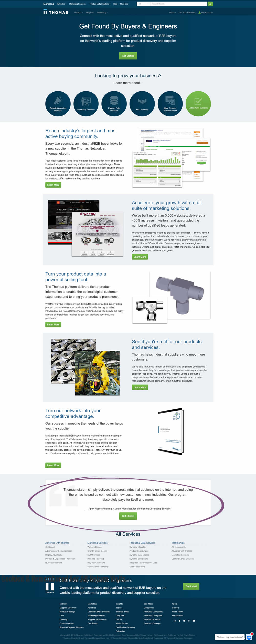
In this experiment, a testimonial with a repeated call to action was placed at the bottom of a landing page.
Test #187 on
Trydesignlab.com
by
 Will Anderson
Jul 09, 2018
Desktop
Mobile
Product
Will Anderson Tested Pattern #71: Personalized Next Step In Test #187 On Trydesignlab.com


In this experiment, a lead form (with a syllabus) would transform into the next application step of "enrolling" after being submitted. More so, this surfacing of the next enrollment step was personalized and shown for users that also returned to the web site in future visits.
Test #185 on
Retrome.pl
by
Grzegorz Jancewicz
Jul 03, 2018
Mobile
Listing
Grzegorz Jancewicz Tested Pattern #49: Above The Fold Call To Action In Test #185 On Retrome.pl

