All Latest 582 A/B Tests
Become a member to unlock the abiltiy to see the highest impact a/b tests. Being able to see the actual test results and sort by impact allows growth and experimentation teams to take action on the biggest gains first
MOST RECENT TESTS
Test #186 on
by
 Devesh Khanal
Jul 02, 2018
Mobile
Home & Landing
Devesh Khanal Tested Pattern #14: Exposed Menu Options In Test #186
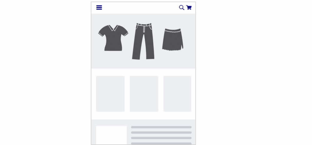
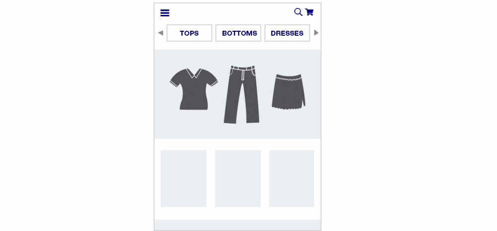
In this experiment, additional product categories were added at the top of the navigation.
Test #184 on
Bomgar.com
by
 Lee Elkins
Jun 25, 2018
Desktop
Mobile
Home & Landing
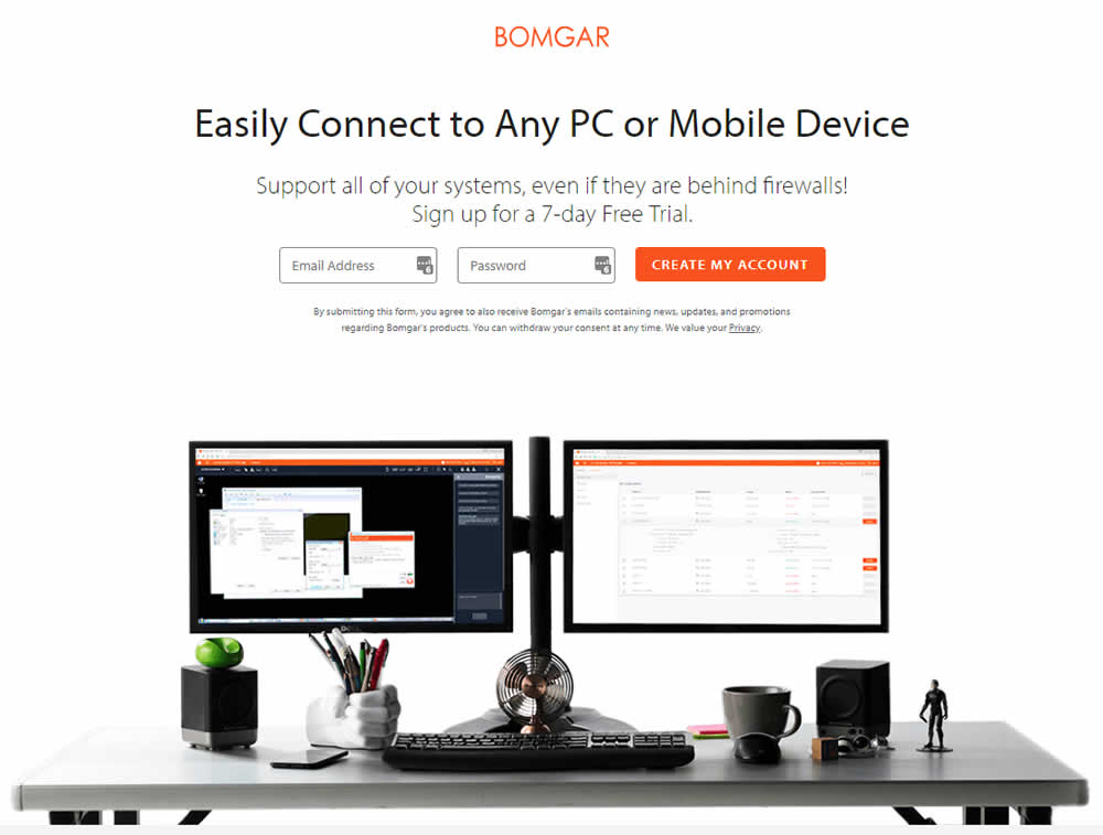
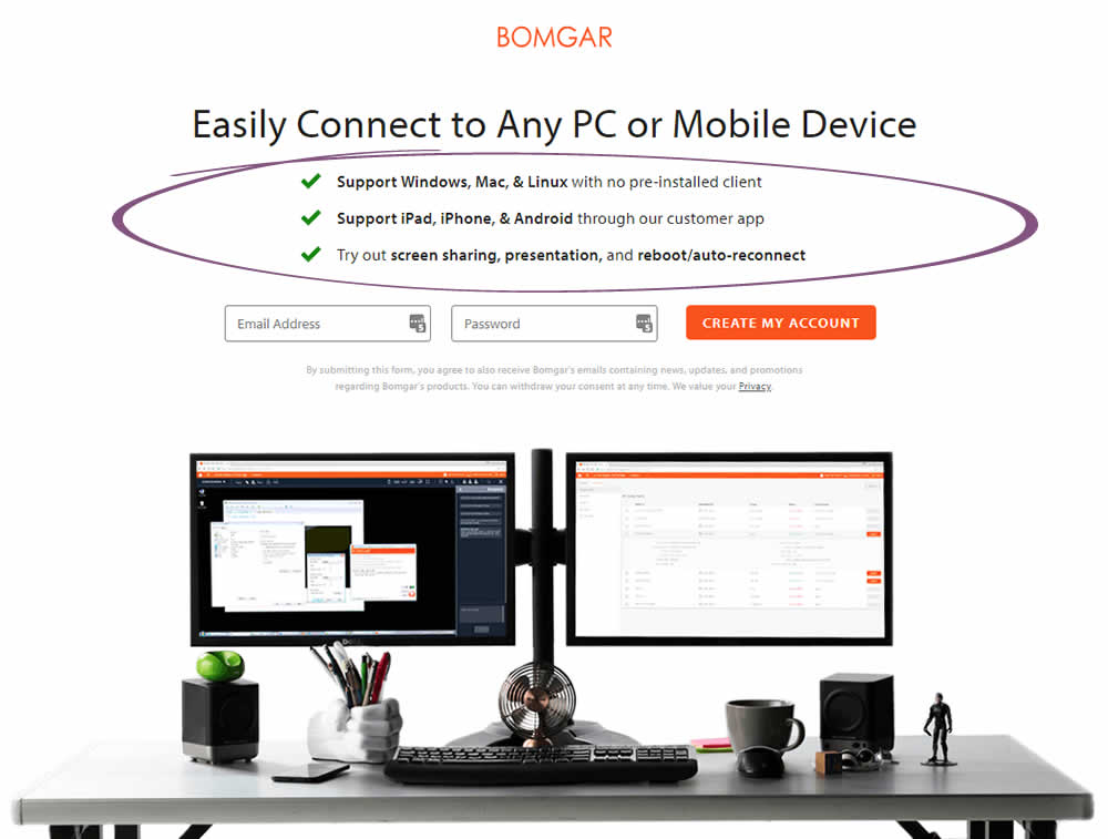
Lee Elkins Tested Pattern #15: Bulleted Reassurances In Test #184 On Bomgar.com
Test #183 on
Trydesignlab.com
by
 Daniel Shapiro
Jun 19, 2018
Desktop
Mobile
Product
Daniel Shapiro Tested Pattern #46: Pay Later In Test #183 On Trydesignlab.com


Test #182 on
Yummly.com
by
 Marcos Ciarrocchi
Jun 12, 2018
Desktop
Listing
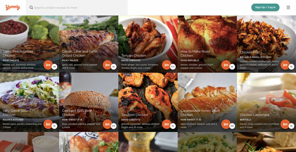
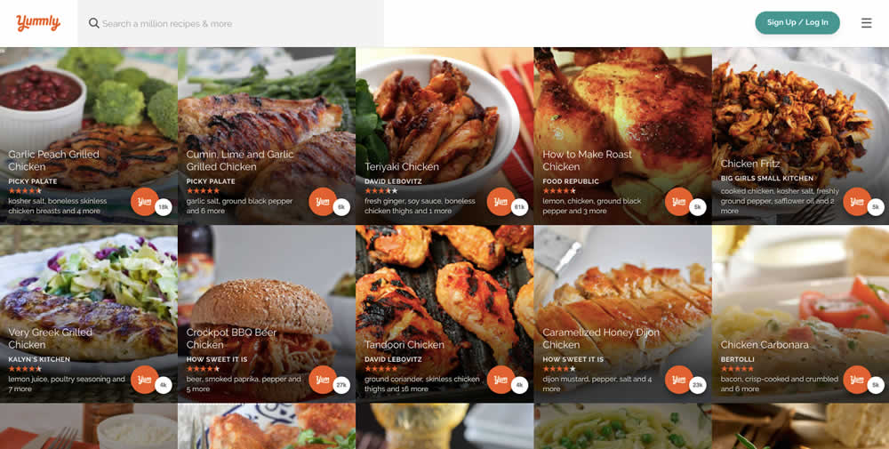
Marcos Ciarrocchi Tested Pattern #6: Customer Star Ratings In Test #182 On Yummly.com
Test #181 on
Yummly.com
by
 Kimberly Cheung
Jun 04, 2018
Desktop
Mobile
Signup
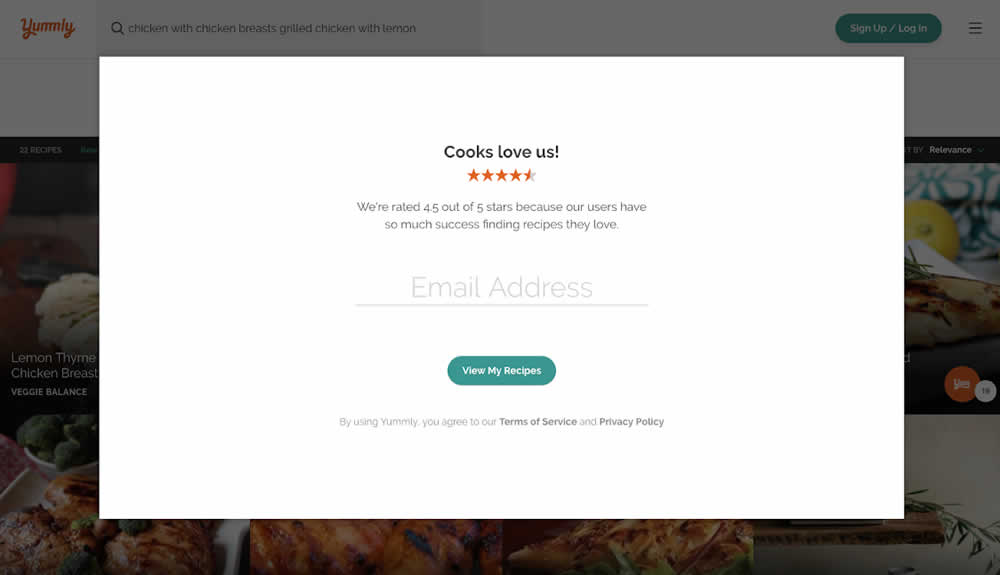
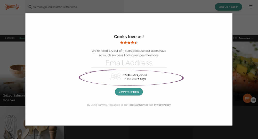
Kimberly Cheung Tested Pattern #7: Social Counts In Test #181 On Yummly.com
Test #180 on
Radhabeauty.com
by
 Viljo Vabrit
Jun 03, 2018
Mobile
Global
Viljo Vabrit Tested Pattern #45: Benefit Bar In Test #180 On Radhabeauty.com


Test #179 on
Yummly.com
by
 Marcos Ciarrocchi
May 18, 2018
Desktop
Listing
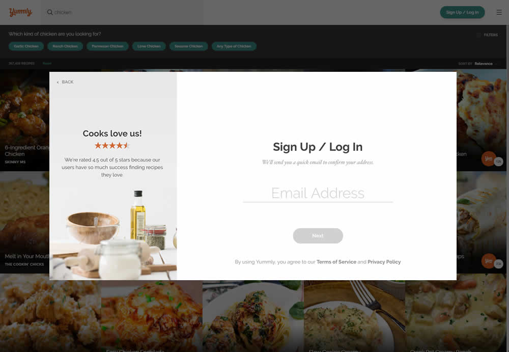
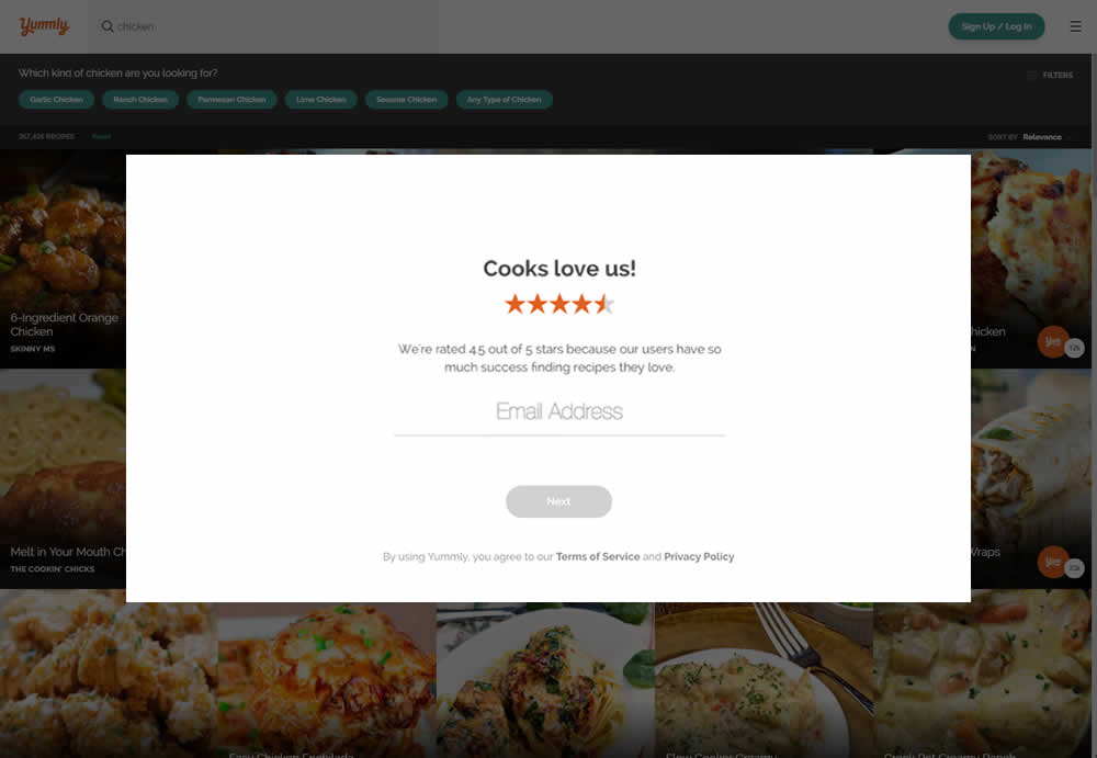
Marcos Ciarrocchi Tested Pattern #13: Centered Forms & Buttons In Test #179 On Yummly.com
Test #178 on
by
 Devesh Khanal
May 17, 2018
Desktop
Product
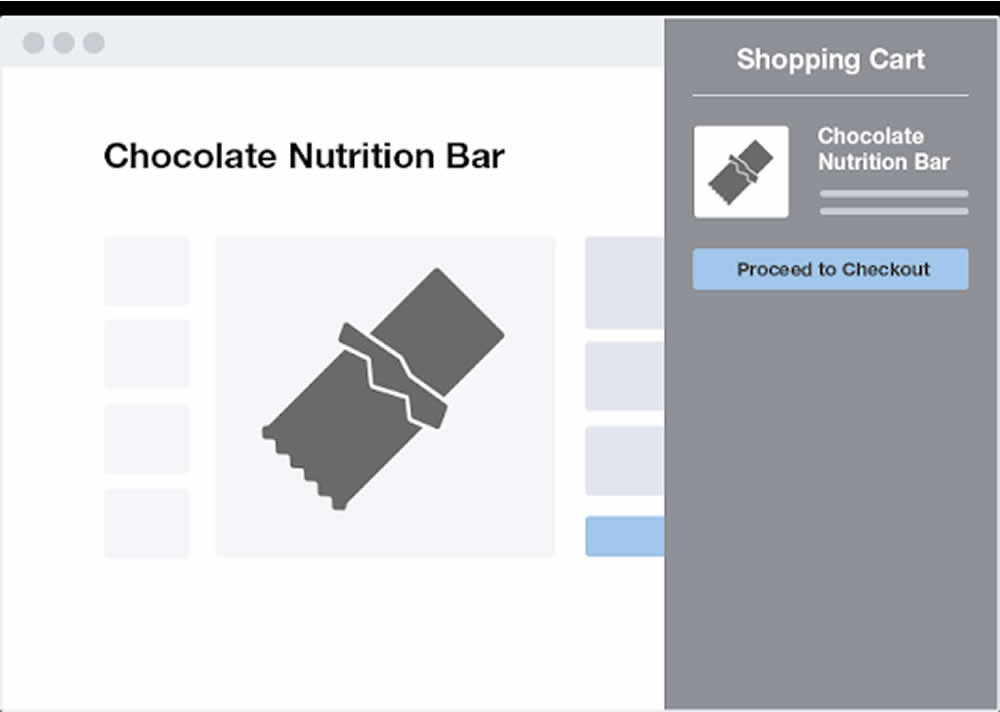
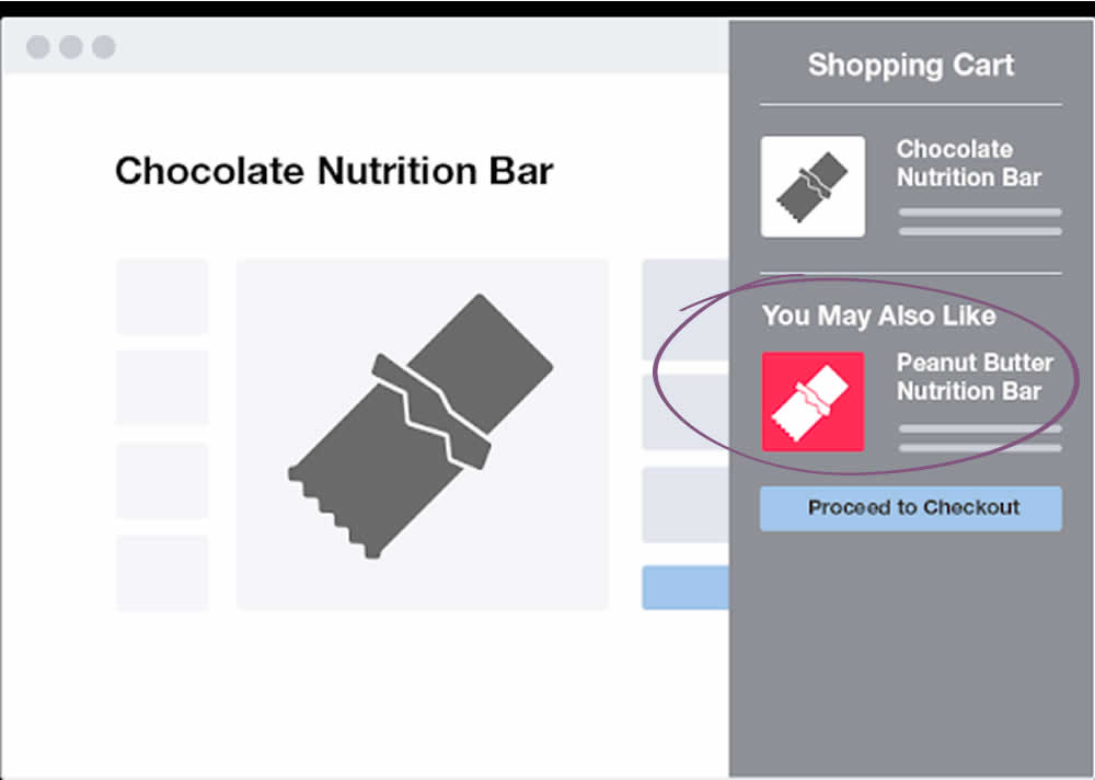
Devesh Khanal Tested Pattern #66: Complementary Upsell In Test #178
Test #177 on
by
 Devesh Khanal
May 17, 2018
Desktop
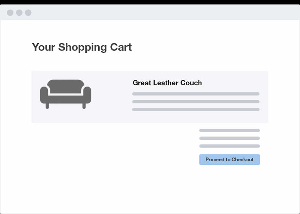
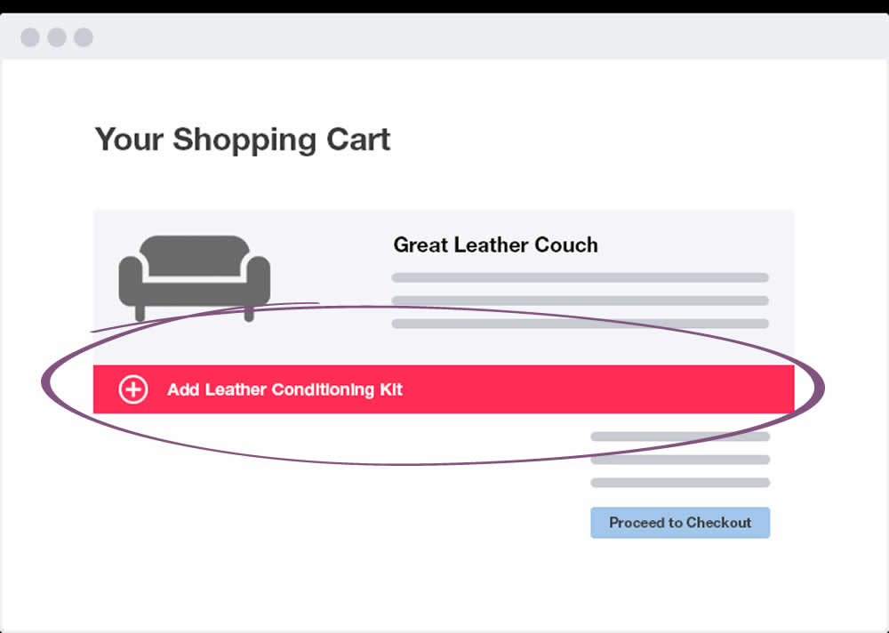
Shopping Cart
Devesh Khanal Tested Pattern #66: Complementary Upsell In Test #177
Test #176 on
Kenhub.com
by
 Niels Hapke
May 16, 2018
Desktop
Mobile
Checkout
Niels Hapke Tested Pattern #4: Testimonials In Test #176 On Kenhub.com
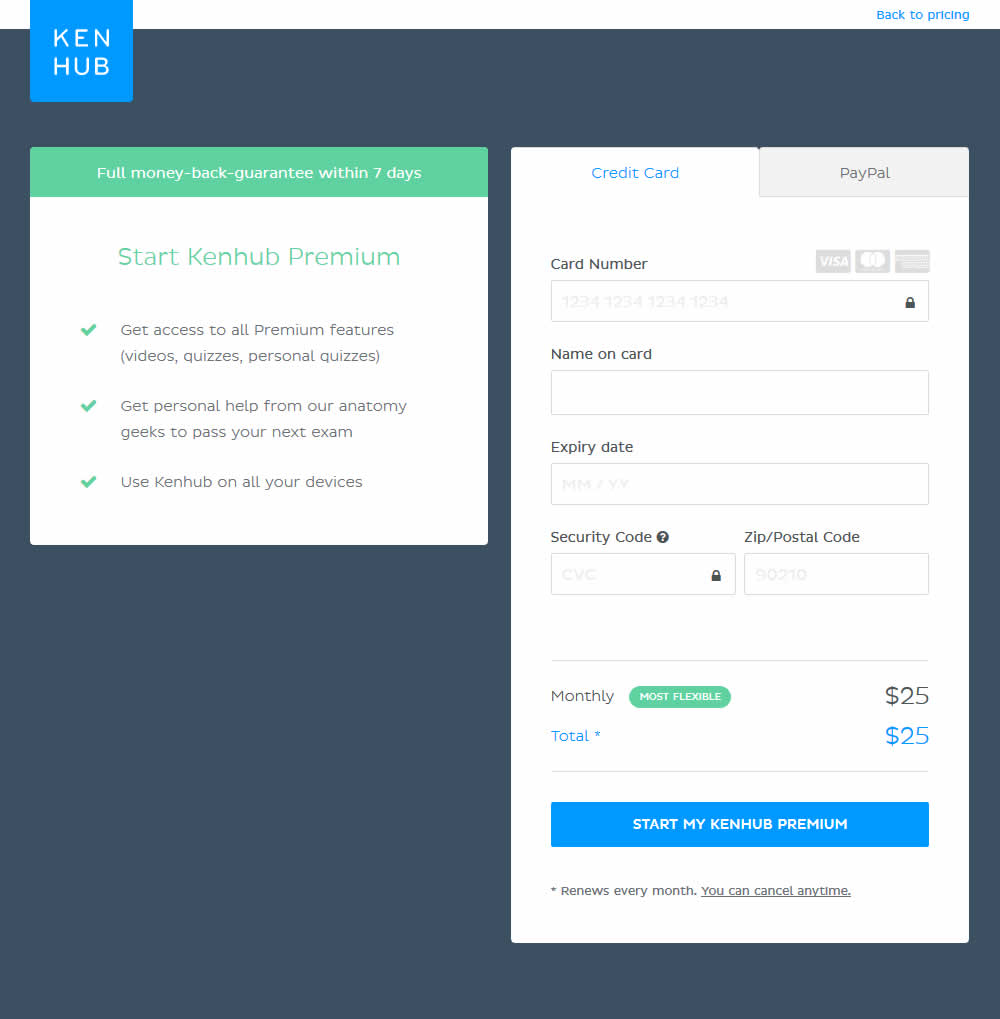
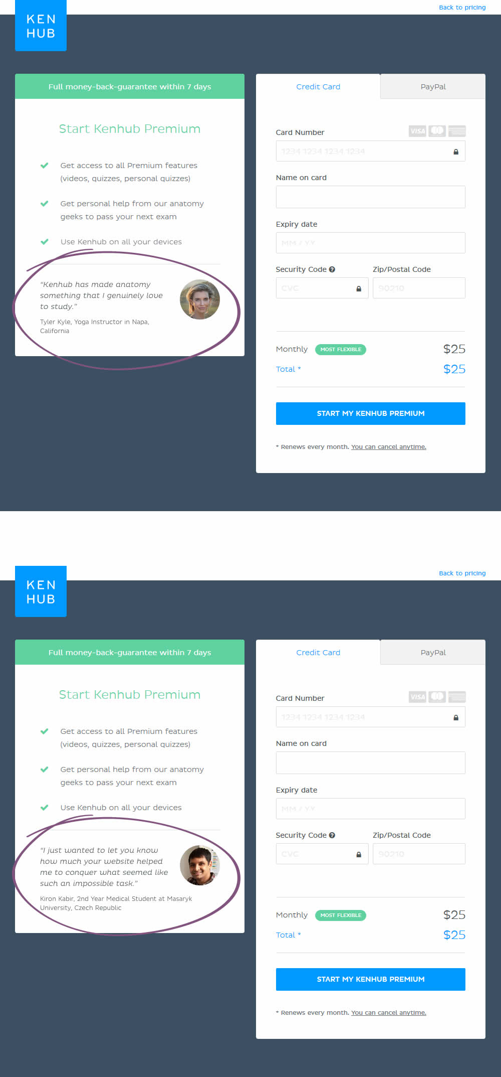
In this experiment, testimonials were added on a checkout screen.
Test #175 on
Thomasnet.com
by
 Julian Gaviria
May 14, 2018
Desktop
Mobile
Content
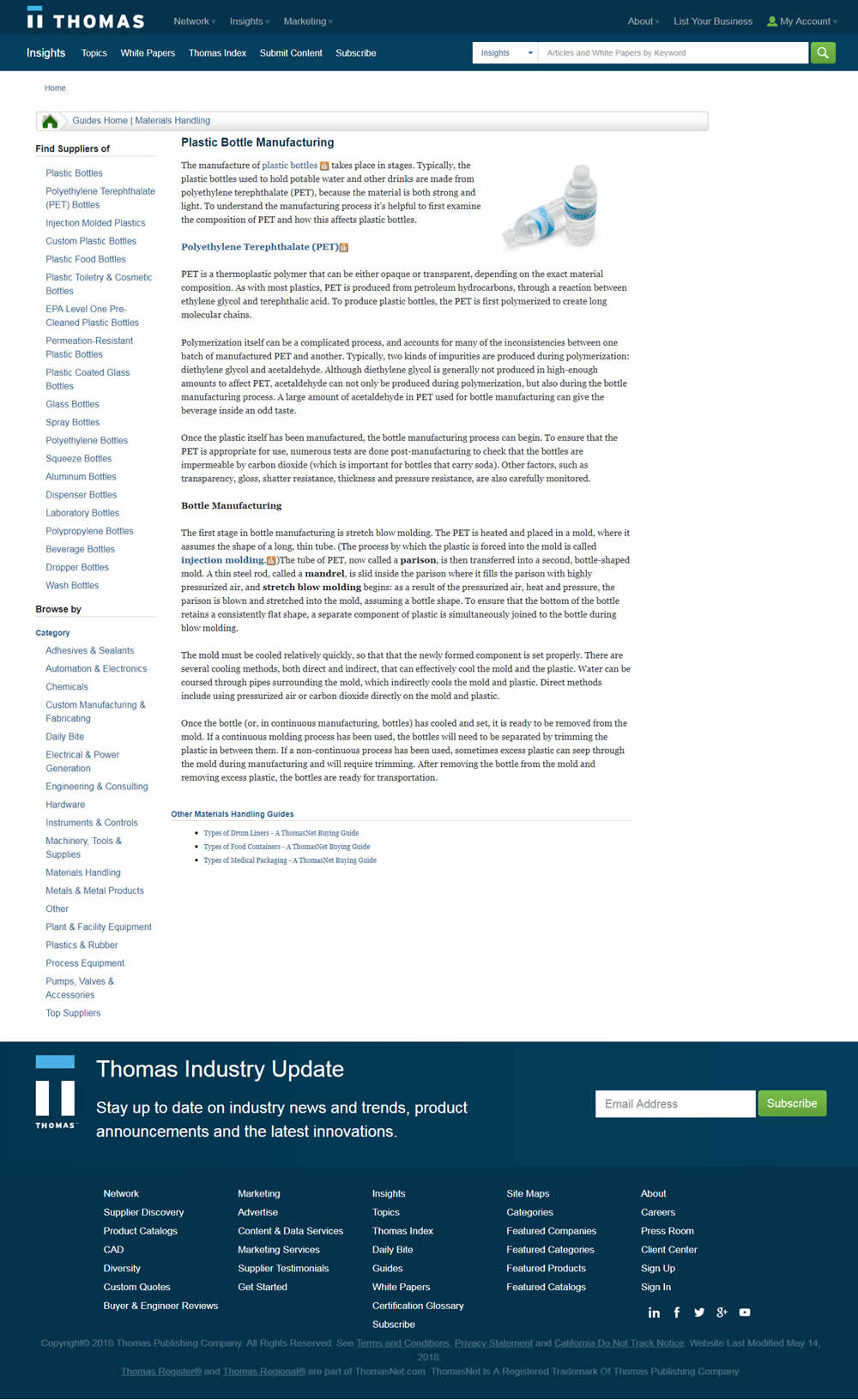
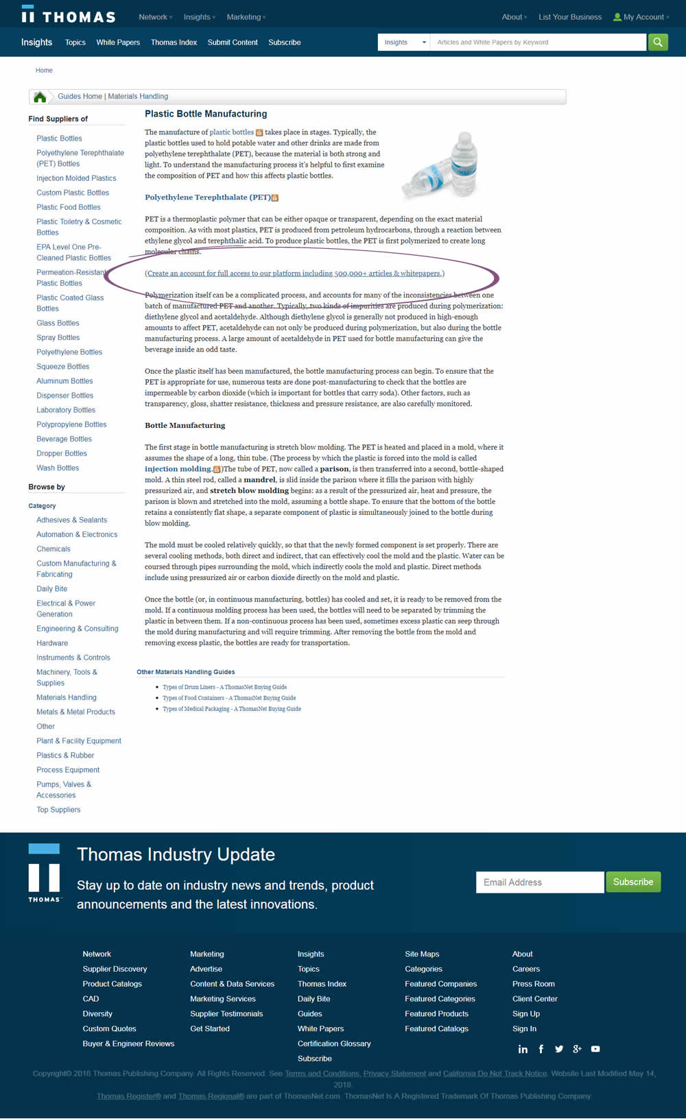
Julian Gaviria Tested Pattern #23: Inline Link Nudge In Test #175 On Thomasnet.com
Test #174 on
Examine.com
by
 Martin Wong
May 13, 2018
Desktop
Mobile
Checkout
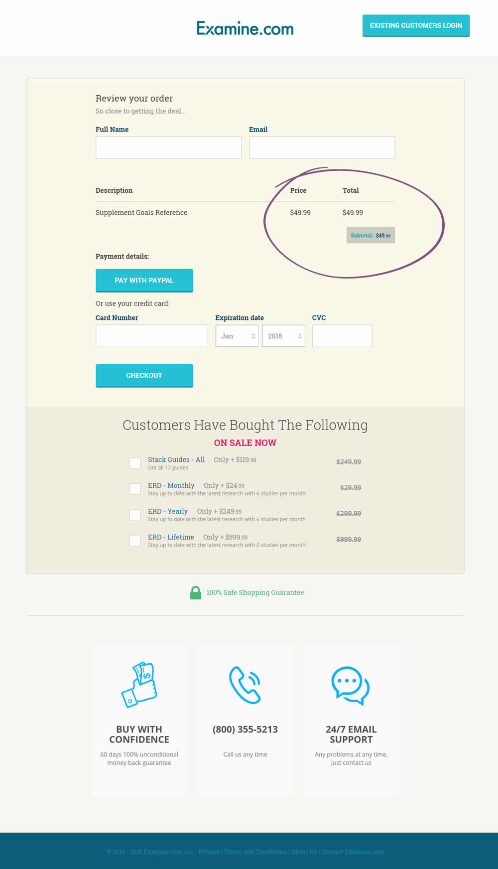
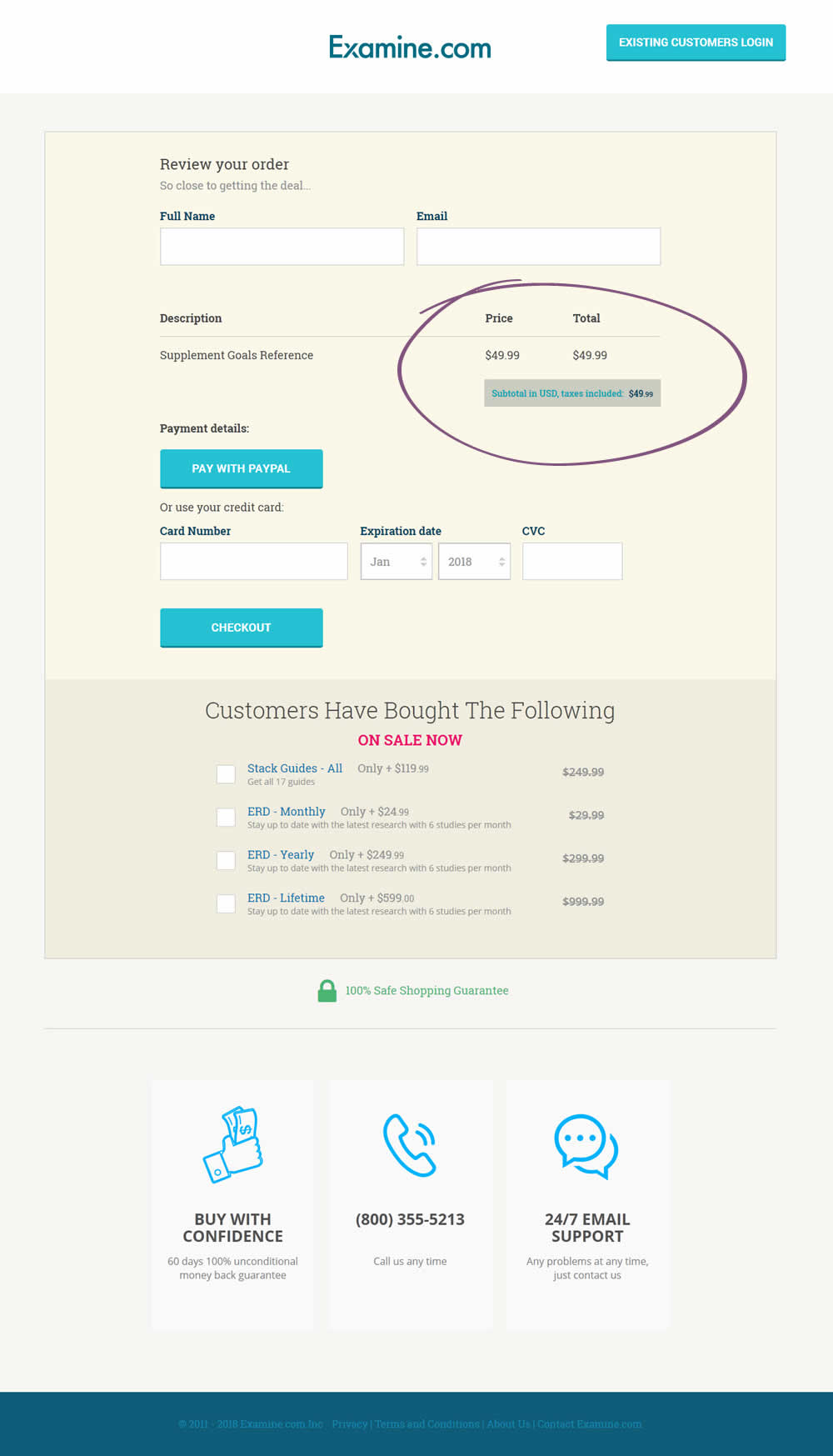
Martin Wong Tested Pattern #67: Currency & Taxes In Test #174 On Examine.com
Test #172 on
Trydesignlab.com
by
 Daniel Shapiro
May 08, 2018
Desktop
Mobile
Product
Daniel Shapiro Tested Pattern #11: Gradual Reassurance In Test #172 On Trydesignlab.com


Test #173 on
Rollbar.com
by
 Mike Smith
May 08, 2018
Desktop
Mobile
Home & Landing
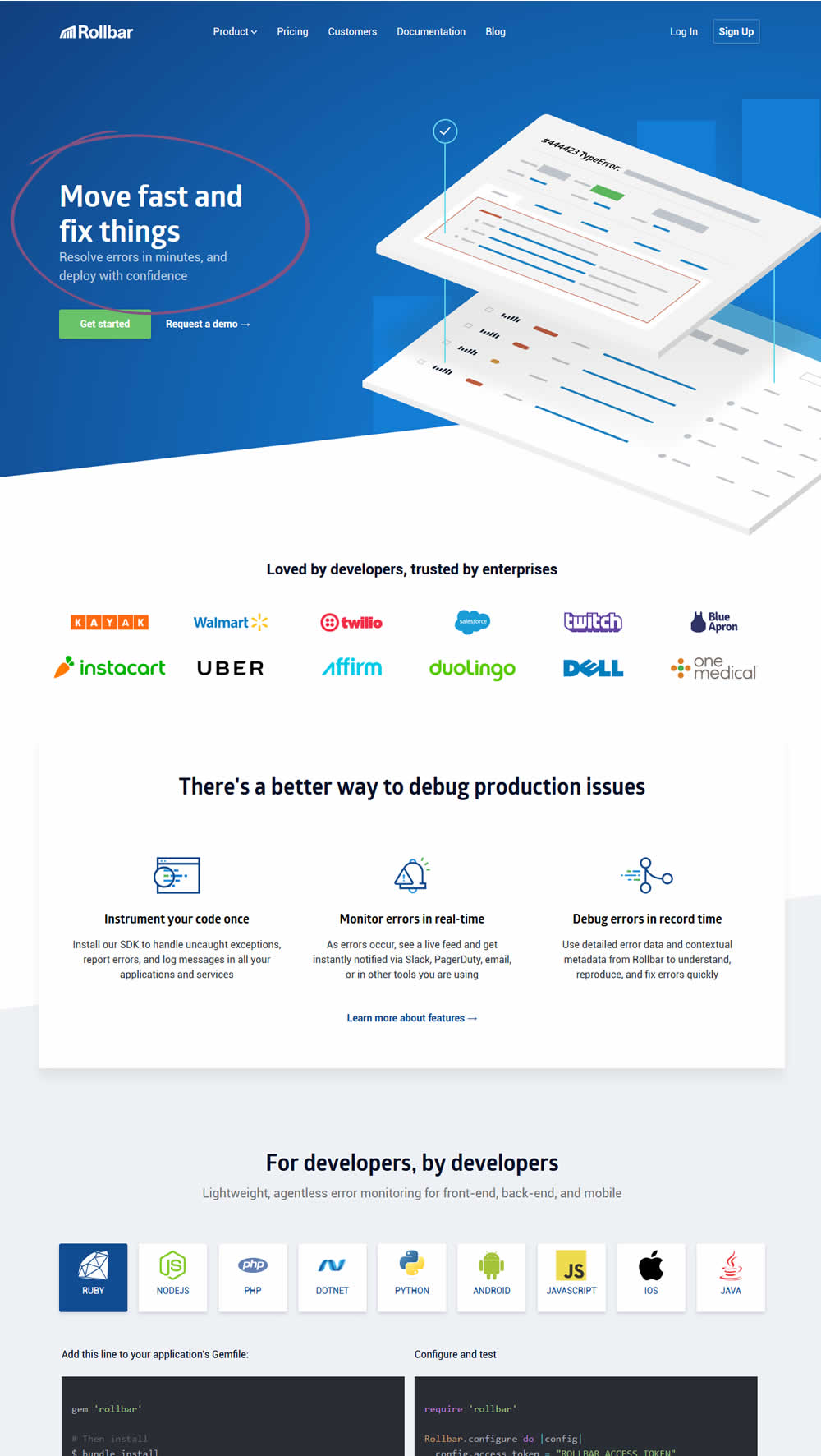
Mike Smith Tested Pattern #22: Empowering Headline In Test #173 On Rollbar.com

Test #171 on
Sjvc.edu
by
Phillip Barnes
Apr 27, 2018
Desktop
Mobile
Signup
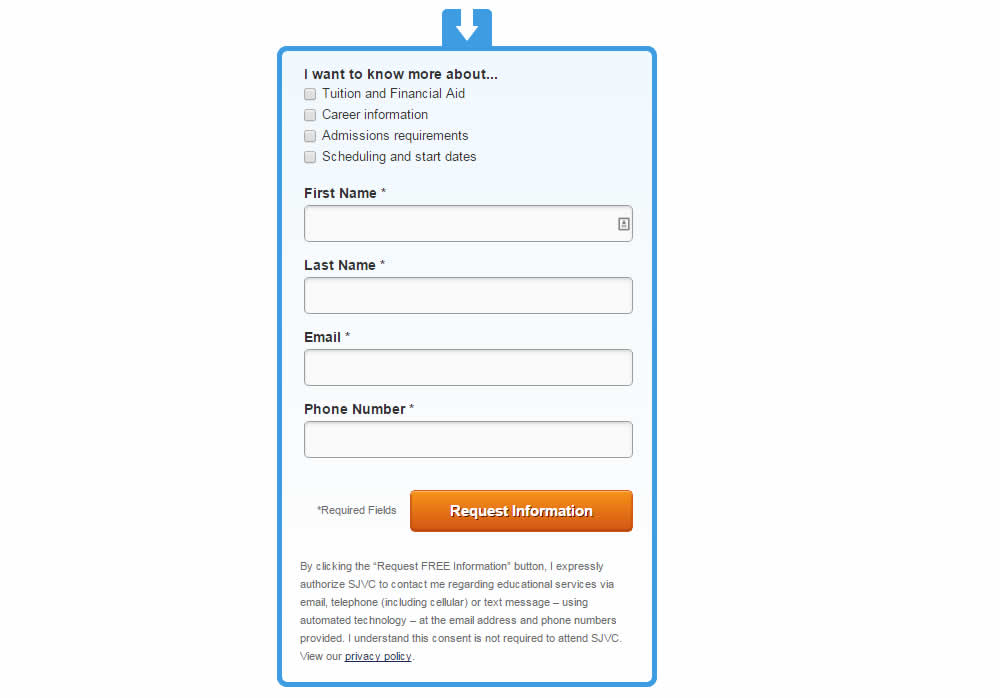
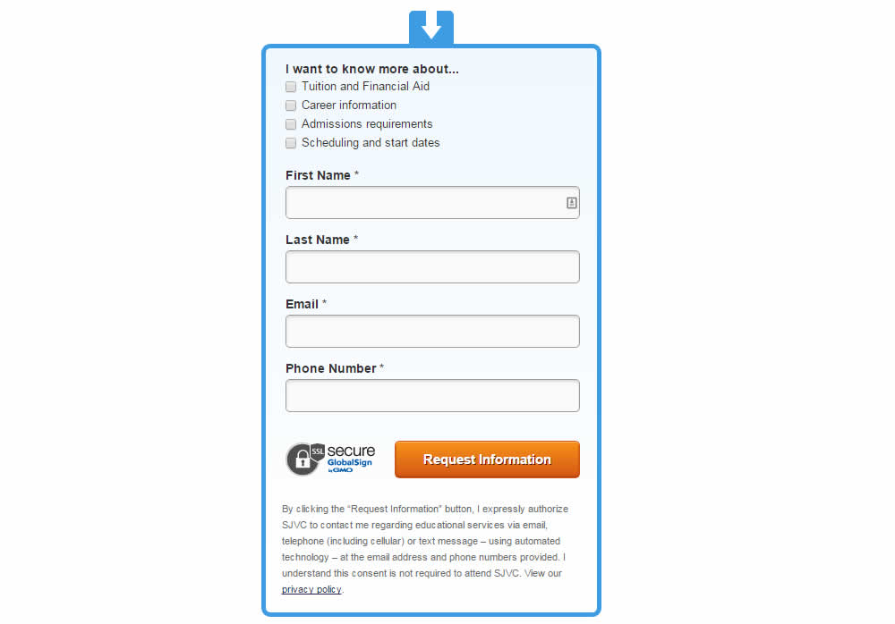
Phillip Barnes Tested Pattern #63: Trust Seals In Test #171 On Sjvc.edu
Test #169 on
Mt.com
by
 Vito Mediavilla
Apr 24, 2018
Desktop
Listing
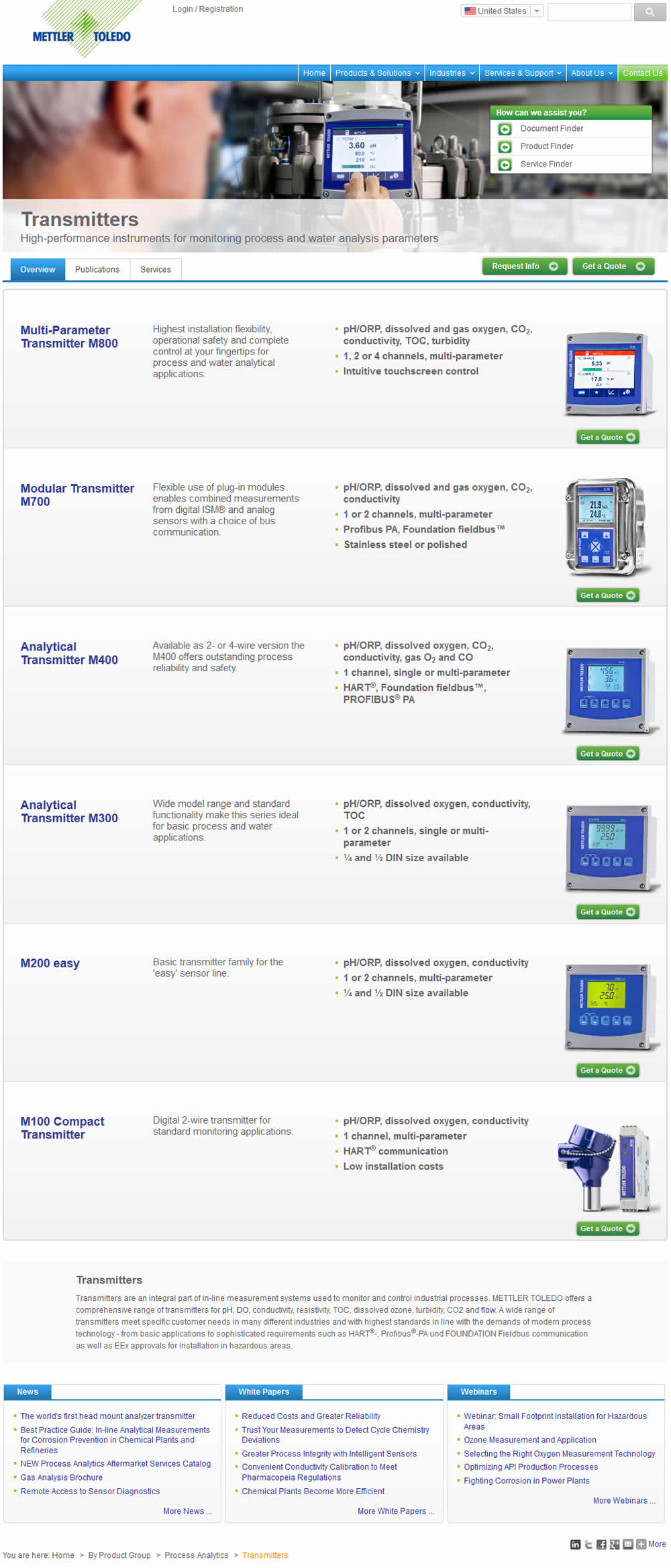
Vito Mediavilla Tested Pattern #37: List Or Grid View In Test #169 On Mt.com
Test #170 on
Goodui.org
by
 Jakub Linowski
Apr 24, 2018
Desktop
Mobile
Home & Landing
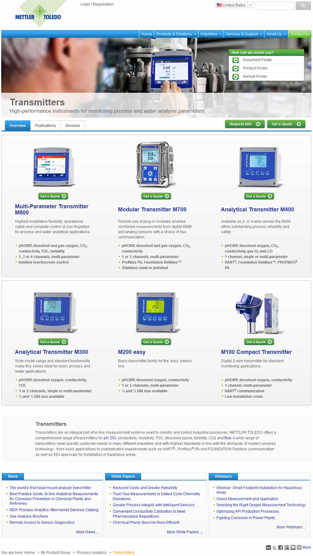
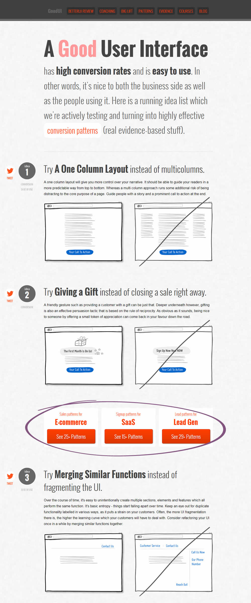
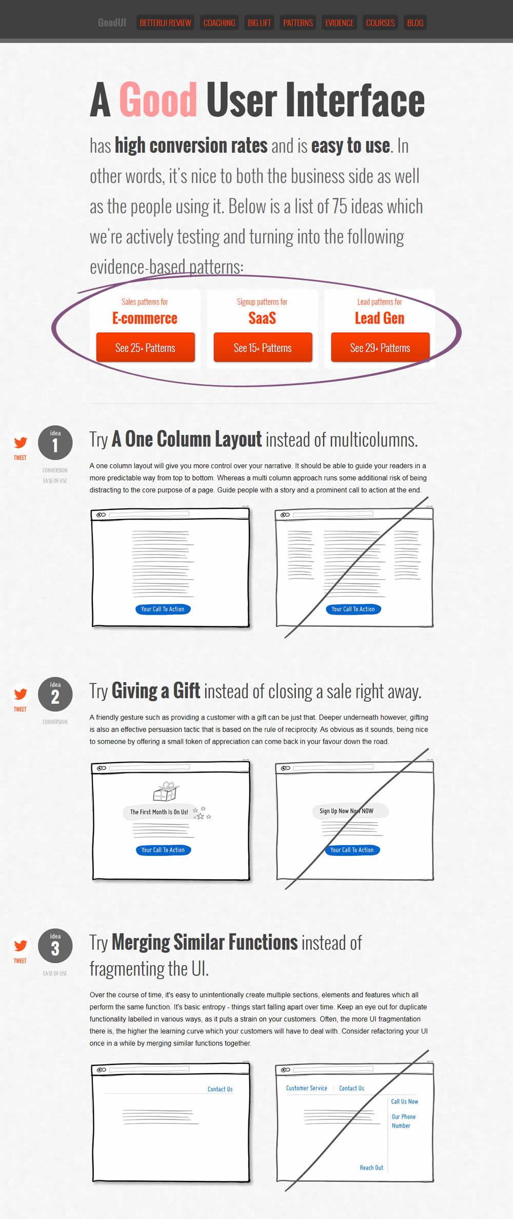
Jakub Linowski Tested Pattern #49: Above The Fold Call To Action In Test #170 On Goodui.org
Test #168 on
Akademiafotografii.p...
by
Grzegorz Jancewicz
Apr 23, 2018
Desktop
Listing
Grzegorz Jancewicz Tested Pattern #45: Benefit Bar In Test #168 On Akademiafotografii.p...


Test #167 on
Lovehoney.co.uk
by
 Matthew Curry
Apr 10, 2018
Desktop
Product
Matthew Curry Tested Pattern #69: Autodiscounting In Test #167 On Lovehoney.co.uk
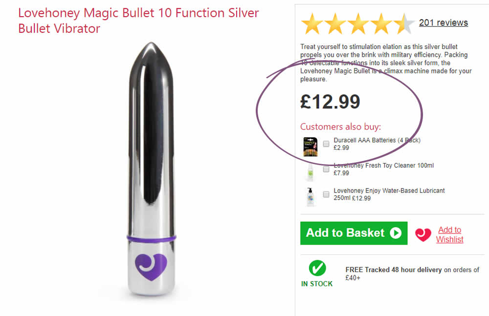
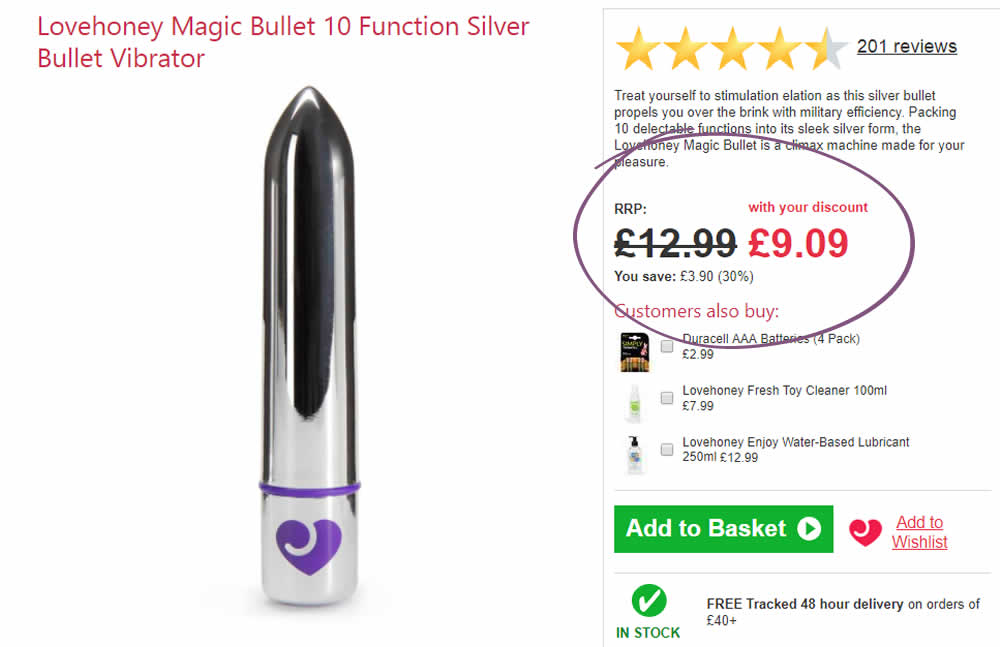
The idea is that, if the customer has an active discount code for that session (either by landing on a particular page, or entering a code somewhere), instead of just showing the discount in the basket, we show it further (earlier) up the funnel and automatically discount on the product page.
The effectiveness of this depends on the discount level, I've tested it at 30% and 50%.
With a 50% Discount:
Add to Cart rate +33%
Sales rate + 24%
With a 30% Discount:
Add to Cart rate +11.6%
Sales rate + 10.2%
Test #166 on
Olark.com
by
 Sunir Shah
Apr 05, 2018
Desktop
Mobile
Home & Landing
Sunir Shah Tested Pattern #12: Payment First In Test #166 On Olark.com
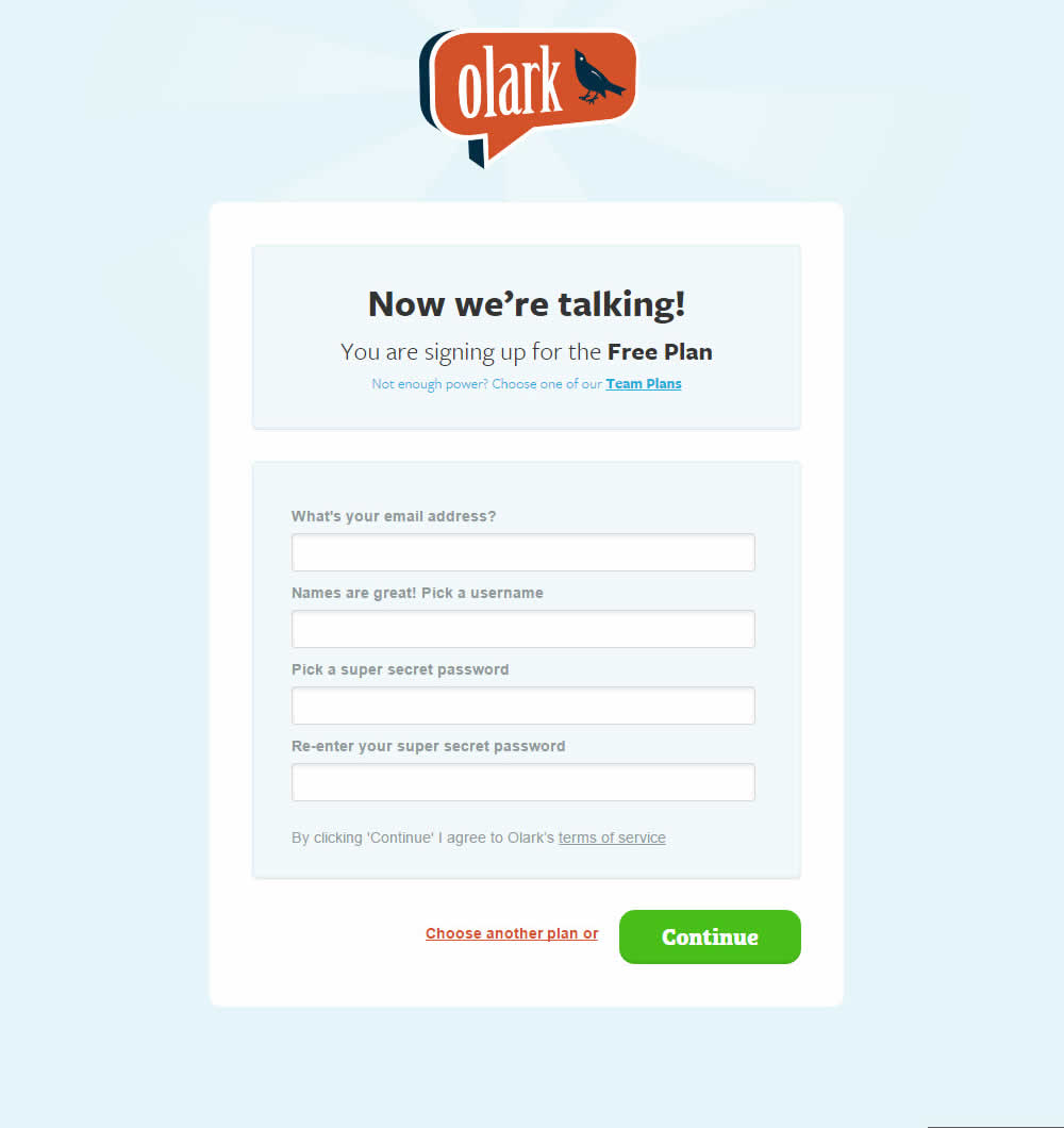
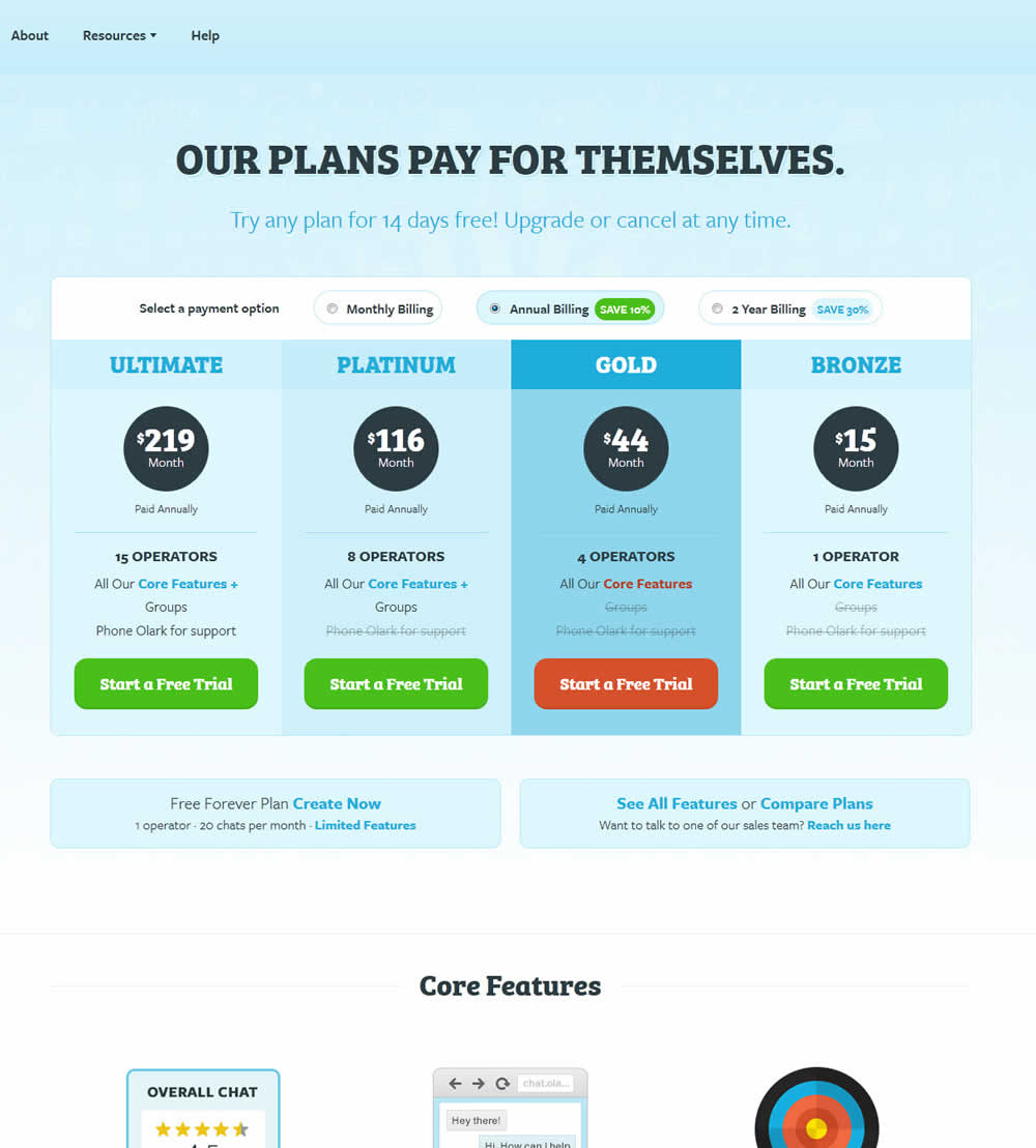
Olark's homepage was directing users towards a free forever trial - with followup nudges to upgrade some days later. The variation B of the experiment tested a more aggressive push to a pricing page page - with options to select a paid plan, as well as provide a credit card (getting the payment conversation out of the way sooner).