17 Tests By  Daniel Shapiro
Tests
Test #439 on
Designlab.com
by
 Daniel Shapiro
Oct 31, 2022
Desktop
Mobile
Daniel Shapiro Tested Pattern #18: Single Or Alternative Buttons In Test #439 On Designlab.com


This was a larger leap experiment with numerous changes to the header part of a design program landing page. One of the key changes however was a shift from a single to multiple call to actions for lead generation. In the control, all potential leads would first funnel through a single syllabus download flow. In the variation, users were given three visible choices: download syllabus, webinar signup and/or book a live call with admissions. Impact on overall generated leads was measured, as well as paid enrollments.
Test #436 on
Designlab.com
by
 Daniel Shapiro
Oct 25, 2022
Desktop
Mobile
Daniel Shapiro Tested Pattern #7: Social Counts In Test #436 On Designlab.com


In this experiment, social proof and scarcity messages were shown on a course enrollment landing page. When students were starting to sign up at the beginning of each month (with greater availability), a simpler "X students have already enrolled in the next cohort" message was used.
Later in the month when fewer spots were available, a more scarce message was used with the following copy "ONLY X SPOTS available in the next cohort".
In both cases, the numbers were accurate and dynamically updated.
Test #427 on
Designlab.com
by
 Daniel Shapiro
Aug 10, 2022
Desktop
Mobile
Daniel Shapiro Tested Pattern #28: Easiest Fields First In Test #427 On Designlab.com
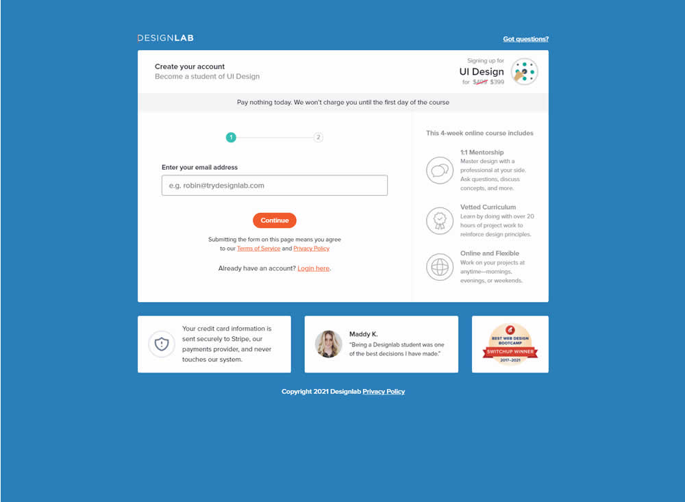
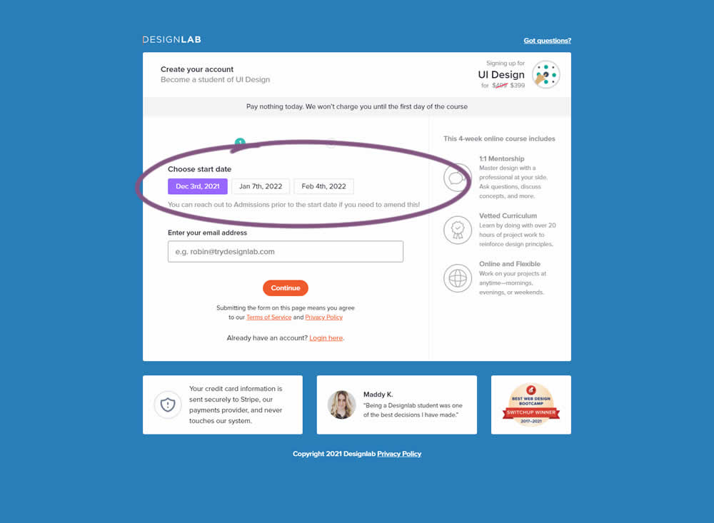
In this experiment, the course enrollment start date was moved from step 2 to step 1 of an enrollment / checkout flow. The test was run by Designlab - that offers design courses and education with a strong element of mentorship. Impact on progression to next step and completed transactions were measured.
Test #420 on
Designlab.com
by
 Daniel Shapiro
Jul 12, 2022
Desktop
Mobile
Daniel Shapiro Tested Pattern #115: Pricing Comparison Table In Test #420 On Designlab.com
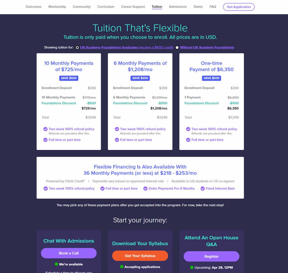
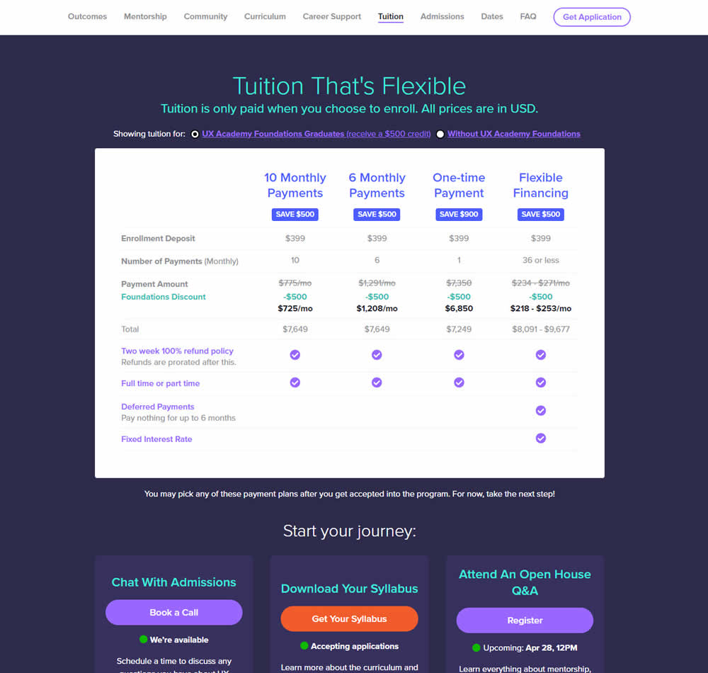
In this experiment, pricing plans were laid out horizontally for easier comparison. In the variation, most of the plan benefits, features and differences were also referenced using a single lable that was left-aligned. The idea was to make the variables aligned and therefore more comparable.
This pricing table appeared at the bottom of a long design program landing page. Impact on leads and applications was measured.
Test #416 on
Designlab.com
by
 Daniel Shapiro
Jun 20, 2022
Desktop
Mobile
Daniel Shapiro Tested Pattern #105: Lead Magnets In Test #416 On Designlab.com


In this experiment, copy was added which communicated that students signing up for a course would receive extra design resources (the lead magnet). This was added in multiple states of the course page. Impact on lead generation and enrollment was measured.
Test #410 on
Designlab.com
by
 Daniel Shapiro
May 05, 2022
Desktop
Mobile
Daniel Shapiro Tested Pattern #29: Surfaced Content In Test #410 On Designlab.com
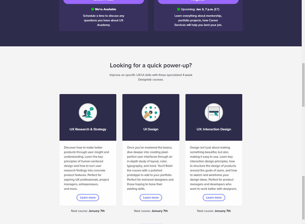
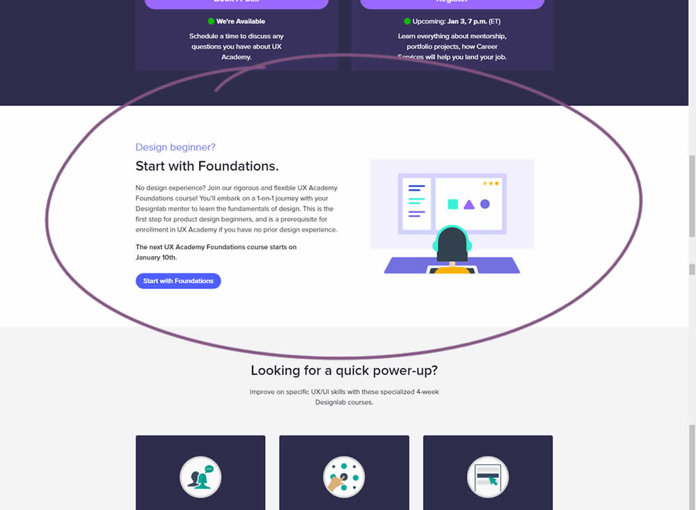
Does linking to a product detail page help? Or should a homepage simply focus on generic lead generation? In this homepage experiment, the presence of a component with a link to a detailed course landing page was tested. Impact on course enrollments was measured.
Test #122 on
Designlab.com
by
 Daniel Shapiro
Jan 22, 2022
Desktop
Mobile
Daniel Shapiro Tested Pattern #30: Authentic Photos In Test #122 On Designlab.com

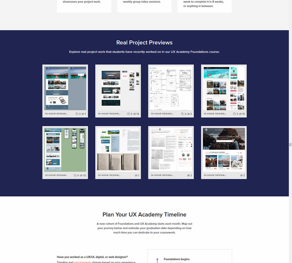
In this experiment for an online design course, the variation had an extra section with student work previews. The previews were not clickable but were added just below the fold. Impact on leads was measured by potential students requesting a syllabus through an online form throughout the long landing page.
Test #316 on
Trydesignlab.com
by
 Daniel Shapiro
Sep 24, 2020
Desktop
Mobile
Daniel Shapiro Tested Pattern #22: Empowering Headline In Test #316 On Trydesignlab.com


In this experiment, the headline was changed to focus more on the end-goal of the UX Academy program - that of landing your first UI/UX role.
Test #313 on
Trydesignlab.com
by
 Daniel Shapiro
Aug 19, 2020
Desktop
Mobile
Daniel Shapiro Tested Pattern #11: Gradual Reassurance In Test #313 On Trydesignlab.com


In this experiment, instead of showing a single-focused lead form (for the UX Academy Program), users were asked to express a wider set of choices first (for the UX Academy or shortter set of skill-based courses). The experiment measured overall leads for both types of programs.
Test #297 on
Trydesignlab.com
by
 Daniel Shapiro
May 04, 2020
Desktop
Daniel Shapiro Tested Pattern #41: Sticky Call To Action In Test #297 On Trydesignlab.com


In this experiment, a sticky "Enroll" button was shown on a course landing page. The button lead to a payment funnel to allow enrolling/paying for a course. The exeperiment measured inital progression into this funnel as well as the deeper completed sales metric.
Test #183 on
Trydesignlab.com
by
 Daniel Shapiro
Jun 19, 2018
Desktop
Mobile
Daniel Shapiro Tested Pattern #46: Pay Later In Test #183 On Trydesignlab.com


Test #172 on
Trydesignlab.com
by
 Daniel Shapiro
May 08, 2018
Desktop
Mobile
Daniel Shapiro Tested Pattern #11: Gradual Reassurance In Test #172 On Trydesignlab.com


Test #141 on
Trydesignlab.com
by
 Daniel Shapiro
Jan 05, 2018
Desktop
Mobile
Daniel Shapiro Tested Pattern #49: Above The Fold Call To Action In Test #141 On Trydesignlab.com


The variation introduced a call to action at the top of the screen that linked to a form deep down on a long course page.
Test #137 on
Trydesignlab.com
by
 Daniel Shapiro
Dec 22, 2017
Desktop
Mobile
Daniel Shapiro Tested Pattern #46: Pay Later In Test #137 On Trydesignlab.com
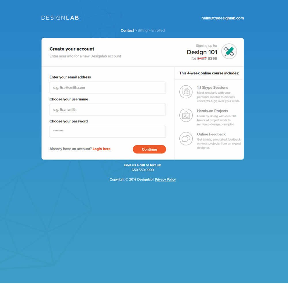
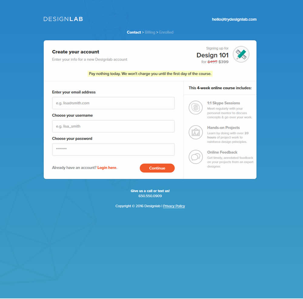
This test was run on a 3 step checkout process. The first screen was asking for contact information, and the second screen asked for credit card details. The change was shown on both first two steps as shown on the image below.
Test #138 on
Trydesignlab.com
by
 Daniel Shapiro
Dec 22, 2017
Desktop
Mobile
Daniel Shapiro Tested Pattern #42: Countdown Timer In Test #138 On Trydesignlab.com
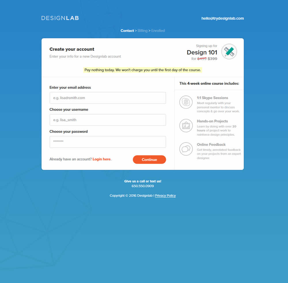
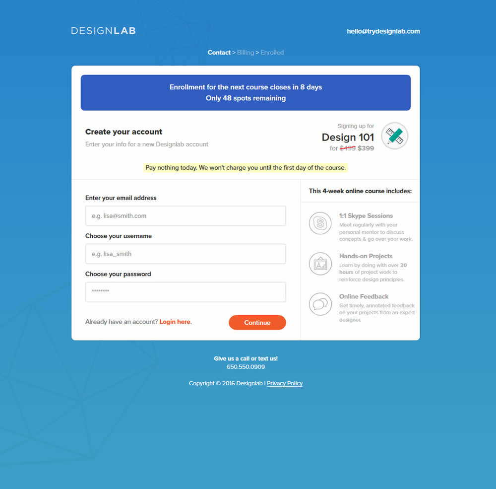
This test was run on a 3 step checkout process. The first screen was asking for contact information, and the second screen asked for credit card details. The change was shown on both first two steps as shown on the image below.
Test #110 on
Trydesignlab.com
by
 Daniel Shapiro
Jul 01, 2017
Desktop
Daniel Shapiro Tested Pattern #14: Exposed Menu Options In Test #110 On Trydesignlab.com


Test #111 on
Trydesignlab.com
by
 Daniel Shapiro
Jul 01, 2017
Desktop
Daniel Shapiro Tested Pattern #58: Full Height False Bottom In Test #111 On Trydesignlab.com
