All Latest 582 A/B Tests
Become a member to unlock the abiltiy to see the highest impact a/b tests. Being able to see the actual test results and sort by impact allows growth and experimentation teams to take action on the biggest gains first
MOST RECENT TESTS
Test #101 on
Acousticalsurfaces.c...
by
 Julian Gaviria
May 02, 2017
Desktop
Mobile
Content
Julian Gaviria Tested Pattern #23: Inline Link Nudge In Test #101 On Acousticalsurfaces.c...


Test #95 on
Vivareal.com.br
by
 Rodrigo Maués
May 01, 2017
Desktop
Mobile
Home & Landing
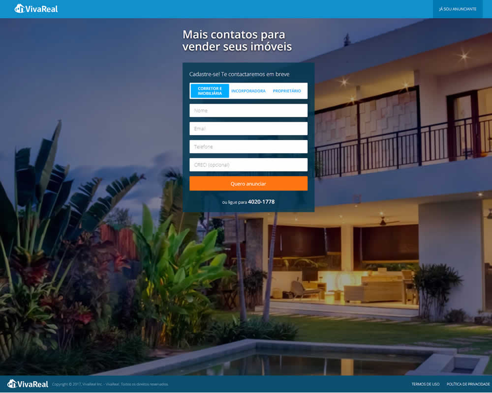
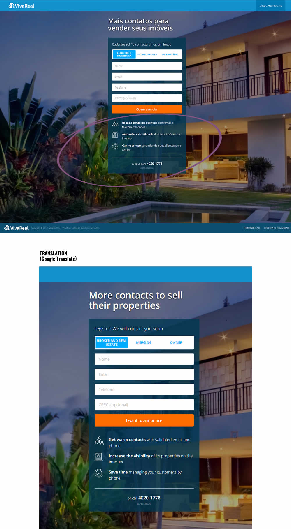
Rodrigo Maués Tested Pattern #15: Bulleted Reassurances In Test #95 On Vivareal.com.br
Test #103 on
Rollbar.com
by
 Mike Smith
May 01, 2017
Desktop
Home & Landing
Mike Smith Tested Pattern #11: Gradual Reassurance In Test #103 On Rollbar.com


Test #96 on
3dhubs.com
by
 Rob Draaijer
Apr 21, 2017
Desktop
Mobile
Home & Landing
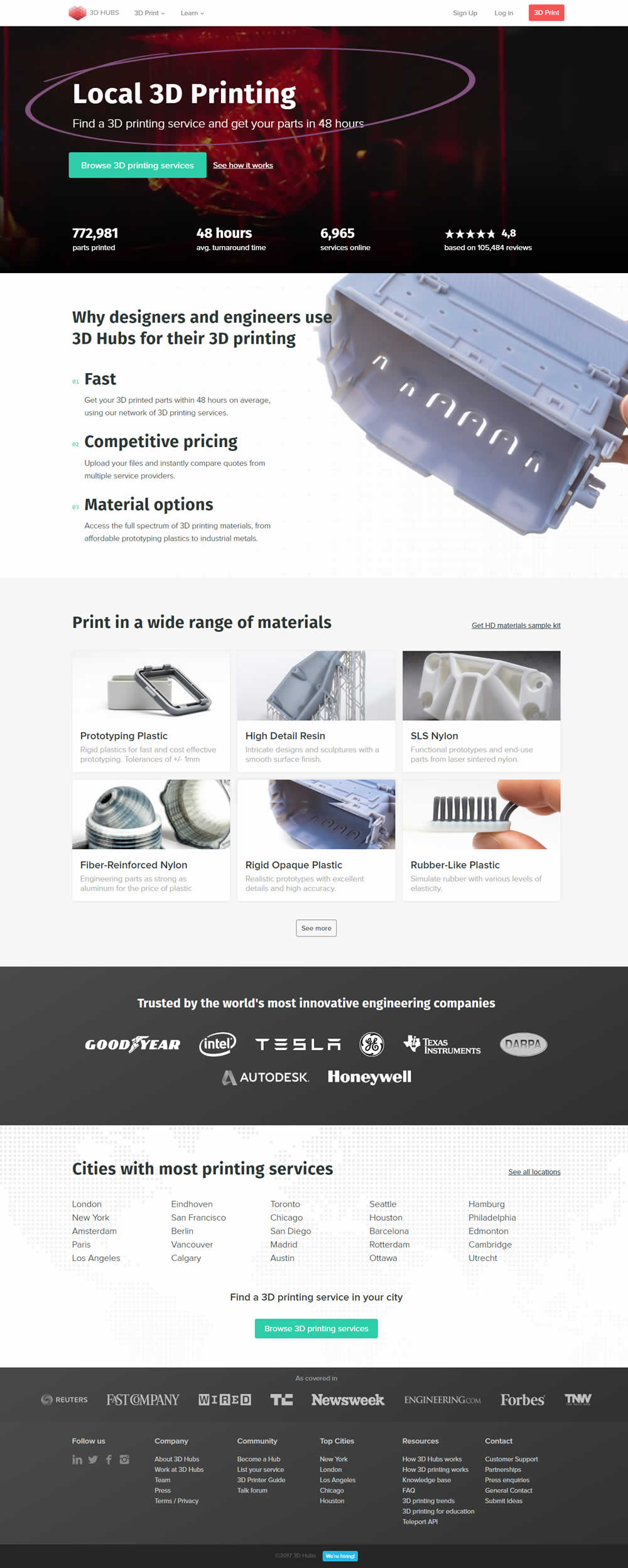
Rob Draaijer Tested Pattern #61: Local Headline In Test #96 On 3dhubs.com

Test #90 on
Vivareal.com.br
by
 Rodrigo Maués
Apr 01, 2017
Desktop
Home & Landing
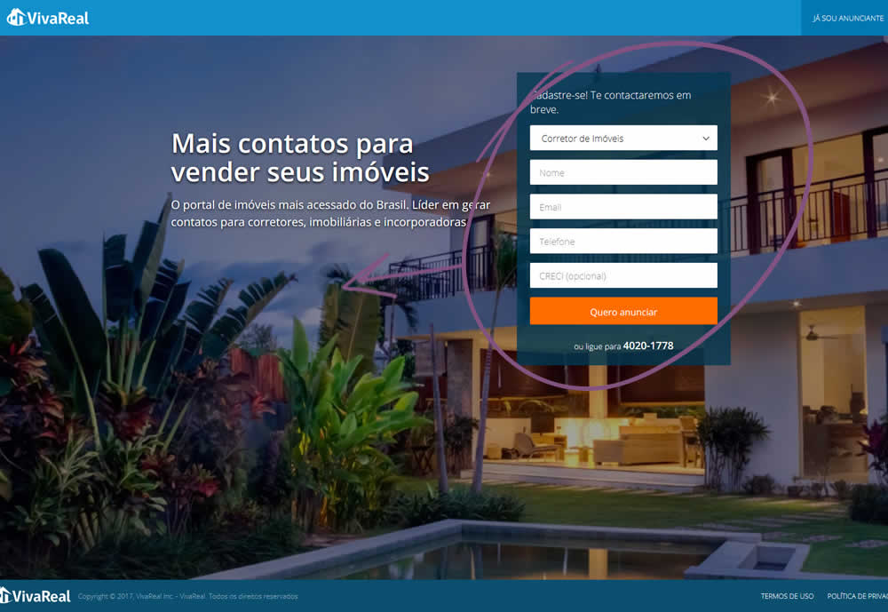
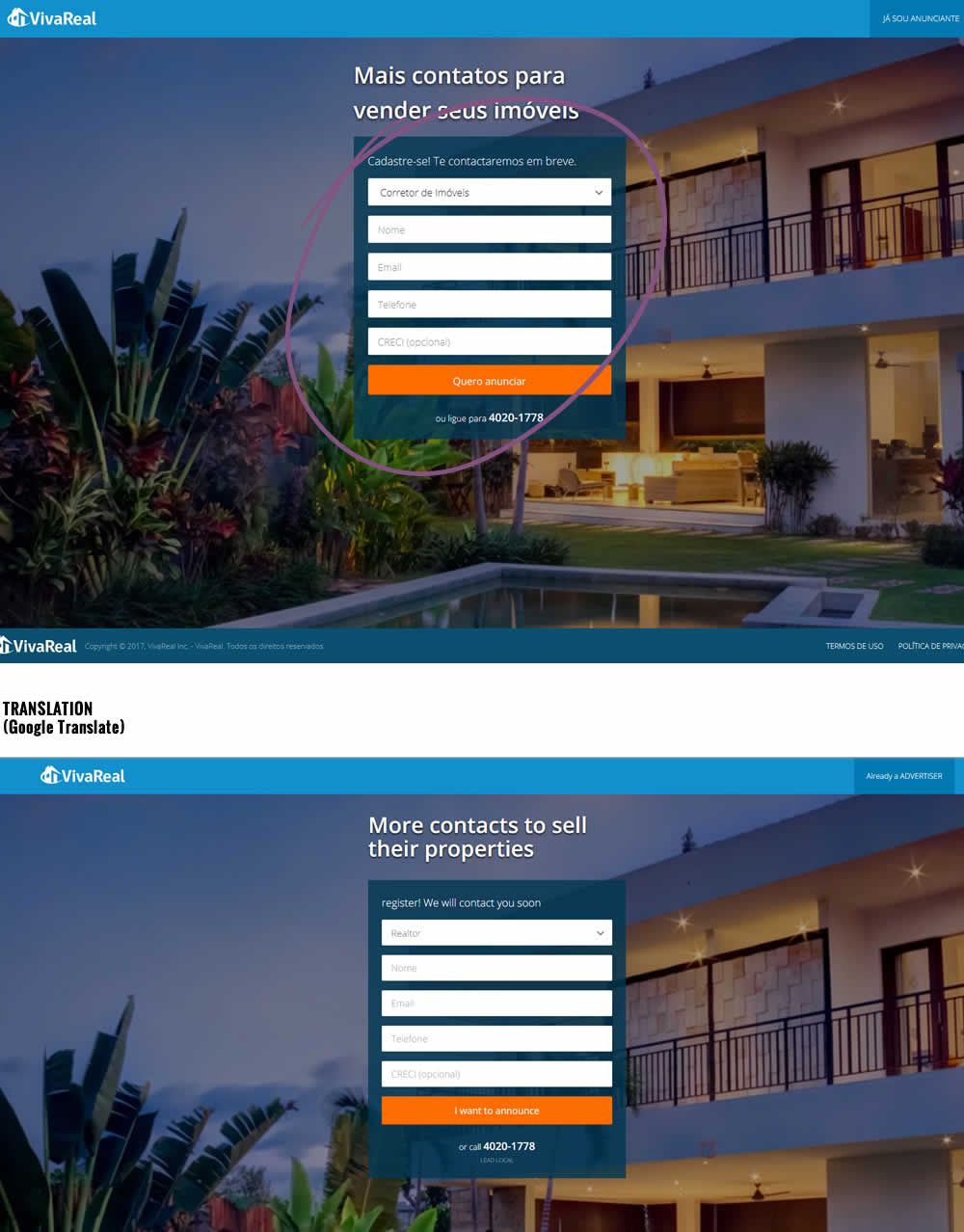
Rodrigo Maués Tested Pattern #13: Centered Forms & Buttons In Test #90 On Vivareal.com.br
Test #88 on
Ssdnodes.com
by
 Matt Connor
Mar 31, 2017
Desktop
Mobile
Shopping Cart
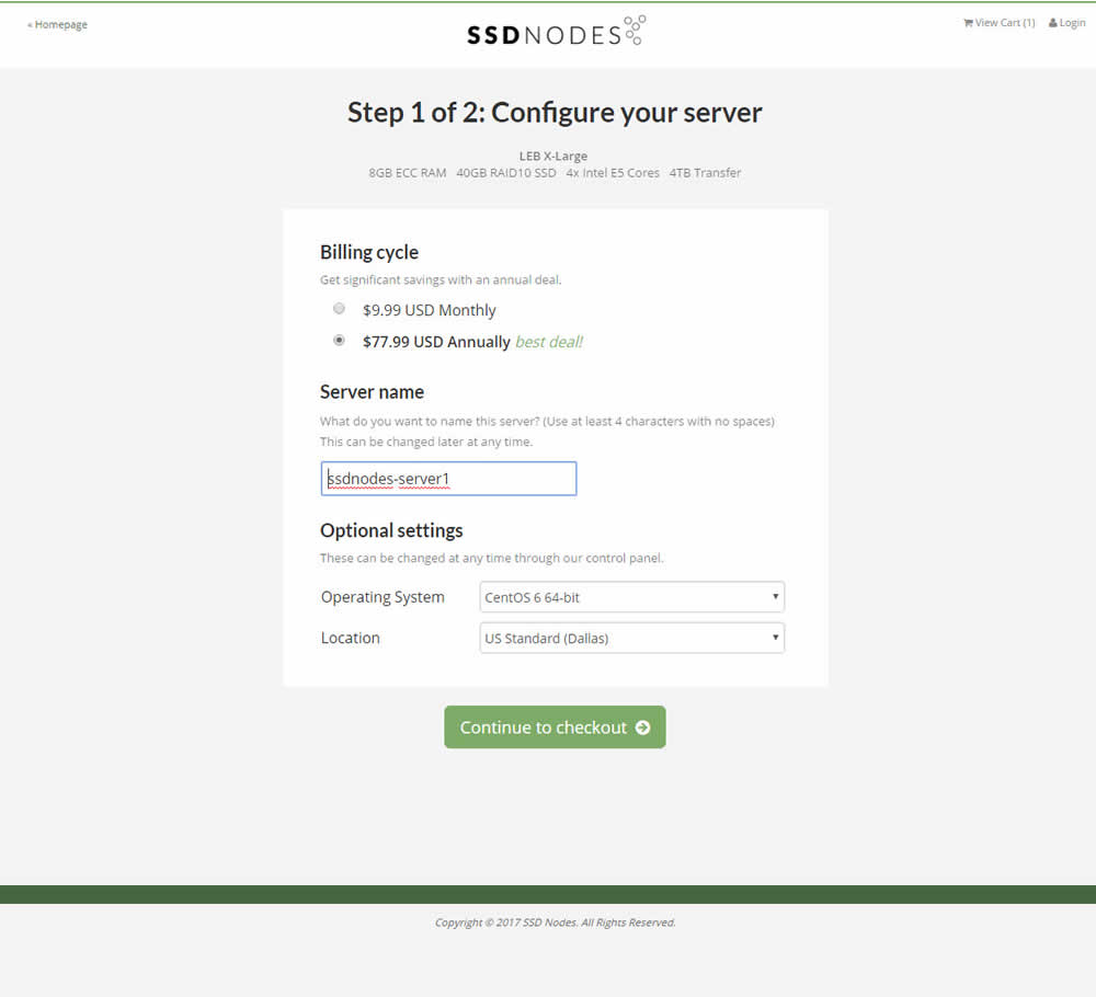
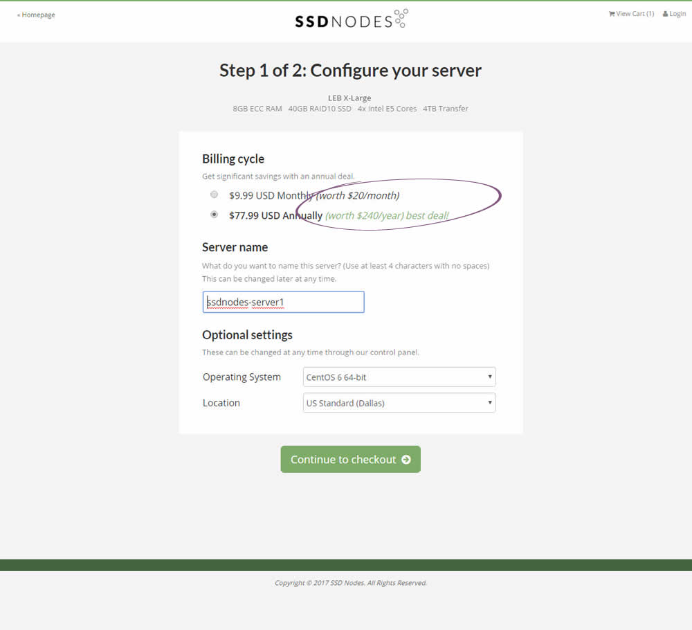
Matt Connor Tested Pattern #21: What It's Worth In Test #88 On Ssdnodes.com
Test #84 on
Onlinefaxes.com
by
 Jaymie Friesen
Mar 02, 2017
Desktop
Mobile
Home & Landing
Jaymie Friesen Tested Pattern #7: Social Counts In Test #84 On Onlinefaxes.com


Test #83 on
Onlinefaxes.com
by
 Jaymie Friesen
Mar 02, 2017
Desktop
Home & Landing
Jaymie Friesen Tested Pattern #4: Testimonials In Test #83 On Onlinefaxes.com


Test #85 on
Vivareal.com.br
by
 Rodrigo Maués
Mar 01, 2017
Desktop
Mobile
Product
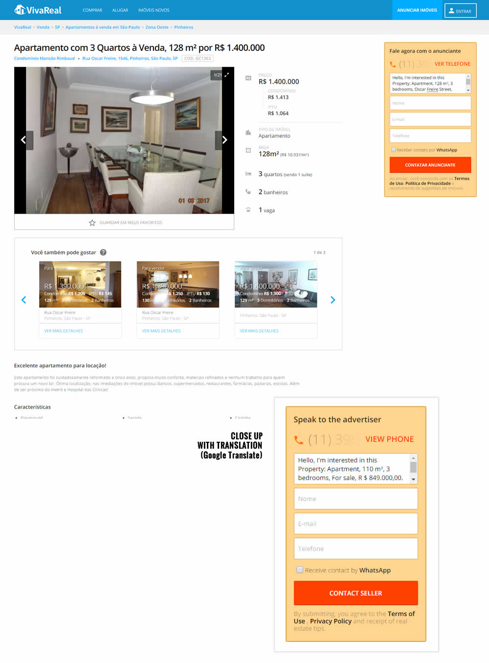
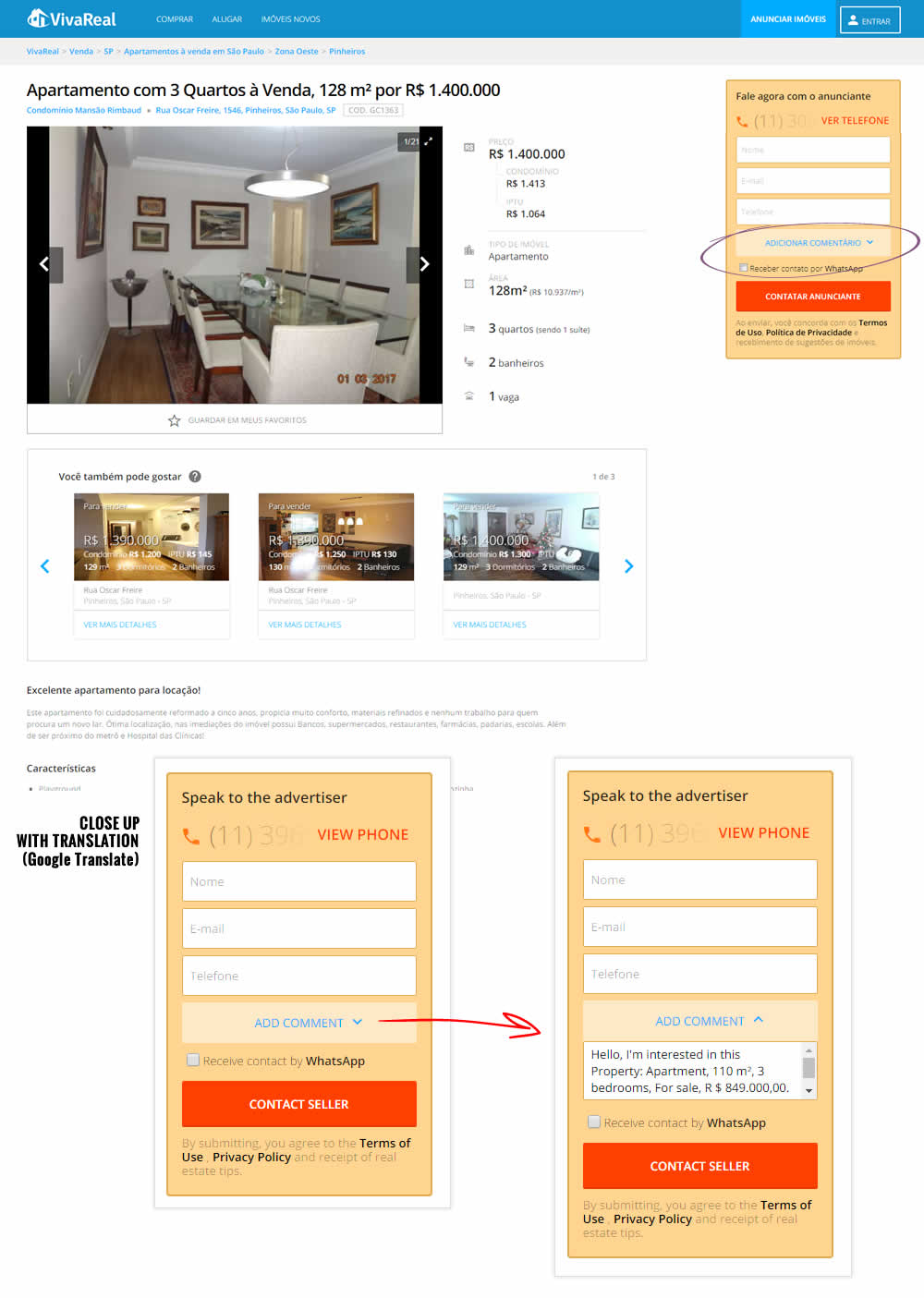
Rodrigo Maués Tested Pattern #3: Fewer Form Fields In Test #85 On Vivareal.com.br
Test #87 on
Vivareal.com.br
by
 Rodrigo Maués
Mar 01, 2017
Desktop
Mobile
Product
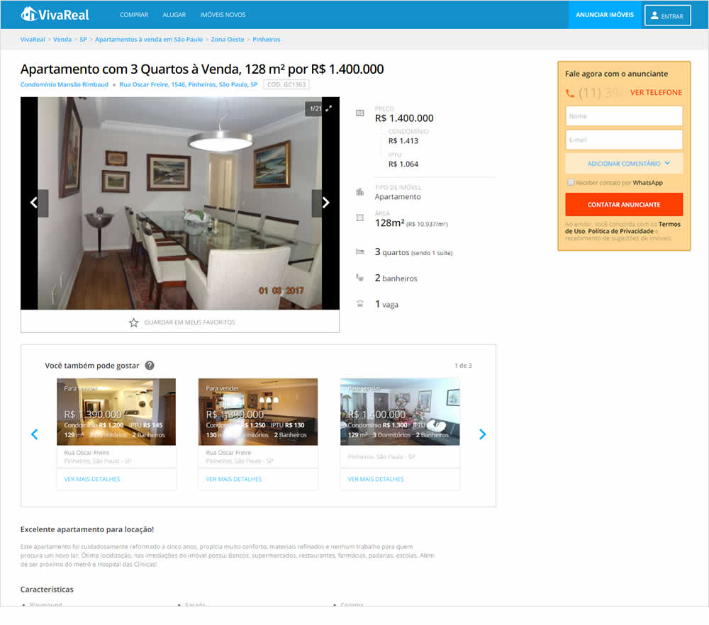
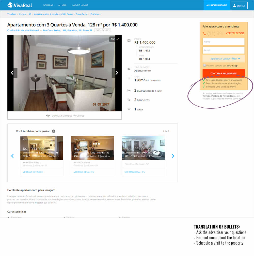
Rodrigo Maués Tested Pattern #15: Bulleted Reassurances In Test #87 On Vivareal.com.br
Test #76 on
Goodui.org
by
 Jakub Linowski
Feb 01, 2017
Desktop
Home & Landing
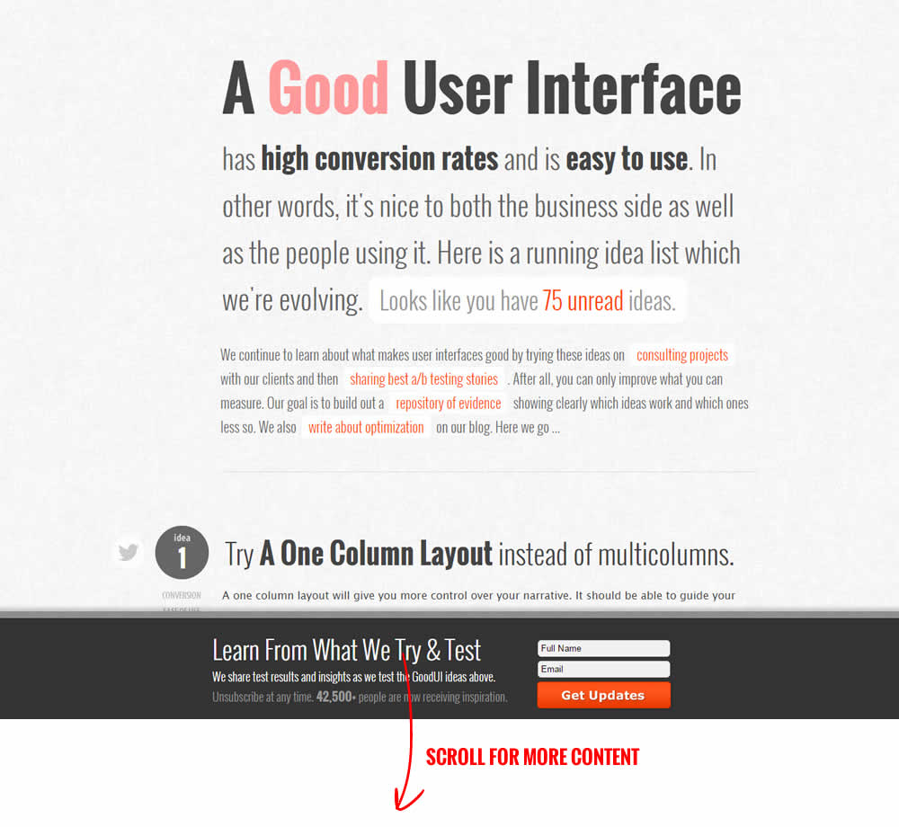
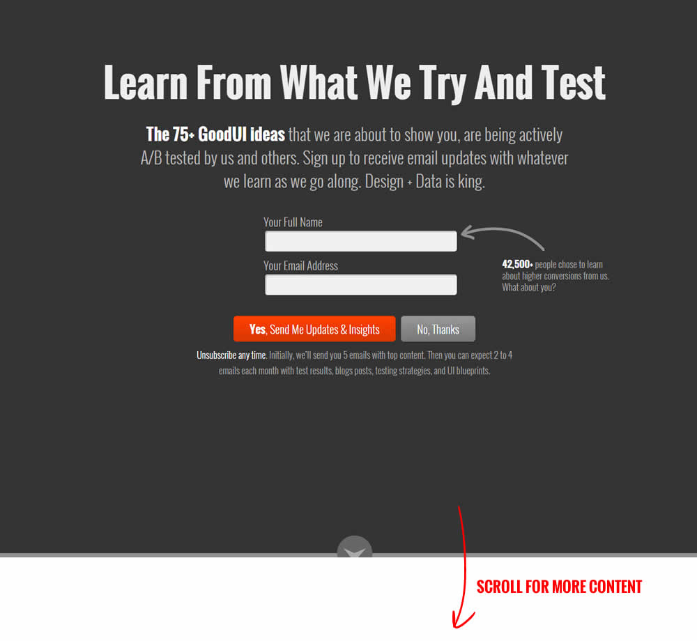
Jakub Linowski Tested Pattern #16: Welcome Mat - Partial In Test #76 On Goodui.org
Test #46 on
Hylokusa.com
by
 Julian Gaviria
Feb 01, 2017
Desktop
Product
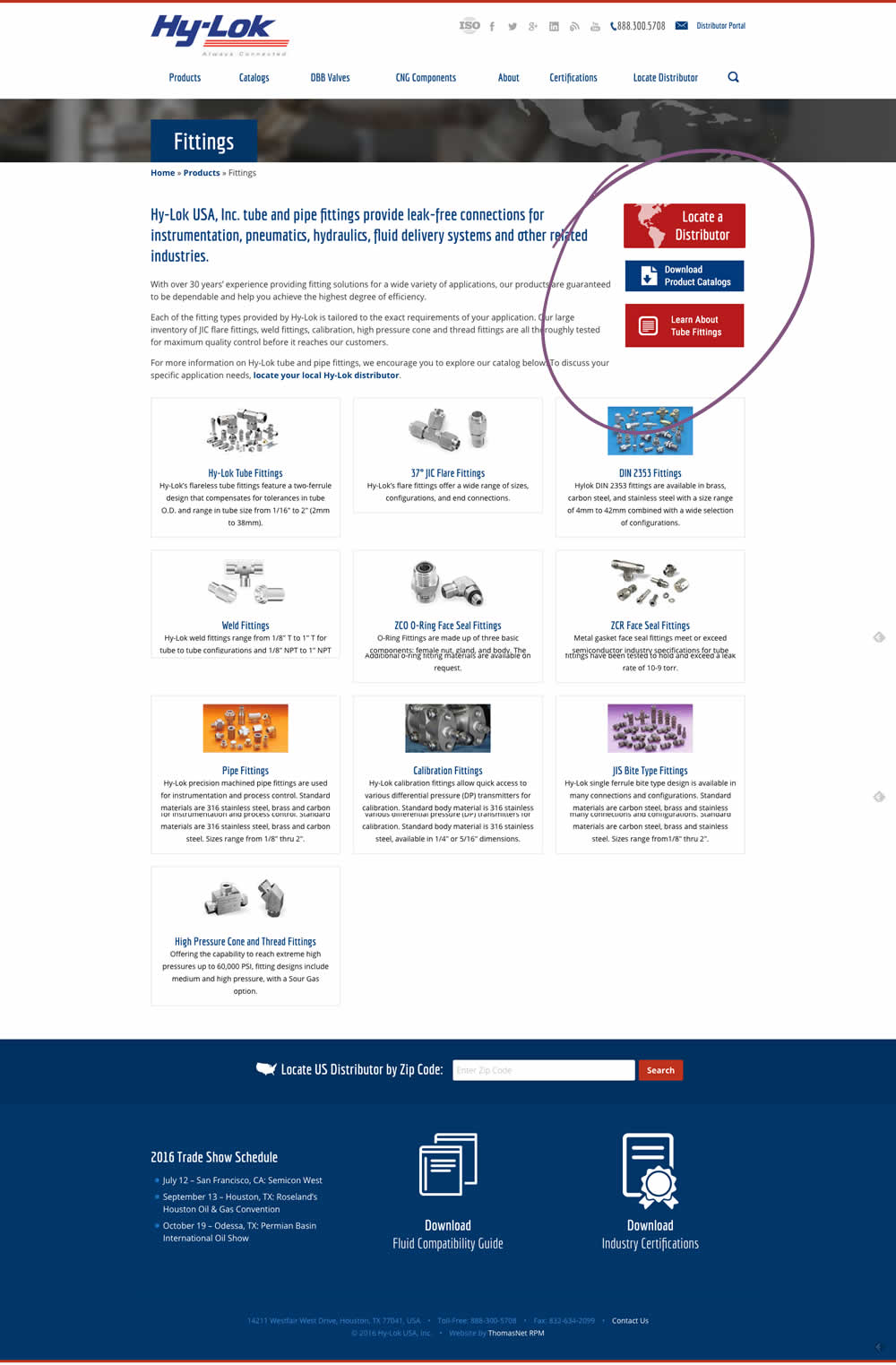
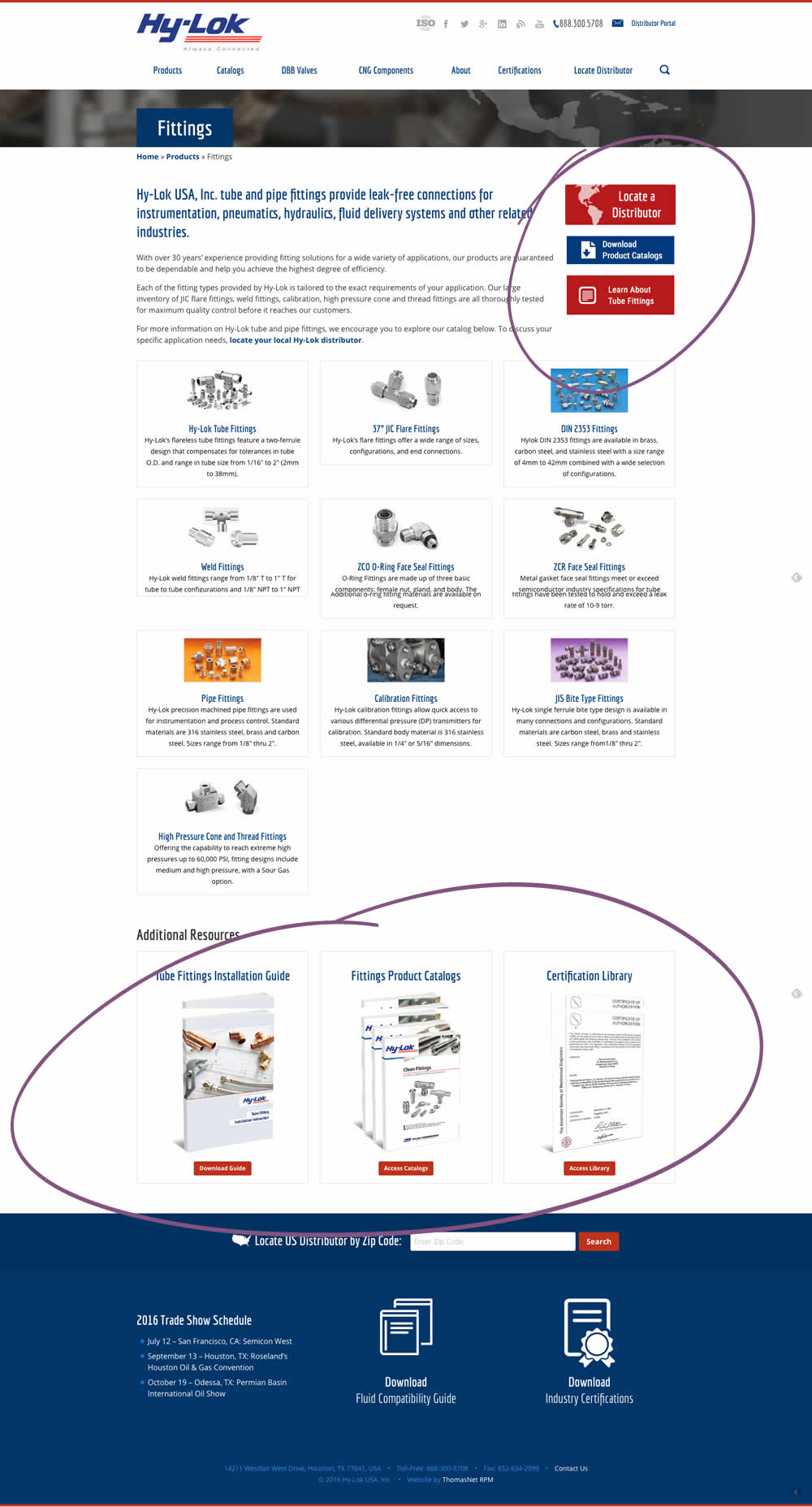
Julian Gaviria Tested Pattern #60: Repeated Bottom Call To Action In Test #46 On Hylokusa.com
Test #94 on
Vivareal.com.br
by
 Rodrigo Maués
Feb 01, 2017
Mobile
Desktop
Signup
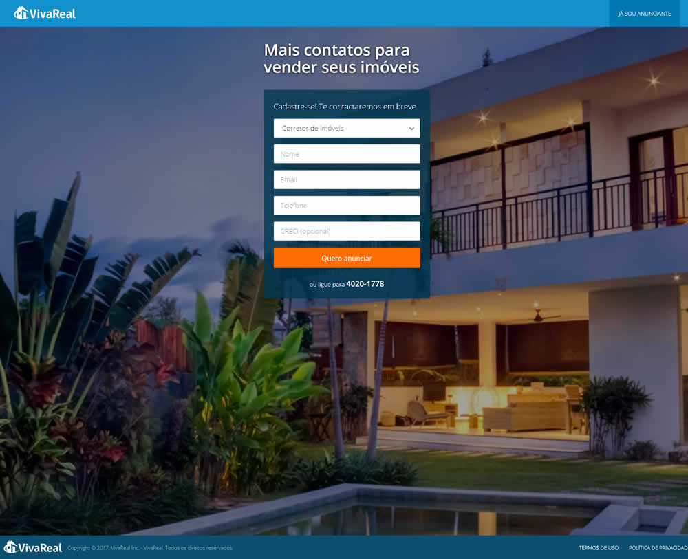
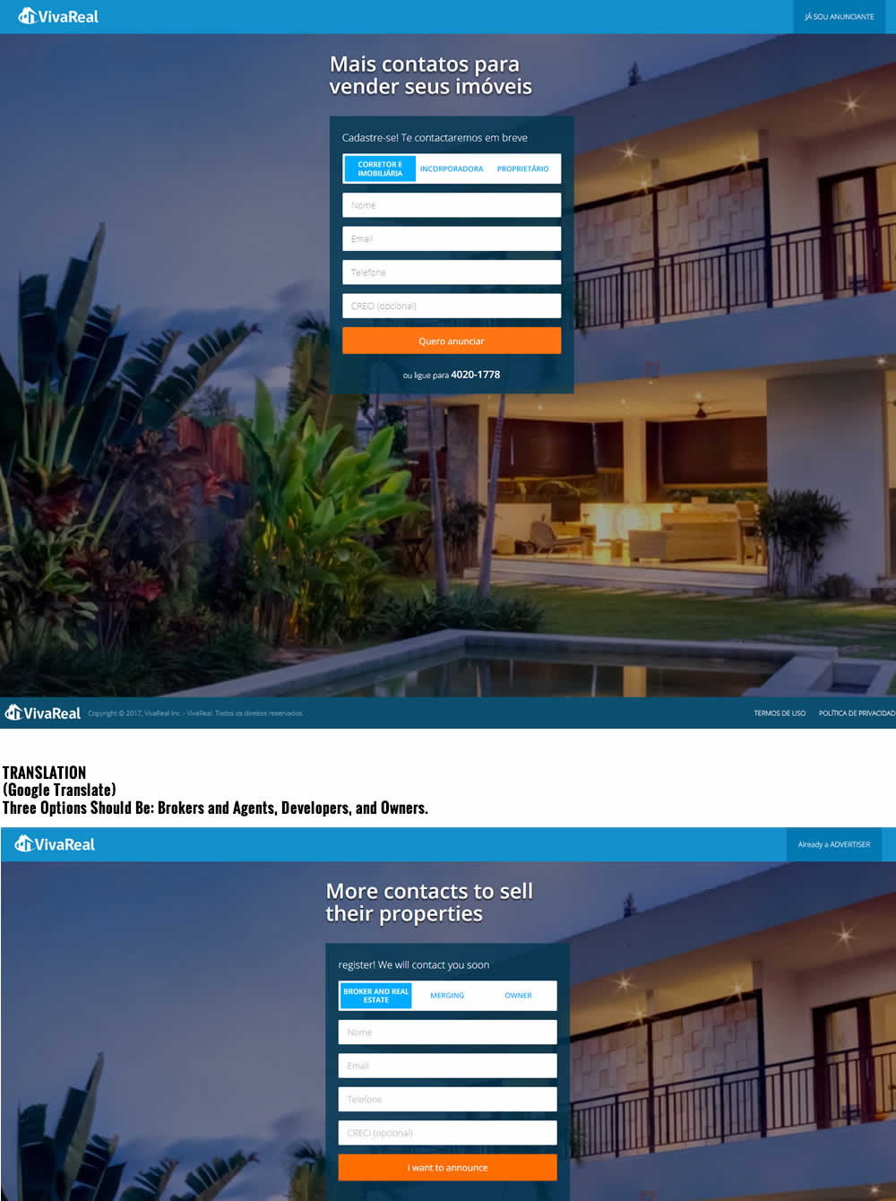
Rodrigo Maués Tested Pattern #14: Exposed Menu Options In Test #94 On Vivareal.com.br
Test #82 on
Poll-app.com
by
 Pierre Olivier Martel
Jan 17, 2017
Desktop
Mobile
Home & Landing
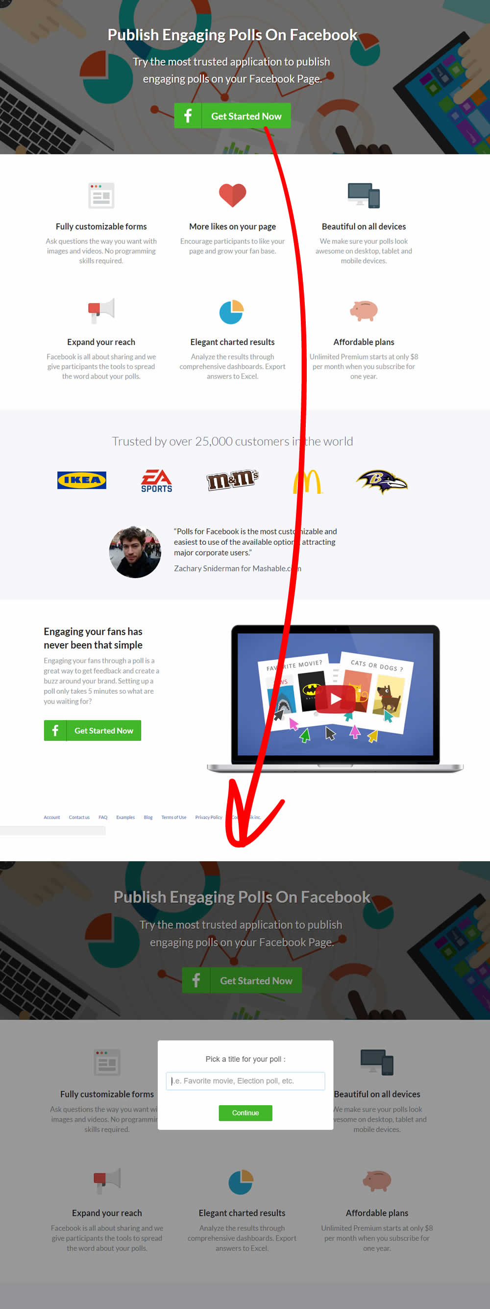
Pierre Olivier Martel Tested Pattern #10: Postponed Modal Forms In Test #82 On Poll-app.com

Test #79 on
by
 Chris Goward
Jan 10, 2017
Desktop
Product
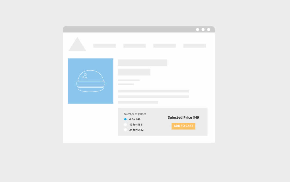
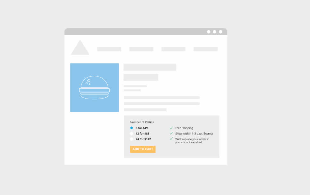
Chris Goward Tested Pattern #15: Bulleted Reassurances In Test #79
Test #74 on
Poll-app.com
by
 Pierre Olivier Martel
Jan 07, 2017
Desktop
Home & Landing
Pierre Olivier Martel Tested Pattern #22: Empowering Headline In Test #74 On Poll-app.com


Test #80 on
Vivareal.com.br
by
 Rodrigo Maués
Jan 03, 2017
Mobile
Product
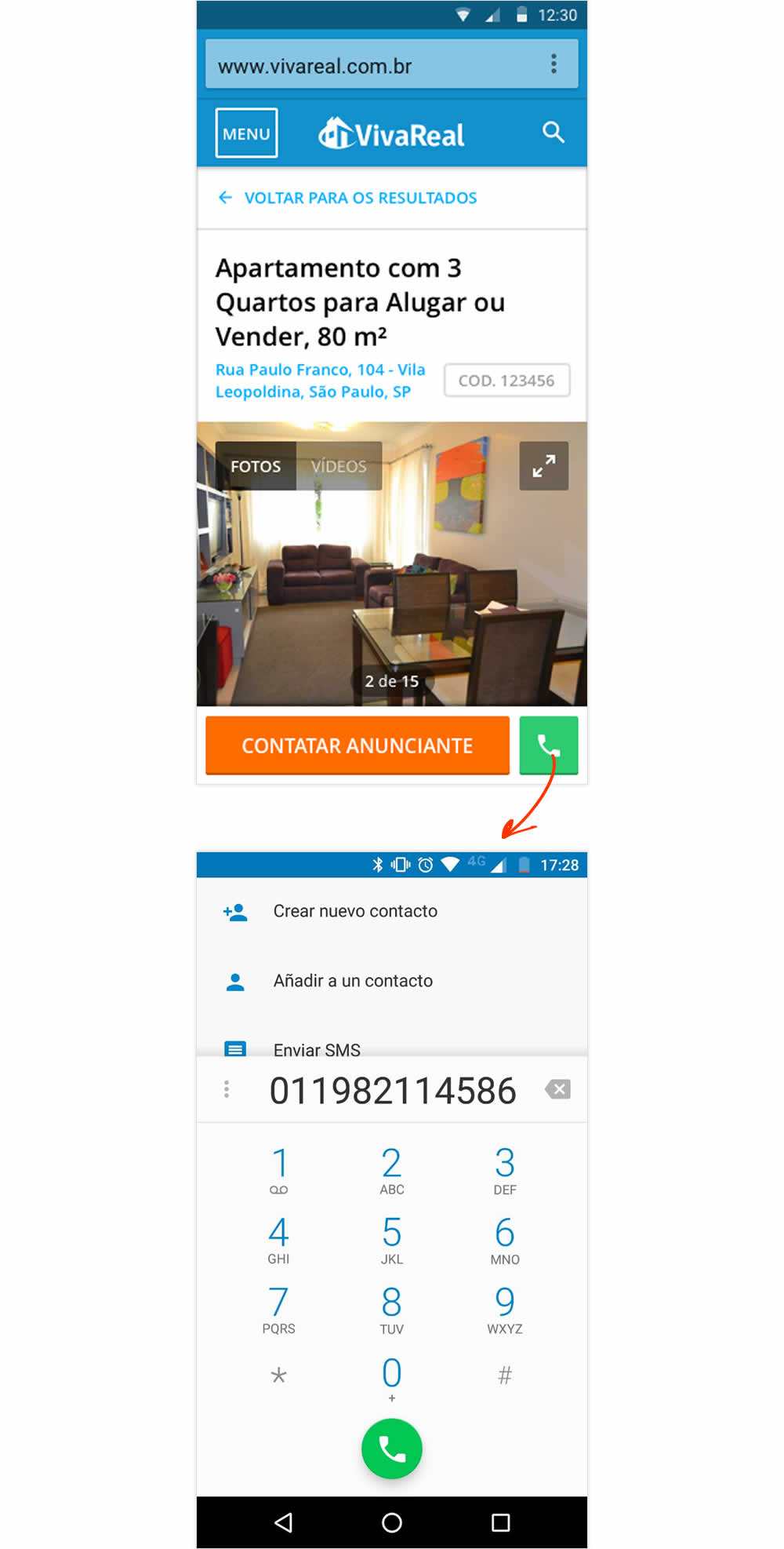
Rodrigo Maués Tested Pattern #18: Single Or Alternative Buttons In Test #80 On Vivareal.com.br

Test #92 on
Rollbar.com
by
 Mike Smith
Jan 02, 2017
Desktop
Mobile
Home & Landing
Mike Smith Tested Pattern #22: Empowering Headline In Test #92 On Rollbar.com


Test #91 on
3dhubs.com
by
 Rob Draaijer
Jan 01, 2017
Desktop
Listing
Rob Draaijer Tested Pattern #9: Multiple Steps In Test #91 On 3dhubs.com
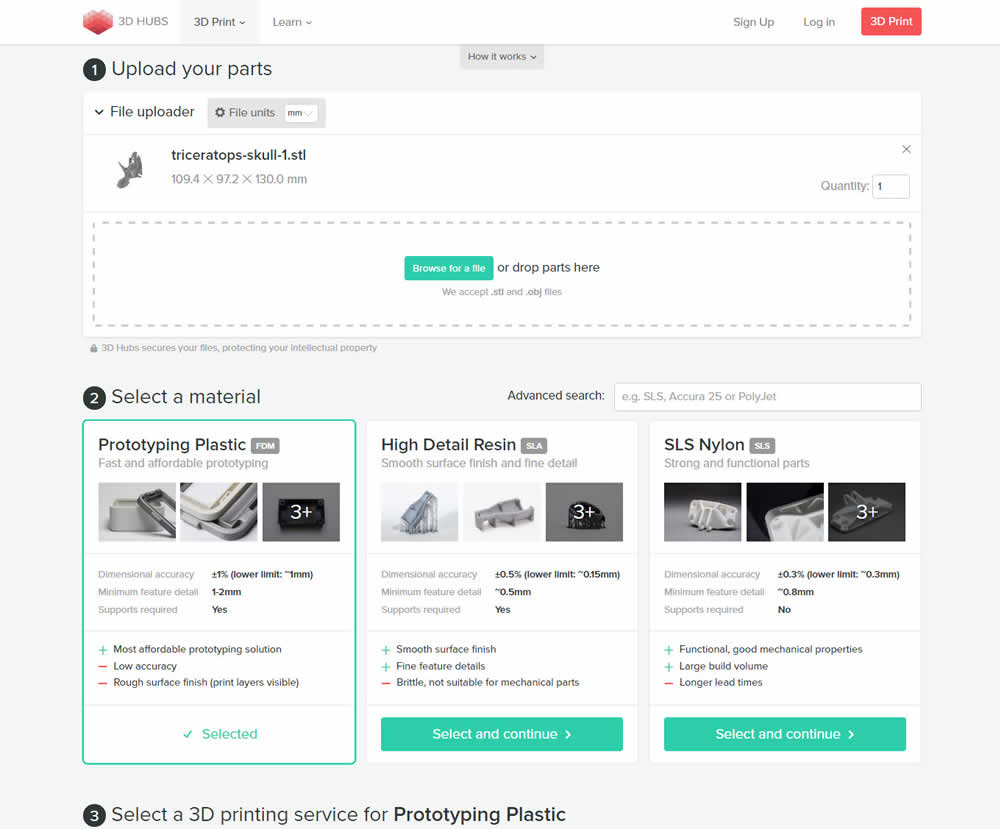
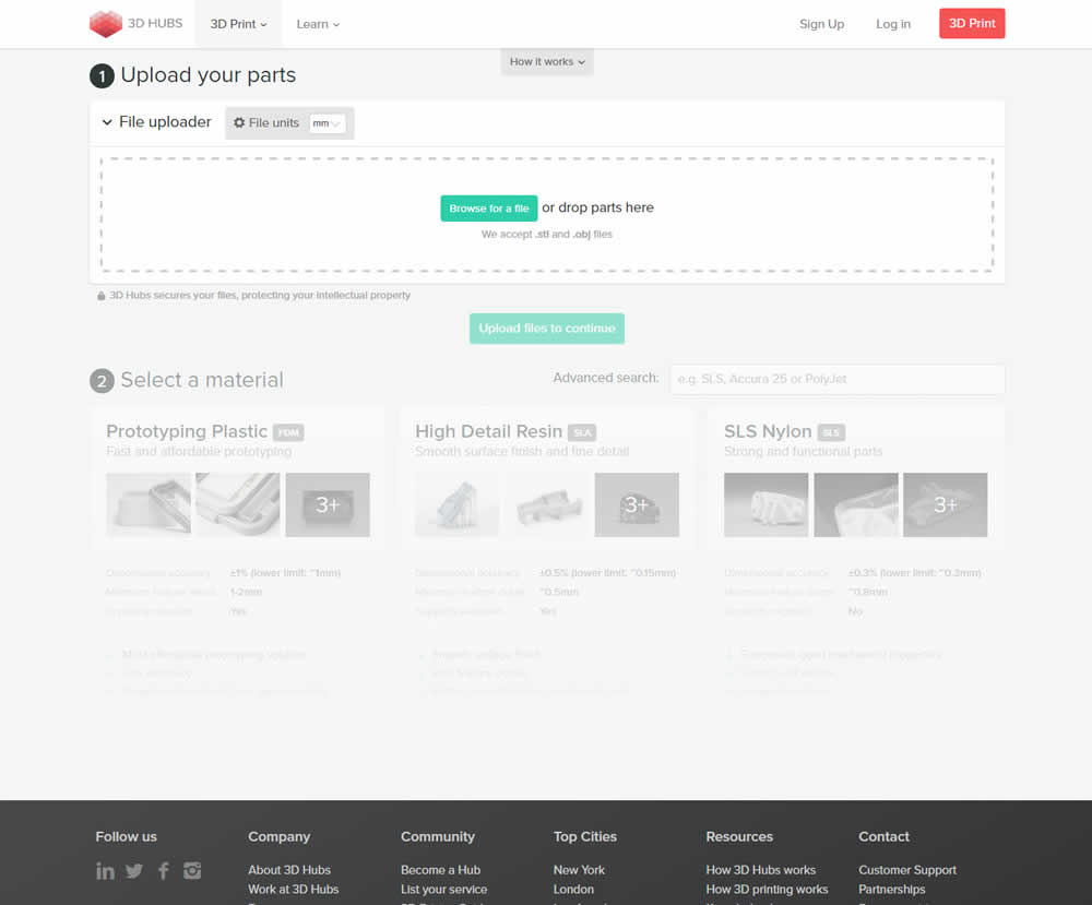
In this experiment, a long form with multiple steps was broken down into a progressive interaction form. In the B variant, as users would complete particular steps, new ones would be communicated subtly and finally come into full view.
Test #64 on
Goodui.org
by
 Jakub Linowski
Jan 01, 2017
Desktop
Home & Landing
Jakub Linowski Tested Pattern #41: Sticky Call To Action In Test #64 On Goodui.org
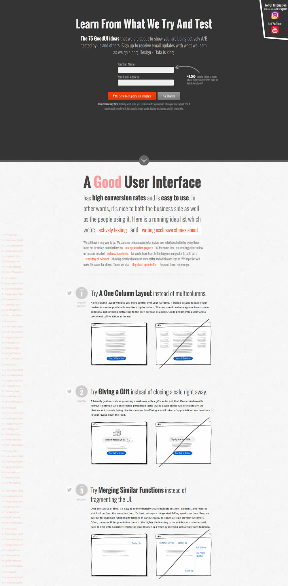
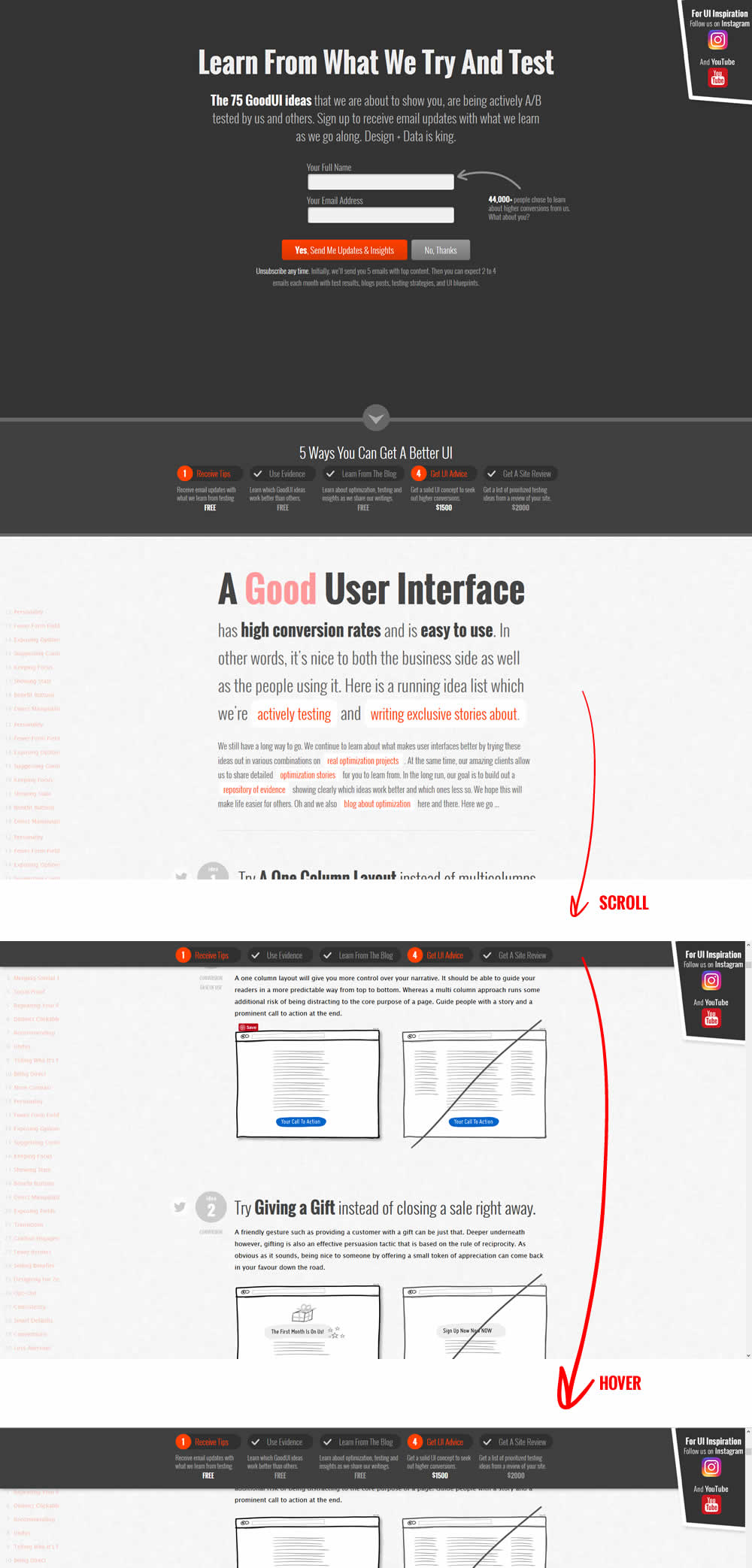
In this experiment, we showed a sticky navigation bar with 5 actions such as (newsletter signup, and visiting certain landing pages). Upon completion of each task, the navigation would transform into a completed state while using cookies to store it for future reference.