All Latest 582 A/B Tests
Become a member to unlock the abiltiy to see the highest impact a/b tests. Being able to see the actual test results and sort by impact allows growth and experimentation teams to take action on the biggest gains first
MOST RECENT TESTS
Test #530 on
by
 Stanley Zuo
Apr 30, 2024
Desktop
Mobile
Stanley Zuo Tested Pattern #28: Easiest Fields First In Test #530 On
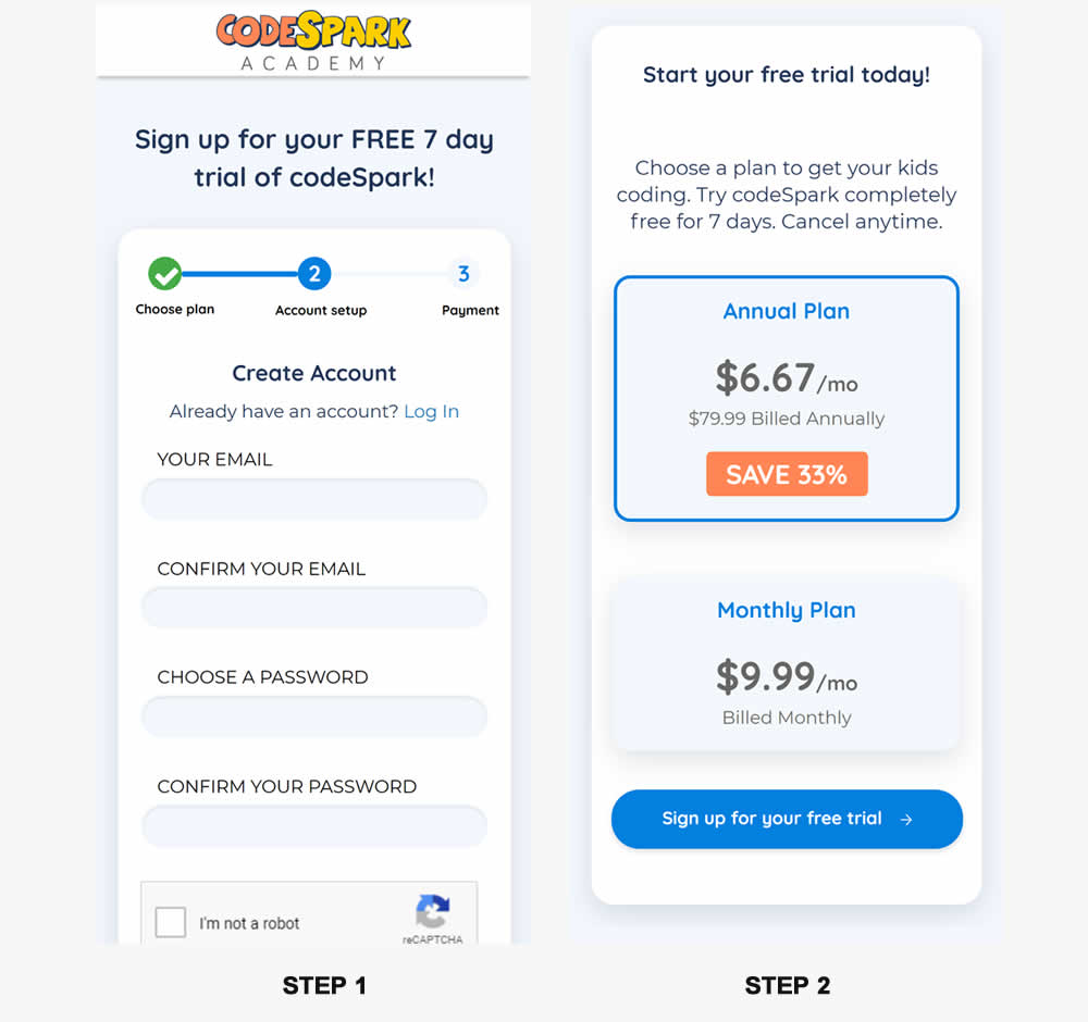
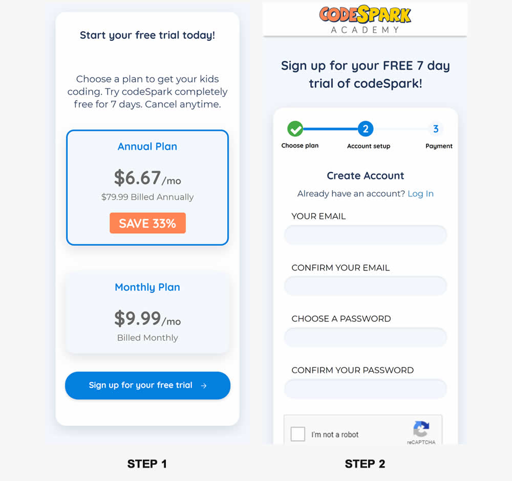
In this experiment, the order of two signup pages was tested: plan selection vs account creation. Here we have the account creation step first in the control and the the plan selection step first in the variation. (I flipped these around to match the pattern). Impact on signups was measured.
Test #529 on
Jared.com
by
 Craig Kistler
Apr 29, 2024
Mobile
Desktop
Listing
Craig Kistler Tested Pattern #55: Conversational Filters In Test #529 On Jared.com
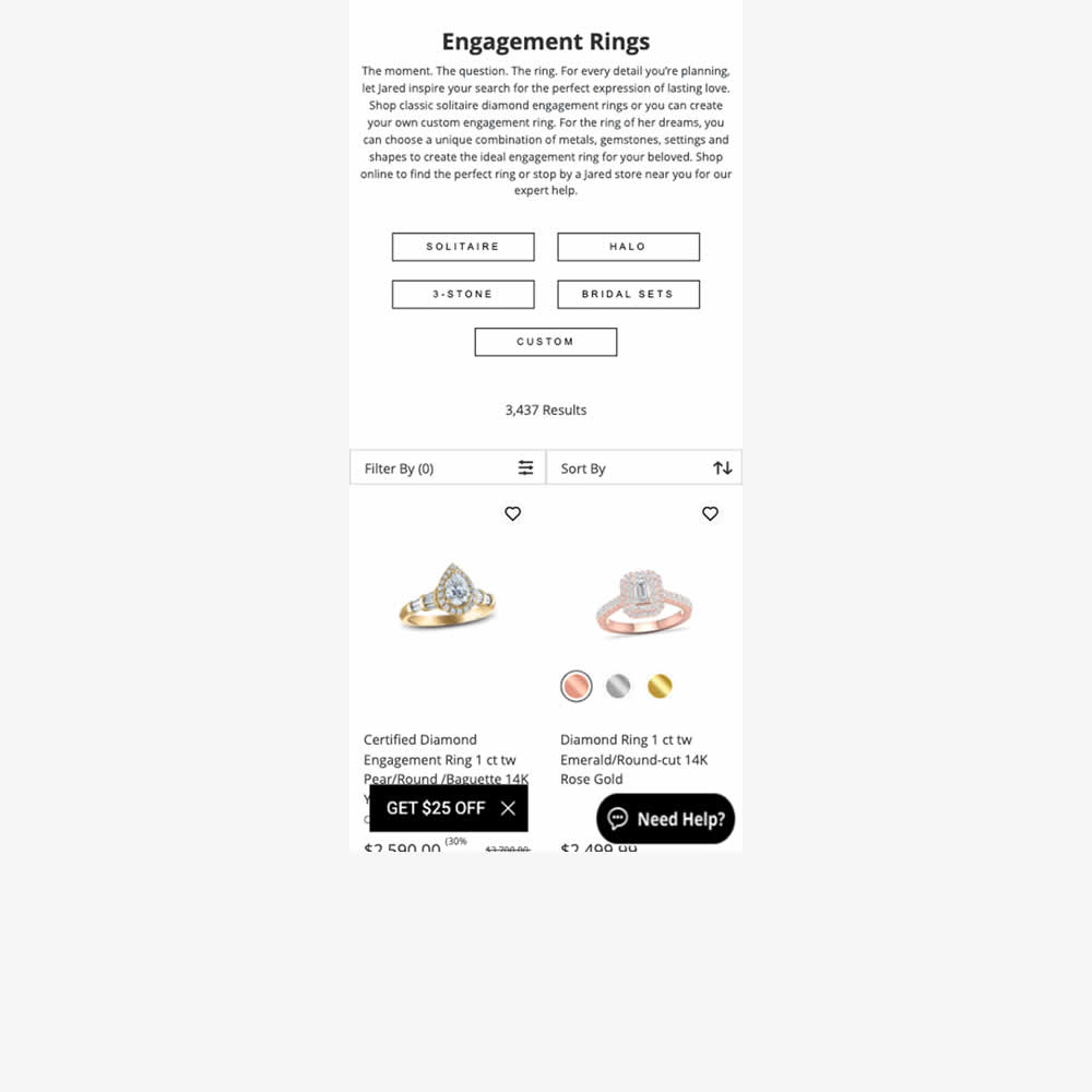
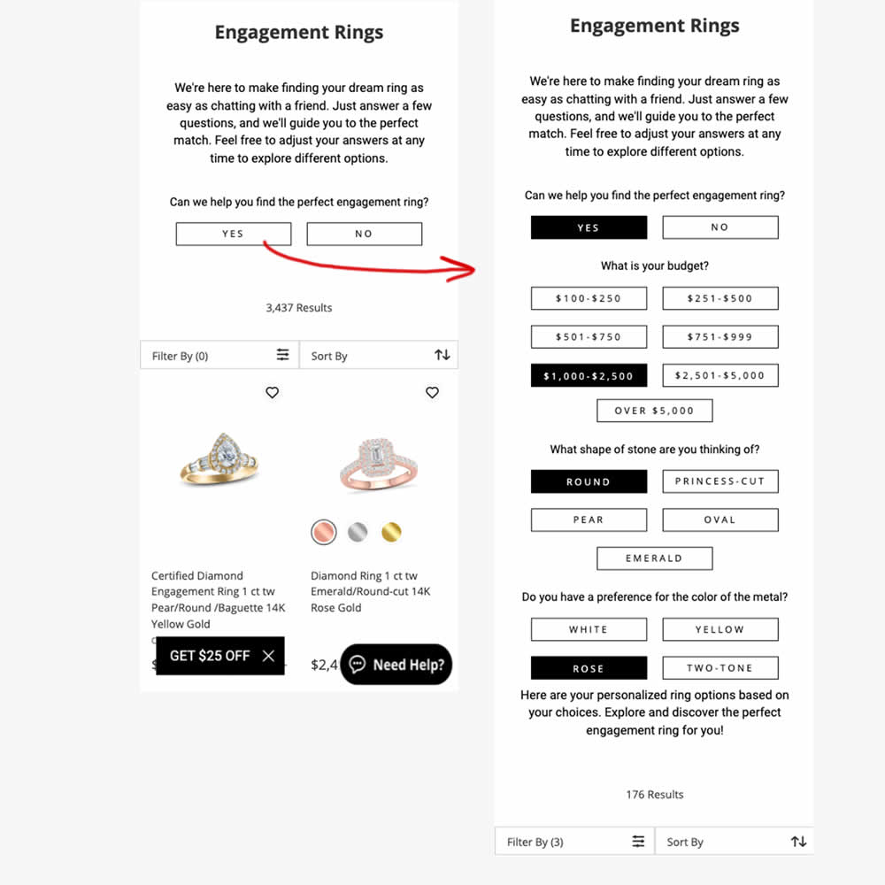
In this experiment, conversational filters were tested at the top of some listing pages. Instead of showing one set of product filters, customers were shown three sets of product questions. After selecting each answer, product results would narrow and update further down on the page. Impact on adds to cart and sales were measured.
Test #528 on
686.com
by
 Adan Archila
Apr 26, 2024
Mobile
Listing
Adan Archila Tested Pattern #120: Supporting Theme Images In Test #528 On 686.com
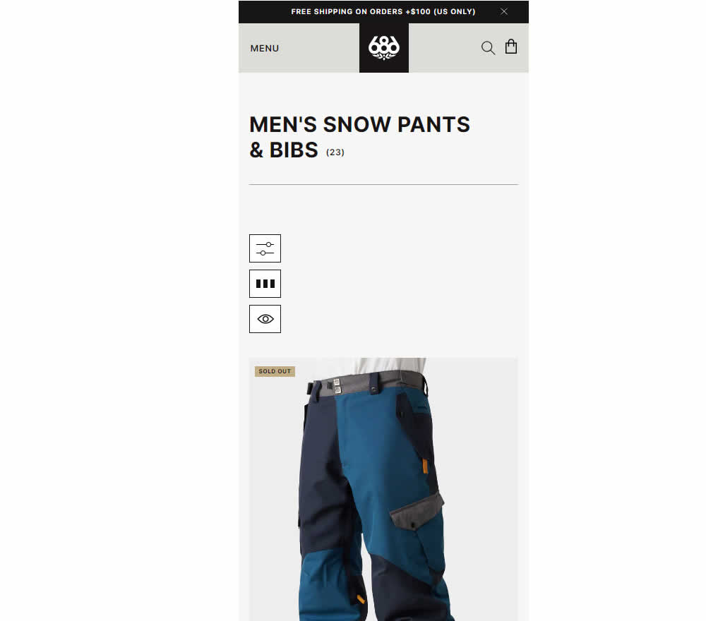
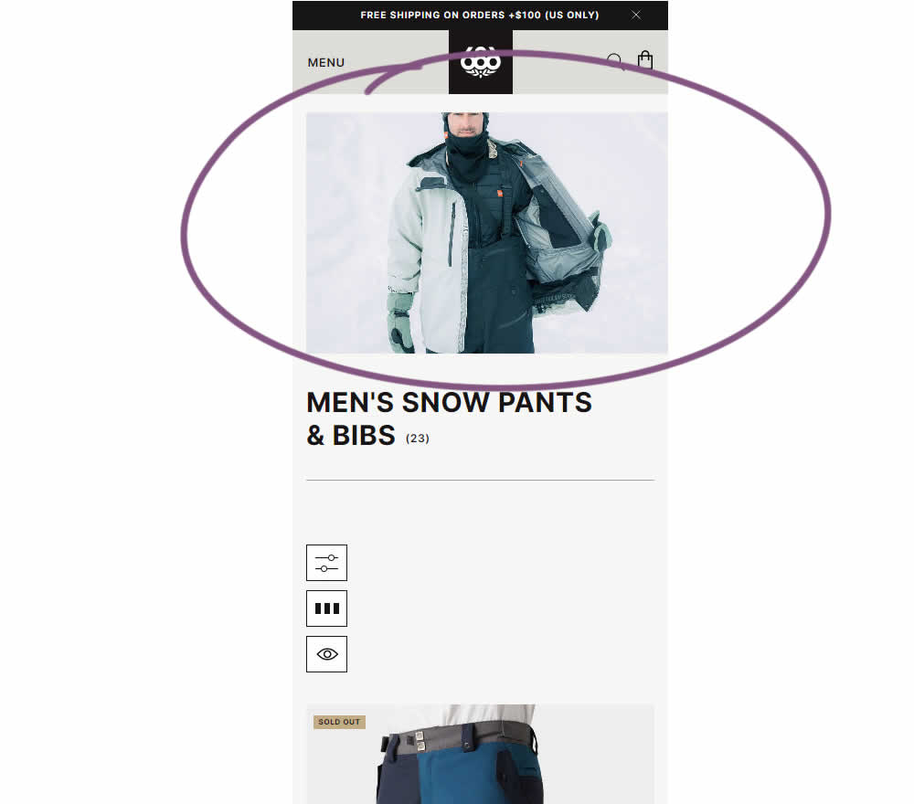
In this experiment, the effect of having additional static category themed images was tested on category listing pages. Impact on sales was measured.
Test #527 on
by
 Jakub Linowski
Apr 23, 2024
Desktop
Mobile
Product
Jakub Linowski Tested Pattern #132: One Time Payment Copy In Test #527
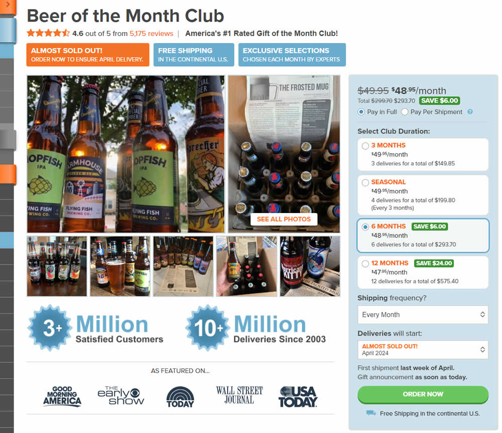
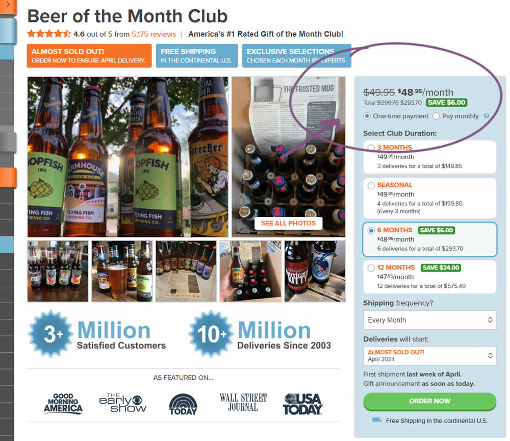
In this experiment, copy related to payment duration types (paid in full or ongoing) was changed. In the the control, one of the option used the "Pay in Full" copy, whereas the variation changed this to "One-time payment". Impact on sales was measured.
Test #526 on
Online.metro-cc.ru
by
 Andrey Andreev
Apr 17, 2024
Desktop
Mobile
Global
Andrey Andreev Tested Pattern #77: Filled Or Ghost Buttons In Test #526 On Online.metro-cc.ru
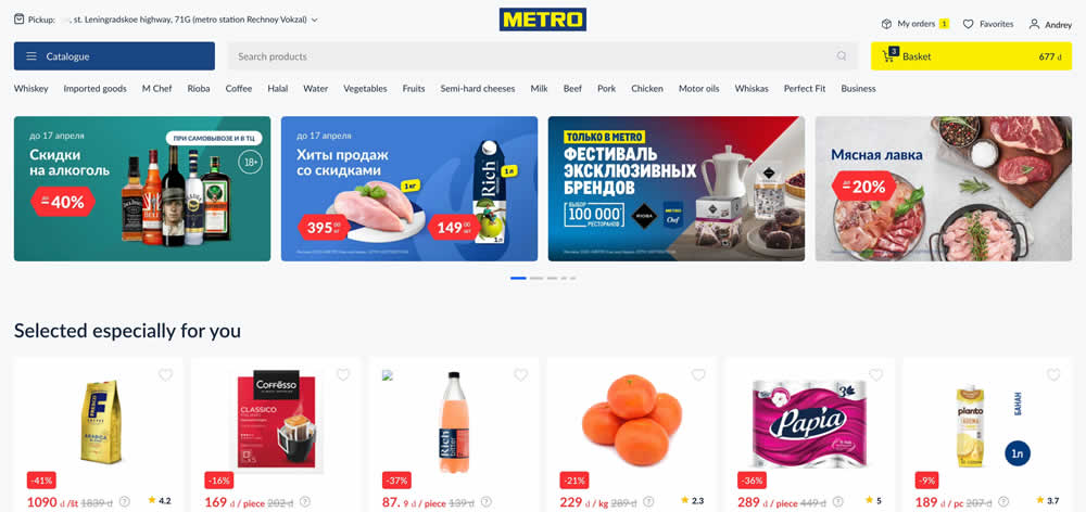
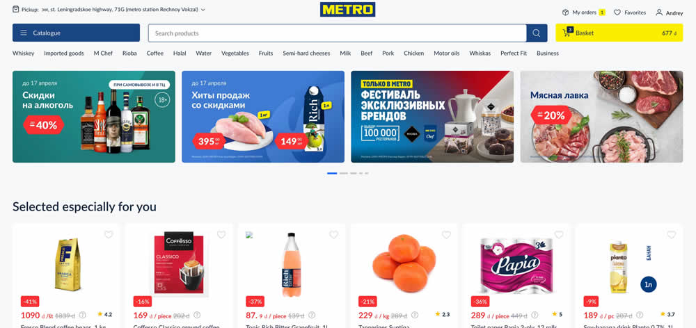
In this experiment, a feint gray background search bar was replaced with a higher contrast one containing a blue border and a filled blue color button style. Impact on searches and purchases was measured. (Inverted to fit the Filled-vs-ghost button pattern).
Test #525 on
by
 Jakub Linowski
Mar 27, 2024
Desktop
Mobile
Product
Jakub Linowski Tested Pattern #119: Unselected Or Selected Defaults In Test #525
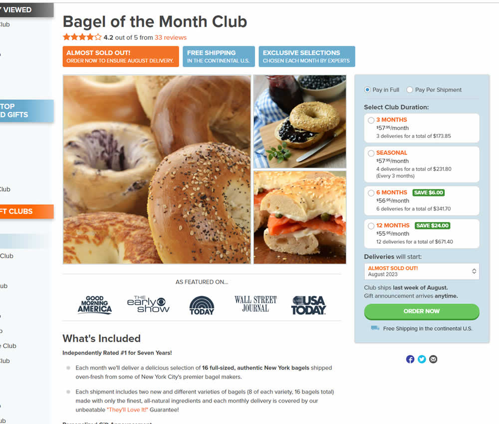
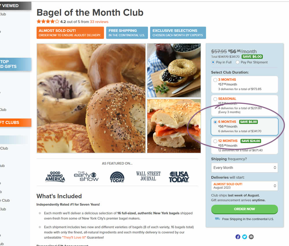
In this experiment, a club subscription duration was preselected to 6 in the variation. The control had no club durations preselected. As a result of preselecting a club duration, a more visible price also appeared at the top (sooner in the variation). Impact on sales was measured.
Test #524 on
Jared.com
by
 Craig Kistler
Mar 26, 2024
Mobile
Listing
Craig Kistler Tested Pattern #79: Product Highlights In Test #524 On Jared.com
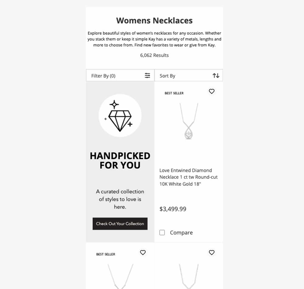
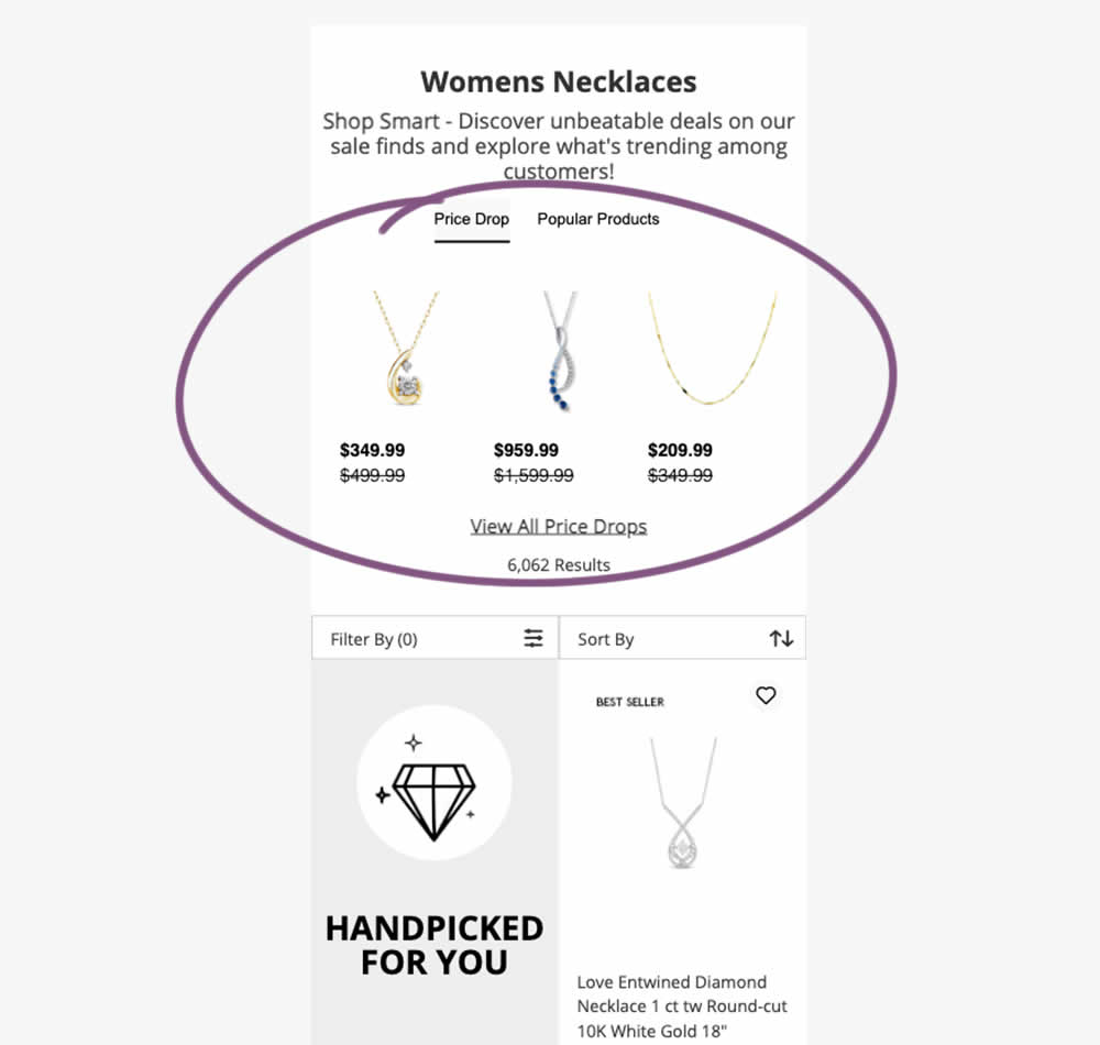
In this experiment, additional (discounted) products were shown at the top of category listing pages with a link to see more such products ("View All Price Drops"). Impact on overall sales was measured.
Test #523 on
Livefresh.de
by
 Pascal Dietz
Mar 21, 2024
Mobile
Product
Pascal Dietz Tested Pattern #131: Authority In Test #523 On Livefresh.de
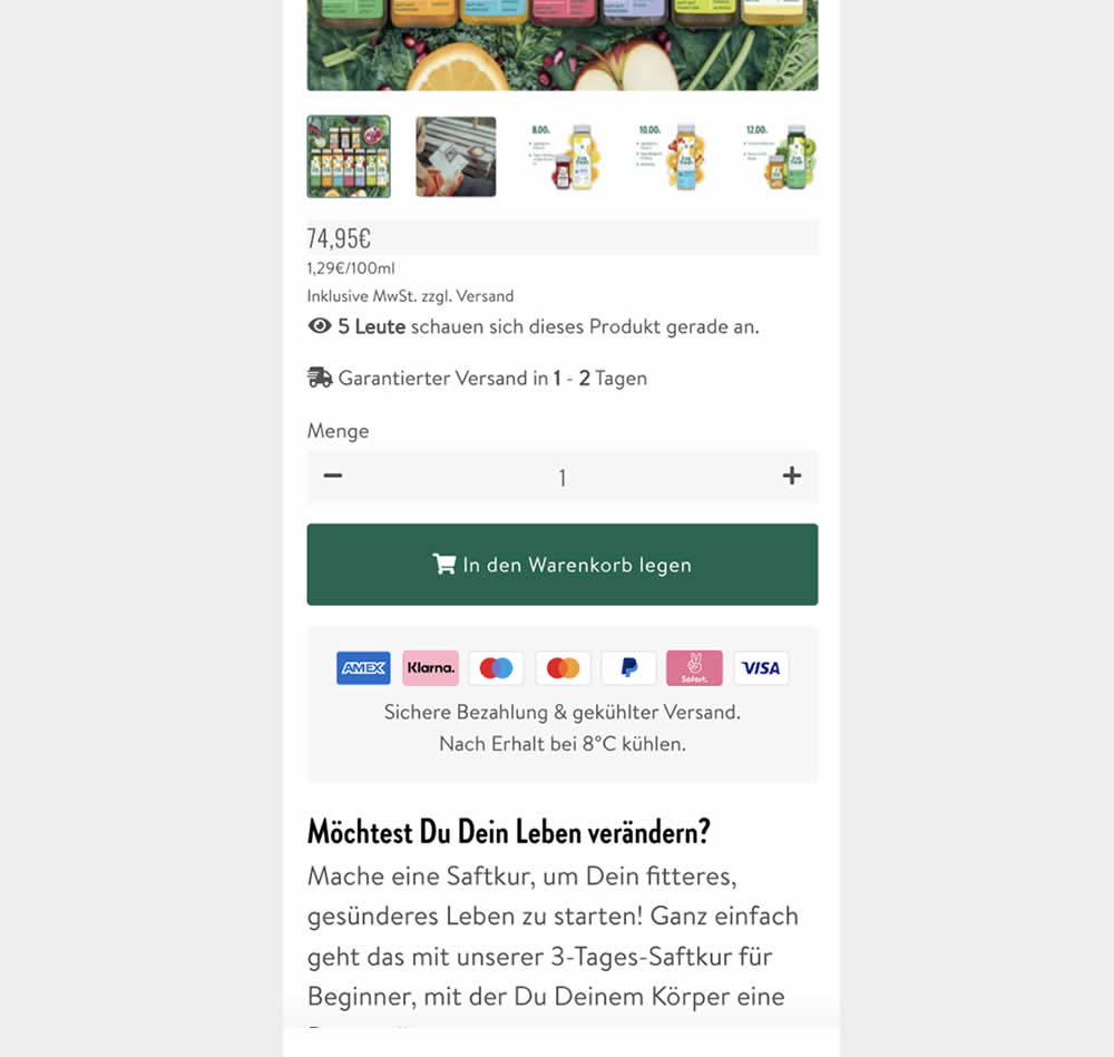
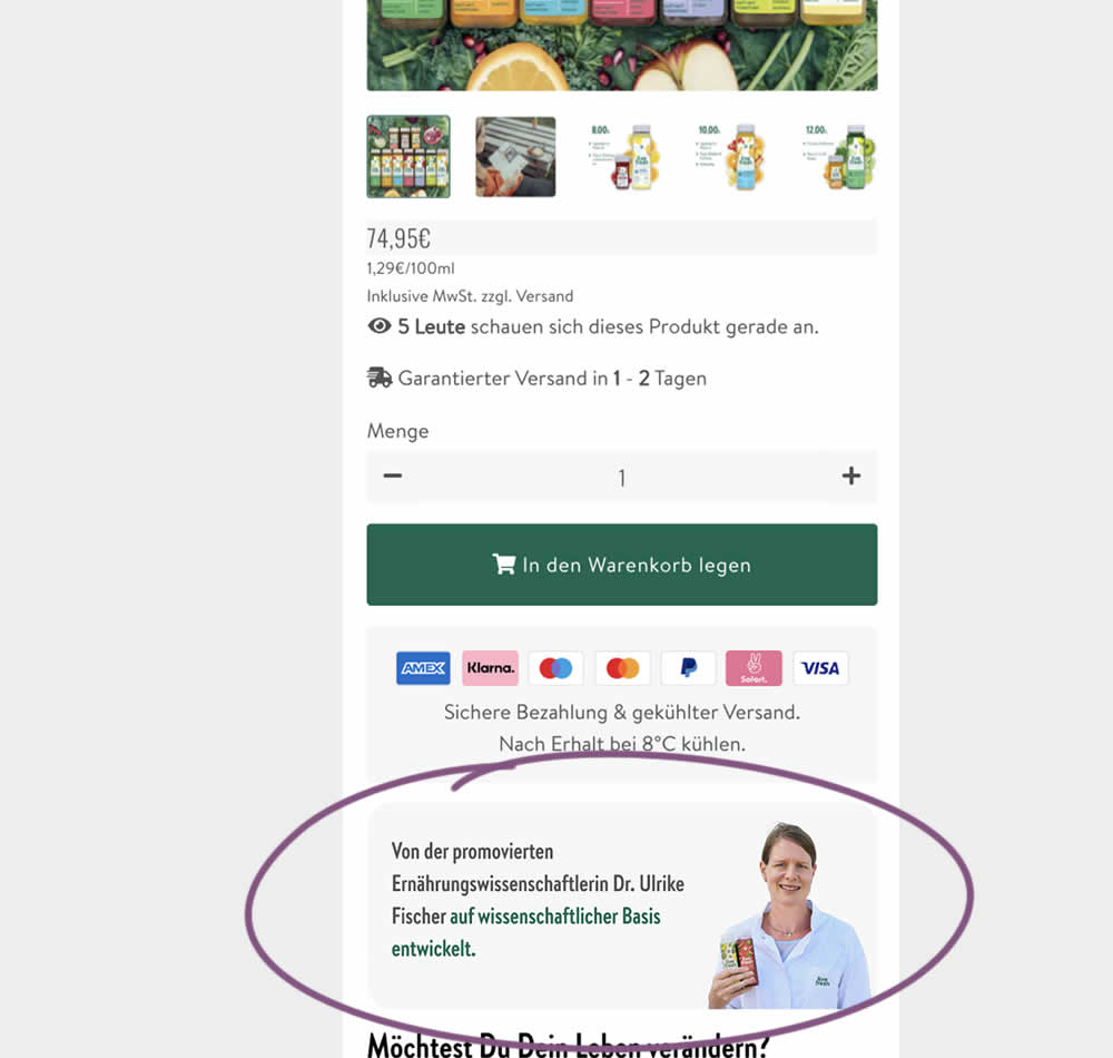
In this experiment, a photo of a doctor (who researched and created the a cleanising juice - the product) was appended after the add to cart button. The copy is translated as follows from "Von der promovierten Ernährungswissenschaftlerin Dr. Ulrike Fisher auf wissenschaftlicher Basis entwickelt." [German] -> "Developed by doctoral nutritionist Dr. Ulrike Fisher with a scientific basis." Impact on sales was measured.
Test #522 on
686.com
by
 Adan Archila
Mar 18, 2024
Desktop
Listing
Adan Archila Tested Pattern #37: List Or Grid View In Test #522 On 686.com
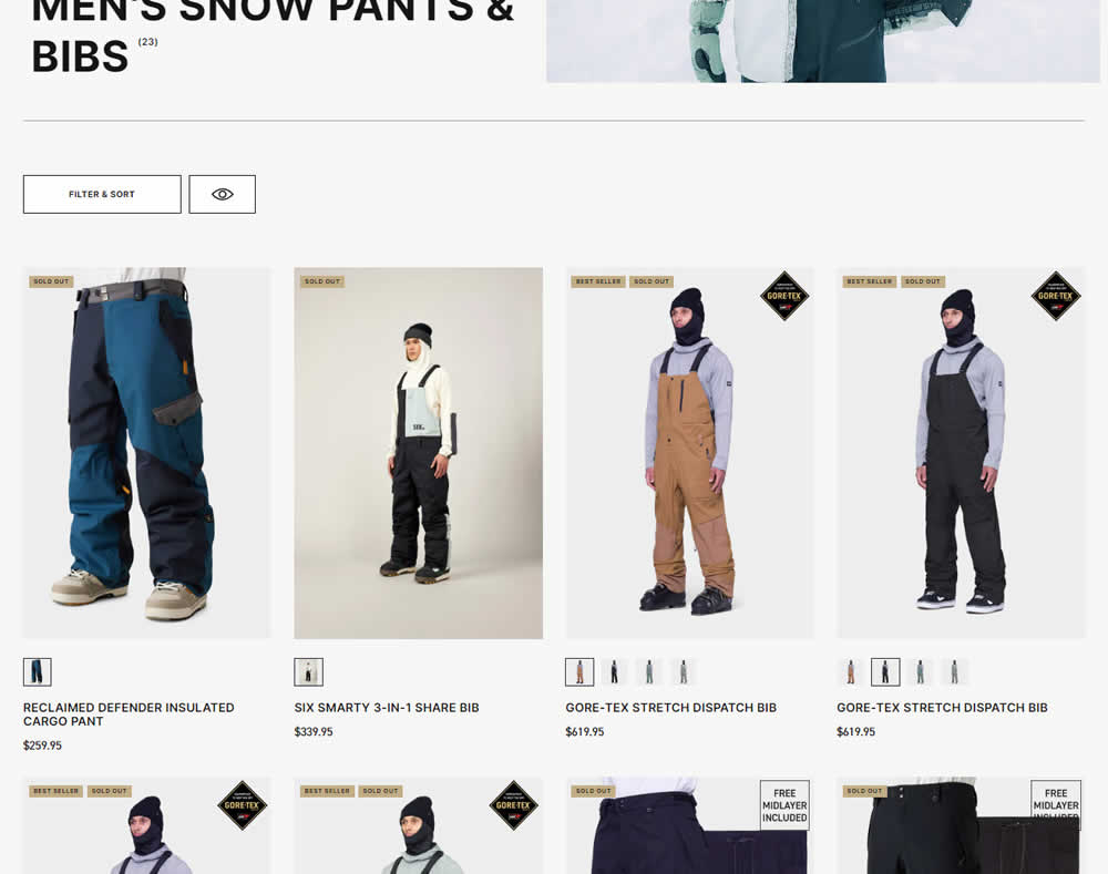
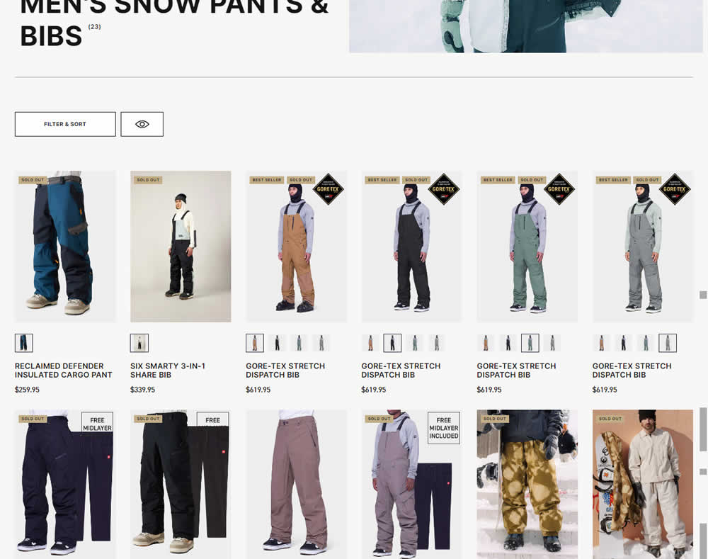
In this desktop experiment, 4 product tiles per page (control) were tested against 6. Impact on sales was measured.
Test #521 on
Finn.com
by
 Maksim Meged
Mar 14, 2024
Mobile
Home & Landing
Maksim Meged Tested Pattern #26: Cart Reminder And Recently Viewed In Test #521 On Finn.com
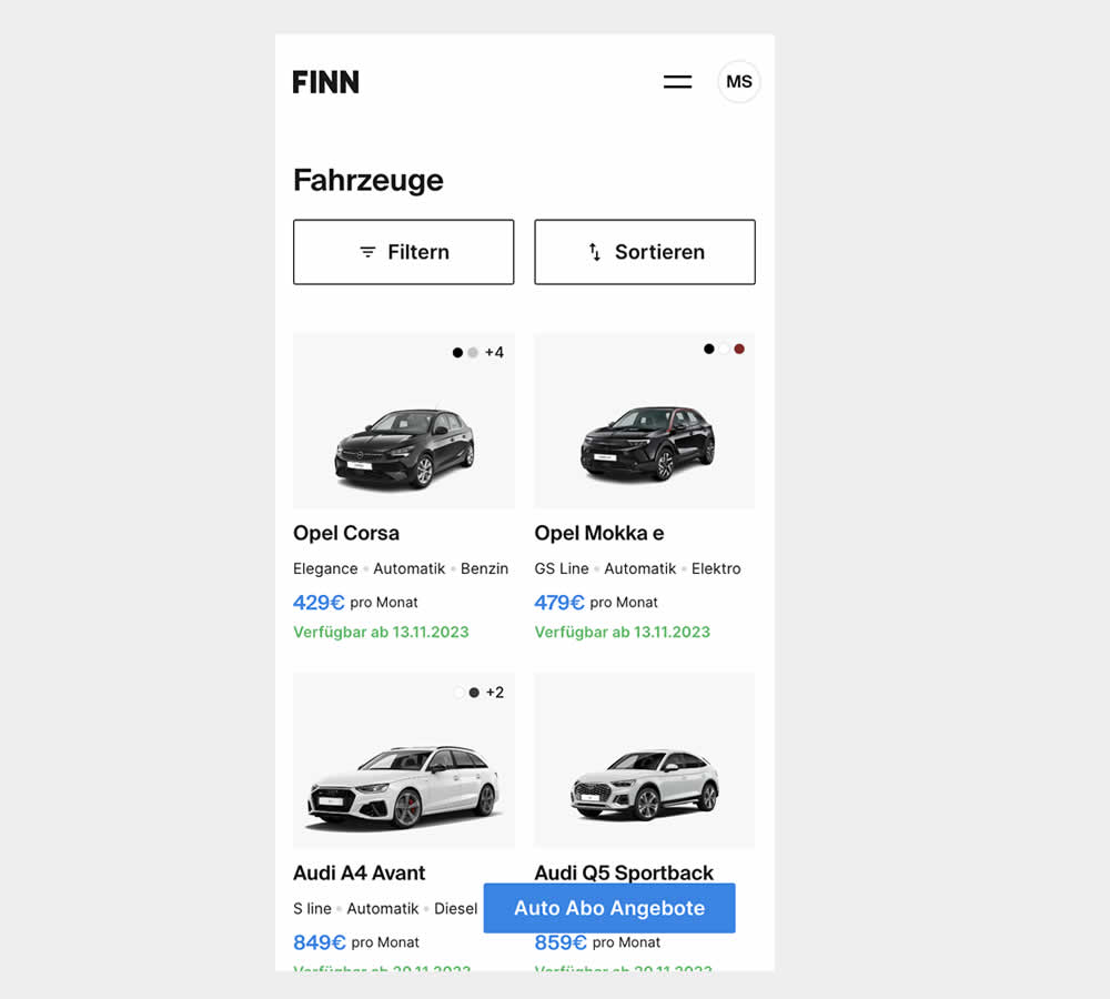
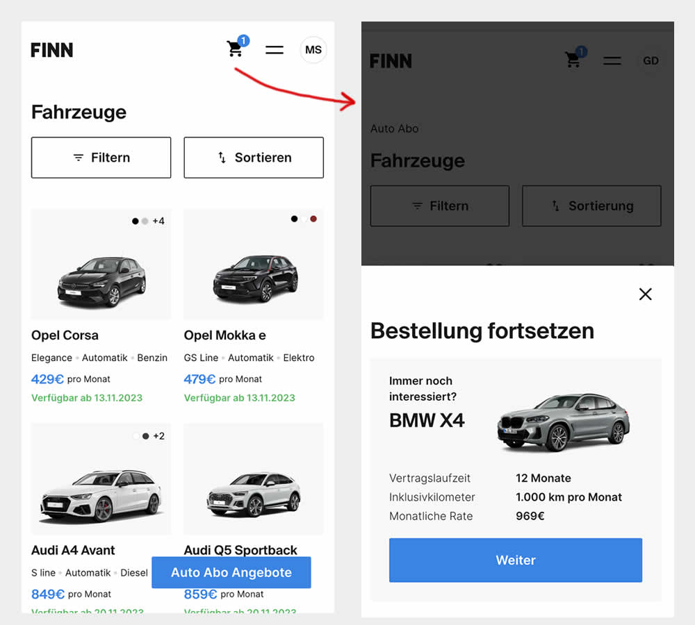
This experiment was triggered by a small segment of users who completed the first step of checkout funnel (submitted email, name, phone number), but dropped from checkout and returned to cars catalogue 7 or more minutes later.
In the control, users didn't see any cart icon nor function to resume their checkout flow.
In the variation however, users saw a filled shopping cart icon with resume functionality. Clicking on the icon would guide and redirect users to their latest abandoned stage of their checkout flow.
Test #520 on
Asics.com
by
 Andrey Prokhorov
Feb 29, 2024
Mobile
Product
Andrey Prokhorov Tested Pattern #51: Shortcut Buttons In Test #520 On Asics.com
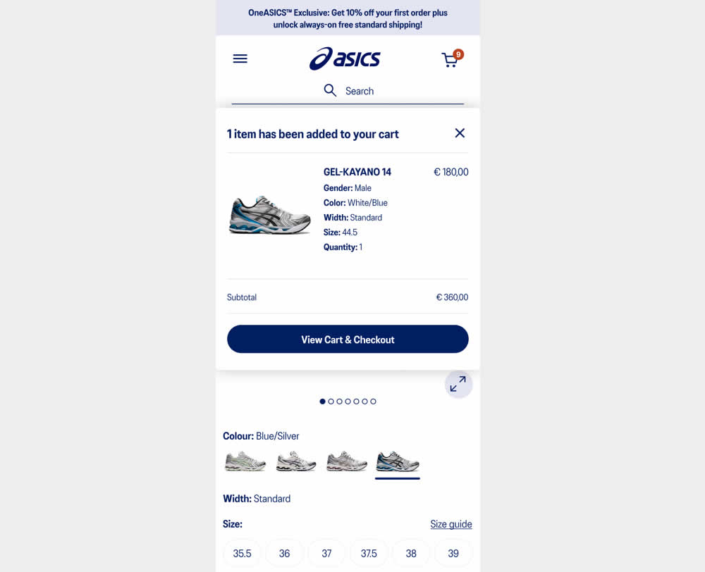
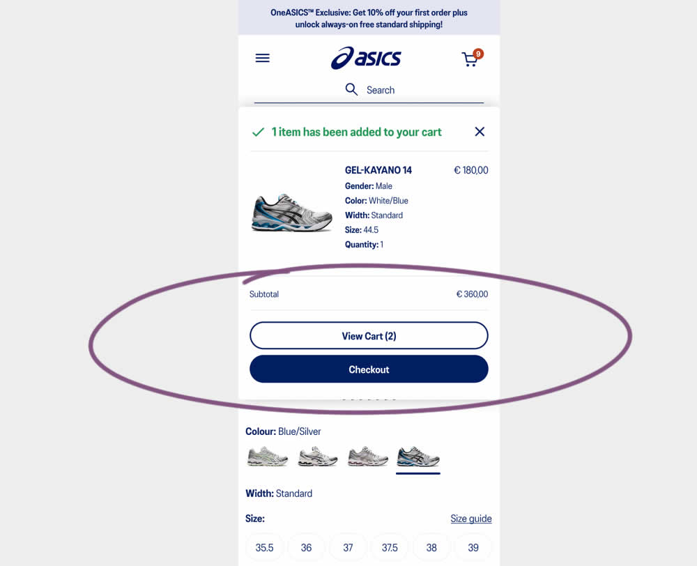
This experiment started when users would click add-to-cart on product detail pages. In both the control and variation, a modal would appear. In the control the modal contained a "View Cart and Checkout" button that lead users to the cart page. In the variation the modal showed separate "View Cart" and "Checkout" buttons. The a/b test variation also introduced a green confirmation message about the product being added to cart. Impact on transactions and revenue was measured.
Test #519 on
Volders.de
by
 Katharina Lay
Feb 23, 2024
Desktop
Mobile
Checkout
Katharina Lay Tested Pattern #134: Optional or Confident Recommendation In Test #519 On Volders.de
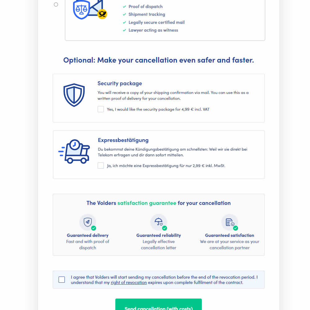
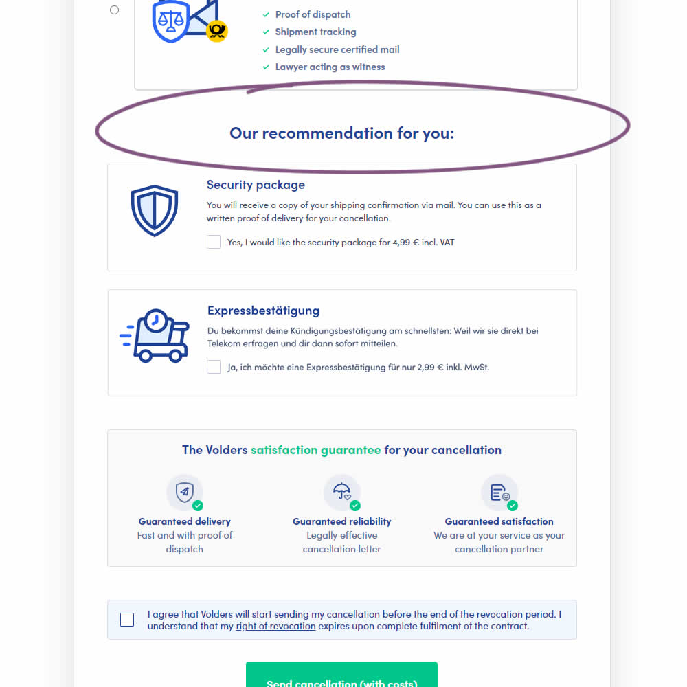
In this experiment, copy around an upsell was changed from using "optional" to "our recommendation for you". The idea was to recommend two upsells with more confidence. Impact on the two upsells (secure, and express) as well as overall transactions was measured.
Test #518 on
by
 Jakub Linowski
Feb 14, 2024
Mobile
Checkout
Jakub Linowski Tested Pattern #64: Tunnel In Test #518
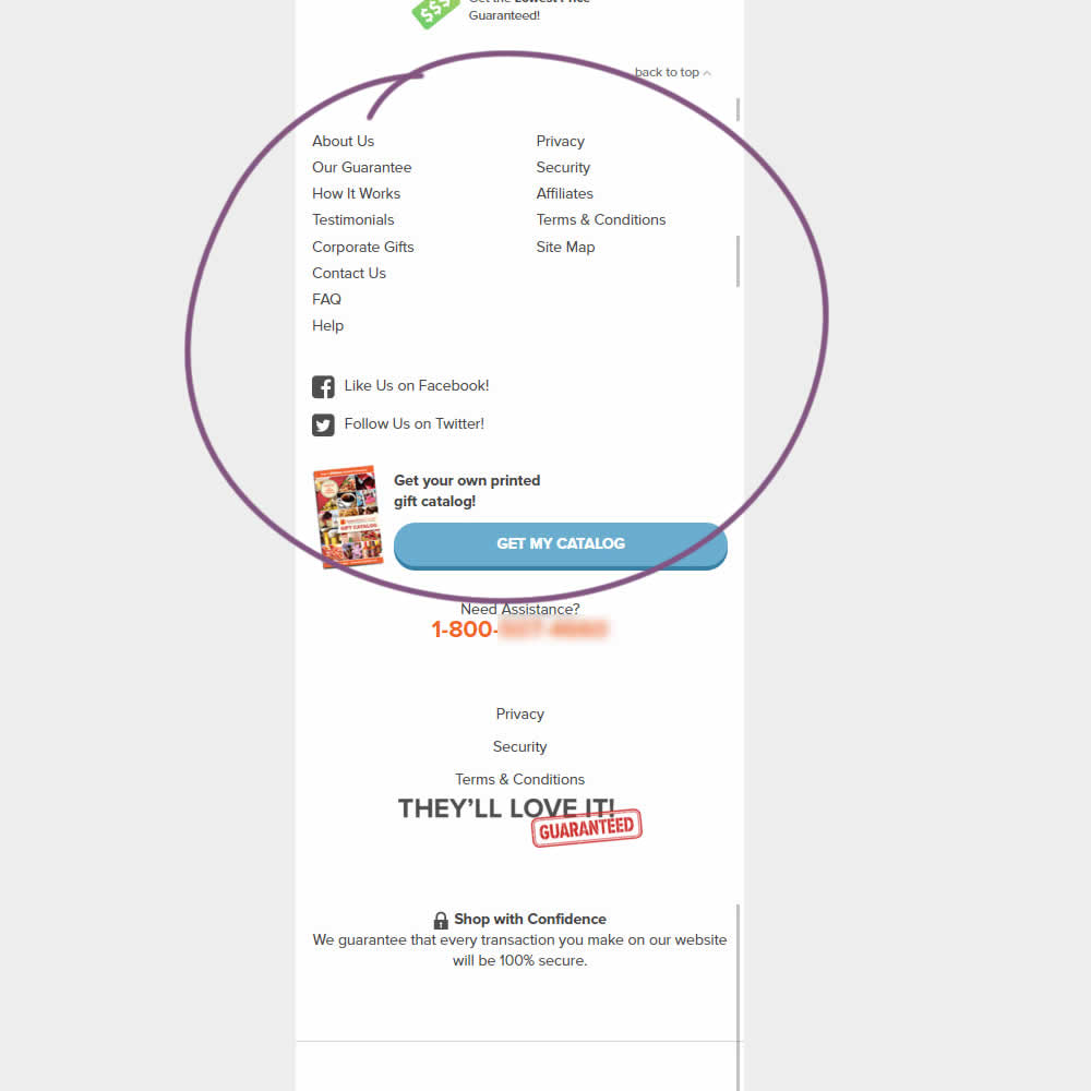
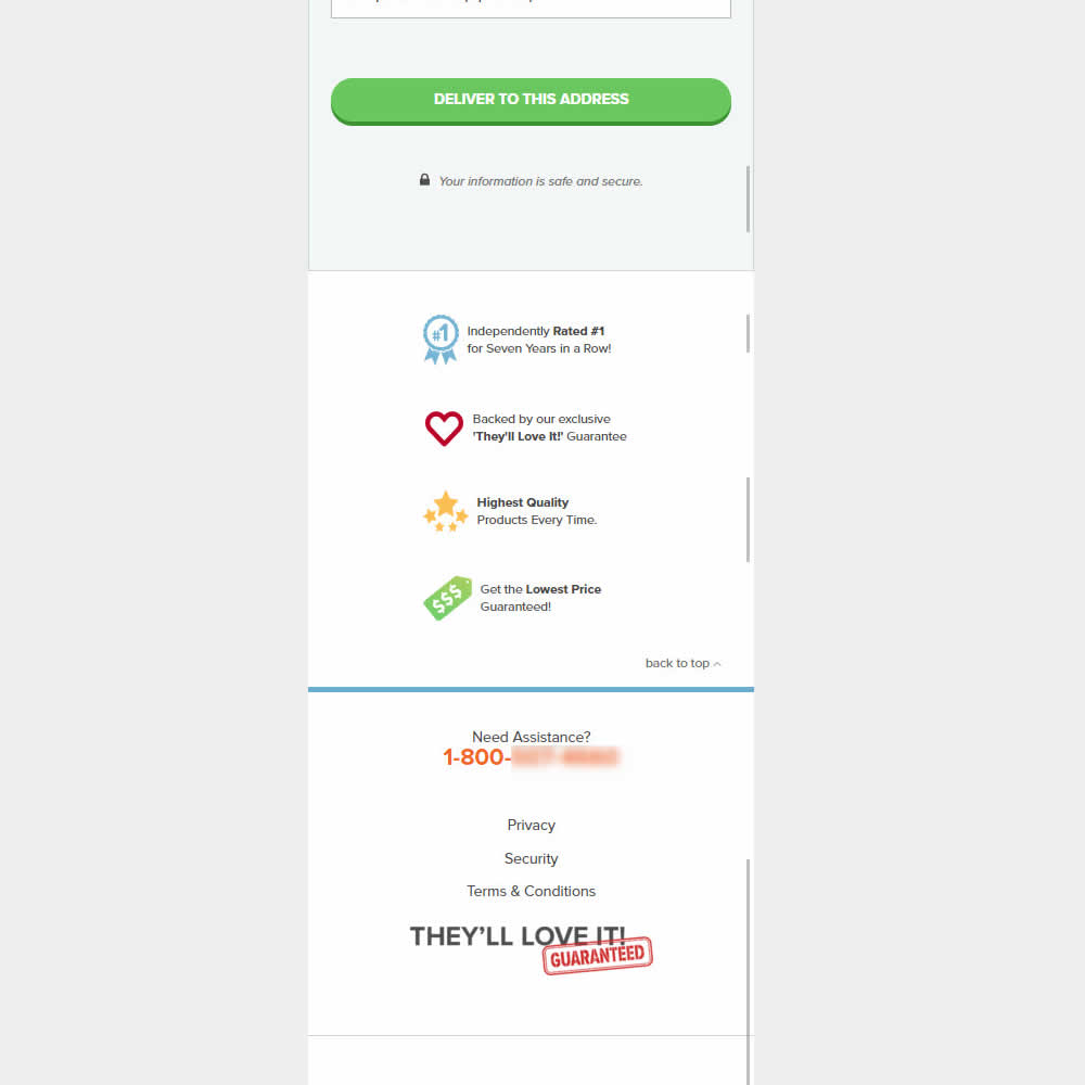
This was an experiment on the first checkout step where users would enter shipping information. The control had a longer footer with more additional sitewide links and a call to action to a newsletter. The variation removed these elements and kept the focus on the shipping information task. Impact on progression to next step and sales was measured.
Test #517 on
Aboalarm.de
by
 Daria Kurchinskaia
Feb 12, 2024
Desktop
Checkout
Daria Kurchinskaia Tested Pattern #78: Tags, Badges And Structured Information In Test #517 On Aboalarm.de
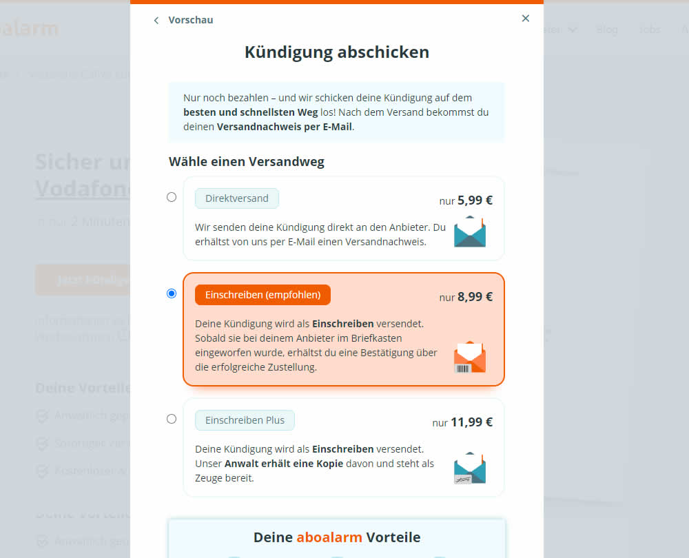
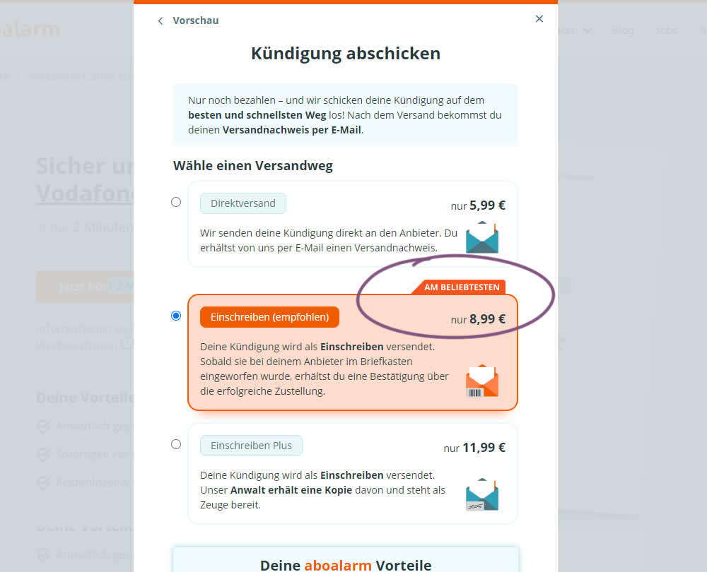
In this experiment, a "most popular" badge ("am beliebsten") was appended to the middle plan of a contract cancellation service. Impact on overall purchases and revenue was measured.
Test #516 on
686.com
by
 Adan Archila
Feb 05, 2024
Mobile
Listing
Adan Archila Tested Pattern #37: List Or Grid View In Test #516 On 686.com
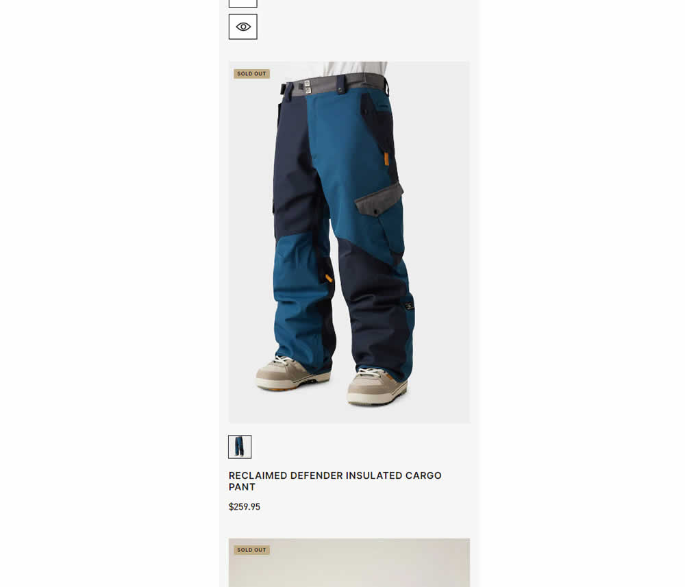
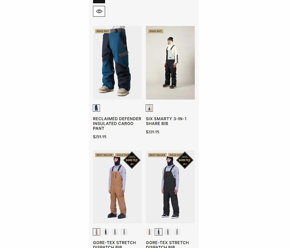
In this experiment, a one large product photo (control) was tested against a two-column layout with two smaller images (variation). Impact on sales was measured.
Test #515 on
by
 Jakub Linowski
Jan 31, 2024
Desktop
Mobile
Home & Landing
Jakub Linowski Tested Pattern #69: Autodiscounting In Test #515
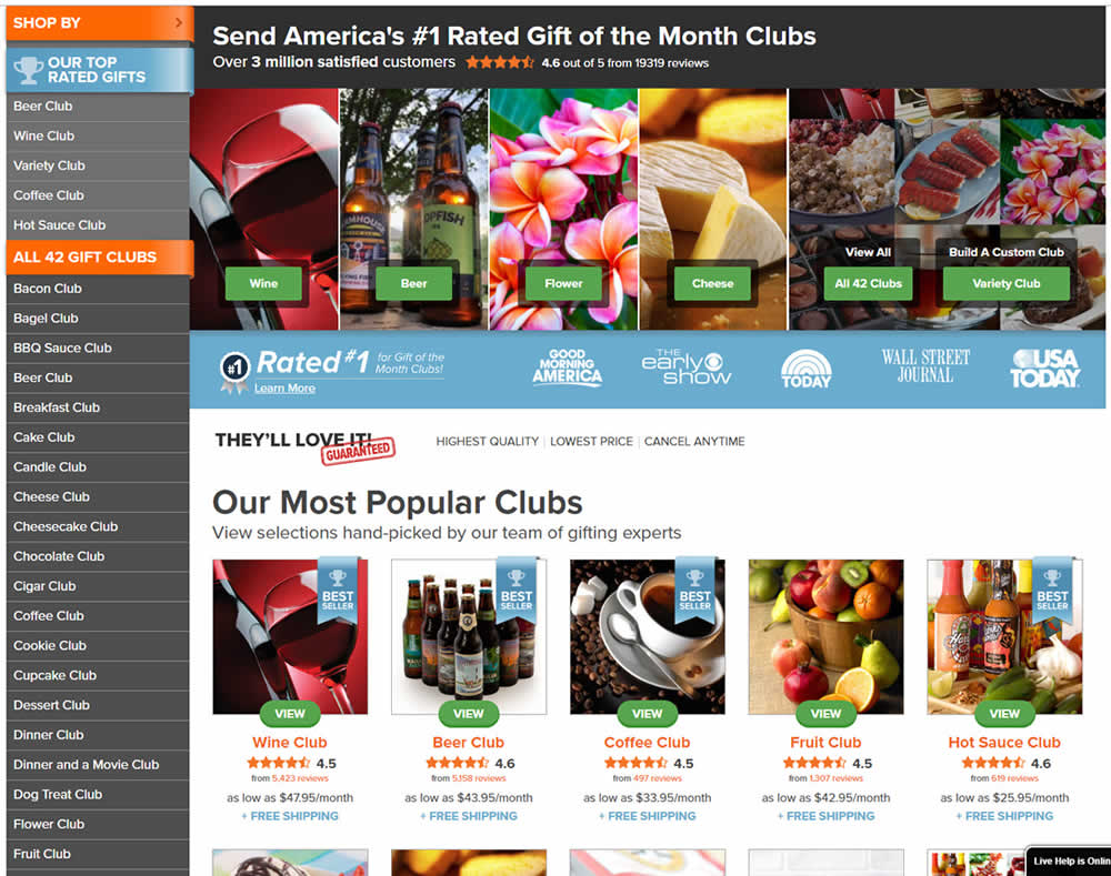
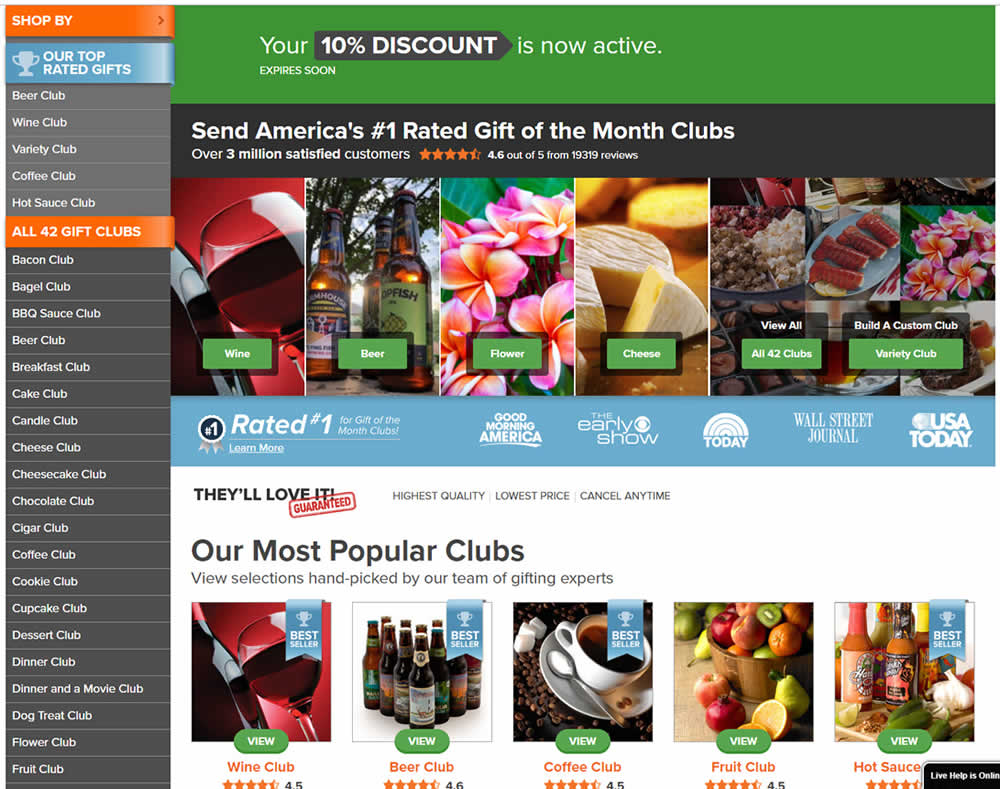
In this experiment, people who saw an offer (in an email or popup) would see a more visible site wide reinforcement of their earned discount being active. In the control, the discount was only shown during checkout. In the variation, it was shown throughout the web site on the homepage and product detail pages.
Test #514 on
Backstage.com
by
 Stanley Zuo
Jan 24, 2024
Desktop
Listing
Stanley Zuo Tested Pattern #97: Bigger Form Fields In Test #514 On Backstage.com
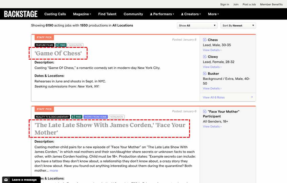
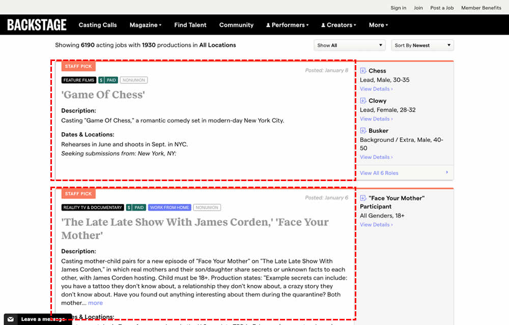
In this experiment, the click area of job listing tiles was expanded to the size of the full job tile. In the control, the click area was smaller - mostly only the job headline, along with additional "view more" links on the right hand column. Clicking the tile or headline would open up a new job details page in both control and variation. Impact on progression and membership sales was measured.
Test #513 on
Dripl.de
by
 Jona Eisenberger
Jan 23, 2024
Mobile
Desktop
Product
Jona Eisenberger Tested Pattern #15: Bulleted Reassurances In Test #513 On Dripl.de
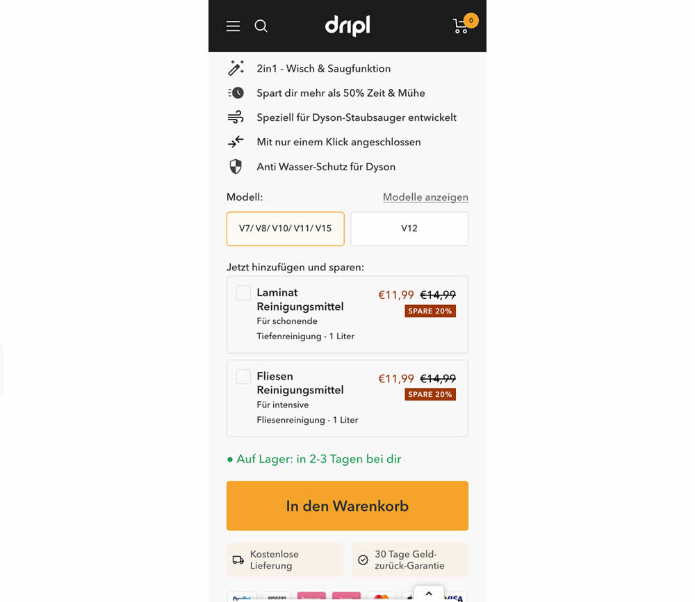
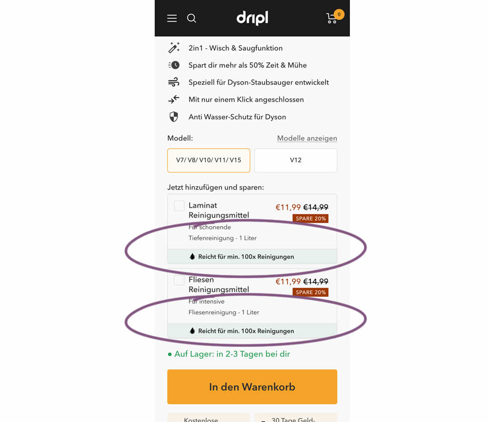
In this experiment of a floor cleaning product, a reassurance about product uses was appended to two cleaning agent upsells. In the control users saw the 2 standard upsells for laminate and tiles. And in the variation the copy "Right for me. 100x Cleanings" (uses) was appended.
Test #512 on
Snocks.com
by
 Melina Hess
Jan 17, 2024
Mobile
Product
Melina Hess Tested Pattern #65: Add More For Free Shipping In Test #512 On Snocks.com
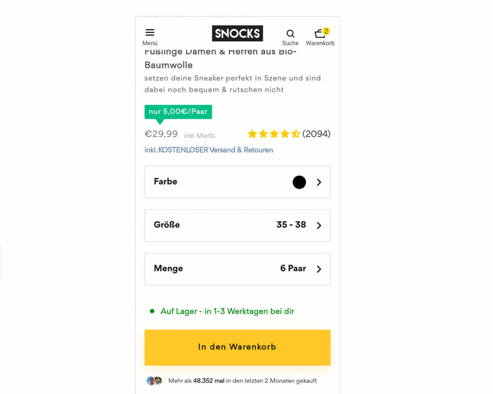
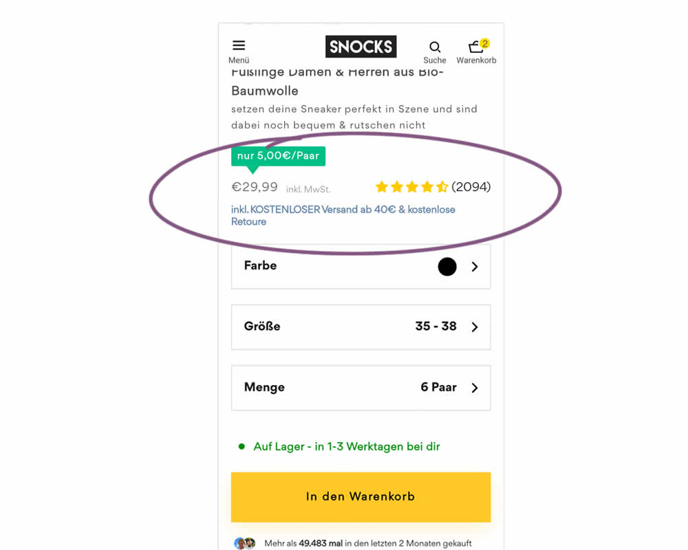
In this experiment, free shipping was a/b tested against free shipping with a 40€ purchase or higher. Hence, in the variation, customers needed to reach a cart amount total in order to be eligible for the free shipping.
Test #511 on
Online.metro-cc.ru
by
 Andrey Andreev
Jan 09, 2024
Desktop
Home & Landing
Andrey Andreev Tested Pattern #79: Product Highlights In Test #511 On Online.metro-cc.ru
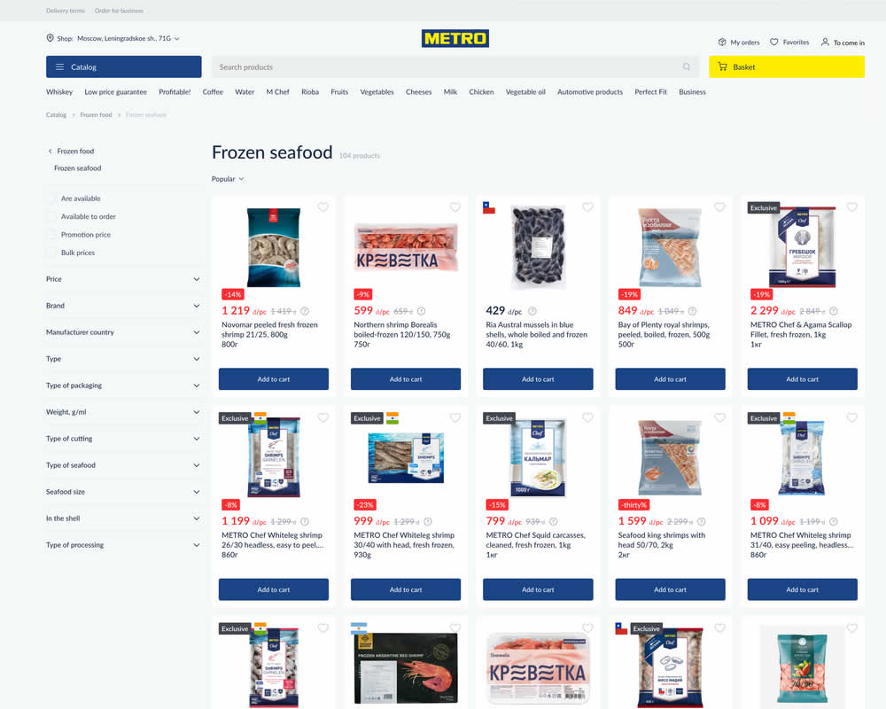
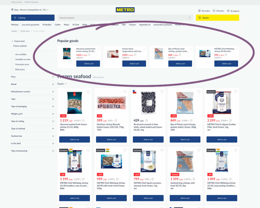
In this experiment, popular products were shown at the top of the homepage. Impact to sale was measured.