All Latest 571 A/B Tests
Become a member to unlock the abiltiy to see the highest impact a/b tests. Being able to see the actual test results and sort by impact allows growth and experimentation teams to take action on the biggest gains first
MOST RECENT TESTS
Test #559 on
Tourradar.com
by
 Clemens Grave
Oct 18, 2024
Desktop
Listing
Clemens Grave Tested Pattern #137: Visible Filters In Test #559 On Tourradar.com
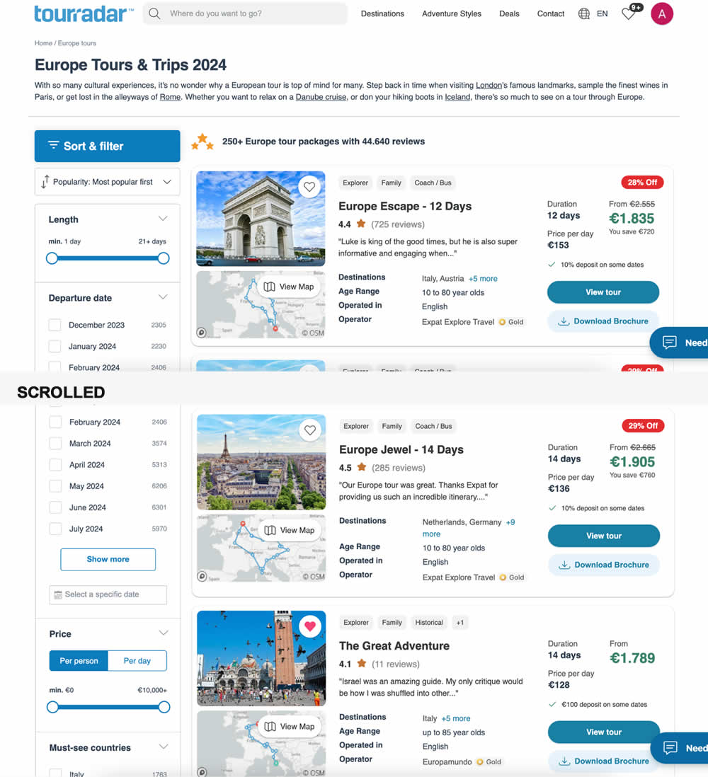
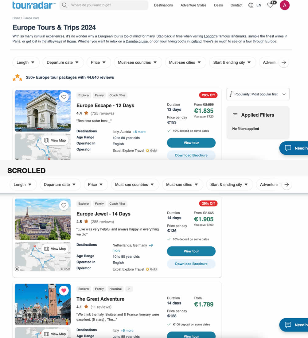
In this experiment, left column filters (control) were tested against top-aligned and sticky filters (variation). The hypothesis was to increase their visibility. Impact on their use and progression to next step (product/tour detail page) were measured.
Test #557 on
Obsbygg.no
by
 Joachim Furuseth
Oct 17, 2024
Desktop
Product
Joachim Furuseth Tested Pattern #41: Sticky Call To Action In Test #557 On Obsbygg.no
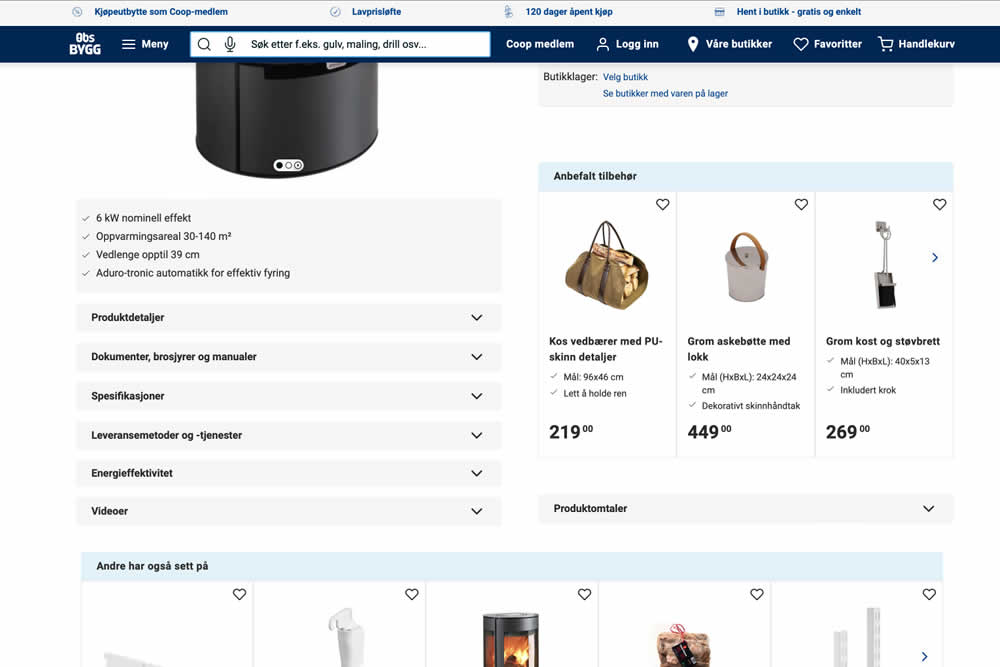
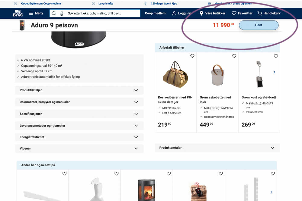
A sticky floating navigation bar was tested on product pages. The floating navigation contained: the product name, price and an add to cart button (add to cart). Impact on sales was measured. (Desktop Only)
Test #558 on
Obsbygg.no
by
 Joachim Furuseth
Oct 17, 2024
Mobile
Product
Joachim Furuseth Tested Pattern #41: Sticky Call To Action In Test #558 On Obsbygg.no
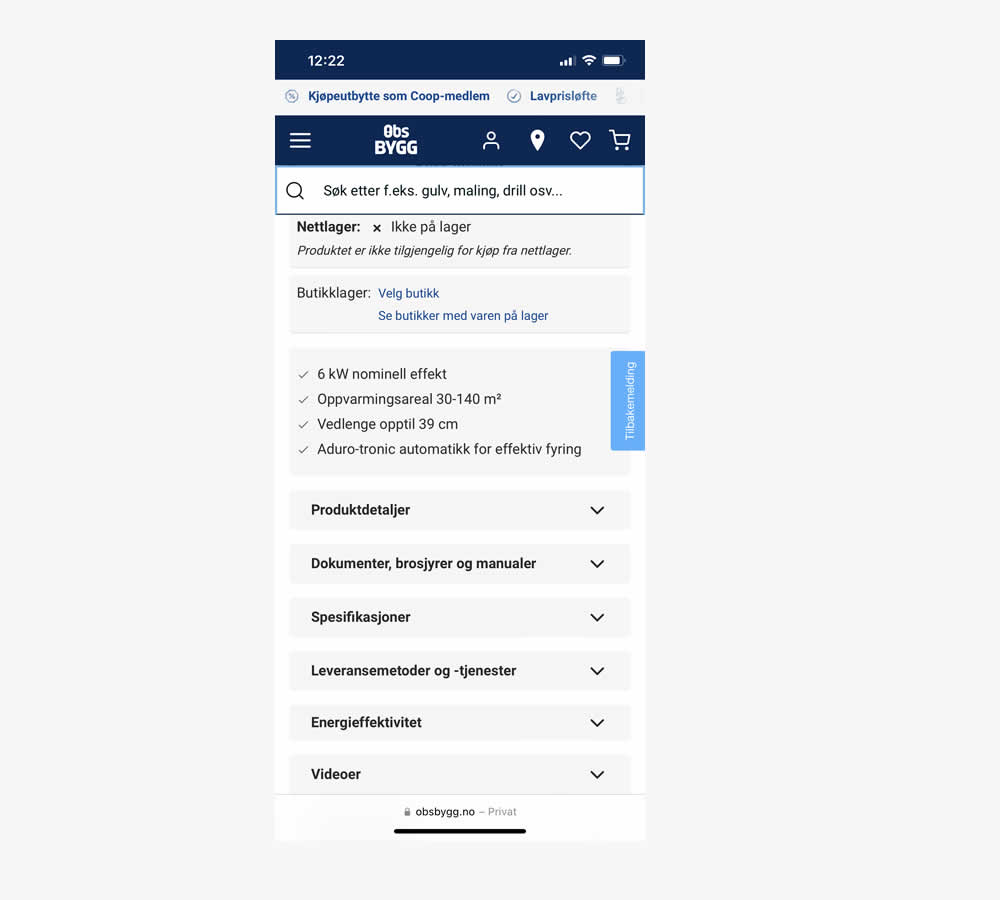
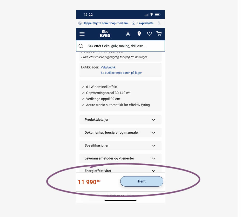
A sticky floating navigation bar was tested on product pages. The floating navigation contained: the product name, price and an add to cart button (add to cart). Impact on sales was measured. (Mobile Only)
Test #556 on
Snocks.com
by
 Melina Hess
Oct 08, 2024
Mobile
Product
Melina Hess Tested Pattern #65: Add More For Free Shipping In Test #556 On Snocks.com
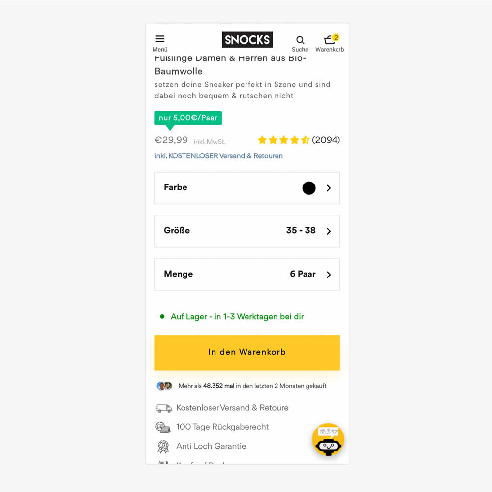
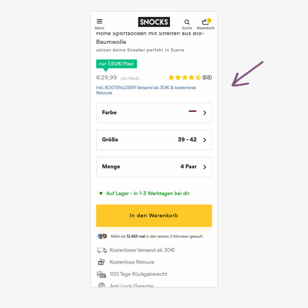
In this experiment, free shipping was a/b tested against free shipping with a 30€ purchase or higher. Hence, in the variation, customers needed to reach a cart amount total in order to be eligible for the free shipping.
Test #554 on
Obs.no
by
 Joachim Furuseth
Sep 30, 2024
Desktop
Product
Joachim Furuseth Tested Pattern #41: Sticky Call To Action In Test #554 On Obs.no
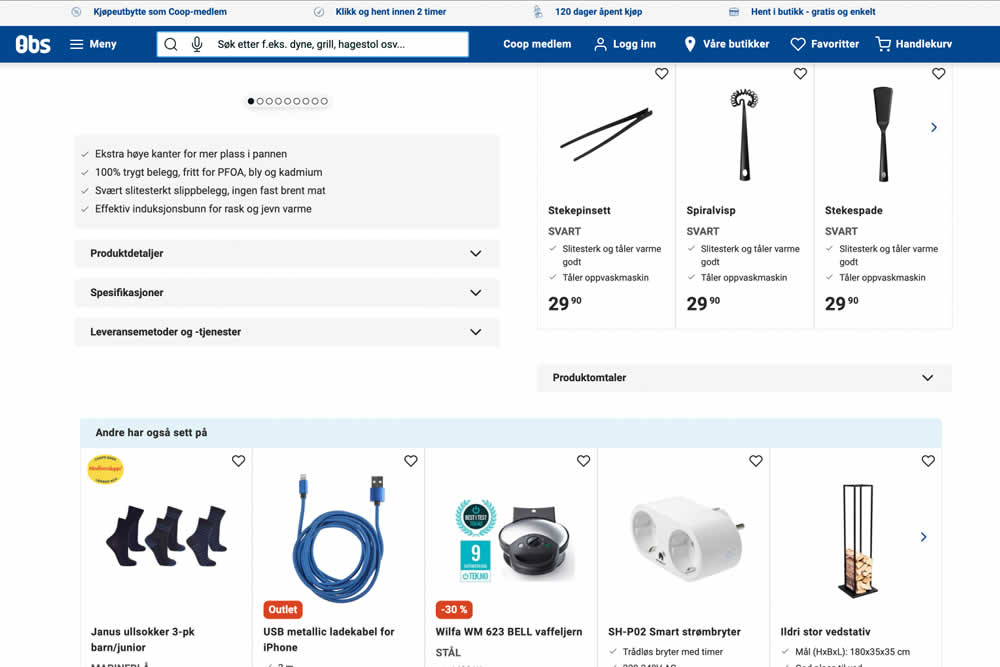
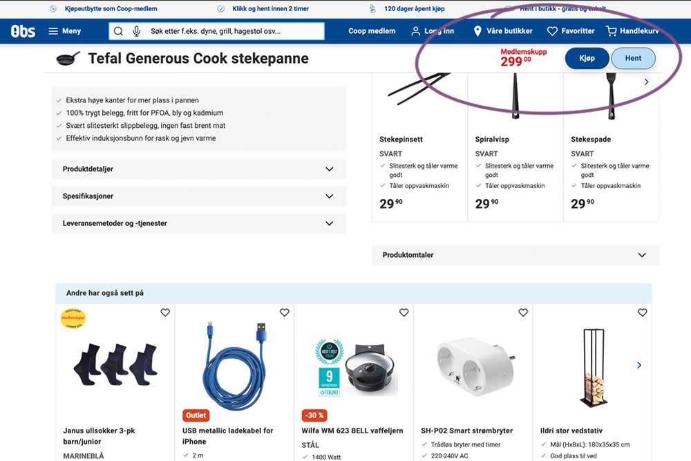
A sticky floating navigation bar was tested on product pages. The floating navigation contained: the product name, price and two add to cart buttons (add to cart; pickup in store). Impact on sales was measured. (Desktop Only)
Test #555 on
Obs.no
by
 Joachim Furuseth
Sep 30, 2024
Mobile
Product
Joachim Furuseth Tested Pattern #41: Sticky Call To Action In Test #555 On Obs.no
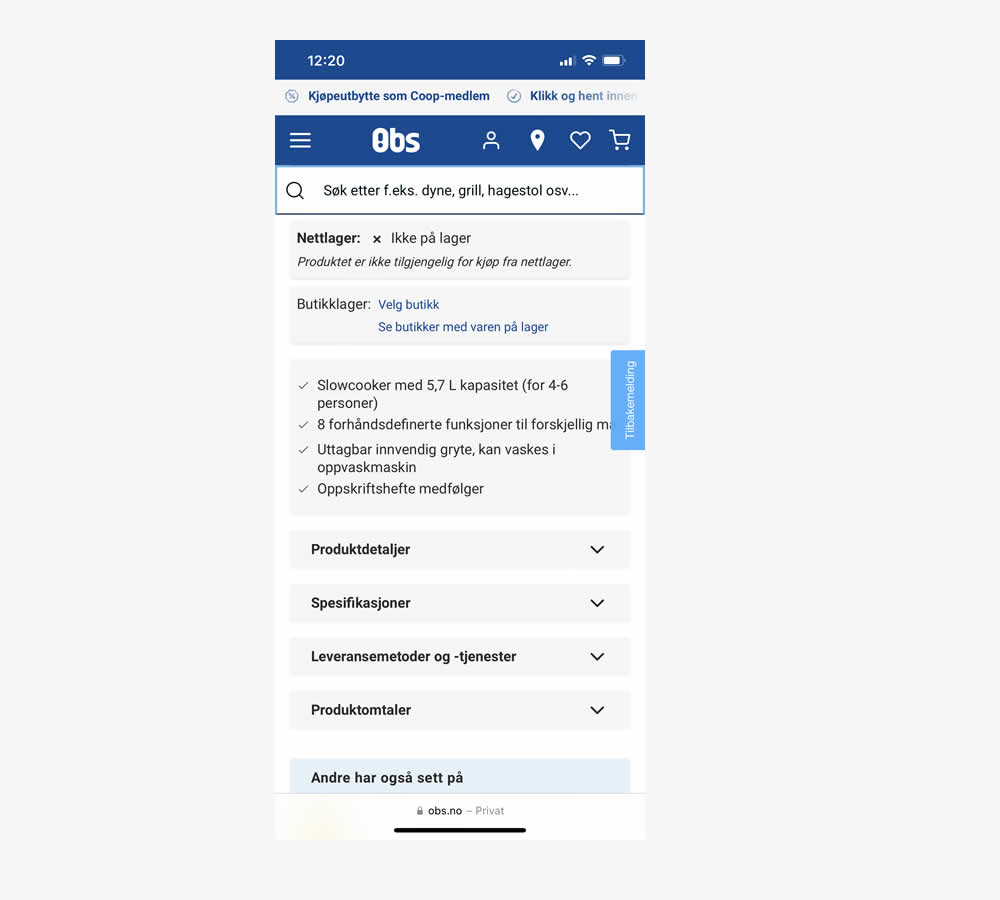
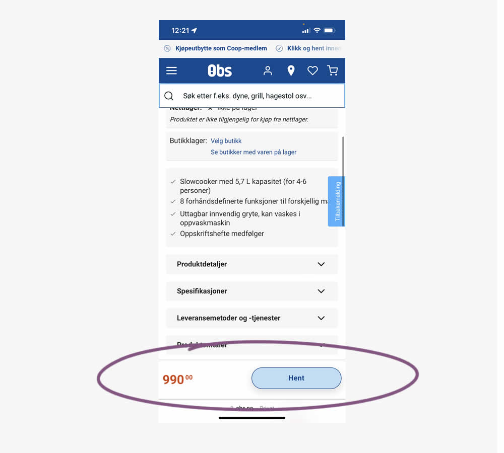
A sticky floating navigation bar was tested on product pages. The floating navigation contained: the product name, price and two add to cart buttons (add to cart; pickup in store). Impact on sales was measured. (Mobile only)
Test #553 on
Online.metro-cc.ru
by
 Andrey Andreev
Sep 27, 2024
Mobile
Desktop
Checkout
Andrey Andreev Tested Pattern #69: Autodiscounting In Test #553 On Online.metro-cc.ru
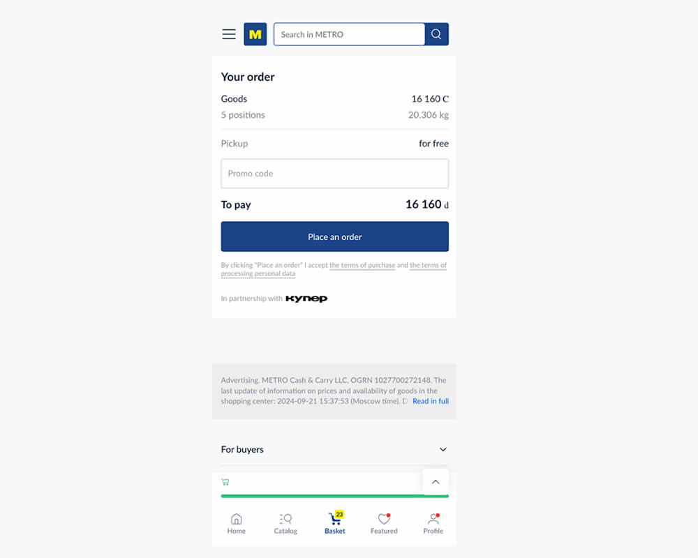
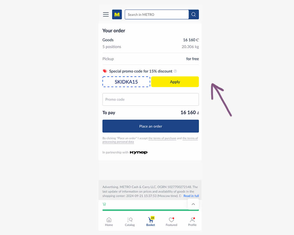
In this experiment, a preset coupon code with -15% amount and an easy to "apply" button was shown to new users who have never made a purchase. In the variation, the an empty coupon field was shown. Impact and transactions and revenue was measured.
Test #552 on
Tourradar.com
by
 Clemens Grave
Sep 19, 2024
Product
Clemens Grave Tested Pattern #15: Bulleted Reassurances In Test #552 On Tourradar.com

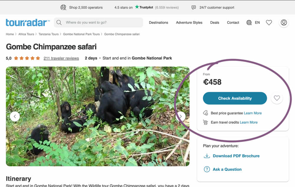
In this experiment, existing reassurance copy was changed. The control contained copy that focused on splitting payments and paying over time. The variation challenged this and showed a best price guarantee and the ability to earn credits.
Test #551 on
Tourradar.com
by
 Clemens Grave
Sep 04, 2024
Desktop
Product
Clemens Grave Tested Pattern #139: Page Level Navigation In Test #551 On Tourradar.com
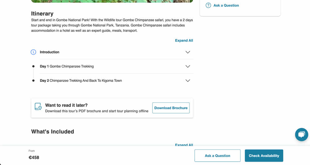
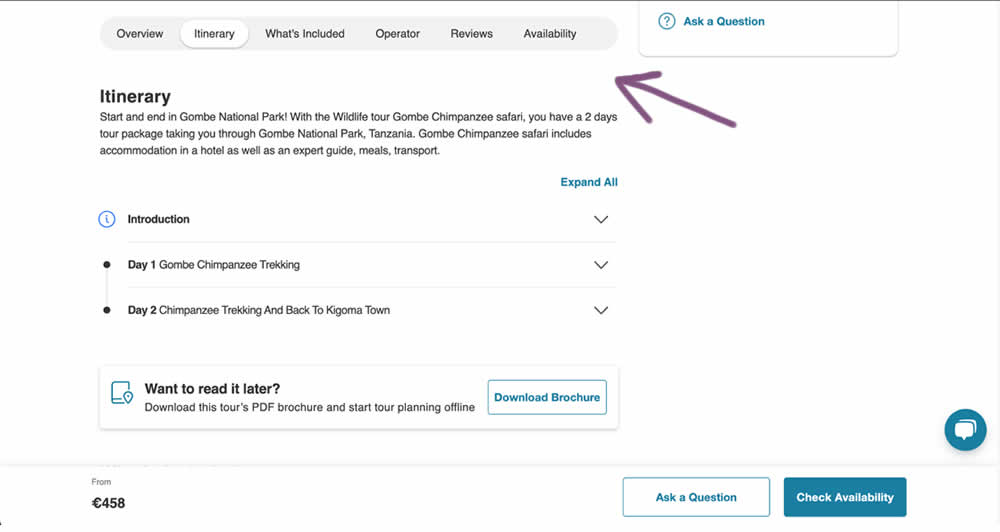
In this experiment, a floating page level navigation was added near the top of the product pages (under the main image). The navigation links included: Overview, Itinerary, What's Included, Operator, Reviews and Availability. Impact on next step progression was measured.
Test #550 on
Online.metro-cc.ru
by
 Andrey Andreev
Aug 14, 2024
Mobile
Listing
Andrey Andreev Tested Pattern #137: Visible Filters In Test #550 On Online.metro-cc.ru
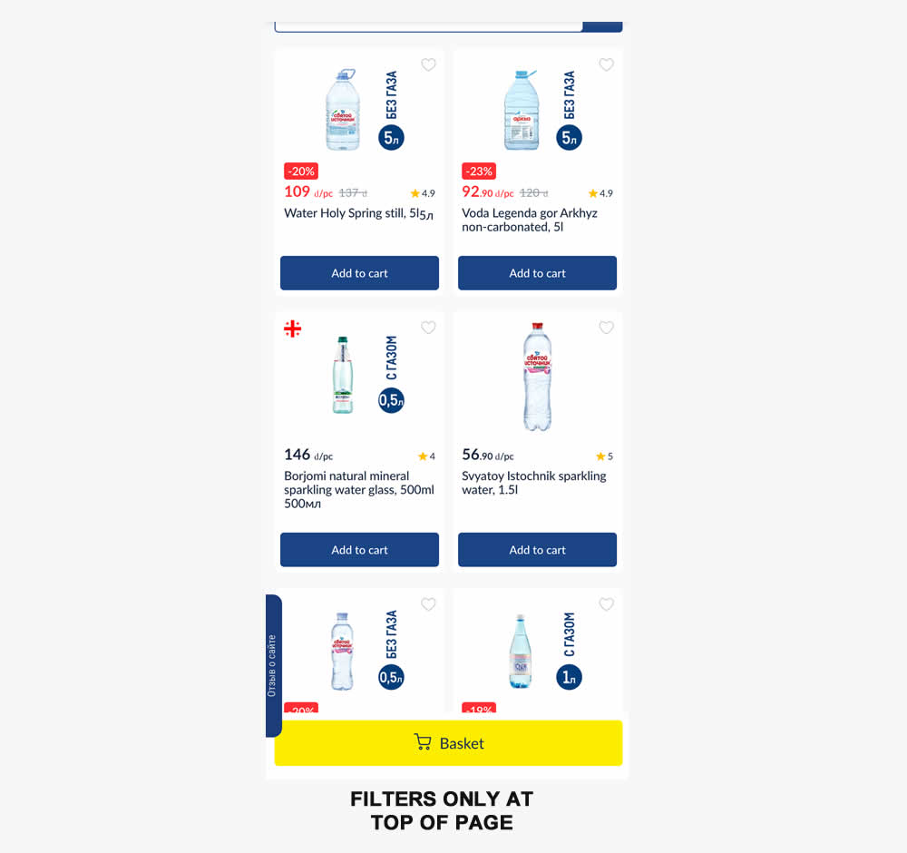
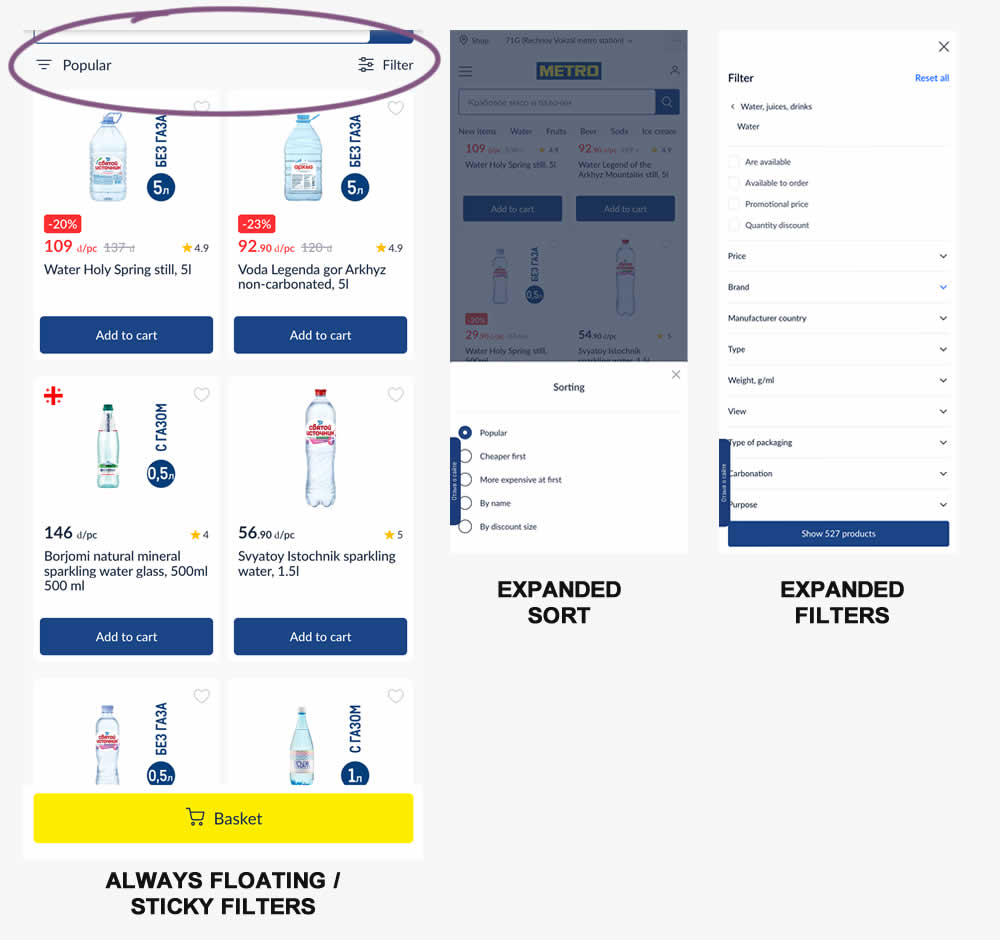
Instead of only displaying sort and filters at the top of a listing page, the variation always had them visible with a sticky/floating interaction. Impact on sales was measured.
Test #548 on
Livefresh.de
by
 Melina Hess
Aug 13, 2024
Desktop
Mobile
Product
Melina Hess Tested Pattern #17: Least Or Most Expensive First In Test #548 On Livefresh.de
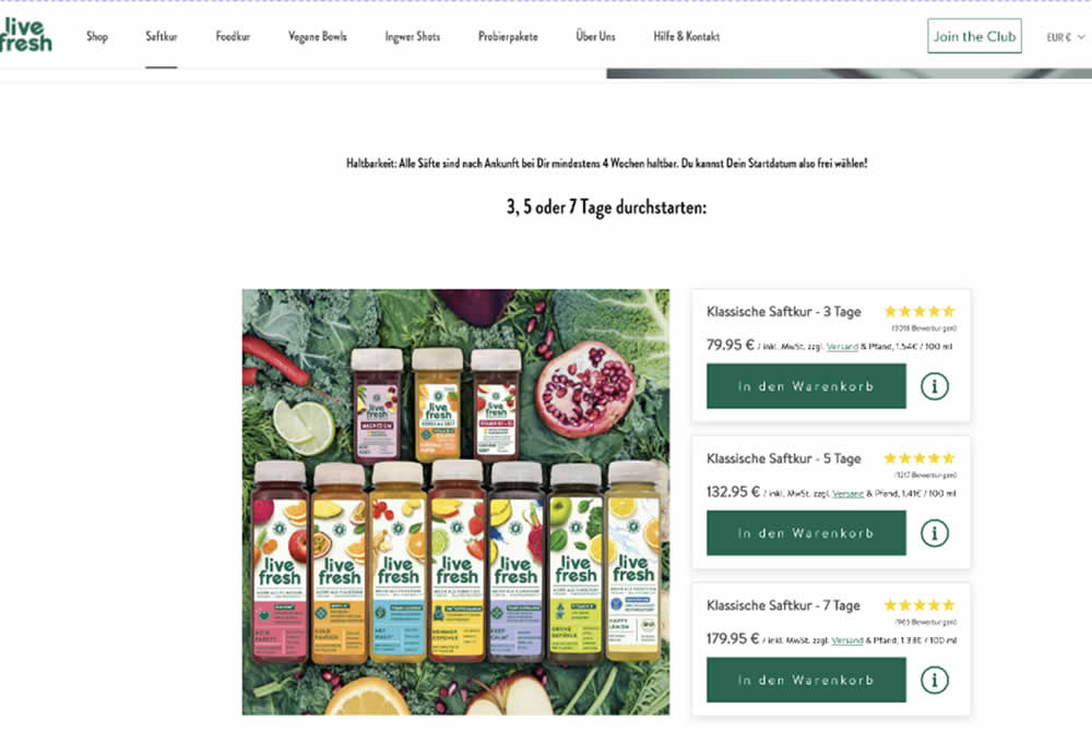
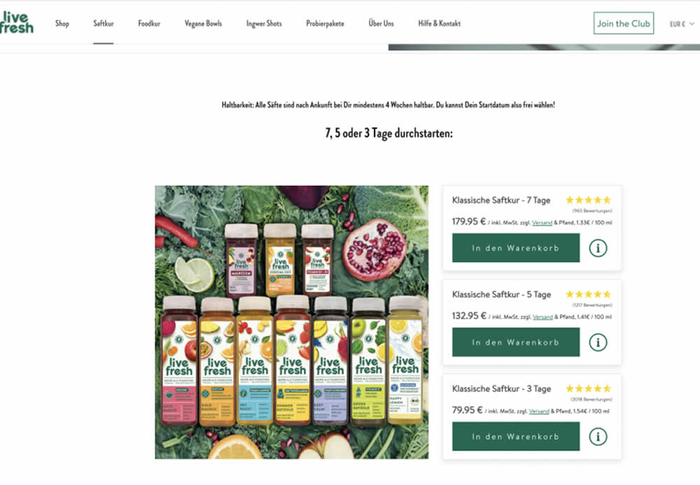
In this product landing page experiment, the plan sort order was rearranged. In the control it was sorted from least expensive to most expensive. In the variation, the plans were shown as most expensive first. Impact on sales and revenue was measured.
Test #549 on
Kay.com
by
 Craig Kistler
Aug 13, 2024
Desktop
Listing
Craig Kistler Tested Pattern #138: Visible Payment Options In Test #549 On Kay.com
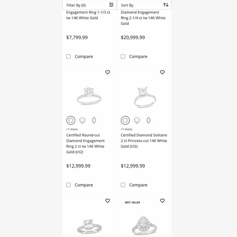
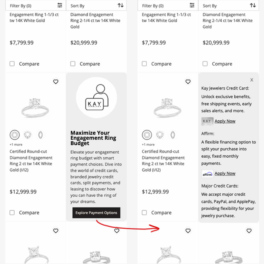
In this experiment, an inline panel was shown as a product tile. The panel informed customers about a variety of payment options (with detailed information being further presented after a button click). Impact on sales was measured.
Test #547 on
Aboalarm.de
by
 Katharina Lay
Aug 12, 2024
Mobile
Signup
Katharina Lay Tested Pattern #6: Customer Star Ratings In Test #547 On Aboalarm.de
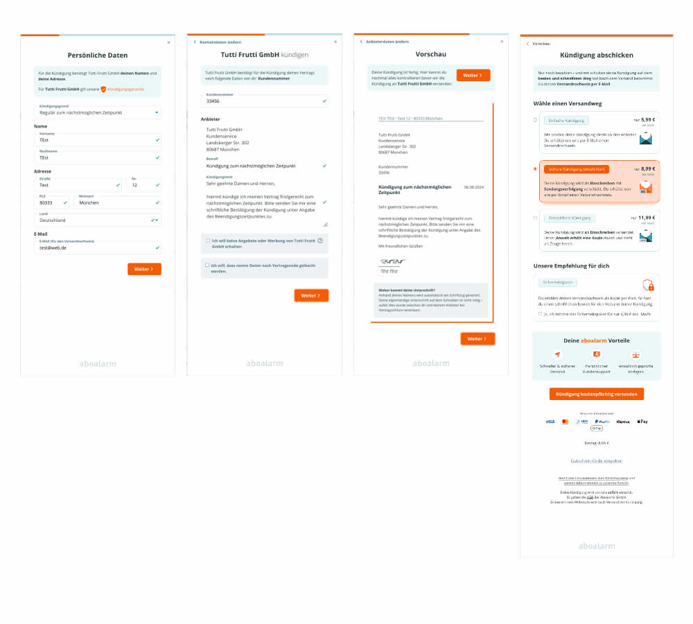
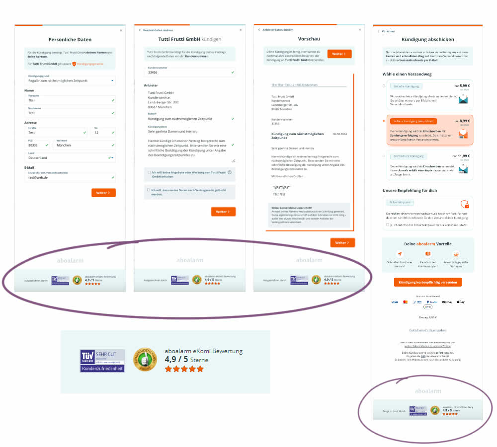
In this 4 step signup funnel experiment, social proof and customer reviews were appended at the bottom of the screen. Impact on conversions was measured.
Test #546 on
Finn.com
by
 Maksim Meged
Aug 01, 2024
Desktop
Signup
Maksim Meged Tested Pattern #129: Right Or Left Aligned Forms In Test #546 On Finn.com
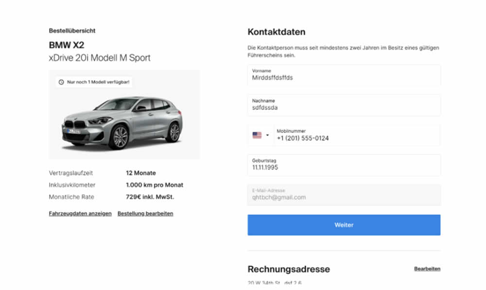
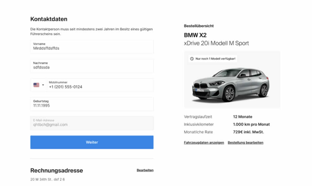
In this signup flow experiment, form fields on the right hand side (control) were shifted to the left column (variation). Impact on account creations and checkouts was measured.
Test #545 on
Banter.com
by
 Craig Kistler
Jul 29, 2024
Desktop
Product
Craig Kistler Tested Pattern #66: Complementary Upsell In Test #545 On Banter.com
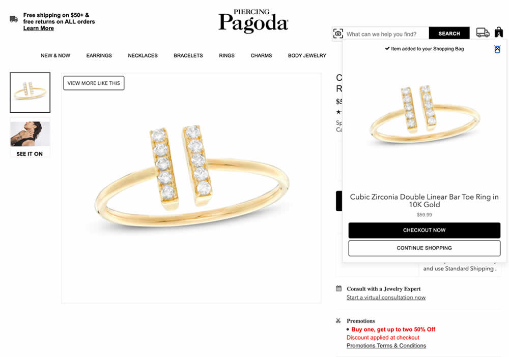
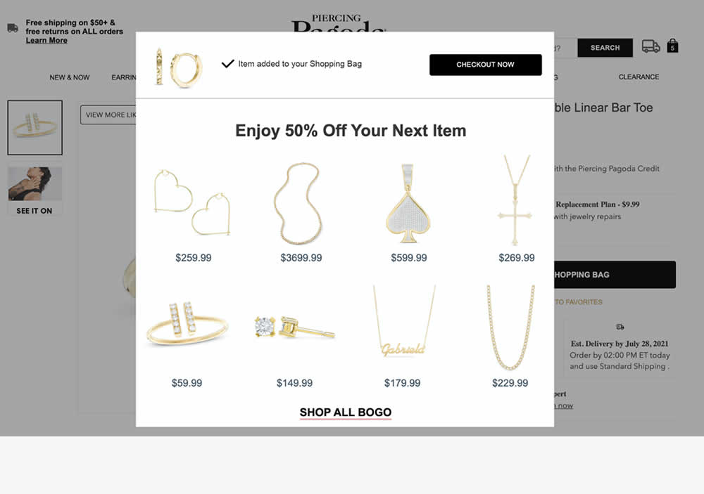
In this experiment, a modal based message was shown to encourage extra products being added as complementary upsells. In the control, the promotion text appeared at the bottom as red text ("Buy one, get up to two 50% Off"). Whereas in the variation, specific products were shown on the modal (post add-to-cart). Impact on adds-to-cart, sales and average revenue was measured.
Test #544 on
686.com
by
 Adan Archila
Jul 25, 2024
Desktop
Product
Adan Archila Tested Pattern #104: Carousel Vs Static Grid Images In Test #544 On 686.com
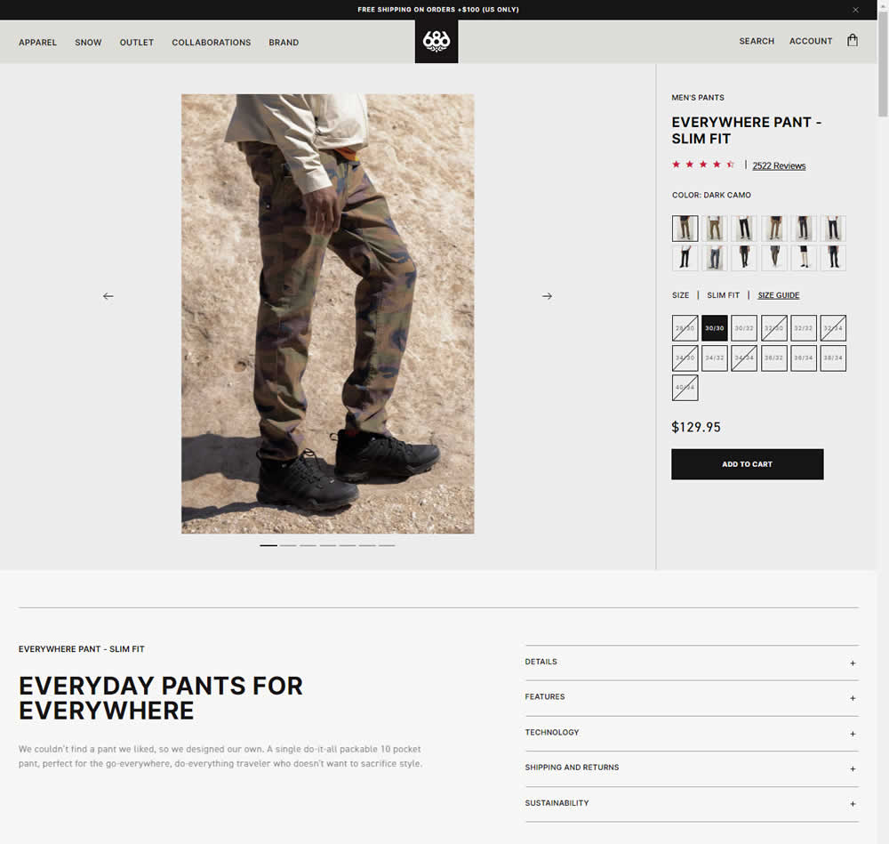
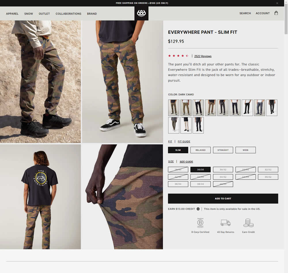
In this experiment, a single image carousel gallery was replaced with a grid gallery. In addition the variation also used: taller swatches; a wider size box, added fit (slim, relaxed, straight, wide) options; and used a wider Add to Cart CTA (full width of the column). Impact on sales was measured.
Test #543 on
by
 Jakub Linowski
Jul 22, 2024
Desktop
Mobile
Product
Jakub Linowski Tested Pattern #7: Social Counts In Test #543
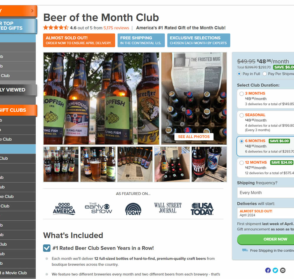
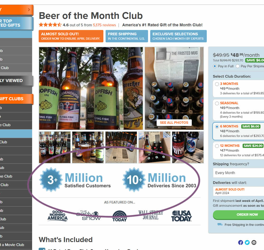
In this experiment, social proof copy was added just below product photos. The copy emphasied that "3 million satisfied customers" and "10 million deliveries since 2003". Impact on sales was measured.
Test #542 on
Expertinstitute.com
by
 Ardit Veliu
Jul 17, 2024
Desktop
Home & Landing
Ardit Veliu Tested Pattern #108: Frequently Asked Questions In Test #542 On Expertinstitute.com
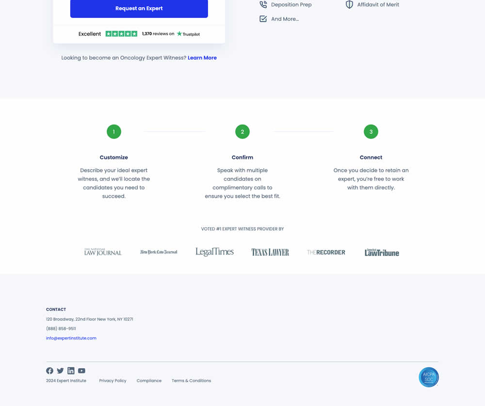
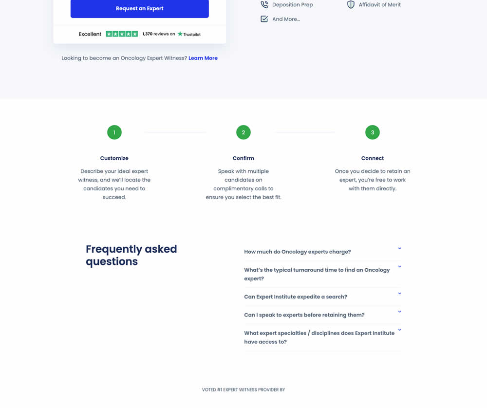
In this experiment, a Frequently Asked Questions section was added near the bottom of a short lead gen form. This test ran on one of Expert Institute's landing pages for their expert witness seeking services. Impact on leads was measured.
Test #541 on
Online.metro-cc.ru
by
 Andrey Andreev
Jul 10, 2024
Desktop
Listing
Andrey Andreev Tested Pattern #137: Visible Filters In Test #541 On Online.metro-cc.ru
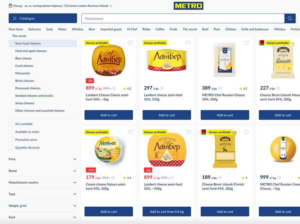
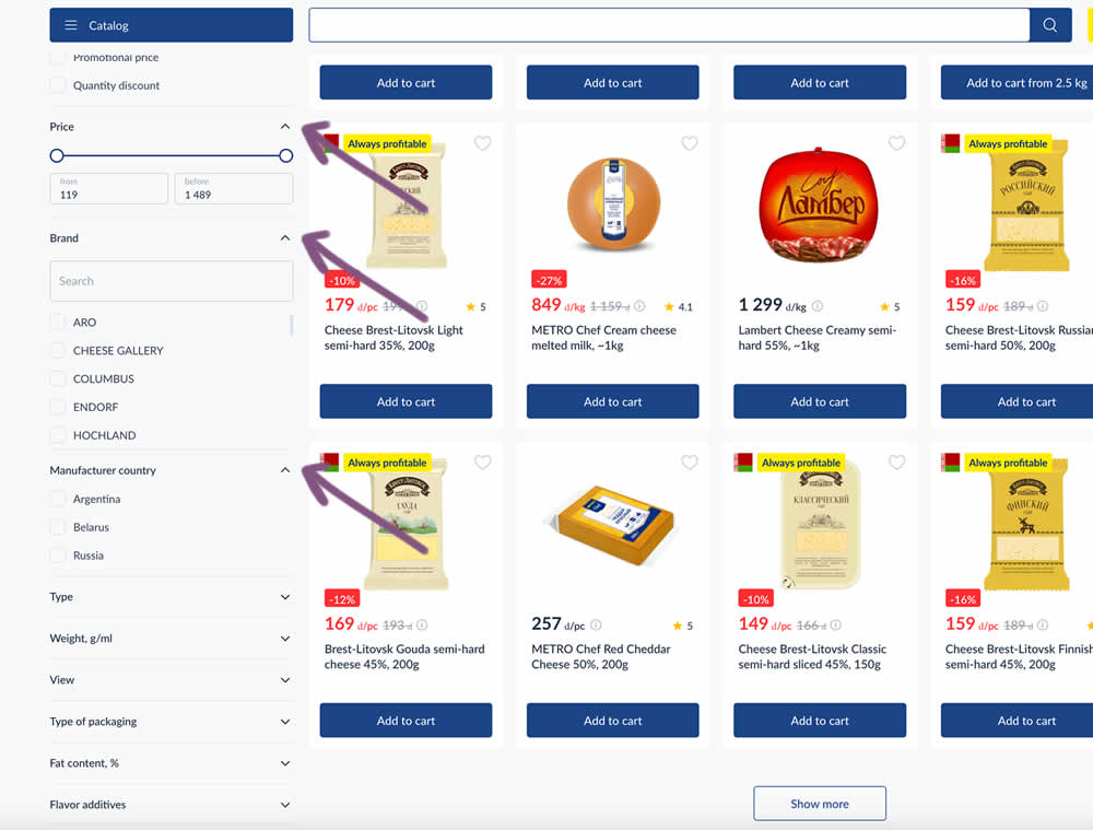
In this experiment, some side column filters were made more visible by being automatically expanded. These included: brand, price and country of manufacturing.
Test #540 on
by
 Maksim Meged
Jun 28, 2024
Mobile
Listing
Maksim Meged Tested Pattern #136: Earliest Availability In Test #540
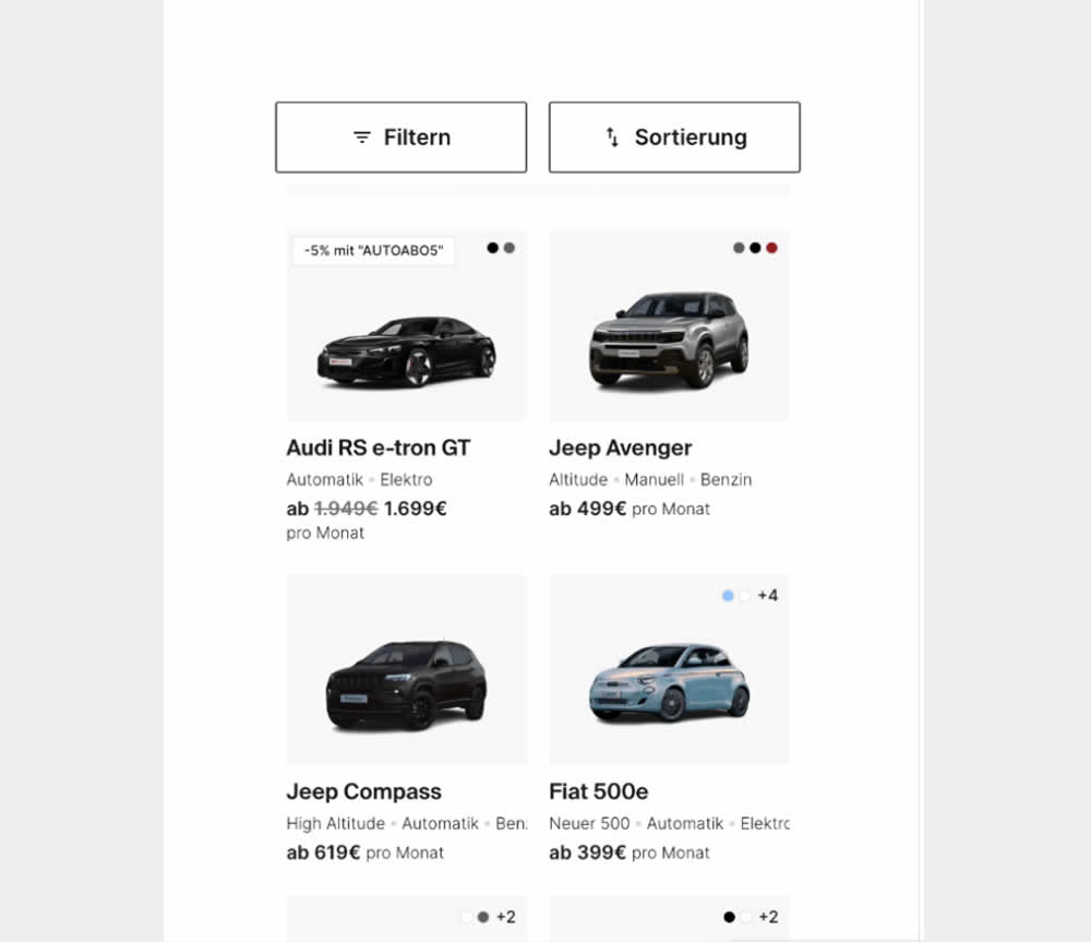
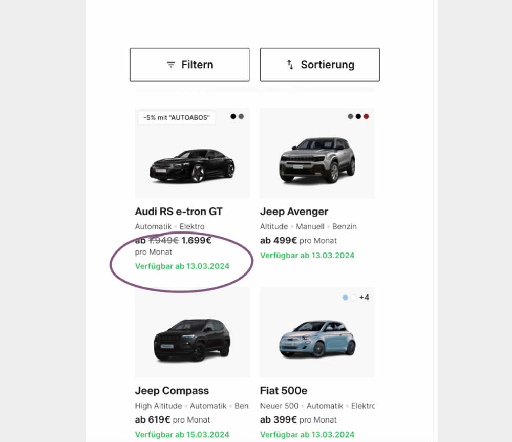
In this experiment, the earliest availability dates were displayed underneath product tiles on listing pages. This was a/b tested on a car rental service website. Impact on product adds-to-cart as well as transactions was measured.