All Latest 571 A/B Tests
Become a member to unlock the abiltiy to see the highest impact a/b tests. Being able to see the actual test results and sort by impact allows growth and experimentation teams to take action on the biggest gains first
MOST RECENT TESTS
Test #480 on
Aboalarm.de
by
 Daria Kurchinskaia
Jun 15, 2023
Desktop
Mobile
Checkout
Daria Kurchinskaia Tested Pattern #15: Bulleted Reassurances In Test #480 On Aboalarm.de
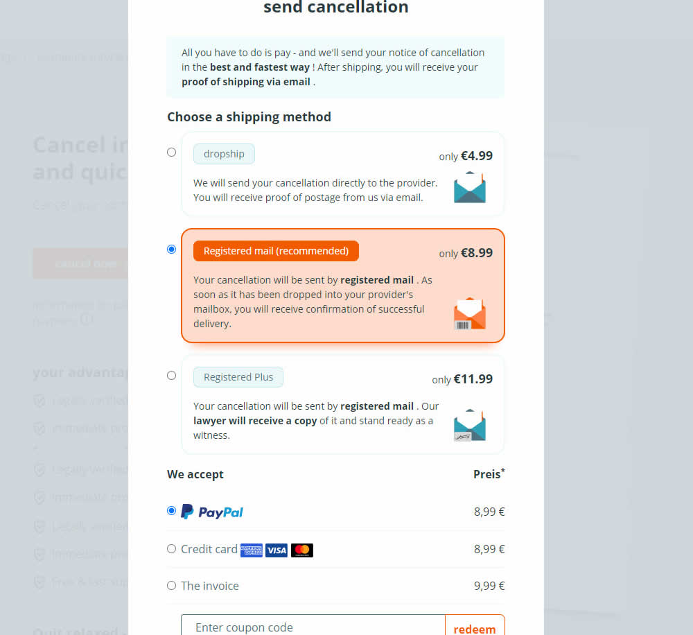
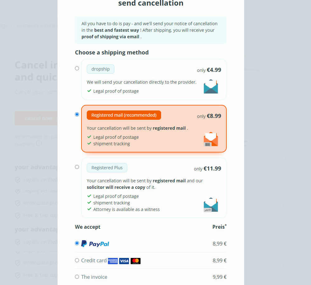
In this experiment, a list of benefits were shown for each of the 3 plans on the last step of a contract cancelation service. The lowest plan only had one benefit, whereas the highest plan had 3. Impact on transactions was measured.
Test #478 on
Estilomma.com
by
 José Álvarez
Jun 14, 2023
Mobile
Global
José Álvarez Tested Pattern #130: Visible Or Hidden Offer Pages In Test #478 On Estilomma.com
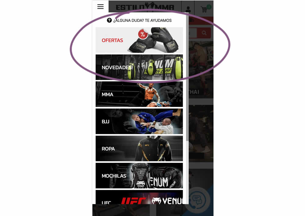
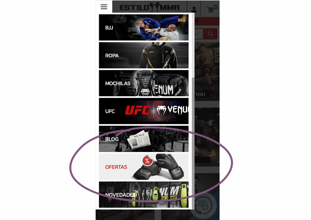
In this experiment, an offers page was shifted all the way down inside an expanded mobile navigation. The control showed it at the very top. The variation showed it at the bottom. (Note that the screen shot shows an already scrolled navigation - in the initial view, users would not be able to see the discount page right away, as it required some scrolling). Impact on overall sales was measured.
Test #477 on
Snocks.com
by
 Melina Hess
Jun 09, 2023
Mobile
Desktop
Product
Melina Hess Tested Pattern #95: Clickable Product Previews In Test #477 On Snocks.com
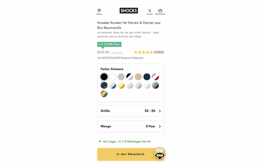
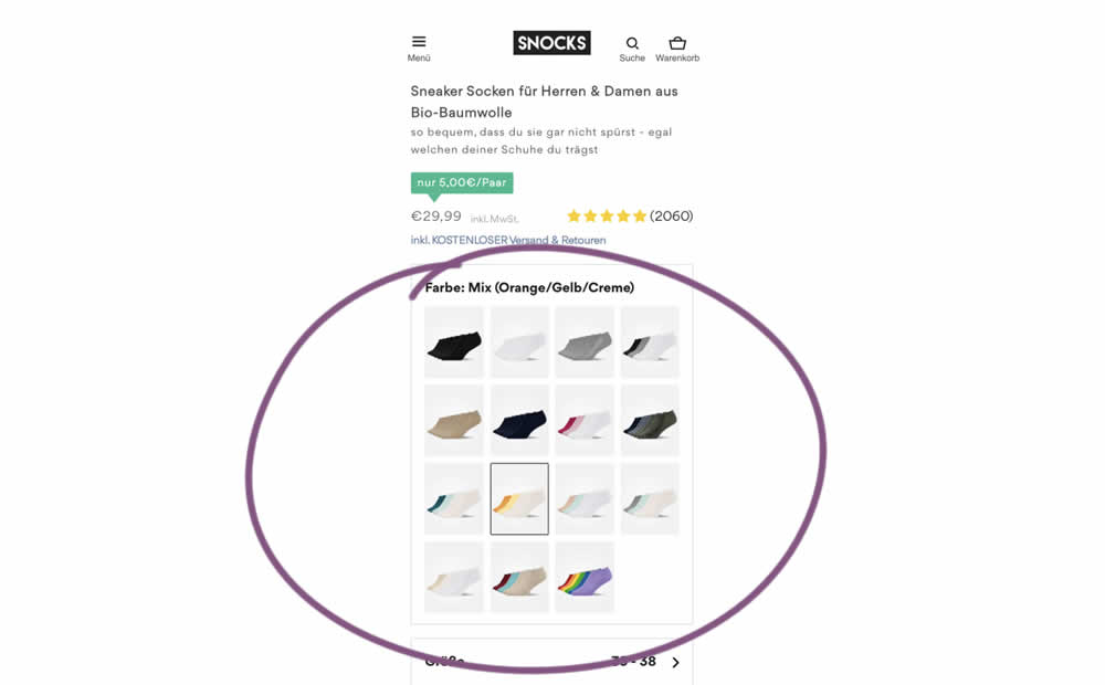
In this experiment, product color swatches were replaced with real product photos. Whereas the control showed the colors as more abstract circles. Impact on sales was measured.
Test #476 on
by
 Devesh Khanal
Jun 08, 2023
Mobile
Product
Devesh Khanal Tested Pattern #95: Clickable Product Previews In Test #476
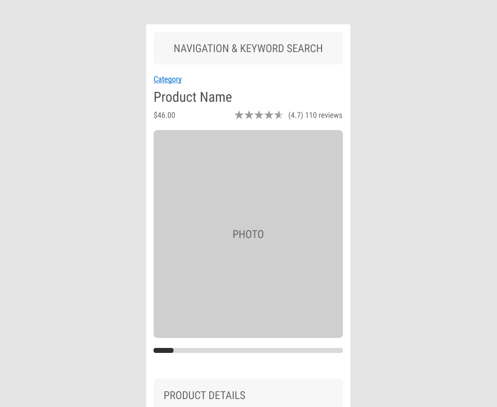
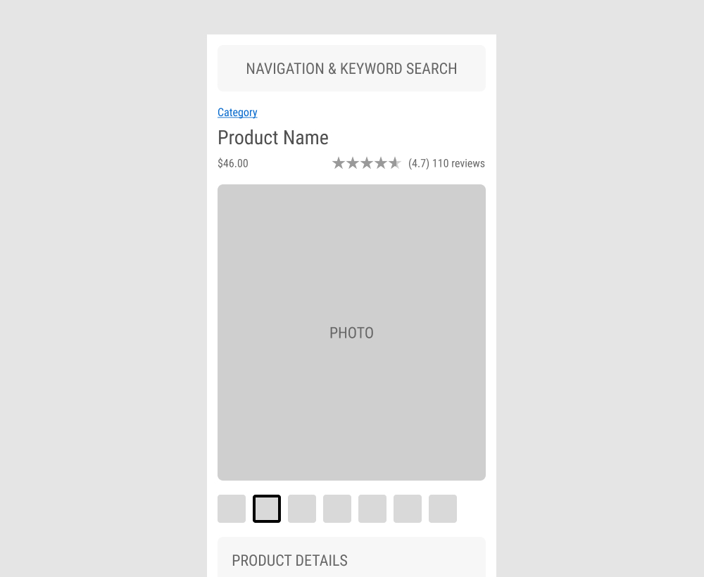
The GrowthRock team ran an experiment on one of their client's product detail pages. Instead of using a scrollbar (for mulitple images), clickable product photo thumbnails were used instead. Impact on sales was measured.
Test #475 on
Online.metro-cc.ru
by
 Andrey Andreev
Jun 07, 2023
Desktop
Mobile
Listing
Andrey Andreev Tested Pattern #36: Fewer Or More Results In Test #475 On Online.metro-cc.ru
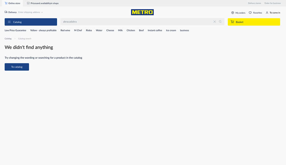
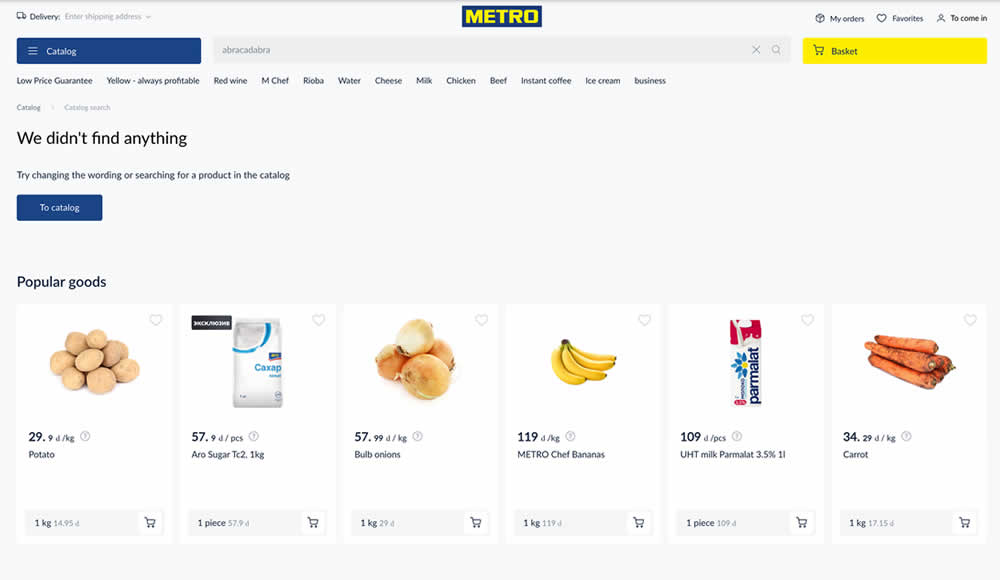
Are more (popular) product results better than none at all? In this experiment, popular products were shown during an empty search result. Impact on sales was measured.
Test #474 on
Rollbar.com
by
 Mike Smith
May 27, 2023
Desktop
Mobile
Home & Landing
Mike Smith Tested Pattern #4: Testimonials In Test #474 On Rollbar.com
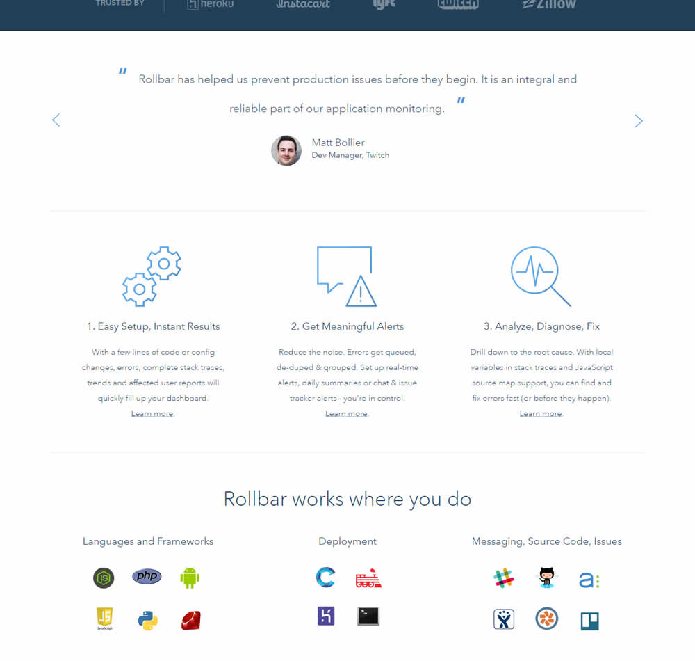
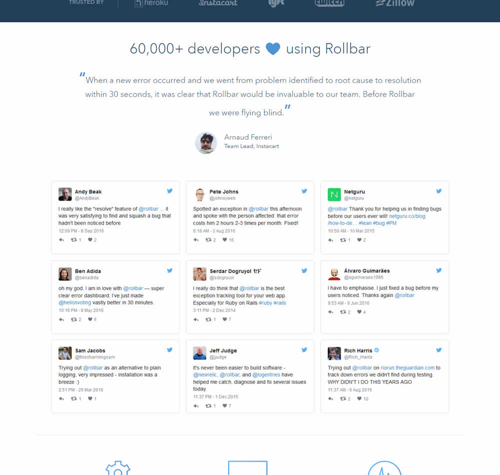
In this experiment, 9 Twitter card style testimonials were appended onto the homepage of Rollbar. These were image / screenshots recreations without links to the actual tweets.
Test #473 on
by
 Jakub Linowski
May 26, 2023
Desktop
Home & Landing
Jakub Linowski Tested Pattern #19: Benefit Testimonials In Test #473
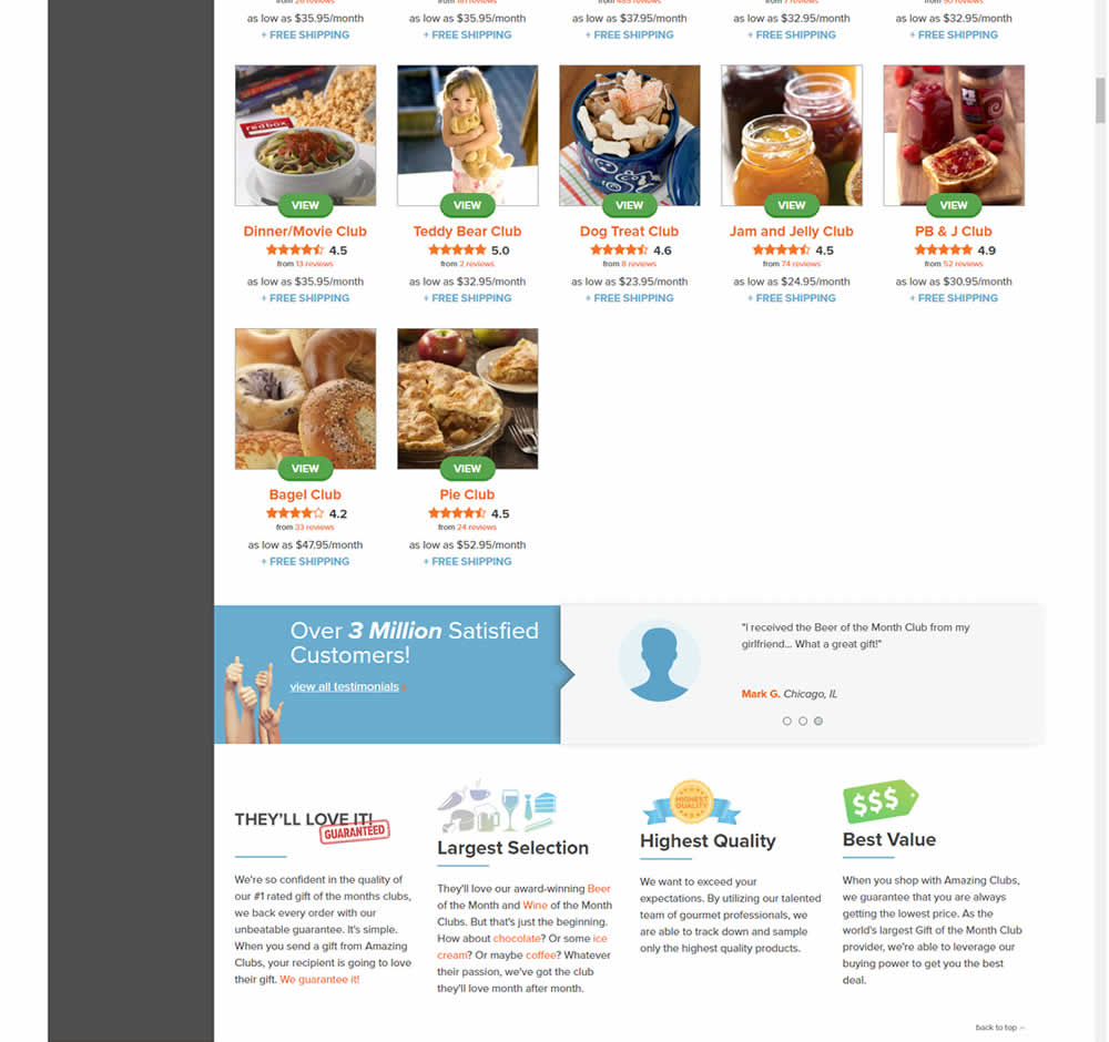
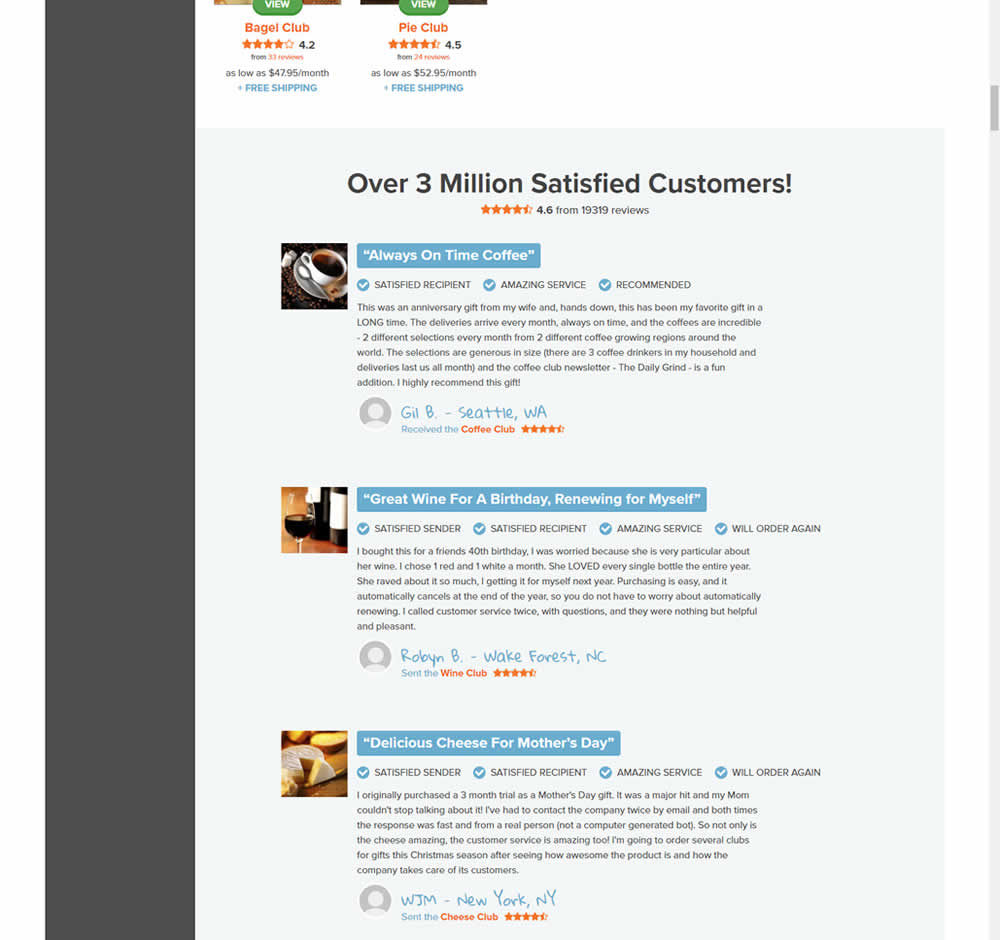
In this experiment, very short form testimonials (with a reference to over 3 million customers) were replaced with 3 more elaborate ones. These elaborate or benefit testimonials contained: highlighted statements, star reviews, emphasized location, tag summaries and photos of the purchased product. The control also contained a 3 testimonial carousel interaction.
This test appeared at the bottom of a longer homepage with additional product listings above.
Test #471 on
Expertinstitute.com
by
 Ardit Veliu
May 25, 2023
Desktop
Mobile
Home & Landing
Ardit Veliu Tested Pattern #48: Video Testimonials In Test #471 On Expertinstitute.com
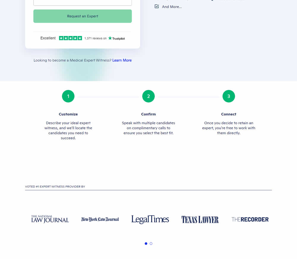
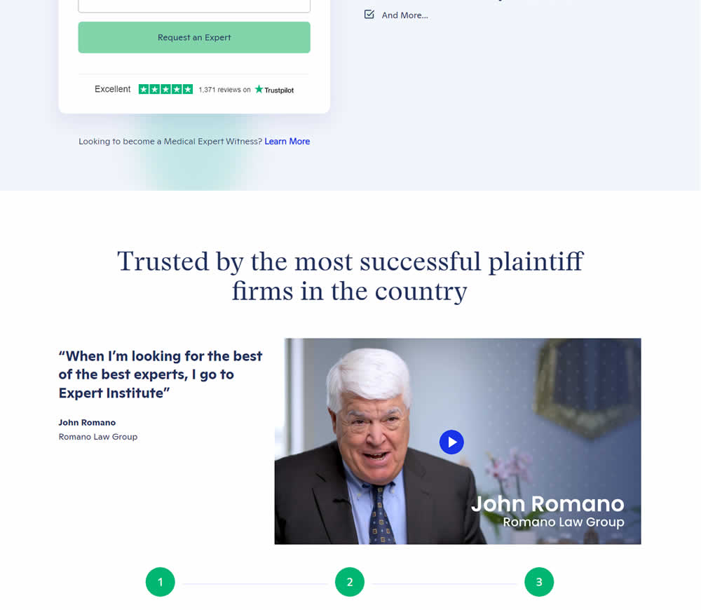
In this experiment, a video testimonial was added mid page onto a signup / lead form page.
Test #472 on
Expertinstitute.com
by
 Ardit Veliu
May 25, 2023
Desktop
Mobile
Home & Landing
Ardit Veliu Tested Pattern #48: Video Testimonials In Test #472 On Expertinstitute.com

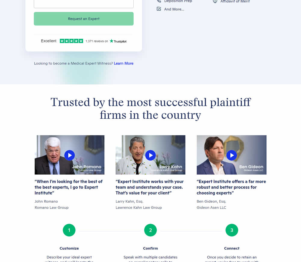
In this experiment, three video testimonials were added mid page onto a signup / lead form page.
Test #470 on
Formelskin.de
by
 Alexander Krieger
May 12, 2023
Mobile
Signup
Alexander Krieger Tested Pattern #3: Fewer Form Fields In Test #470 On Formelskin.de
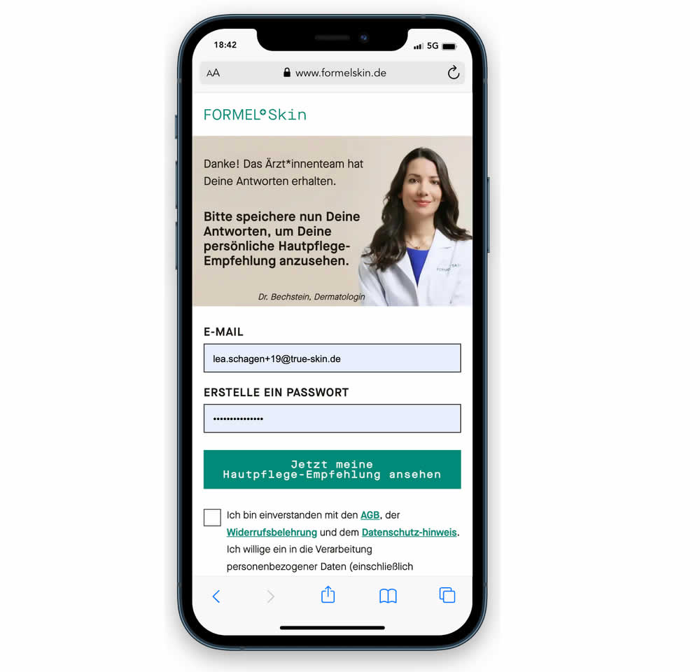
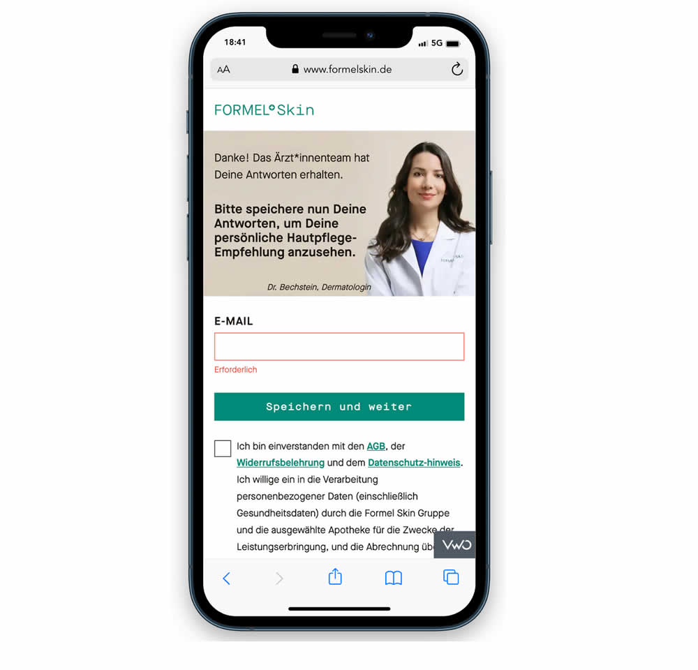
In this experiment, a password field was removed from a signup / account creation step. Instead of asking for a password, users received an email with an auto-generated password. This experiment ran on mobile and impact on sales (post-signup) was measured.
Test #469 on
by
 Ardit Veliu
Apr 28, 2023
Desktop
Signup
Ardit Veliu Tested Pattern #129: Right Or Left Aligned Forms In Test #469
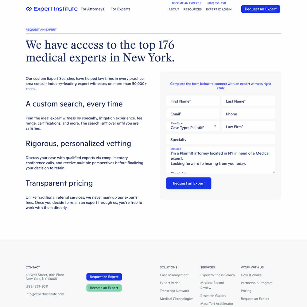
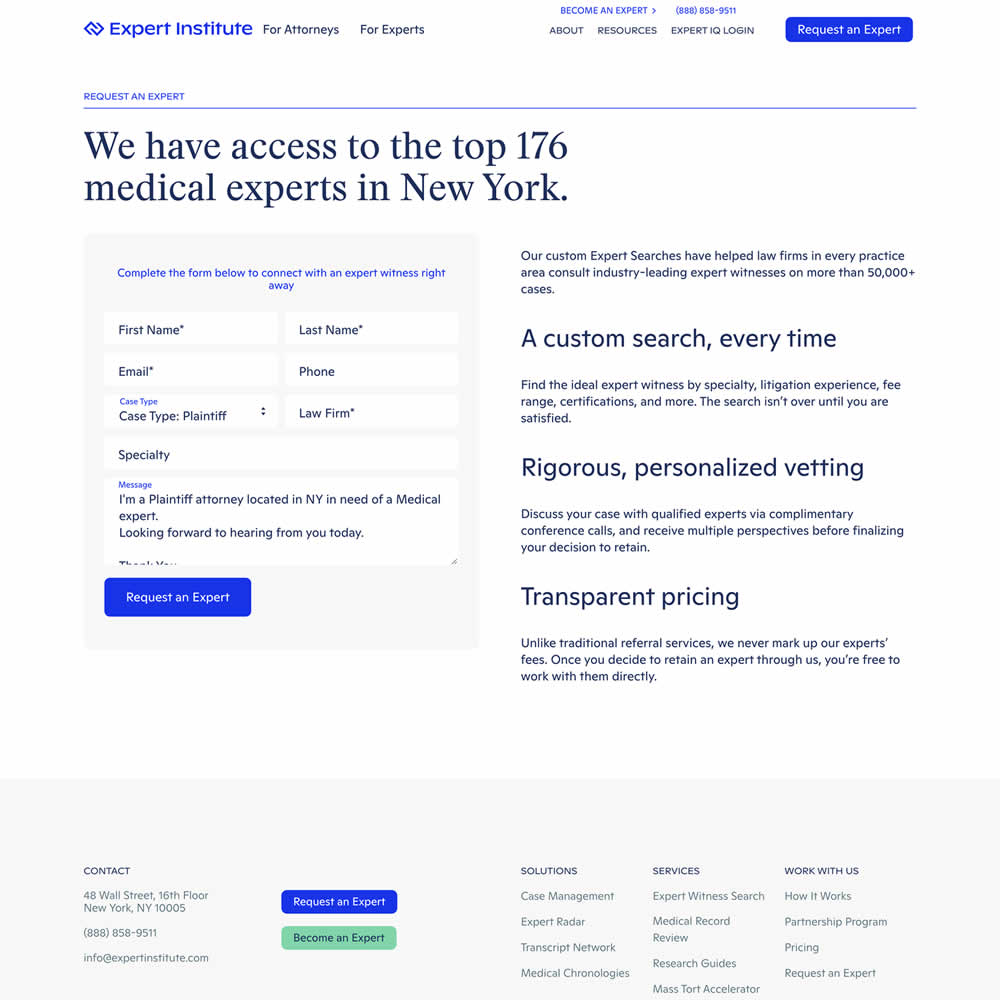
In this experiment, a right side form shifted in position to the left. Impact on leads was measured.
Test #468 on
Umbraco.com
by
 Lars Skjold Iversen
Apr 28, 2023
Desktop
Mobile
Home & Landing
Lars Skjold Iversen Tested Pattern #6: Customer Star Ratings In Test #468 On Umbraco.com
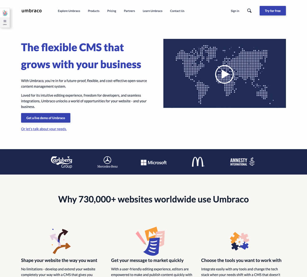
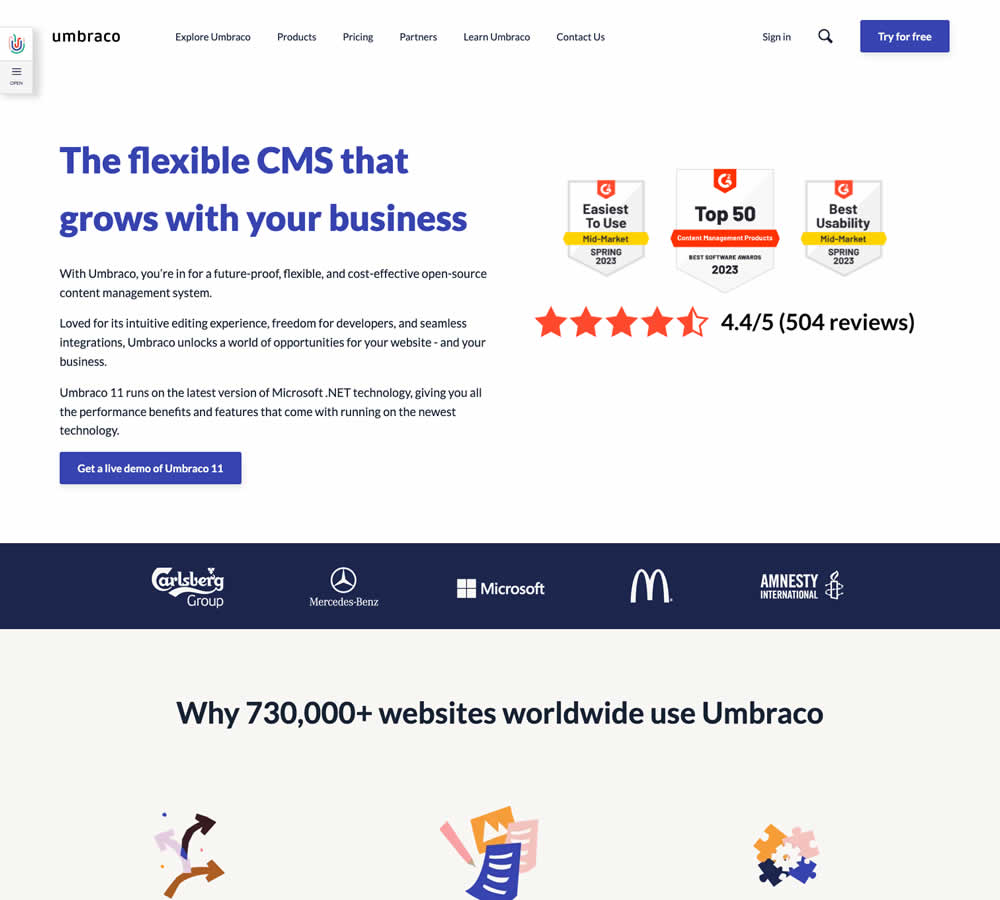
In this homepage experiment a number of changes were introduced - with perhaps the most prominent one being the replacement of a video component with customer review badges. Additional copy changes included reinforcement of the latest version number (v11) throughout the page, as well as a dedicated (v11) section in the middle of the page. Impact on demo signups was measured.
Test #467 on
by
 Jakub Linowski
Apr 27, 2023
Desktop
Mobile
Product
Jakub Linowski Tested Pattern #108: Frequently Asked Questions In Test #467
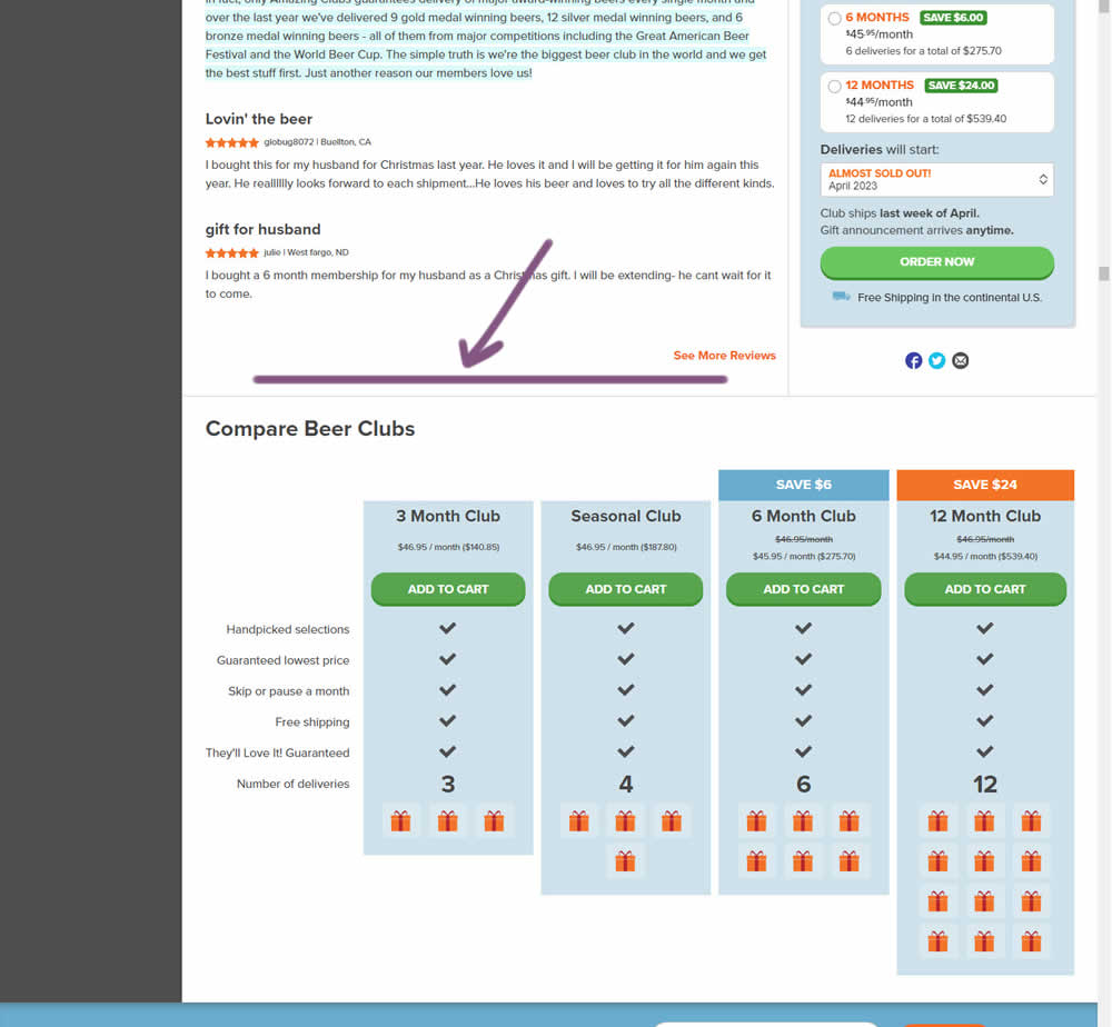
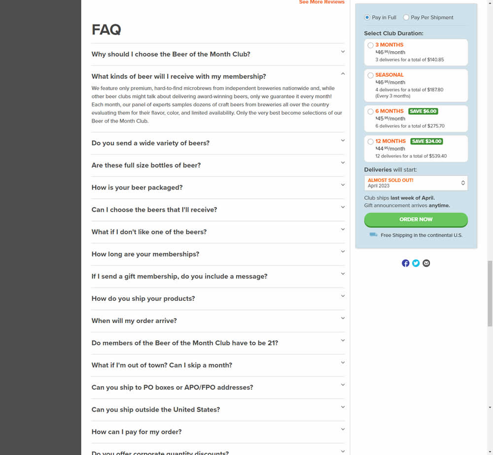
In this experiment, an FAQ section was added near the bottom of a long product page. The reviews were collapsed by default, but expandable upon clicking. Impact on adds-to-cart and sales was measured.
Test #466 on
Volders.de
by
 Daria Kurchinskaia
Apr 26, 2023
Desktop
Signup
Daria Kurchinskaia Tested Pattern #4: Testimonials In Test #466 On Volders.de
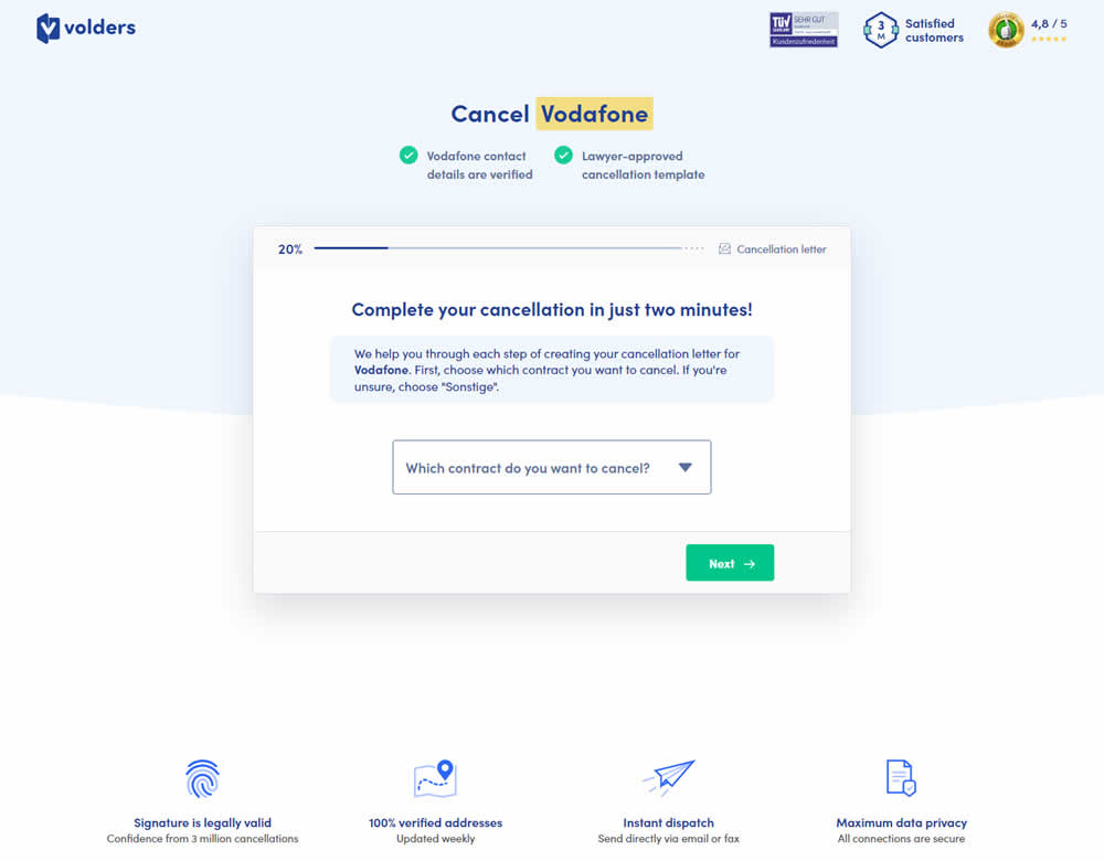
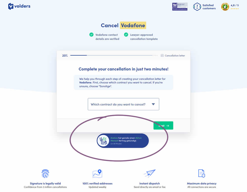
In this experiment, a social proof popups were added to the signup / funnel pages for a contract cancellation service. The added social testimonials appeared as other customers used the service, anywhere except on the final checkout page. Additionaly, the interval at which these messaged appeared was 60 seconds, and they were shown for 10s. The messages translated to "[Name] had recently canncelled a contract with [Company], in the last 38 minutes". Impact on sales was measured.
Test #465 on
by
 Melina Hess
Apr 22, 2023
Desktop
Mobile
Product
Melina Hess Tested Pattern #15: Bulleted Reassurances In Test #465
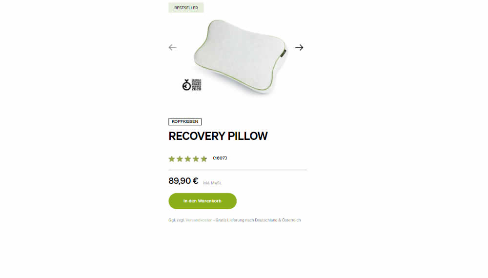
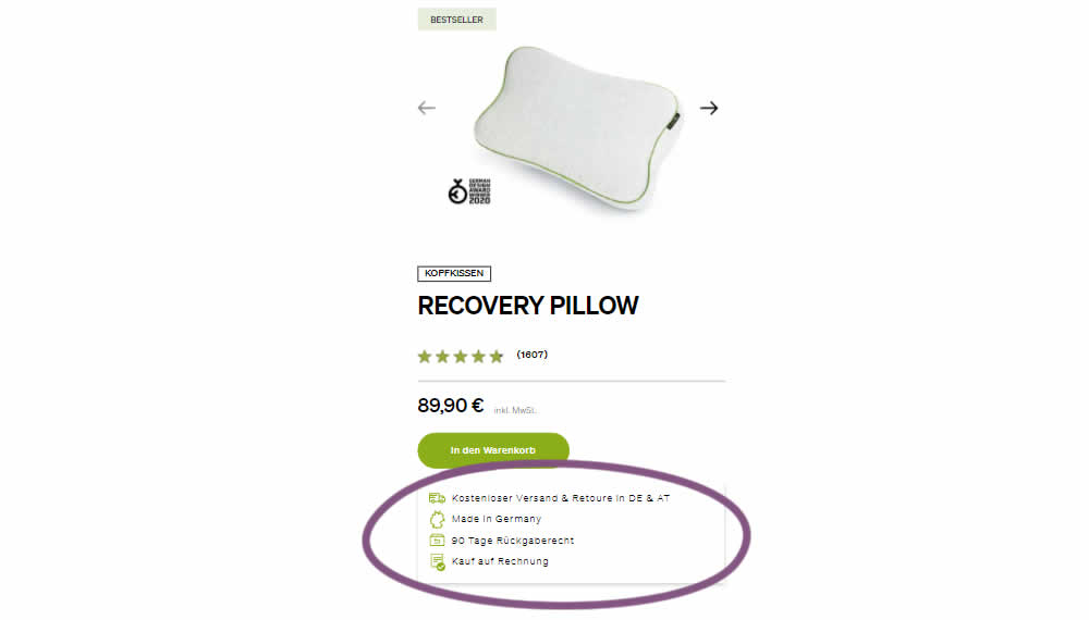
In this product detail page experiment, a number of reassurances were brought out visually in a lined or bulleted way. The 4 reassurances included: free shipping and returns; Made in Germany, 90 Day Returns; and Buy With Invoice (popular in Germany). Impact on revenue per user was measured. The control contained very feint copy (smaller and more subtle) about free shipping.
Test #464 on
Expertinstitute.com
by
 Ardit Veliu
Mar 31, 2023
Desktop
Mobile
Home & Landing
Ardit Veliu Tested Pattern #7: Social Counts In Test #464 On Expertinstitute.com
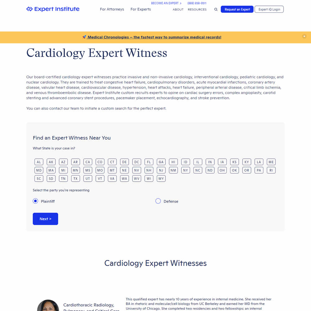
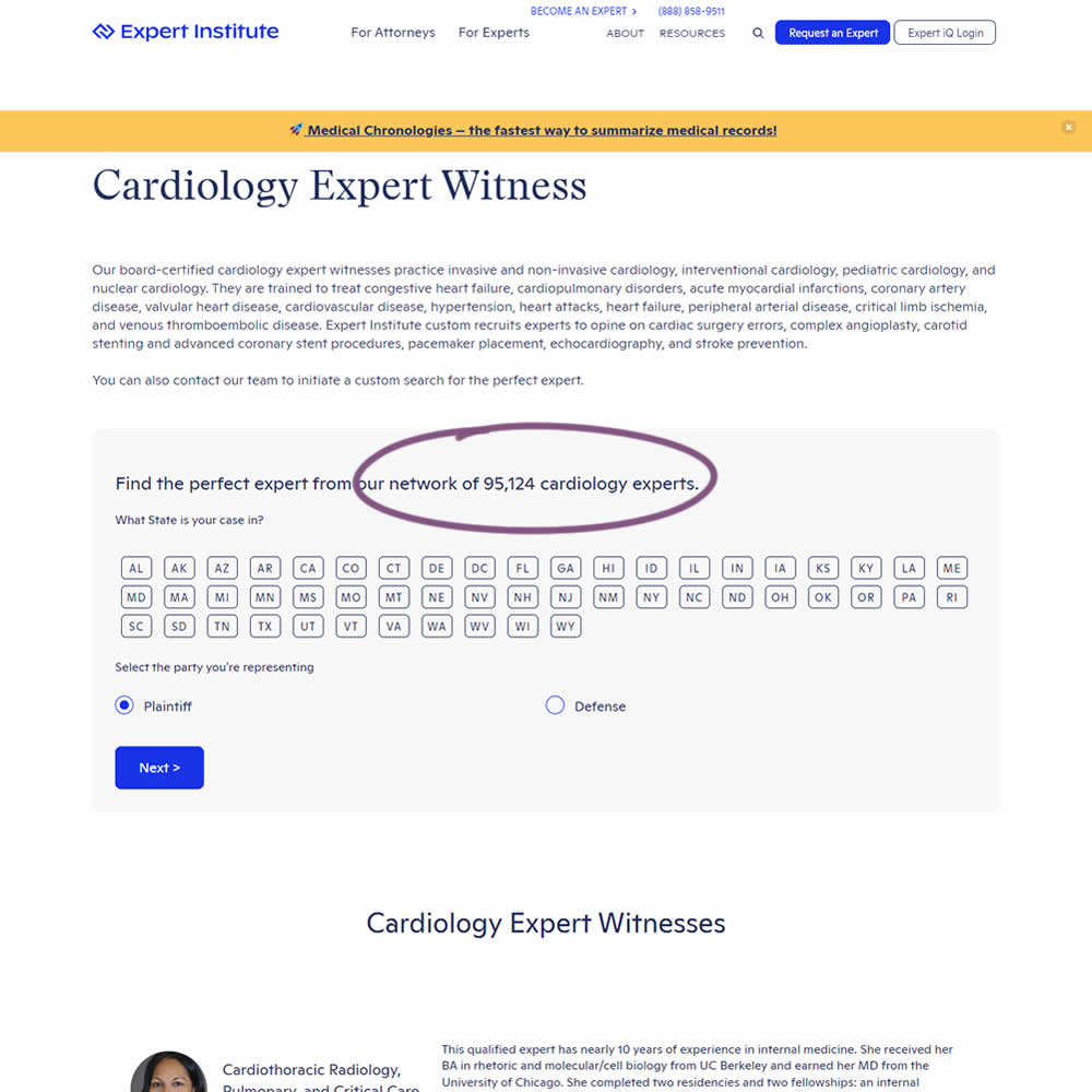
In this experiment, copy was added which showed the number of experts (in a given category) a person may gain access to after filling out a lead form. The context of this is a lead-gen landing page where people are seeking experts for legal purposes. Impact on initial progression (of a multi step form) and completed leads was measured.
Test #463 on
Volders.de
by
 Daria Kurchinskaia
Mar 25, 2023
Desktop
Checkout
Daria Kurchinskaia Tested Pattern #115: Pricing Comparison Table In Test #463 On Volders.de
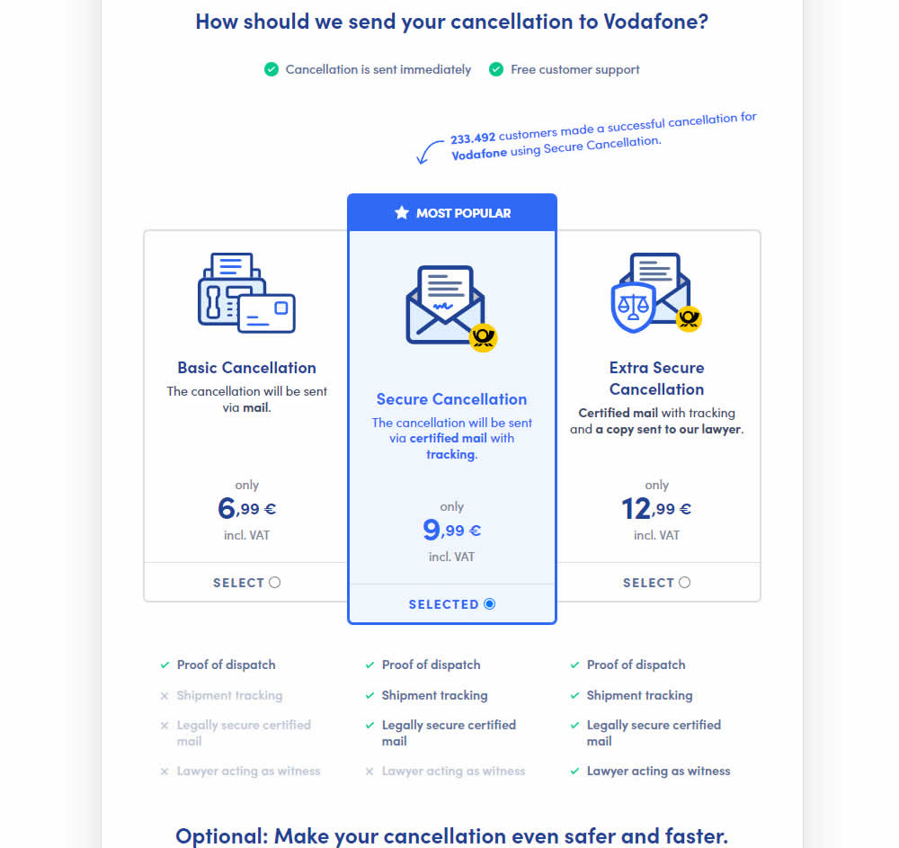
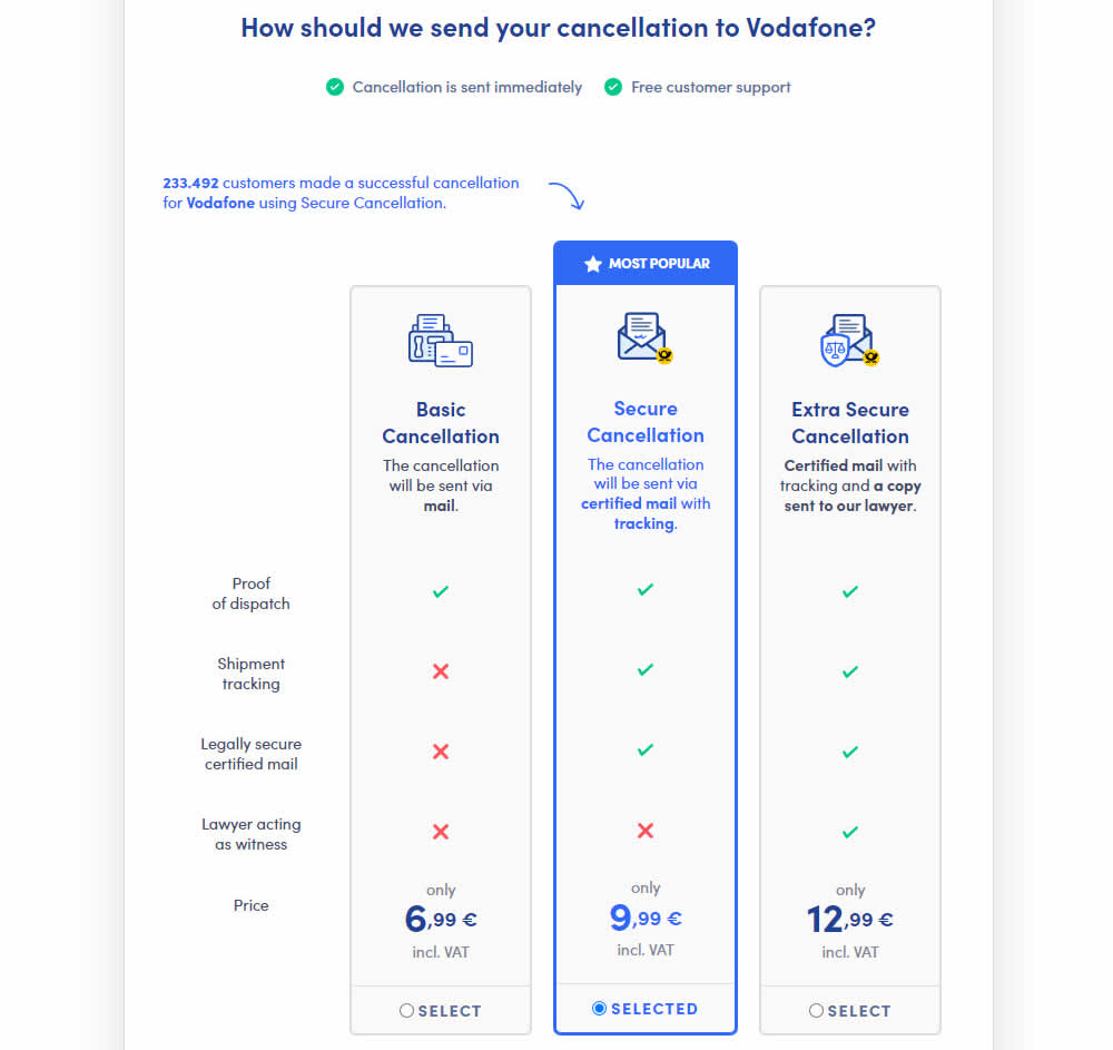
This experiment explored a pricing layout that enabled more feature comparisons. It also conveyed more clearly which features were missing between plans. The test has been inspired by this Netflix experiment. Impact on sales was measured.
Test #462 on
by
 Jakub Linowski
Mar 24, 2023
Desktop
Mobile
Product
Jakub Linowski Tested Pattern #128: Standard Or Superscript Price Format In Test #462
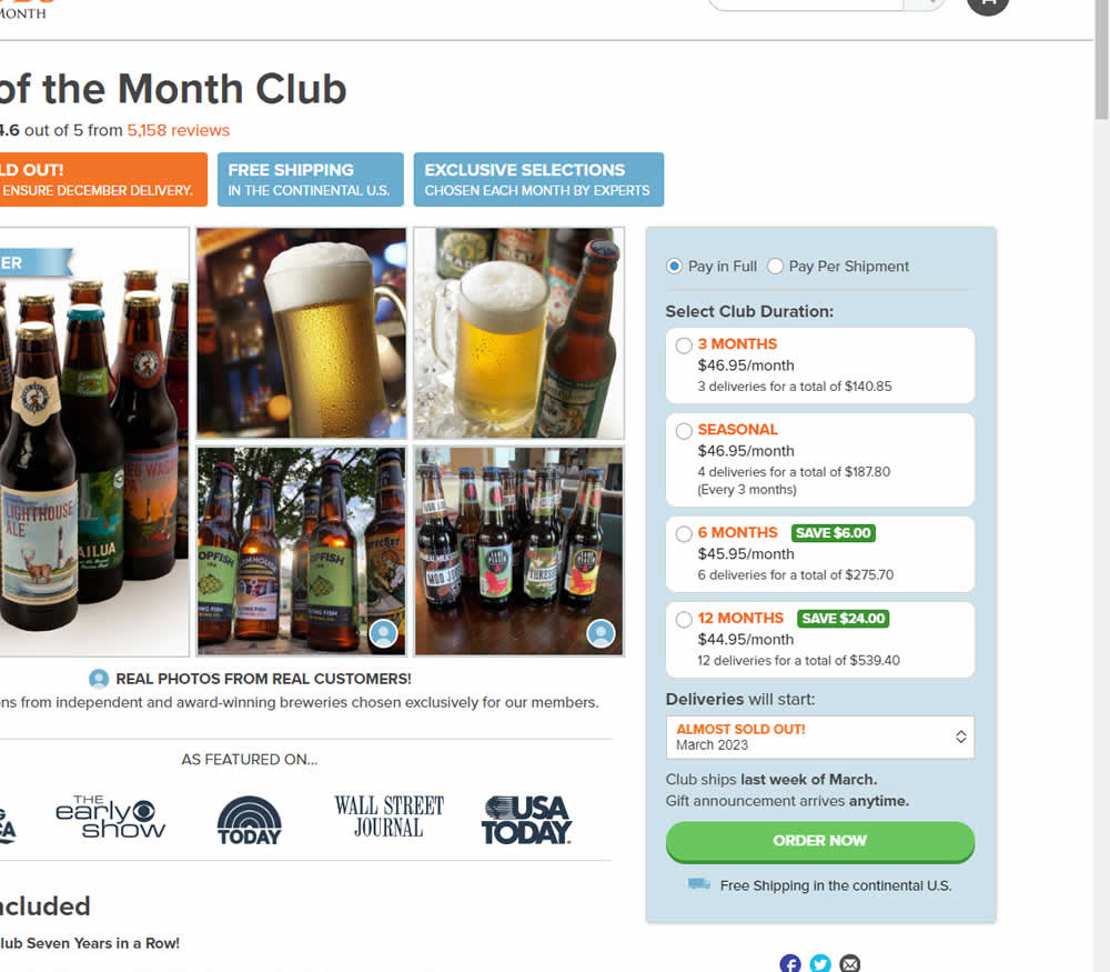
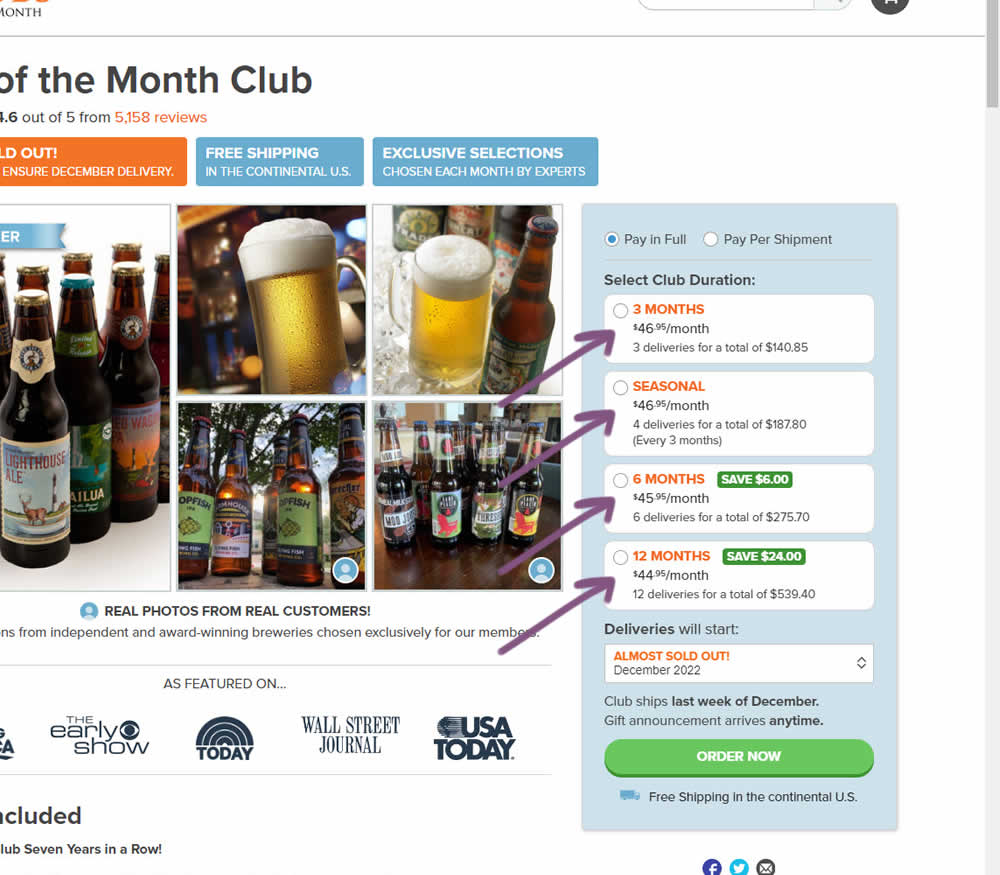
In this experiment, standard $ signs and cents were formatted into a smaller superscript. Impact on add-to-cart and sales was measured.
Test #461 on
Snocks.com
by
 Melina Hess
Mar 23, 2023
Mobile
Product
Melina Hess Tested Pattern #15: Bulleted Reassurances In Test #461 On Snocks.com
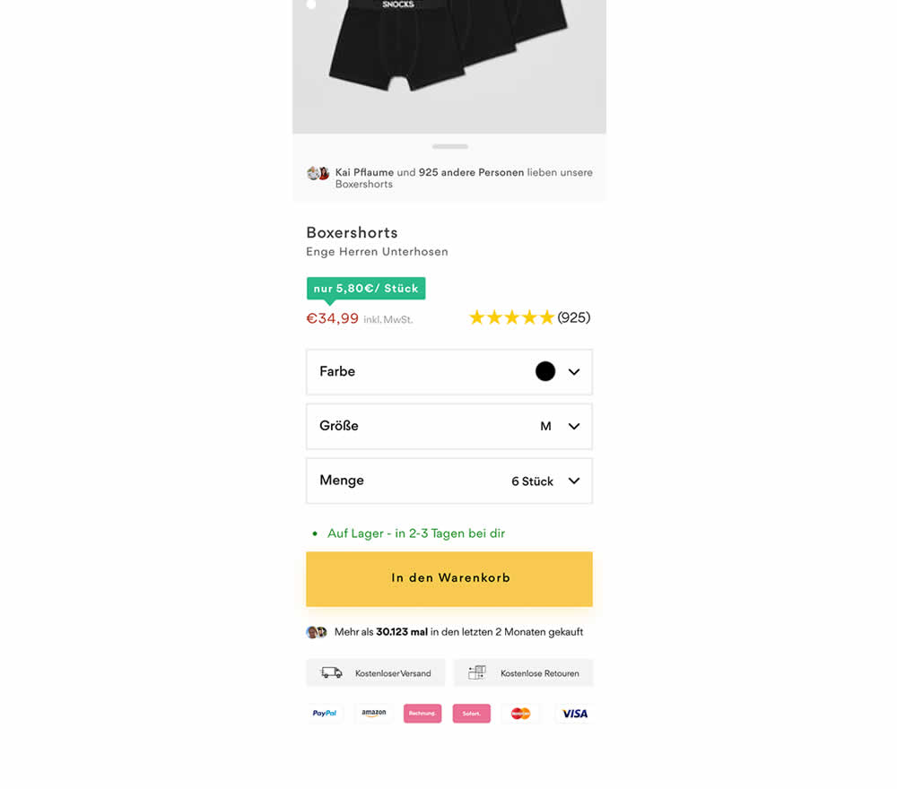
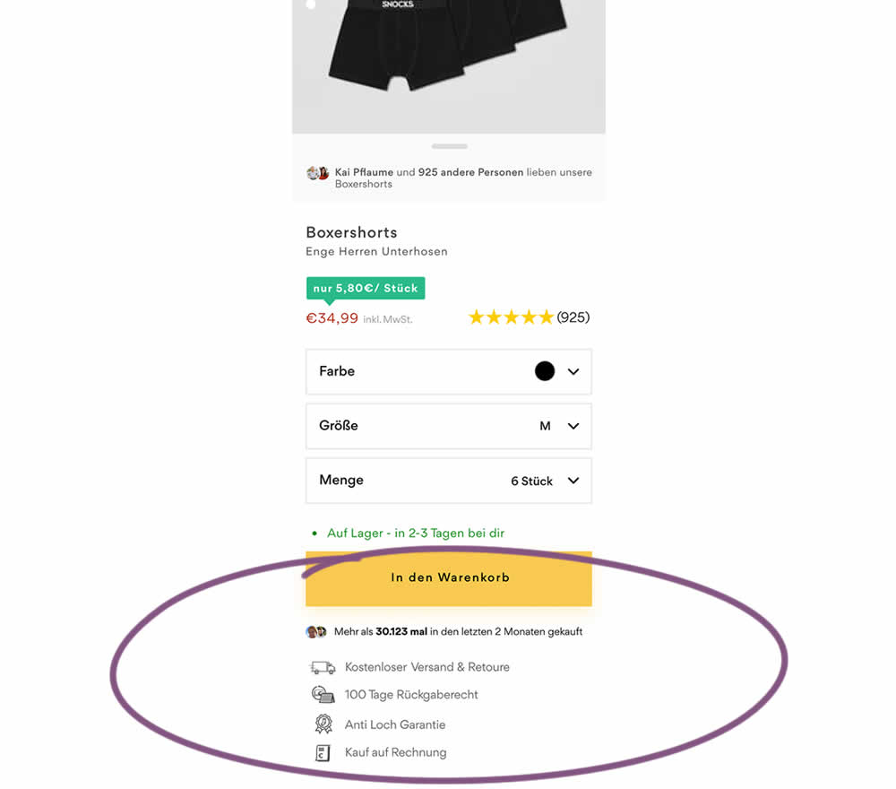
In this product detail page experiment, reassurances under the add-to-cart button were rearranged. The control contained copy about: free shipping and free returns formatted as two gray boxes, with a variety of payment methods and their corresponding logos underneath.
The variation used a more convention bulleted, line-by-line format. It also contained free shipping and returns, but also elaborated with "100 day returns", an "anti-hole guarantee", and "purchase with invoice" (perhaps more popular in Germany?). Impact on sales was measured.
Test #460 on
Backstage.com
by
 Stanley Zuo
Mar 21, 2023
Mobile
Listing
Stanley Zuo Tested Pattern #41: Sticky Call To Action In Test #460 On Backstage.com
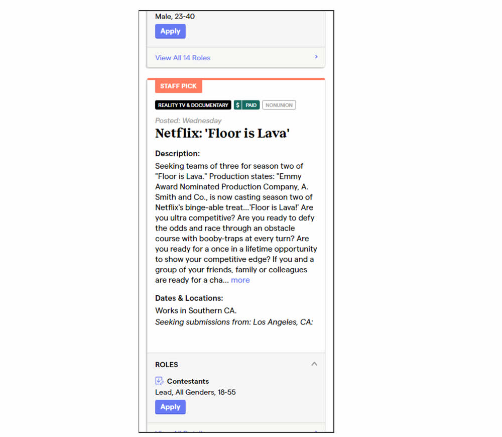
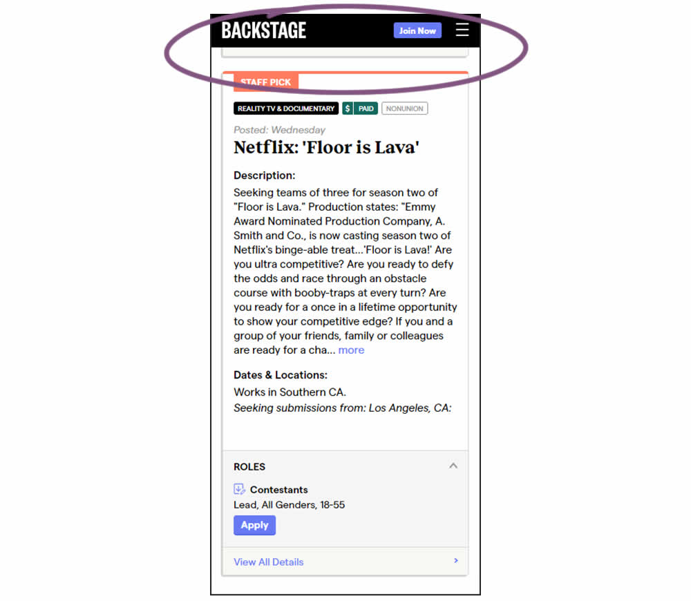
In this experiment, a floating top navigation was shown with a "Join" button. In the control, the navigation was only visible at the top of the page. Also keep in mind that signup starts were also triggered throughout multiple CTAs throughout the page and from particular job detail pages. The a/b test ran on a listing page of Backstage - a casting call job site. Impact on signups and checkouts was measured.