All Latest 556 A/B Tests
Become a member to unlock the abiltiy to see the highest impact a/b tests. Being able to see the actual test results and sort by impact allows growth and experimentation teams to take action on the biggest gains first
MOST RECENT TESTS
Test #584 on
Snocks.com
by
 Melina Hess
Mar 31, 2025
Mobile
Listing
Melina Hess Tested Pattern #6: Customer Star Ratings In Test #584 On Snocks.com
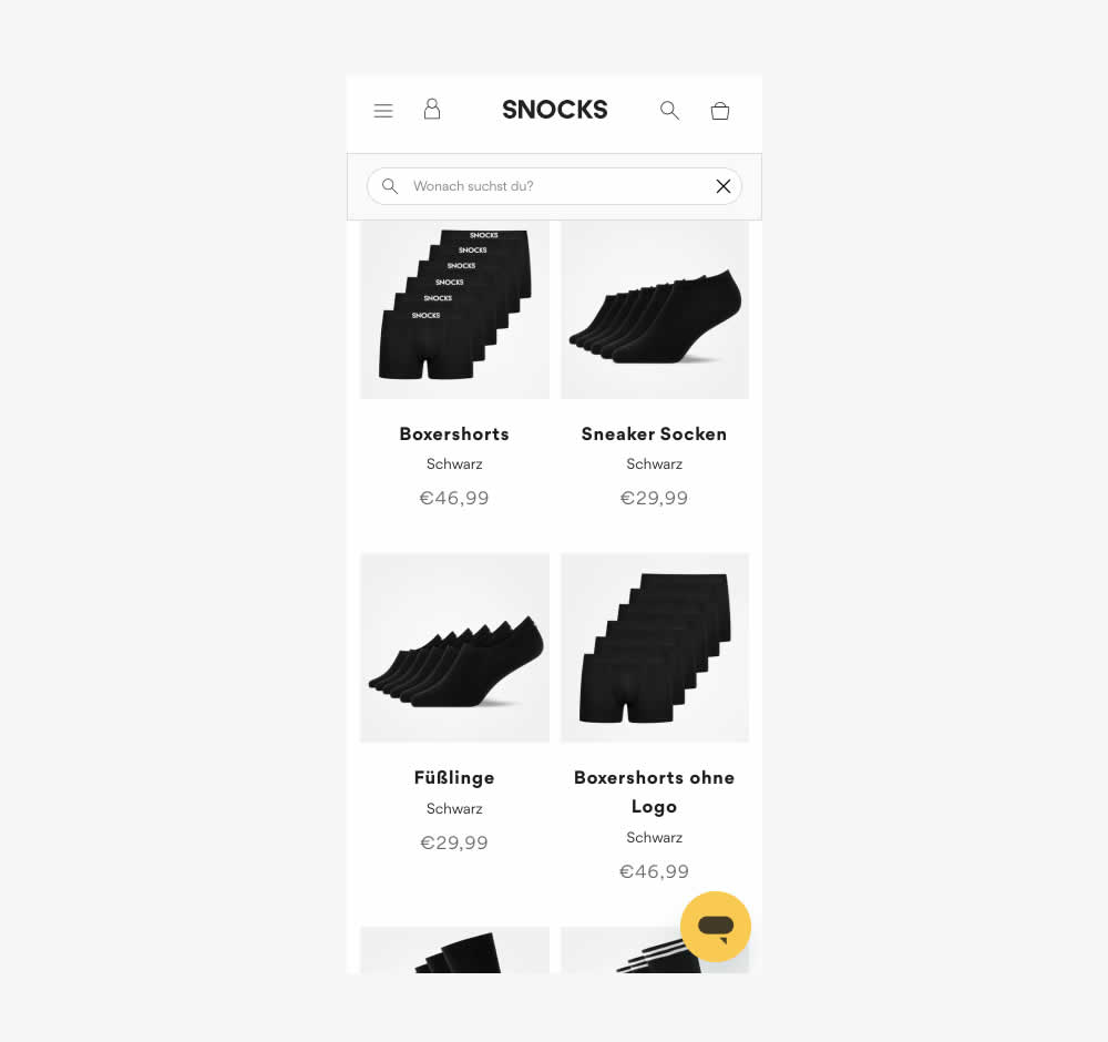
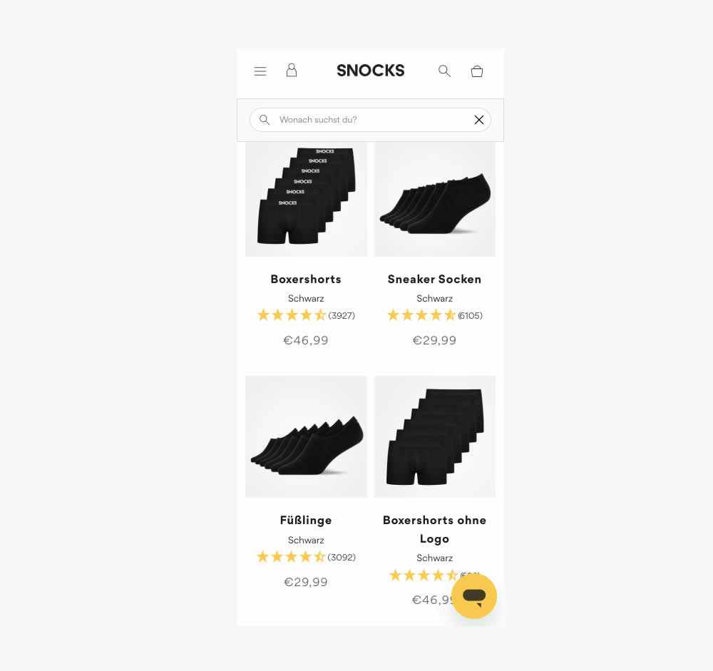
This experiment tested the presence of customer review (in the variation). As a result of adding customer reviews, the product page density decreased (requiring a bit more scrolling from longer product tiles). Impact on conversion was measured.
Also the test originally ran as a "removal of customer reviews" test. However it was flipped here to align with the pattern.
Test #583 on
Backstage.com
by
 Stanley Zuo
Mar 30, 2025
Desktop
Mobile
Listing
Stanley Zuo Tested Pattern #24: Visible Availability In Test #583 On Backstage.com
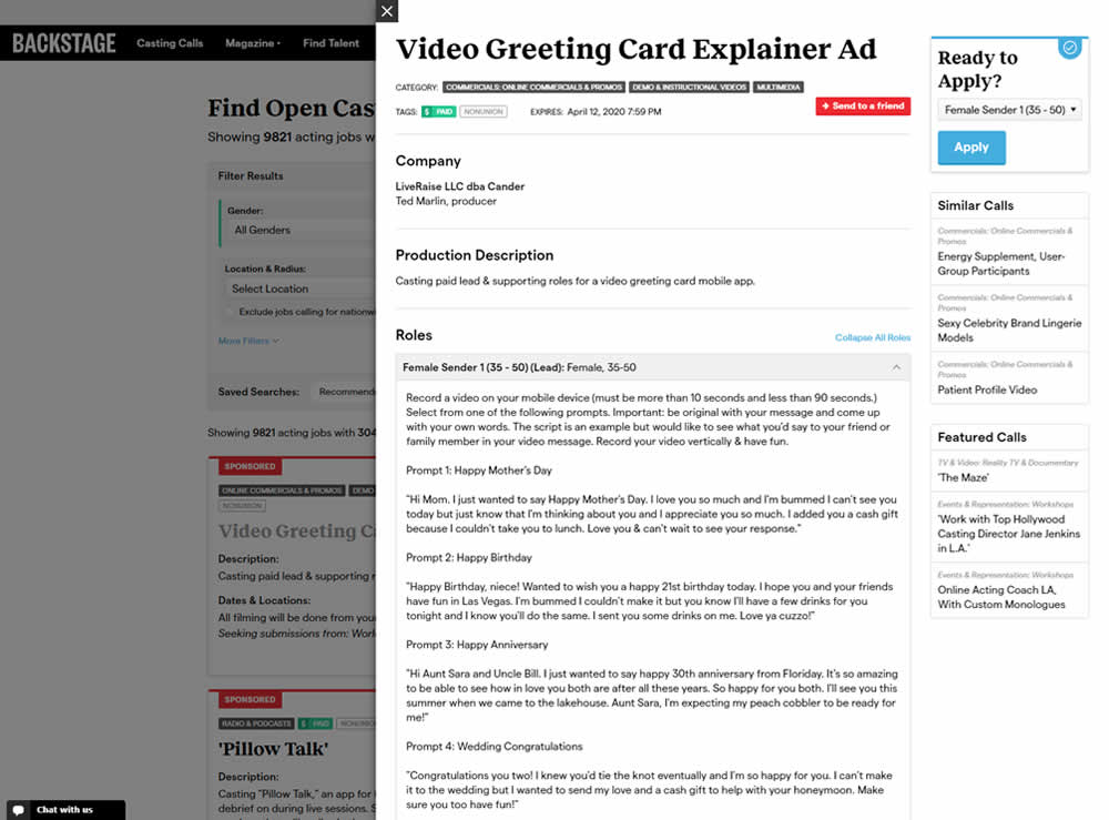
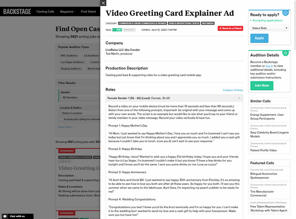
In this experiment, the active availability of a casting call (job offer) was was made more prominent using green text: "Accepting applications". The variation also made the "Join Now" button more prominent as an alternative path to signing up for a membership. The experiment reports on three metrics: clicks on apply, application starts and premium membership sales (measured a few steps further in the funnel).
Test #582 on
Online.metro-cc.ru
by
 Andrey Andreev
Mar 22, 2025
Desktop
Mobile
Listing
Andrey Andreev Tested Pattern #77: Filled Or Ghost Buttons In Test #582 On Online.metro-cc.ru
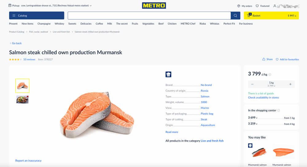
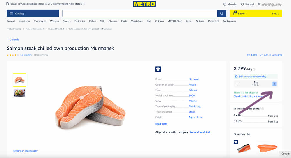
In this experiment, the plus and minus quantity icons near the add to cart button were made more visible. In the variation they gained a higher contrast from a full background color. Impact on add to cart and sales was measured.
Test #581 on
Asics.com
by
 Andrey Prokhorov
Mar 21, 2025
Desktop
Product
Andrey Prokhorov Tested Pattern #104: Carousel Vs Static Grid Images In Test #581 On Asics.com
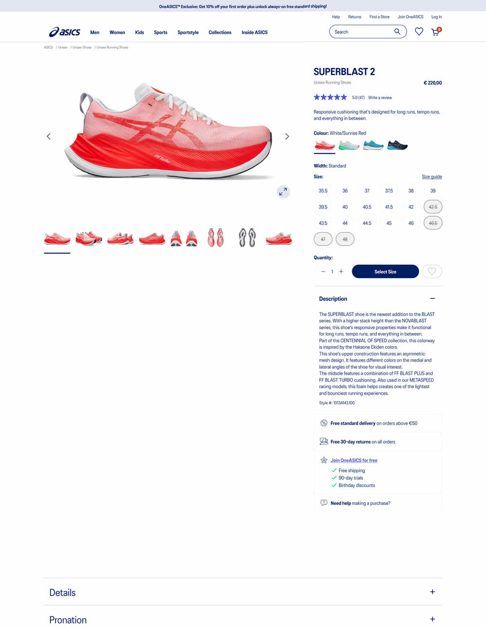
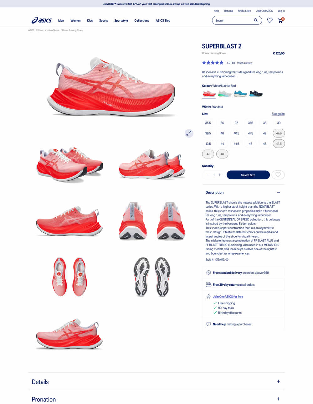
More product photos were exposed in the main column of the variation. Treatment used a collapsed gallery. Impact on ATC and sales was measured.
Test #580 on
Finn.com
by
 Tim Karcher
Mar 06, 2025
Mobile
Signup
Tim Karcher Tested Pattern #91: Forced Action In Test #580 On Finn.com
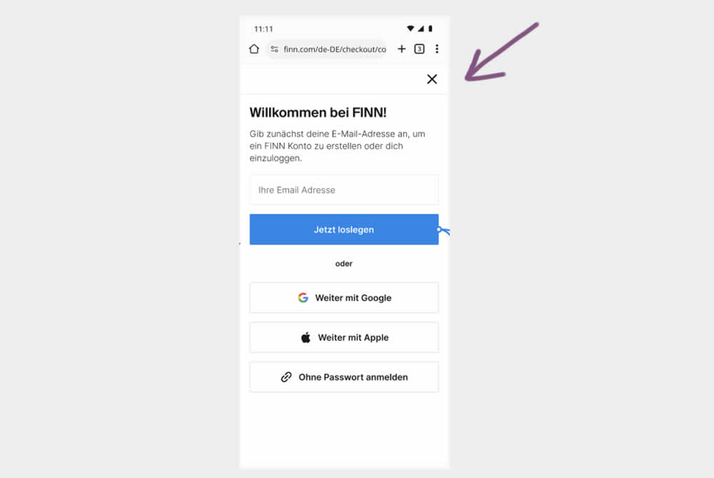
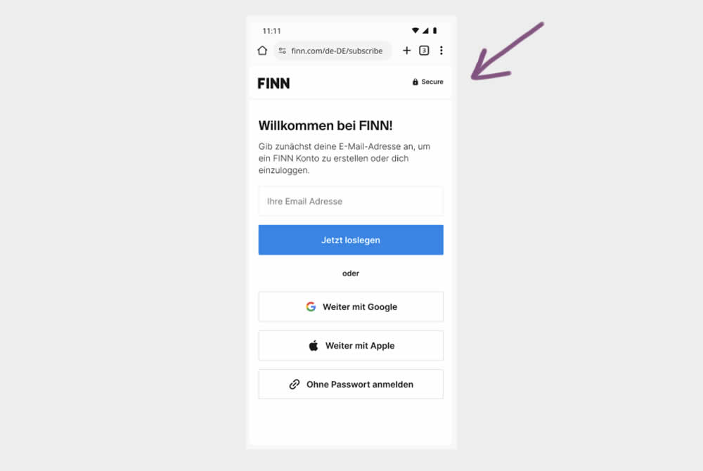
In this experiment, the control shows an (X) close option within a signup flow, whereas the variation had it removed. Clicking the close icon would collapse the signup modal and show the product page. Users were still able use the back and forward functionality.
(The test was inversed in order to fit the pattern). Impact on signups was measured.
Test #579 on
Jared.com
by
 Craig Kistler
Feb 23, 2025
Mobile
Product
Craig Kistler Tested Pattern #21: What It's Worth In Test #579 On Jared.com
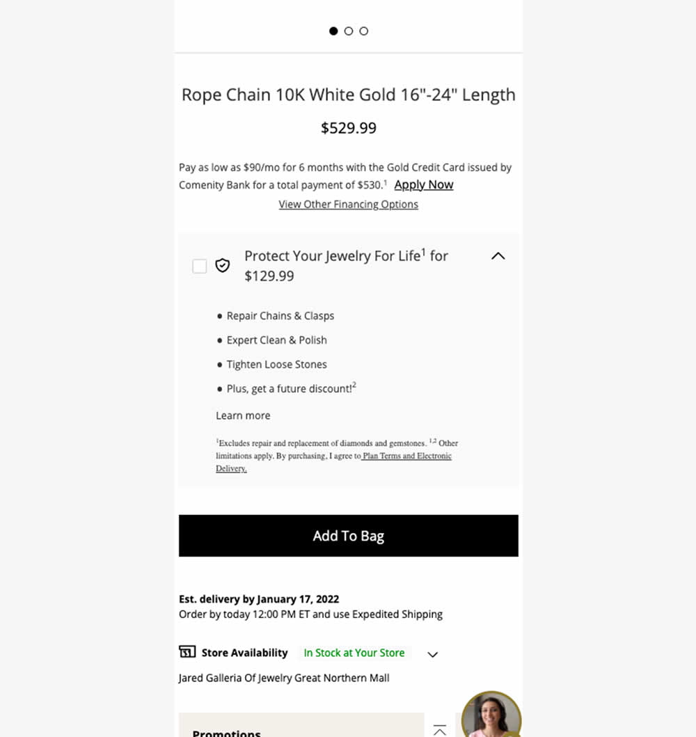
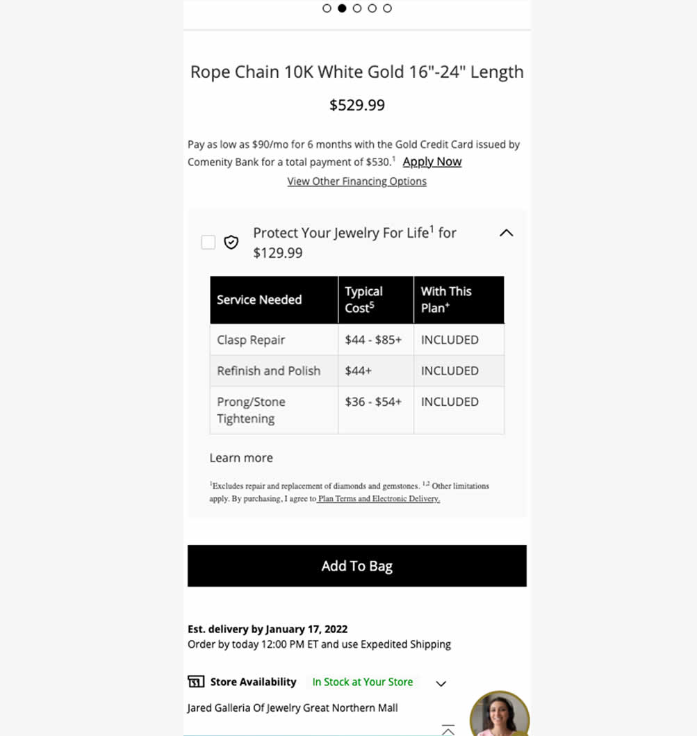
In this experiment, typical dollar values of typical coverages for an extended protection plan were shown. This ran on a product page of a jewelery site. Impact on on adds to cart, sales and uptake of the upsell was measured. Traffic split was 25/75.
Test #578 on
by
 Jakub Linowski
Feb 20, 2025
Mobile
Product
Jakub Linowski Tested Pattern #48: Video Testimonials In Test #578
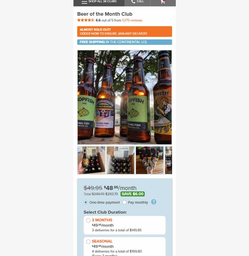
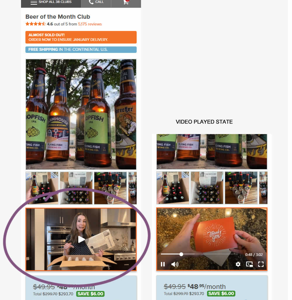
In this experiment, a video unboxing and product overview video was added on product pages. After pressing play, the video started playing with the controls only appearing for a short time before fading away.
Notice the confounding from pushing the buy box further down.
Impact on adds to cart and sales was measured.
Test #577 on
by
 Jakub Linowski
Feb 19, 2025
Desktop
Product
Jakub Linowski Tested Pattern #48: Video Testimonials In Test #577
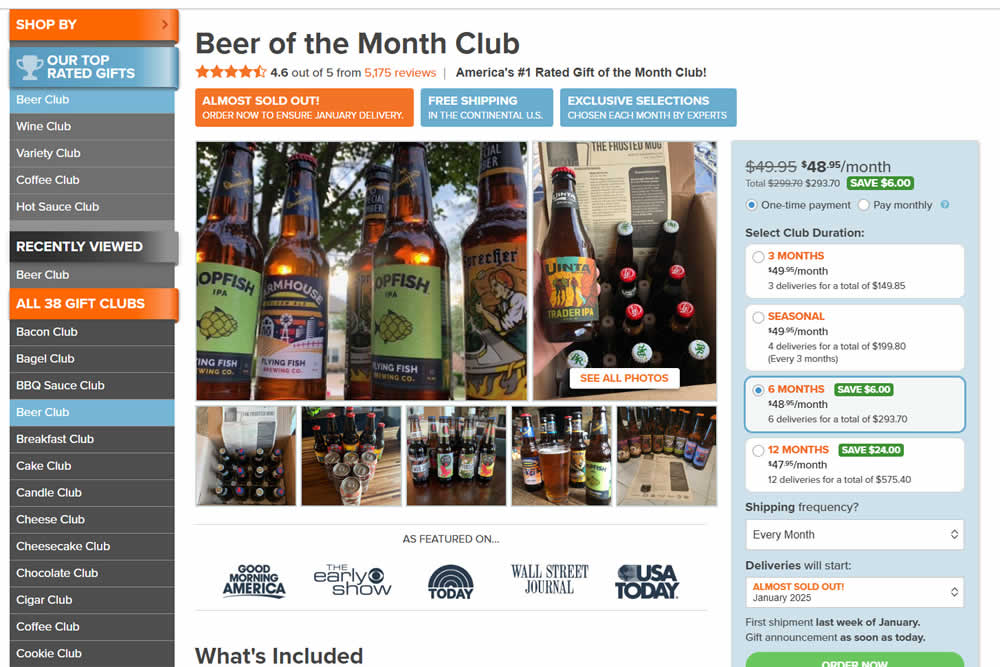
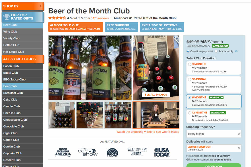
In this experiment, a video unboxing and product overview video was added on product pages. After pressing play, the video expanded to a full column width (taking over the middle column while replacing the 5 small square photo tiles and growing in height.) The video in its play state also contained a prominent (X) icon that allowed users to stop and revert to the original state.
Impact on adds to cart and sales was measured.
Test #575 on
Finn.com
by
 Tim Karcher
Feb 12, 2025
Desktop
Listing
Tim Karcher Tested Pattern #34: Open In A New Tab In Test #575 On Finn.com
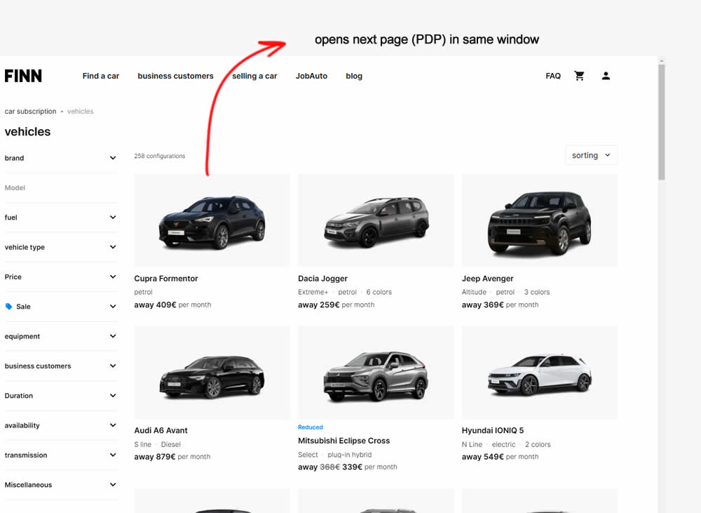
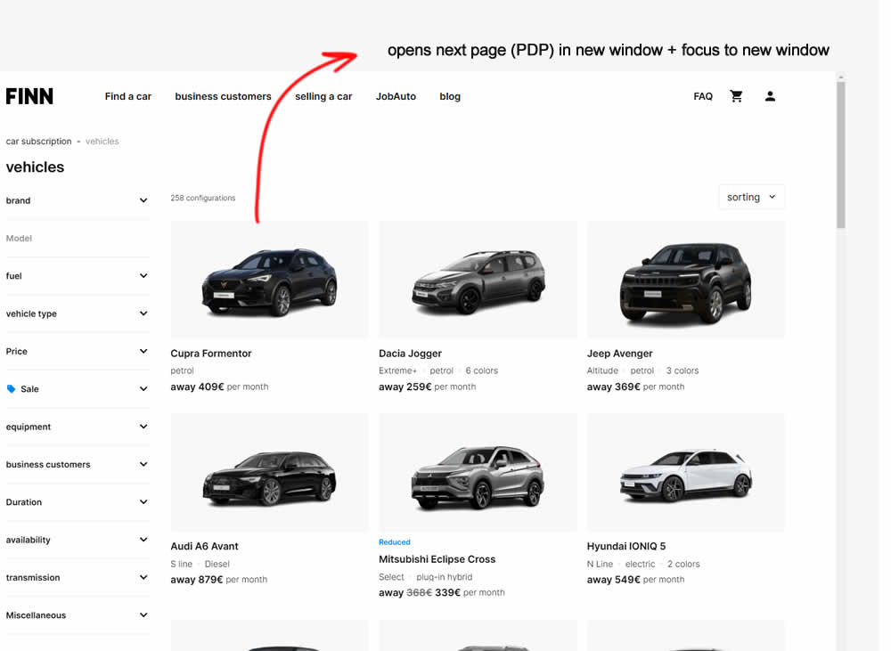
In this experiment, product listing were either opened in the same window (control) or opened in a new tab and focused on (variation). Impact on signups and sales was measured.
Test #576 on
Finn.com
by
 Tim Karcher
Feb 12, 2025
Mobile
Listing
Tim Karcher Tested Pattern #34: Open In A New Tab In Test #576 On Finn.com
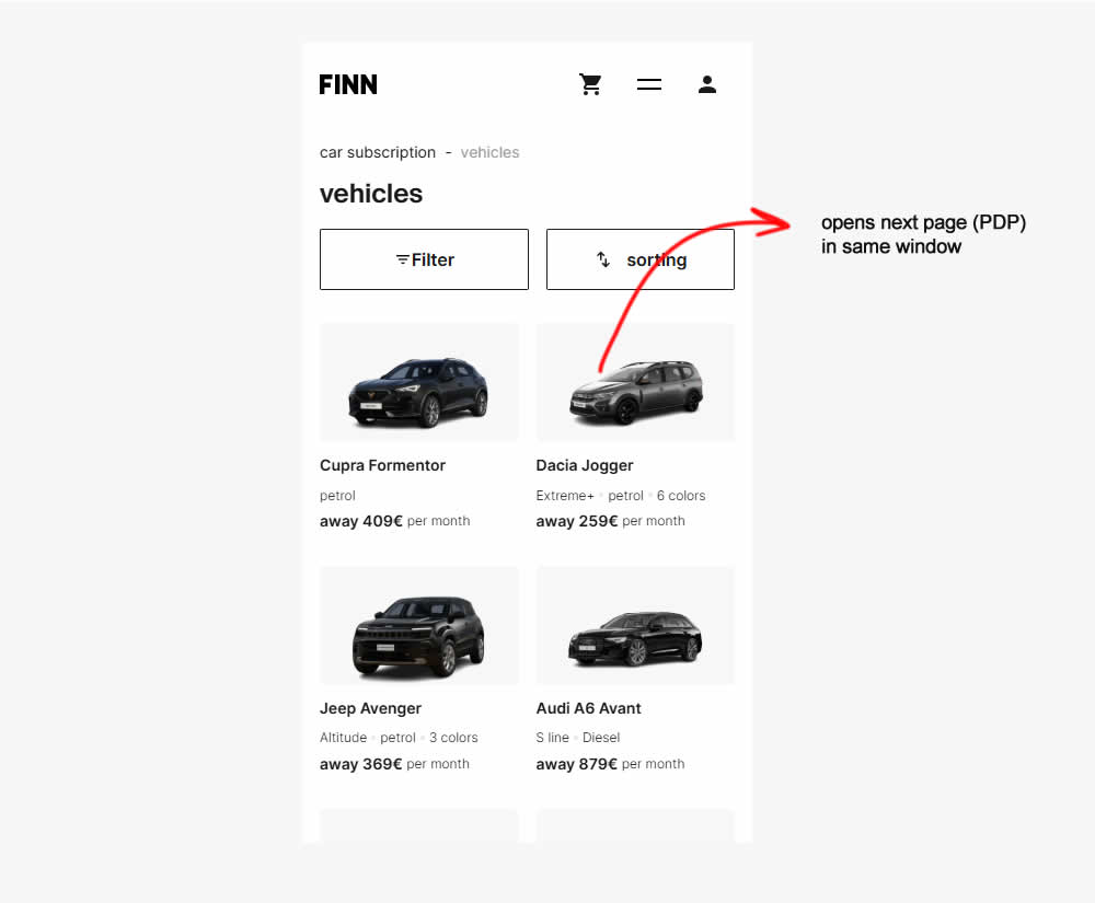
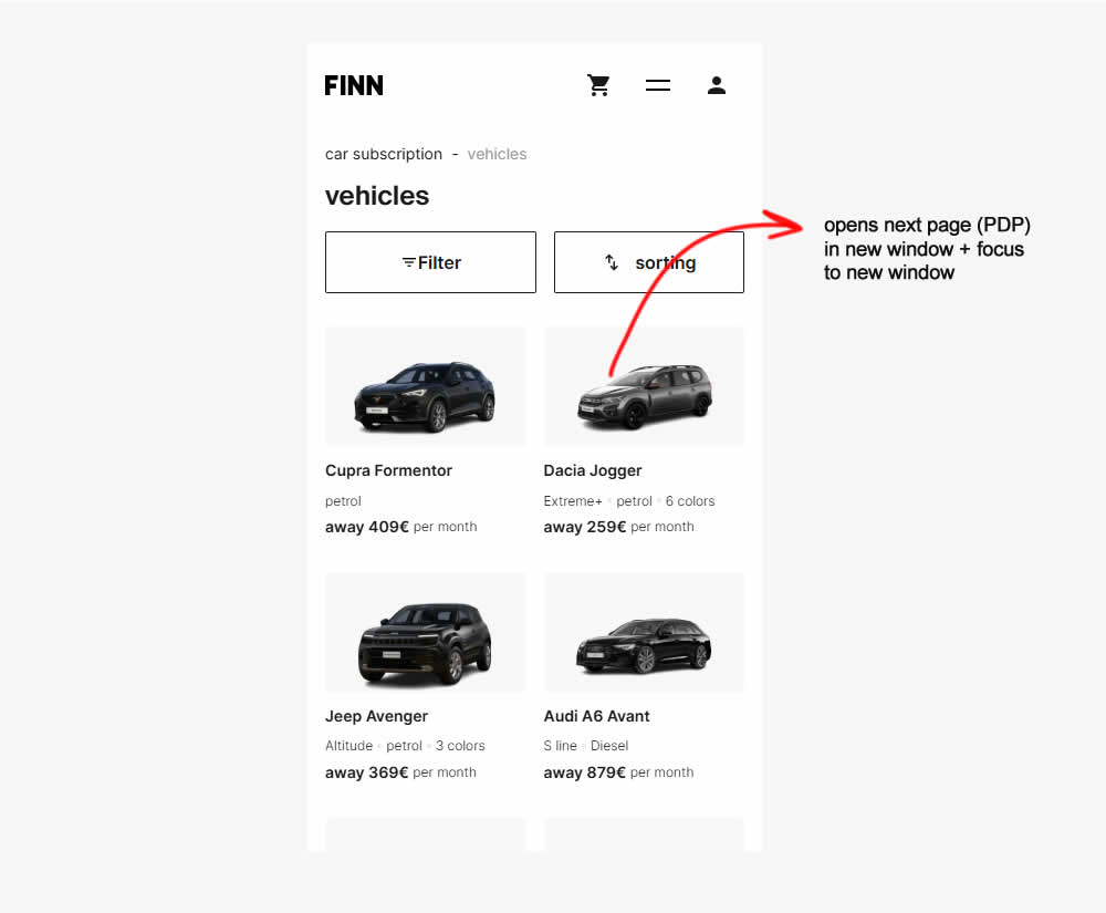
Test #574 on
Myer.com.au
by
 Jay Kim
Jan 30, 2025
Mobile
Product
Jay Kim Tested Pattern #41: Sticky Call To Action In Test #574 On Myer.com.au
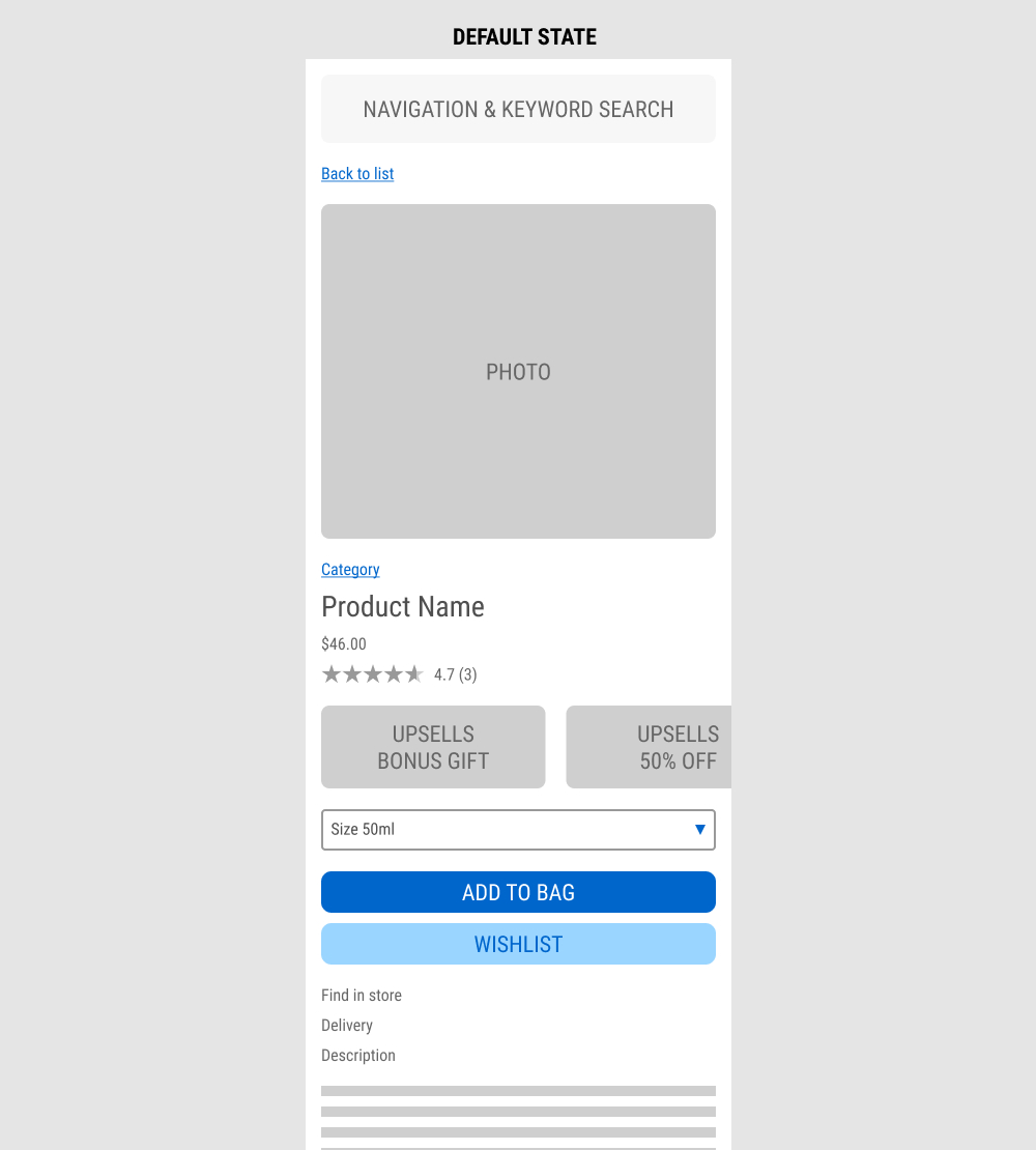
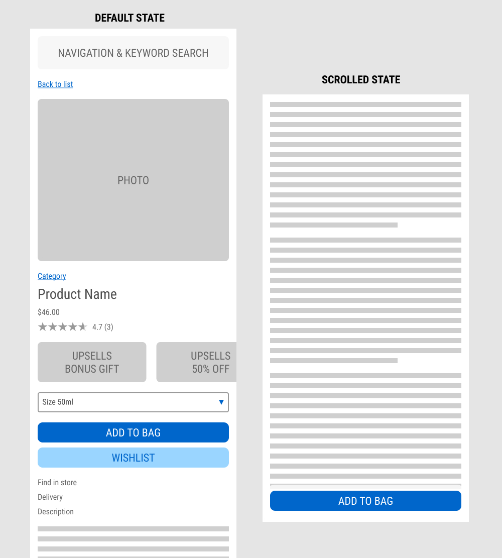
In this experiment published by Jay Kim, a sticky add to cart button was added on mobile product detail pages. It appeared after the scroll depth past the original add to cart button. Impact to adds to cart and completed sales was measured.
Test #573 on
Online.metro-cc.ru
by
 Andrey Andreev
Jan 28, 2025
Mobile
Shopping Cart
Andrey Andreev Tested Pattern #41: Sticky Call To Action In Test #573 On Online.metro-cc.ru
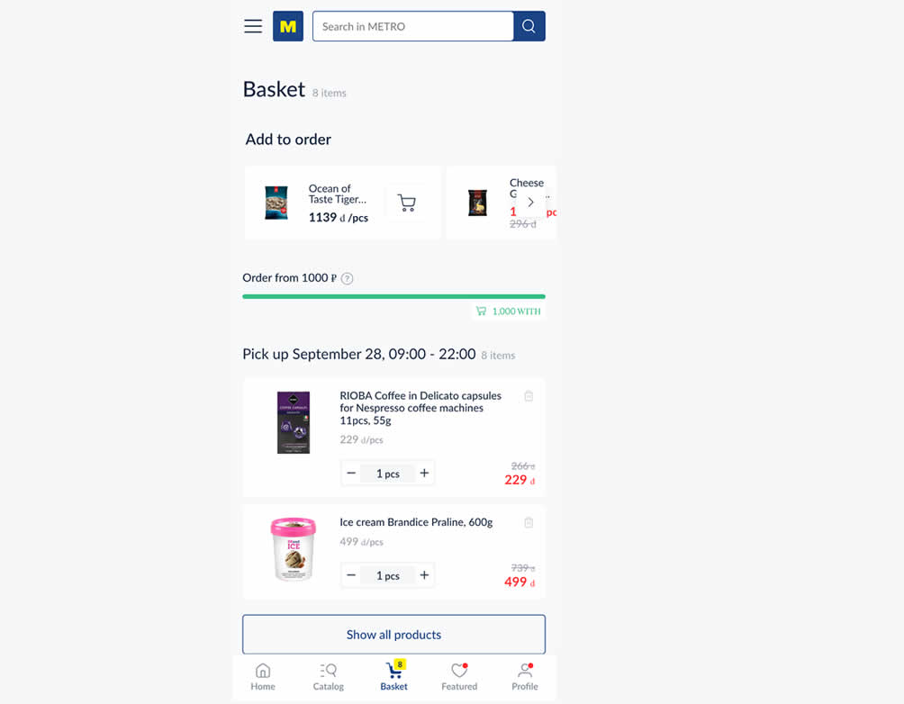
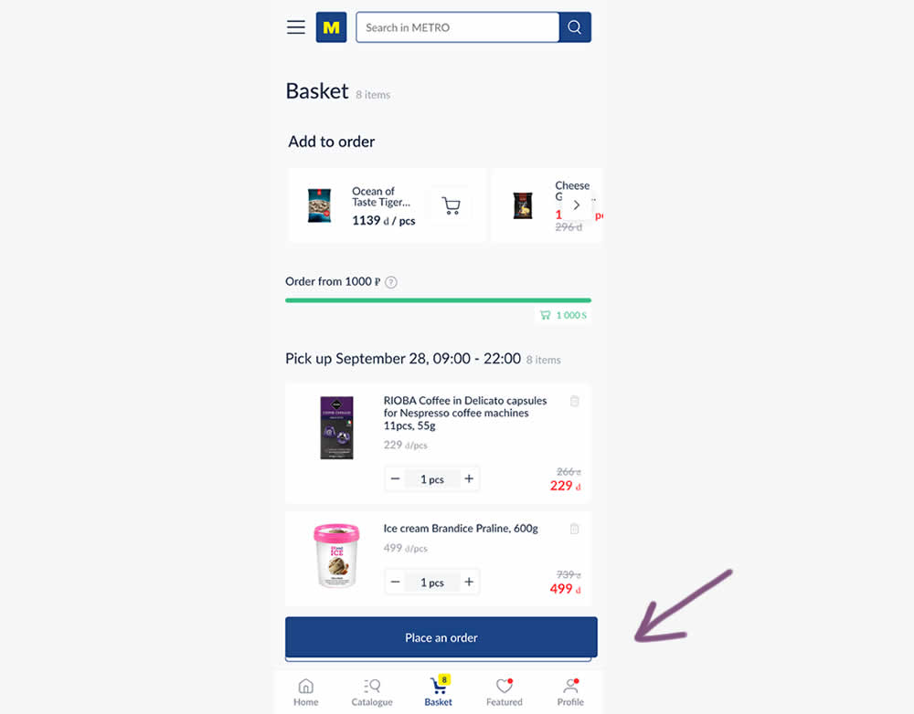
In this experiment, a floating "Place order" button was added to a mobile shopping cart screen. Impact on progression (to checkout) and sales was measured.
Test #572 on
by
 Deborah O'Malley
Jan 27, 2025
Mobile
Product
Deborah O'Malley Tested Pattern #41: Sticky Call To Action In Test #572


In this experiment from GuessTheTest.com, the control variation only showed the primary add-to-cart button further down on the page. The variation however turned the button into a floating one once users scrolled on the page. Impact on button clicks was measured.
Test #571 on
by
 Jakub Linowski
Jan 03, 2025
Desktop
Mobile
Product
Jakub Linowski Tested Pattern #30: Authentic Photos In Test #571
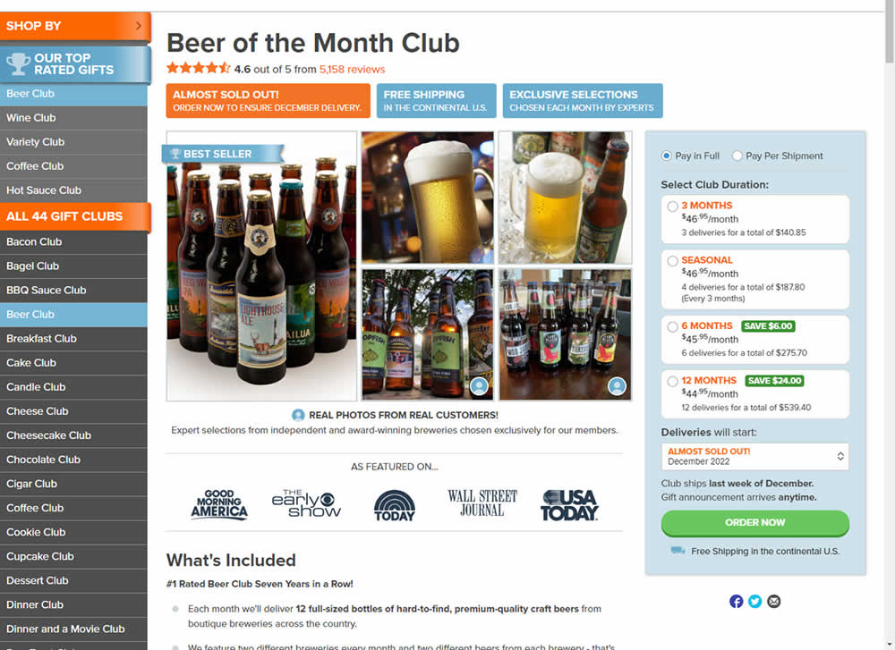
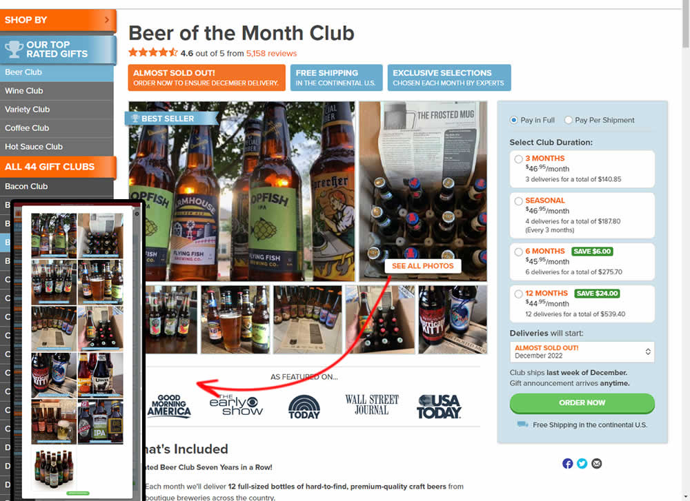
In this experiment, additional customer product photos were shown at the top of the product page. A "Show More Photos" button was also added which launched a modal with additional and larger images. Impact on sales was measured.
Test #570 on
Livefresh.de
by
 Melina Hess
Dec 30, 2024
Desktop
Mobile
Home & Landing
Melina Hess Tested Pattern #79: Product Highlights In Test #570 On Livefresh.de
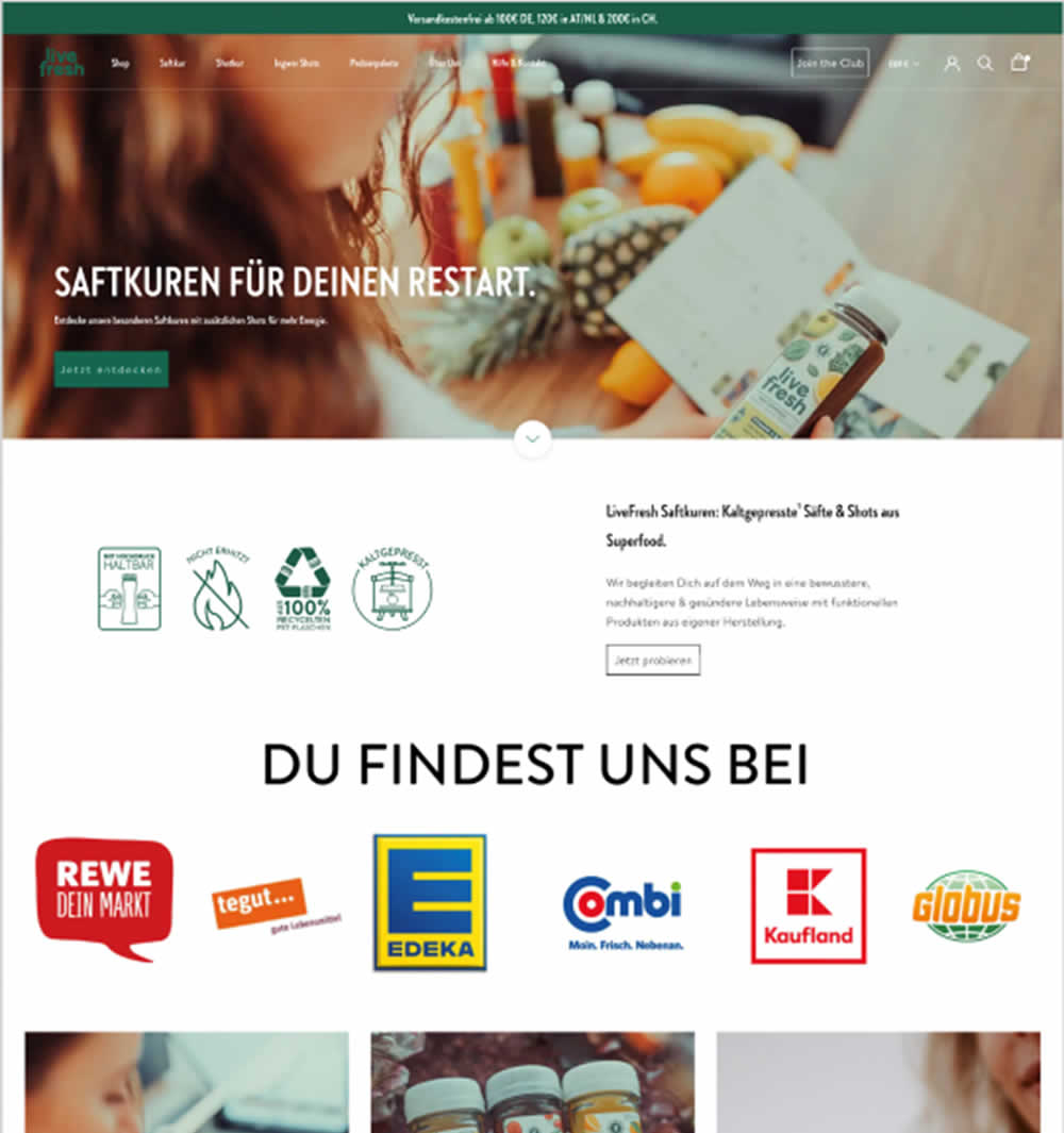
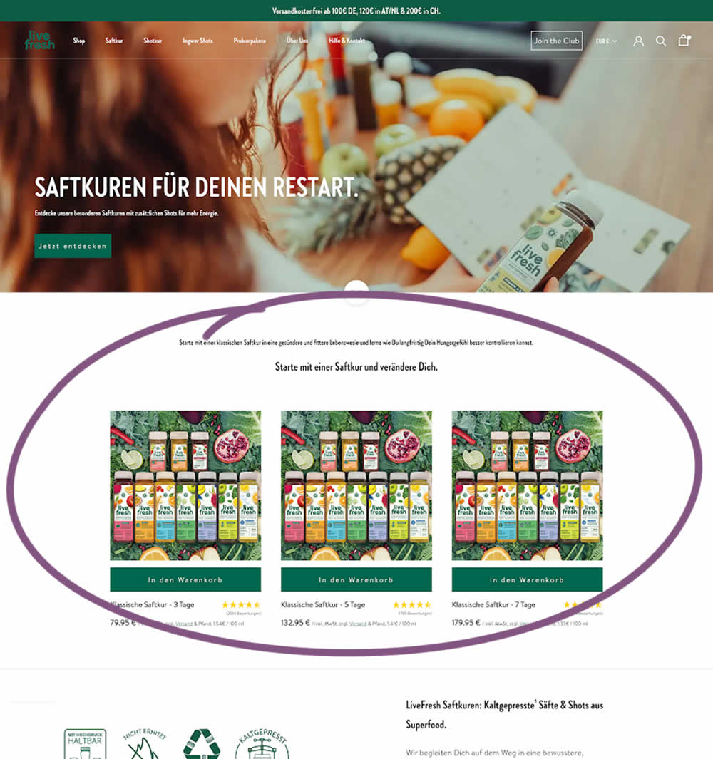
In this experiment, three popular juice products were shown higher on the variation (instead of lower in the control). Impact on sales was measured.
Test #569 on
Snocks.com
by
 Melina Hess
Dec 29, 2024
Mobile
Product
Melina Hess Tested Pattern #124: Confirmed Selection In Test #569 On Snocks.com
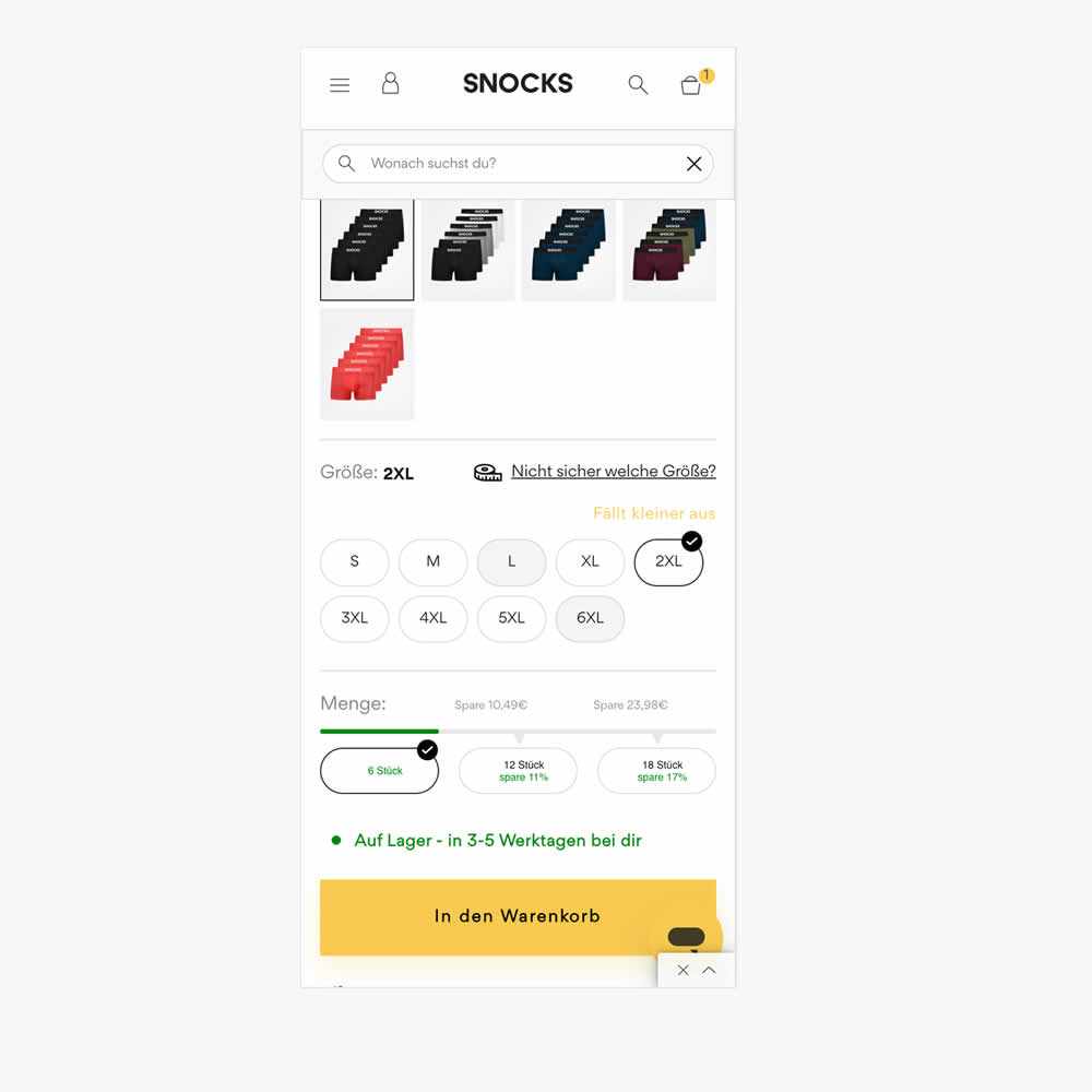
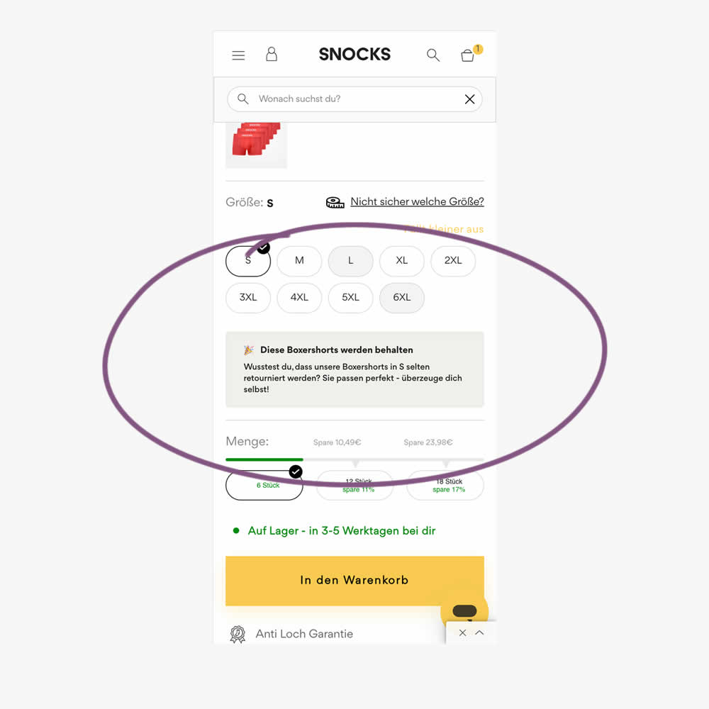
In this experiment, reaffirming copy was added for particular size options in the variation. Here is the translation from German:
"These boxer shorts will be kept. Did you know that our boxer shorts in S are rarely returned? They fit perfectly - see for yourself!"
Impact on sales was measured.
Test #568 on
by
 Jakub Linowski
Dec 22, 2024
Jakub Linowski Tested Pattern #80: Persistent Filters In Test #568
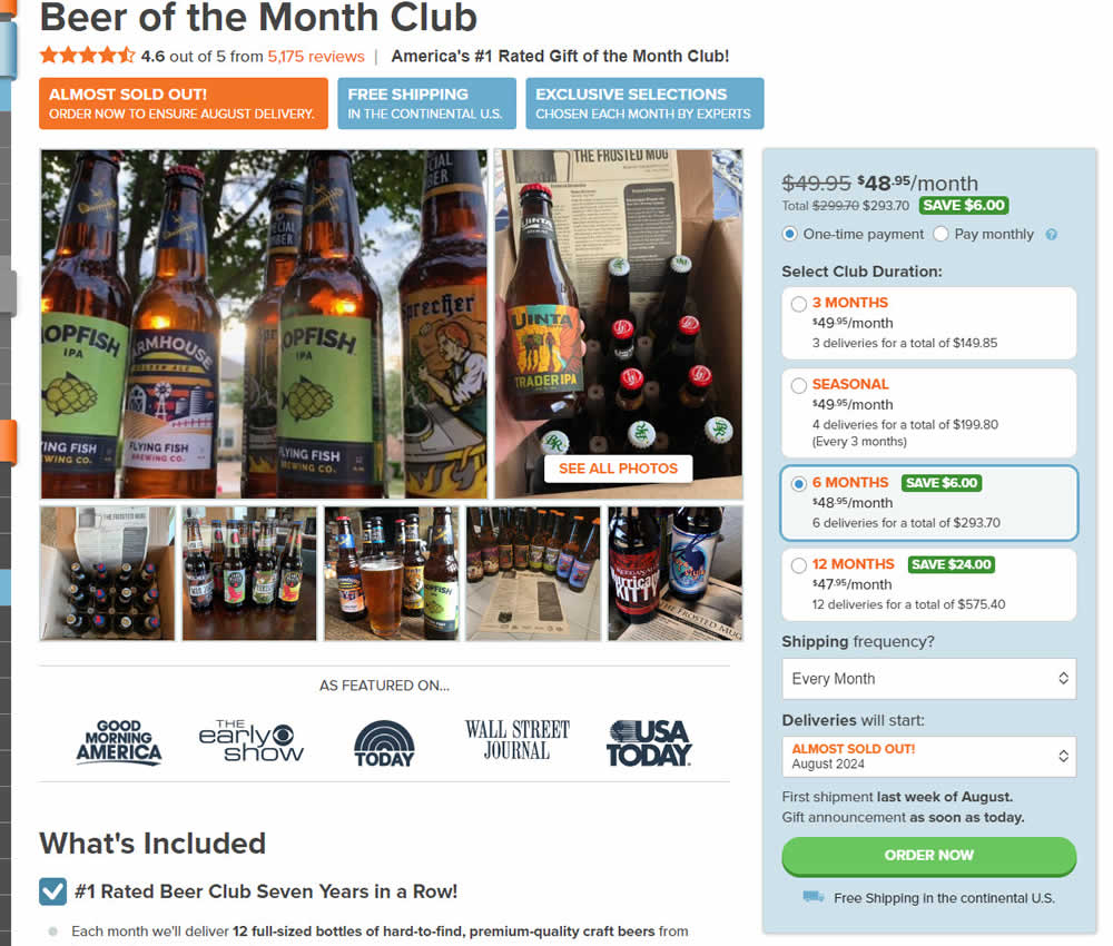
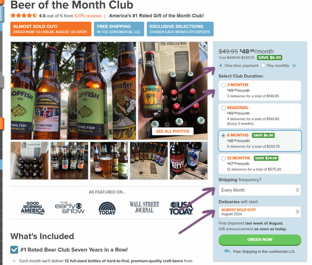
In this experiment, "persistence" of 4 product choices was added in the variation. When users made a product selection such as: duration, payment terms, starting month or shipping frequency, their choices were remembered and defaulted on next visits, reloads or when viewing other products. Impact on adds to cart and sales was measured.
Test #567 on
Online.metro-cc.ru
by
 Andrey Andreev
Dec 18, 2024
Mobile
Desktop
Home & Landing
Andrey Andreev Tested Pattern #135: Product Categories In Test #567 On Online.metro-cc.ru
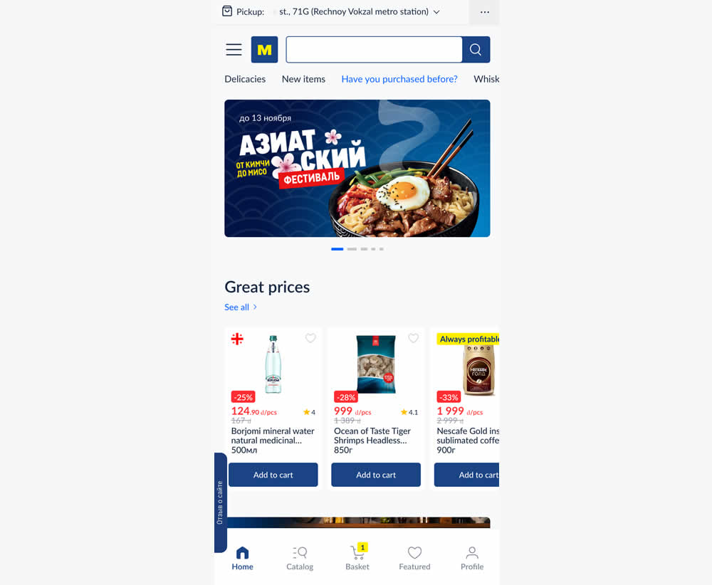
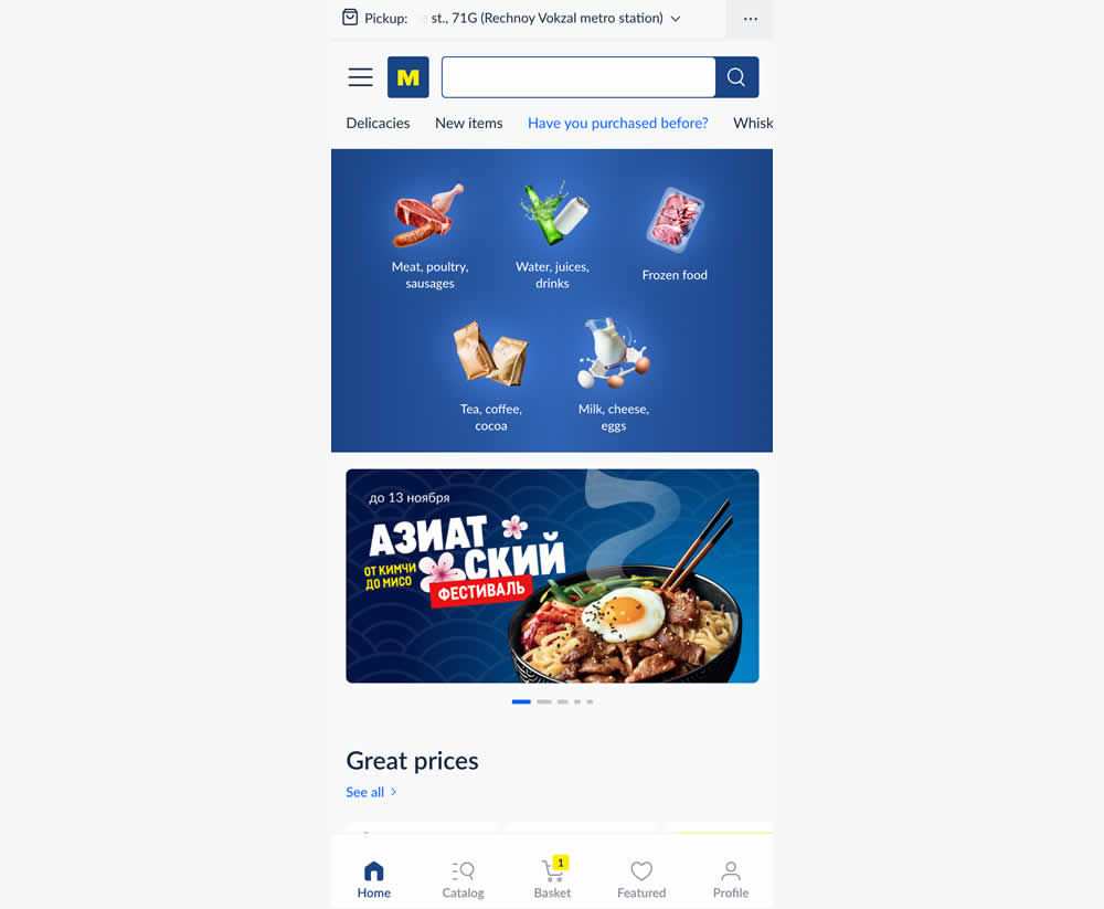
In this experiment, the variation added popular categories with links at the top of the homepage. This was done for all sets of user segments: new and returning. Impact on transactions was measured.
Test #566 on
Banter.com
by
 Craig Kistler
Dec 11, 2024
Desktop
Product
Craig Kistler Tested Pattern #66: Complementary Upsell In Test #566 On Banter.com
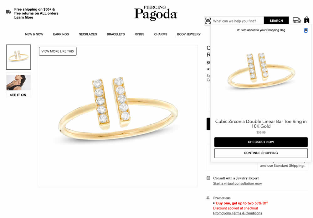
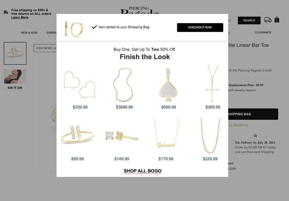
In this experiment, a modal based message was shown to encourage extra products being added as complementary upsells. In the control, the promotion text appeared at the bottom as red text ("Buy one, get up to two 50% Off"). Whereas in the variation, specific products were shown on the modal (post add-to-cart). Impact on adds-to-cart, sales and average revenue was measured.
Test #565 on
Umbraco.com
by
 Lars Skjold Iversen
Nov 30, 2024
Desktop
Home & Landing
Lars Skjold Iversen Tested Pattern #129: Right Or Left Aligned Forms In Test #565 On Umbraco.com
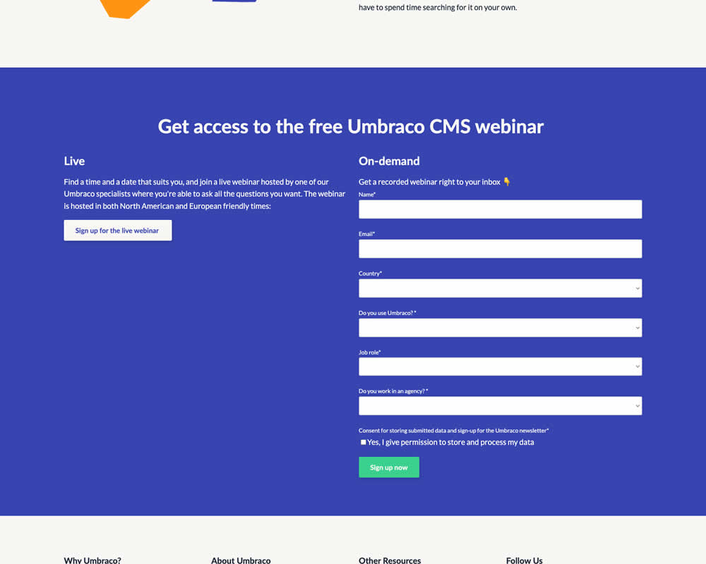
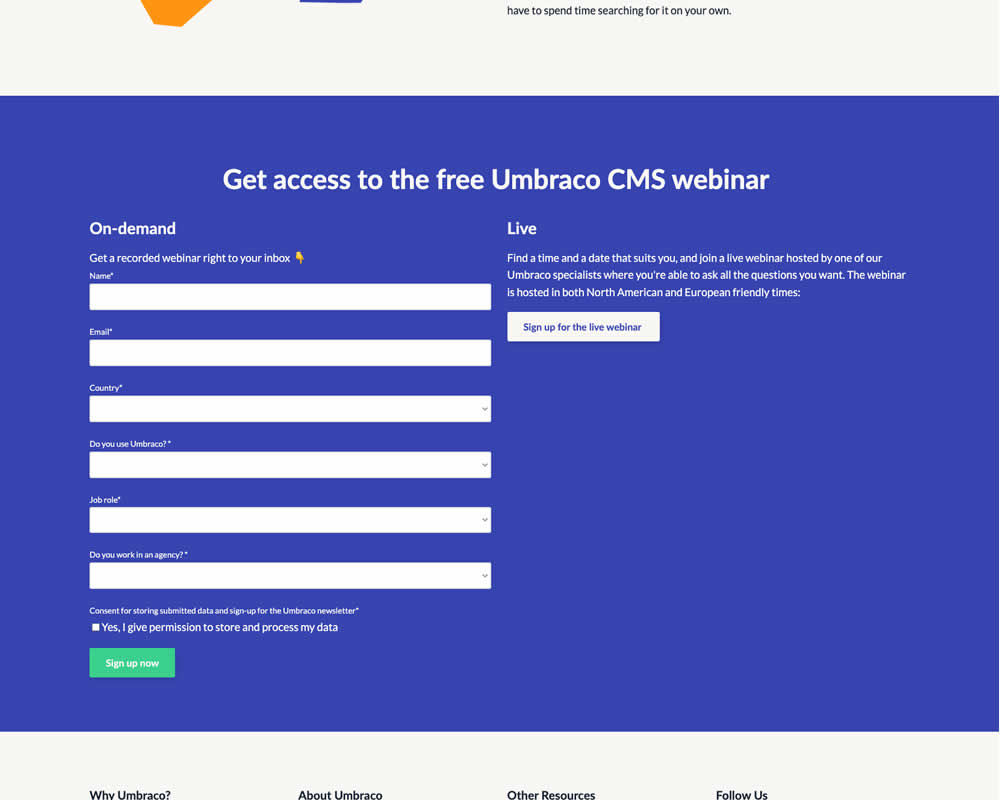
In this experiment, the right vs left position of a form (at the bottom of a landing page) was a/b tested. Impact on progression and form completion was measured.