All Latest 556 A/B Tests
Become a member to unlock the abiltiy to see the highest impact a/b tests. Being able to see the actual test results and sort by impact allows growth and experimentation teams to take action on the biggest gains first
MOST RECENT TESTS
Test #174 on
Examine.com
by
 Martin Wong
May 13, 2018
Desktop
Mobile
Checkout
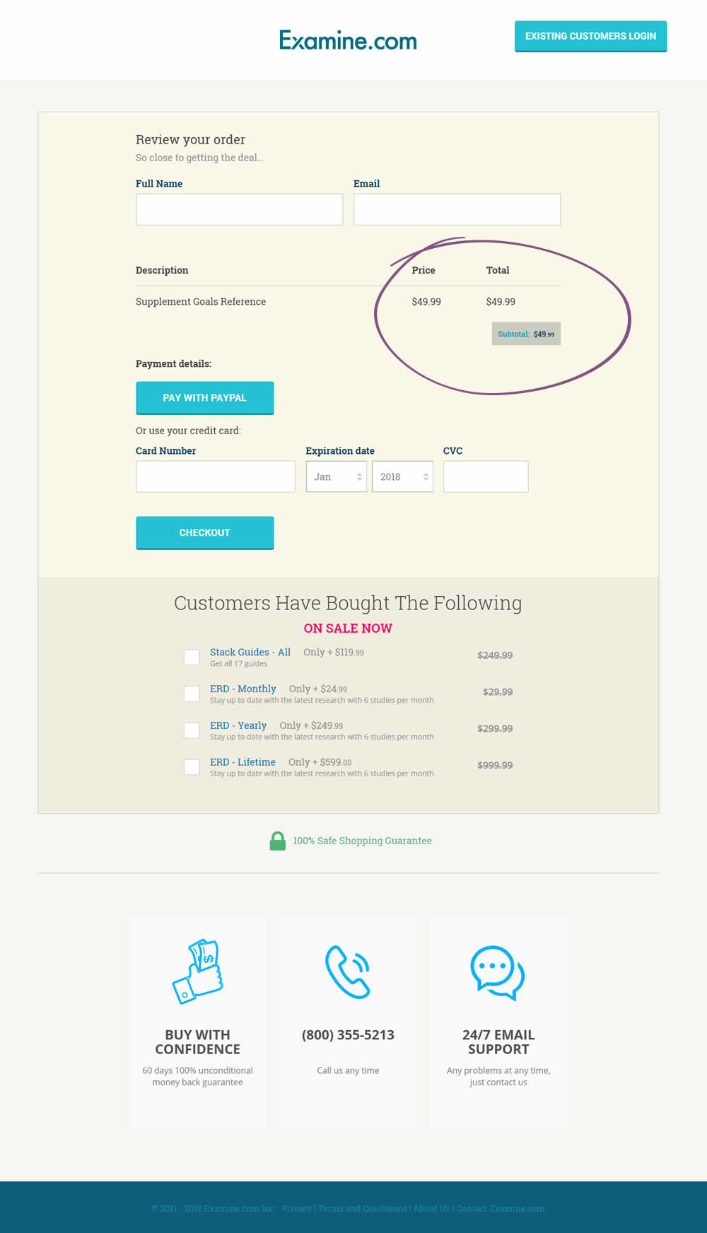
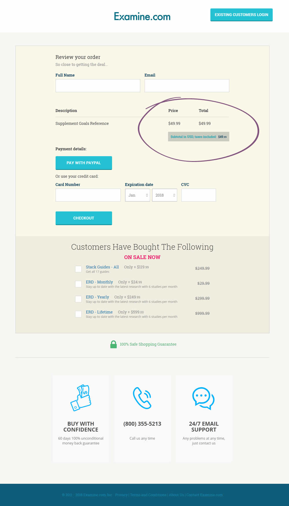
Martin Wong Tested Pattern #67: Currency & Taxes In Test #174 On Examine.com
Test #158 on
Kenhub.com
by
 Niels Hapke
Mar 11, 2018
Desktop
Mobile
Checkout
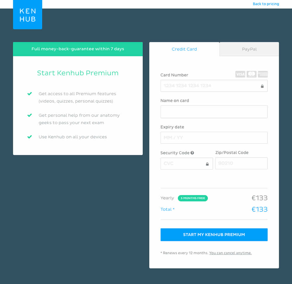
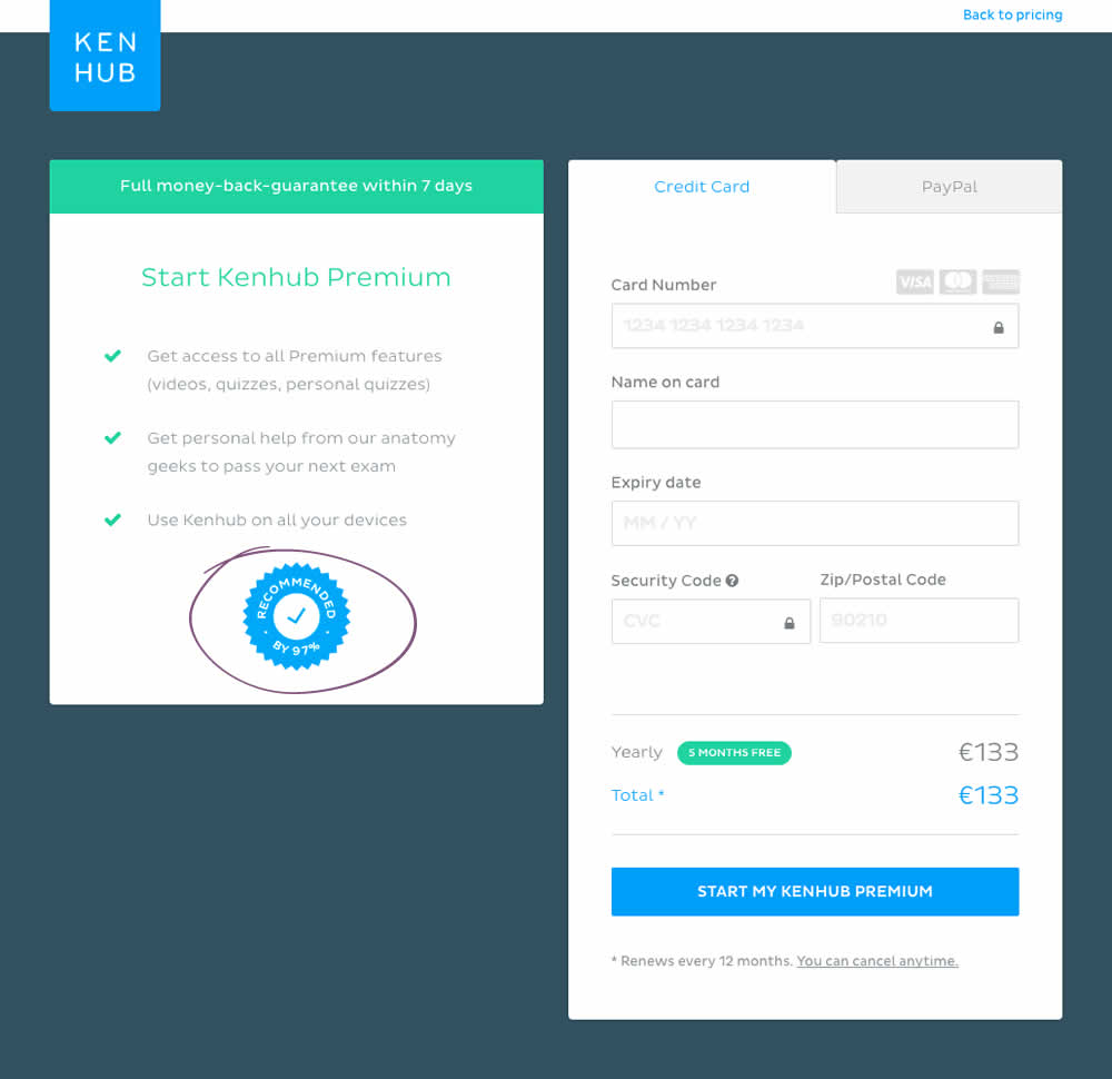
Niels Hapke Tested Pattern #63: Trust Seals In Test #158 On Kenhub.com
Test #159 on
Swimsuitsforall.com
by
 Devesh Khanal
Mar 11, 2018
Desktop
Checkout
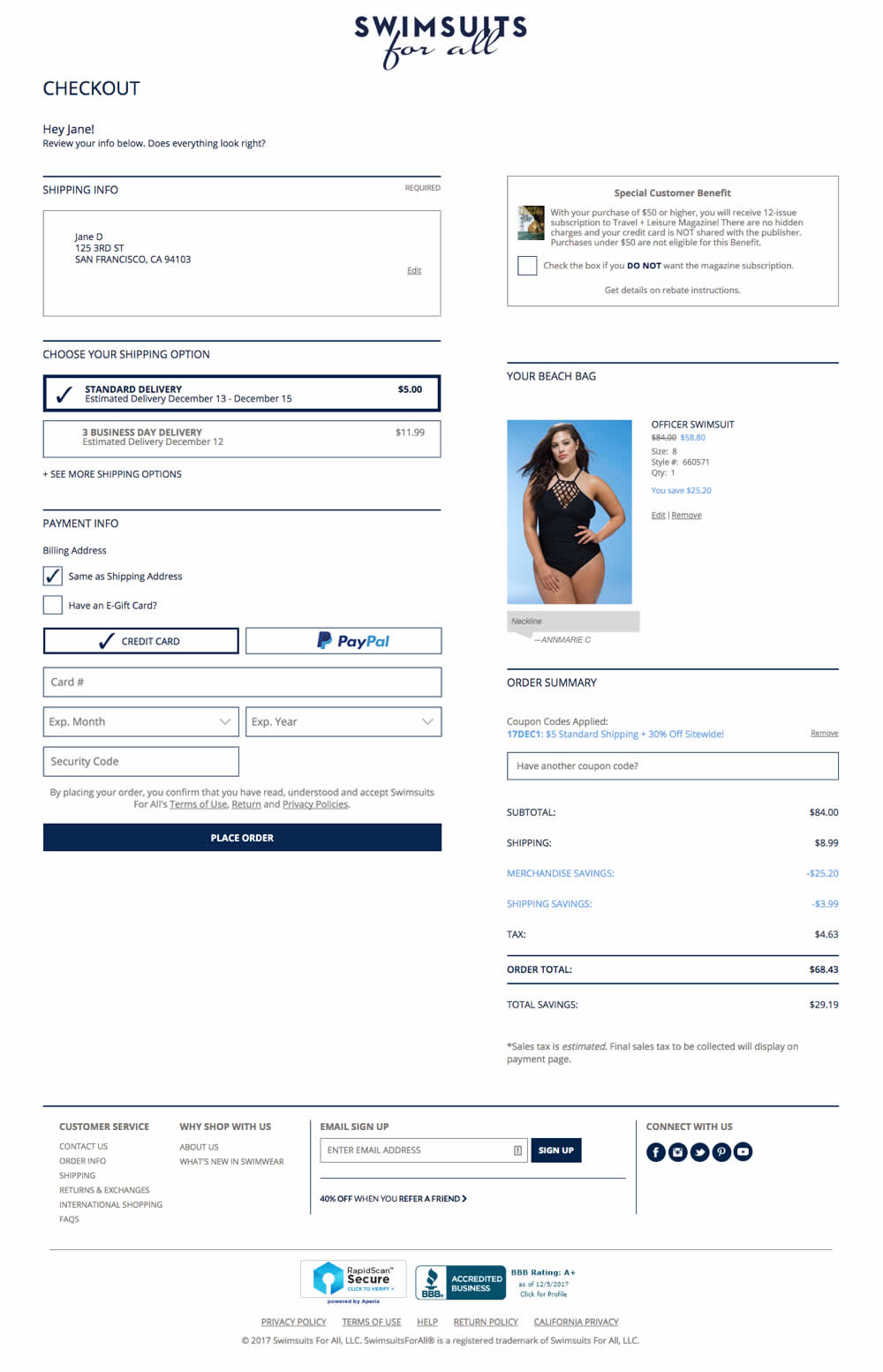
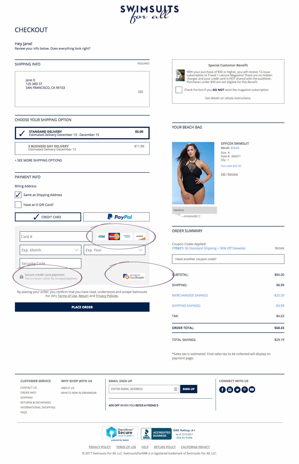
Devesh Khanal Tested Pattern #63: Trust Seals In Test #159 On Swimsuitsforall.com
Test #151 on
Mamaearth.ca
by
 Michael Bernstein
Feb 08, 2018
Desktop
Checkout
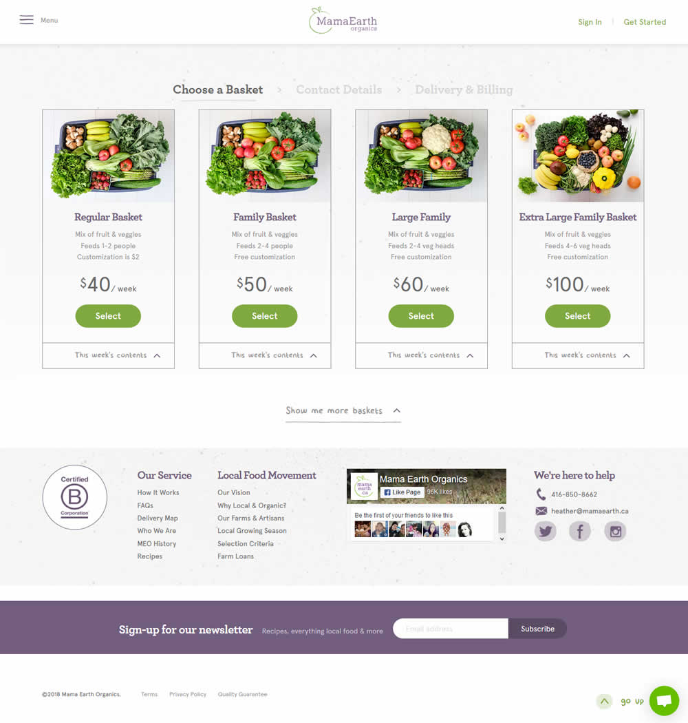
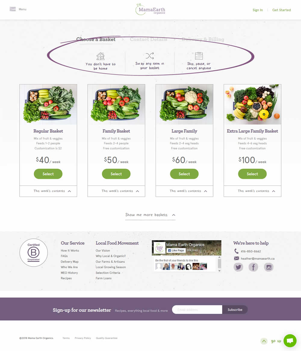
Michael Bernstein Tested Pattern #45: Benefit Bar In Test #151 On Mamaearth.ca
Test #145 on
Normanrecords.com
by
 Nathon Raine
Jan 18, 2018
Desktop
Checkout
Nathon Raine Tested Pattern #1: Remove Coupon Fields In Test #145 On Normanrecords.com
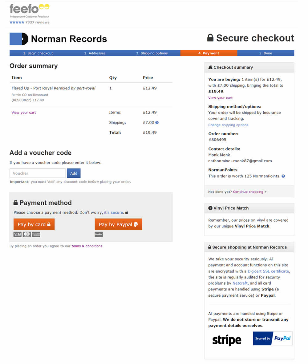
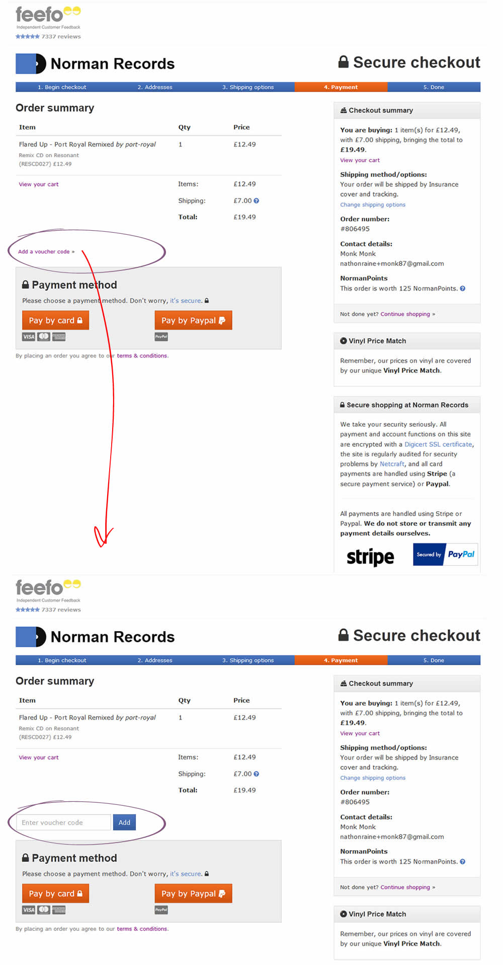
In this test the coupon field was replaced with a small link that would bring the field back if needed. This is a more suble approach than just completely removing the coupon field. It still allows for the use of coupon fields by those customers which are truly searching for a way to enter their aquired codes.
Test #137 on
Trydesignlab.com
by
 Daniel Shapiro
Dec 22, 2017
Desktop
Mobile
Checkout
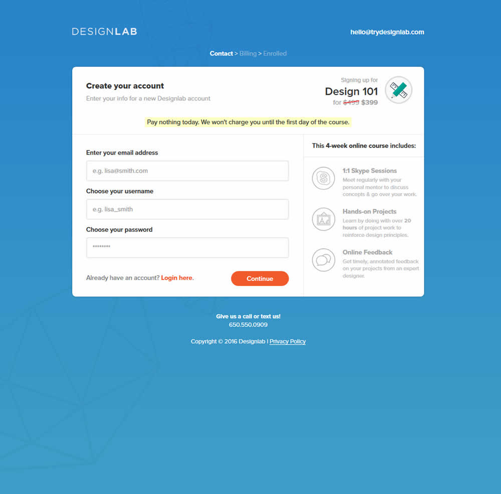
Daniel Shapiro Tested Pattern #46: Pay Later In Test #137 On Trydesignlab.com
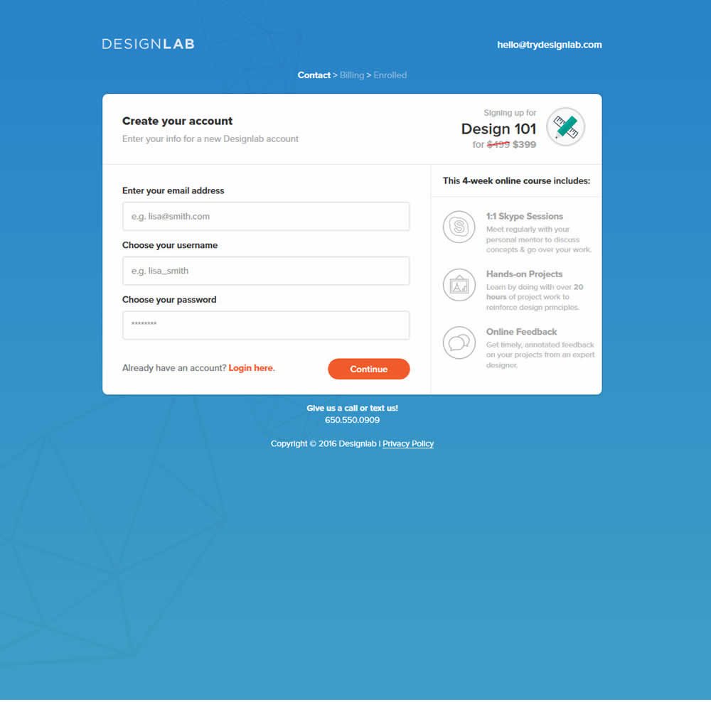
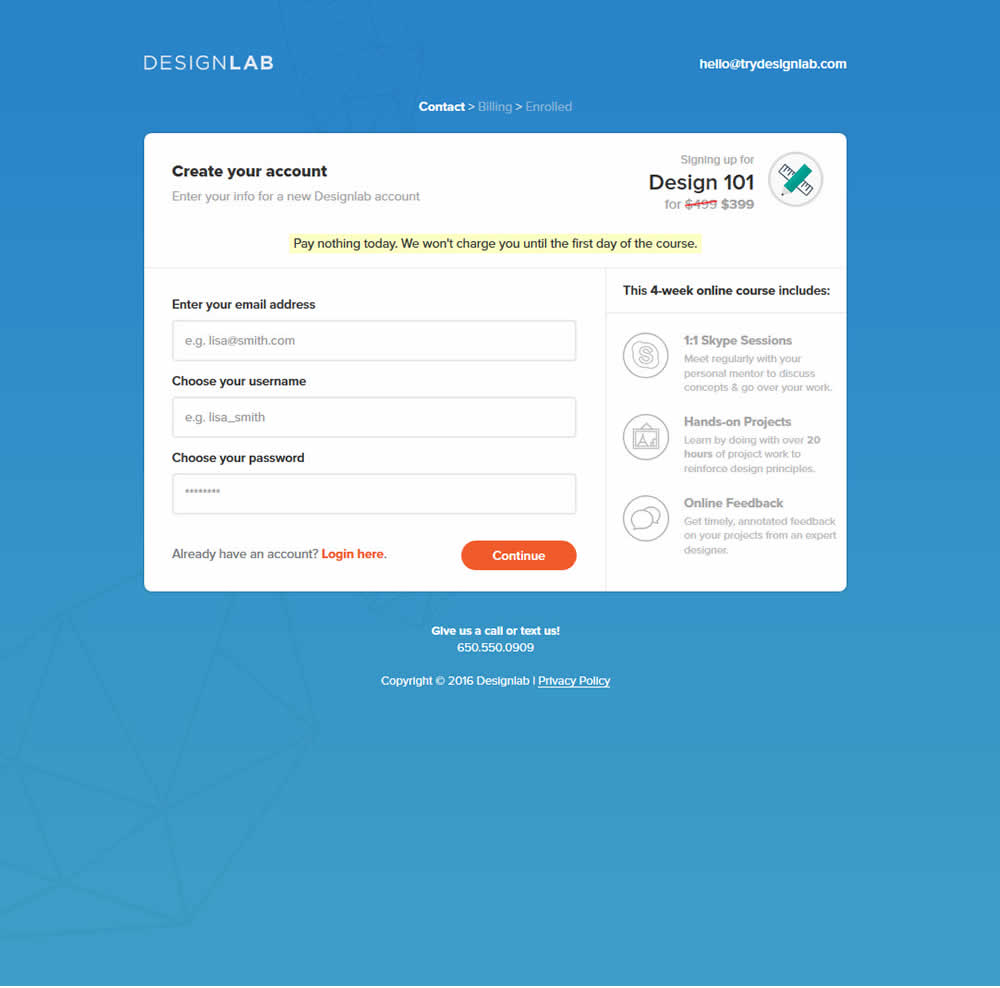
This test was run on a 3 step checkout process. The first screen was asking for contact information, and the second screen asked for credit card details. The change was shown on both first two steps as shown on the image below.
Test #138 on
Trydesignlab.com
by
 Daniel Shapiro
Dec 22, 2017
Desktop
Mobile
Checkout
Daniel Shapiro Tested Pattern #42: Countdown Timer In Test #138 On Trydesignlab.com
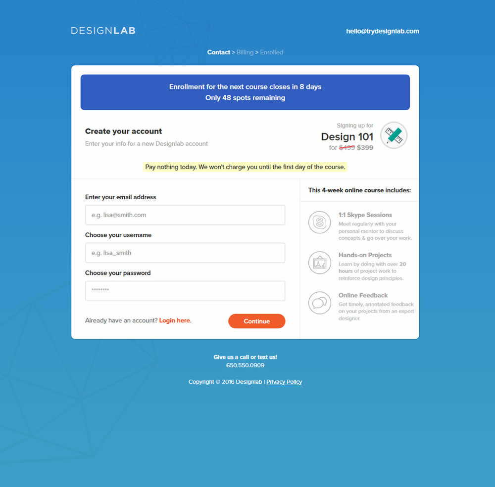
This test was run on a 3 step checkout process. The first screen was asking for contact information, and the second screen asked for credit card details. The change was shown on both first two steps as shown on the image below.
Test #89 on
Ssdnodes.com
by
 Matt Connor
Jun 01, 2017
Desktop
Mobile
Checkout
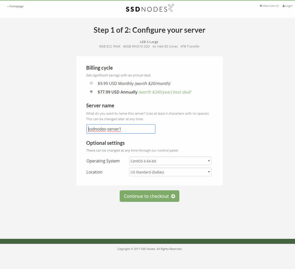
Matt Connor Tested Pattern #4: Testimonials In Test #89 On Ssdnodes.com

Test #51 on
Menufy.com
by
 Aleksandr Elesev
Oct 20, 2016
Desktop
Mobile
Checkout
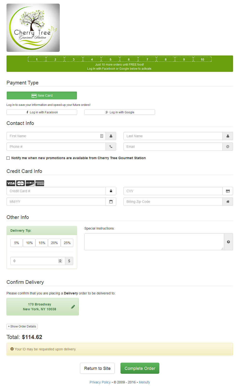
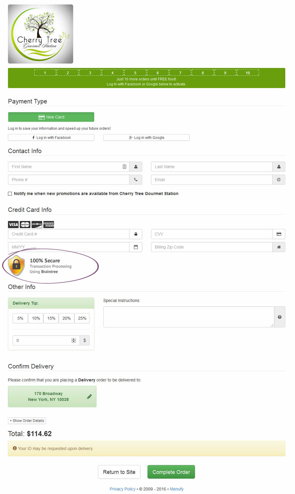
Aleksandr Elesev Tested Pattern #63: Trust Seals In Test #51 On Menufy.com
Test #57 on
by
 Jakub Linowski
Jul 07, 2016
Desktop
Checkout
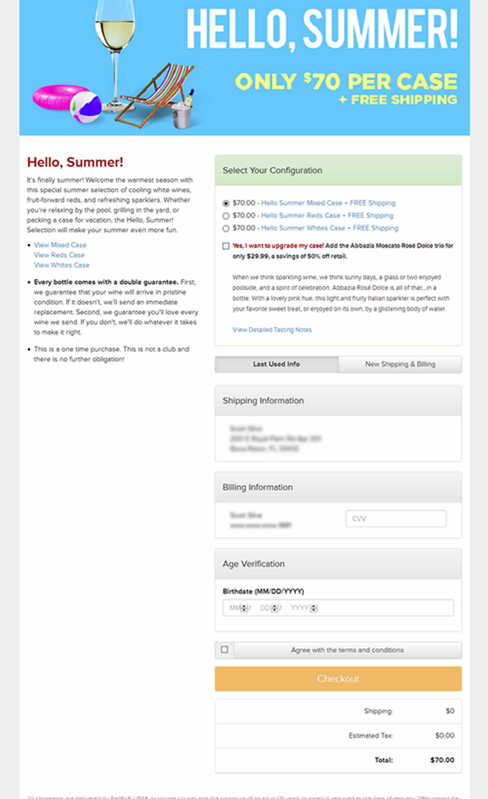
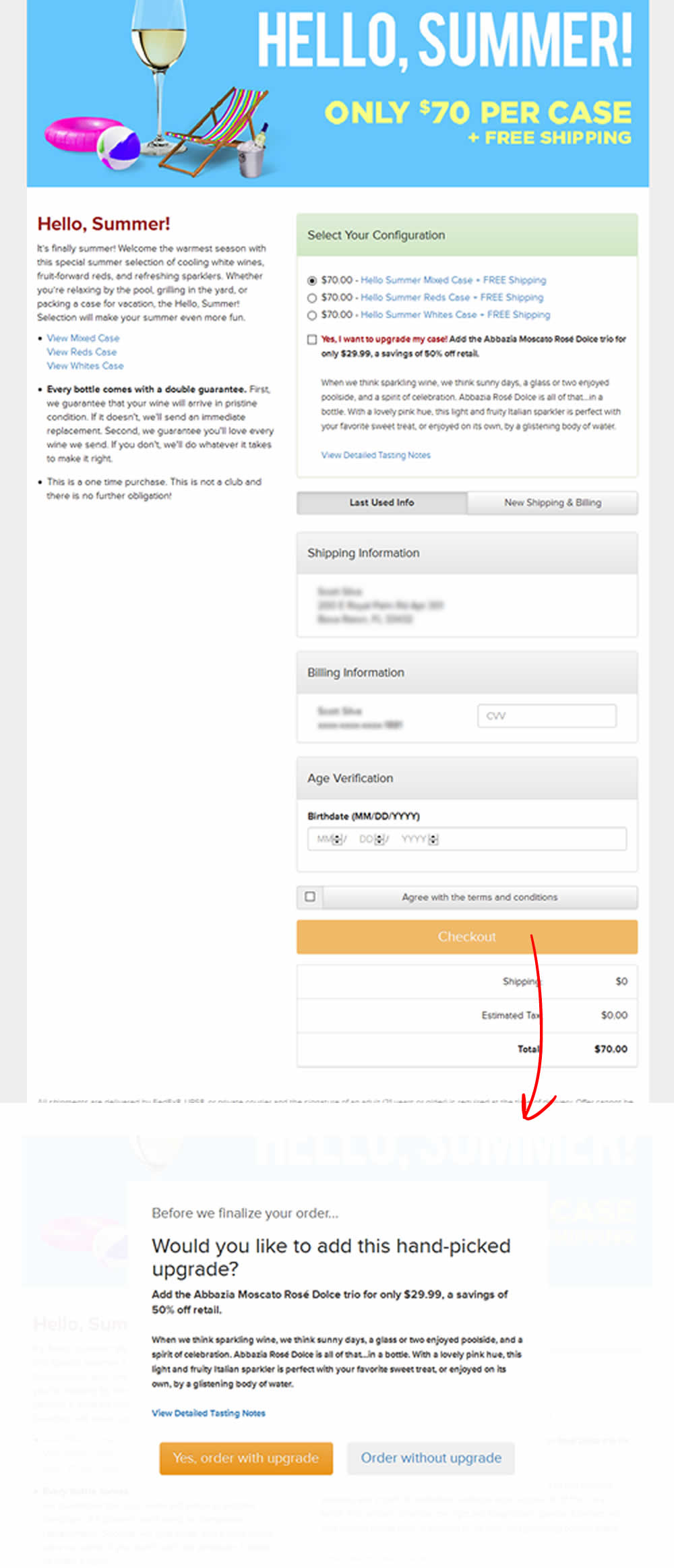
Jakub Linowski Tested Pattern #66: Complementary Upsell In Test #57
Test #129 on
Barackobama.com
by
 Kyle Rush
Jun 01, 2012
Desktop
Checkout
Kyle Rush Tested Pattern #9: Multiple Steps In Test #129 On Barackobama.com
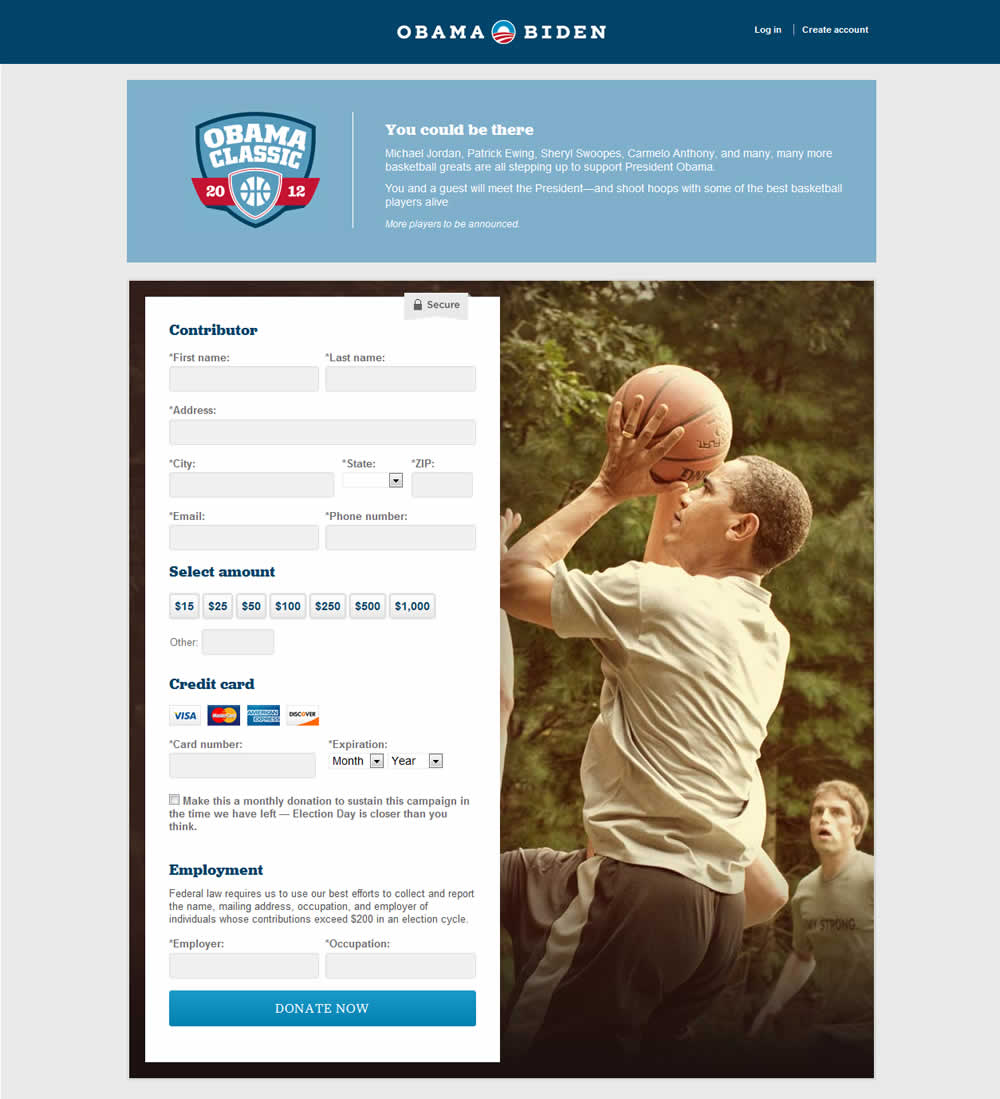
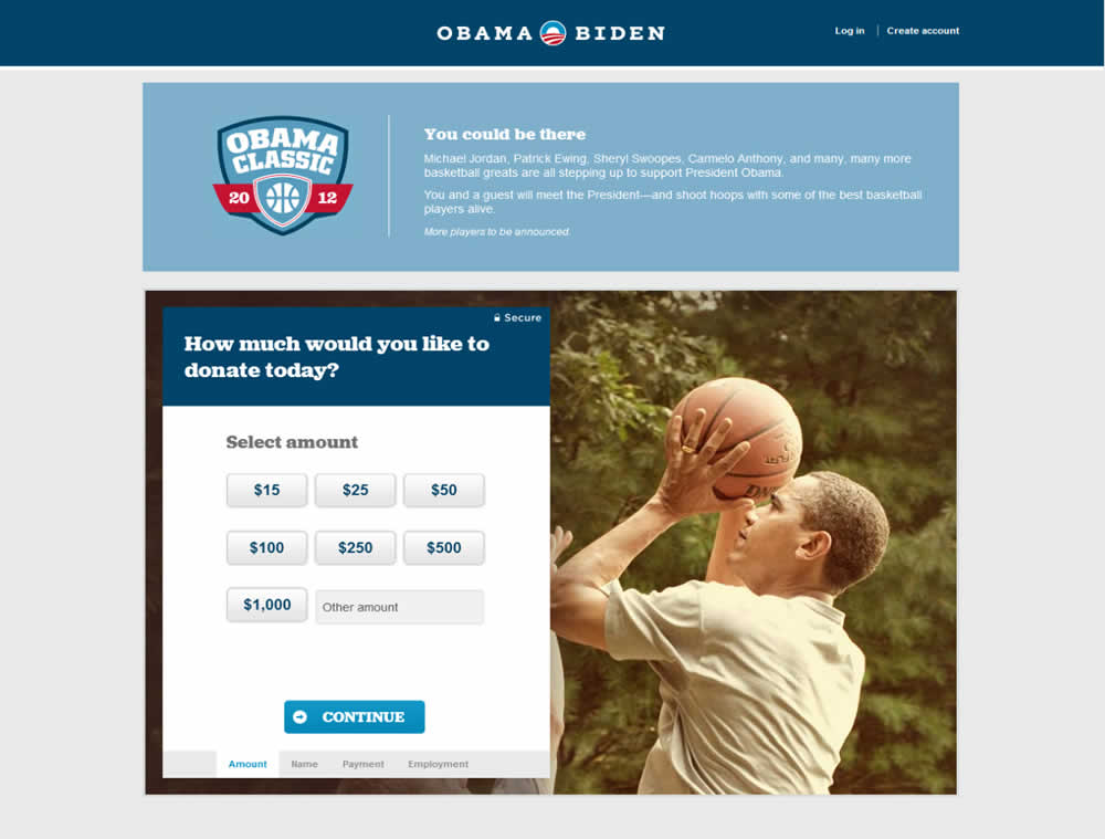
Kyle's team changed a donation form for the Barack Obama 2012 campaign from a single step to a 4 step one. The 4 steps were: amount, personal information, billing information and occupation/employer.
"Our plan was to separate the field groups into four smaller steps so that users did not feel overwhelmed by the length of the form." - Kyle Rush