Pattern #37: List Or Grid View

Pattern #37  Tested 7 timesFirst tested by Rodrigo Maués Recently tested by Adan Archila on Mar 18, 2024

Based on 7 Tests, Members See How Likely Version B Wins Or Loses And By How Much

LOSSES
-5
-4
-3
-2
-1
FLAT
+1
+2
+3
+4
+5
WINS

Measured by the sum of negative and positive tests.
A B
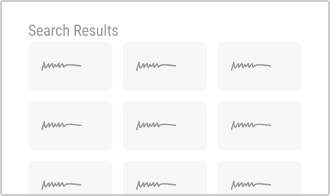
List Or Grid View (Variant A) List Or Grid View (Variant B)

Expected Median Effects Of B

?

Progression

(4 tests)

?

Leads

(2 tests)

-

Signups

-

Engagement

?

Sales

(4 tests)

-

Revenue

-

Retention

-

Referrals

?

ANY PRIMARY

(7 tests)

Tested on

Tests

Pattern #37: List Or Grid View
Was Tested On Fairment.de by Jona Eisenberger

Replaced

Isolated

Test # 502 on Fairment.de by $conducted_test->test->user_->first_name . ' ' . $conducted_test->test->user_->last_name Jona Eisenberger    Nov 06, 2023 Test link

Find Out How It Did With 14,417 Visitors

  • Measured by adds to cart

  • Measured by completed transactions

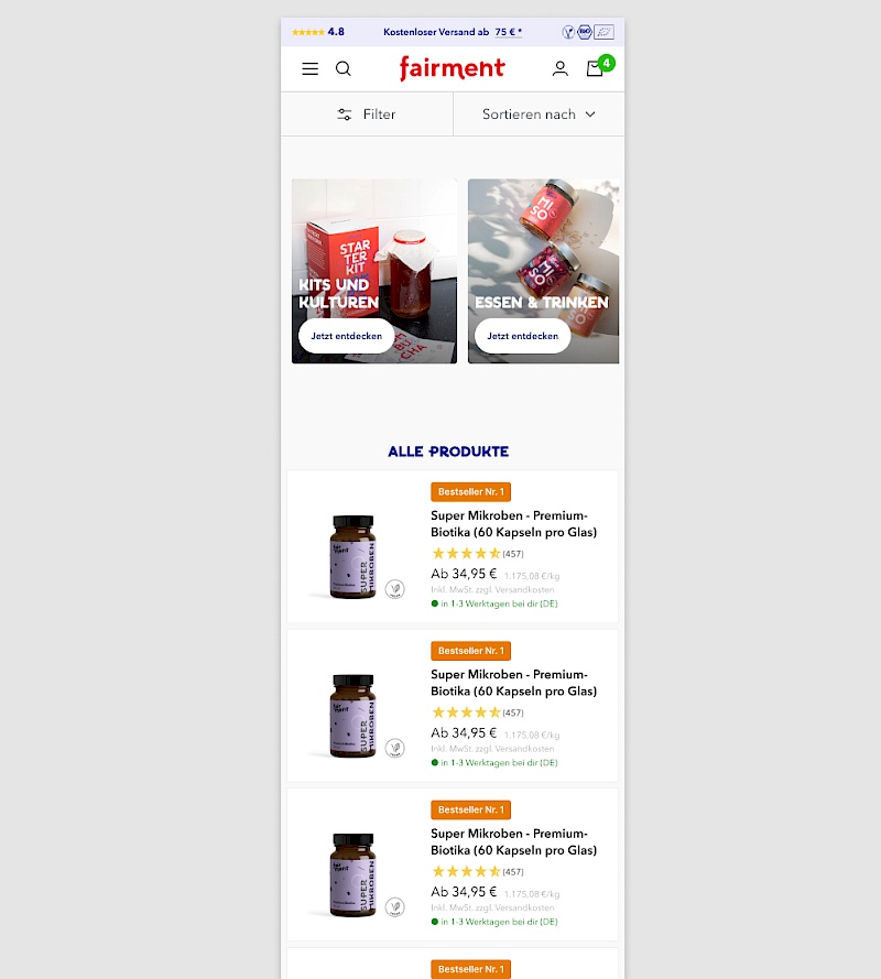
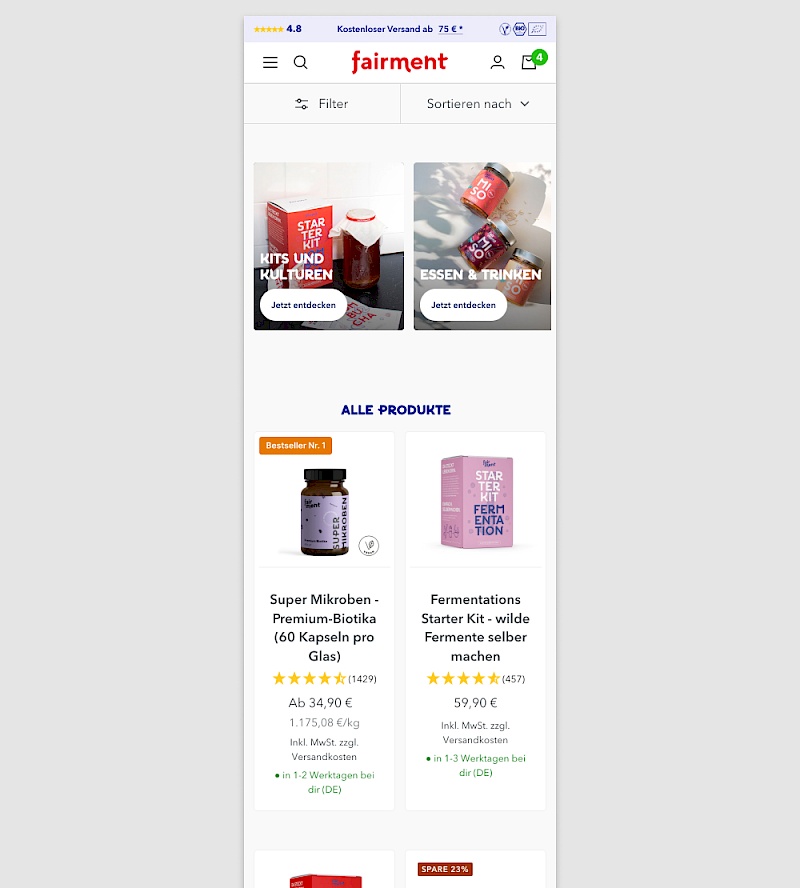
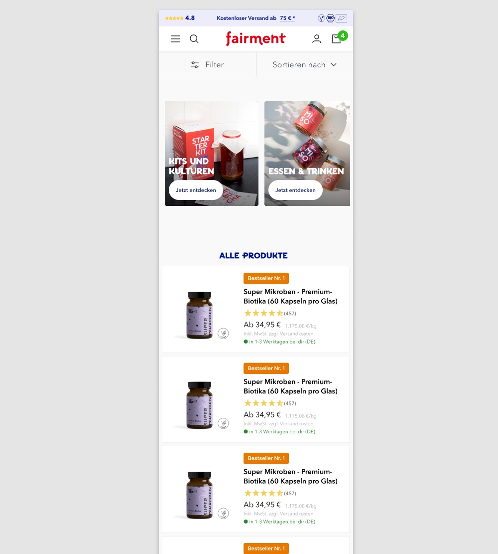
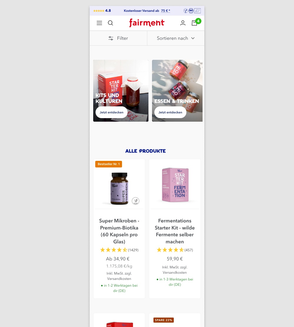
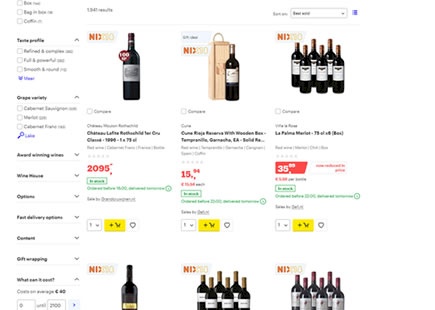
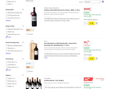
In this experiment, a two column grid layout (control) was tested against single column layout (variation) with the product information shown to the right. Please note that the screenshot shows repeated products only because it's been sourced from a Figma design file. In reality, the products in the variation were equally diverse as in the control. 

(We've also flipped the A and B to match up with our grid pattern.)

Get Access To See The Test Results

The Same Pattern Was Also Tested Here

Replaced

Isolated

Test # 522 on 686.com by $conducted_test->test->user_->first_name . ' ' . $conducted_test->test->user_->last_name Adan Archila    Mar 18, 2024 Test link

Find Out How It Did With 79,626 Visitors

  • Measured by completed purchases

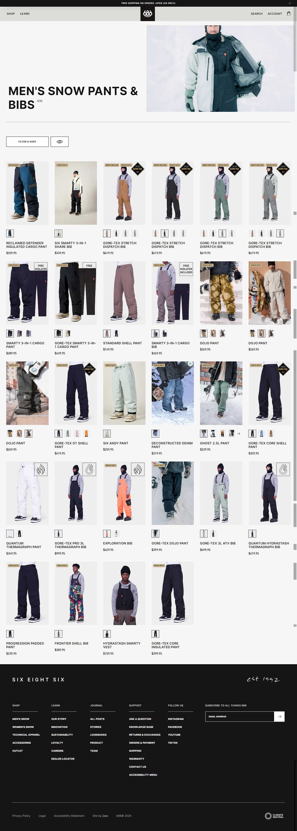
In this desktop experiment, 4 product tiles per page (control) were tested against 6. Impact on sales was measured.

Get Access To See The Test Results

Replaced

Isolated

Test # 516 on 686.com by $conducted_test->test->user_->first_name . ' ' . $conducted_test->test->user_->last_name Adan Archila    Feb 05, 2024 Test link

Find Out How It Did With 216,092 Visitors

  • Measured by completed sales

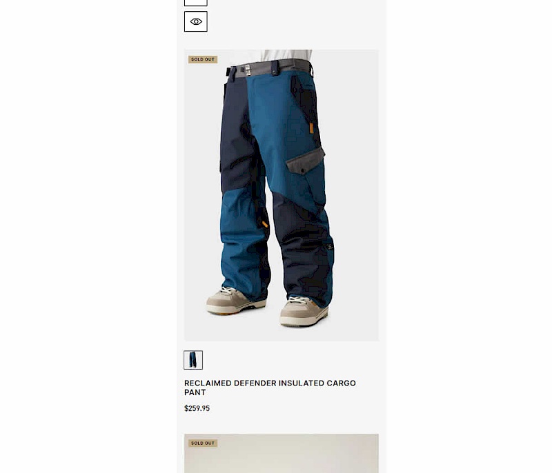
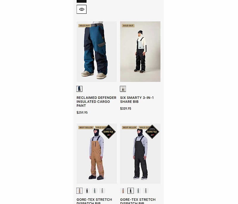
In this experiment, a one large product photo (control) was tested against a two-column layout with two smaller images (variation). Impact on sales was measured.

Get Access To See The Test Results

Replaced

Isolated

Test # 270 on Dentalplans.com by $conducted_test->test->user_->first_name . ' ' . $conducted_test->test->user_->last_name J.R. Hernandez    Nov 19, 2019 Test link

Find Out How It Did With 264,000 Visitors

  • Measured by plan page visits

  • Measured by cart page visits

In this experiment, a list view was tested against a grid view.

Get Access To See The Test Results

Replaced

Isolated

Test # 169 on Mt.com by $conducted_test->test->user_->first_name . ' ' . $conducted_test->test->user_->last_name Vito Mediavilla    Apr 24, 2018 Test link

Find Out How It Did With 5,934 Visitors

  • Measured by initiated leads with quote form

  • Measured by form submits

Get Access To See The Test Results

Replaced

Isolated

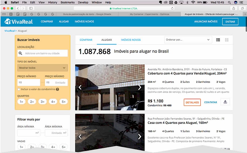
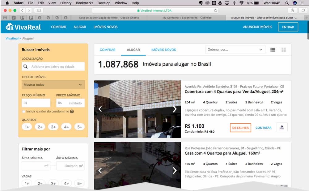
Test # 120 on Vivareal.com.br by $conducted_test->test->user_->first_name . ' ' . $conducted_test->test->user_->last_name Rodrigo Maués    Nov 01, 2017 Test link

Find Out How It Did With 1,847,933 Visitors

  • Measured by visits to any property page

  • Measured by successful lead form submission

Get Access To See The Test Results

Leaks

Leak #33 from Bol.com   |   Nov 18, 2019 Listing

Bol A/B Tests The UI Classic: List Vs Grid View With A Clear Decision

I am continously interested in answering and providing guidance on whether grid or list views are in general better, worse or indifferent as one of many UI patterns. To my surprise, Bol.com the leading Dutch web shop, has recently a/b tested this classic pattern which we were super lucky to detect on their red wine product listing pages. After anticipating their leaked design decision, we eventually learned that lists fared better for Bol. This of course we'll now use as additional and emerging evidence to tip the scales of probability (and hopefully better predict similar future experiments). View Leak

-0.5 Evidence

Leak #34 from Google.com   |   Nov 25, 2019 Listing

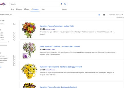
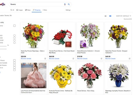
Google Also A/B Tests The List Vs The Grid

Interestingly, Google was also discovered a/b testing the list vs grid pattern just as Bol finished a similar experiment this month. The Google experiment ran on one of their shopping results pages with the specific query for "flowers". And the outcome? Looks like the grid beat the list and was rolled out in this case.  View Leak

+0.5 Evidence

Leak #64 from Amazon.com   |   Oct 19, 2020 Listing

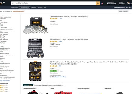
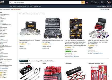
Amazon A/B Tests The List Vs Grid Layout

A month ago I managed to detect this classic list vs grid layout experiment on two of Amazon's product listing pages. I learned that this a/b test ran at least on two random queries such as "tools for mechanics" and "sports gear". Today, the grid layout view now looks like it was implemented. View Leak

+0.5 Evidence

For each pattern, we measure three key data points derived from related tests:

REPEATABILITY - this is a measure of how often a given pattern has generated a positive or negative effect. The higher this number, the more likely the pattern will continue to repeat.

SHALLOW MEDIAN - this is a median effect measured with low intent actions such as initiating the first step of a lengthier process

DEEP MEDIAN - this is derived from the highest intent metrics that we have for a given test such as fully completed signups or sales.