40 Tests By  Stanley Zuo
Tests
Test #342 on
Backstage.com
by
 Stanley Zuo
Feb 28, 2021
Desktop
Mobile
Stanley Zuo Tested Pattern #25: Nagging Results In Test #342 On Backstage.com
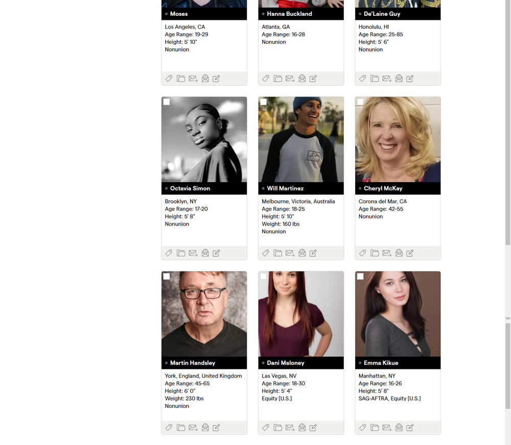
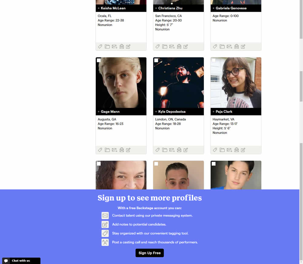
In this experiment, a registration wall was added on a listing page of casting call profiles. The registration wall appeared after the first 9 listings or so and encouraged users to sign up. Impact on registrations was measured, along with an engagement metric of "posting a job".
Test #336 on
Backstage.com
by
 Stanley Zuo
Jan 28, 2021
Desktop
Mobile
Stanley Zuo Tested Pattern #51: Shortcut Buttons In Test #336 On Backstage.com
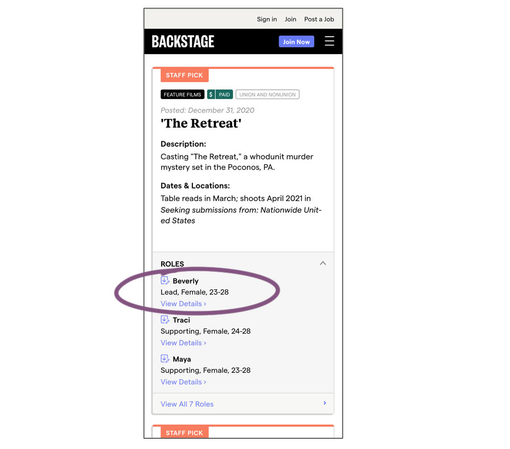
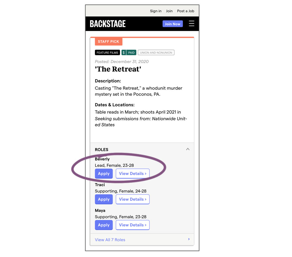
In this experiment, a listing page was expanded to show two actions (apply and view details) instead of a single one (view details only). This variation enabled users with a shortcut action to apply for roles one step earlier (and start membership flows for new users).
Test #337 on
Backstage.com
by
 Stanley Zuo
Jan 28, 2021
Desktop
Mobile
Stanley Zuo Tested Pattern #51: Shortcut Buttons In Test #337 On Backstage.com
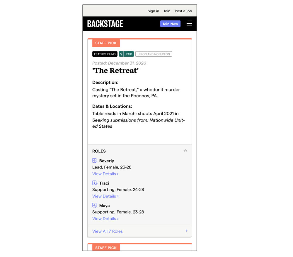
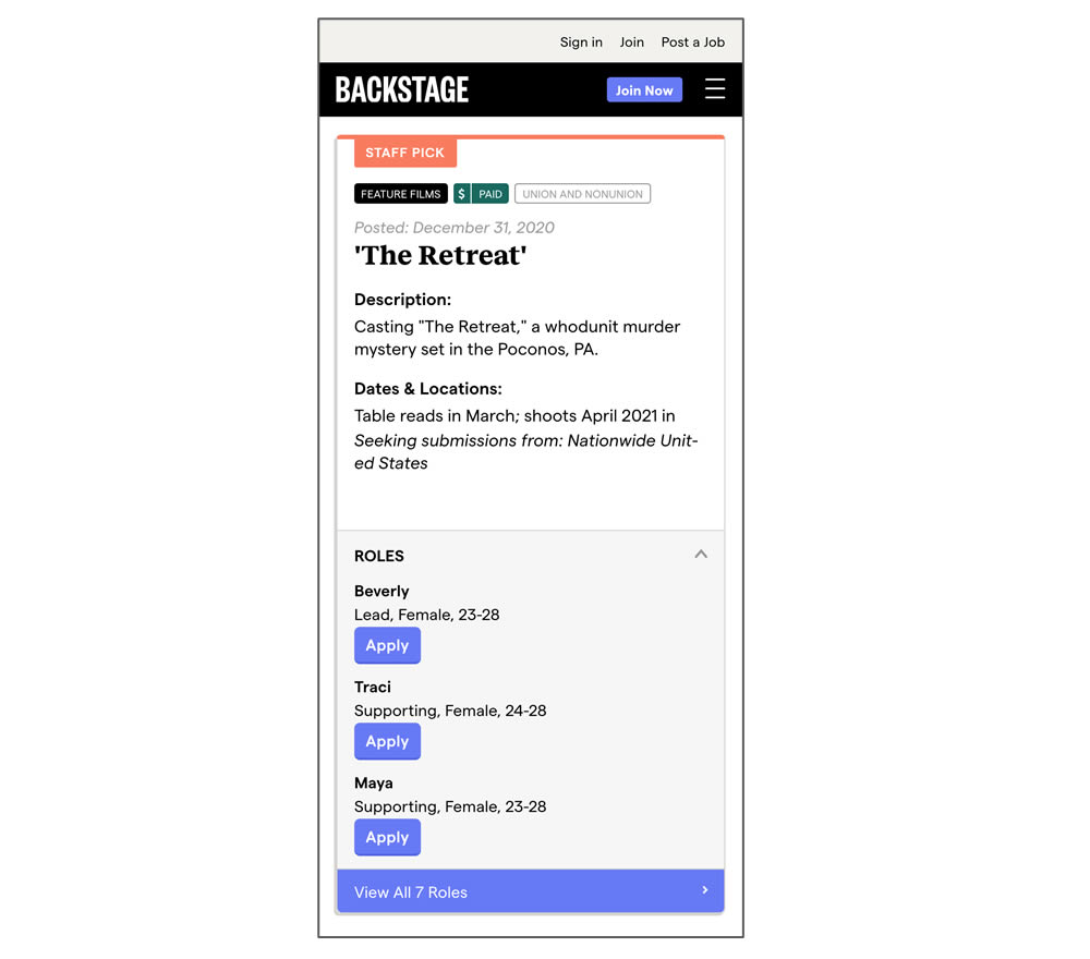
In this experiment, a listing page was expanded to show two actions (apply and view details) instead of a single one (view details only). In the variant, the "view detail" links were replaced with "apply links" starting a job application (and membership flows) sooner.
Test #330 on
Backstage.com
by
 Stanley Zuo
Dec 29, 2020
Desktop
Stanley Zuo Tested Pattern #116: Links Or Buttons In Test #330 On Backstage.com
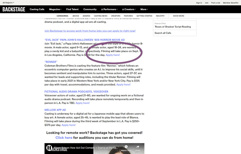
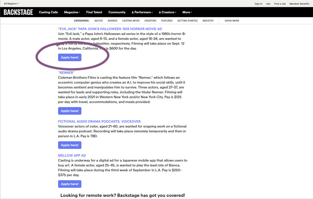
In this simple experiment on a content page, links were turned into more prominent buttons. The experiment measured clicks and signups.
Test #327 on
Backstage.com
by
 Stanley Zuo
Nov 26, 2020
Desktop
Stanley Zuo Tested Pattern #120: Supporting Theme Images In Test #327 On Backstage.com
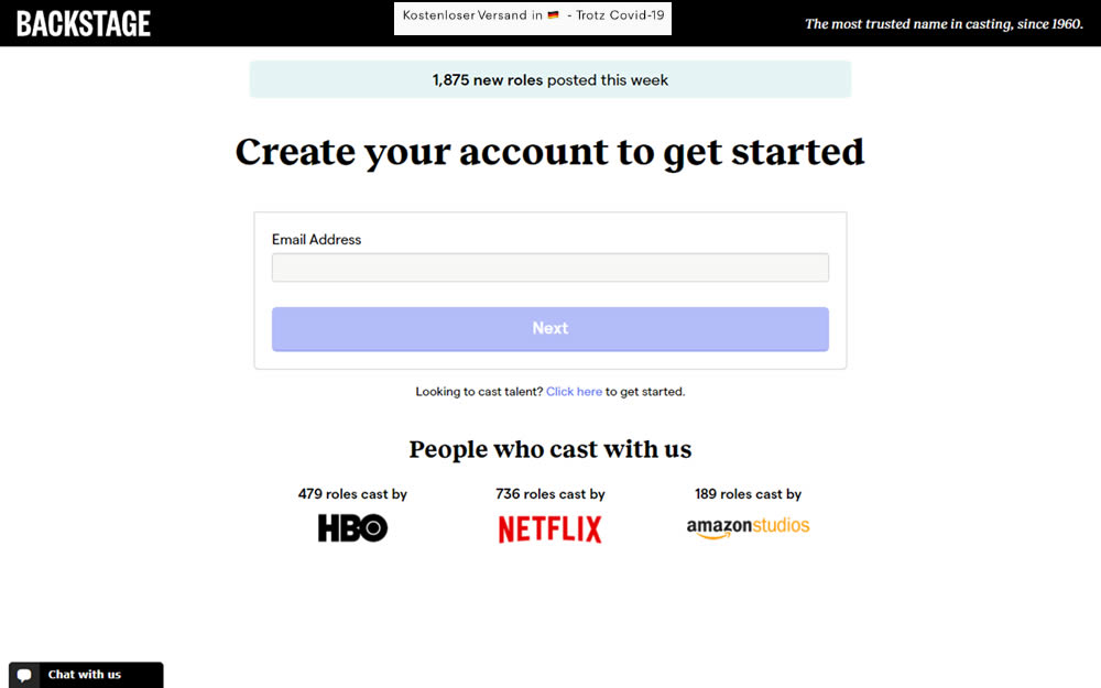
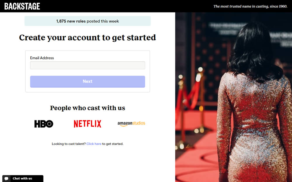
In this experiment, an aspirational photo was shown on the right side panel - reinforcing the theme of casting calls. The experiment measured progression to the next step and completed signups.
Test #323 on
Backstage.com
by
 Stanley Zuo
Oct 29, 2020
Mobile
Stanley Zuo Tested Pattern #117: Company Logos In Test #323 On Backstage.com
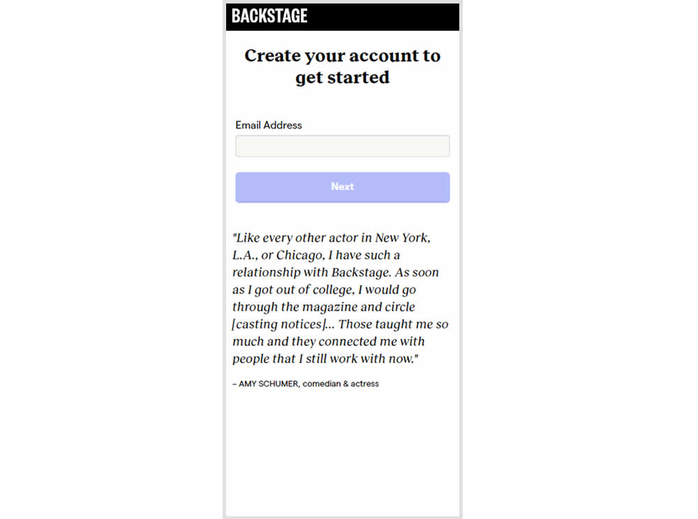
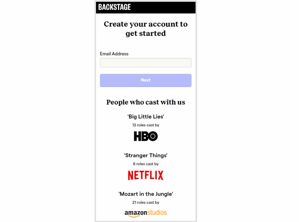
In this experiment, the variation replaced a text testimonial with high-profile production companies that have cast with Backstage. The logos were shown during the signup and checkout flow.
Test #319 on
Backstage.com
by
 Stanley Zuo
Sep 30, 2020
Desktop
Stanley Zuo Tested Pattern #113: More Or Fewer Plans In Test #319 On Backstage.com
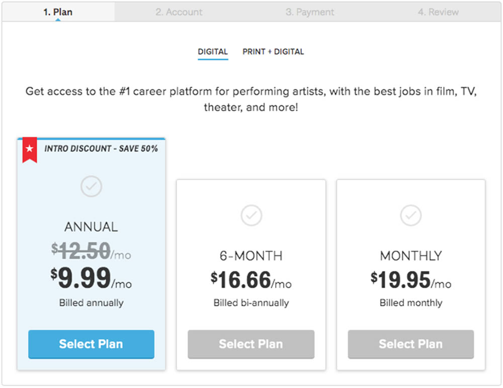
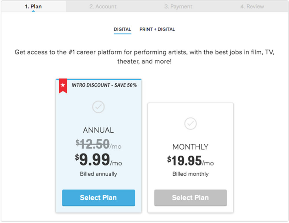
In this experiment, a 3 plan vs 2 plan pricing page was shown to potential customers. Impact on sales and revenue were measured.
Test #315 on
Backstage.com
by
 Stanley Zuo
Aug 22, 2020
Mobile
Stanley Zuo Tested Pattern #7: Social Counts In Test #315 On Backstage.com
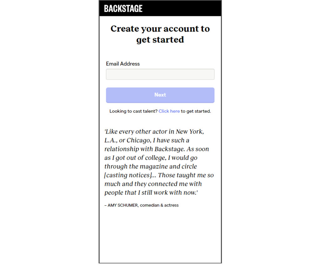
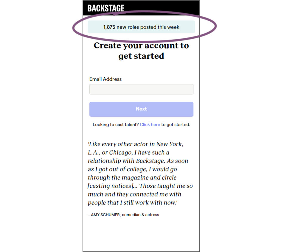
In this experiment, a dynamic number of job postings was displayed during the signup process - reinforcing the value of signing up for membership access.
Test #311 on
Backstage.com
by
 Stanley Zuo
Aug 11, 2020
Desktop
Mobile
Stanley Zuo Tested Pattern #118: Category Images In Test #311 On Backstage.com
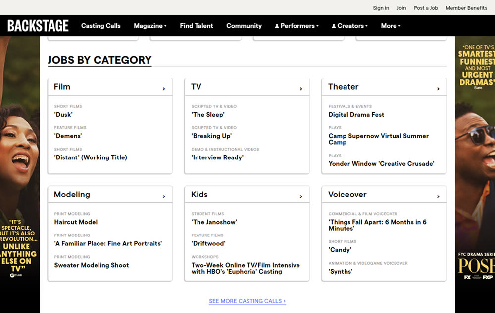
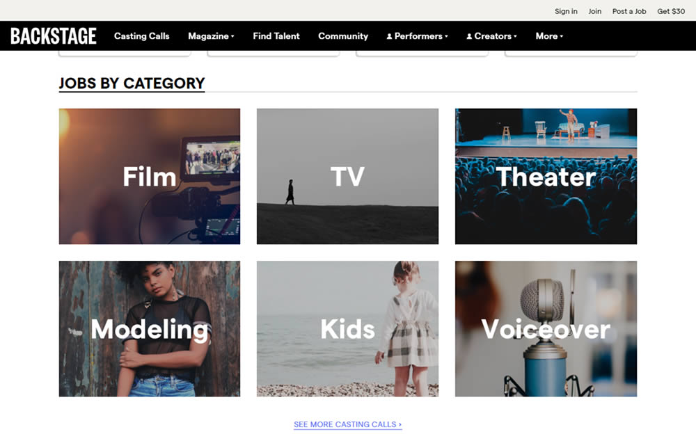
In this experiment, category links (linking to casting call search results) were replaced with tile images. In addition, 2 levels of categories were also replaced with a single text link for each tile. Finally, the font size of the link titles was also increased.
Test #310 on
Backstage.com
by
 Stanley Zuo
Jul 25, 2020
Mobile
Stanley Zuo Tested Pattern #77: Filled Or Ghost Buttons In Test #310 On Backstage.com
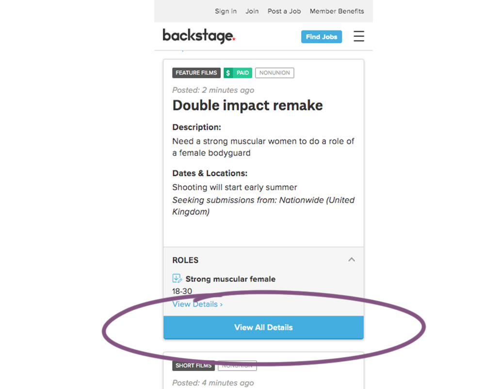
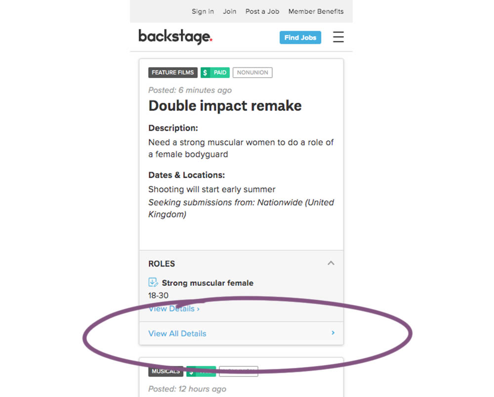
In this experiment, the style of a button leading to view detailed casting calls on a listing page was changed. In version the style was a filled high contrast blue background, and the the B variation there was a feint "ghost button" style.
Test #306 on
Backstage.com
by
 Stanley Zuo
Jul 09, 2020
Desktop
Mobile
Stanley Zuo Tested Pattern #69: Autodiscounting In Test #306 On Backstage.com
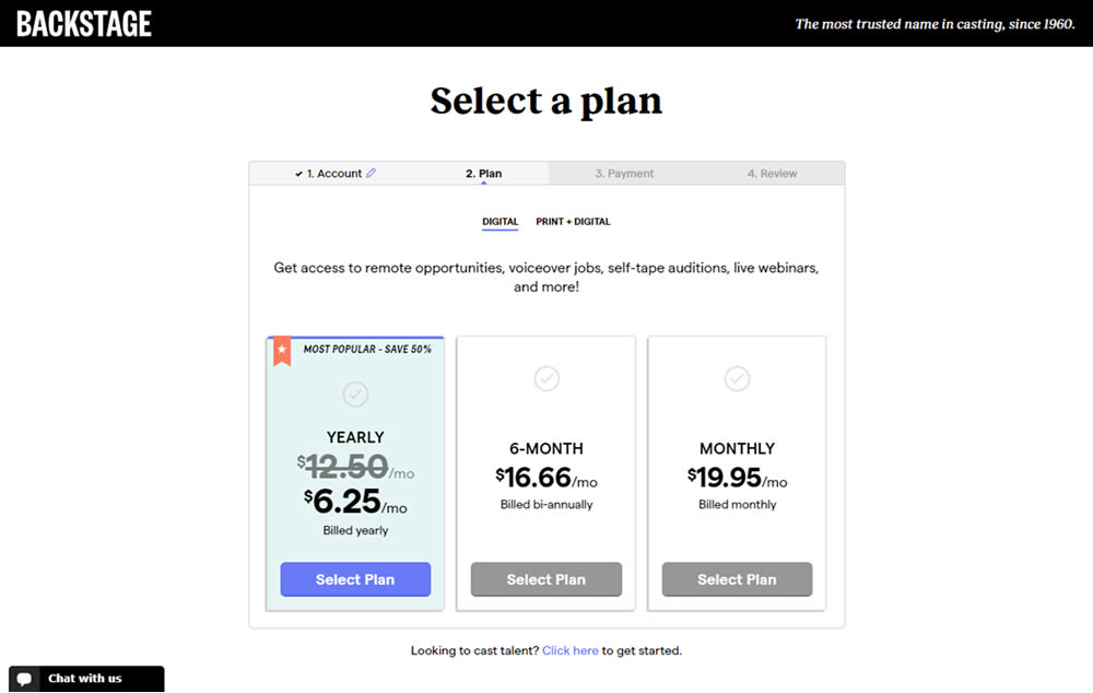
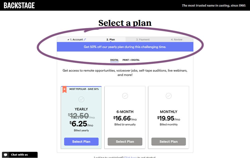
In this experiment, the only change was an added message at the top of the pricing screen, clarifying that there is an active discount on a yearly plan. The discount was already communicated with a strike-through price on the control version as well. The variation simply emphasized this aggressively.
Test #304 on
Backstage.com
by
 Stanley Zuo
Jun 29, 2020
Mobile
Stanley Zuo Tested Pattern #97: Bigger Form Fields In Test #304 On Backstage.com
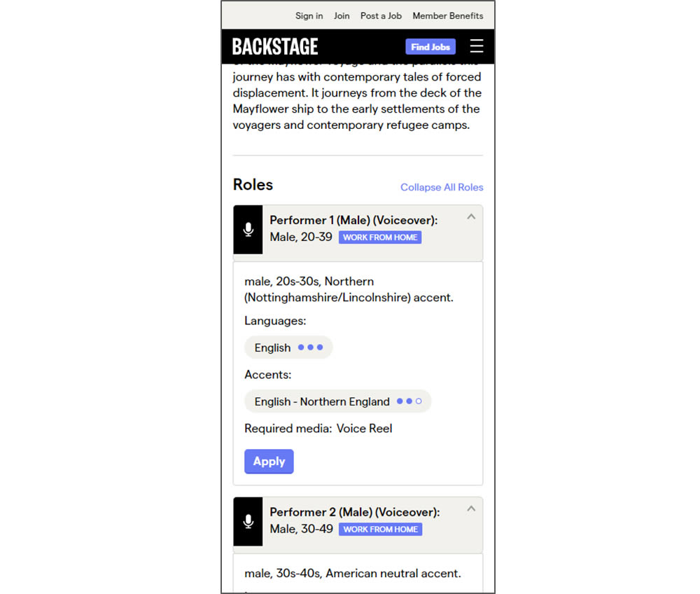
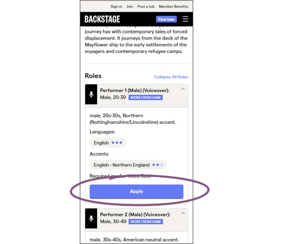
In this experiment, larger "Apply" buttons were shown on a casting detail page. The application funnel would take users through a series of steps leading to a paid membership subscription. The experiment measured initial progression and account signups (email signups).
Test #299 on
Backstage.com
by
 Stanley Zuo
May 22, 2020
Desktop
Mobile
Stanley Zuo Tested Pattern #60: Repeated Bottom Call To Action In Test #299 On Backstage.com
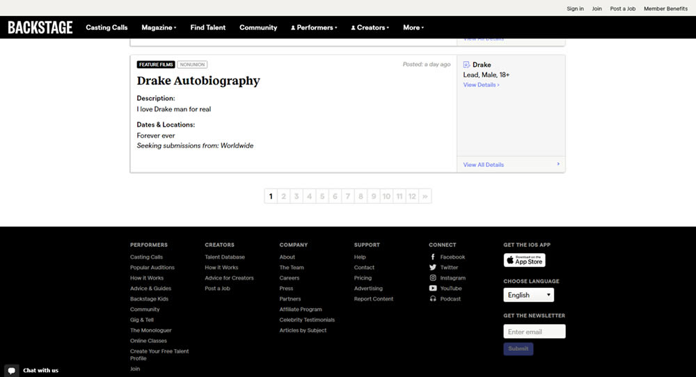
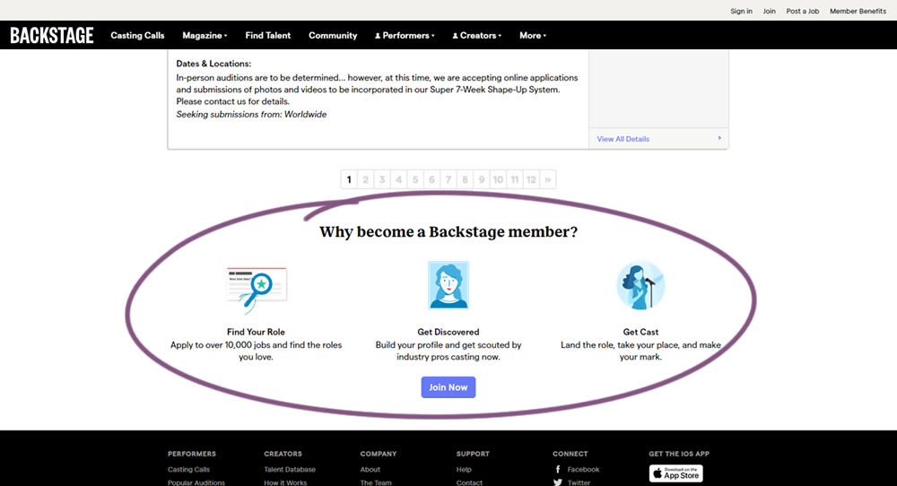
In this experiment, at the bottom of a search results screen, a membership join button was added along with 3 encouraging reasons. The experiment measured membership funnel starts, as well as paid membership transactions (sales).
Test #296 on
Backstage.com
by
 Stanley Zuo
Apr 30, 2020
Mobile
Stanley Zuo Tested Pattern #23: Inline Link Nudge In Test #296 On Backstage.com
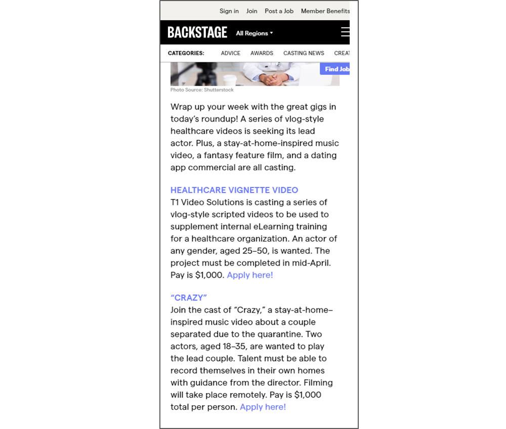
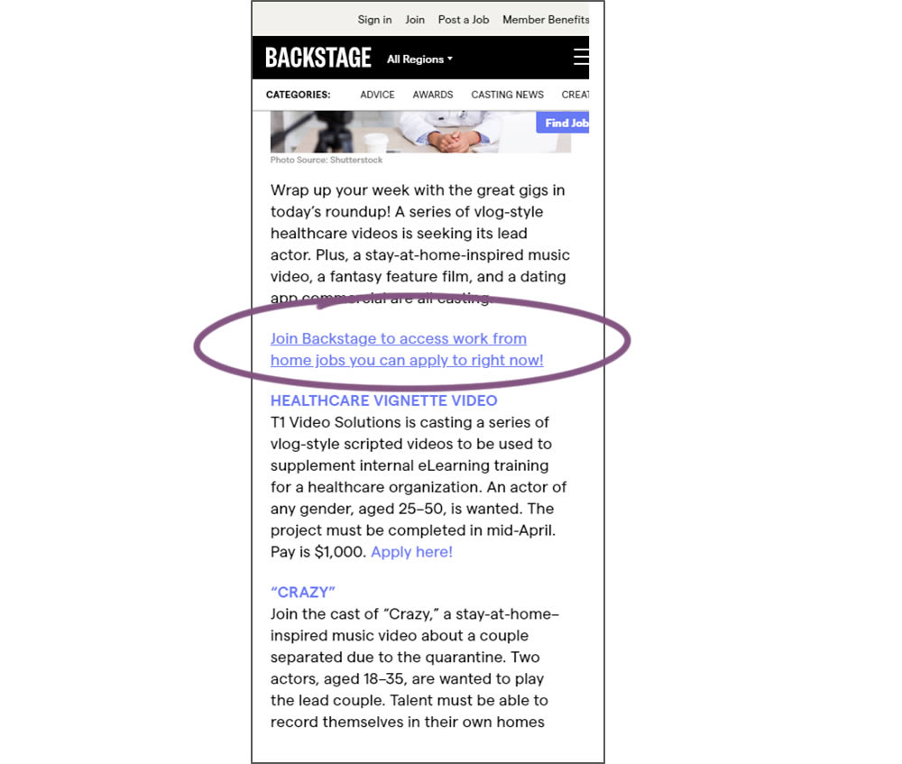
In this simple experiment, a text link to a join page was injected on an article page. The hypothesis was that more users would signup as a result of this subtle trigger.
Test #293 on
Backstage.com
by
 Stanley Zuo
Apr 14, 2020
Desktop
Mobile
Stanley Zuo Tested Pattern #114: Less Or More Visible Prices In Test #293 On Backstage.com
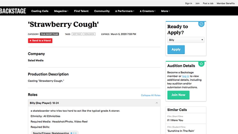
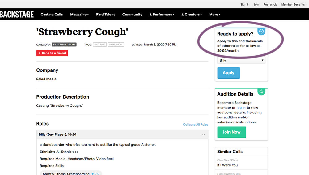
In this experiment on a casting call site, pricing information was shown beside the application button. This change shows the effect of setting a price expectation and being more clear that the application process is not free.
Test #292 on
Backstage.com
by
 Stanley Zuo
Apr 13, 2020
Desktop
Mobile
Stanley Zuo Tested Pattern #24: Visible Availability In Test #292 On Backstage.com
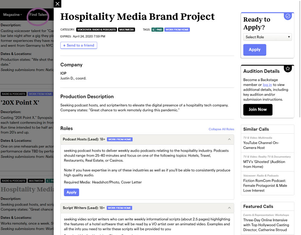
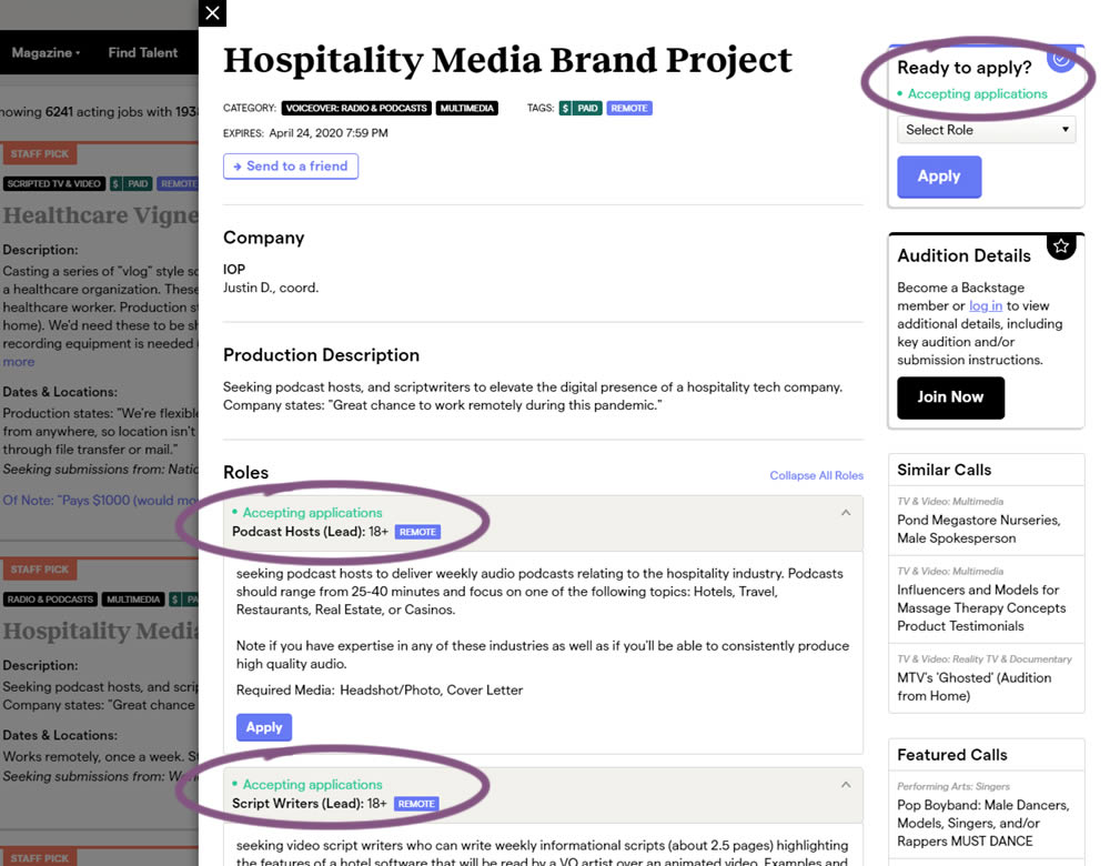
The core hypothesis of this experiment was that by showing clear availability (in green text) beside each casting call, more users would apply and become premium members. The experiment reports on two metrics: application starts (the first progression metric), and premium membership sales (measured a few steps further in the funnel).
Test #281 on
Backstage.com
by
 Stanley Zuo
Jan 31, 2020
Desktop
Stanley Zuo Tested Pattern #116: Links Or Buttons In Test #281 On Backstage.com
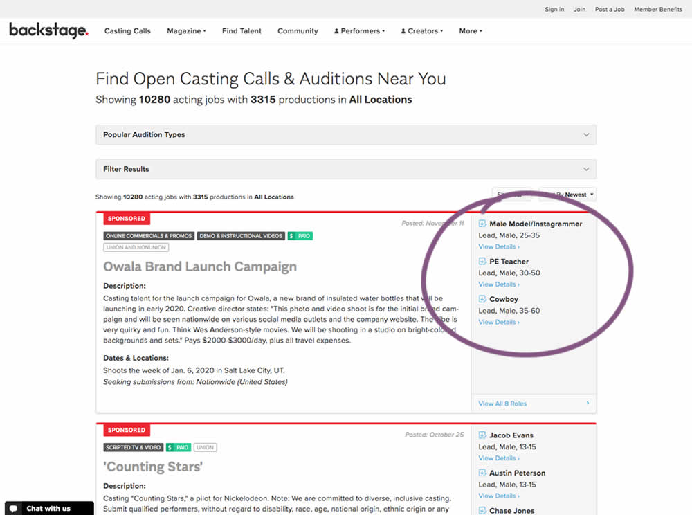
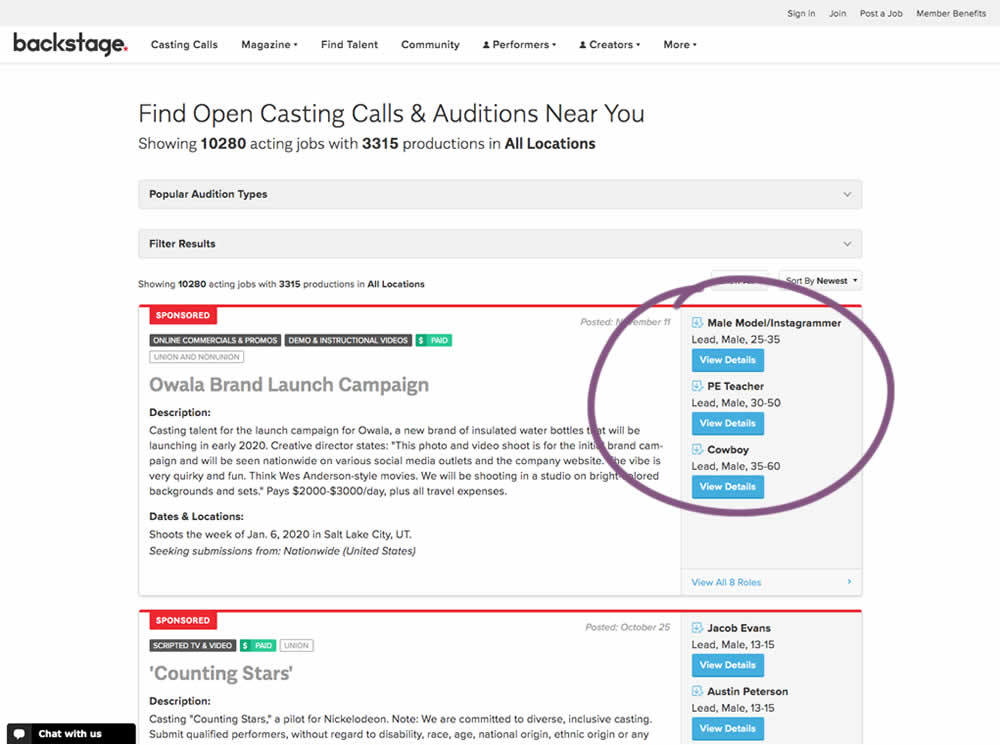
In this experiment, multiple view detail links for a listing tile were turned into higher contrast buttons.
Test #272 on
Backstage.com
by
 Stanley Zuo
Dec 03, 2019
Desktop
Stanley Zuo Tested Pattern #113: More Or Fewer Plans In Test #272 On Backstage.com
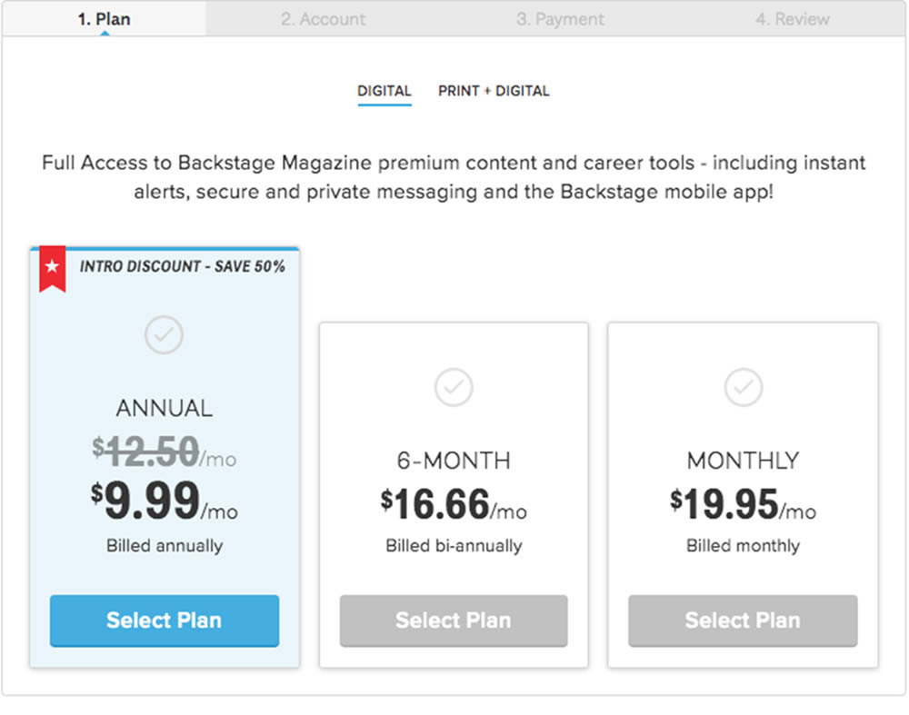
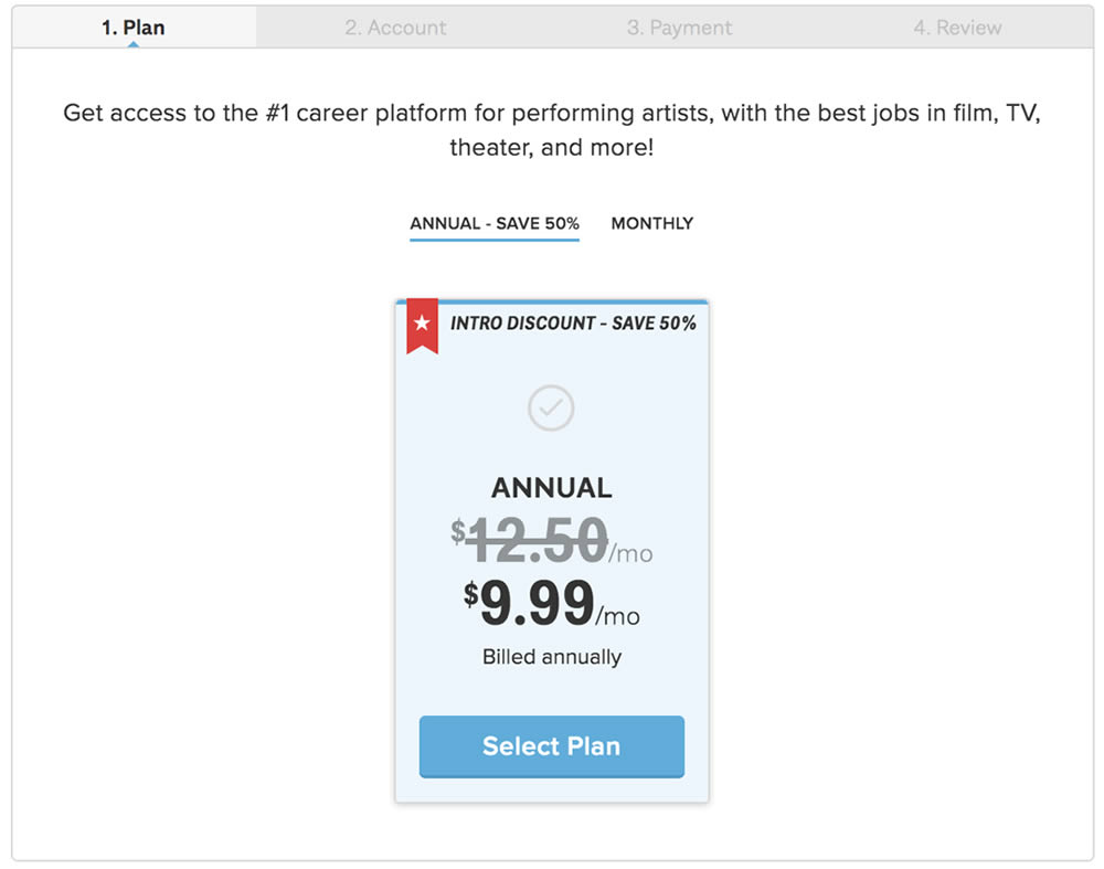
In this experiment, the three pricing plans were condensed into a single recommended plan (annual), with a secondary option to choose the monthly plan.
Test #268 on
Backstage.com
by
 Stanley Zuo
Nov 08, 2019
Mobile
Stanley Zuo Tested Pattern #14: Exposed Menu Options In Test #268 On Backstage.com
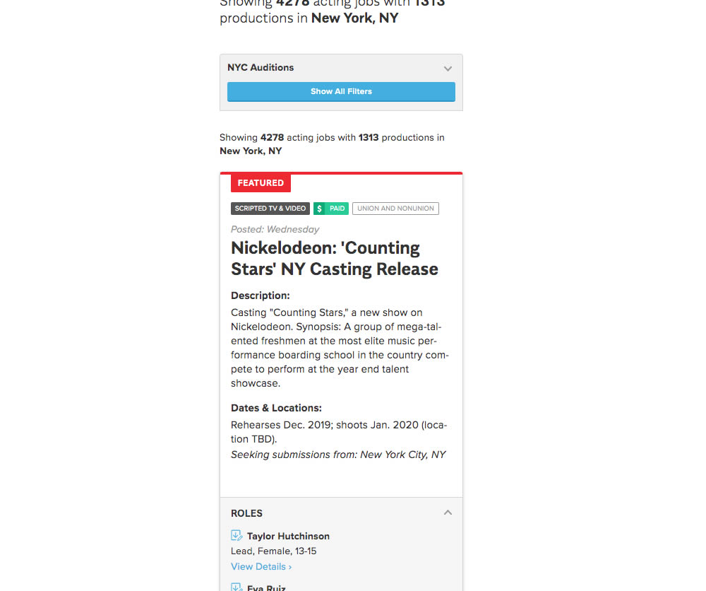
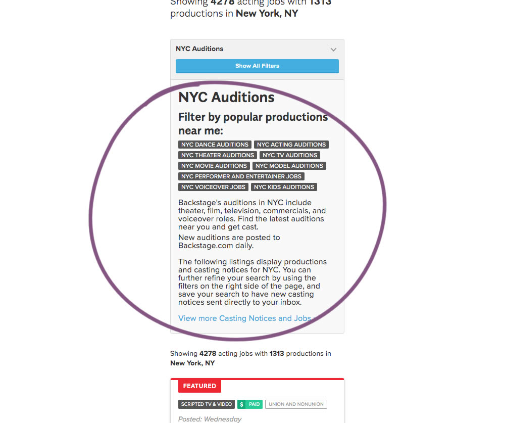
The change in this experiment was an exposed SEO panel (B) with a number of clickable filter options.
Test #267 on
Backstage.com
by
 Stanley Zuo
Nov 05, 2019
Mobile
Stanley Zuo Tested Pattern #99: Progress Bar In Test #267 On Backstage.com
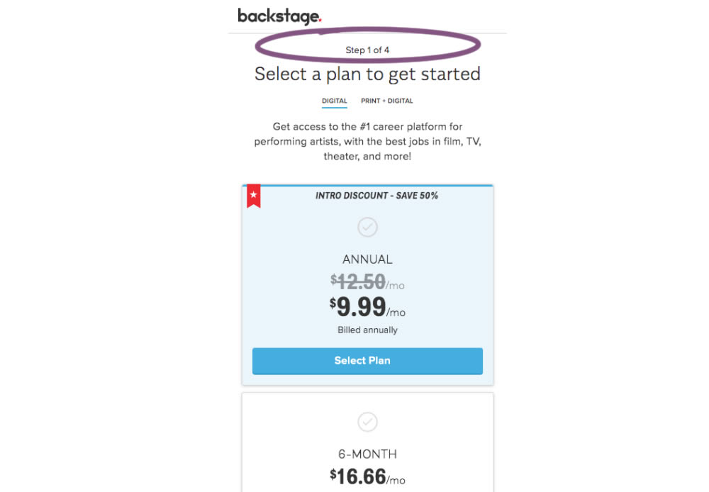
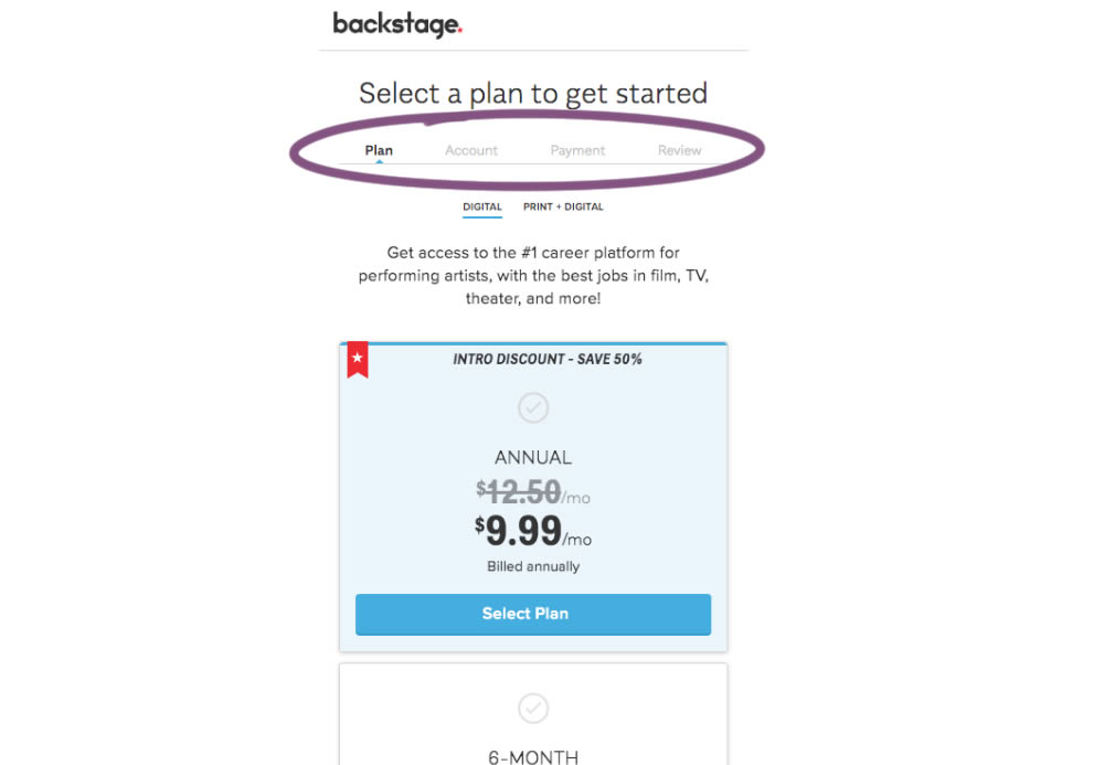
A "Step X of 4" progress bar was tested against a fully visible one that was also clickable.