4 Tests By  Marika Francisco
Tests
Test #451 on
Fluke.com
by
 Marika Francisco
Jan 25, 2023
Desktop
Marika Francisco Tested Pattern #115: Pricing Comparison Table In Test #451 On Fluke.com
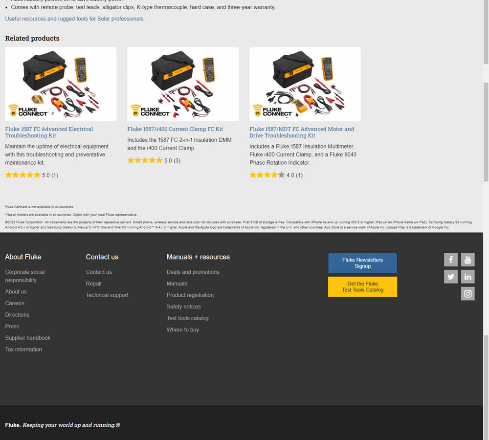
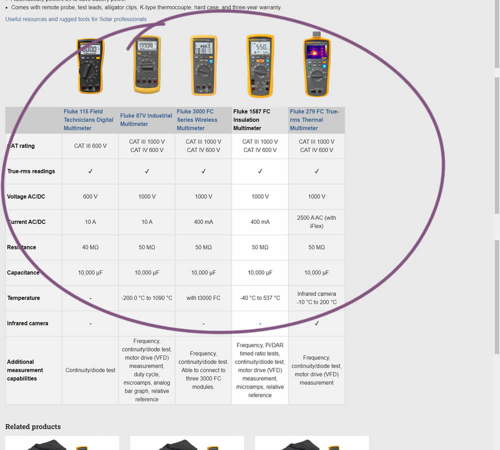
In this experiment, a product comparison table was added in the middle of a product detail page. The comparison table contained products from the same class or family of products. Clicking on the photo thumbnails also allowed customers to visit the specific detail page. Impact on adds to cart and transactions was measured.
Test #421 on
Amazon.com
by
 Marika Francisco
Jul 15, 2022
Desktop
Mobile
Marika Francisco Tested Pattern #43: Long Titles In Test #421 On Amazon.com
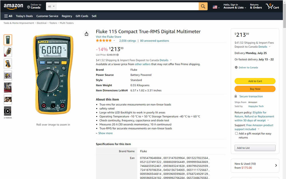
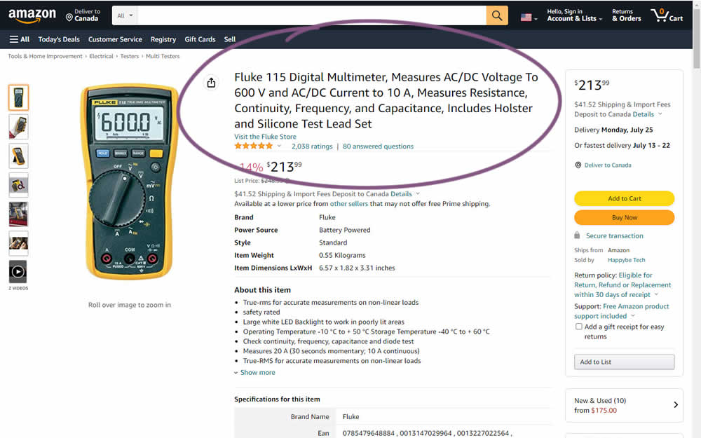
Fluke is an industrial manufacterer of measurement and calibration devices and they ran a test on their Amazon store for a series of their prodcts. Instead of using short product names, they tested longer and more descriptive ones. Impact was measured on sales.
Test #372 on
Fluke.com
by
 Marika Francisco
Aug 30, 2021
Desktop
Marika Francisco Tested Pattern #122: Zigzag Layout In Test #372 On Fluke.com
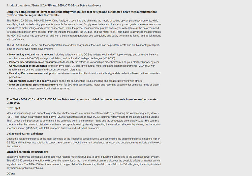

In this experiment, product descriptions were changed to an alternating zig zag layout with images. Impact on adds-to-cart and sales was measured.
Test #348 on
Flukenetworks.com
by
 Marika Francisco
Apr 22, 2021
Desktop
Marika Francisco Tested Pattern #97: Bigger Form Fields In Test #348 On Flukenetworks.com


In this simple experiment, the size of the "Get Quote" button in the top navigation was increased.