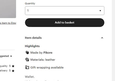
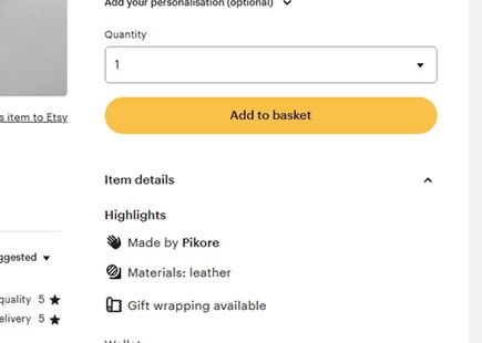
Pattern #107: Contrast Links & Buttons
Pattern #107 Tested 1 timesTested by  Julian Gaviria on Jul 30, 2019
Based on 1 Tests, Members See How Likely Version B Wins Or Loses And By How Much
Measured by the sum of negative and positive tests.
Expected Median Effects Of B
-
Progression
-
Leads
-
Signups
?
Engagement
(1 tests)
-
Sales
-
Revenue
-
Retention
-
Referrals
?
ANY PRIMARY
(1 tests)
Leaks
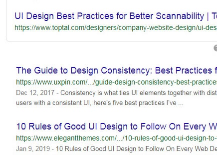
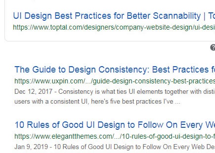
Google Has Been A/B Testing Link Colors (Again) And This Light Blue Didn't Pass
It's been a decade since it was first discovered that Google has famously tested those 41 shades of blue. Last month I discovered that they began experimenting with link colors on their search results screen - once again. This time Google tested a lighter blue with a lower contrast which turned out that they rejected (most likely due to a negative experiment result). View Leak
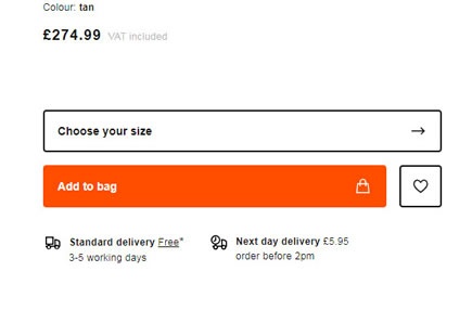
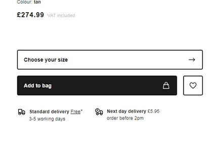
Zalando Tests Black Add-To-Cart Buttons
Zalando ran a simple experiment on their product page where they challenged their existing orange add-to-cart button against a black one. One month later, the black button was rejected even though the black one had a higher contrast ratio. [UPDATE: the outcome of the experiment was flipped with black being the eventual implementation] View Leak
For each pattern, we measure three key data points derived from related tests:
REPEATABILITY - this is a measure of how often a given pattern has generated a positive or negative effect. The higher this number, the more likely the pattern will continue to repeat.
SHALLOW MEDIAN - this is a median effect measured with low intent actions such as initiating the first step of a lengthier process
DEEP MEDIAN - this is derived from the highest intent metrics that we have for a given test such as fully completed signups or sales.
