Olark's Better Home & Landing Screen Inspired By A +16% Signups A/B Test
1 Starting Inspiration
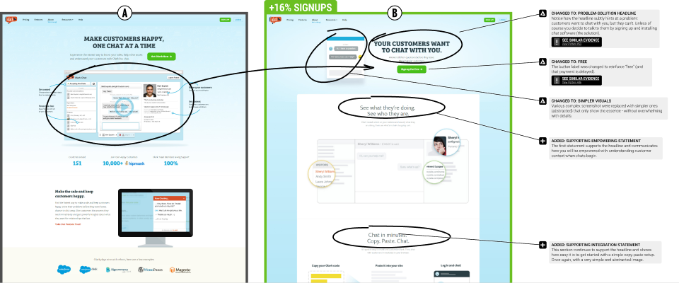
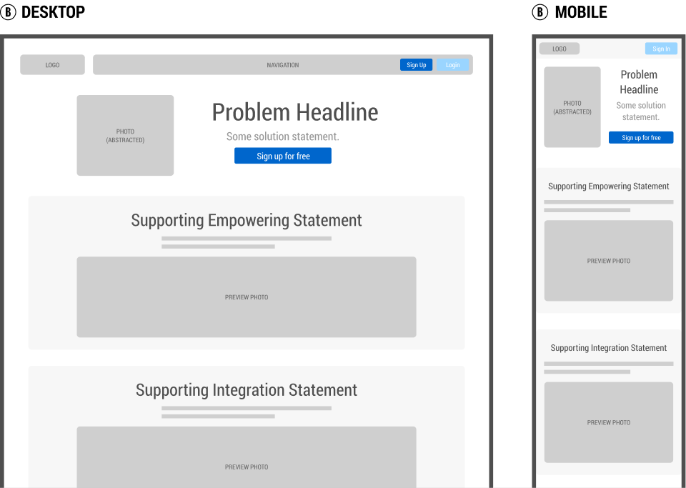
Back in 2015, Olark.com asked us to run a leap experiment on their homepage. And so we designed three variations which were then a/b tested with the aim of increasing signups. Each variation aimed to maximize gains by incorporating more drastic UI changes - some of which were supported by already tested patterns. This template has been directly inspired by the winning variation.

1 BASE TEMPLATE WITH 12 CHECKS

Obtain all of the above as a GoodUI Premium member
Get A Membership To DownloadUse This Template To Design Better When...
Use Case #1 Designing A New Screen Wireframe
This Figma template can be used when designing new UI screens from scratch. Instead of starting from a blank slate, use what has already worked for others to speed up your wireframing.
Use Case #2 Designing An A/B Test
You can also use this template when designing an experiment or a/b test. This template is based on and compatible with the GoodUI Catalyst Canvas for Figma.
Use Case #3 Reviewing An Existing Screen With Evidence-Based Checks
You can also use this template to review an existing screen with the provided annotations labeled as "Checks". Do to so, add your own notes and then hand-off to a designer.