Netflix's Better Home & Landing Screen
1 Starting Inspiration
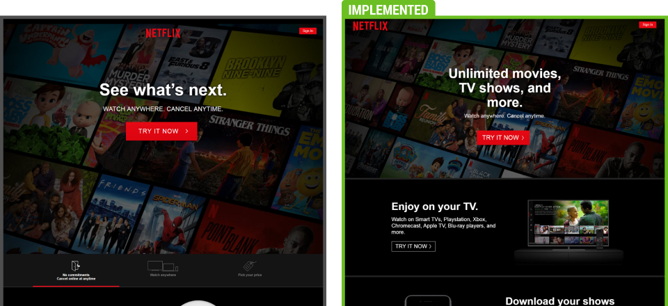
Back in 2019, Netflix quietly ran a succesful homepage layout experiment with a series of UI changes. We detected this leaked experiment along with the outcome and that's how this template came about. It contains a number of considerations based on the winning variation.

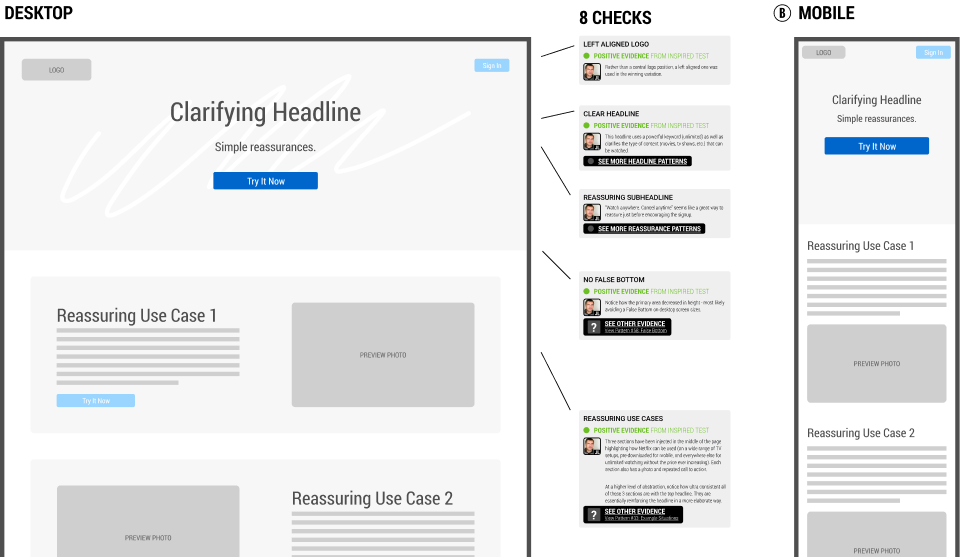
1 BASE TEMPLATE WITH 8 CHECKS

Use This Template To Design Better When...
Use Case #1 Designing A New Screen Wireframe
This Figma template can be used when designing new UI screens from scratch. Instead of starting from a blank slate, use what has already worked for others to speed up your wireframing.
Use Case #2 Designing An A/B Test
You can also use this template when designing an experiment or a/b test. This template is based on and compatible with the GoodUI Catalyst Canvas for Figma.
Use Case #3 Reviewing An Existing Screen With Evidence-Based Checks
You can also use this template to review an existing screen with the provided annotations labeled as "Checks". Do to so, add your own notes and then hand-off to a designer.