Shopping Cart Page Explorations
7 Starting Inspirations
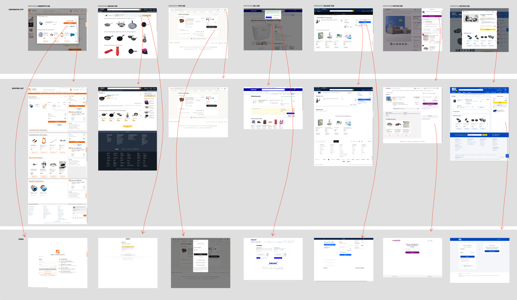
This template has been inspired by how 7 leading companies designed their shopport cart experience - starting for someone who is signed out and clicks on an "add to cart" button on a product page, until the signin screen. The companies that were analyzed here include: Home Depot, Amazon, Etsy, Bol, Walmart, Wayfair and Best Buy

8 Wireframe Explorations
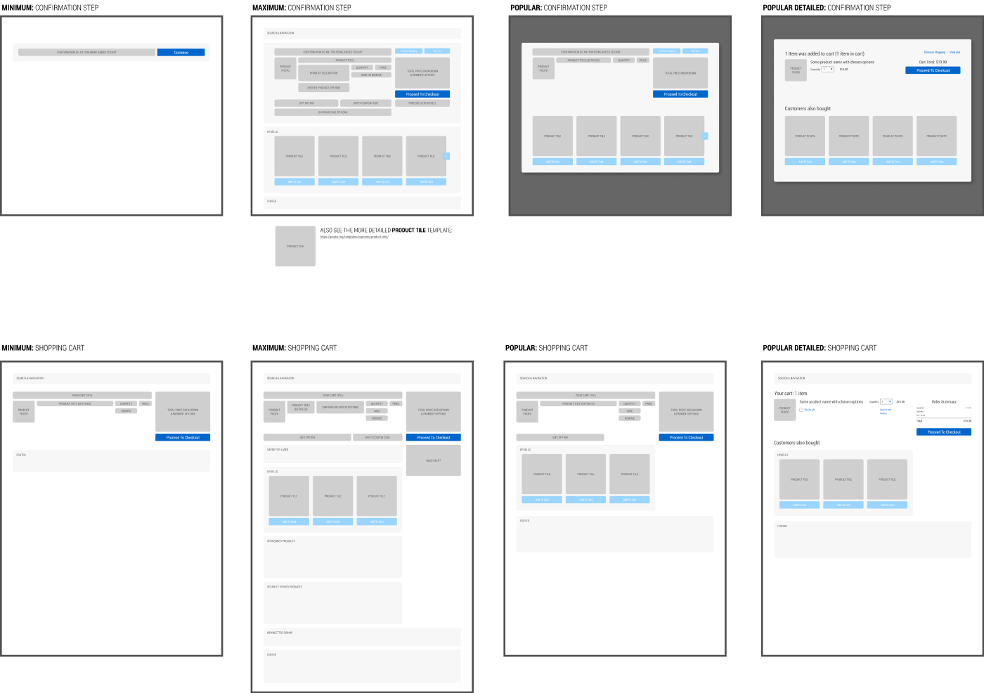
From this analysis, we have processed the UI of these 7 companies into 4 wireframe types: minimum, maximum, popular, and popular detailed for both the confirmation step and the shopping cart screen.

Obtain all of the above as a GoodUI Premium member
Get A Membership To DownloadUse This Template To Design Better When...
Use Case #1 Designing A New Screen Wireframe
This Figma template can be used when designing new UI screens from scratch. Instead of starting from a blank slate, use what has already worked for others to speed up your wireframing.
Use Case #2 Designing An A/B Test
You can also use this template when designing an experiment or a/b test. This template is based on and compatible with the GoodUI Catalyst Canvas for Figma.
Use Case #3 Reviewing An Existing Screen With Evidence-Based Checks
You can also use this template to review an existing screen with the provided annotations labeled as "Checks". Do to so, add your own notes and then hand-off to a designer.