Product Tile Explorations
6 Starting Inspirations
To create this template, we looked at how 6 leading companies designed product tiles. More specifically, for inspiration we looked at: Bol, Etsy, Airbnb, Home Depot, Bol, Booking, and Amazon.

8 Wireframe Explorations
From the above, we then designed a series of wireframe variations for you to consider. The first three explorations contain: the minimal elements, maximum elements, and a full detail version. The rest of the variations raise additional UI questions for you consideration.

20 UI Bits
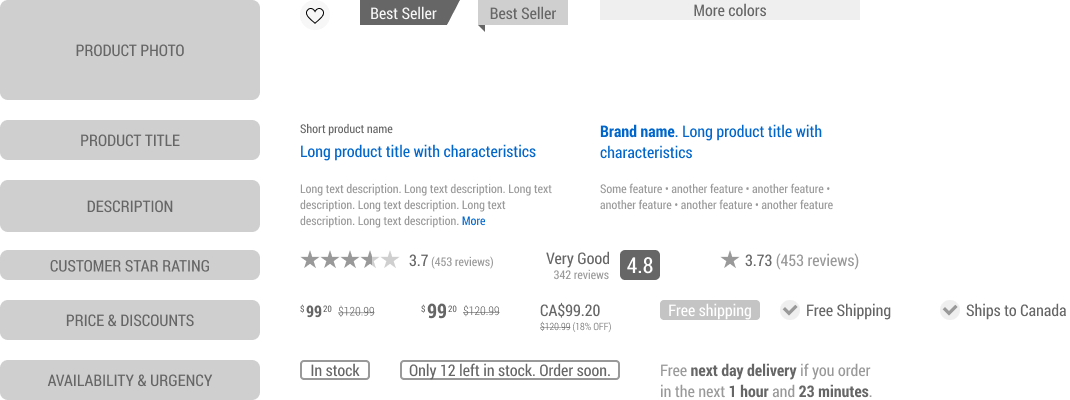
Here we also extracted the most useful specific UI element variations that can be used on your wireframes for additional detail.

Use This Template To Design Better When...
Use Case #1 Designing A New Screen Wireframe
This Figma template can be used when designing new UI screens from scratch. Instead of starting from a blank slate, use what has already worked for others to speed up your wireframing.
Use Case #2 Designing An A/B Test
You can also use this template when designing an experiment or a/b test. This template is based on and compatible with the GoodUI Catalyst Canvas for Figma.
Use Case #3 Reviewing An Existing Screen With Evidence-Based Checks
You can also use this template to review an existing screen with the provided annotations labeled as "Checks". Do to so, add your own notes and then hand-off to a designer.