Designlab's Better Online Course Landing Page Inspired By A +49% Leads A/B Test
2 Starting Inspirations
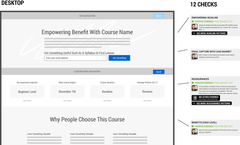
This template follows 2 successful A/B tests on Designlab's course page. The first experiment was a larger leap experiment described in a previous article. While the second followup experiment explored the idea of introducing a floating Enroll button.

2 Expert Contributors
-
 Jakub Linowski
Founder @ GoodUI
-
 Daniel Shapiro
Co-Founder @ Designlab
1 BASE TEMPLATE WITH 12 CHECKS

Obtain all of the above as a GoodUI Premium member
Get A Membership To DownloadUse This Template To Design Better When...
Use Case #1 Designing A New Screen Wireframe
This Figma template can be used when designing new UI screens from scratch. Instead of starting from a blank slate, use what has already worked for others to speed up your wireframing.
Use Case #2 Designing An A/B Test
You can also use this template when designing an experiment or a/b test. This template is based on and compatible with the GoodUI Catalyst Canvas for Figma.
Use Case #3 Reviewing An Existing Screen With Evidence-Based Checks
You can also use this template to review an existing screen with the provided annotations labeled as "Checks". Do to so, add your own notes and then hand-off to a designer.