Walmart A/B Tests Shipping Choices Vs Shipping Reassurances
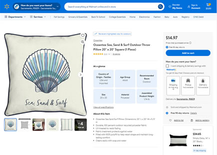
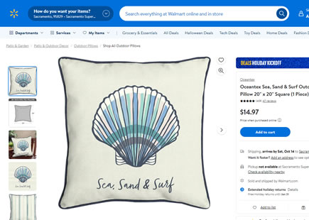
Walmart recently ran an a/b test on their product detail pages that showed shipping information in two different styles. On one hand (here shown as A) shipping options were shown as a button choice. Whereas in the variation, all shipping information was fully expanded and readable bullets. Almost two months later, it looks like the A version was rejected - a possible piece of light evidence in favor of the bulleted reassurances pattern.
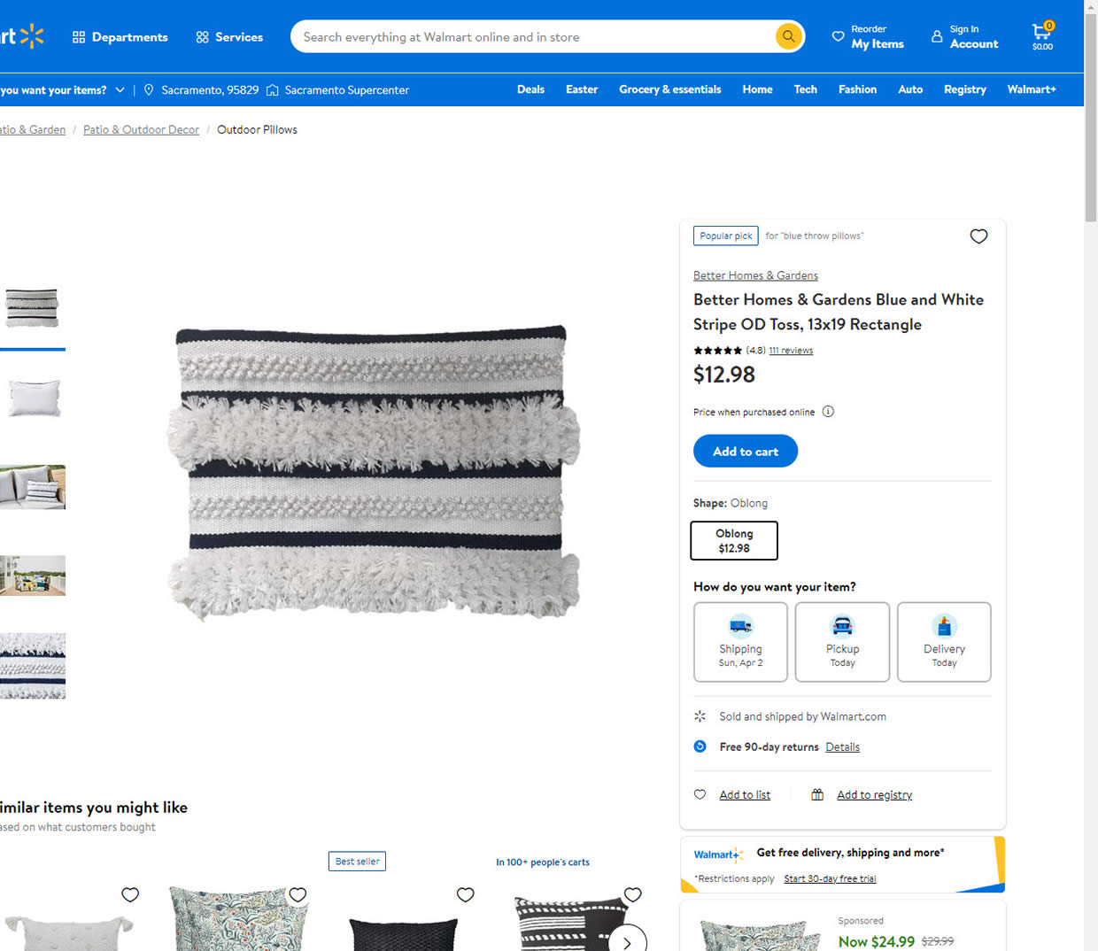
B - Mar 31, 2023 Screenshot
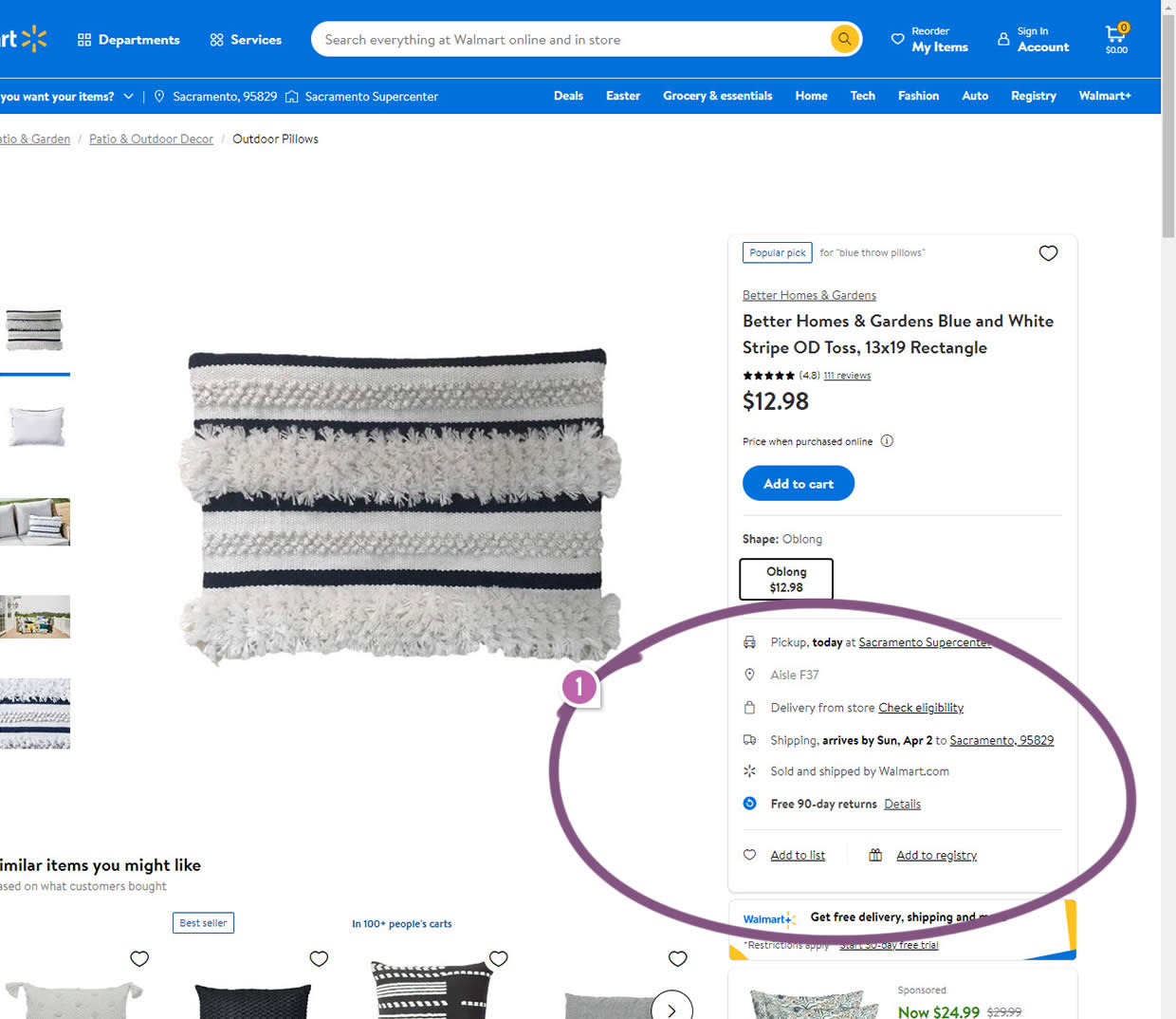
Highlighted UI Changes From This Leak
-
Choices Vs Reassurances
Here we can see the A version with 3 prominent button choices: Shipping, Pickup and Delivery under the "How do you want your item?".
In the B variation however, instead of the button choices, the information is presented as 4 additional bullets: Pickup today (at some location), aisle information, Delivery from store, and shipping arrival date (with location info).
Interestingly, the B variation actually has some more granular and specific location information (Sacramento and zip code in this case). Could this have played a role in possibly being a more effective variant? More so, some of the information like the arrival dates are also bolder in the B variant.
0.5 Repeatability has been assigned to Pattern #15: Bulleted Reassurances as evidence that it's getting better
Repeatability is a net count of evidence for or against a pattern. It’s how we can predict which patterns are better than others. :)
Comments