Walmart A/B Tests And Rolls Out This New Product Page Layout
Walmart ran this larger A/B test on their product detail pages which leaped them from a 2 column to a 3 column layout. The evolution seems inline with a similar finding that Amazon discovered a few years back (with an inverse setup). The A/B test contained at least the following 5 changes changes (described below) and seems to have been rolled out.
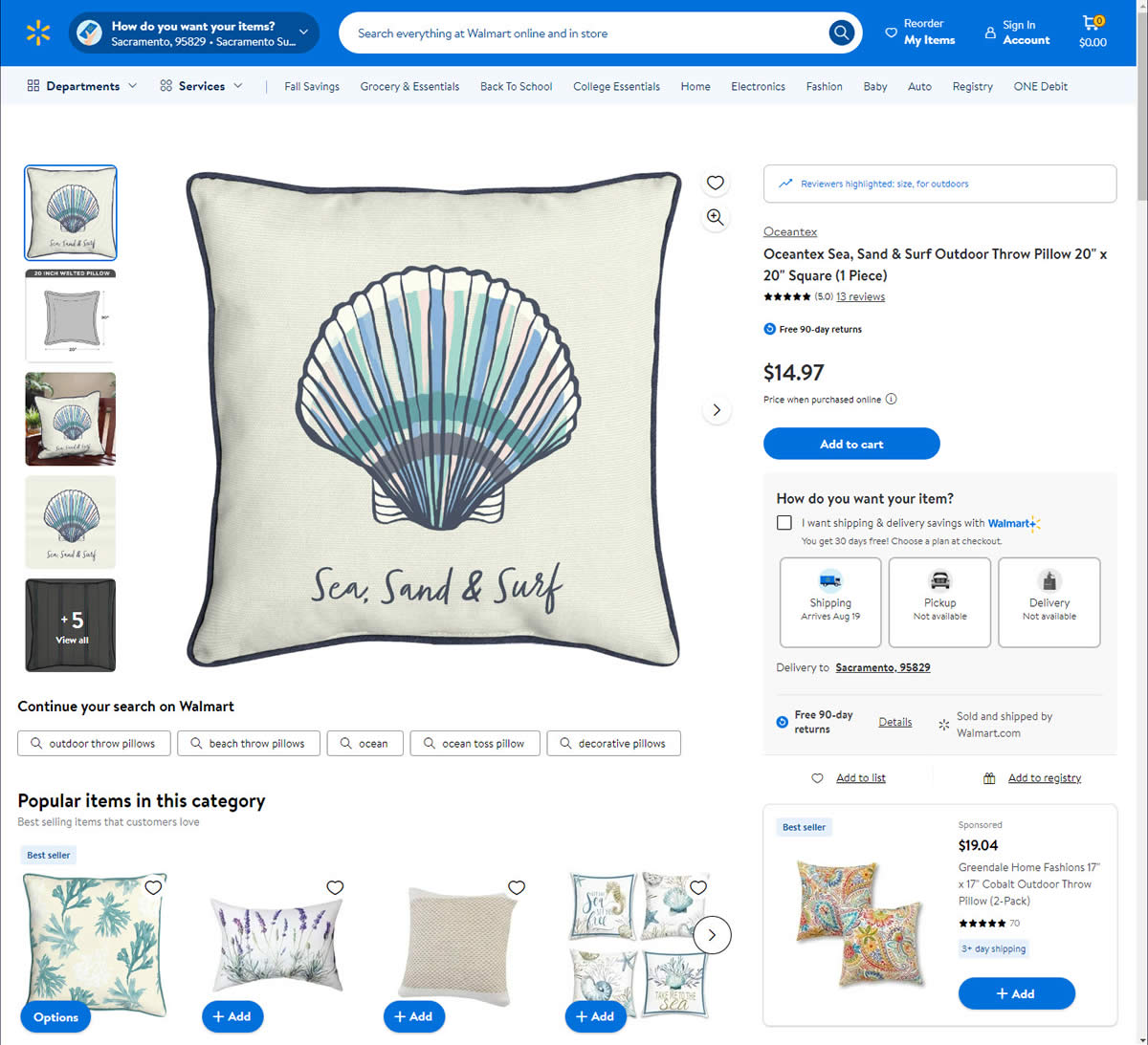
B - Aug 14, 2024 Screenshot
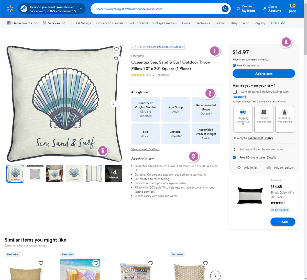
Highlighted UI Changes From This Leak
-
Centered Headline
As the layouted in the variation shifted towards a 3 column one, the product headline was the first element which visibly shifted towards the center column.
-
Visible Product Descriptions
The variation also introduced a highly visible set of product descriptions in the center space. These included: country of origin, age group, recommended room, size, material and assembled weight. This may be somewhat similar to another positive impact experiment from Amazon.
-
Bulleted Product Descriptions
The variation further reinforced additional product descriptions with the help of bulleted text
-
Multiple Buy Box (Right Column) Changes
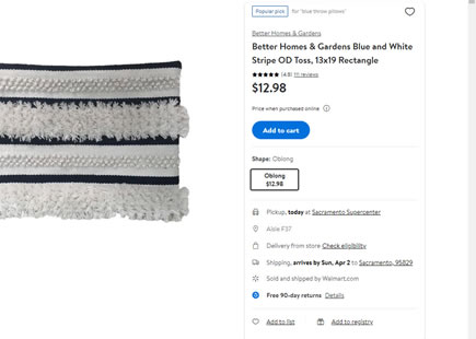
The variation also narrowed the buy box on the right, while raising it higher. This way, the product price become more visible while shifting higher up (possibly similar to this Amazon experiment). The add-to-cart button grew in size. Some of the bulleted reassurances were broken onto separate vertical lines. Add-to-list and Add to registry links joined the buy box.
This is very similar to Pattern #15: Bulleted Reassurances
This is very similar to Pattern #114: Less Or More Visible Prices
This is very similar to Pattern #97: Bigger Form Fields
-
Product Thumbnail Photos
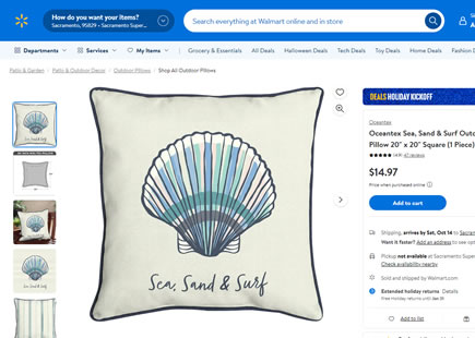
In the variation, we can also see that the product thumbnail photos shifted below the main image, decreased in size, and more of them were displayed at once (5 vs 4).
This is very similar to Pattern #126: Bottom Or Left Thumbnails
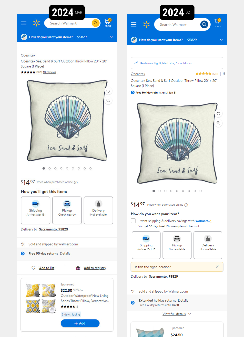
Mobile Versions
Although I was not able to detect the experiment on mobile, I can at least show the evolutionary trajectory while comparing 2024 March with October - suggesting that this was mostly a desktop expeirment.

Comments