Discover UI Design Decisions Of Leading Companies,
From Leaked Screenshots & A/B Tests.
Showing 112 results
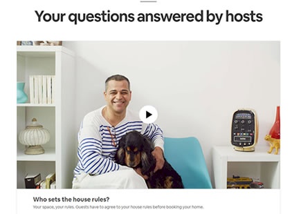
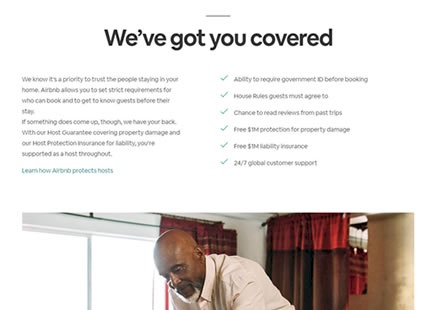
Airbnb A/B Tested And Dropped Its Videos On The Host Signup Page
Videos are usually considered a popular growth tactic that people believe will improve conversion or signup rates. Hence I find it really interesting that Airbnb A/B tested a series of videos on their host signup landing page and then rejected them altogether. So why where these video removed? View Leak
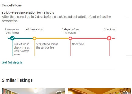
Are Visible Cancellation Graphs Too Much - As Airbnb Learned In Their Failed Experiment?
Some months ago Airbnb ran this experiment where they exposed a beautifully designed cancellation graph. The graph showed a series of refund scenarios someone might be eligible for relatively to the check-in date (usually shrinking over time). Fast track into the future and there is no more sign of this variant as it returned into its collapsed state hiding from view. View Leak
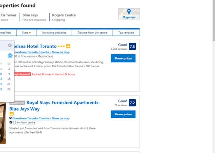
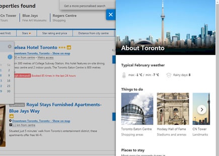
One Modal Too Far: Booking's Rejected Destination Overlay Experiment
Booking.com really likes to use popups, overlays and nudges of various shapes and sizes. Hey why don't you sign in? Why don't you pick your travel dates? Look, someone is about to rent out the room you're looking at. One of their recent destination listing experiments however hints that a particular modal was simply too much when it was eventually rejected. View Leak
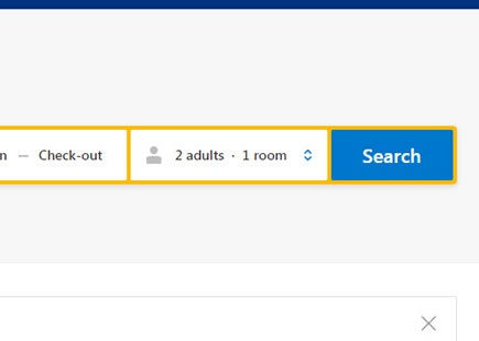
Booking A/B Tested 3 Search Bars Challenging The Fewer Form Fields Pattern
I've been watching this Booking experiment closely ever since sharing a very similar concept some months ago. Their homepage was openly challenged with the UI hypothesis of exposing a "room quantity" field right in the search bar (instead of hiding it in a pulldown menu). And their team took the initiative to run a test. Based on the observed outcome and roll out decision it turns out that the UI concept was better than their control. View Leak
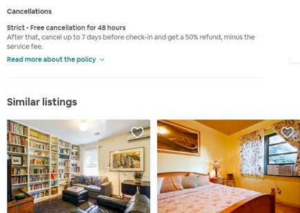
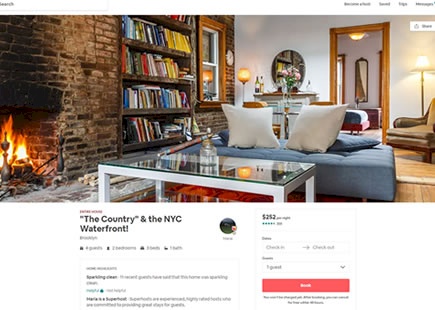
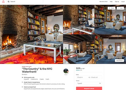
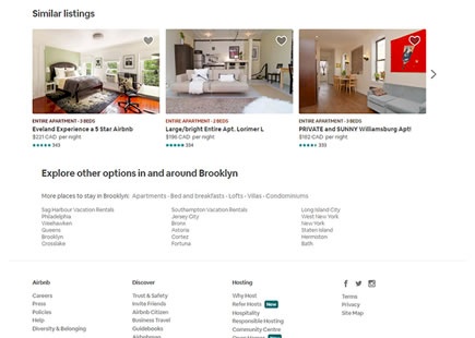
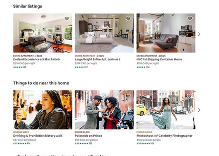
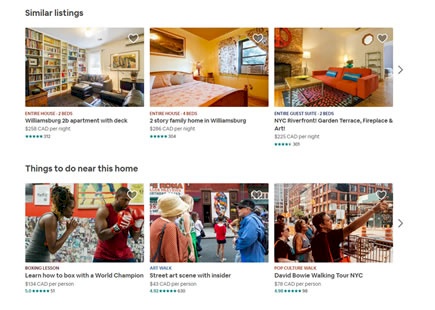
Airbnb Made 3 Changes To Their Property Page
Based on two screenshots from 2018 and 2019, we noticed at least three interesting ways in how the property screen of Airbnb continues to evolve. Here are the changes we found: View Leak
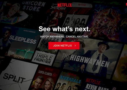
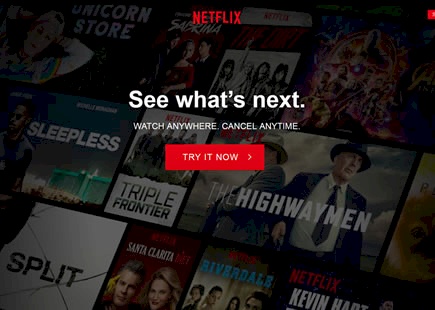
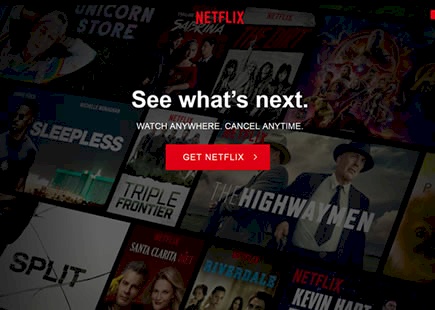
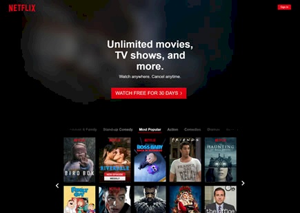
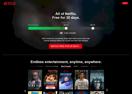
Netflix A/B Tested These 4 Button Labels With "Try It Now" Possibly Leading
Netflix has just finished testing at least four interesting button labels on their homepage. Since one of them looks like it has been implemented, we just might be able to make a few subtle comparisons which I'll attempt to capture in this leak. Of course, given the fact that we're just scratching the surface of this experiment, please take this analysis as highly hypothetical (ripe for further experimentation). View Leak
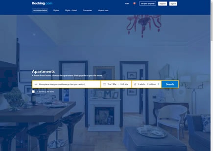
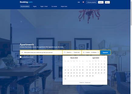
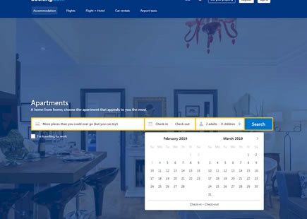
Booking A/B Tested And Rolled Out An Expanded Calendar Control
This leaked experiment captures a very simple and isolated change on Booking's apartment landing page. The tested change was the automatic exposure of the calendar menu instead of keeping it collapsed (requiring an extra click to open the date picker). A few weeks later, the experiment was observed to have been completed with the exposed calendar version (B) as implemented. View Leak
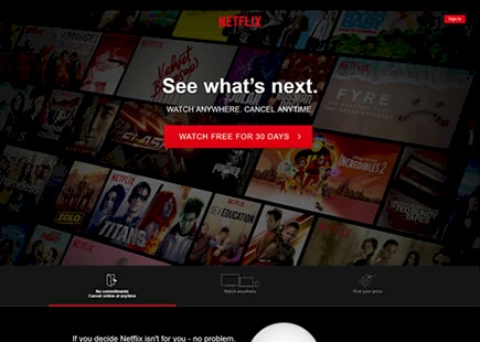
Netflix Rejected All These Tested Homepage Variations - Perhaps This One Will Help?
Netflix has been yet again noticed experimenting with a range of variations on their homepage - all of which yet again seem to have been rejected as before. Below is the leaked experiment with its key changes, the decision, as well as our own followup experiment recommendation (if we had the privilege of doing so). View Leak
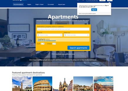
Booking.com A/B Tested Single Vs. Multiple Line Search Forms
It's now clear that Booking ran somewhat of a larger leap experiment of two very diverse search layouts on their Apartments landing page. I'm glad we discovered this one as we now know for sure their awesome team doesn't only run microscopic single change experiments. View Leak
Etsy A/B Tested And Implemented Related Products Thumbnails
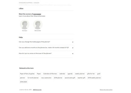
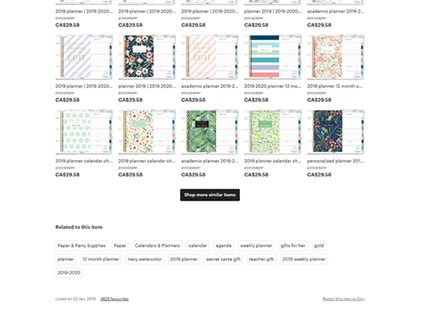
Showing related products might be considered popular practice by now. If a customer doesn't feel that a given product is exactly what they are looking for, somewhere at the bottom of a page they might get nudged with other hopefully relevant product options. View Leak
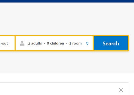
Booking.com A/B Tested And Exposed Incremental UI Controls
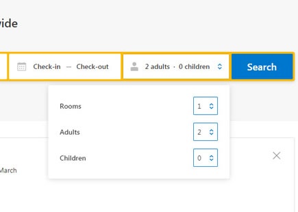
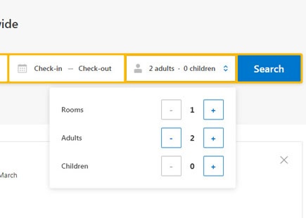
I especially like this particular leak because there is a slight possibility I might have actually inspired Booking to a/b test it - how cool is that? In late November of 2018 I shared some search concepts, one of which suggested incremental UI controls for Booking's guest selector. View Leak
Airbnb Added More Search Cues
In this leak, three Airbnb property page screenshots with different time frames have been compared. Having done this, it became clear that at least one design decision was made near the bottom of the screen - further confirmed by the final screenshot. View Leak
