Discover UI Design Decisions Of Leading Companies,
From Leaked Screenshots & A/B Tests.
Showing 112 results
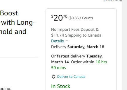
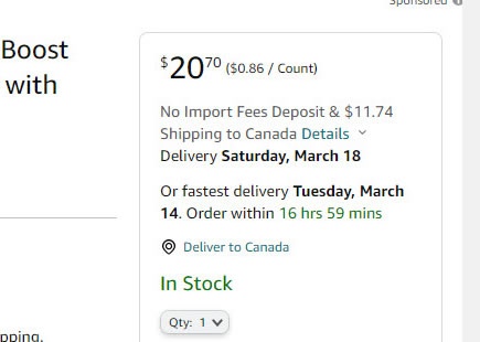
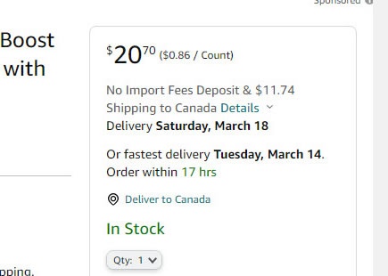
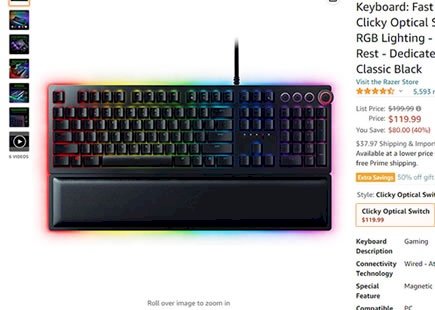
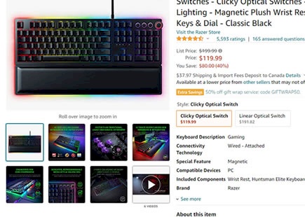
Amazon A/B Tests Wider Buy Boxes On Their Product Pages
Amazon was noticed A/B/C testing at least 2 wider buy box variations on multiple product detail pages. This was an interesting "intensity" experiment where the same hypothesis (related to layout column widths) was varied with 2 intensities. View Leak
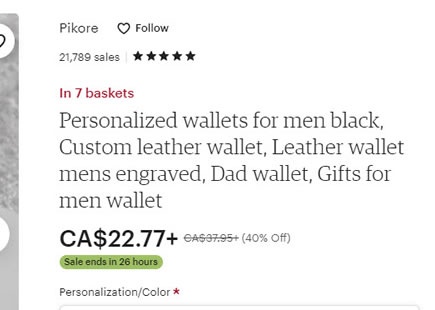
Etsy A/B Tests "In X Carts" Social Proof Message
Etsy has been a/b testing a simple and common social proof element on some of their product pages. They showed how many users have recently added an item in their shopping carts. View Leak
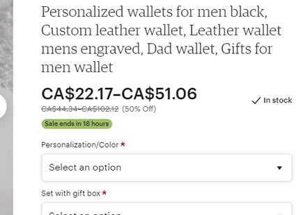
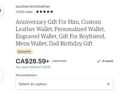
Etsy Discovers That Showing Price Ranges Might Be Inferior
Perhaps this little and rejected a/b test by Etsy might teach us something about price formatting. Sometime in August of 2022 I noticed that some of Etsy's product pages showed price ranges. In other words, prices were showing both low and high end prices for products with customizable options. View Leak
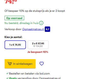
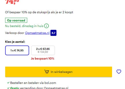
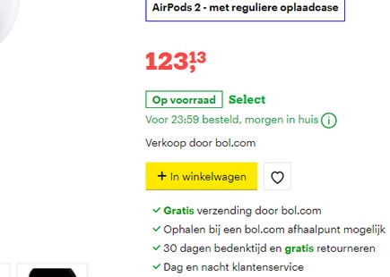
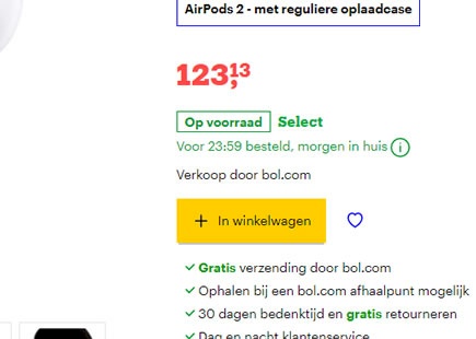
Bol A/B Tests A Bigger Add-To-Cart Button That Is Rejected
After detecting some success with a more padded button, Bol continued their a/b test iteration. The Dutch online retailer ran an experiment with an even wider add-to-cart button on their product pages. View Leak
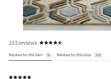
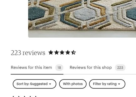
Etsy Rejects Additional Customer Review Filters After This A/B Test
Etsy ran this a/b test where they showed additional customer review filters on selected product detail pages. The test was eventually rejected it seems. View Leak
Amazon A/B Tests Bottom Aligned Product Thumbnails
Amazon attempted an image thumbnail experiment on their product pages. Instead using traditional left aligned thumbnails, they shifted them below the main image and increased their size. This is very similar to the left vs bottom thumbnail pattern we started tracking this year. View Leak
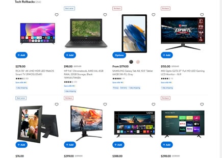
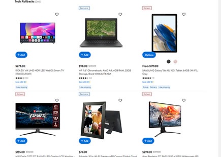
Walmart A/B Tests 4 vs 3 Column Listing Pages
Walmart just ran their very own 4 vs 3 column experiment on some of their listing pages. The a/b test seems to have had a similar hypothesis about product tile density to what Etsy ran just a few months ago. View Leak
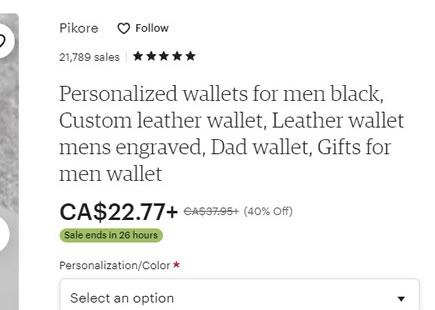
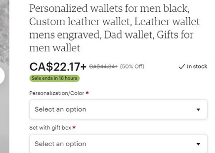
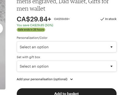
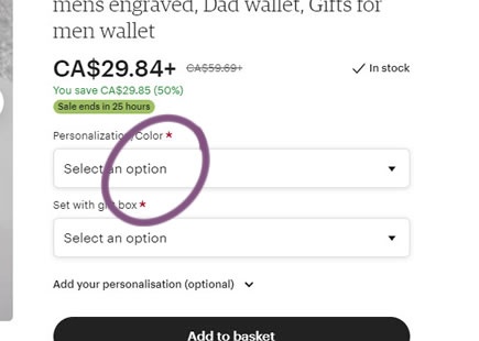
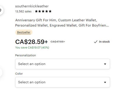
Etsy A/B Tests And Implements Required Field Labels
Here is a very tiny a/b test from Etsy - the marking of two product personalization fields as required using red asterisks. If I had to guess, I'd expect the effect on checkouts was probably very small if any (based on the pattern data so far). View Leak
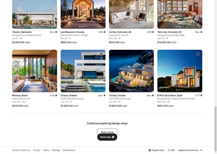
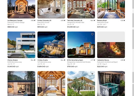
Airbnb Retests The Infamous Infinite Scroll
I believe Airbnb just a/b tested infinite scrolling and rolled it out. Sometime this year they evolved their homepage to include specific property listings. As these property tiles appeared, a month ago I also managed to capture a screenshot of two versions of their homepage: one with 40 results per page that would load more listings with a "Show More" button; and another version with an endless or infinite scroll. View Leak
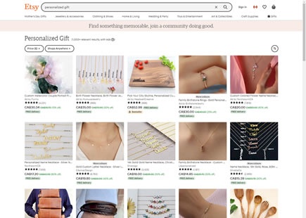
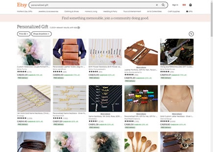
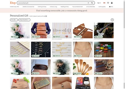
Etsy A/B Tests 5 Vs 4 Listing Tiles
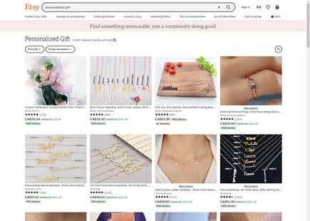
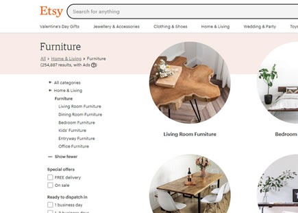
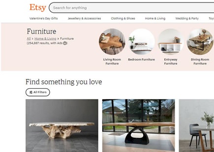
Etsy continues to run interesting and highly isolated layout experiments on their product listing pages. This time around they tested 5 product tiles per row against 4 tiles. View Leak
Walmart A/B Tests Popular Product Tags
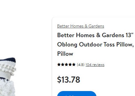
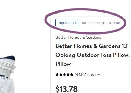
Walmart was noticed running a product detail page experiment with an added "popular picks" badge. The badges were added to some products based on some undecipherable logic. Other products would also sometimes show "best seller" badges, including being shown together. View Leak
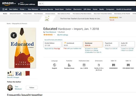
Amazon A/B Tests And Rolls Out Extra Product Information On Book Pages
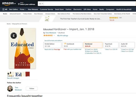
Amazon ran an experiment where they showed additional product information on books. This included such structured information as: language, publisher, publication date, dimensions, etc. View Leak
Etsy Runs An A/B Test Suggesting That Less Isn't Necessarily More
This interesting experiment was discovered a month ago on Etsy's product listing screens. In a nutshell, more traditional and elaborate product tiles was aggressively shortened by removing a lot of information such as product names and customer reviews. This had the additional effect of shortening the tested listing pages. One more later, the experiment looks like it was rejected - hinting that less is not always more. :) View Leak
Etsy A/B Tests Extra Product Collections
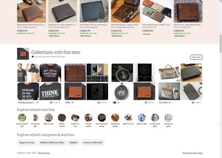
Etsy just completed a simple product page experiment. At the bottom of most of their product pages extra products were appended in the form of visual collections. View Leak
Etsy A/B/C Tests The Left Column Vs Overlay Filters On Listing Pages
Etsy ran an interesting filter experiment on their listing pages. The control's exposed filters on the left column were collapsed in two variations and made visible with the use of an overlay. One variation collapsed the filters completely while another added an extra layer of horizontal categories. View Leak
Amazon Discovers A Better Product Option Selector In This A/B Test
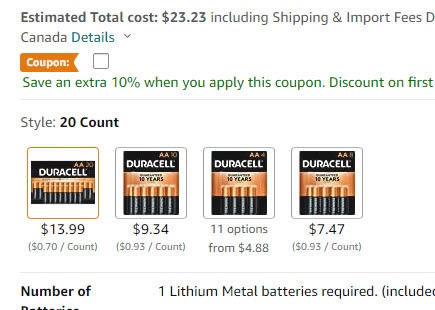
Amazon has been experimenting with different formatting of product choice selections. Think of books being customized as hardcover, audio or paperback. Think of product quantities and colors. I've been observing Amazon run a sequence of such similar tests over the last few months and here is one such experiment with at least 3 properties that now have been implemented - hinting at higher optimality. View Leak
Bol A/B Tested A More Padded Button
Last year I captured this button experiment from Bol (a leading online retailer in the Netherlands). They tested a smaller button with less padding against a slightly more bloated one. It's now clear that the variation was rolled out completely - consistent with the bigger form fields and buttons pattern. View Leak
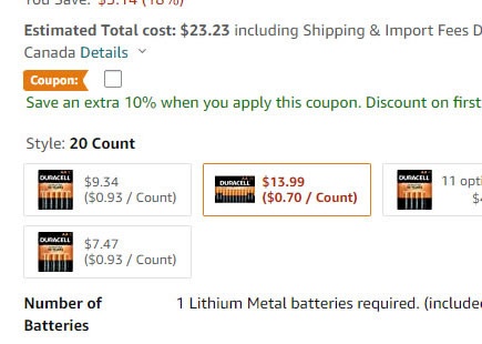
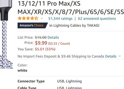
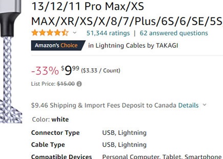
Amazon A/B Tested This Bigger Price Style
I managed to capture this exciting little big price styling experiment from Amazon before it wrapped up this week. What looks like a small change actually has a few interesting differences packed into a single variation which you can see below. View Leak
Etsy A/B Tests Smaller & Shorter Product Titles
Etsy just ran a simple little experiment that changed their product titles into smaller and truncated ones. The outcome looks like it has been rejected so something didn't work out here. View Leak
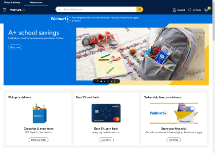
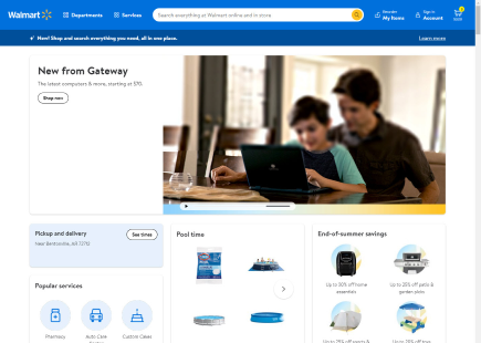
Walmart A/B Tested This Winning Homepage
Walmart a/b tested a new version of their homepage which I managed to capture screenshots of. Generally speaking, the new variation is basically longer with more types of products, more results, and a greater distinction between products and categories. After waiting a few weeks, we can also confirm that the new version was implemented - suggesting a possible improvement. View Leak
