One Possible Reason Why Etsy's Floating Buy Box UI Was Rejected
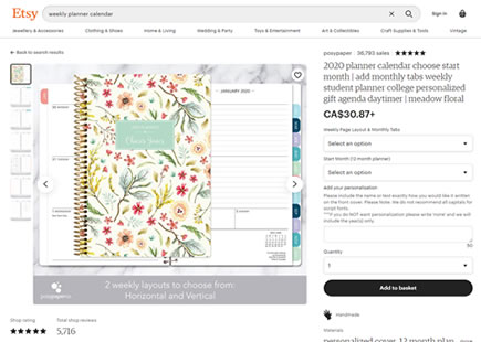
Etsy recently ran an experiment were they floated their buy box on product detail pages. It's a pattern with a pretty good track record of delivering positive results across past experiments. But as many patterns, it doesn't always win. And in Etsy's case, two months after first detecting their experiment, it also seems that they might have rejected their variation - hinting at a superior control. If that's the case, here is at least one thought as to why the variation wasn't yet accepted - notice the 2nd change related to the layout shift.

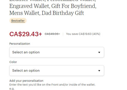
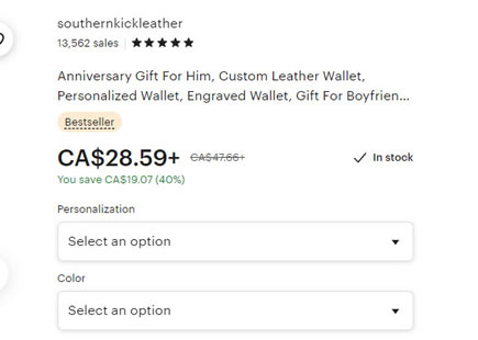
B - Aug 3, 2023 Screenshot

Highlighted UI Changes From This Leak
-
Floating Or Sticky Buy
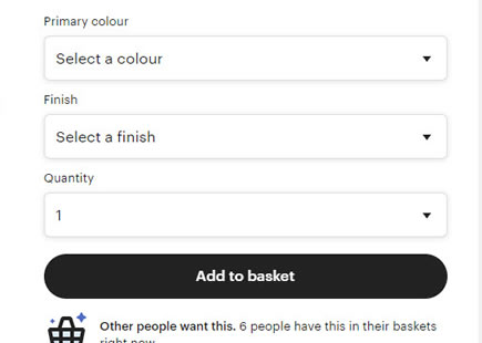
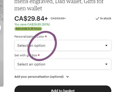
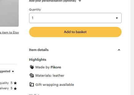
A classic implementation of a floating buy box. In the variation we can see an initial buy box state with all the fields visible. As users would scroll down however, the buy box would collapse into a minimal state that stuck around until the wider column at the bottom ("More from this shop" section).
-0.5 Repeatability has been assigned to Pattern #41: Sticky Call To Action as evidence that it's getting worse
Repeatability is a net count of evidence for or against a pattern. It’s how we can predict which patterns are better than others. :)
-
Shifted Layout With Lowered Delivery And Product Information
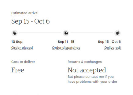
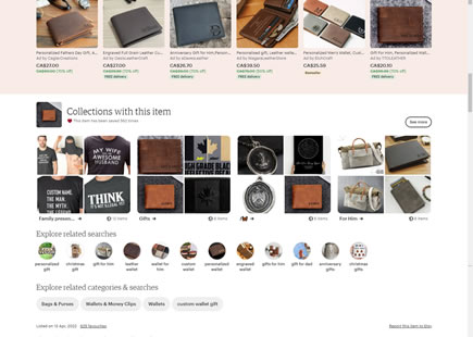
In the control we see product material details and delivery information higher up, right under the buy box. In the variation however, all this information shifted further downward beyond customer reviews. This was done in order to provide the buy box with vertical space to move freely. This I think might have been a mistake that hurt the experiment.
Previously, we have observed that Amazon implemented a variation with additional product details higher up on their page. We also published many positive experiments that communicate to users how soon they may receive a product. In Etsy's case this type of information was de-emphasized as it was pushed downwards.
If we were to redesign and rerun an iteration of this experiment, I'd recommend to find a way and incorporate the floating behaviour without confounding with potentially negative product detail or layout changes.
I think it's worth going back to the drawing board on this one.
This is very similar to Pattern #62: Urgent Next Day Delivery

Comments