Netflix A/B Tests 4 Secondary Choices - All Of Which Get Rejected
In this experiment, Netflix displayed secondary buttons in at least 4 different ways. The idea might have been related to something written about by Online Dialogue - what Bart Schutz calls Hobson's +1 Choice Effect. Instead of inviting a single call to action, secondary actions such as "learn more" or "add to favorites" are shown as well. The closest patterns of our own that might be related to this include Shortcut Buttons, Gradual Reassurance and More Results. I think it's a really interesting experiment design which shows how their engineering team tried to cover a similar idea from a number of angles. Nevertheless, a few months down the road this experiment looks like it was rejected.
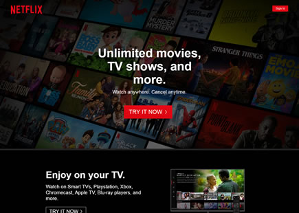
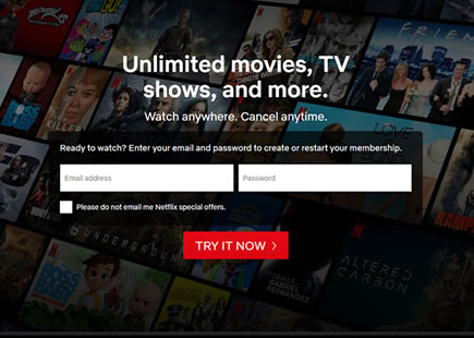
A - Oct 31, 2019 Screenshot
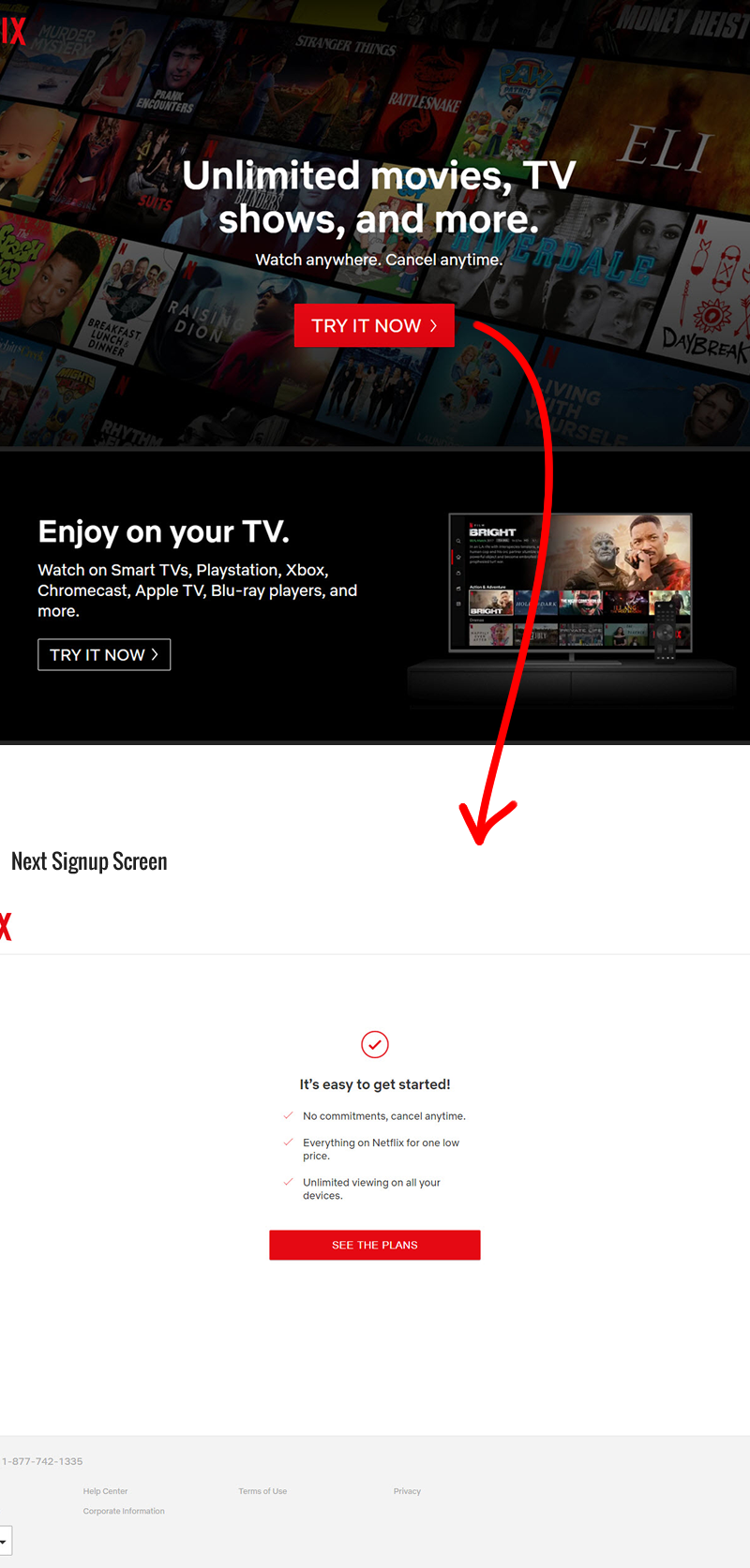
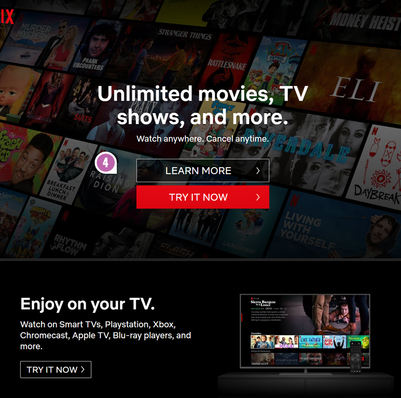
Highlighted UI Changes From This Leak
-
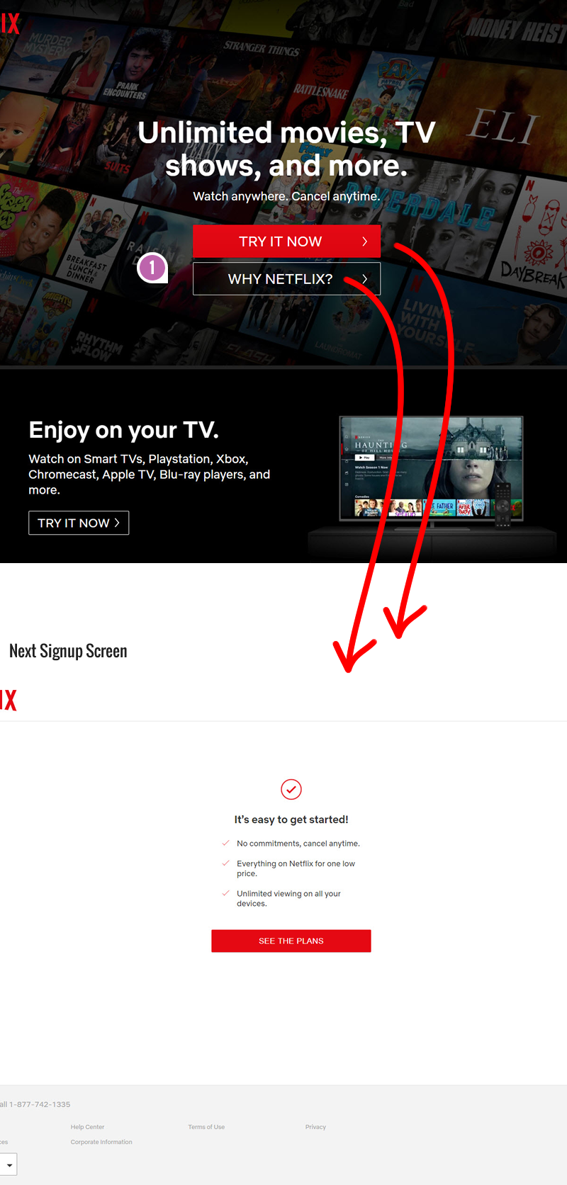
Secondary: Why Netflix (Artificial Choice)
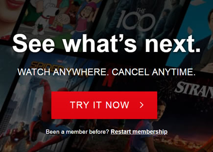
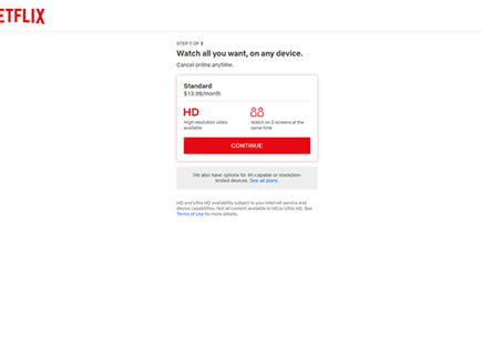
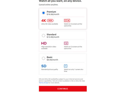
In this variation, the second button "Why Netflix" has been added below the primary one which simply acted as a duplicate link to the next signup screen. Given that both buttons link to the same screen, we can call this button somewhat of an artificial one. :)
-
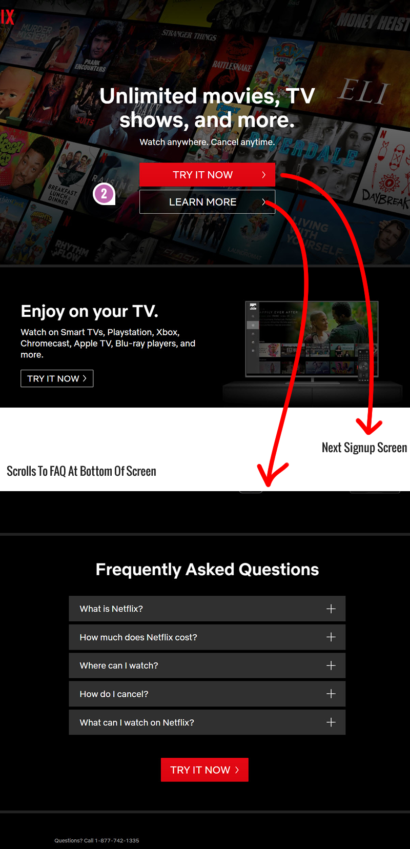
Secondary: Learn More
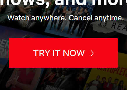
In the C variation, the secondary button "Learn More" linked further down to the bottom of the screen with a FAQ section.
-
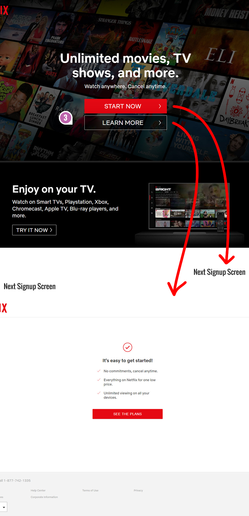
Secondary: Learn More (Artificial Choice)
The D variation was the same as C, except the "Learn More" button linked to the next signup screen (same as the primary button).
-
Secondary Button Above The Primary One
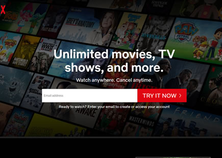
Finally, in the E variation, the secondary "Learn More" button was simply positioned above the primary signup one.
Comments
Ronny Kohavi 3 years ago ↑1↓0
See single option aversion https://www.jstor.org/stable/10.1086/671343 (PDF at http://web.missouri.edu/~segerti/capstone/SingleOptionAversion.pdf)
Reply