Netflix A/B Tested These 4 Button Labels With "Try It Now" Possibly Leading
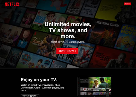
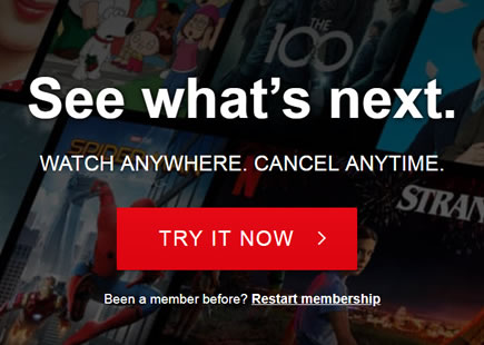
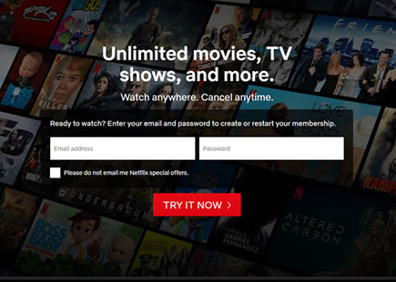
Netflix has just finished testing at least four interesting button labels on their homepage. Since one of them looks like it has been implemented, we just might be able to make a few subtle comparisons which I'll attempt to capture in this leak. Of course, given the fact that we're just scratching the surface of this experiment, please take this analysis as highly hypothetical (ripe for further experimentation).
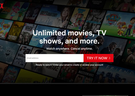
UPDATE May 6, 2019: It seems like version C might have been served to all traffic (a slightly different outcome than originally observed).
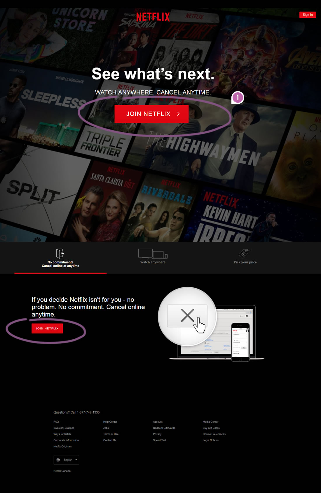

C - Apr 15, 2019 Screenshot
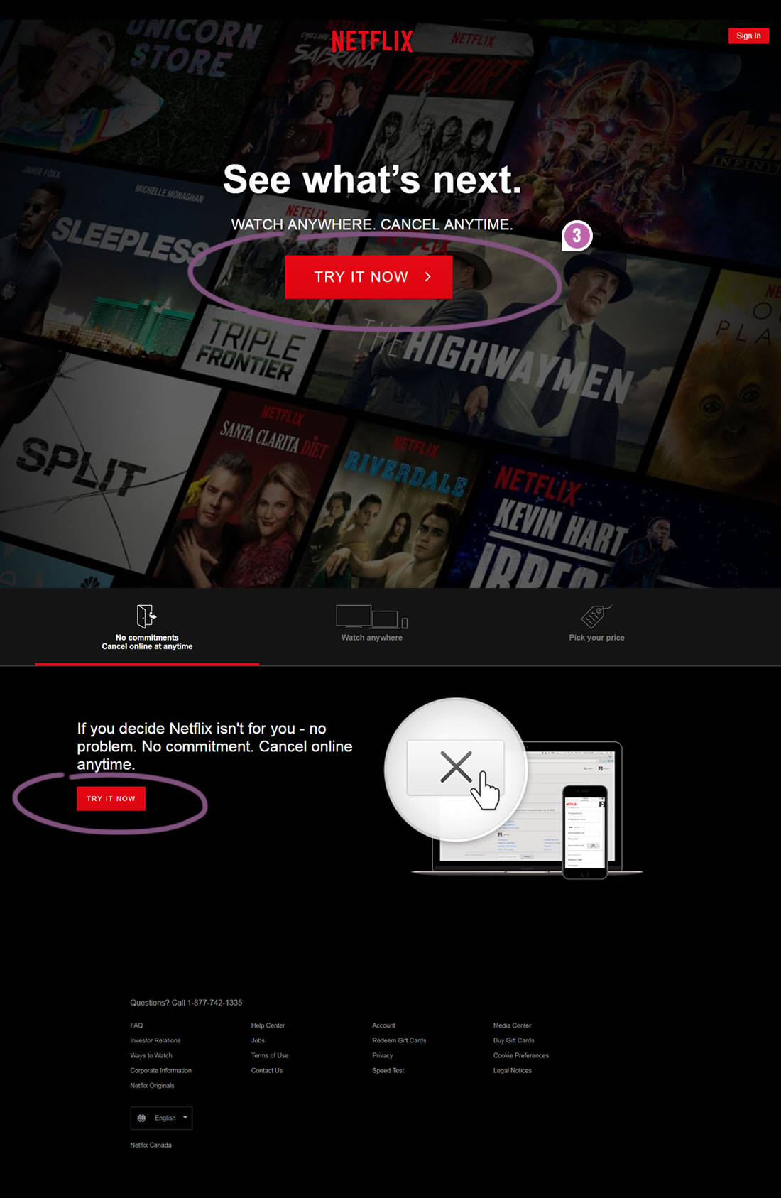

Highlighted UI Changes From This Leak
-
Join Netflix Vs. Join Now
This "Join Netflix" button label might have been the control version.
-
Join Now
Version B tried a button label with "Join Now".
-
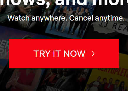
Try It Now Vs. Join Now
Here we have a variation with ("Try It Now") which feels less committal. This version also seems to have been implemented.
0.5 Repeatability has been assigned to Pattern #54: Buy Now Or Smaller Commitment Button as evidence that it's getting better
Repeatability is a net count of evidence for or against a pattern. It’s how we can predict which patterns are better than others. :)
-
Get Netflix Vs. Join Now
If in fact "Get" is in any way inferrior to "Join", could it mean that "joining" is more consistent with its subscription model? Wherease "getting" is wording that's possibly better suited for single purchase products? I'm only speculating here and would consider this as a hypothesis for future experiments.
It would also be super amazing to see the actual test result comapring A ("Join Netflix") and D ("Get Netflix") to answer the above more tightly. Of course that's only for Netflix to know - unless they see this and share their results (wishful thinking)? :)
Why I Respect This Experiment
Button experiments have occasionally been a symbol of ridicule. Some consider them as a waste of time leading towards low impact or insignificant results. Some consider them as wasted efforts compared to potentially more meaningful experiments. The contrary fact that Netflix actually ran such experiments, to me suggests that no experiment is considered taboo by their team. Sometimes even small changes can have impact. And this line of thinking is completely inline with our own evolving understanding of various button patterns (some better than others and some flat of course).
Thank you Netflix for running this!
Comments
Jasper 6 years ago ↑1↓0
Really cool to see these kind of a/b tests. Its really helpful information. I was thinking B or C would be the best, since people want to start watching movies "now" and they also want to join "now". And i feel the same Danit is saying about the Joining, they want to join an already large group of people who use Netflix. So your joining a group of people with the same interest.
Reply
Danit 6 years ago ↑1↓0
I think the word "Join" appeals to users because it has a social connotation.
It implies the opportunity to be part of a community - it might provide a sense of belonging, which is a basic human need many people seek
Reply