Etsy Runs An A/B Test Suggesting That Less Isn't Necessarily More
This interesting experiment was discovered a month ago on Etsy's product listing screens. In a nutshell, more traditional and elaborate product tiles was aggressively shortened by removing a lot of information such as product names and customer reviews. This had the additional effect of shortening the tested listing pages. One more later, the experiment looks like it was rejected - hinting that less is not always more. :) Interestingly, this a/b test also directly corresponds with our condensed list pattern and we'll count this as negative evidence against it.

B - Apr 13, 2022 Screenshot
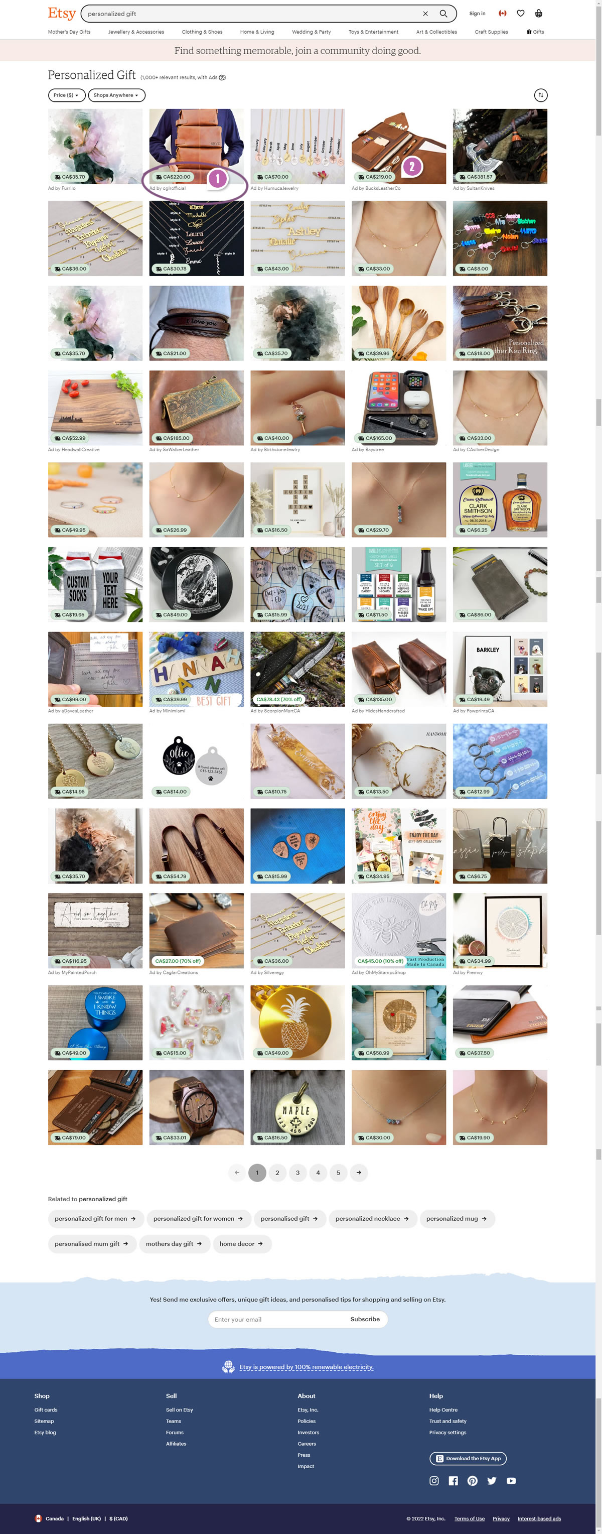
Highlighted UI Changes From This Leak
-
Condensed Listings
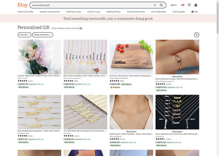
In the variation we can see a clear removal of multiple pieces of information, including: product titles, customer reviews, name of the seller, badges (free delivery), and discounts. The price in the variation was also shifted into the product tiles, overlapping them.
Given that there were around 60 tiles on the full listing screen, by condensing it, the length of the screen decreased visibly.
-0.5 Repeatability has been assigned to Pattern #32: Condensed List as evidence that it's getting worse
Repeatability is a net count of evidence for or against a pattern. It’s how we can predict which patterns are better than others. :)
-
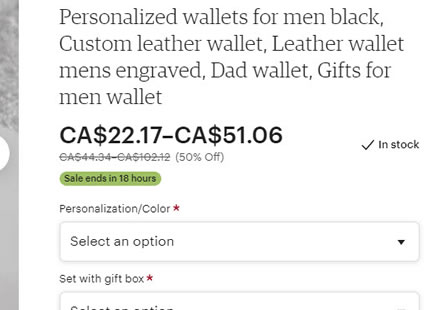
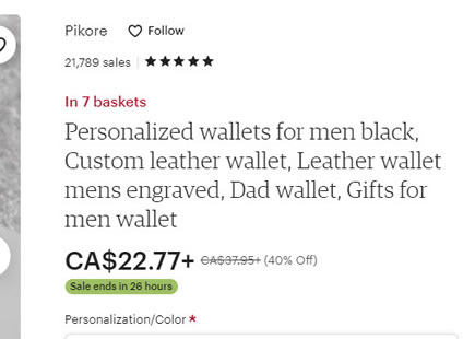
Discounted Vs Pre-Discounted Prices
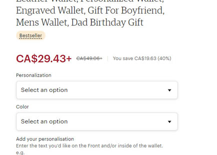
The variation also contains an additional price change that might have contributed to a negative effect (my guess). Notice how the control version on the left shows a lower discounted price (ex: $175) along with a crossed out higher pre-discounted one ($219). In the variation however, we can only see the more expensive pre-discounted price ($219).
If I were designing this experiment, this would be a perfect change to test in isolation and show the discounted lower $175 instead.

Comments