Etsy A/B Tests This High Contrast Button Style
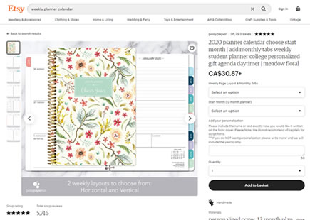
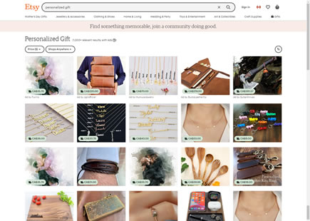
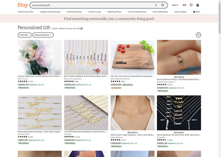
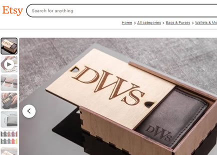
Etsy ran a little A/B test where they probably tried to encourage more searches with the help of a stronger visual cue in their search bar. Instead of using a ghost-like icon only approach for the primary search, they stylized it as a high contrast button. Fast forward a few months and it now looks like the variation was implemented.
We're tracking similar experiments under the Visible Search and Filled Or Ghost Buttons patterns.
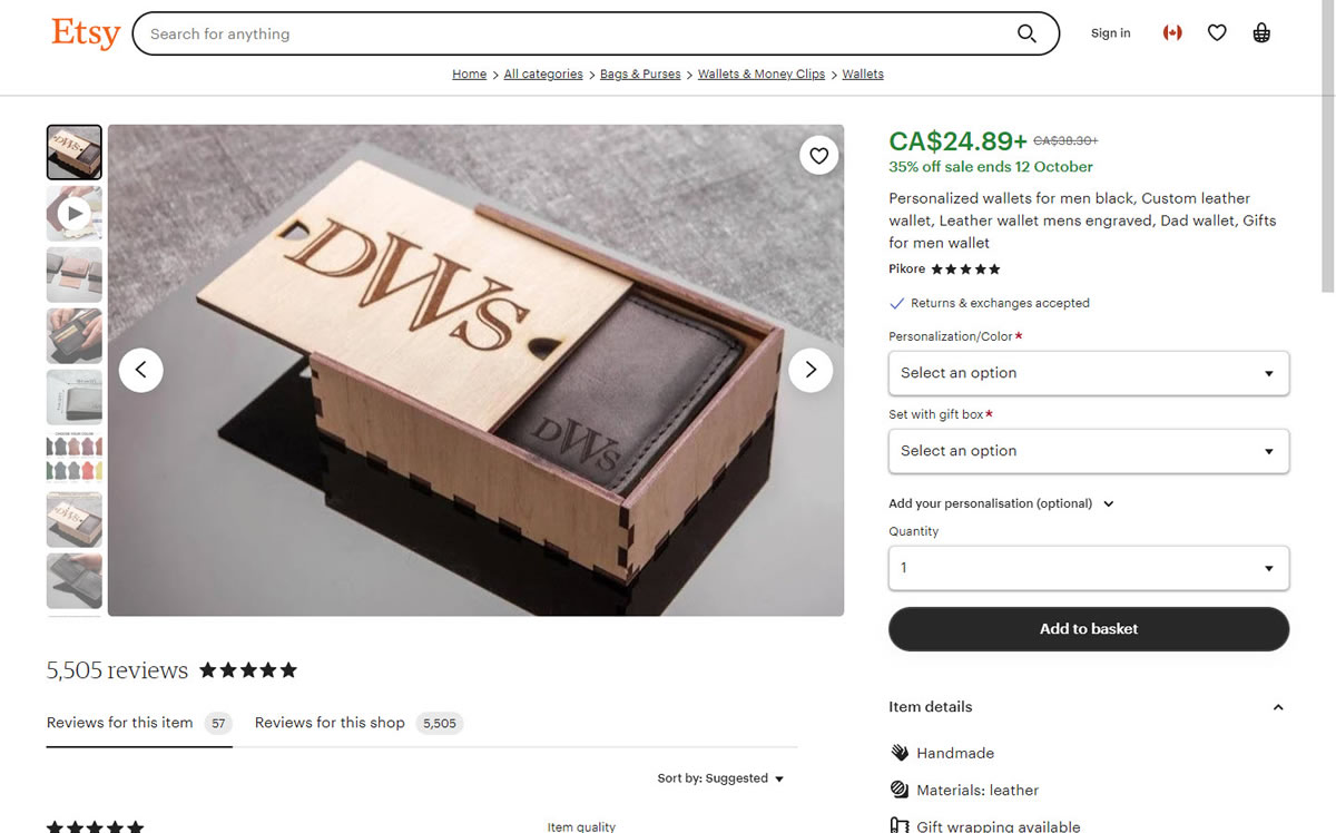
B - Oct 11, 2023 Screenshot
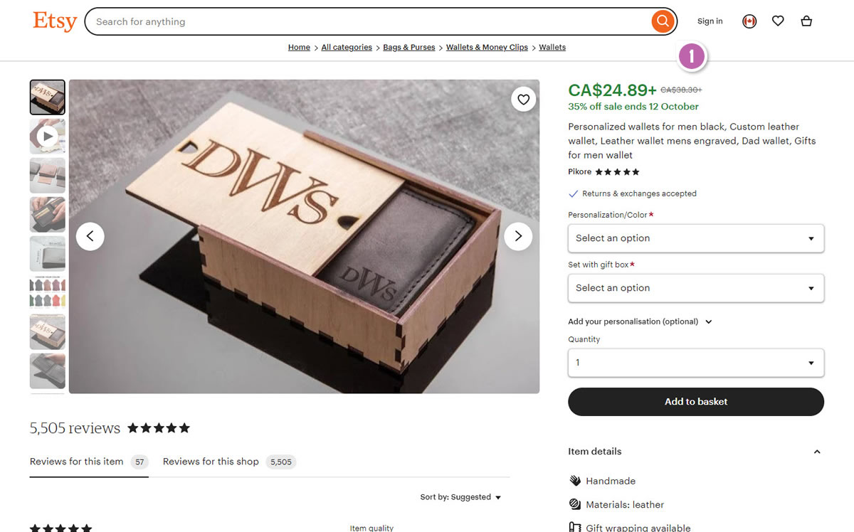
Highlighted UI Changes From This Leak
-
High Contrast Filled Button Style
In the variation we can see a strong orange used as the background color of the search button.
-0.5 Repeatability has been assigned to Pattern #77: Filled Or Ghost Buttons as evidence that it's getting worse
Repeatability is a net count of evidence for or against a pattern. It’s how we can predict which patterns are better than others. :)
Comments